How do you encompass the challenges of the climate emergency for the Arts & Culture, the impact it is going to have on the way we work and how can artists play a role in leading this conversation?
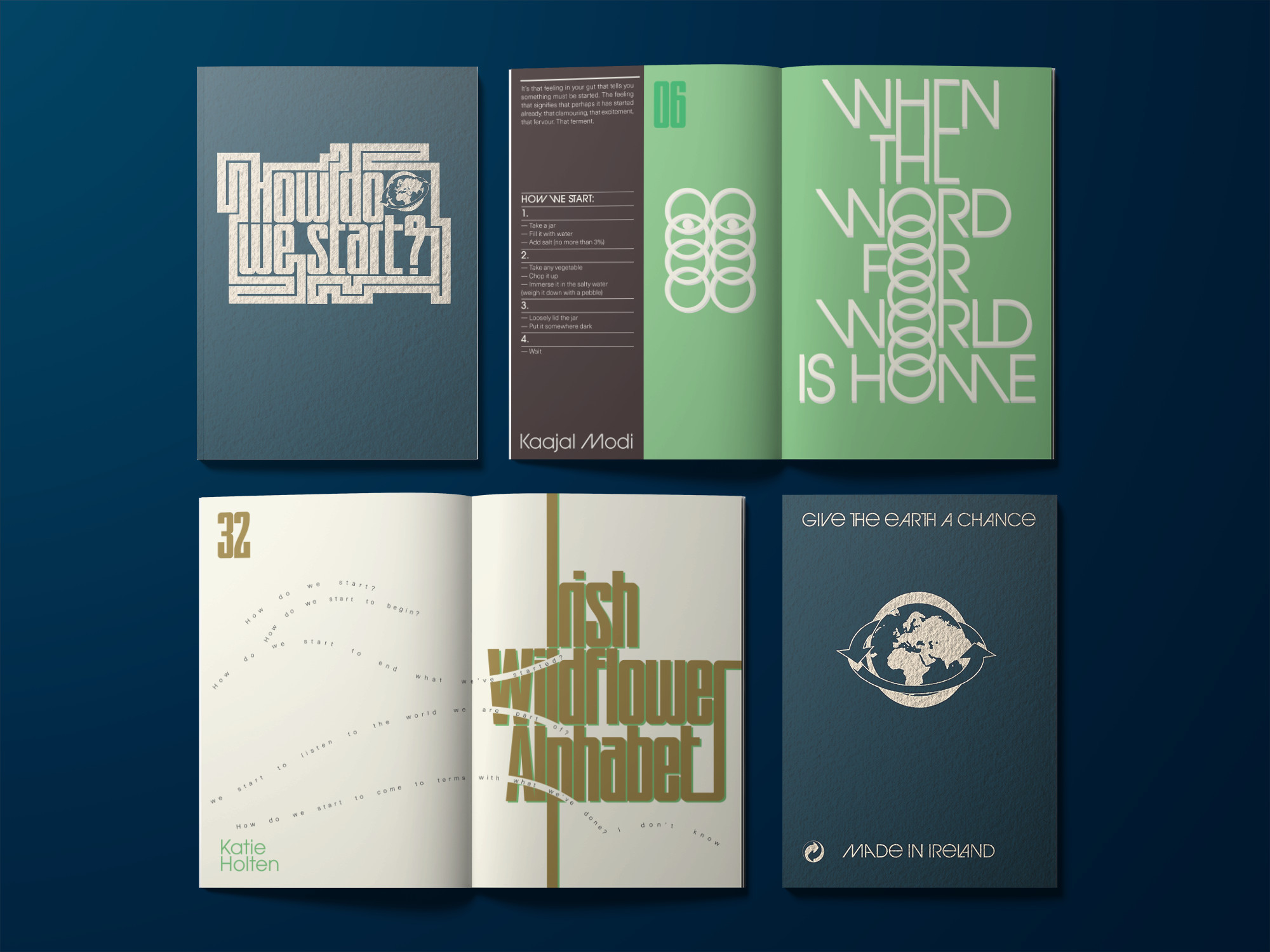
Commissioned by the Project Arts Centre, How Do We Start? explores how they as a cultural institution can approach a more sustainable way of existing in the world and how to support artists to lead the way by collaborating and bringing their dynamic skills to bear on the problem.
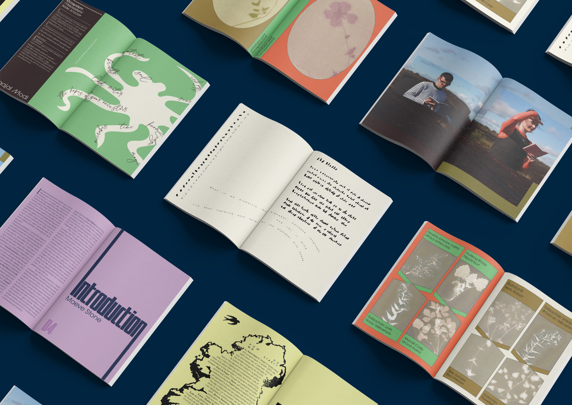
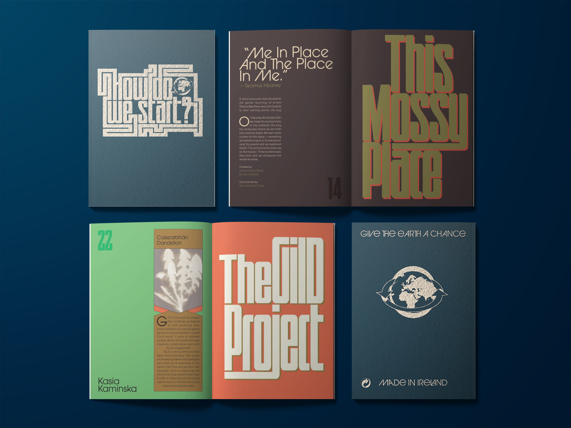
The publication was edited by Maeve Stone & Cian O’Brien, with contributions from; artists Kasia Kaminska, Shanna May Breen & Luke Casserly, Katie Holten and Kaajal Modi. The artists’s work explore the question ‘How Do We Start?’ in ways of practical instructions, poetry, speculations, image making, and language.
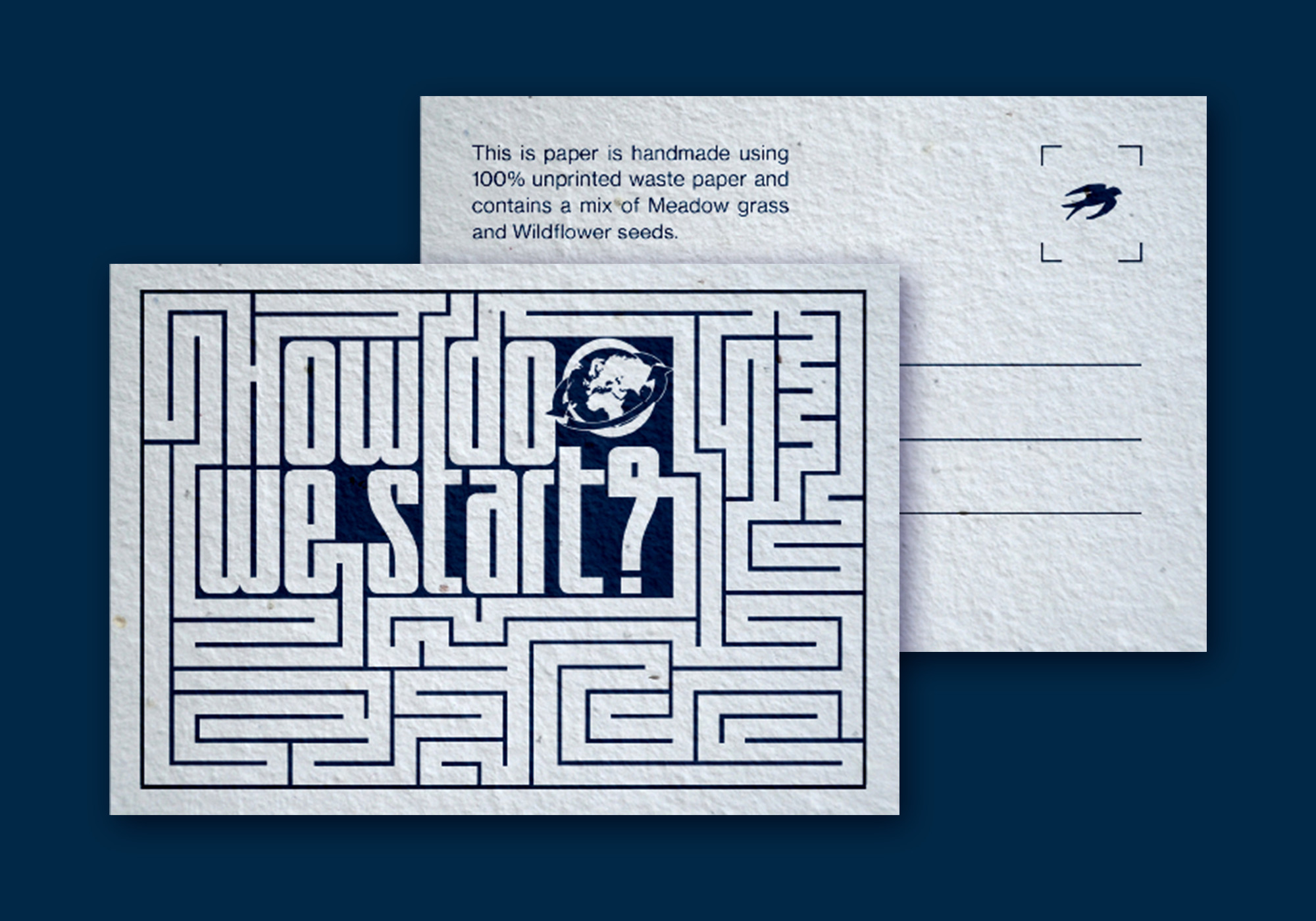
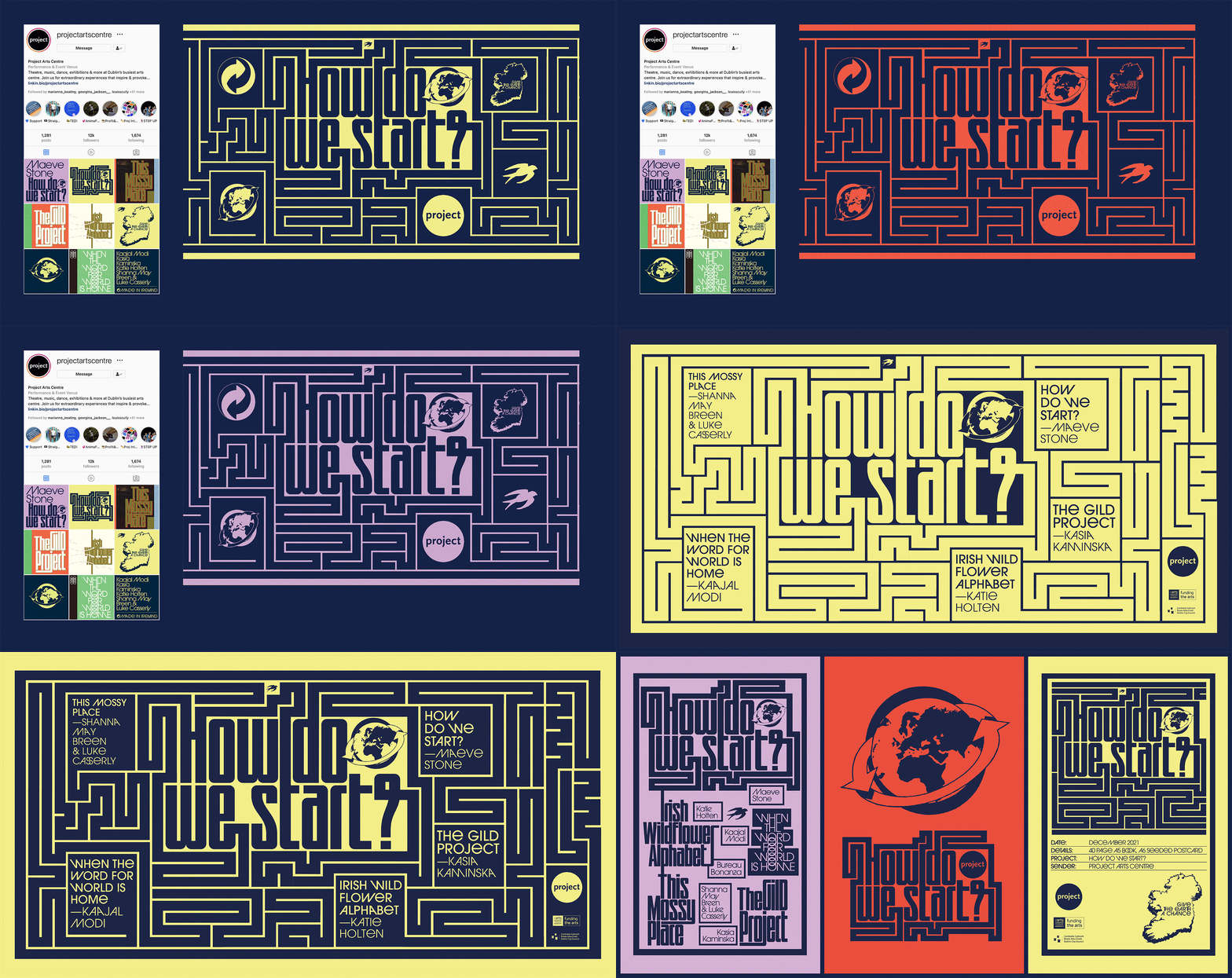
We were inspired by the pragmatic and instructional nature of the artist contributions to base the design on Make-and-Do-Books from our childhood. The aesthetic of these books with their bold colours and framed text and images became a starting point for the book. On the cover and on a postcard (printed on plantable paper stock with wild flower seeds), the question ‘How Do We Start?’ expands out into a maze from several directions and explores ways of answering itself. This theme was extended further in the promotional elements of the project.
A major challenge of the project was to justify the contradiction of producing an object that addresses the climate crisis. We talked directly with paper manufacturers and printers about how we could find ways to minimise the impact of production and waste by using plant based inks, recycled papers, available offcuts and how to minimise transport and deliveries. It was a great learning experience for us as designers of books that will inform the way we work in the future.
A major challenge of the project was to justify the contradiction of producing an object that addresses the climate crisis. We talked directly with paper manufacturers and printers about how we could find ways to minimise the impact of production and waste by using plant based inks, recycled papers, available offcuts and how to minimise transport and deliveries. It was a great learning experience for us as designers of books that will inform the way we work in the future.
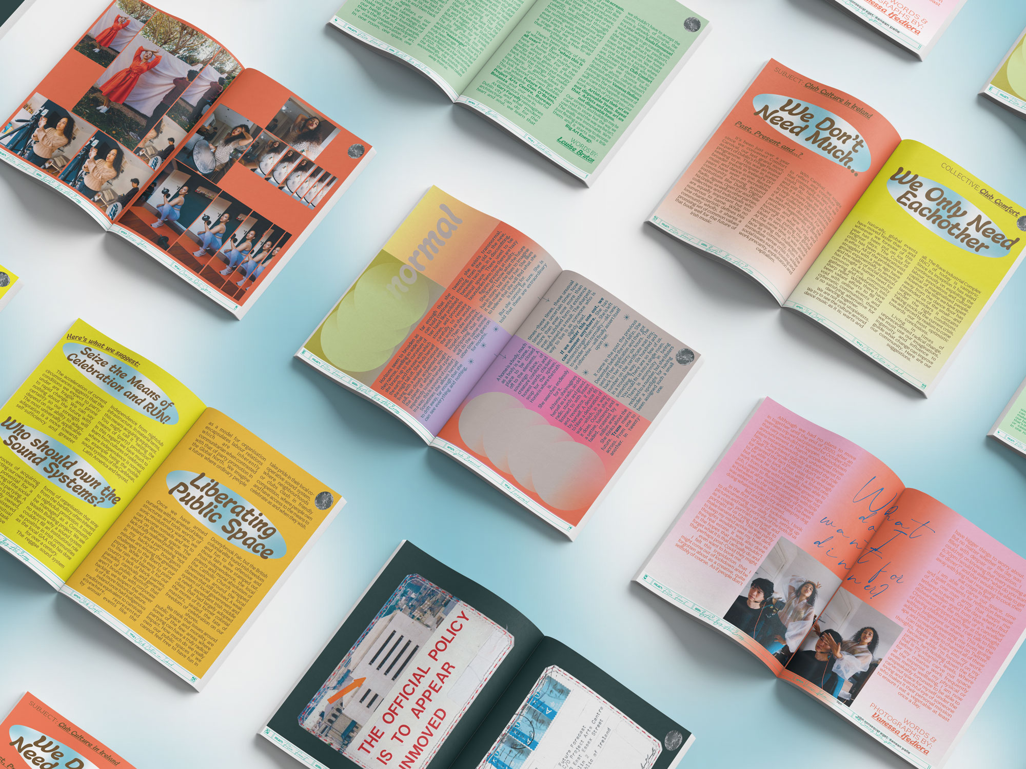
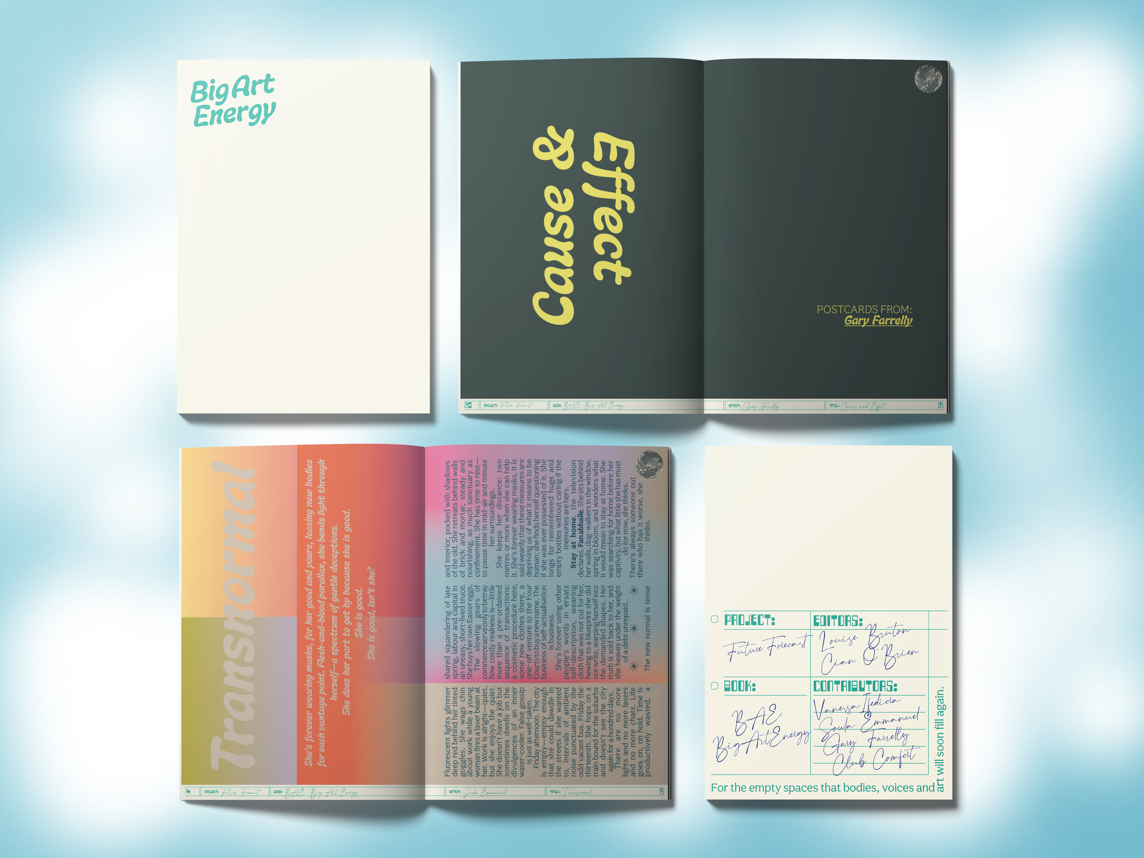
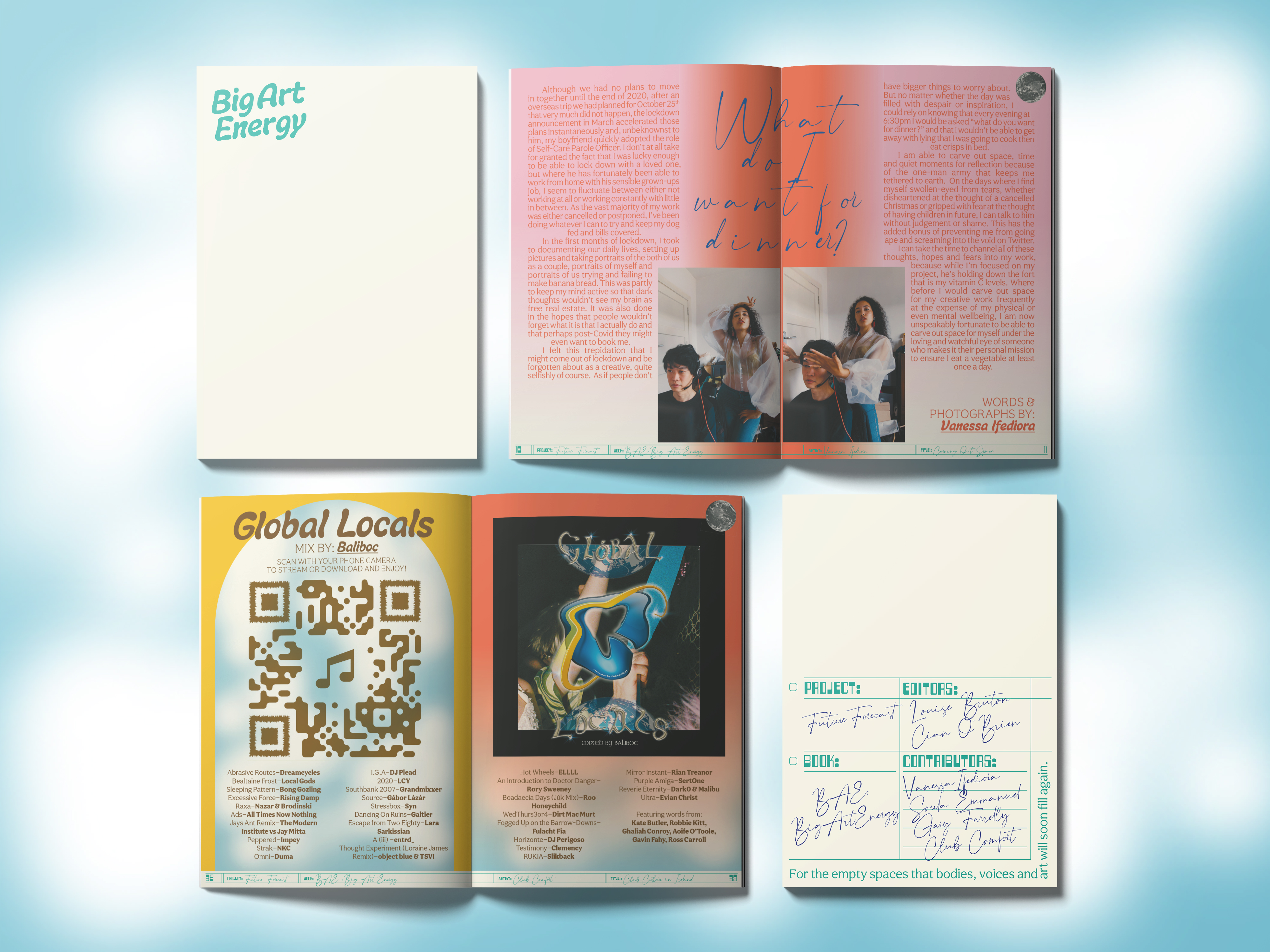
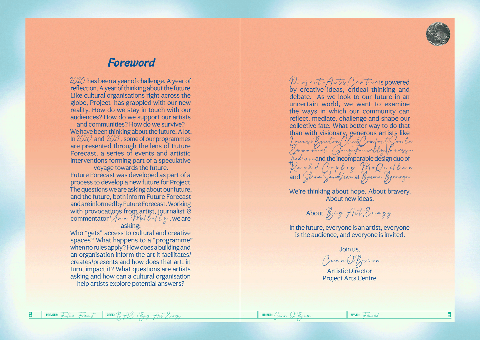
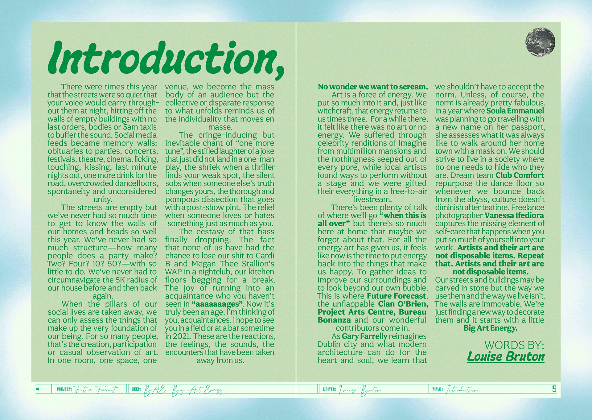
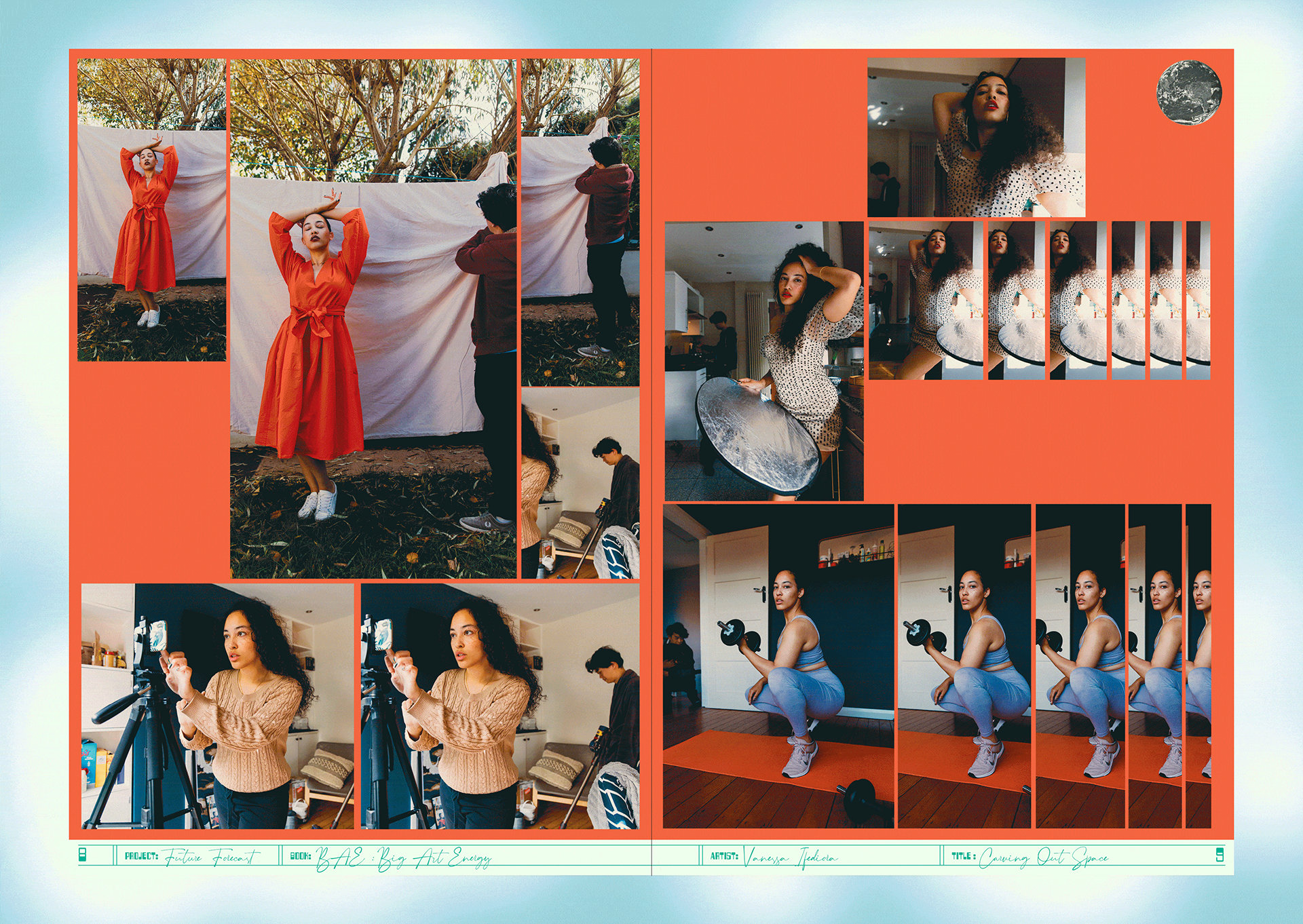
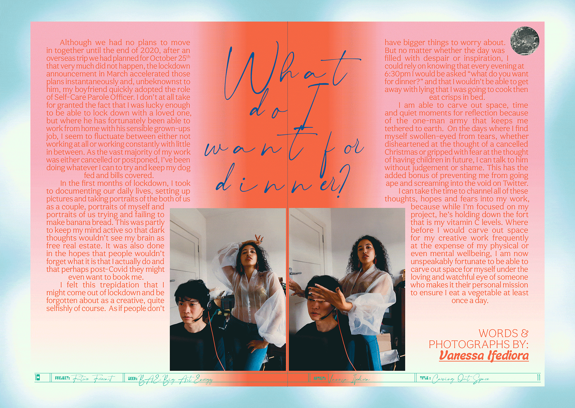
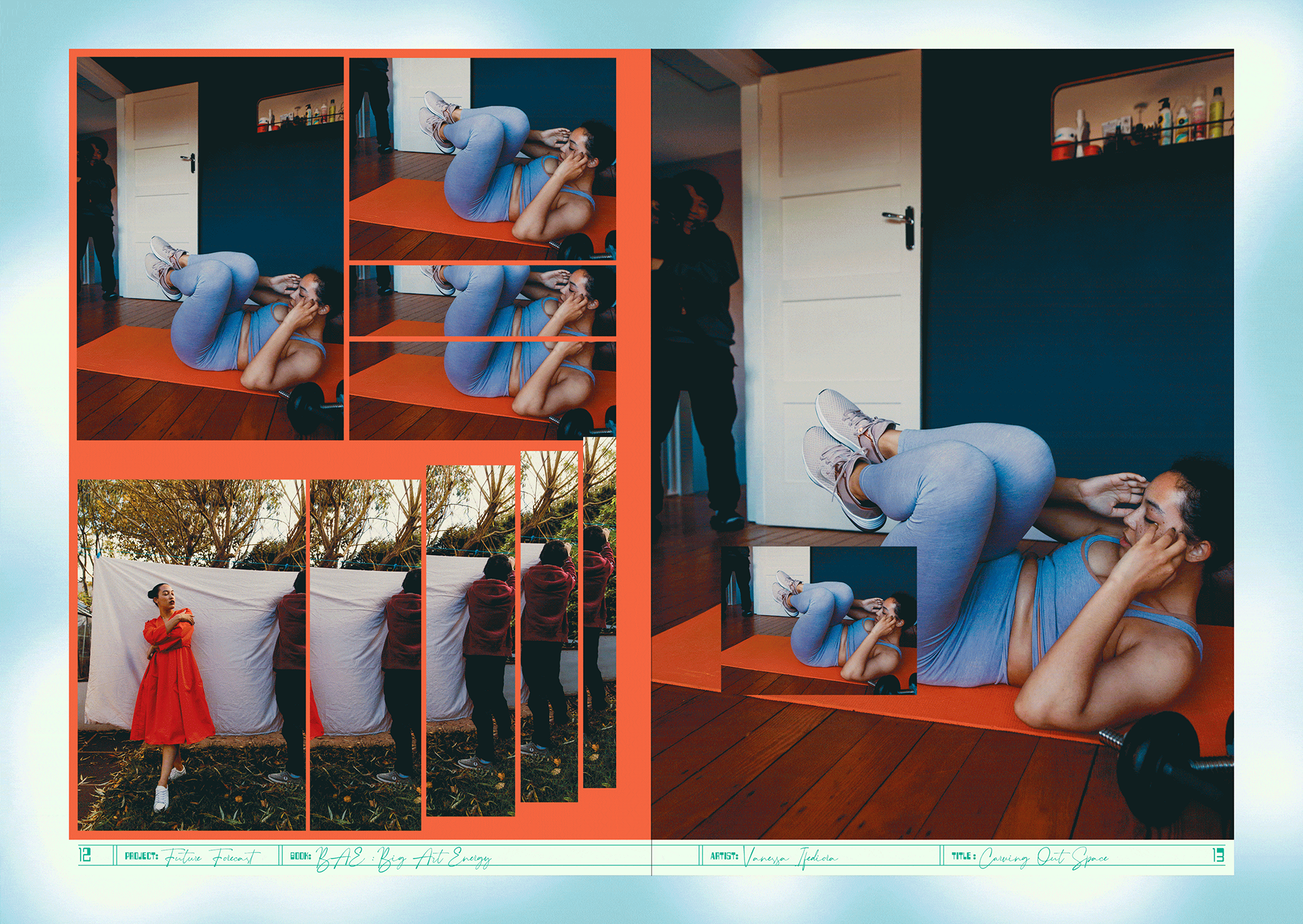
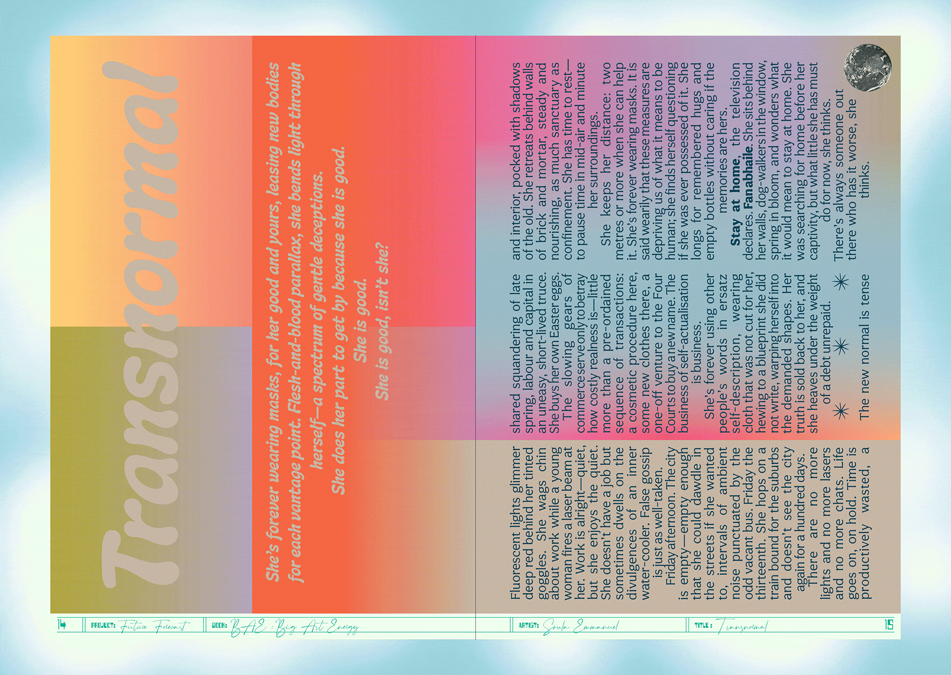
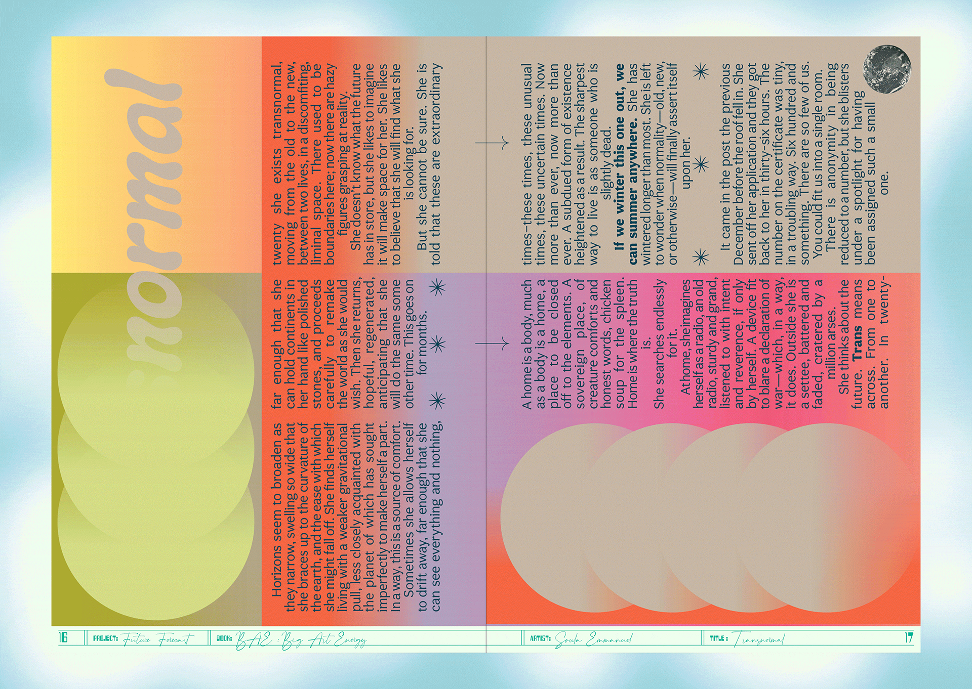
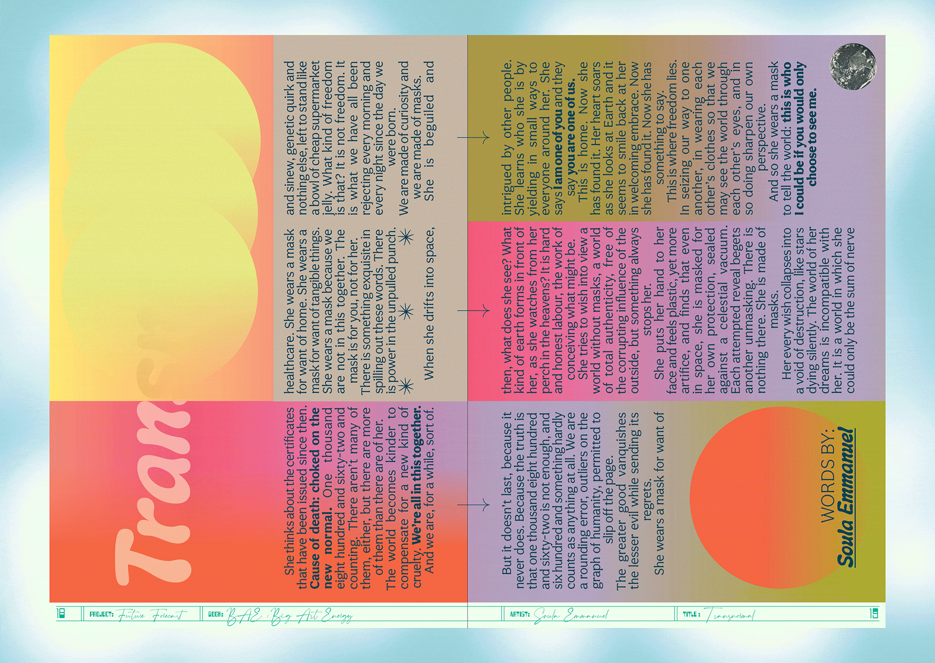
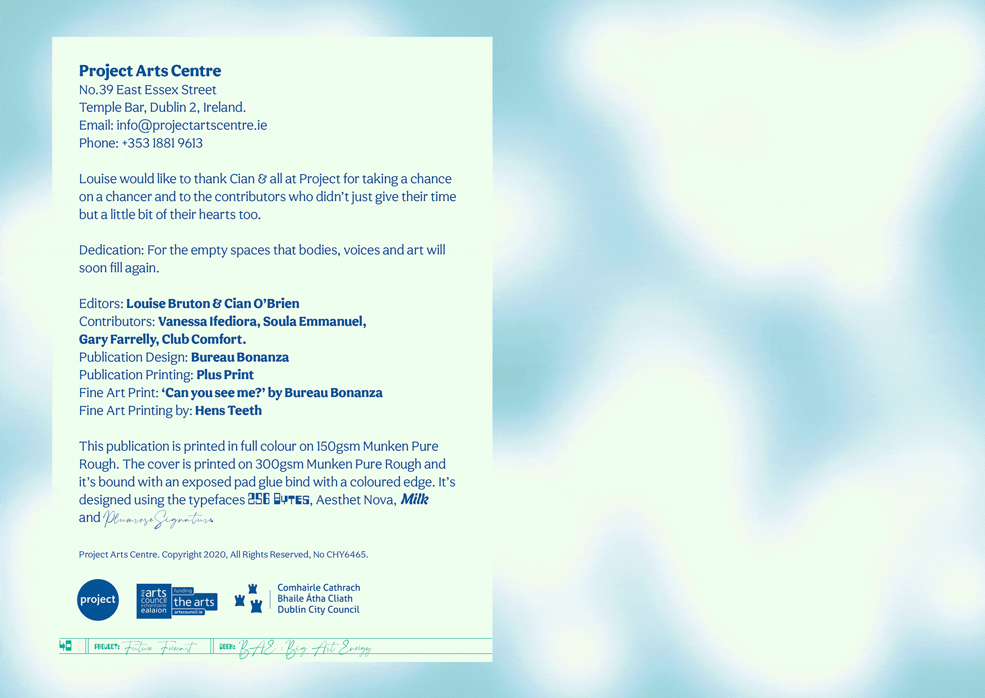
The art publication Big Art Energy was commissioned by the Project Arts Centre as part of Future Forecast—a series of events and artistic interventions forming part of a speculative voyage towards the future.
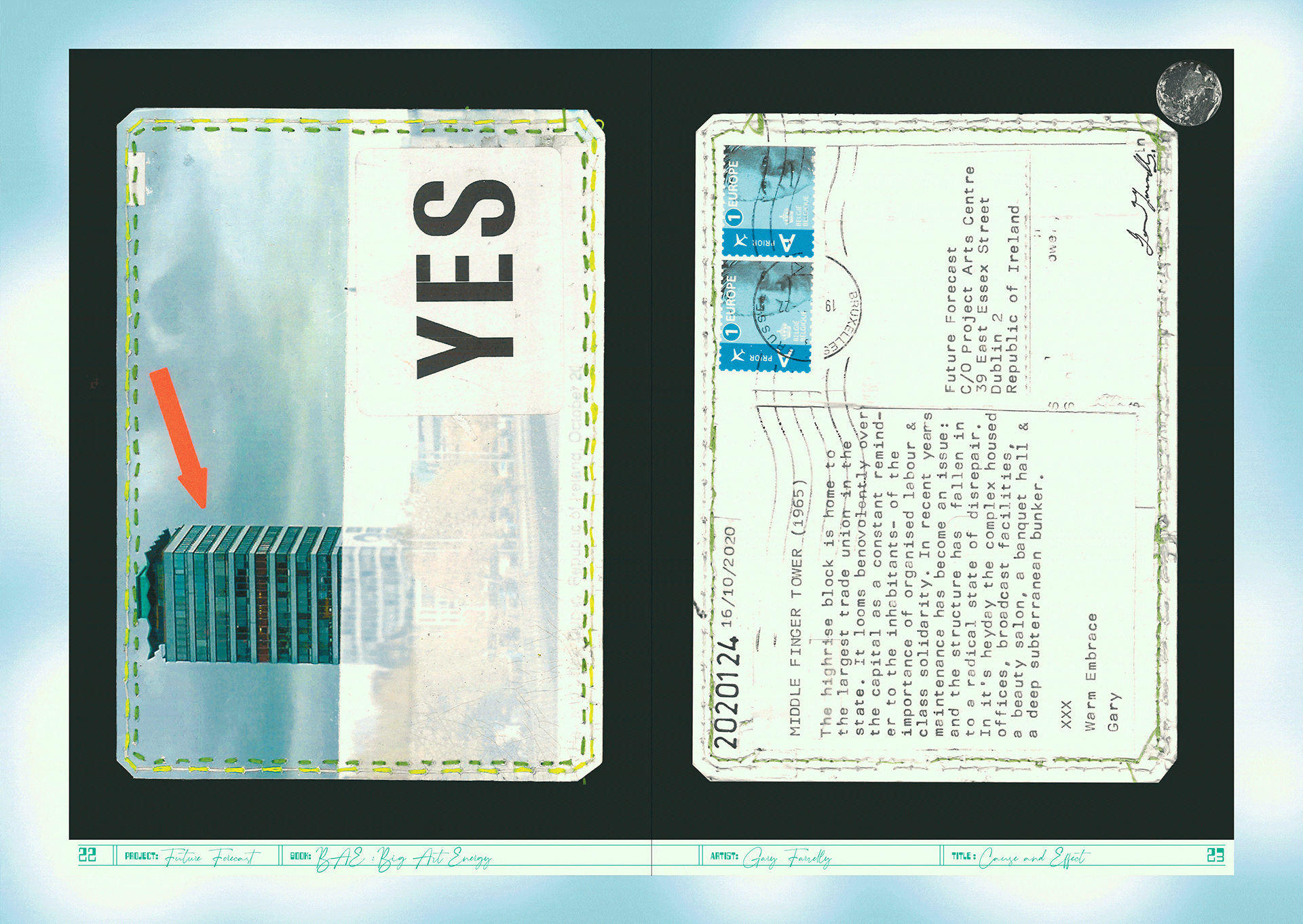
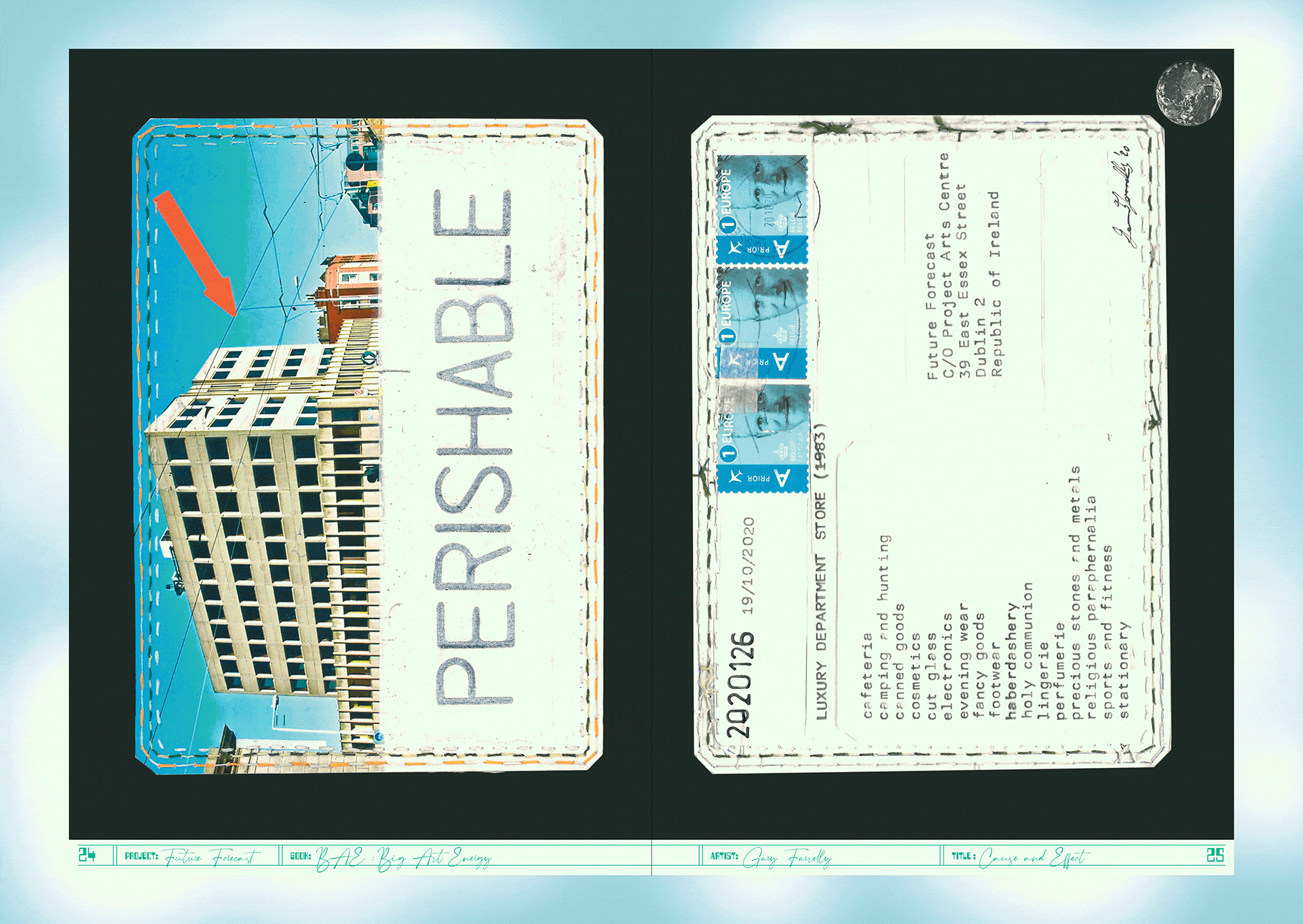
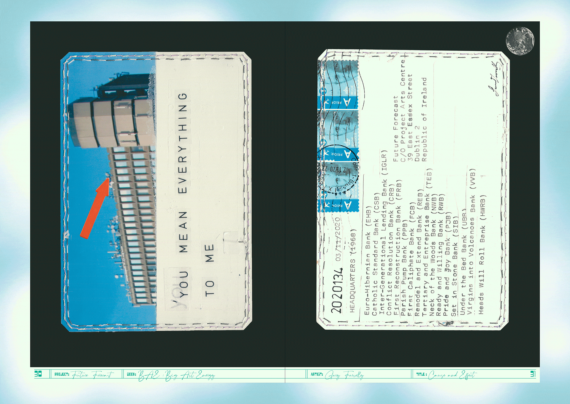
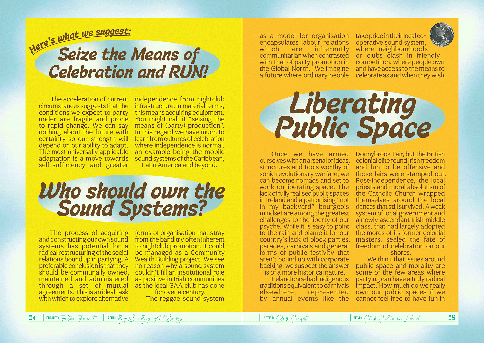
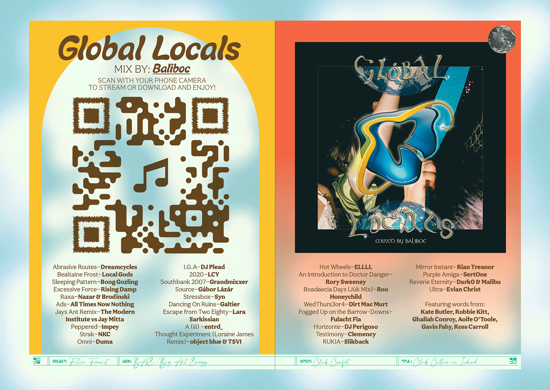
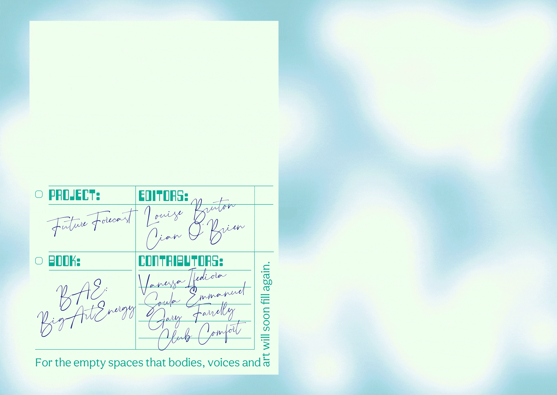
The publication was edited by Louise Bruton & Cian O’Brien, with contributions from; photographer Vanessa Ifediora, writer Soula Emmanuel, artist Gary Farrelly and party makers Club Comfort. Big Art Energy showcases these artists’ reactions to the pandemic, response to lockdown and forecasts of the future of their respective industry or field of art.
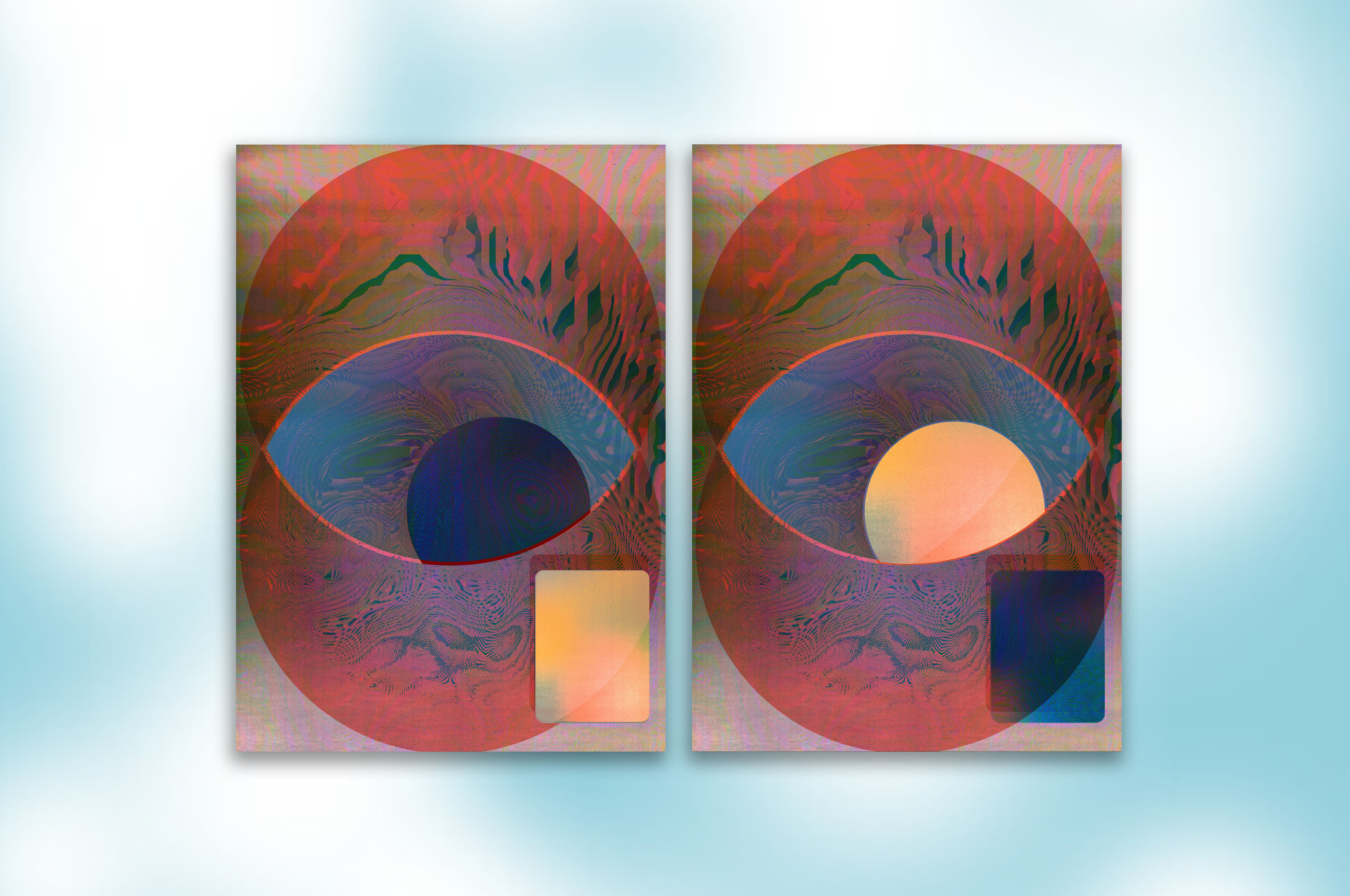
We designed a package to be sent out by post with the limited edition publication and our contribution the fine art print ‘Can You See Me?’, a happy accident sprung from a series of technological failures. A beautiful blur of a screenshot from FaceTime during a failing internet connection became an intriguing portrait of ourselves and our new way of working.
Initially inspired by journals, especially Aisling copy books, the book would act as diary or log book to record and express our inner thoughts and feelings during lockdown. Taking from those visual cues, the cover of the book is plain, quiet and still with the inside being akin the inside of your head and how you might be feeling in the midst of the pandemic—cluttered, maybe a little bit claustrophobic and anxious but colourful and beautiful and overall, hopeful.
We employed a design process inspired by a common concept in architecture and city planning referred to as desire lines; “paths & tracks made over time by the wishes & feet of walkers, especially those paths that run contrary to design or planning”; or “free-will ways.” While first using a strict grid and typographic rules to create a foundation we then allowed our human instinct to take over and Big Art Energy to fill-in, spill over, doodle, colour-in, make notes in the margins and practice our autograph over and over, just like you would in a journal.
These interventions gave each section for the contributing artists a distinct look and feel specific to the content, yet, there remains a unity to the publication thanks to the rigour of the typography and editorial layout.
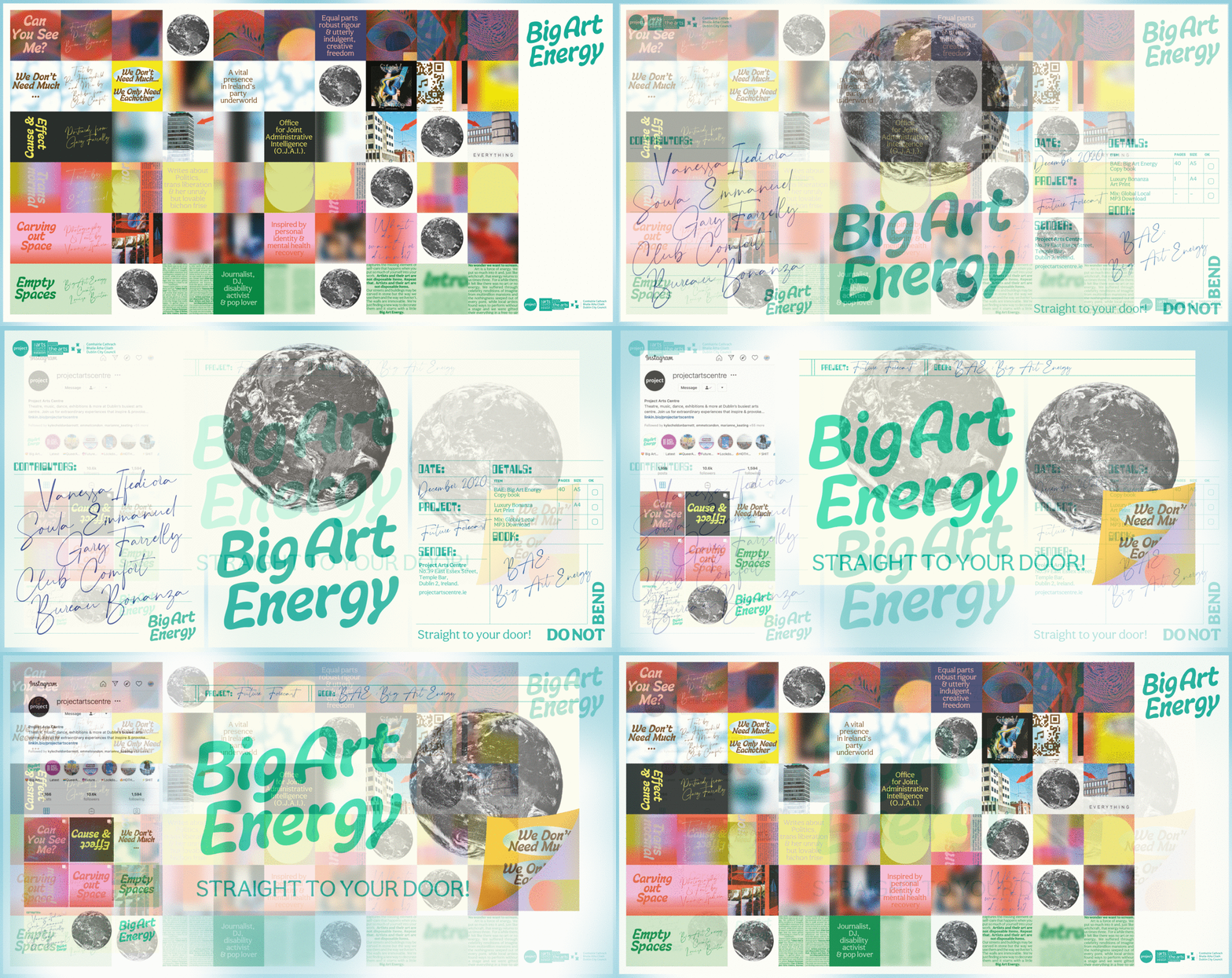
An extensive web, social media and print campaign gave BAE massive traction. As well as providing Project Arts Centre with a social media strategy and content, we created dynamic and personalised social media animations for all the contributing artists to share on their own social media platforms, while also providing all the necessary information for people interested in ordering the package. A billboard and posters outside of the Project put a smile on the faces of a few the passers-by in Temple Bar.
















Client Brief:
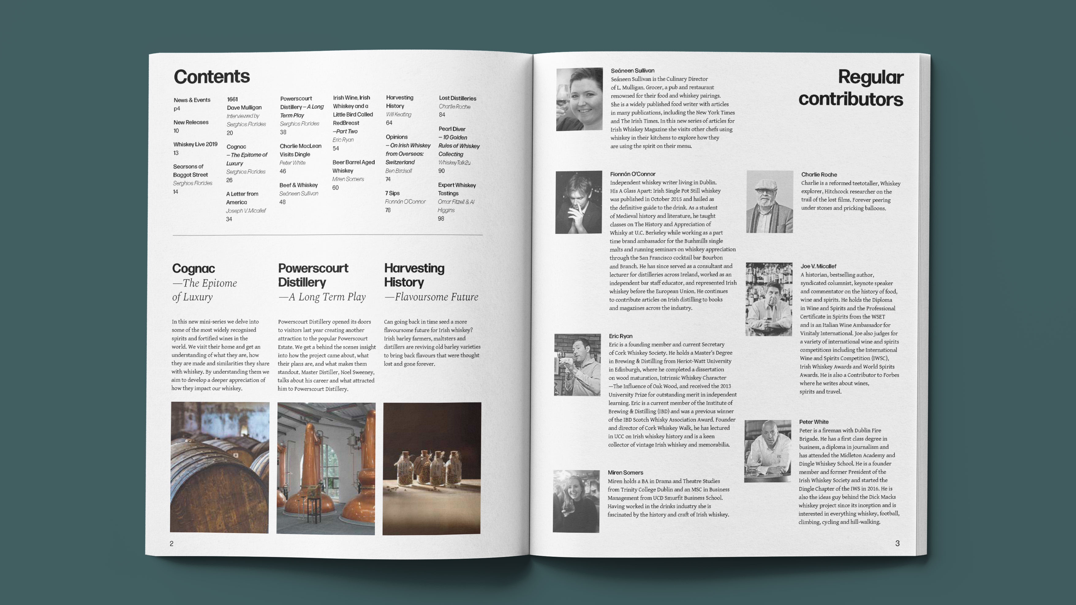
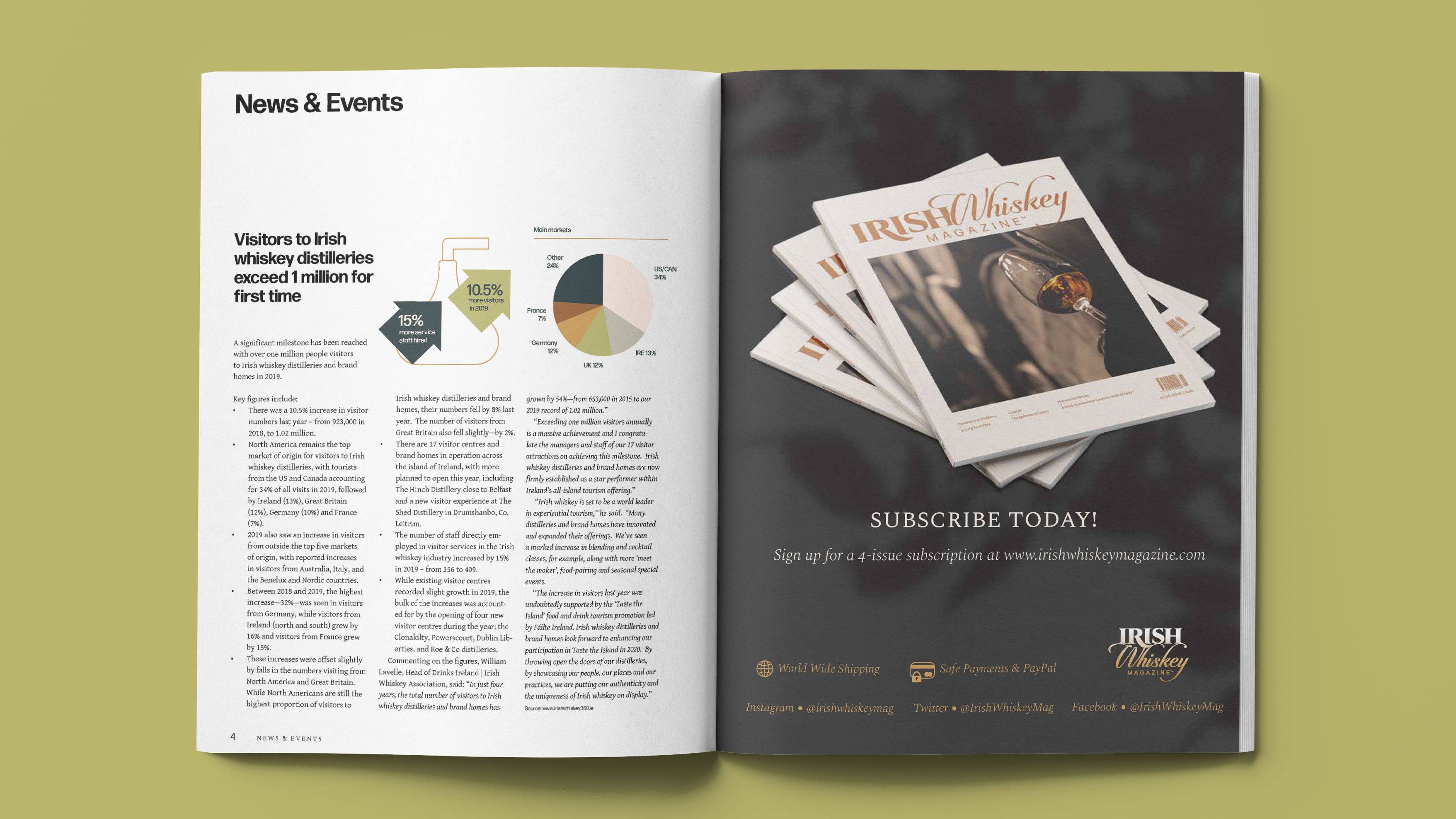
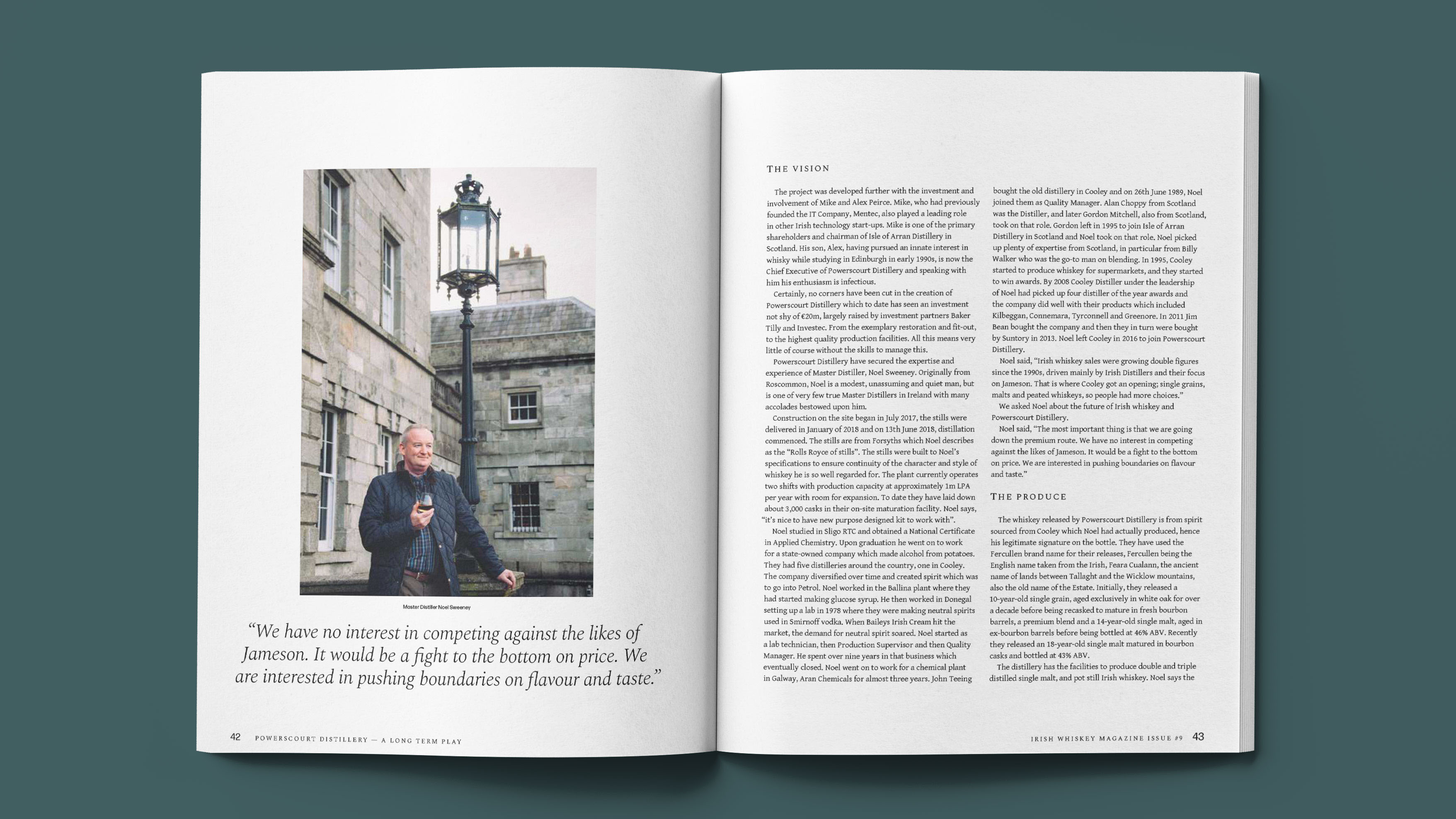
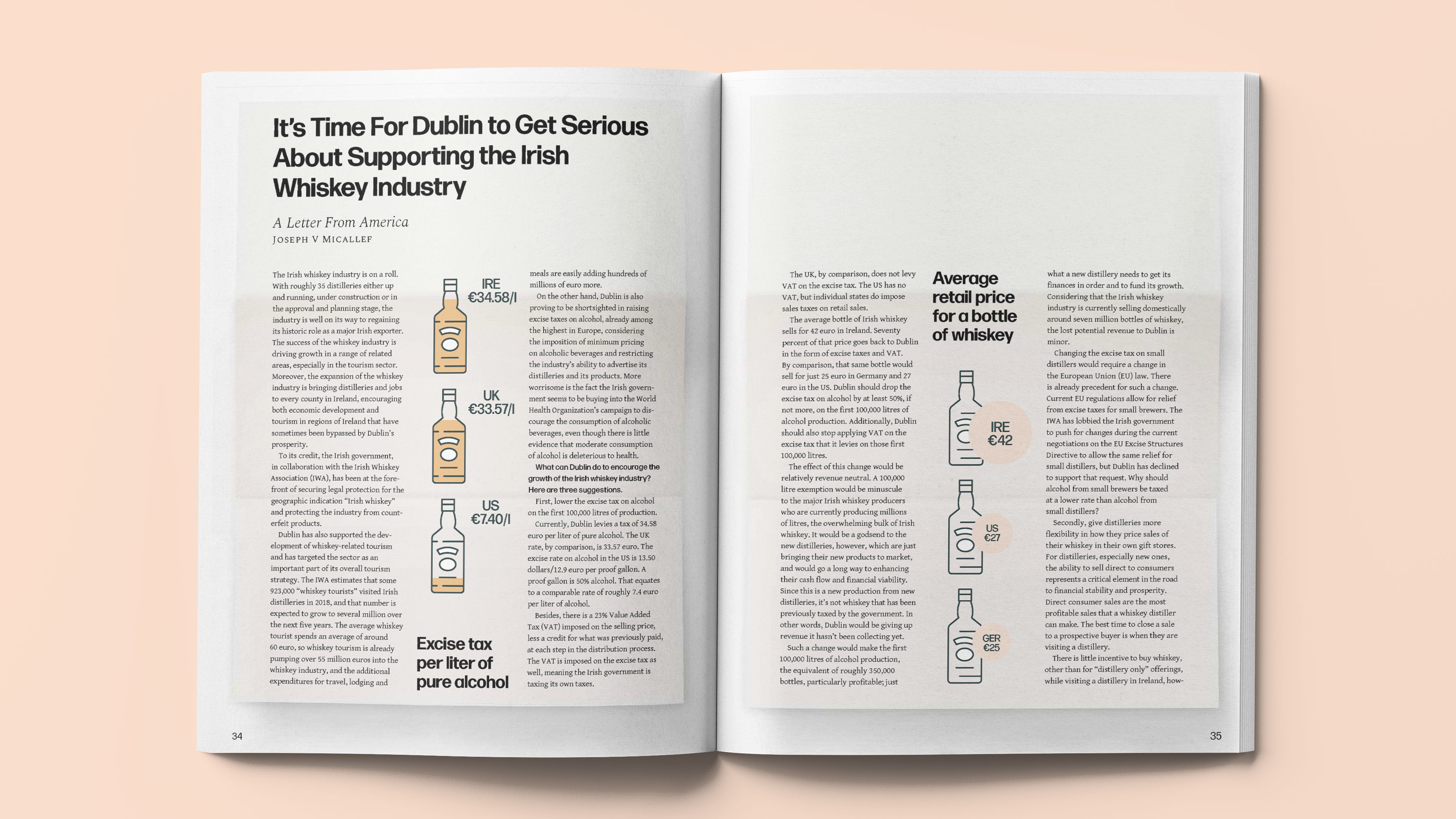
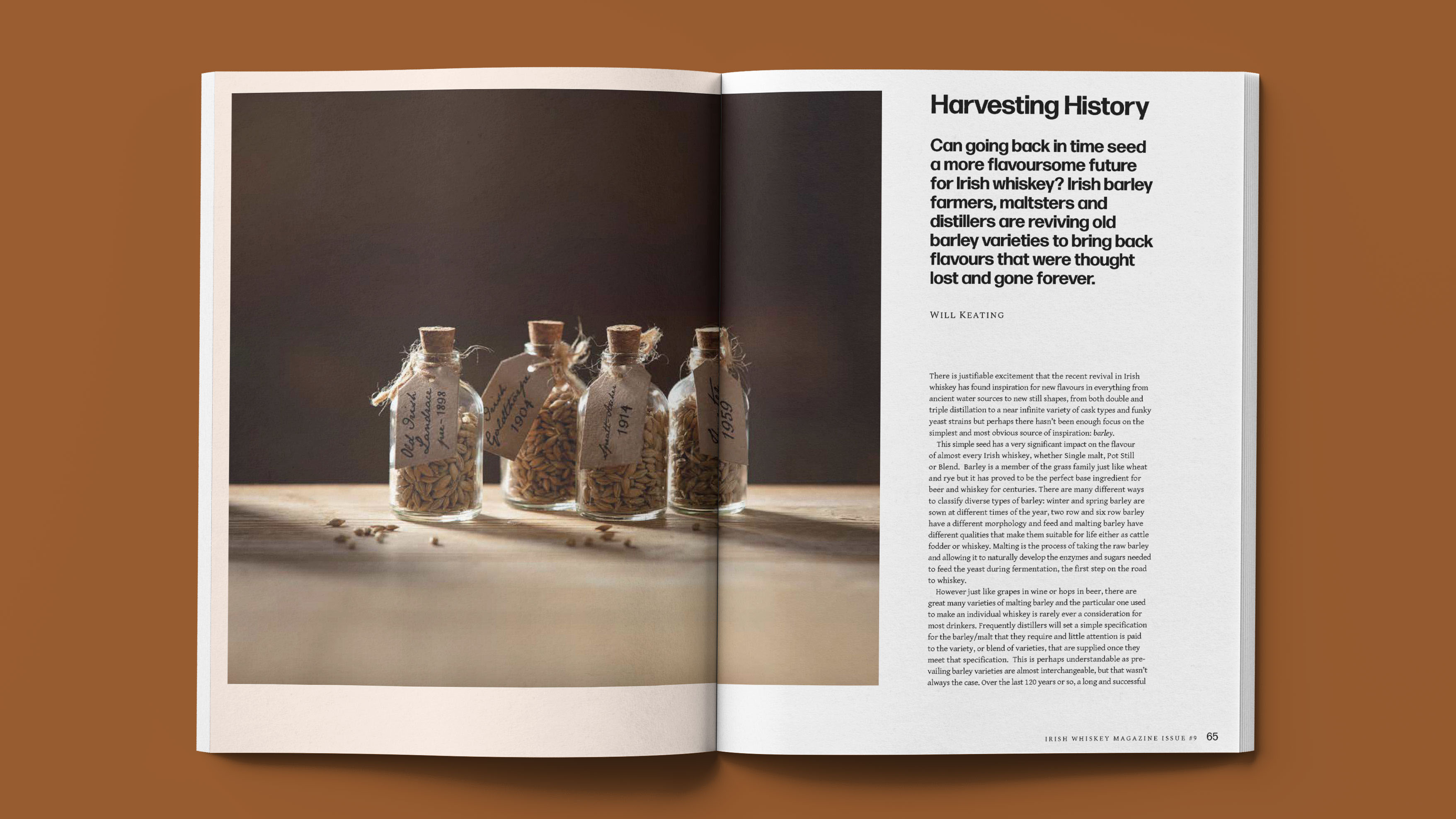
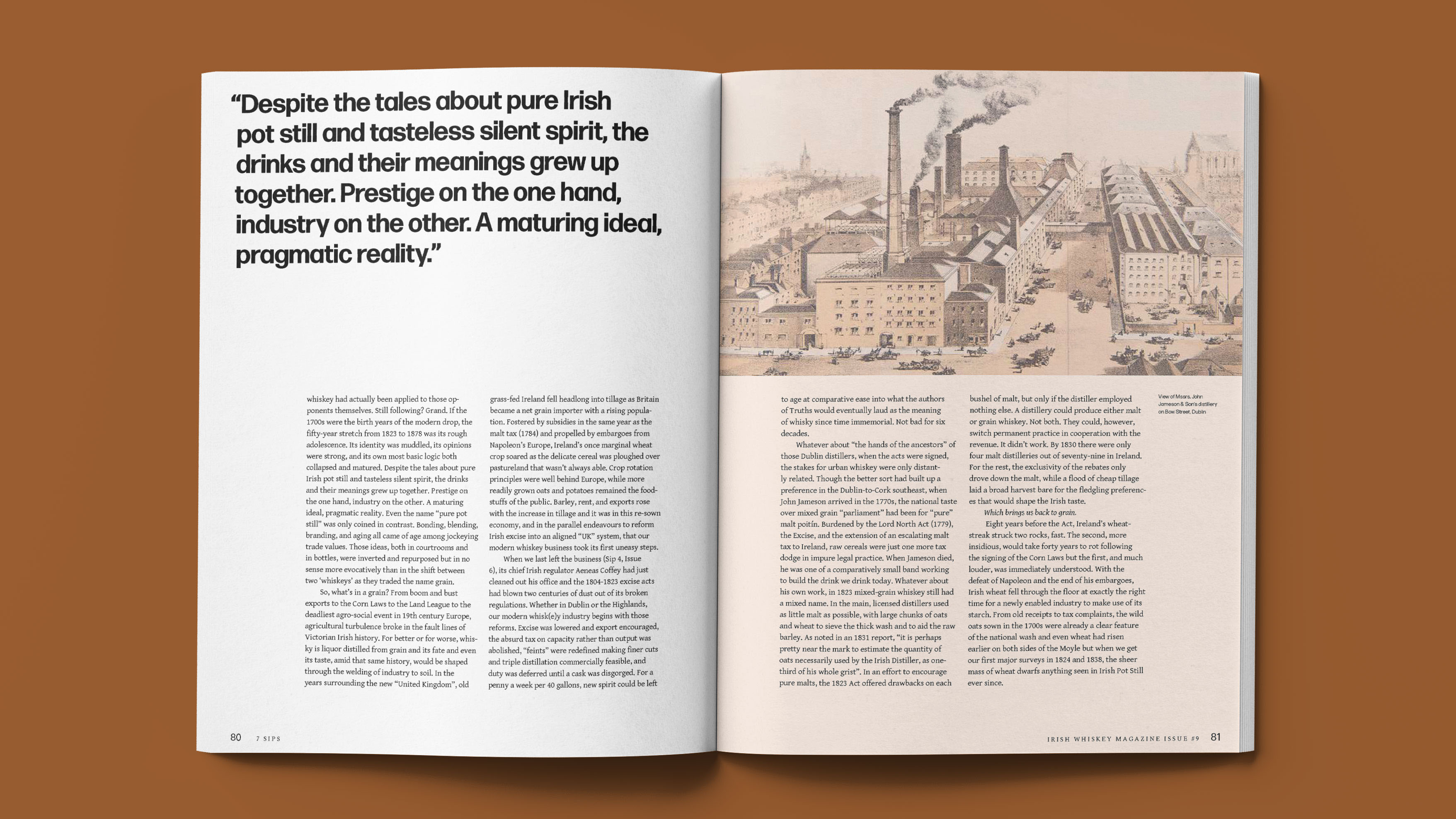
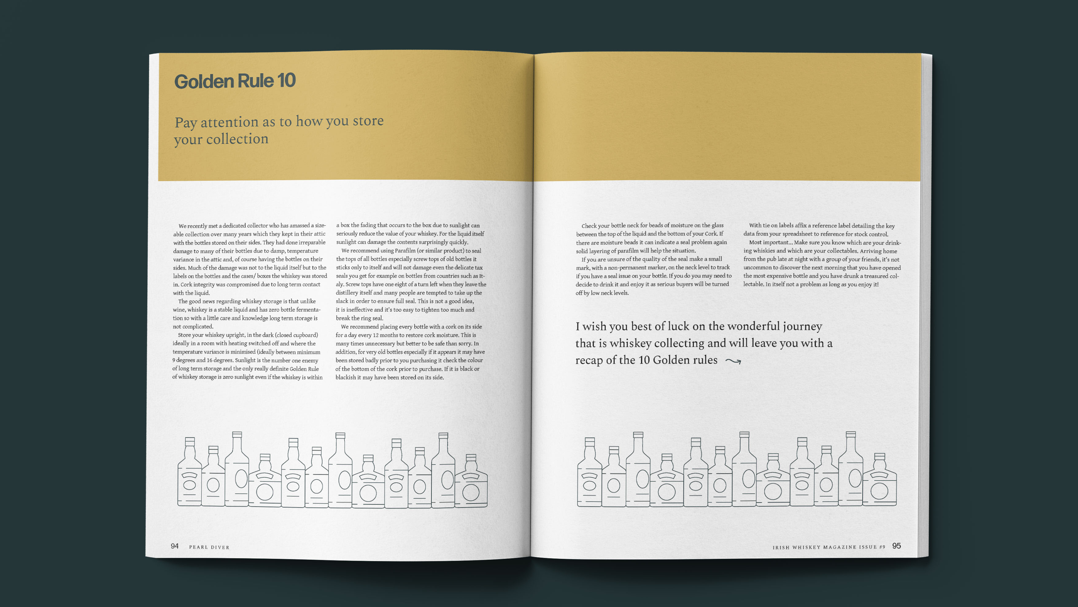
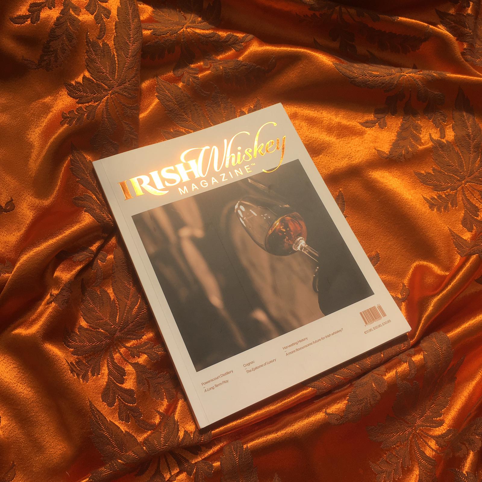
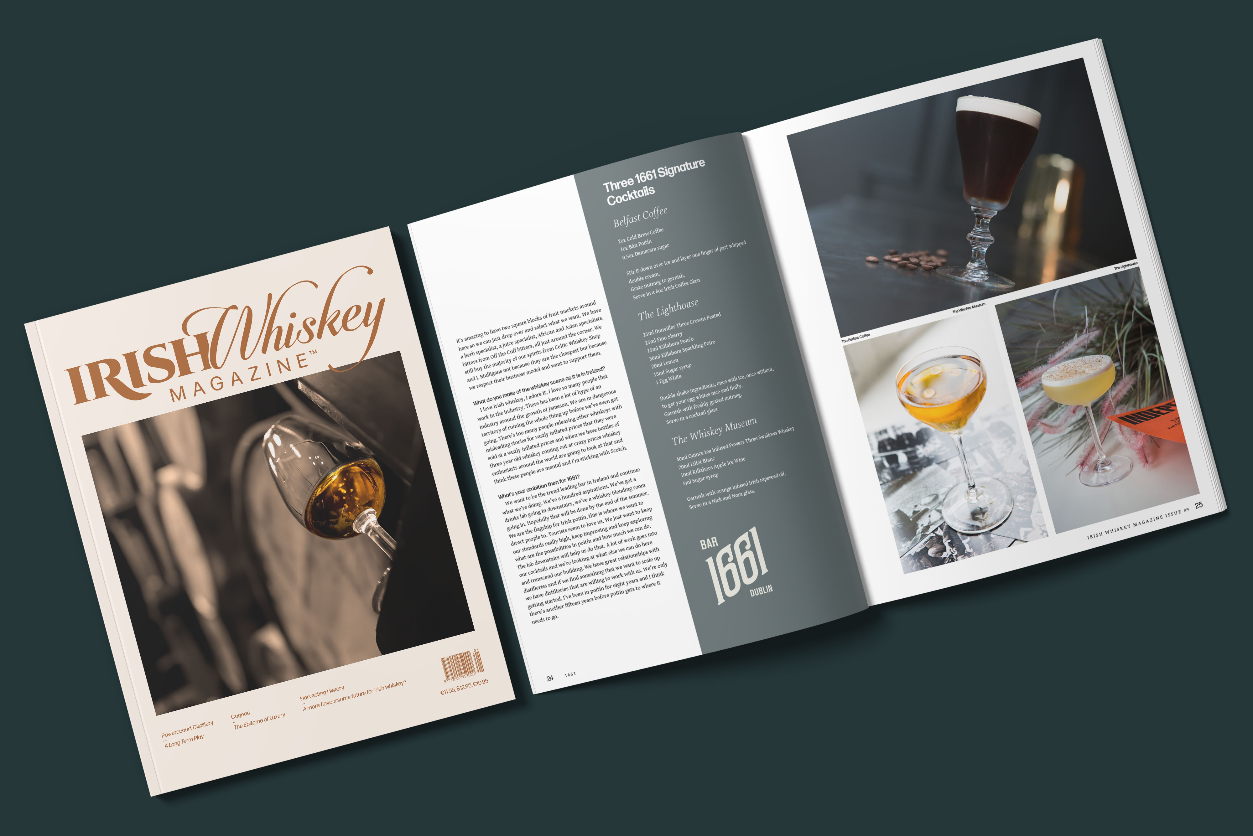
The editor of the specialist publication Irish Whiskey Magazine approached us with a desire to redesign. The previous design was a bit chaotically put together, lacking a sense of cohesion and flow.
After a thoghrough review of the previous issues we identified the key problems of the design;
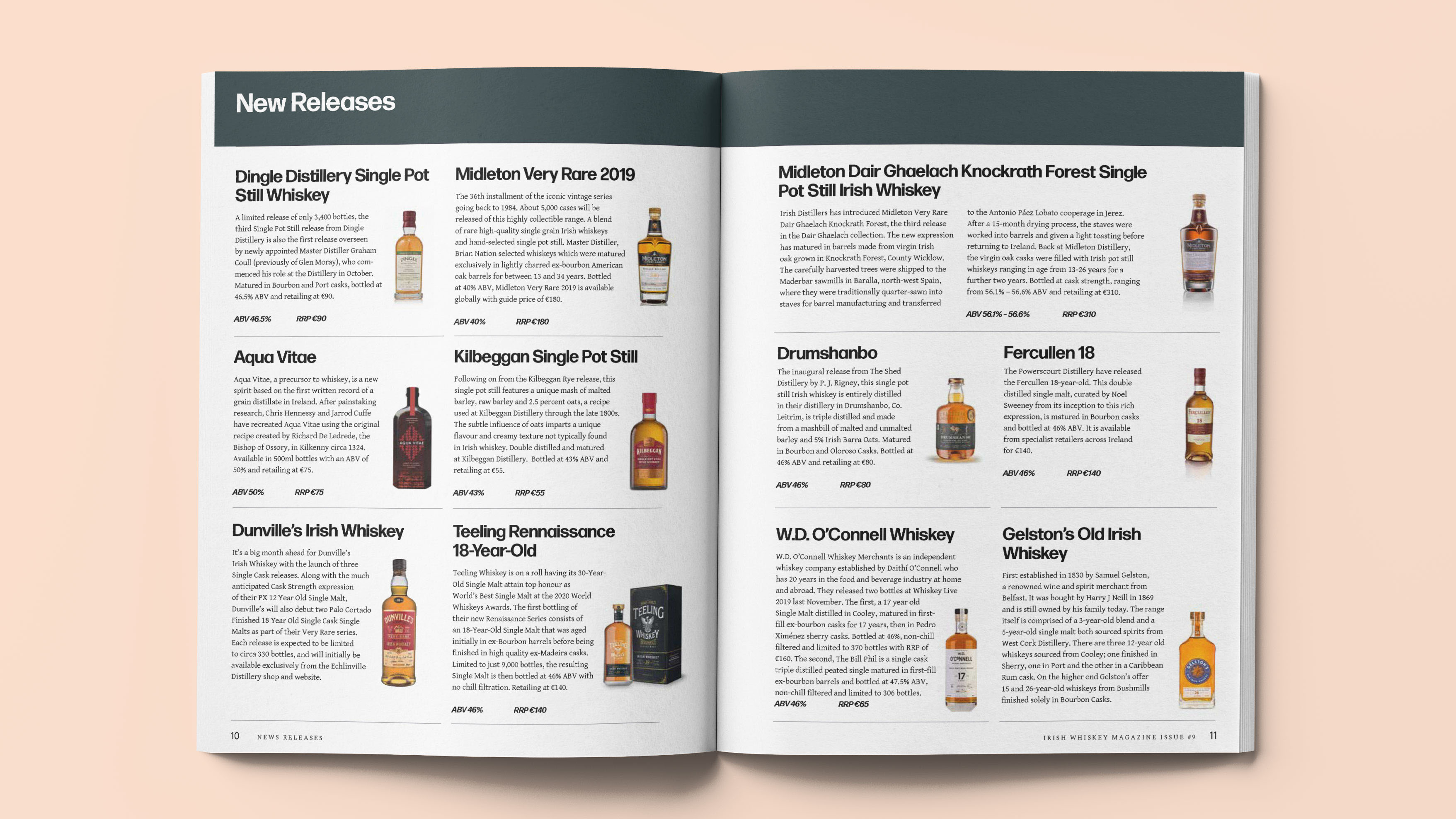
Too many design variables — typefaces, colours, stock illustrations and pagestyles that lowered the standard of the magazine.
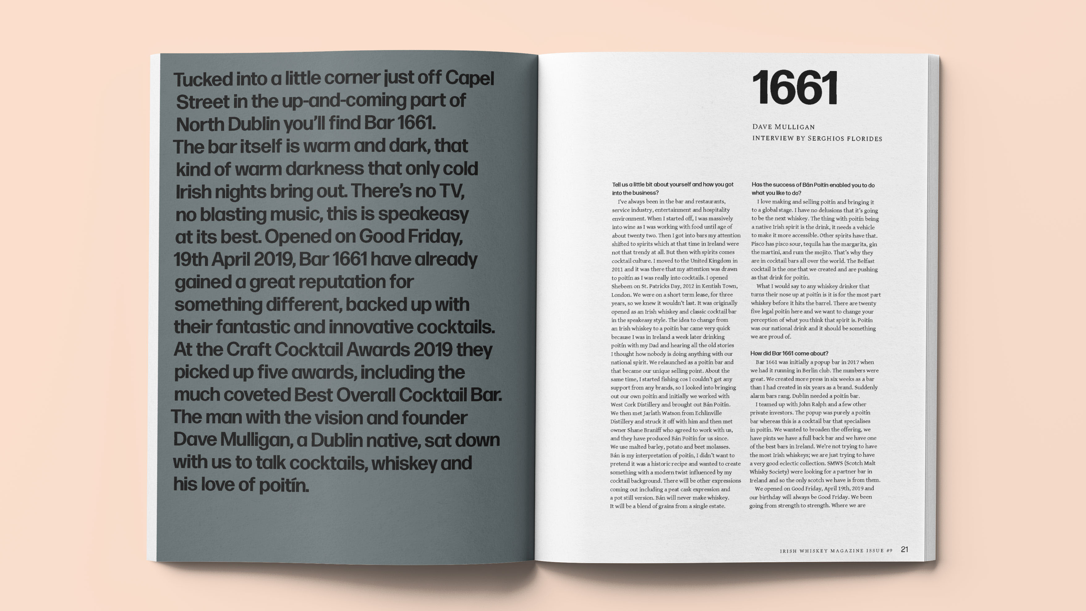
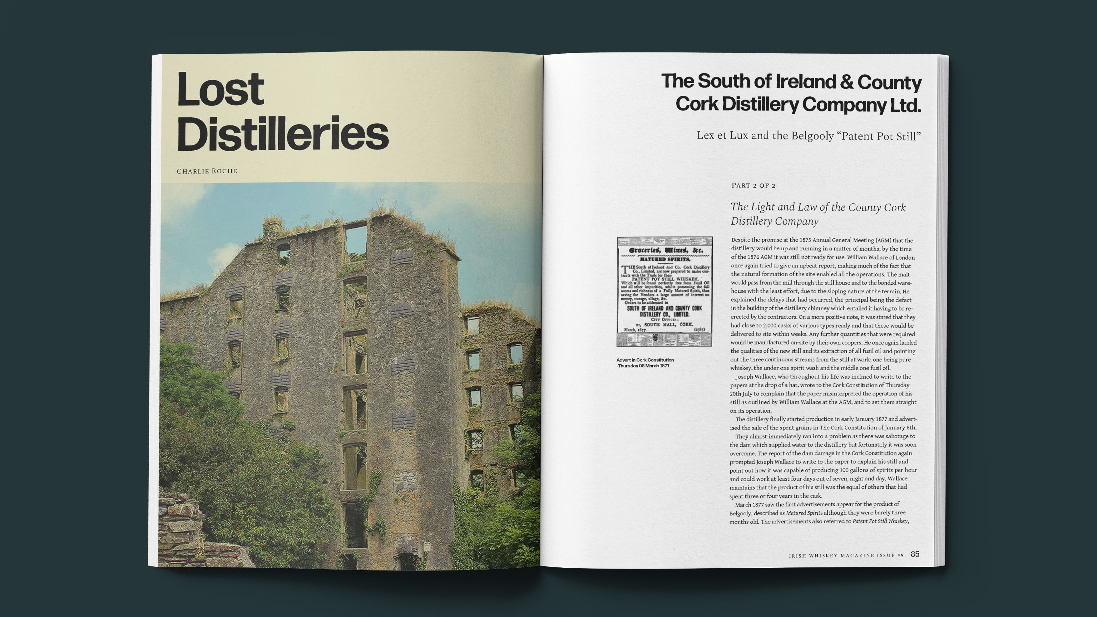
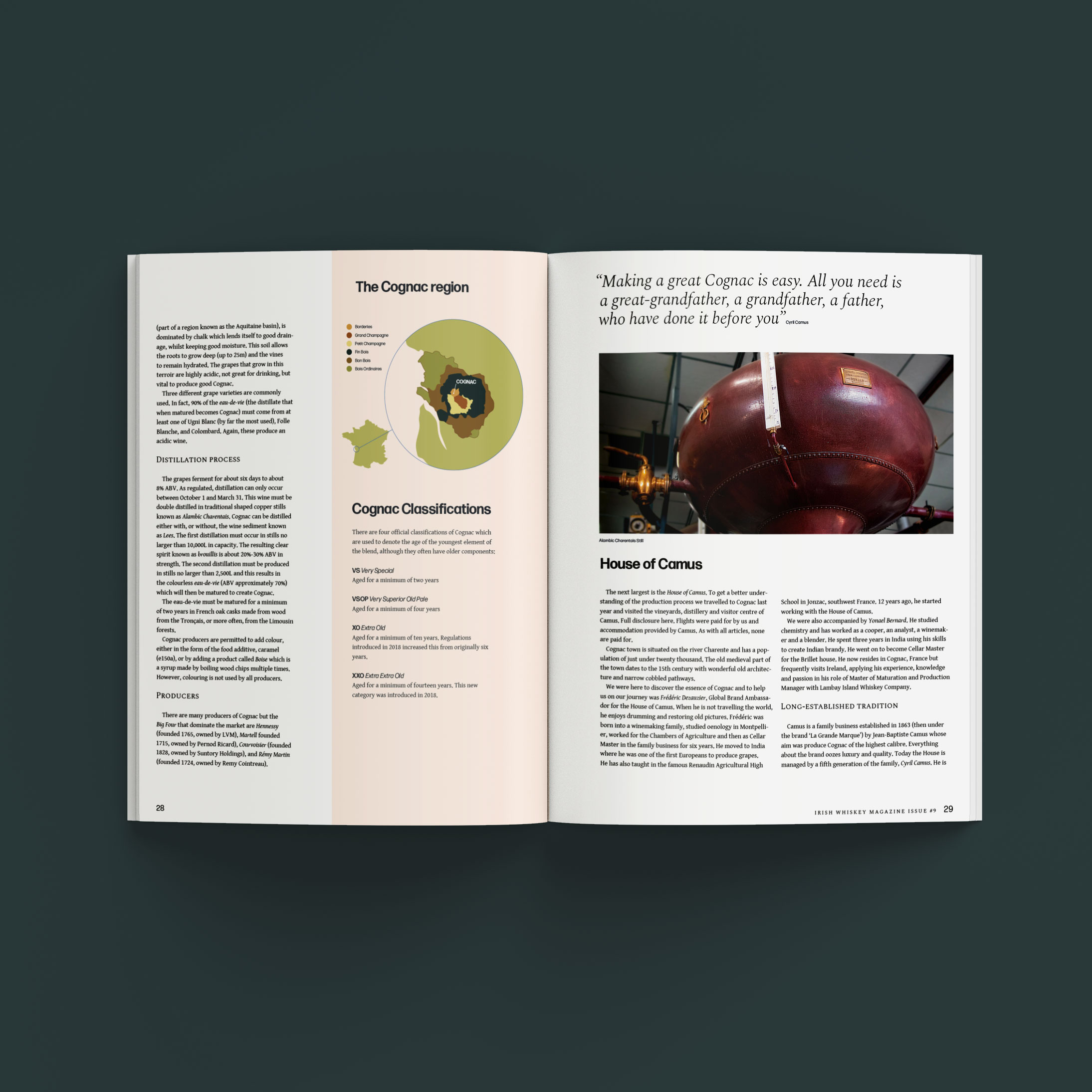
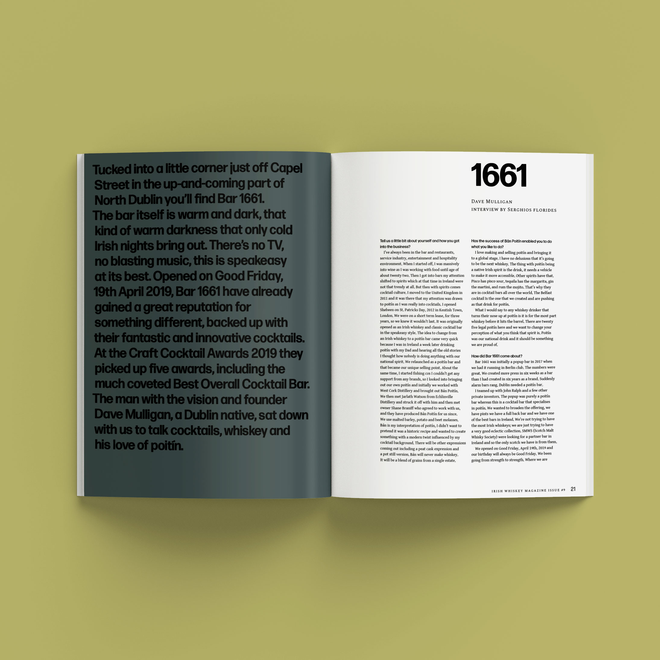
No editorial structure — no subheadings or introductions to articles, categorisation or editorial sequencing, which is key to drawing the reader in.
Our Response:
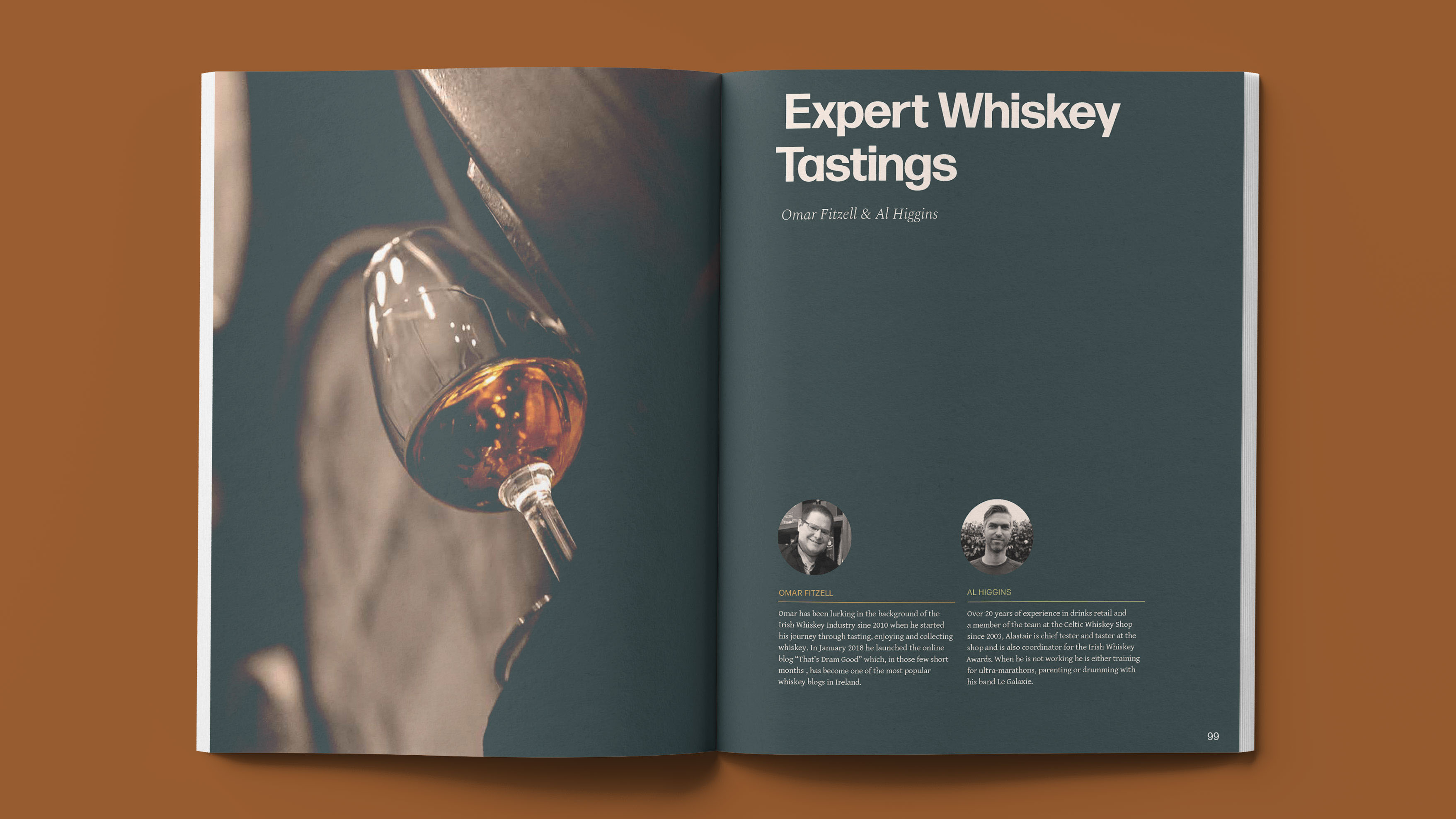
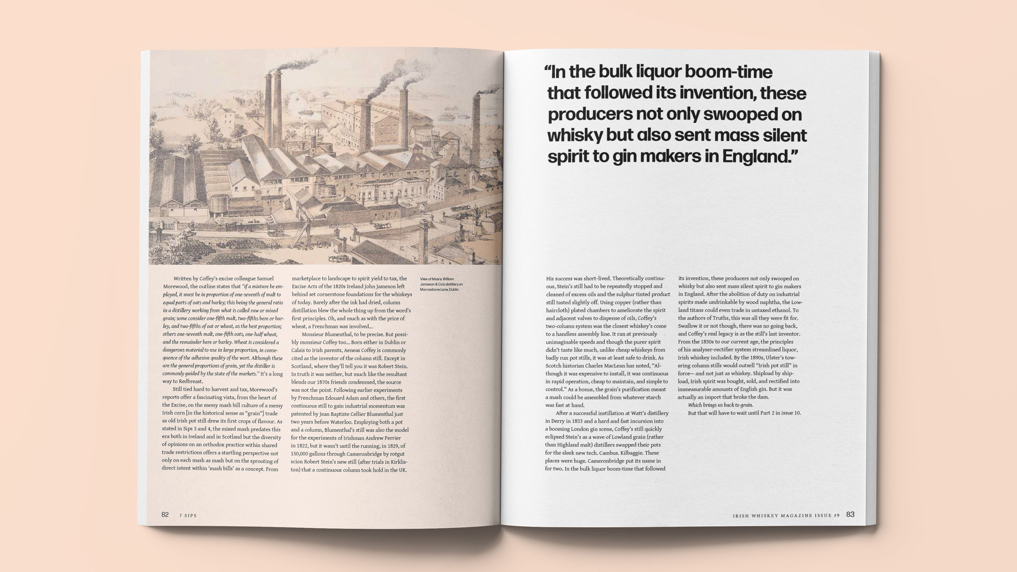
We created a typographic grid system that allowed for continuity and flexibility. We stripped down the brand elements and chose just two typefaces, a handful of colours, a custom illustration style.
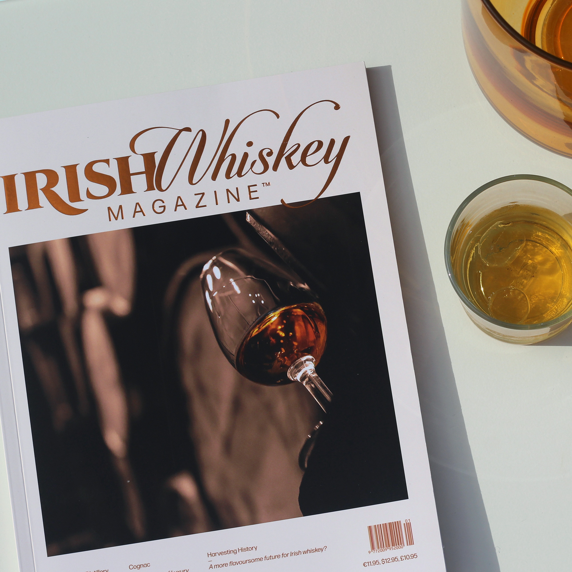
We changed the format from standard A4 to a custom size that gives the magazine an air of exclusivity. Making for a more comfortable read, that oozes luxury and maturity.
We have established the new identity by employing this robust system within a slick new format.




2019
A Vague Anxiety
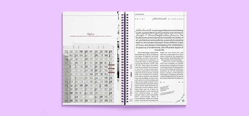
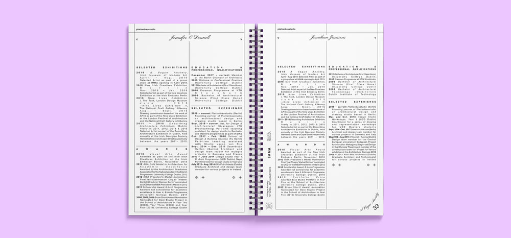
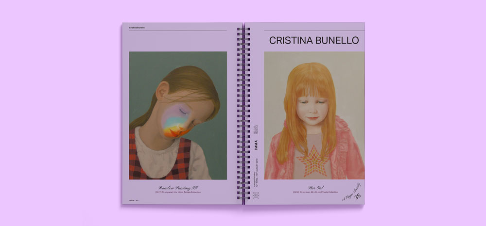
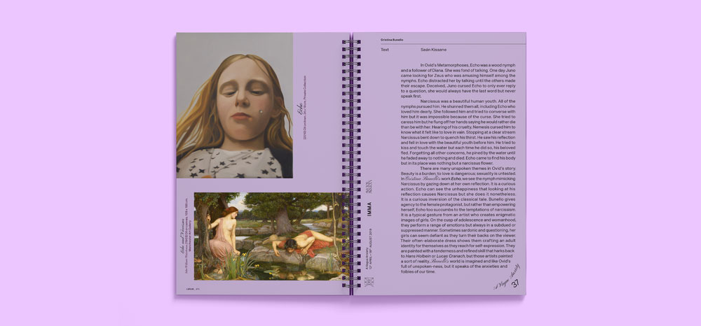
Exhibition Catalogue
Client: IMMA

Client Brief:
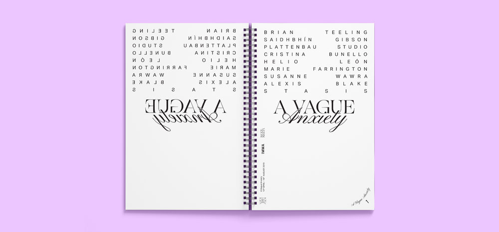
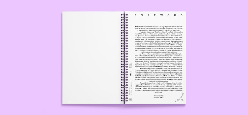
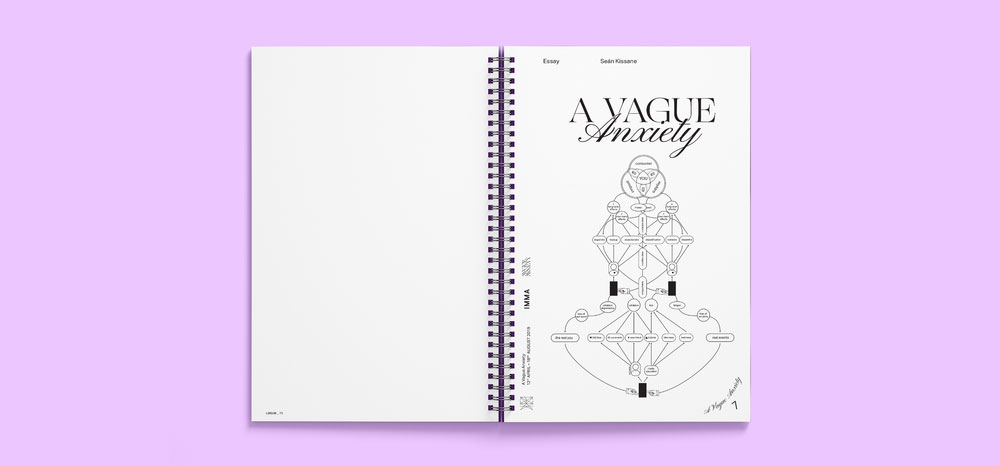
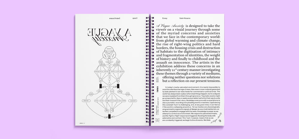
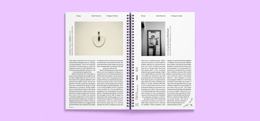
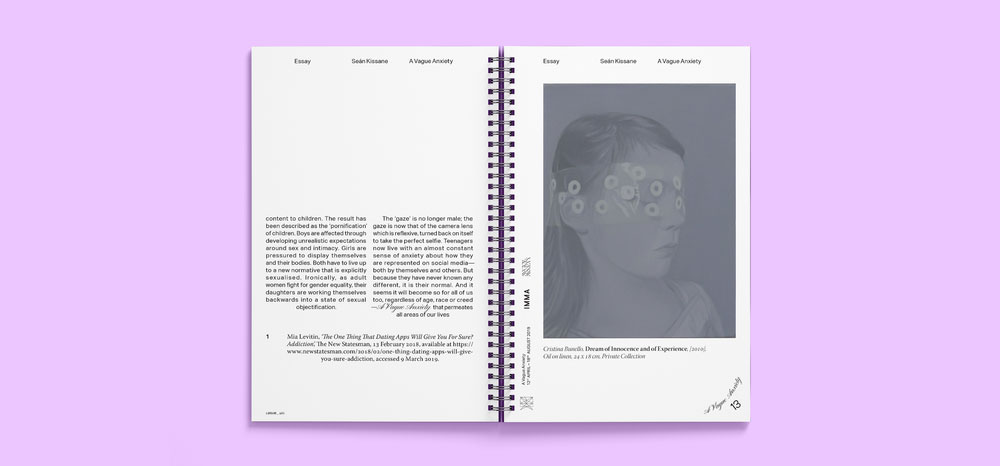
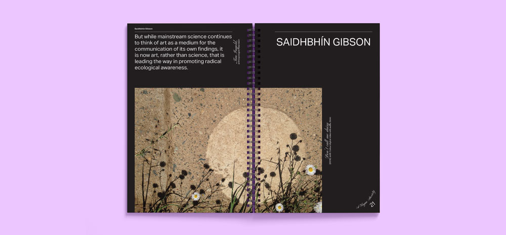
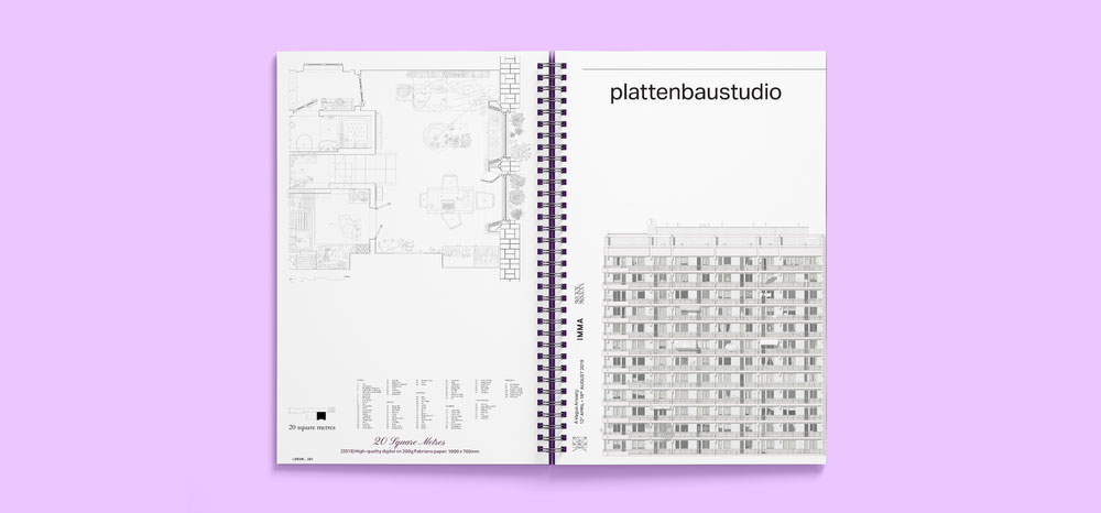
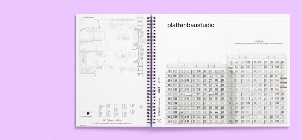
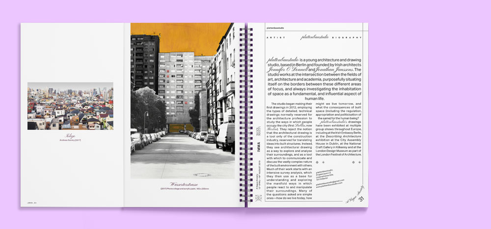
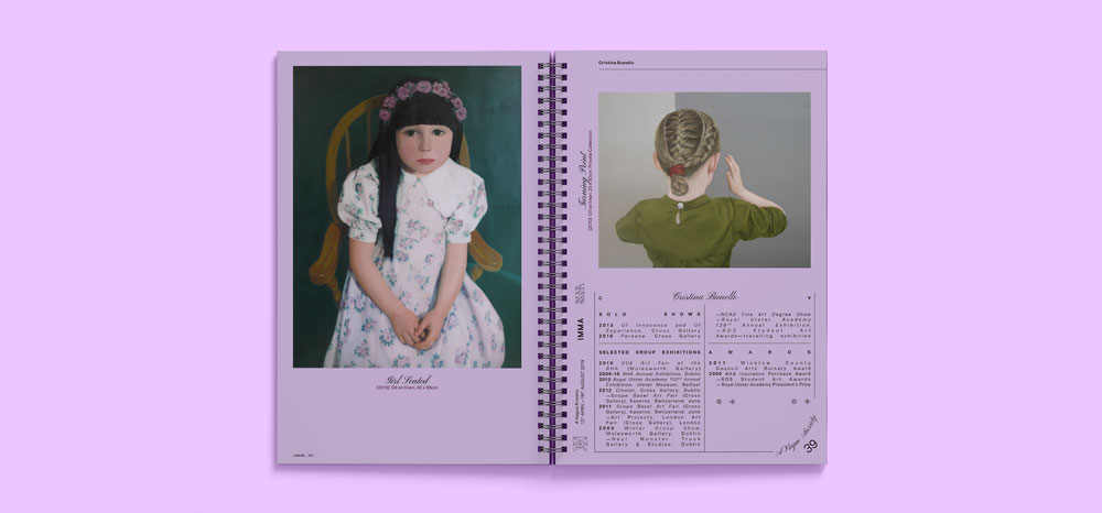
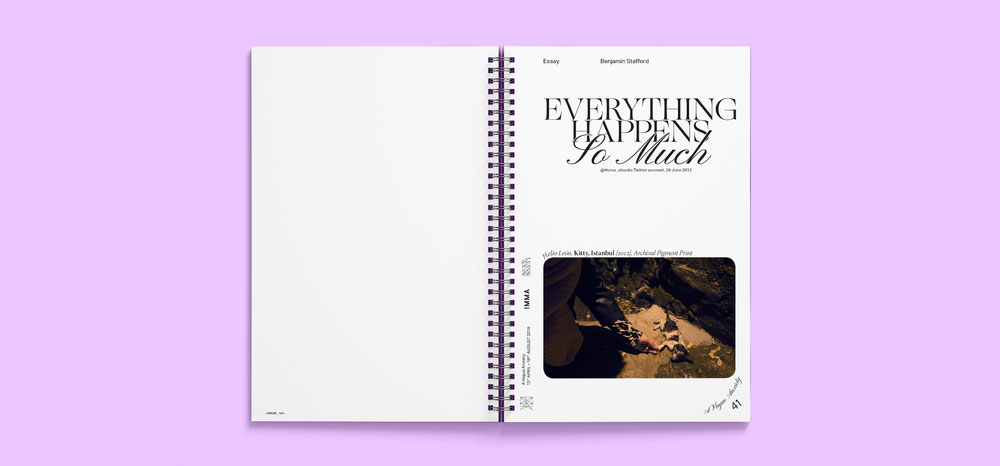
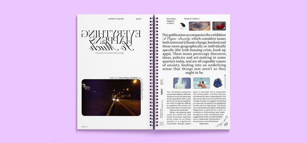
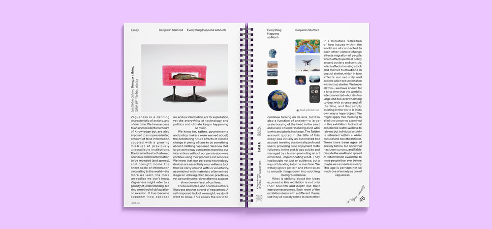
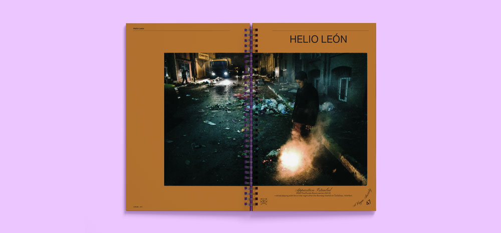
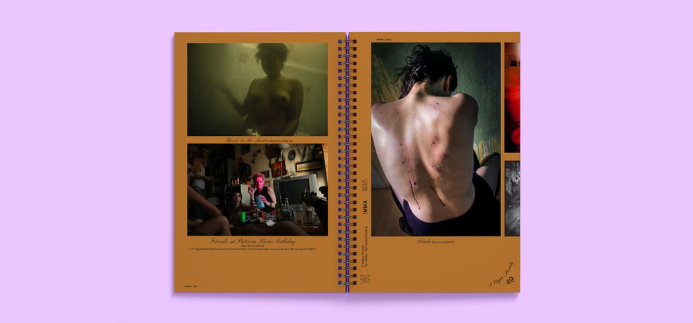
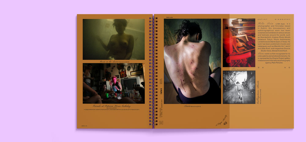
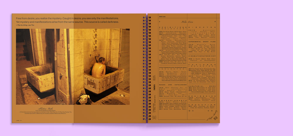
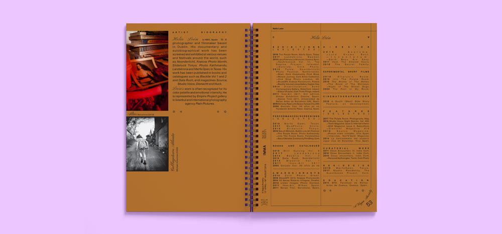
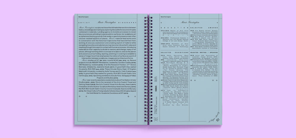
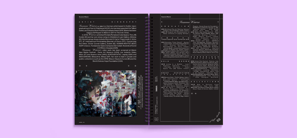
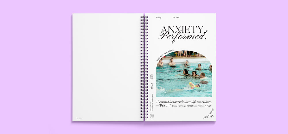
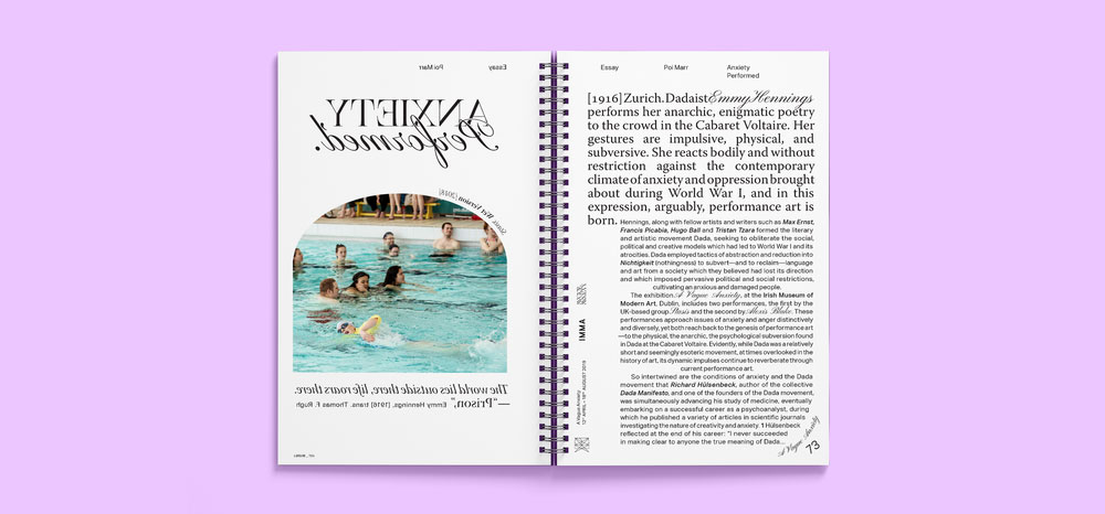
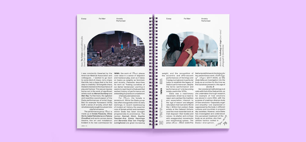
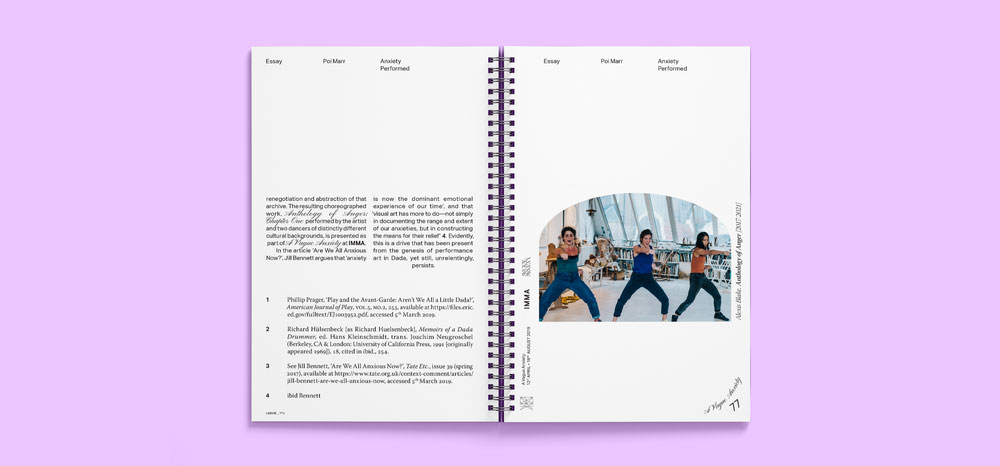
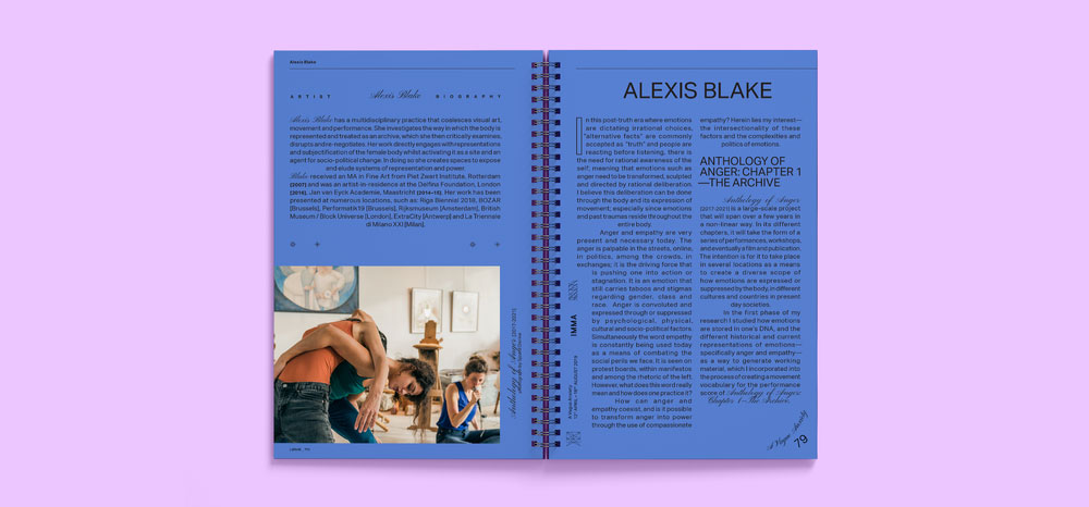
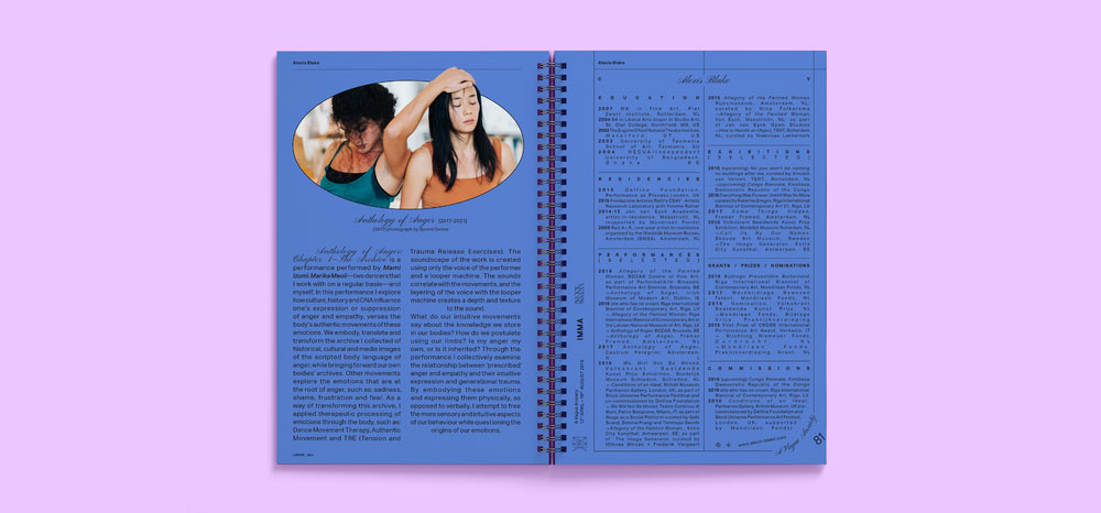
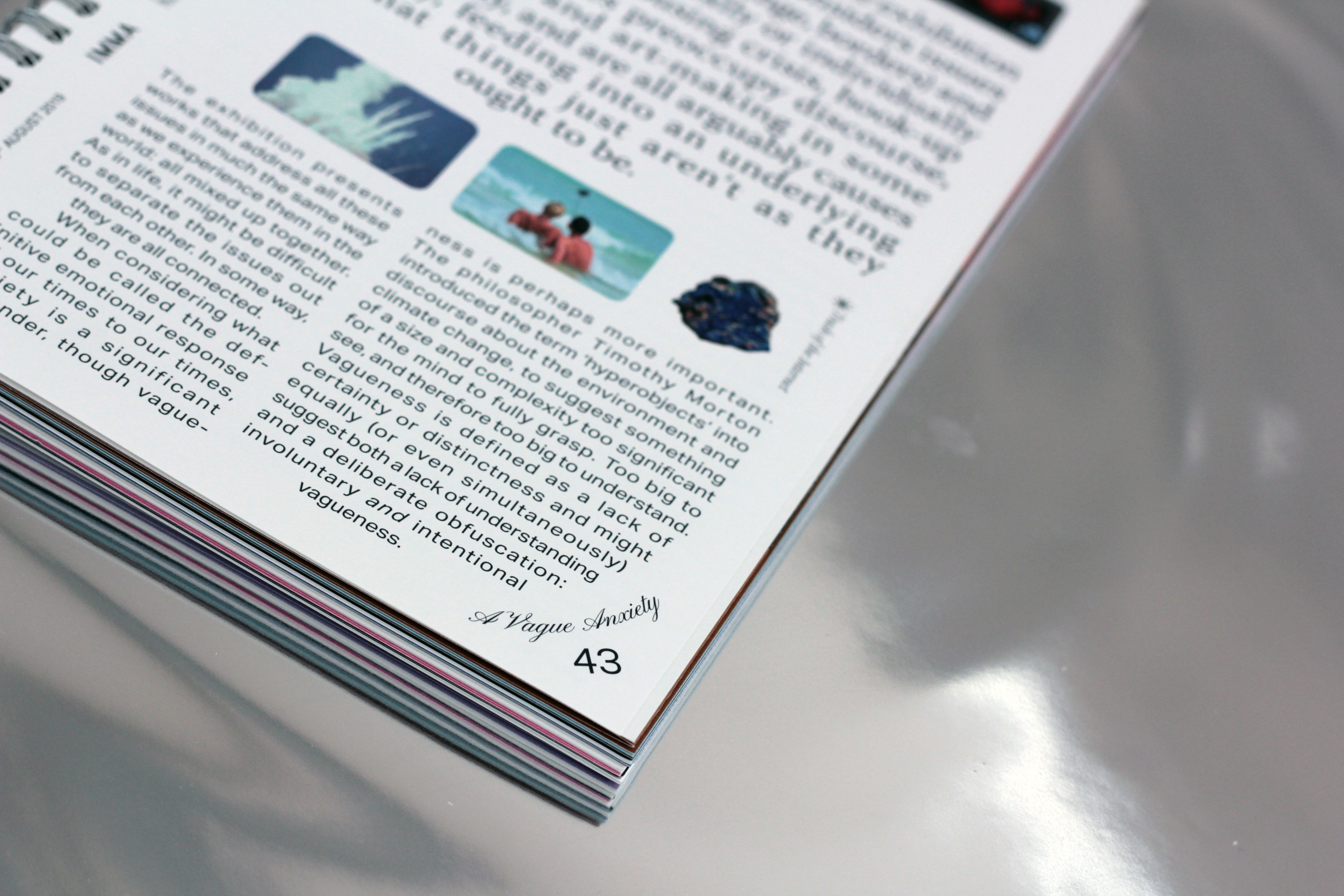
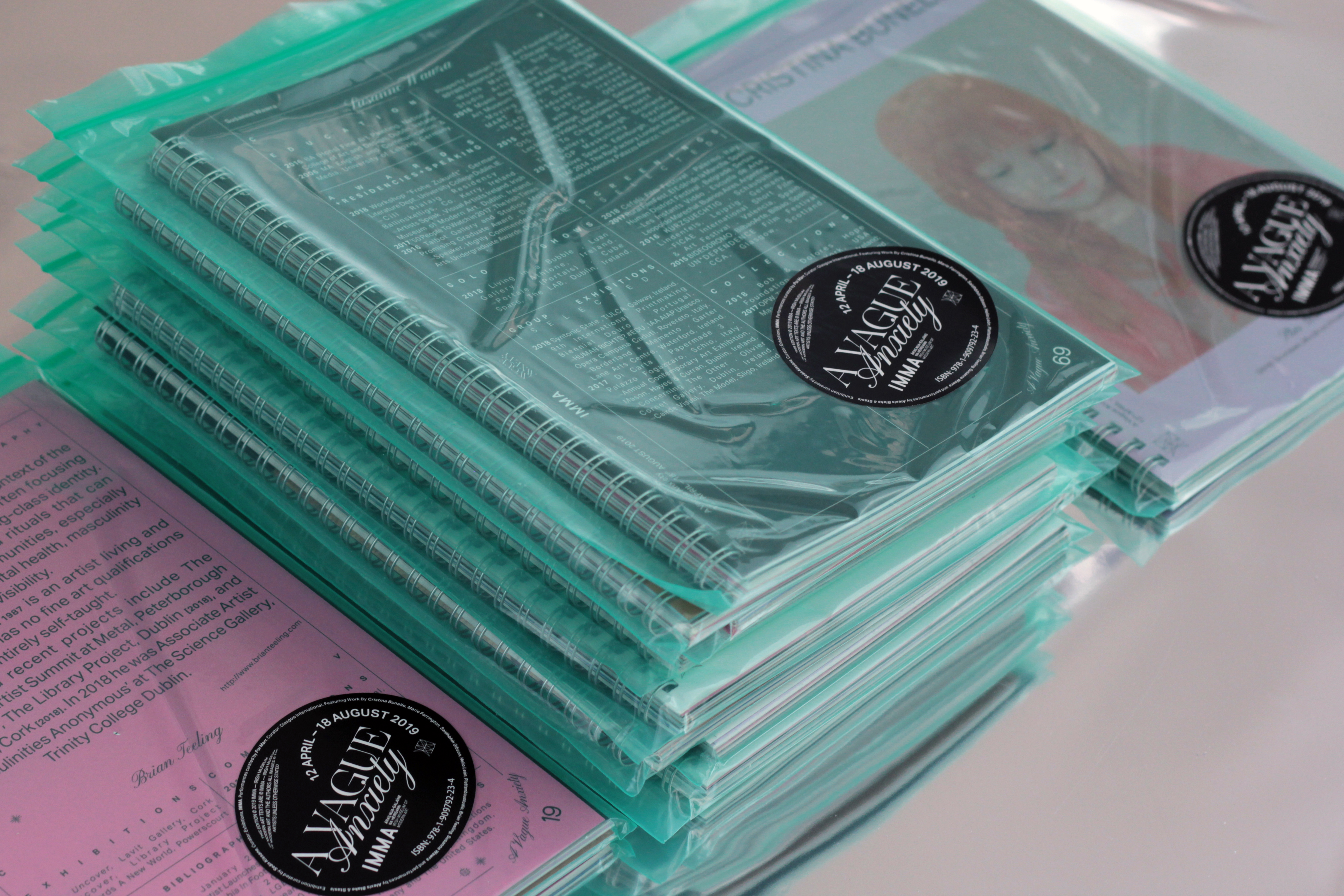
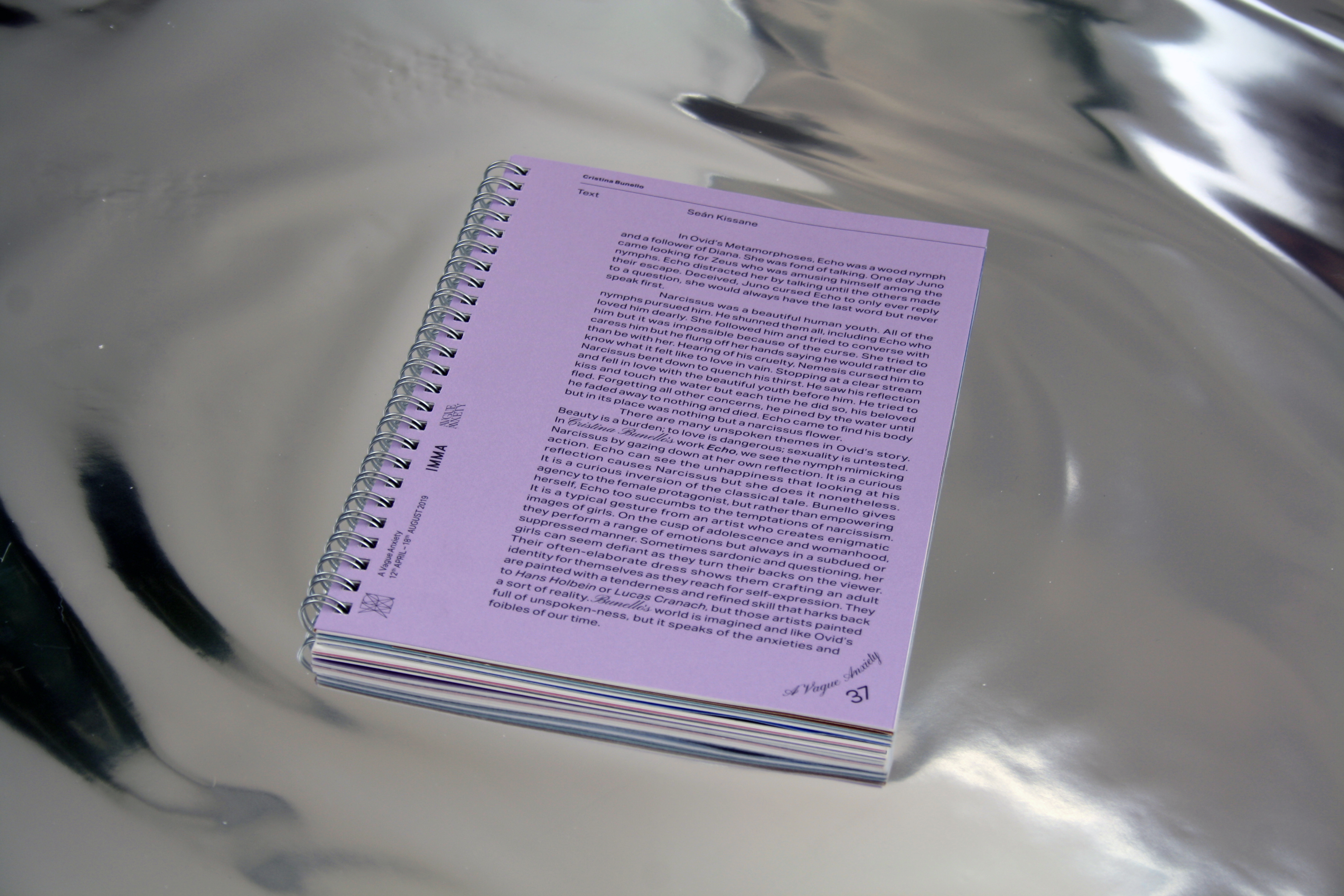
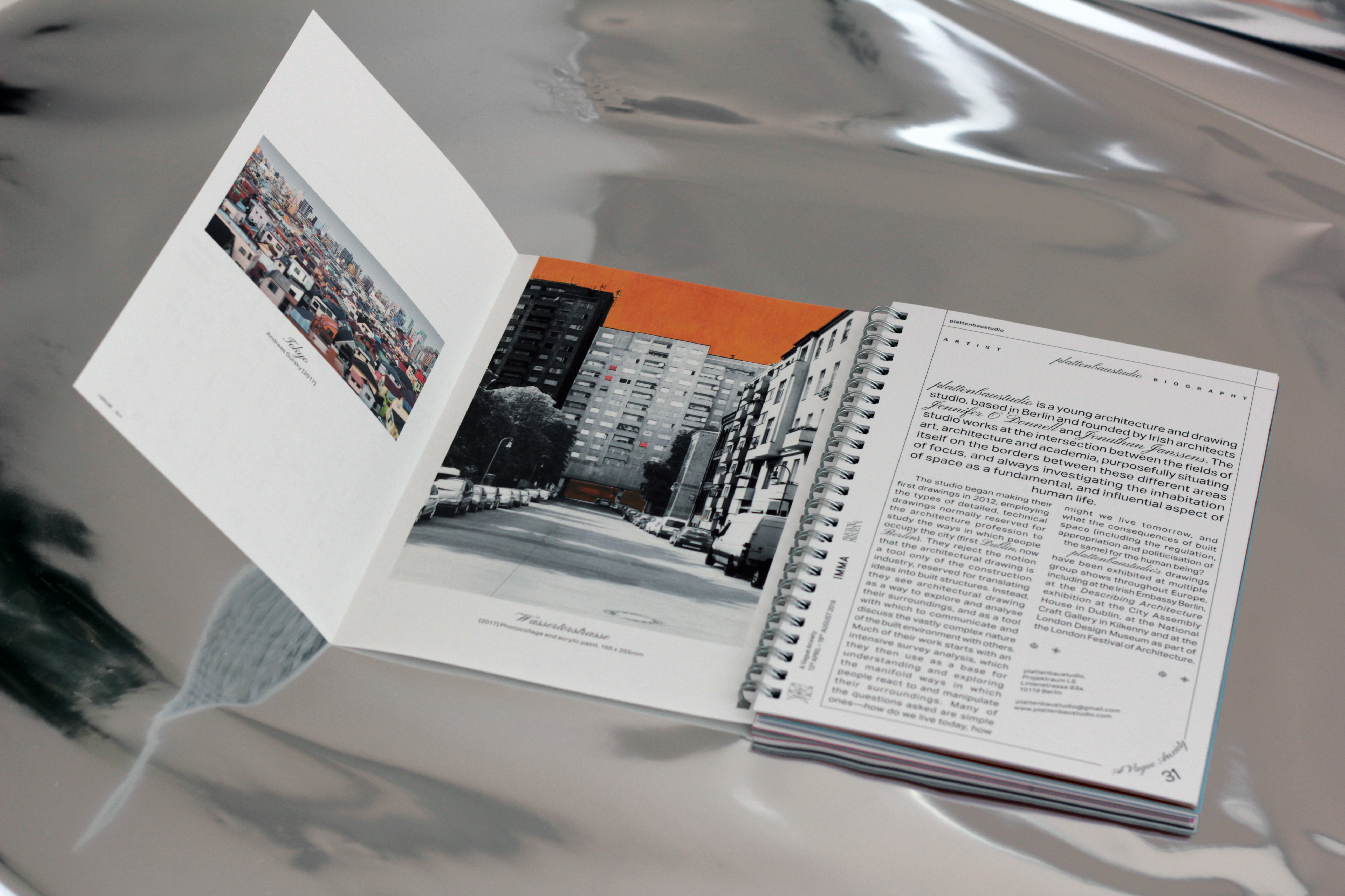
The exhibition title reflected on the rising levels of anxiety in our media-driven lives and how many of these concerns are constantly, and somewhat vaguely in the backdrop of our daily existence. IMMA required a publication to accompany the exhibitions
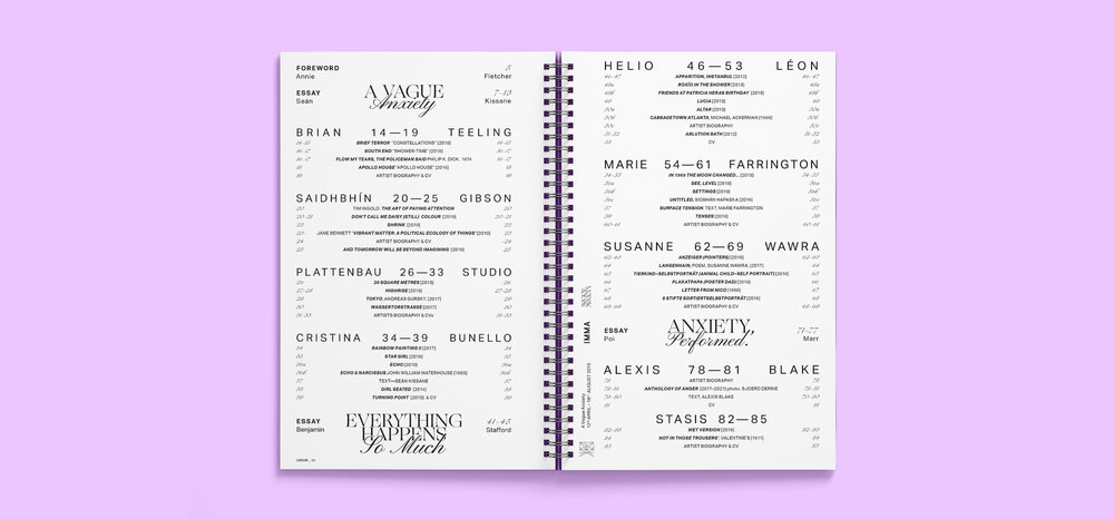
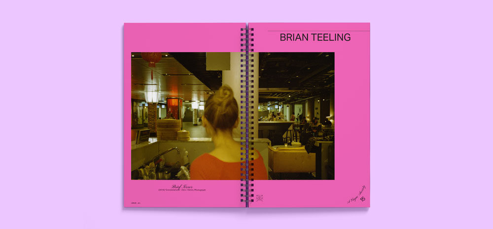
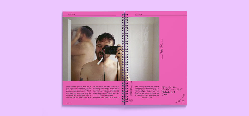
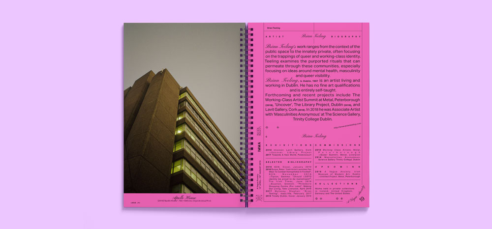
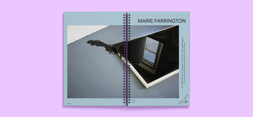
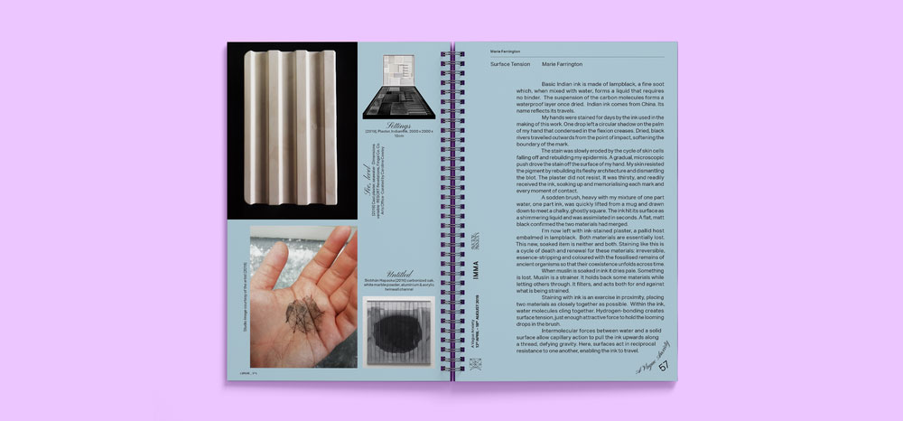
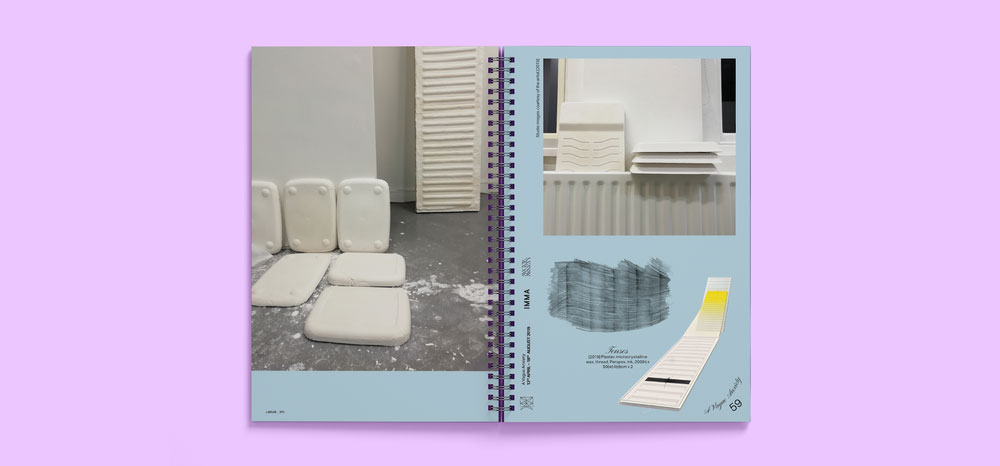
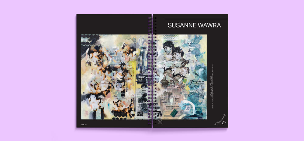
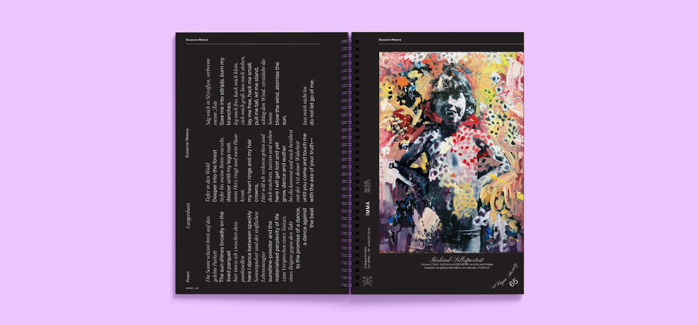
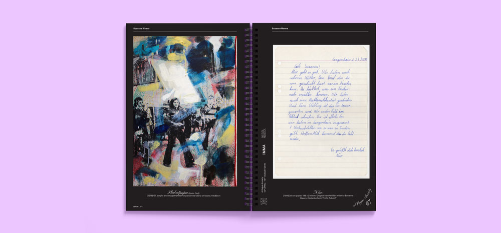
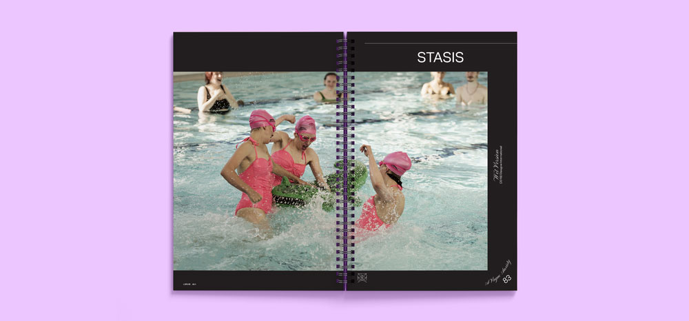
The group exhibition of nine emerging Irish and international artists addressed some of the broader concerns of Generation Y; from political points of departure such as borders, housing, and the environment, to the personal such as mental health, hook-up culture, gender identity and precarity; pressing issues in today’s society.
Our Response:
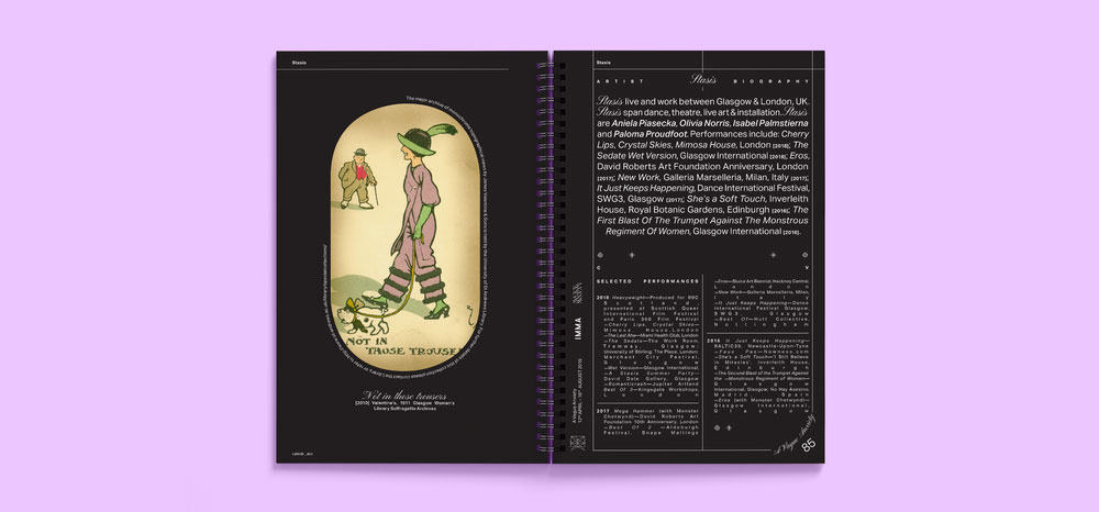
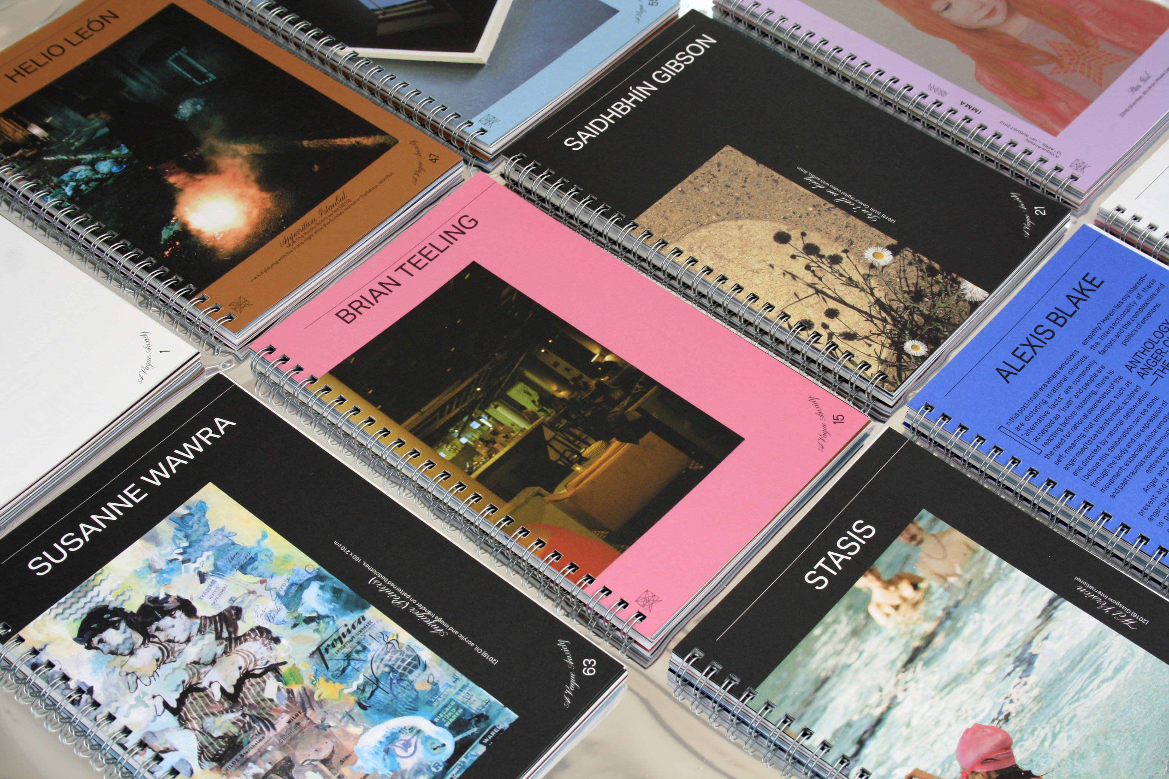
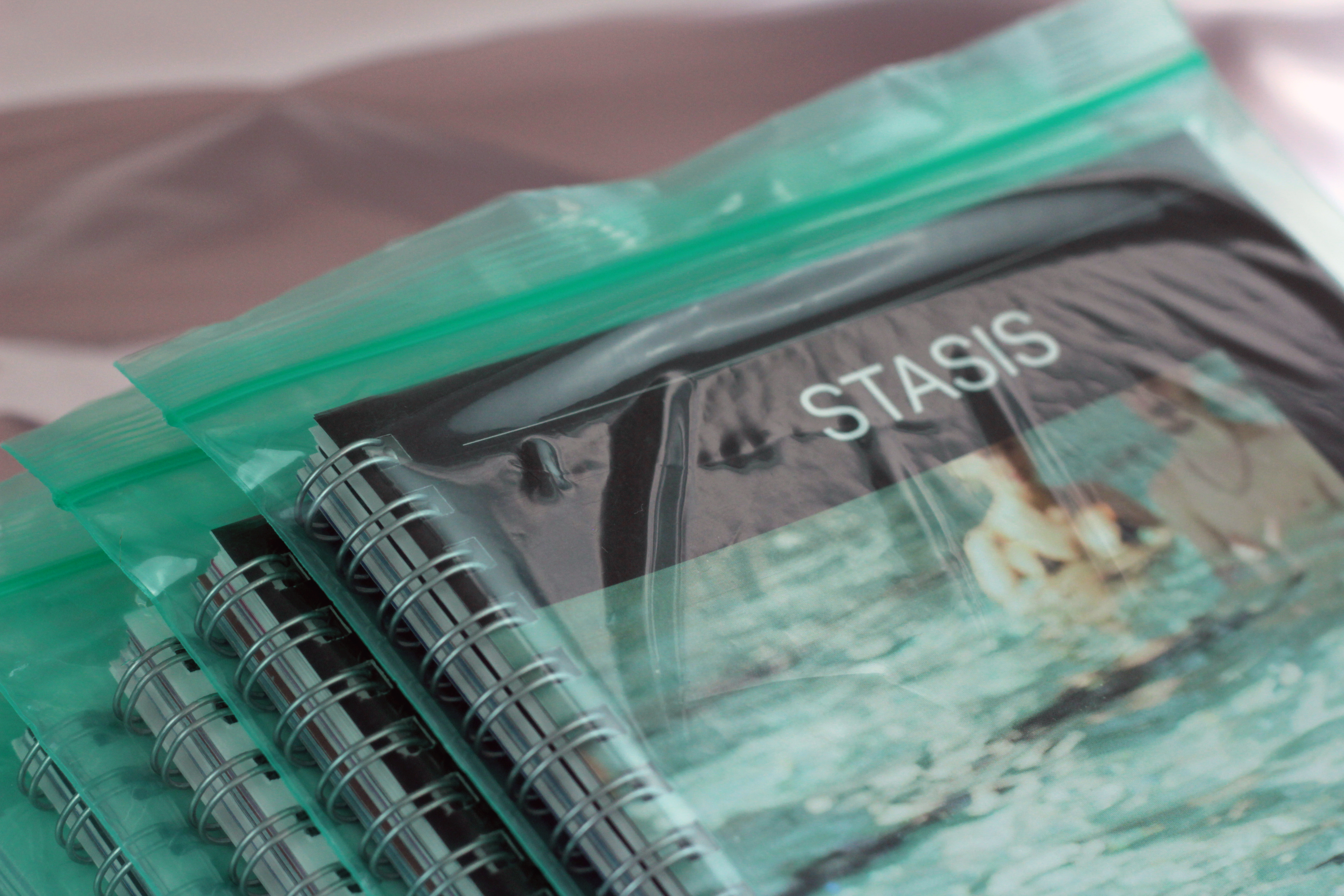
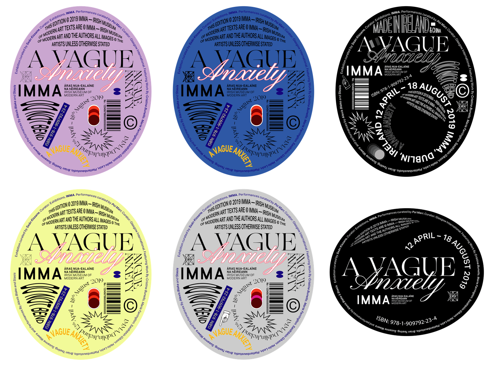
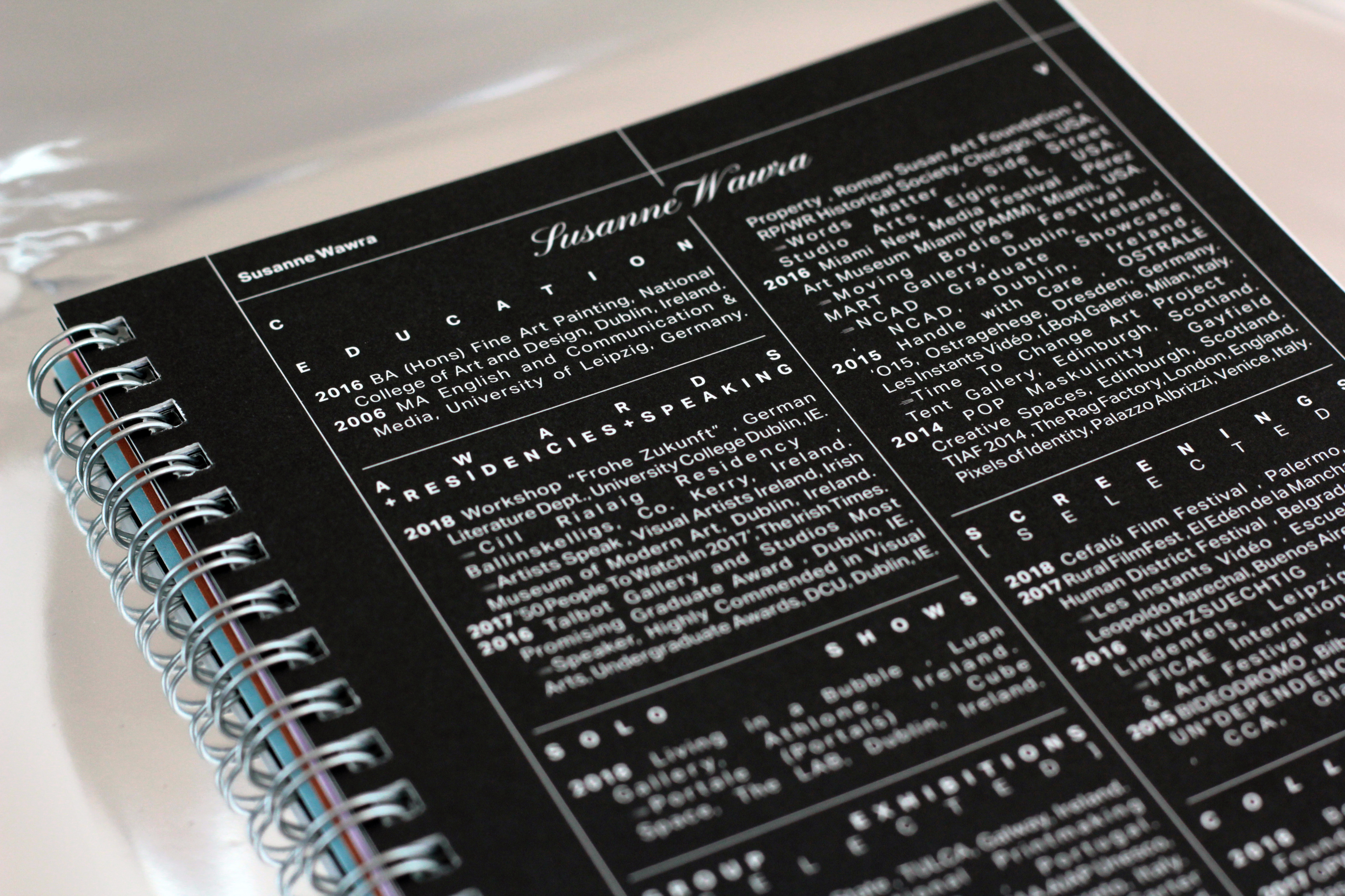
Inspired by our initial conversation with the curators of the show, where we discussed the non-linear reading habits of Generation Y, we created a coverless ring-bound publication that is designed to be read from any point within the book with no definite beginning or end. Not so much without a cover, but with many — for as it could be open on any page, every page potentially became a cover, giving the impression that we had made several different books and each contributing artist had a little book of their own.
Client Testimonial:
Having worked together producing an exhibition catalogue that pulled together content from disparate sources and in varying media, Bureau Bonanza created a beautiful end product with no fuss.
They were receptive to our needs and ideas while having a clear vision of what the finished work would look like. The process was clear, and the outcome looks great.
Benjamin Stafford, Assistant Curator, IMMA
2019
It’s All About Books
Exhibition Catalogue
Client: Marie Hanlon, Artist
It’s All About Books
Exhibition Catalogue
Client: Marie Hanlon, Artist
Client Brief:
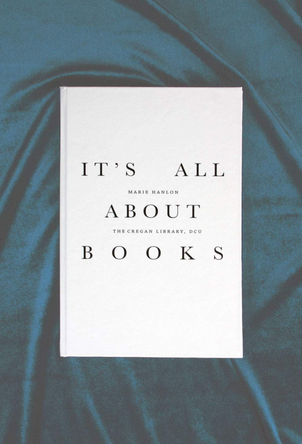
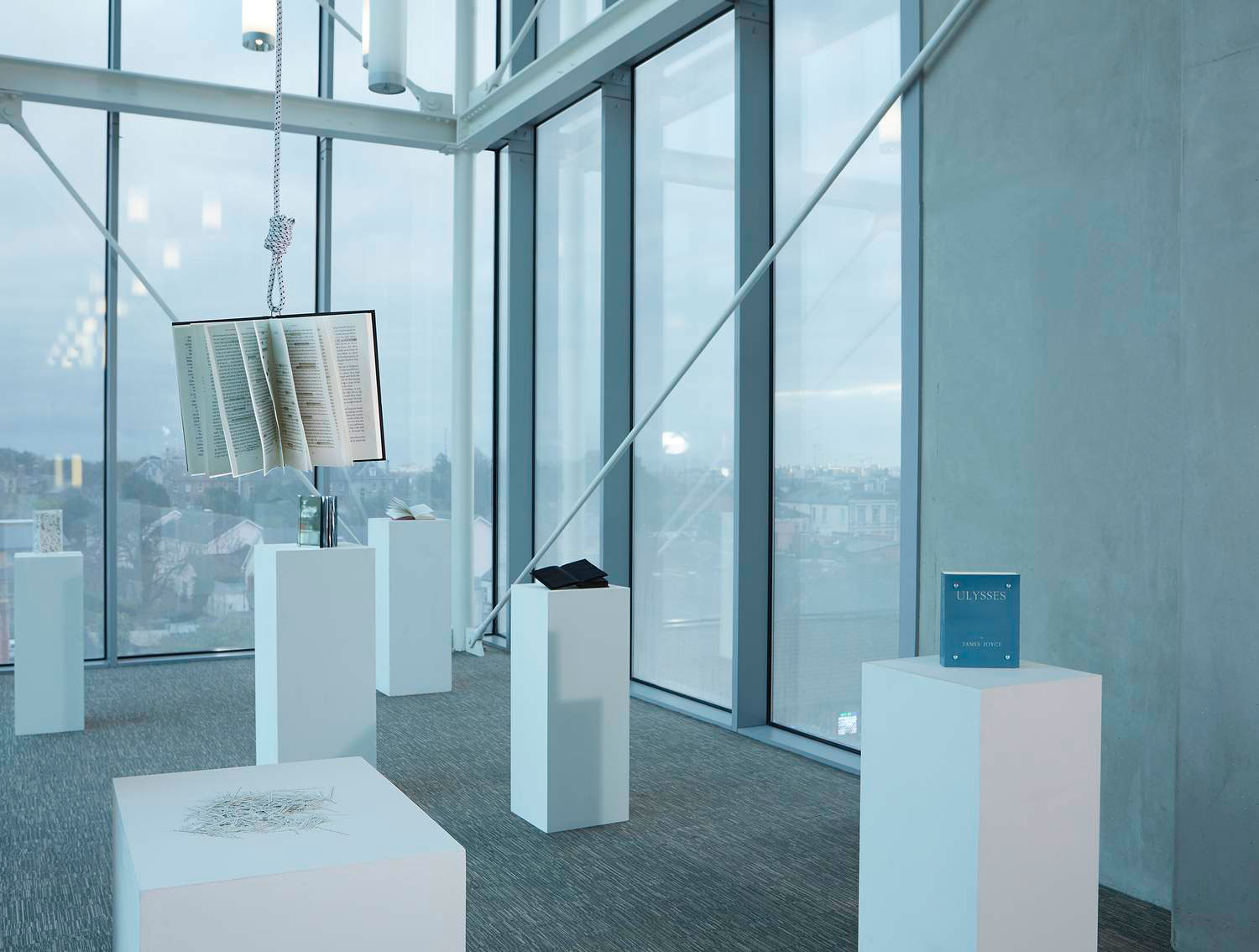
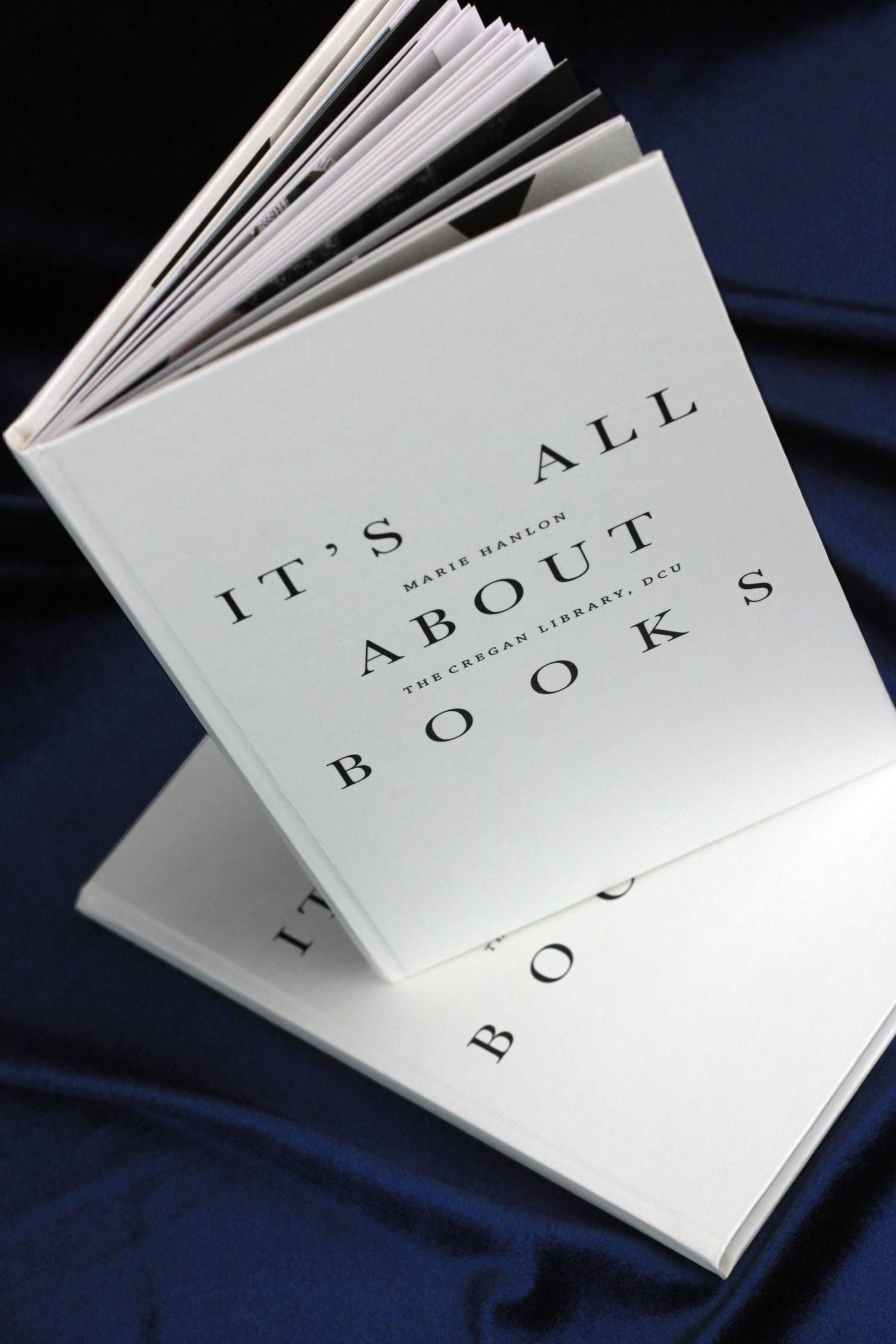
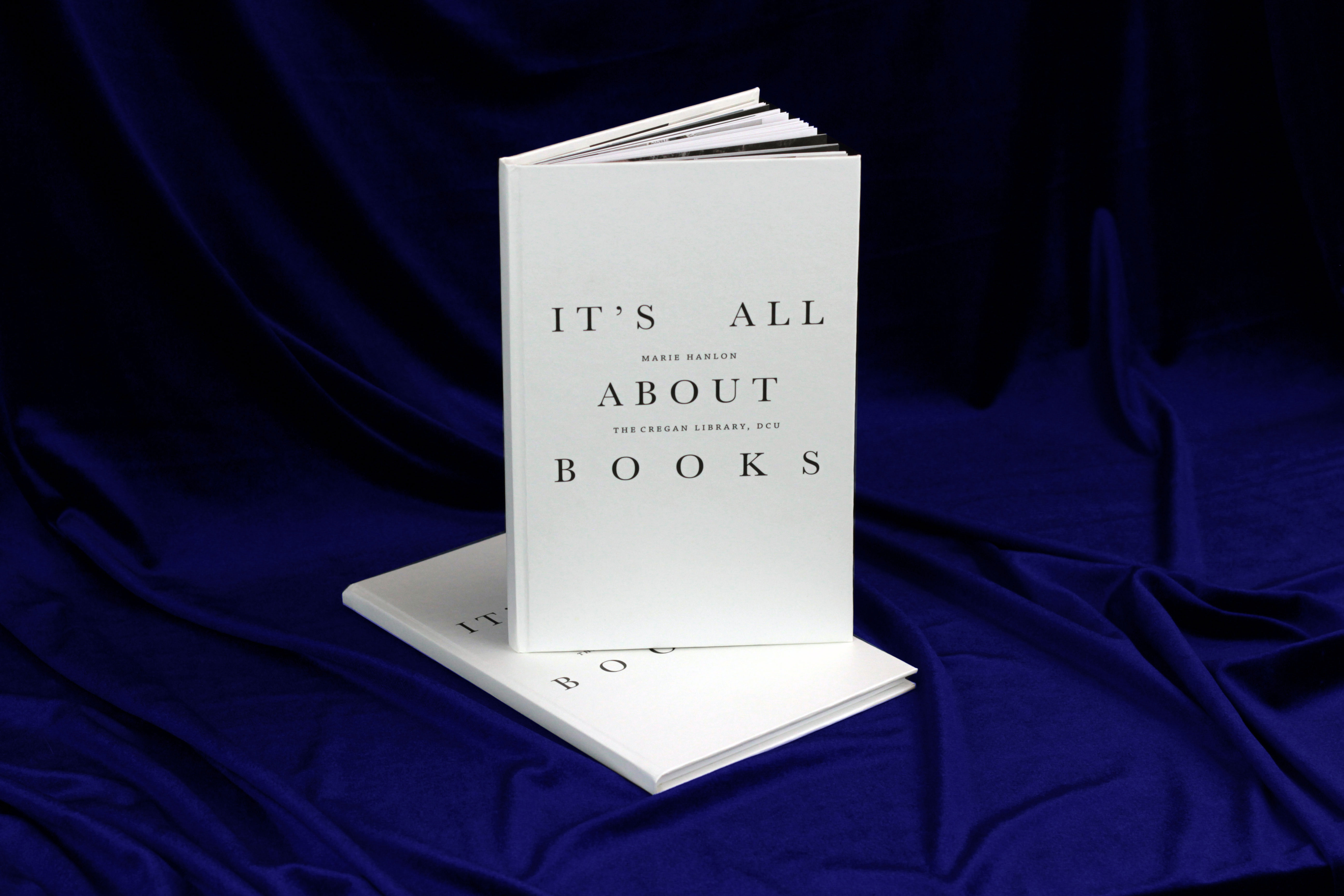
Marie needed an exhibition catalogue for her show ‘It’s All About Books’ that was held in the DCU Library in early 2019.
Marie came to us with a very specific brief, including a wonderfully detailed mockup she had made herself. So from there, it was easy for us to meet all of her requirements and produce this little book in the short time we had.
Our Response:
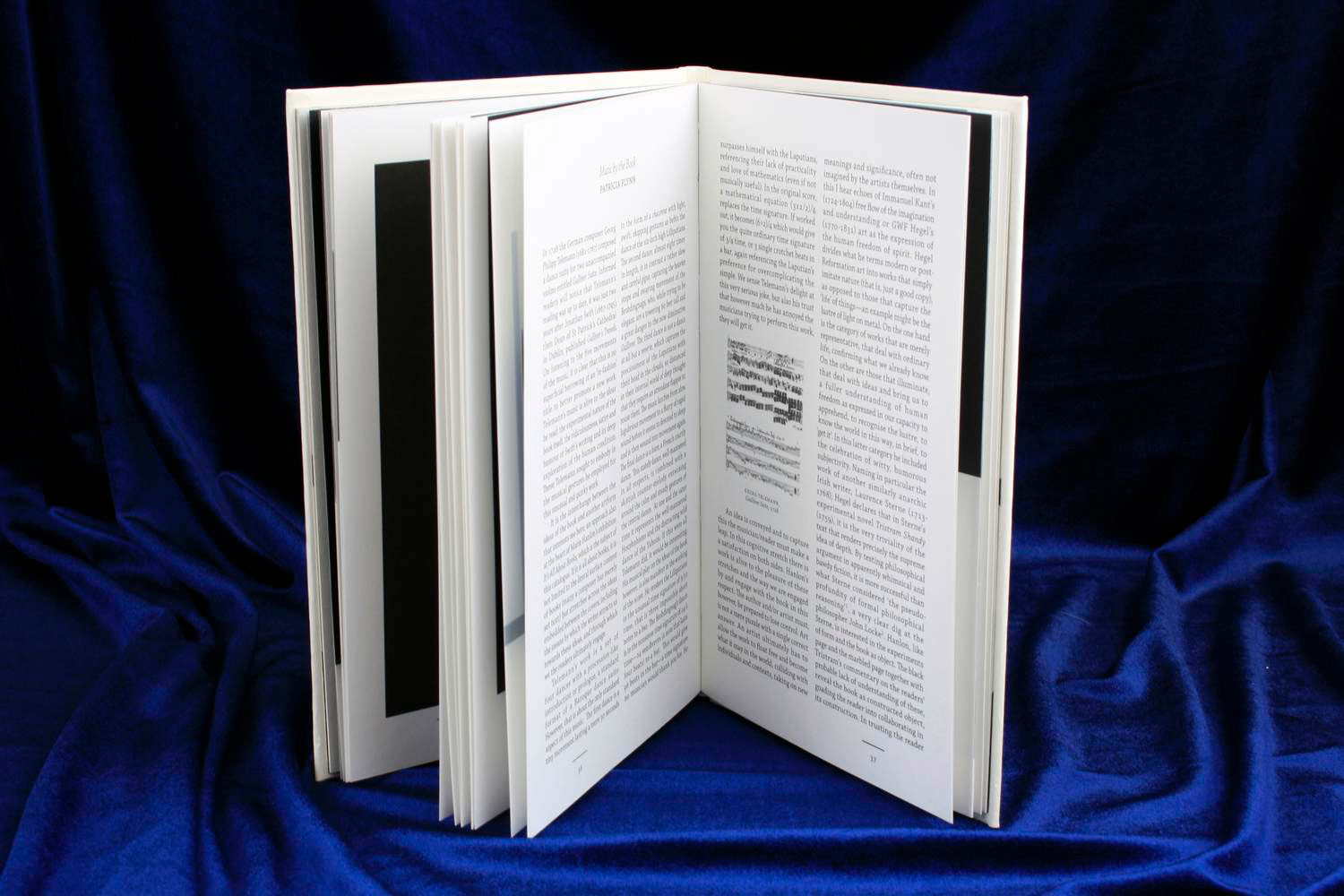
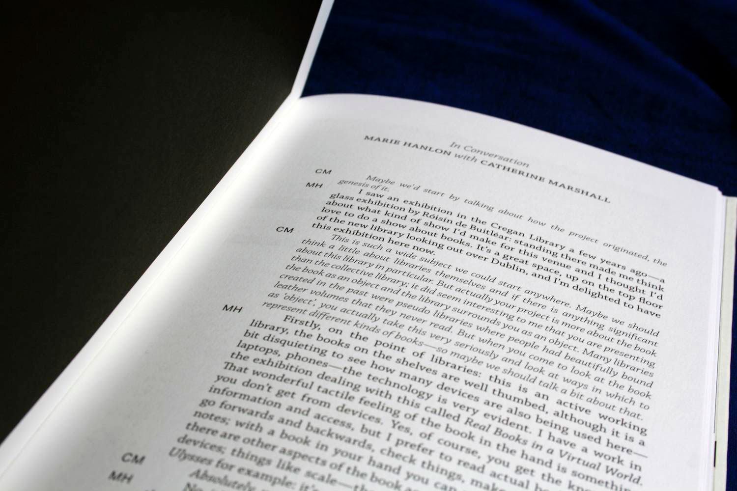
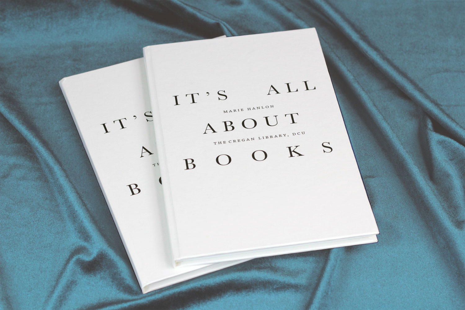
As the show was indeed all about books, we created a classic hard back using traditional book typography.
This created a nice contrast with the imagery used in the book whilst maintainng a simple harmony with the exhibition as a whole.
As the show was indeed all about books, we created a classic hard back using traditional book typography.
This created a nice contrast with the imagery used in the book whilst maintainng a simple harmony with the exhibition as a whole.
Client Testimonial:
I was given a recommendation for Bureau Bonanza and am so glad I acted on it. Due to several factors time was very tight and I needed the designers to do exactly what they pledged to do. They delivered a beautiful catalogue, ahead of schedule, and were a pleasure to deal with.
Marie Hanlon, Independent Artist
