
We create extraordinary, engaging and robust design for entrepreneurs, artists and organisations.


2021
![]()
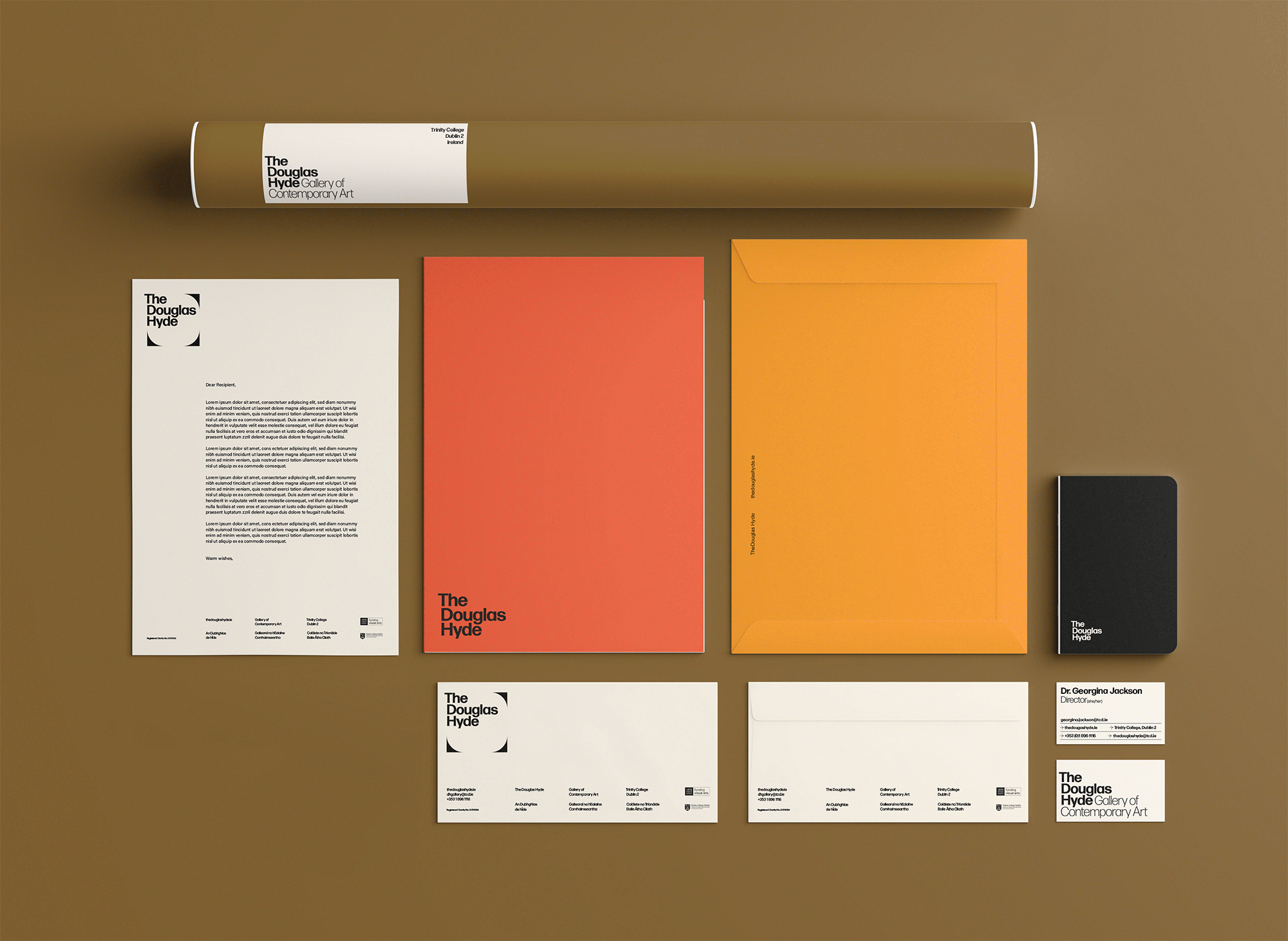
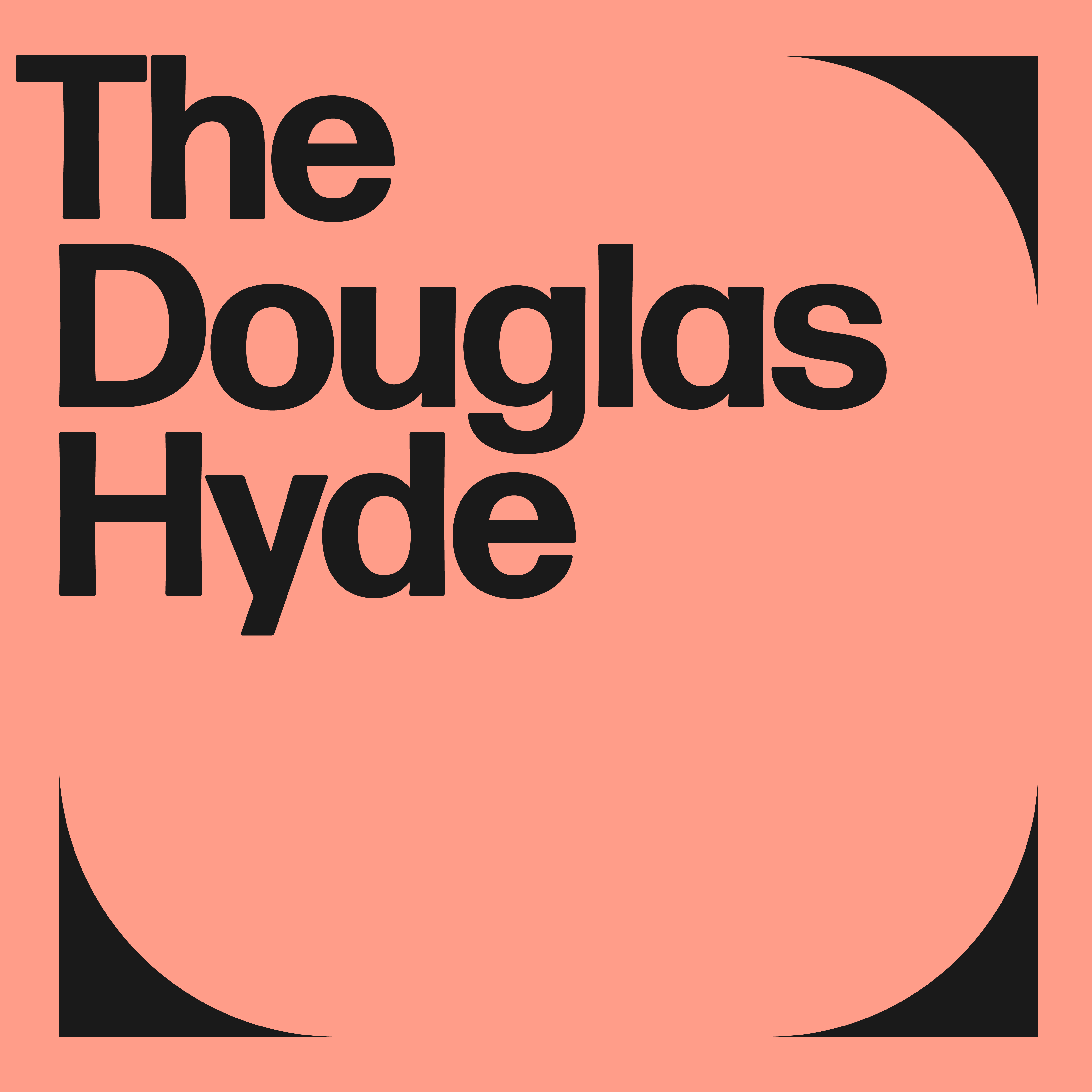
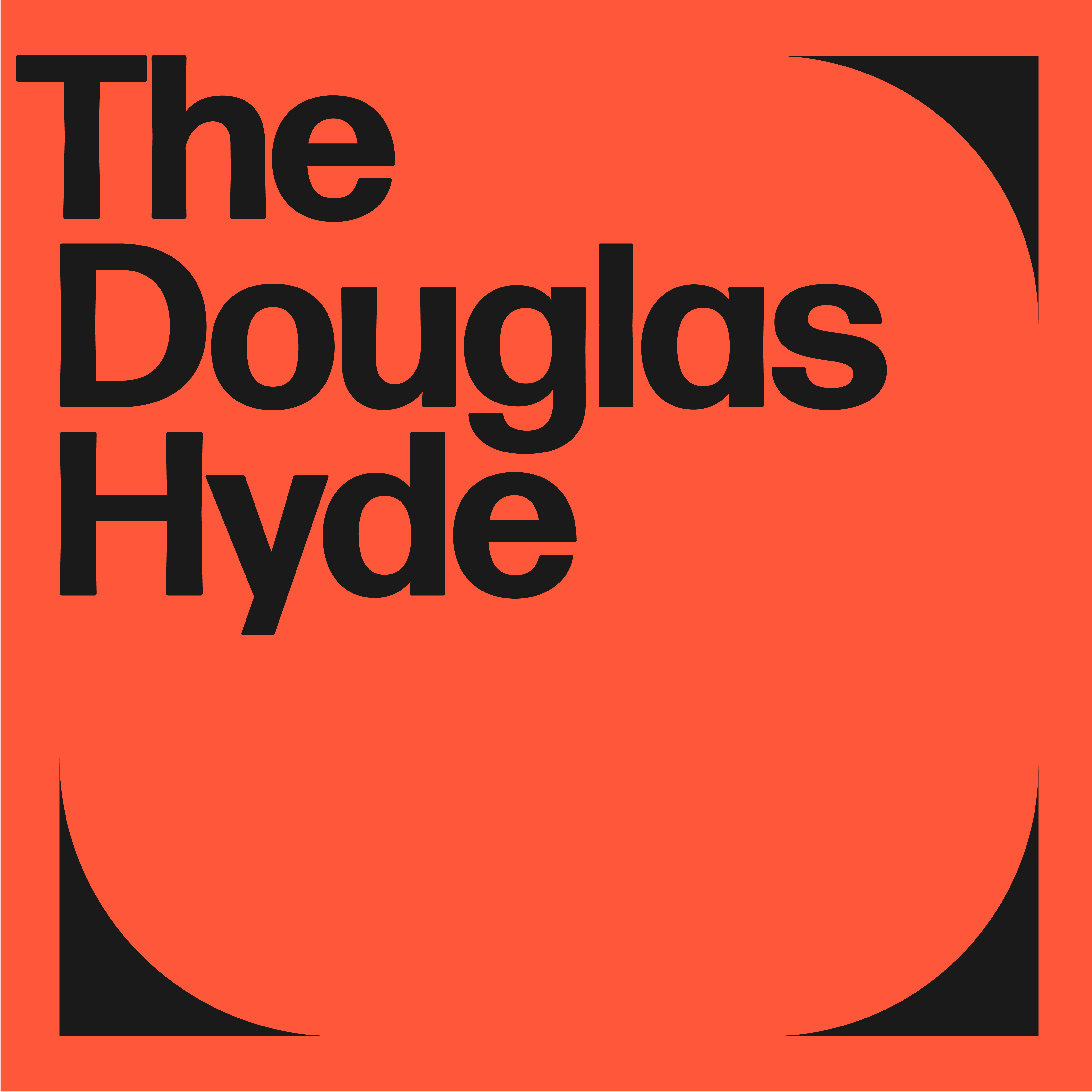
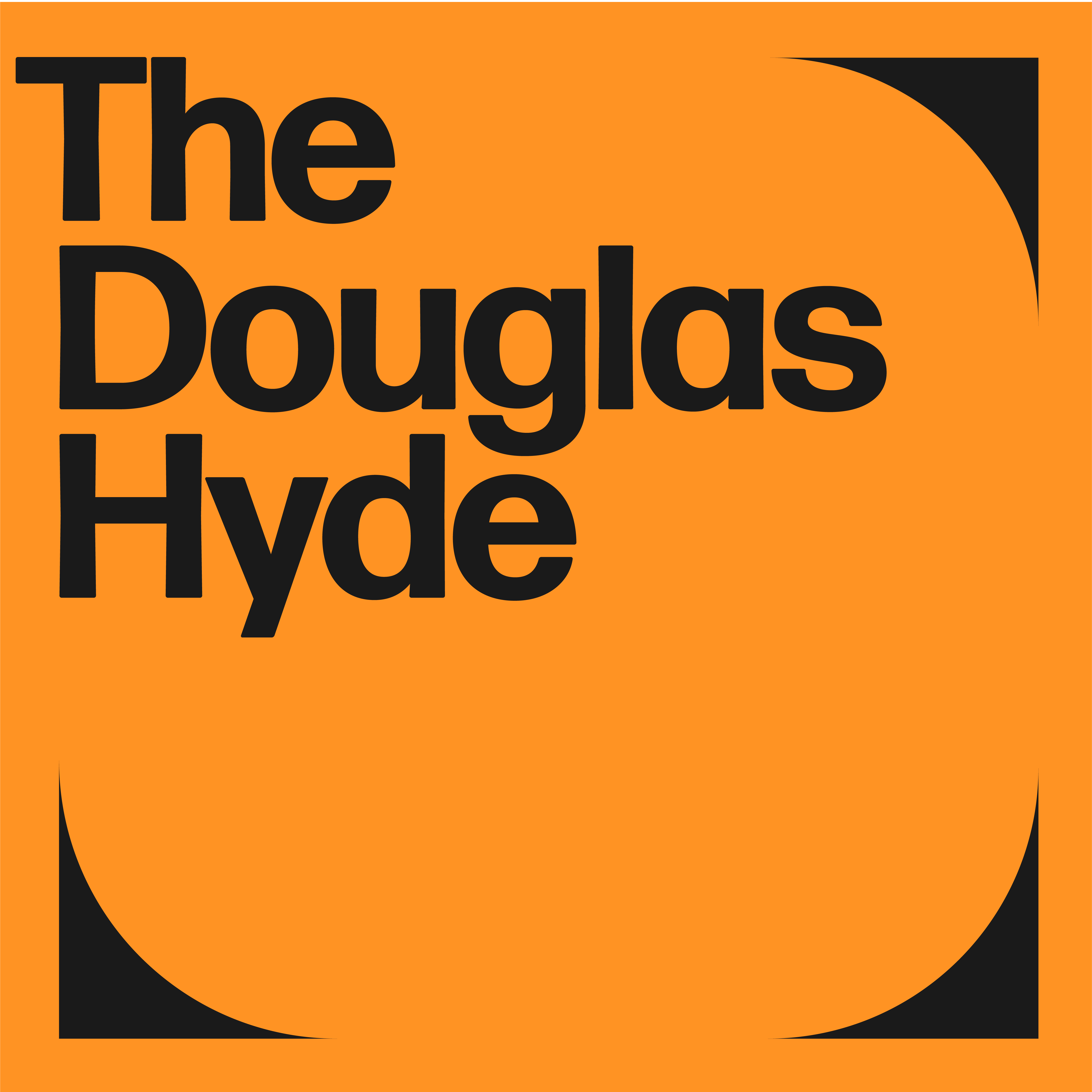
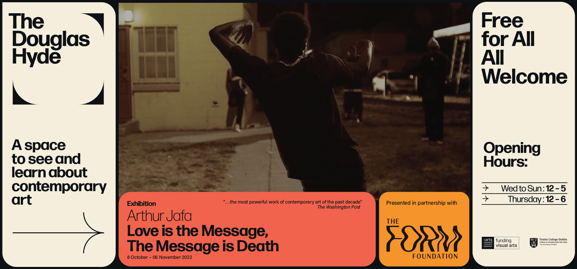
The Douglas Hyde
Brand Identity & Website Design
thedouglashyde.ie
Client: The Douglas Hyde
Developer: Alex Bradley
Winner
IDI Universal Design
Special Awards
![]()
Brand Identity & Website Design
thedouglashyde.ie
Client: The Douglas Hyde
Developer: Alex Bradley
Winner
IDI Universal Design
Special Awards
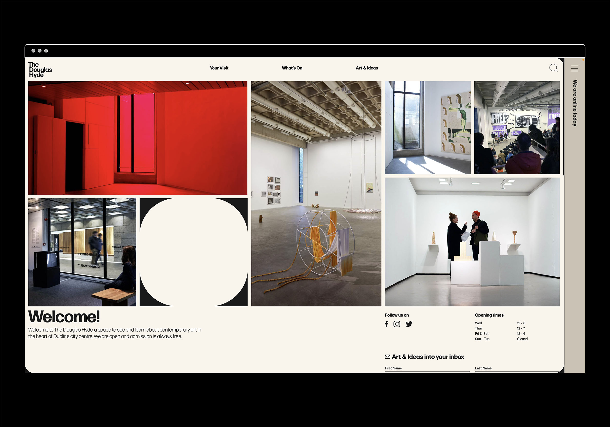
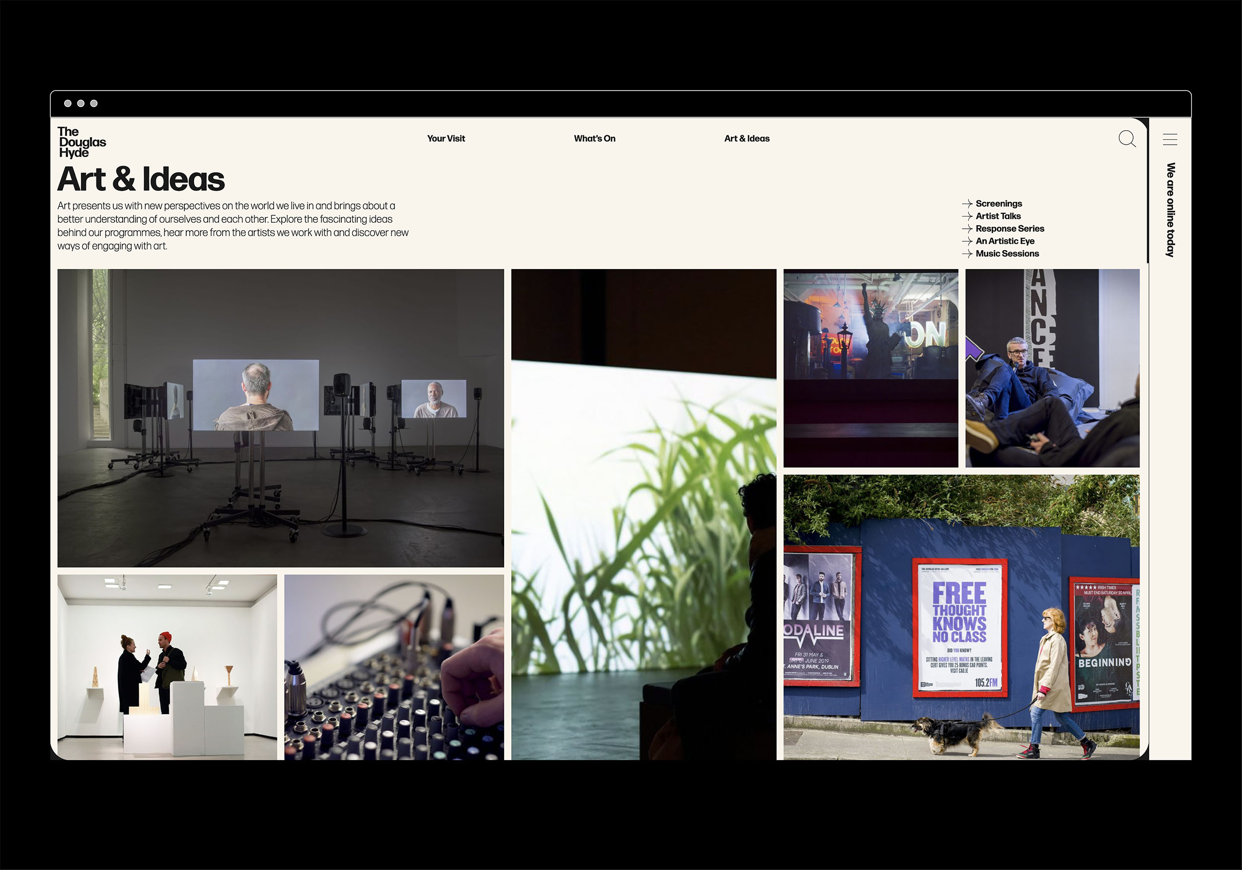
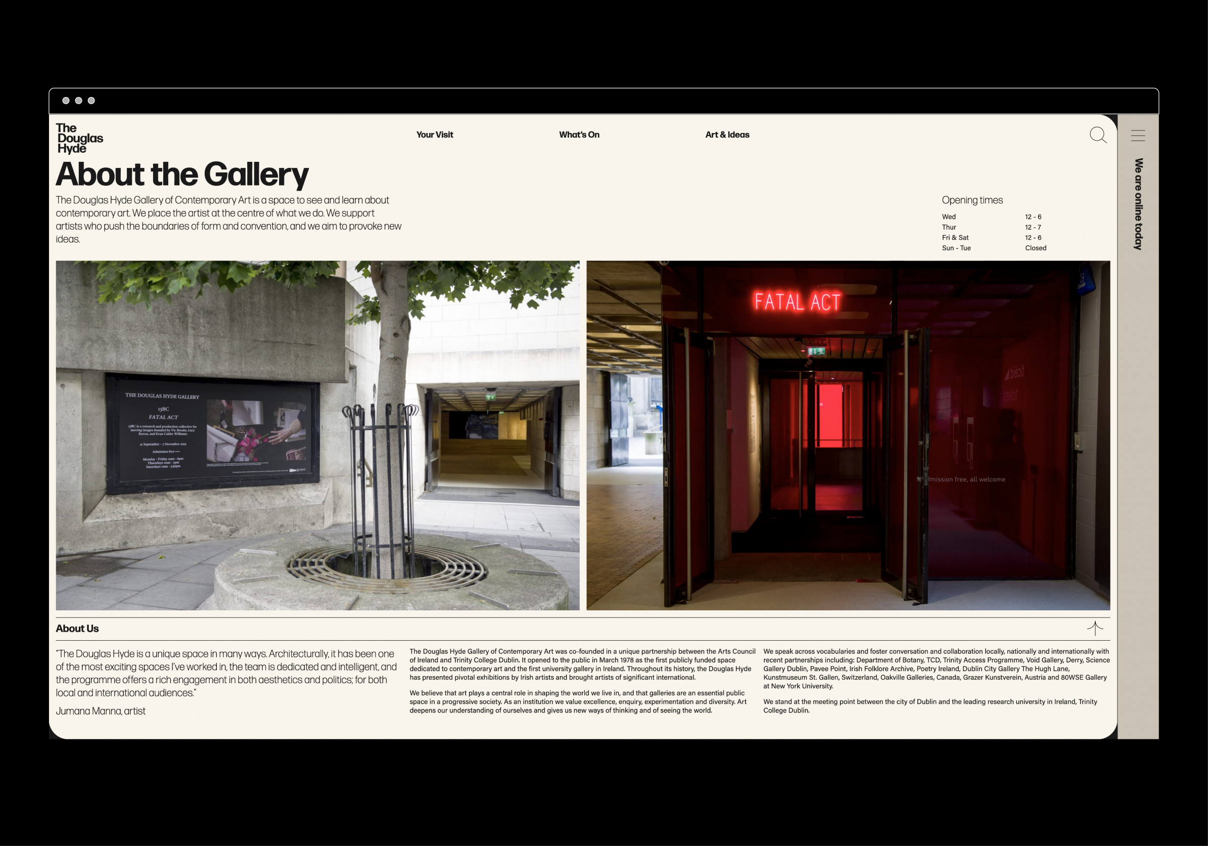
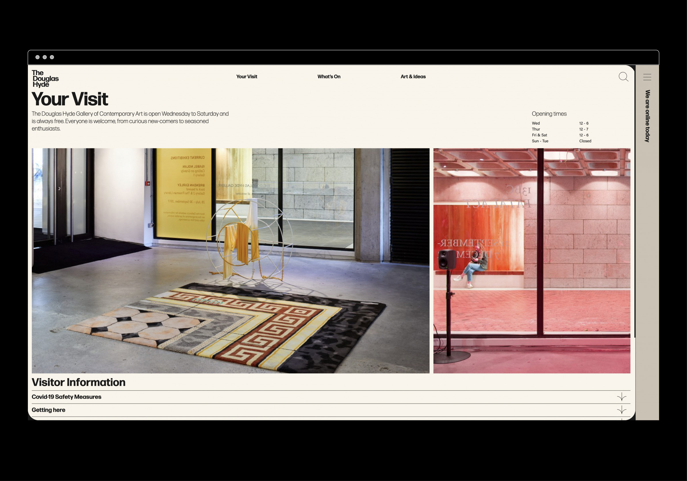
Client Brief:
Challenges that most contemporary art galleries struggle with have to do with accessibility and how to bring conversations about art to larger and non-traditional audiences. With this rebrand and website project we needed to create an accessible and friendly design that welcomes new engagement and does away with any perceived intimidation whilst still maintaining the intellectual reputation of the gallery.
Challenges that most contemporary art galleries struggle with have to do with accessibility and how to bring conversations about art to larger and non-traditional audiences. With this rebrand and website project we needed to create an accessible and friendly design that welcomes new engagement and does away with any perceived intimidation whilst still maintaining the intellectual reputation of the gallery.
Our Response:
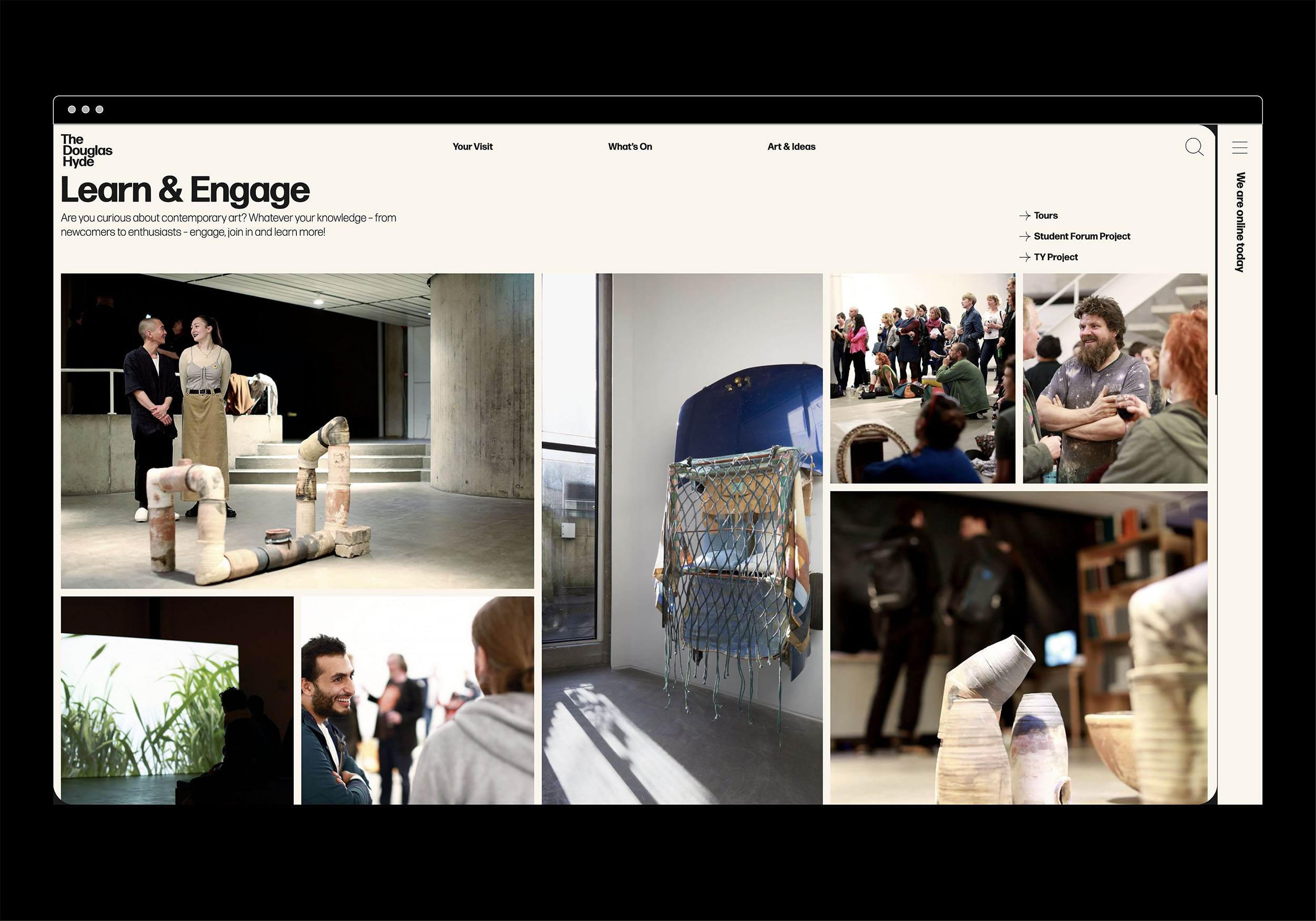
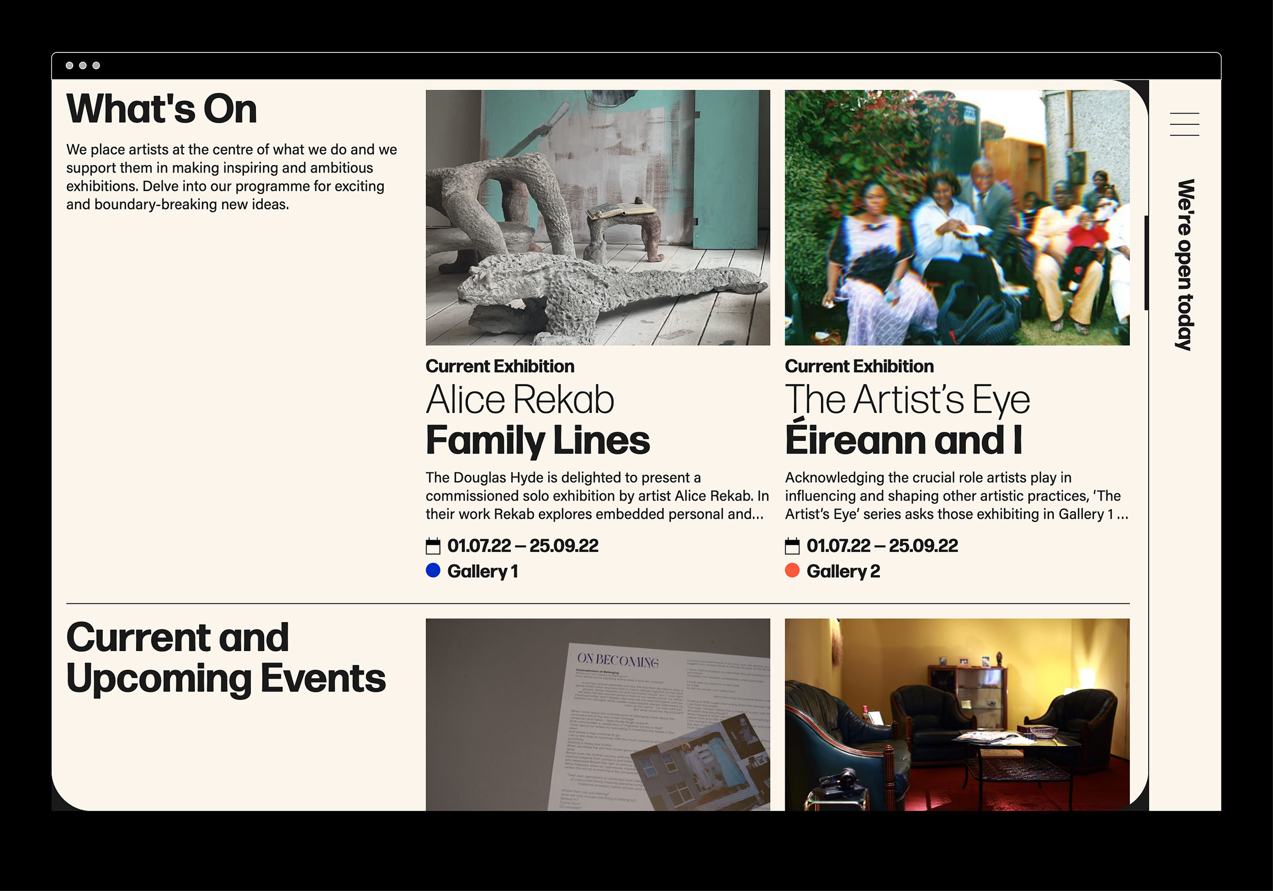
The website and all other communications platforms needed a clear editorial structure that allows for tiered levels of engagement with an information system using headings, sub-heads, introductory paragraph-styles, ‘read more’ tags etc. going from engaging and welcoming to descriptive and informative to academic and critical.
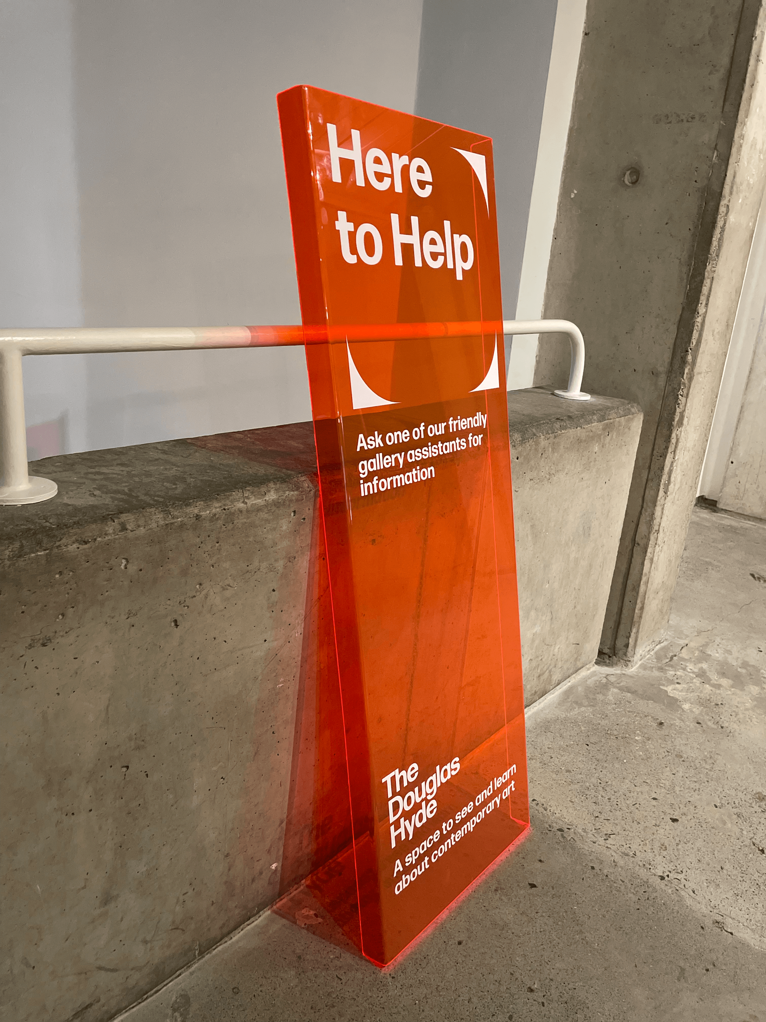
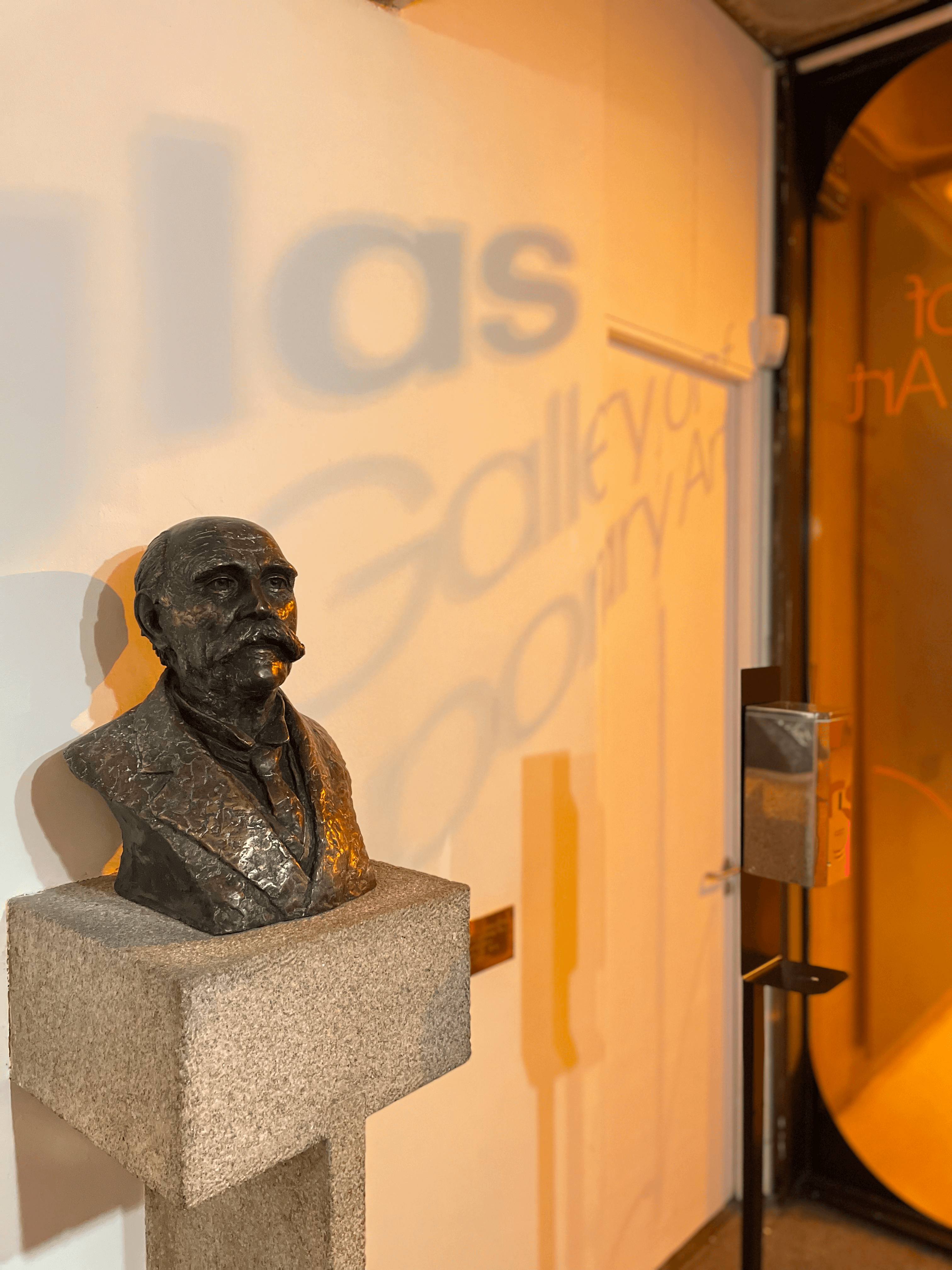
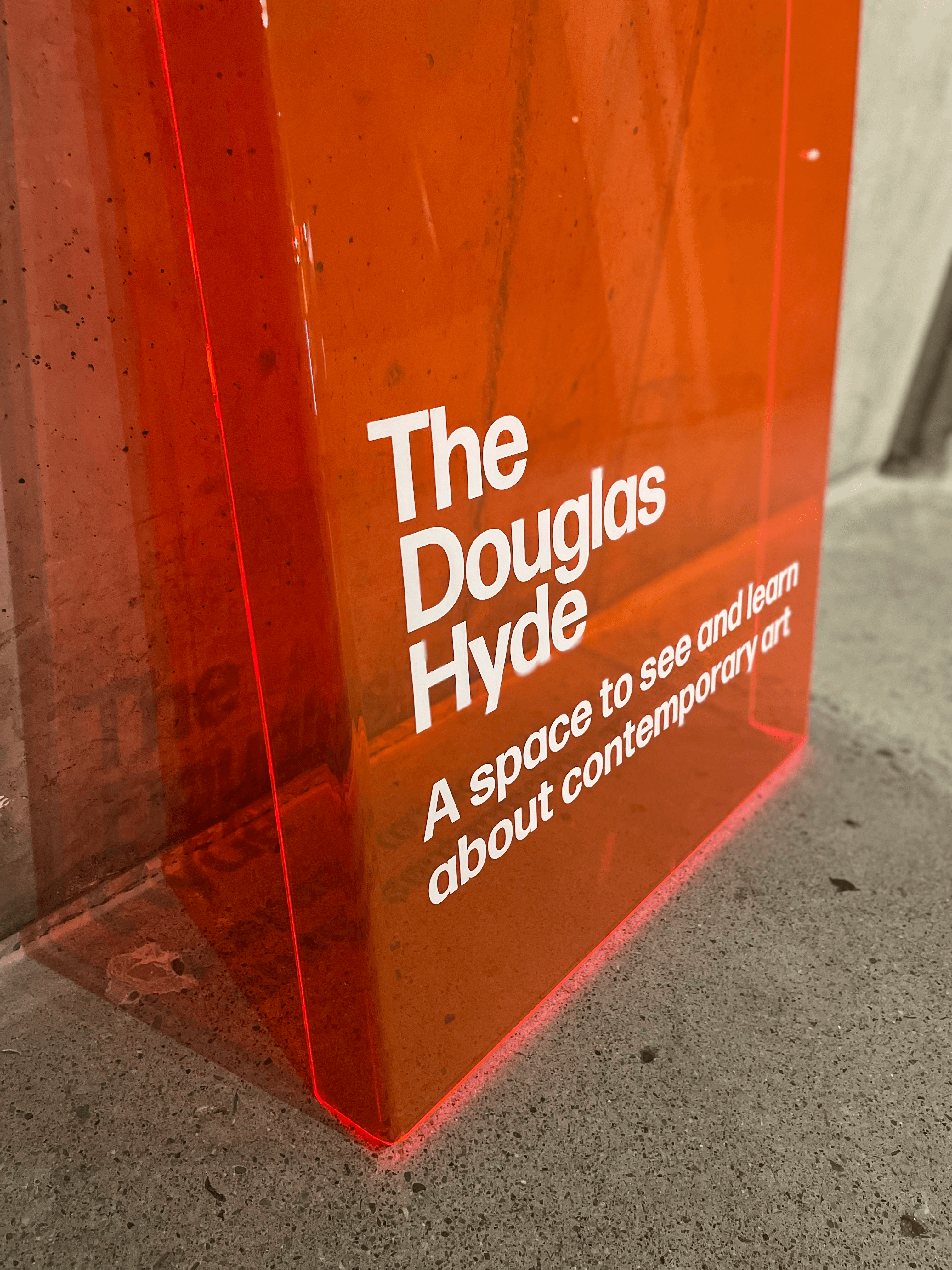
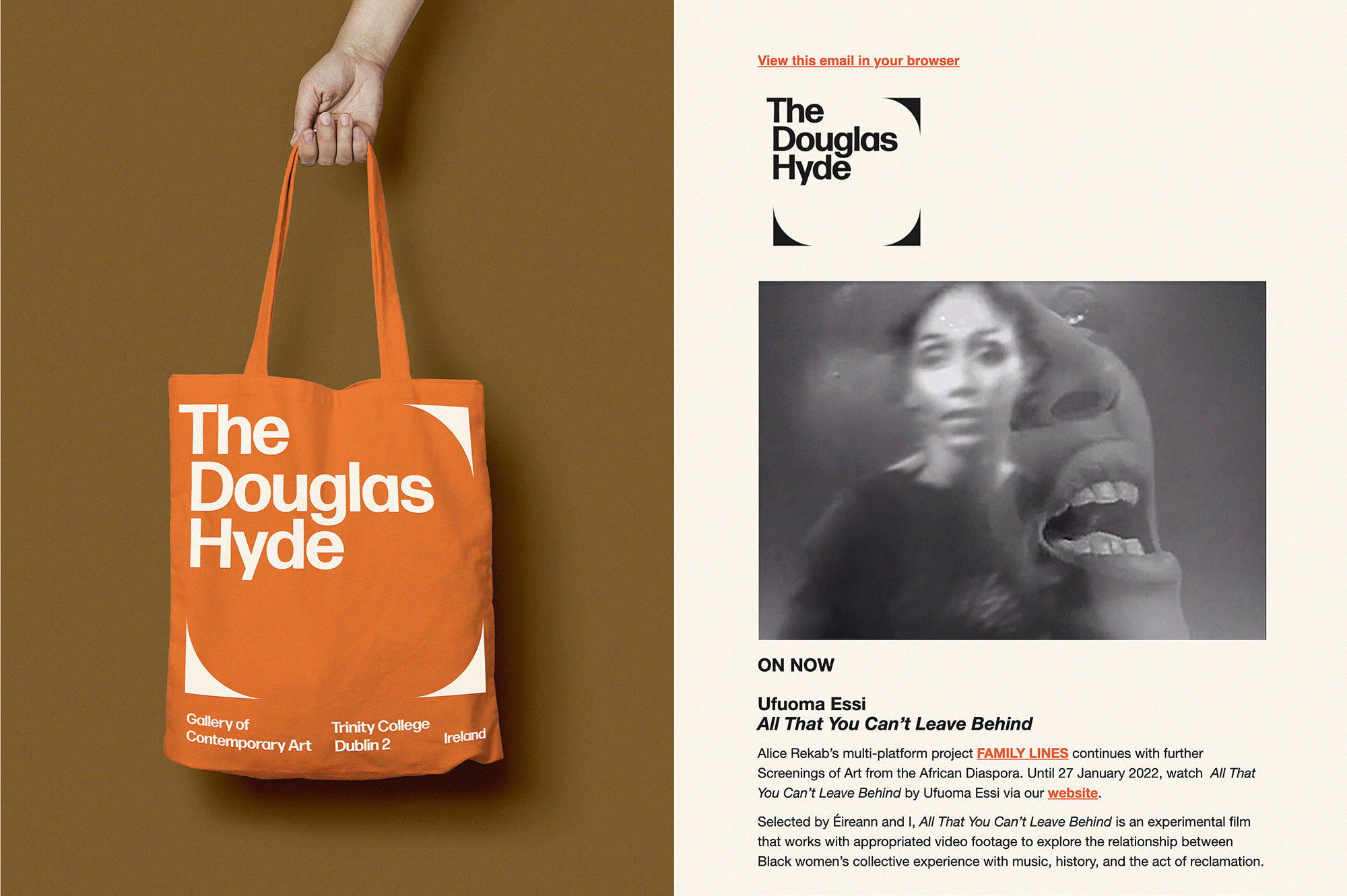
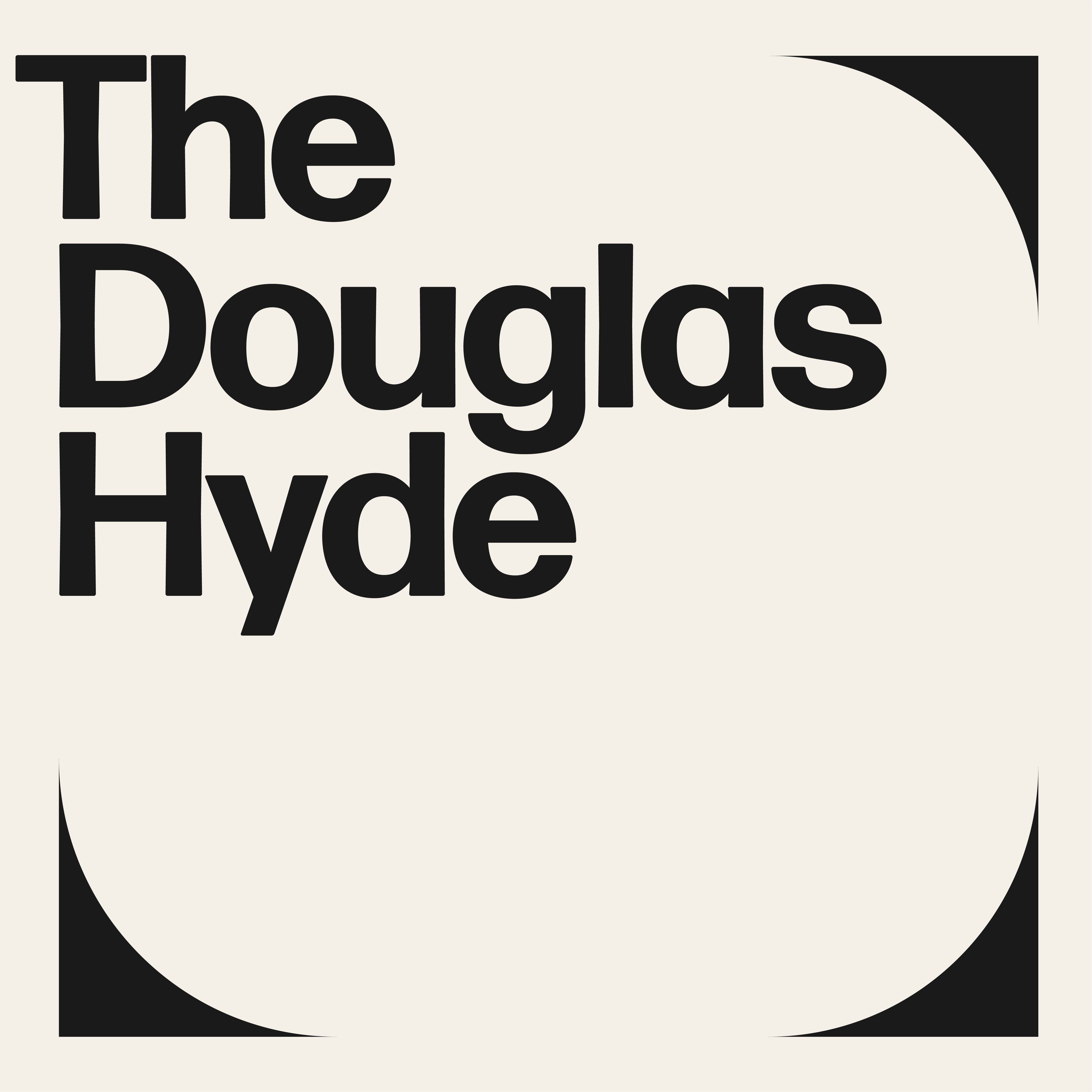
A gallery in essence is an architectural space, thus the design was inspired by aspects of its architectural features. The concrete ceiling of the gallery and the Trinity Arts Block became the catalyst for the logo and subsequently the brand identity and look and feel of the website. The rounded shape of the ceiling cells create a tension between sharpness and smoothness and of the negative and positive space.
The website and all other communications platforms needed a clear editorial structure that allows for tiered levels of engagement with an information system using headings, sub-heads, introductory paragraph-styles, ‘read more’ tags etc. going from engaging and welcoming to descriptive and informative to academic and critical.
A gallery in essence is an architectural space, thus the design was inspired by aspects of its architectural features. The concrete ceiling of the gallery and the Trinity Arts Block became the catalyst for the logo and subsequently the brand identity and look and feel of the website. The rounded shape of the ceiling cells create a tension between sharpness and smoothness and of the negative and positive space.
We worked closely with Learning & Engagement Curator of The Douglas Hyde, Fernando Sánchez-Migallón Cano and developer, Alex Bradley, to achieve a universal design. This included working with Knowbility to ensure the finished design was accessible to a wide range of people regardless of their age, size, ability or disability.
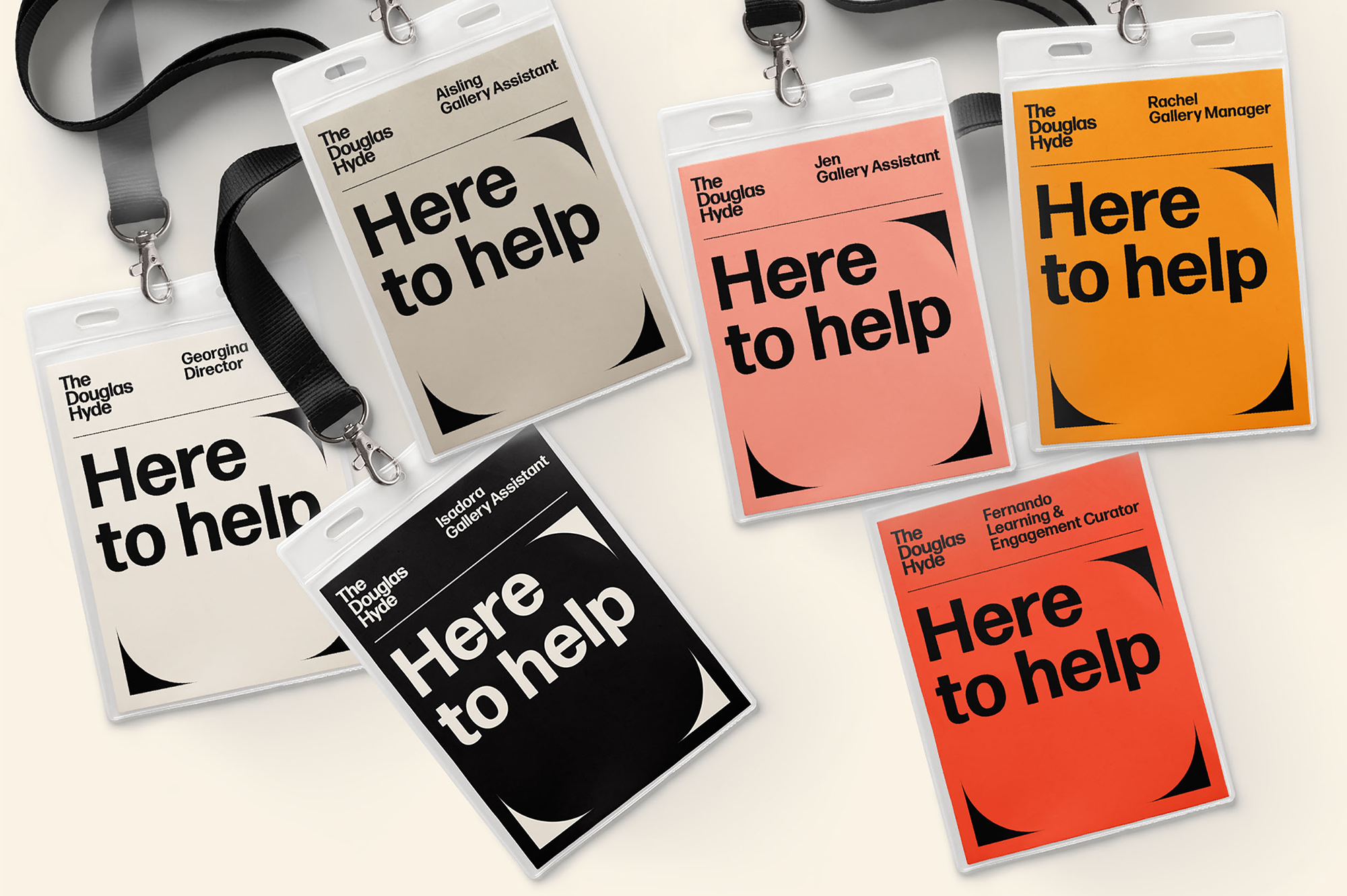
Through deconstructing and multiplying the mark and re-assembling the fragments of the original form, we developed a dynamic and modular system of symbols, icons and framing devices. The display type face (Forma) echoes that same tension between sharpness and smoothness whilst being high in contrast, legibility and character. Wanting to avoid the white cube aesthetic the colour scheme is led by a ‘muted’ charcoal black and warm off white that can be combined with the warm colours that compliments the grey concrete.


2021
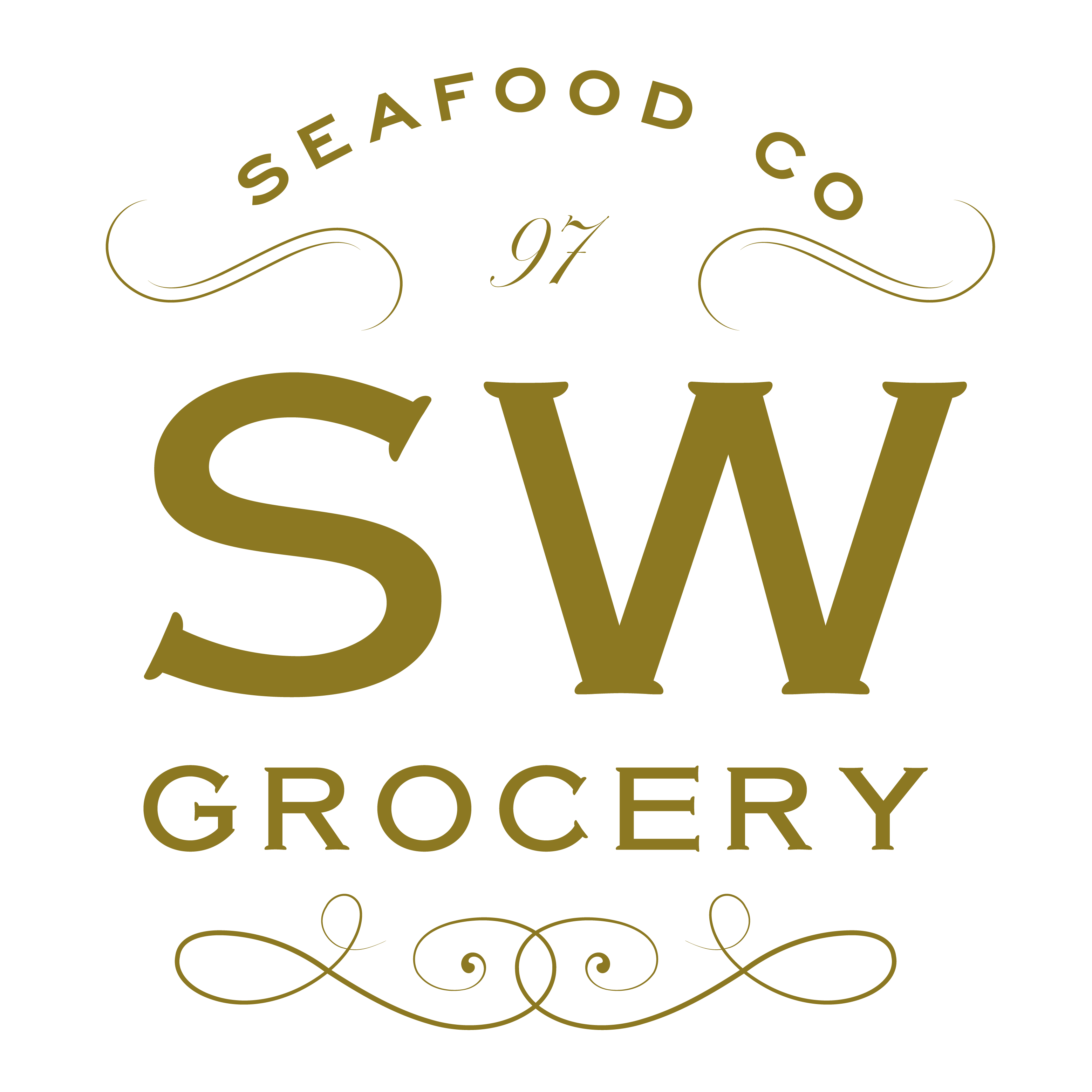
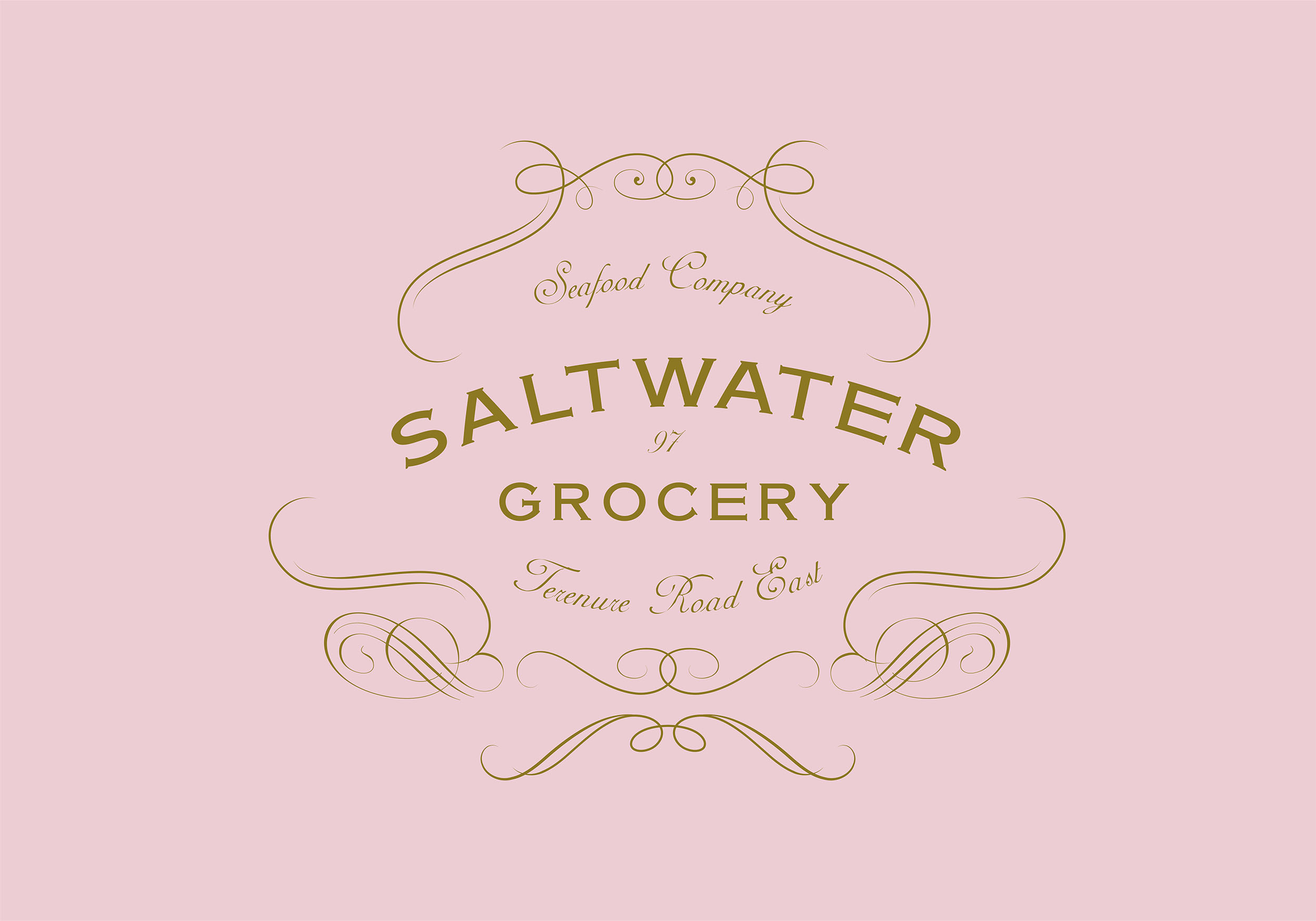
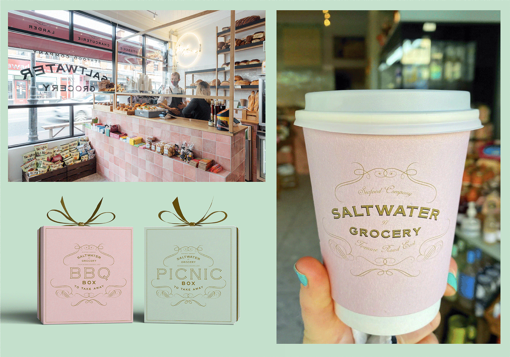
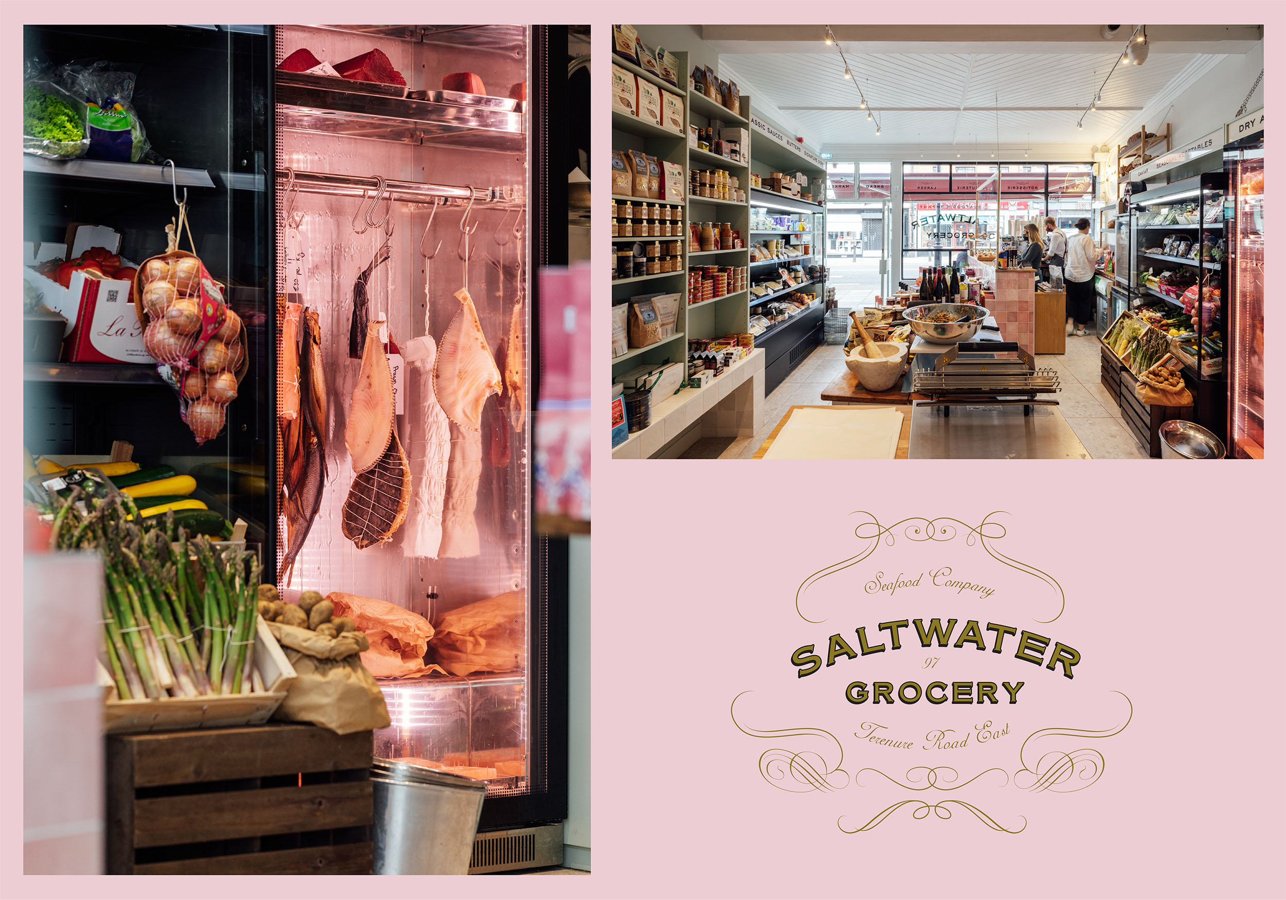
Saltwater Grocery
Brand Identity
Client:
Karl Whelan & Niall Sabongi
Winner
New Branding Schemes
Visual Communication
![]()
Brand Identity
Client:
Karl Whelan & Niall Sabongi
Winner
New Branding Schemes
Visual Communication
"This is world class premium branding."
—Judges thoughtsClient Brief:
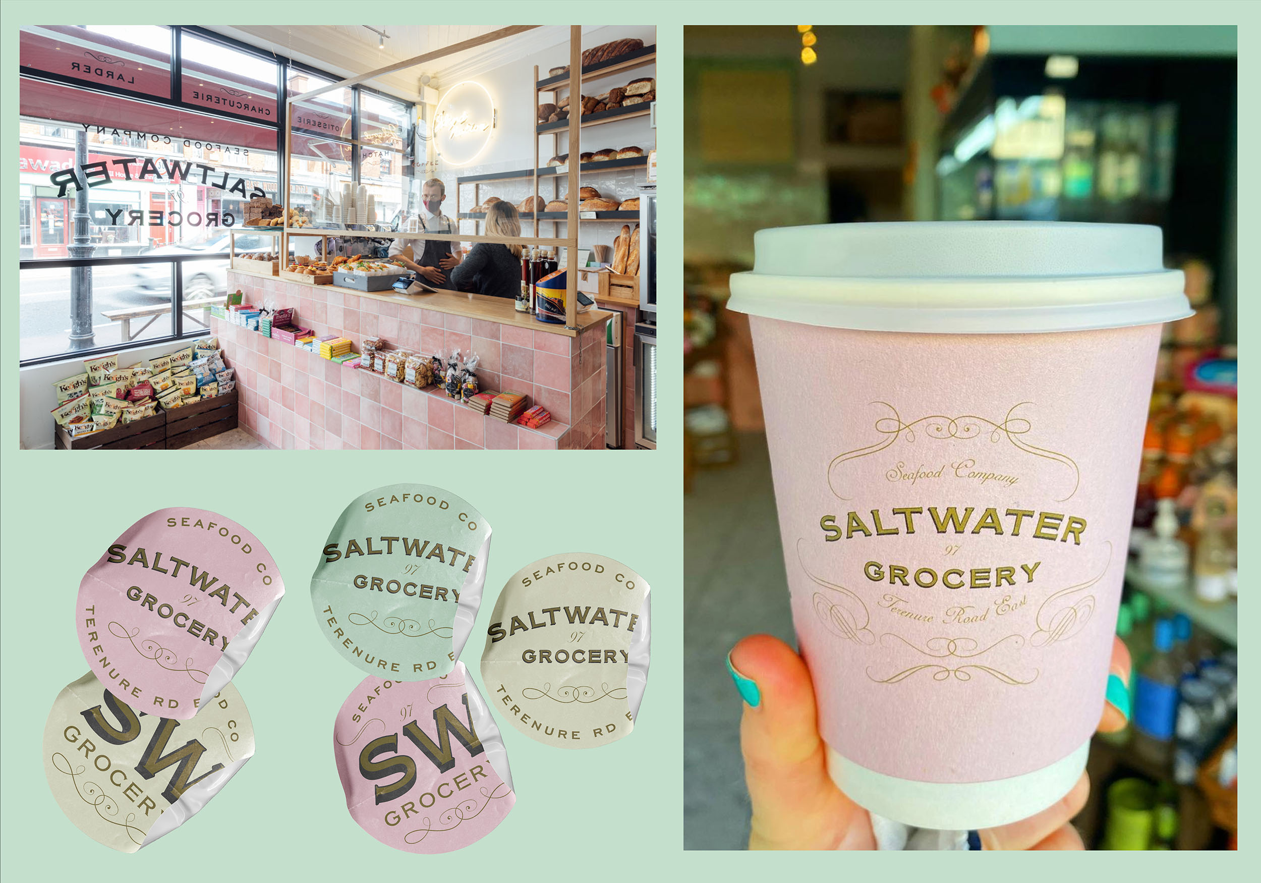
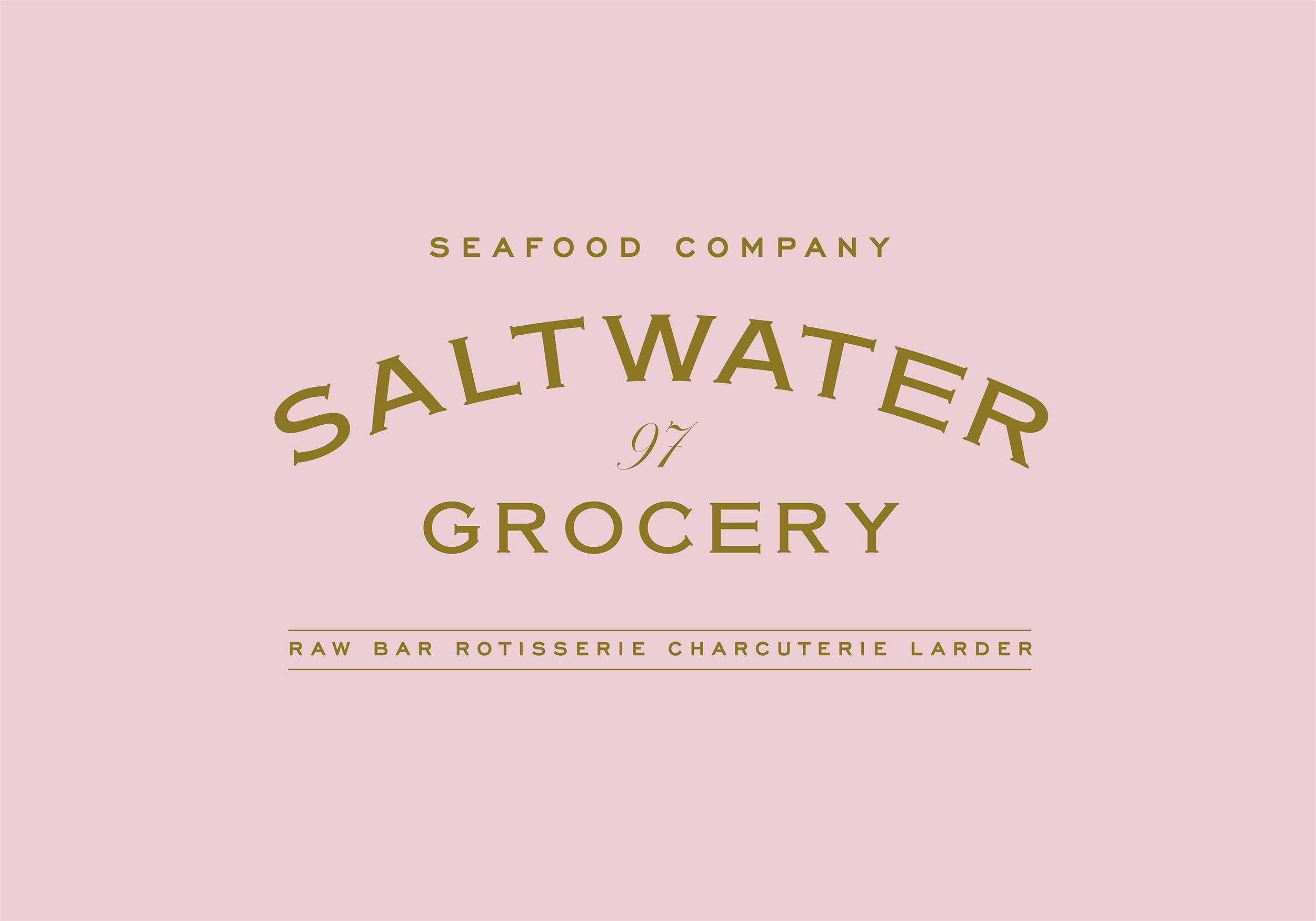
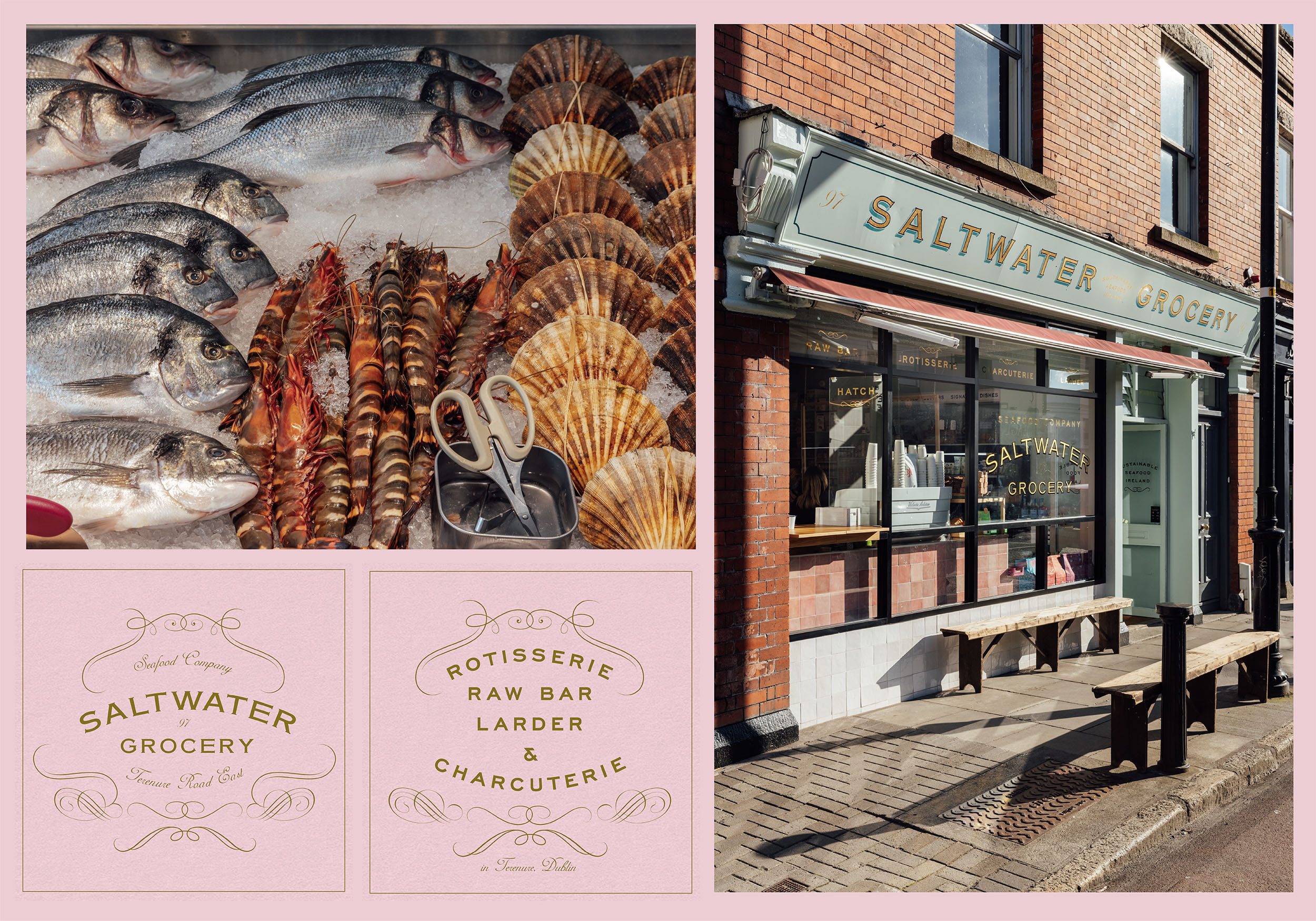
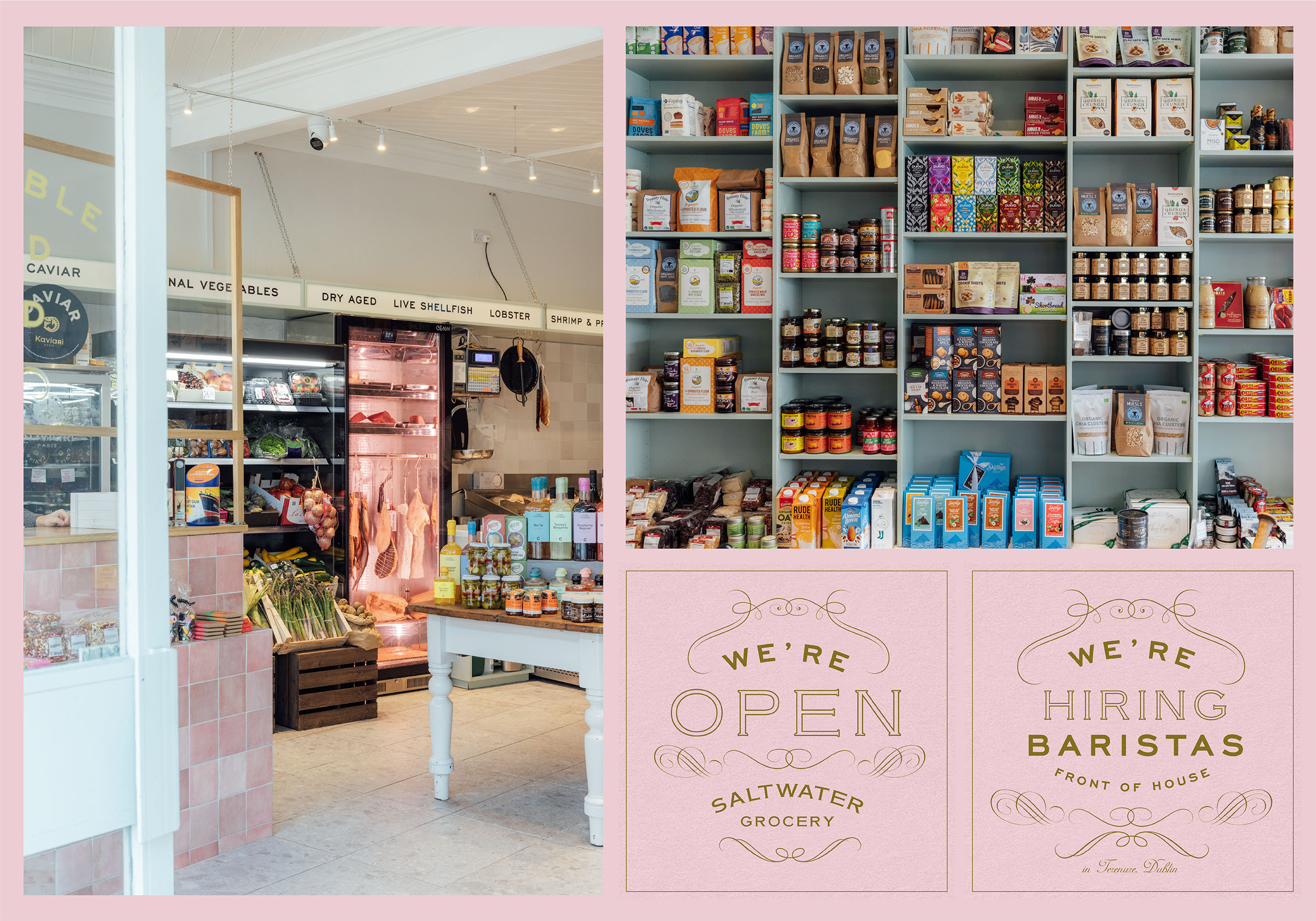
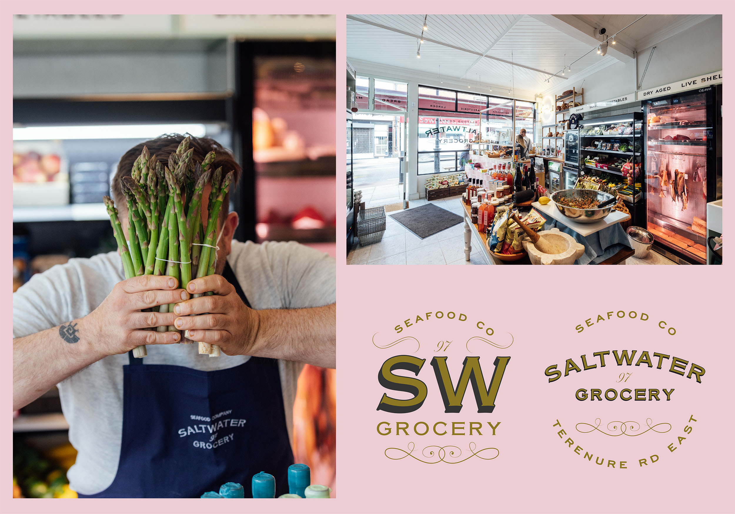
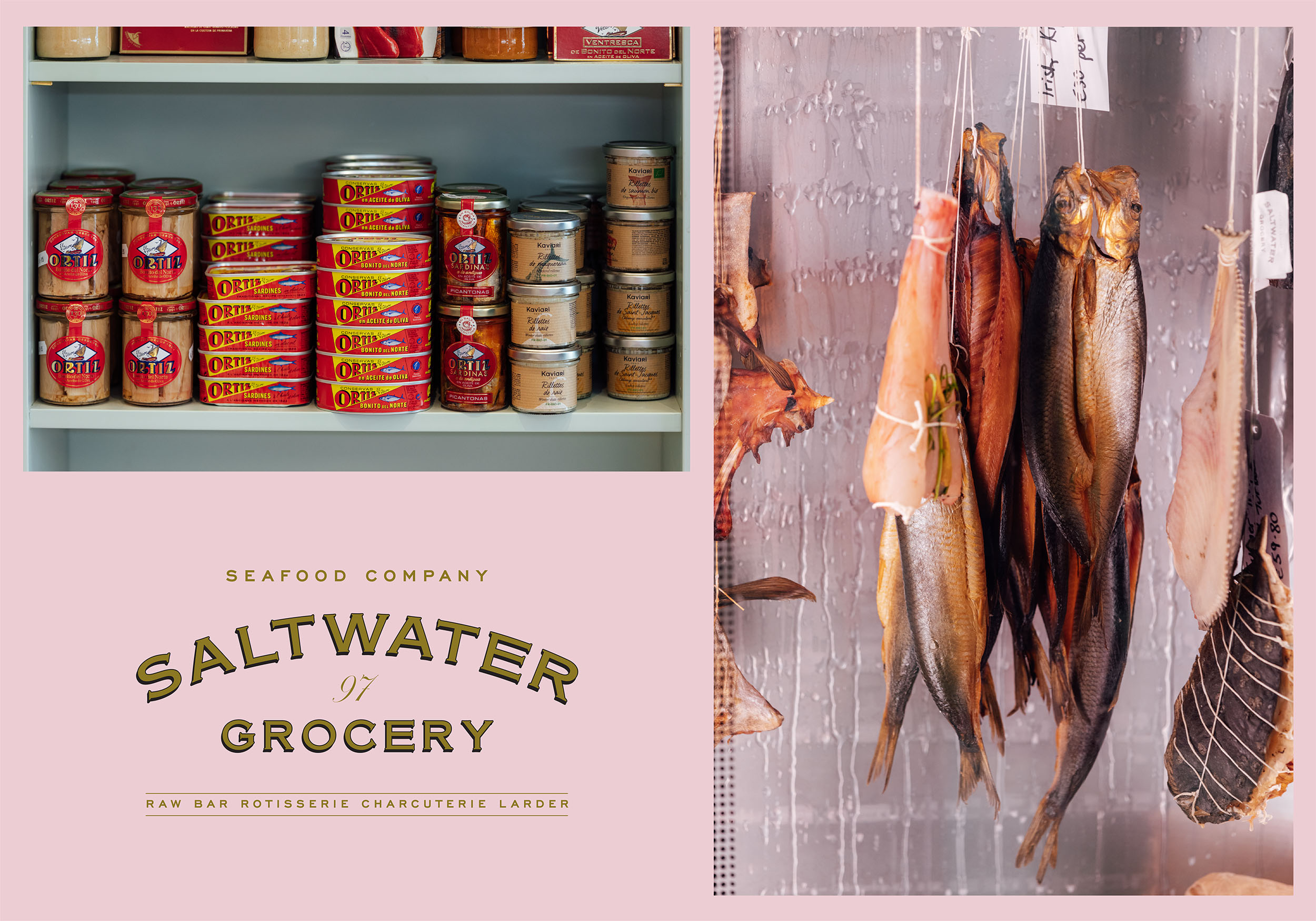
Saltwater Grocery, a gourmet food store that specialises in seafood, founded by chefs Karl Whelan and Niall Sabongi is situated on Terenure Road East. Originally a butchers, the shop was in need of a revamp and the new venture in need of a new brand identity.
Karl and Niall pride themselves on sourcing fresh, sustainable seafood and hand selected artisan products and they needed a brand to reflect this. They came to us with examples of what they wanted and asked us to recreate a vintage style grocery that looked ‘like it has always been there’.
Our Response:
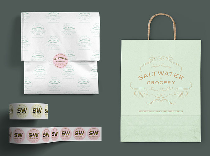
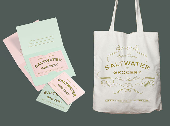
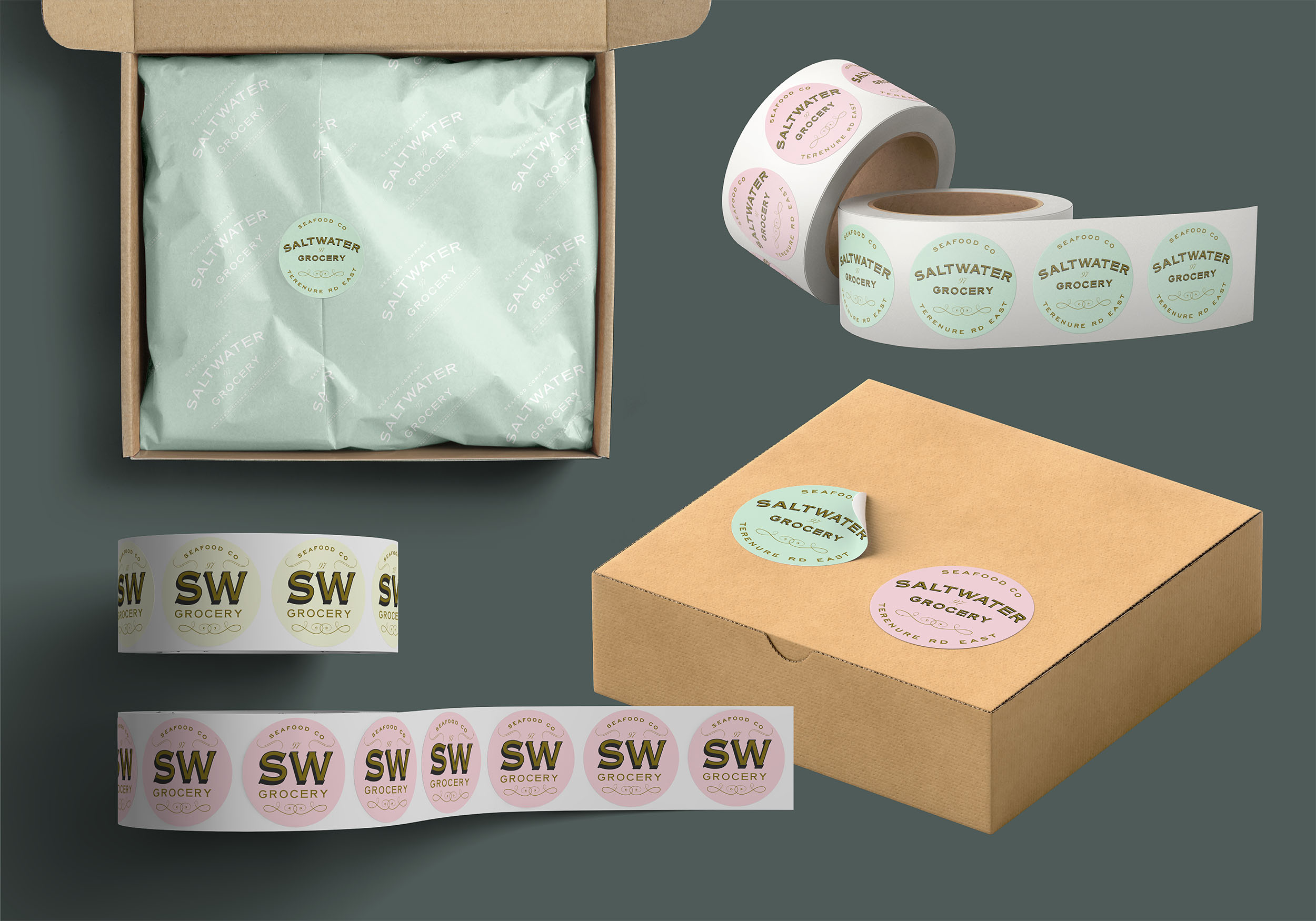
Together with interior specialists, AB Projects, we created an extensive brand and scheme for the store. The starting point was a suite of classic logos and a colour palette inspired by French Boulangeries. The suite included various marks for multiple applications; including a fancy, ornamented logo resembling an opened clam, and a purely typographic logo.
The flexible identity was designed and customised to fit the many elements from the shop interior and exterior shop signs (painted and gilded to the highest standard by Mac Signs) as well as extensive packaging, printed and digital materials, paying close attention to ensure we were sourcing the most environmentally friendly materials and working with printers that could provide such materials.
Credits:
Design Assistance:
Rebecca Wright
Interior Design & Architecture:
Ahmad Fakhry & Andrew Burdock / AB Projects
Sign Painting:
Cormac Dillon & Louise Gardiner / Mack Signs
Photography:
Shantanu Starick
Design Assistance:
Rebecca Wright
Interior Design & Architecture:
Ahmad Fakhry & Andrew Burdock / AB Projects
Sign Painting:
Cormac Dillon & Louise Gardiner / Mack Signs
Photography:
Shantanu Starick


Client Brief:
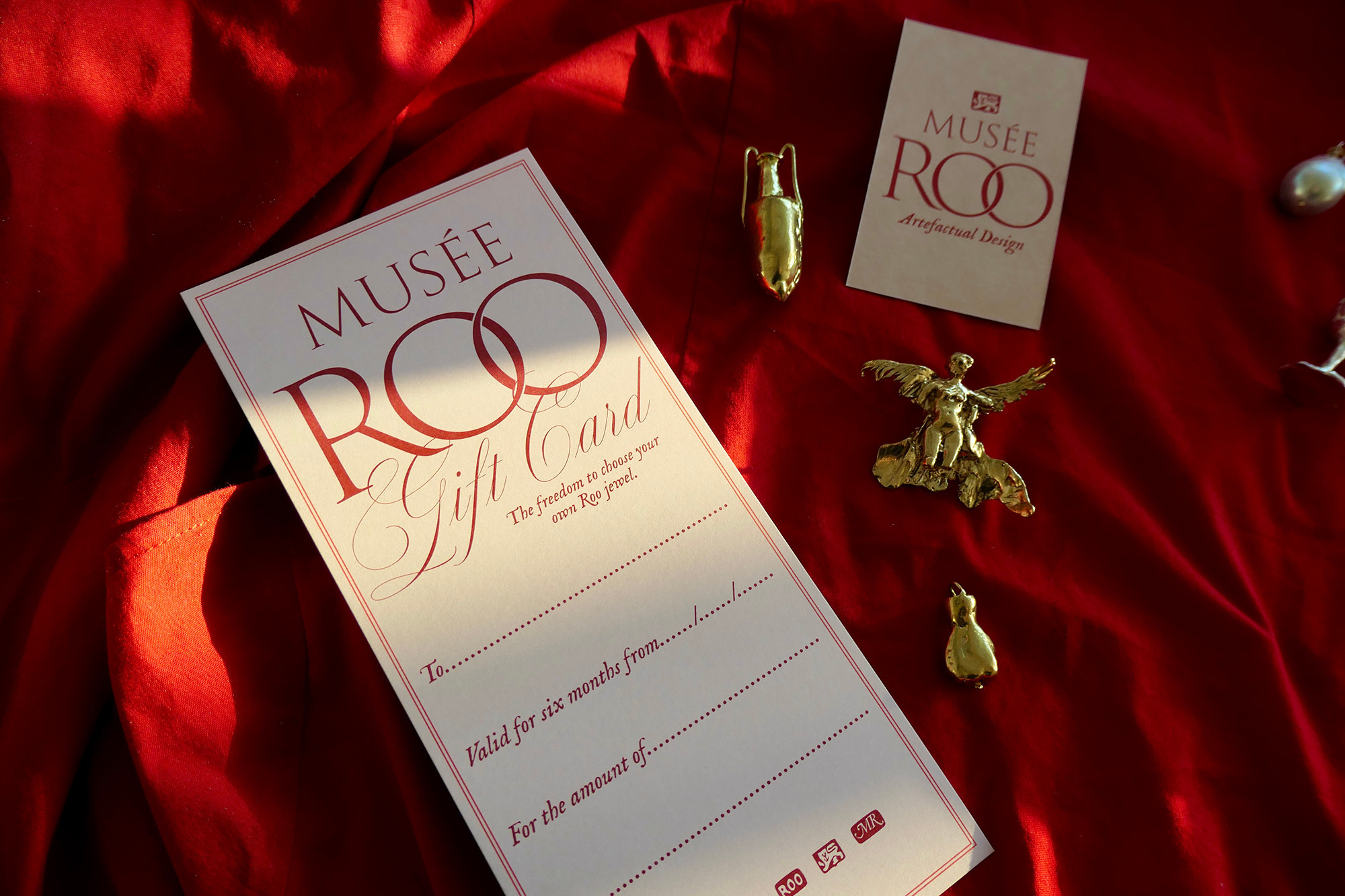
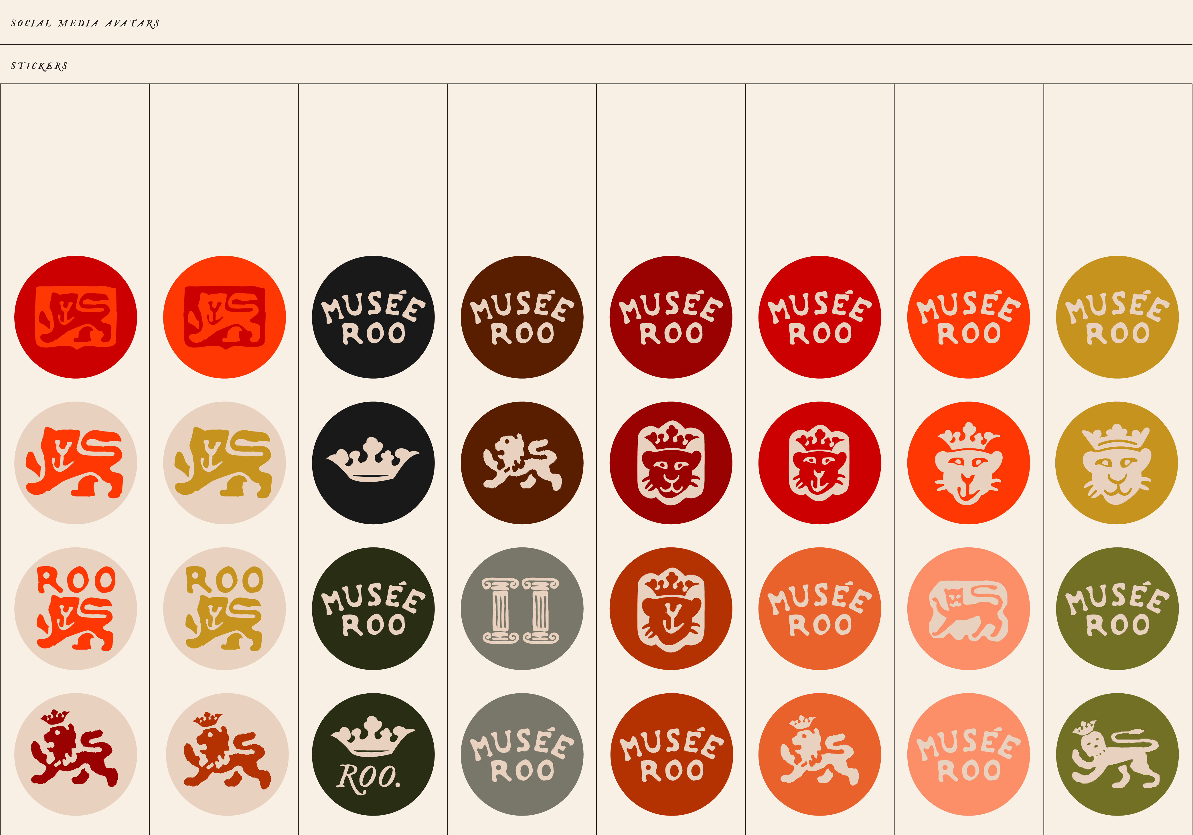
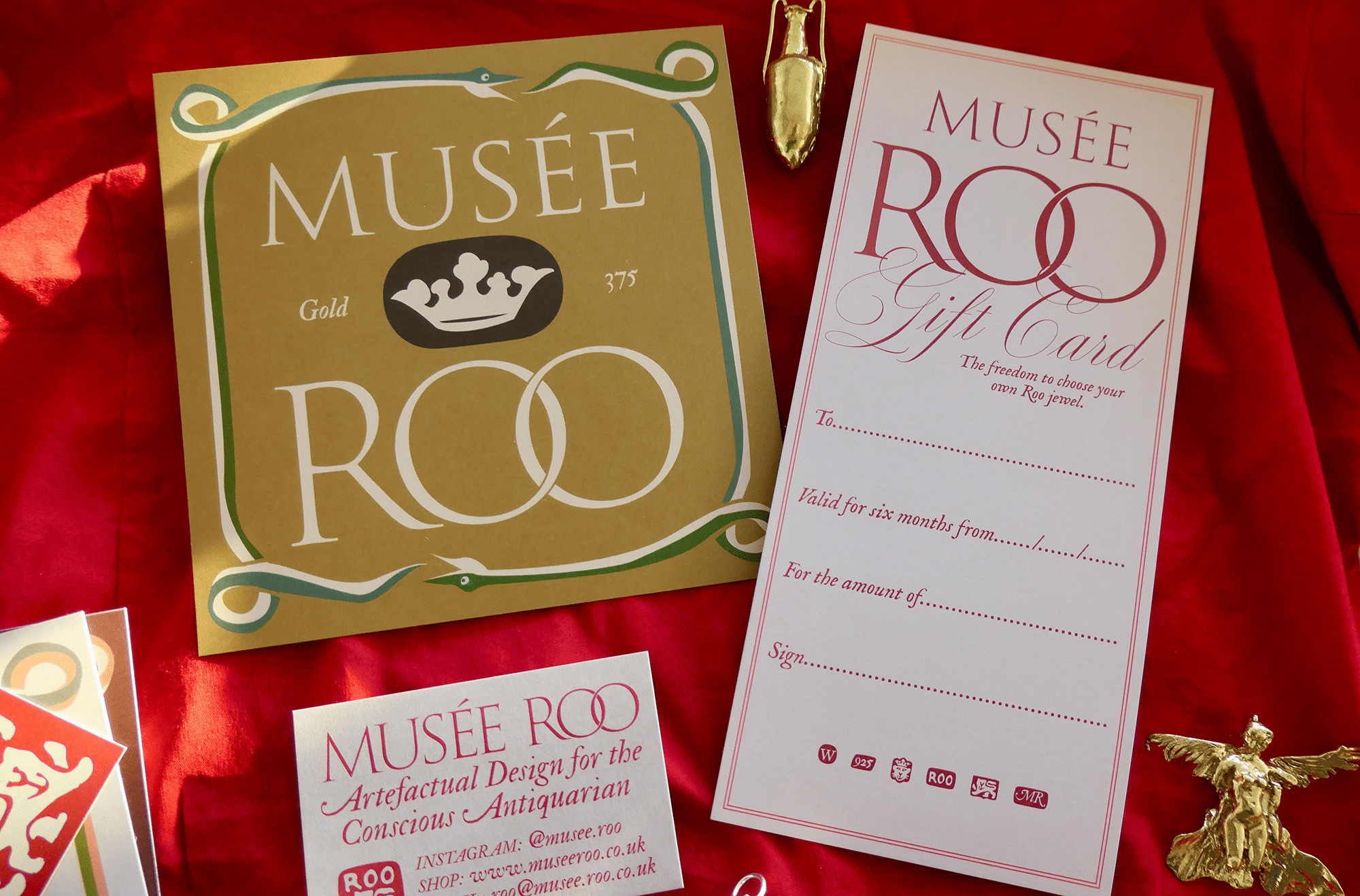
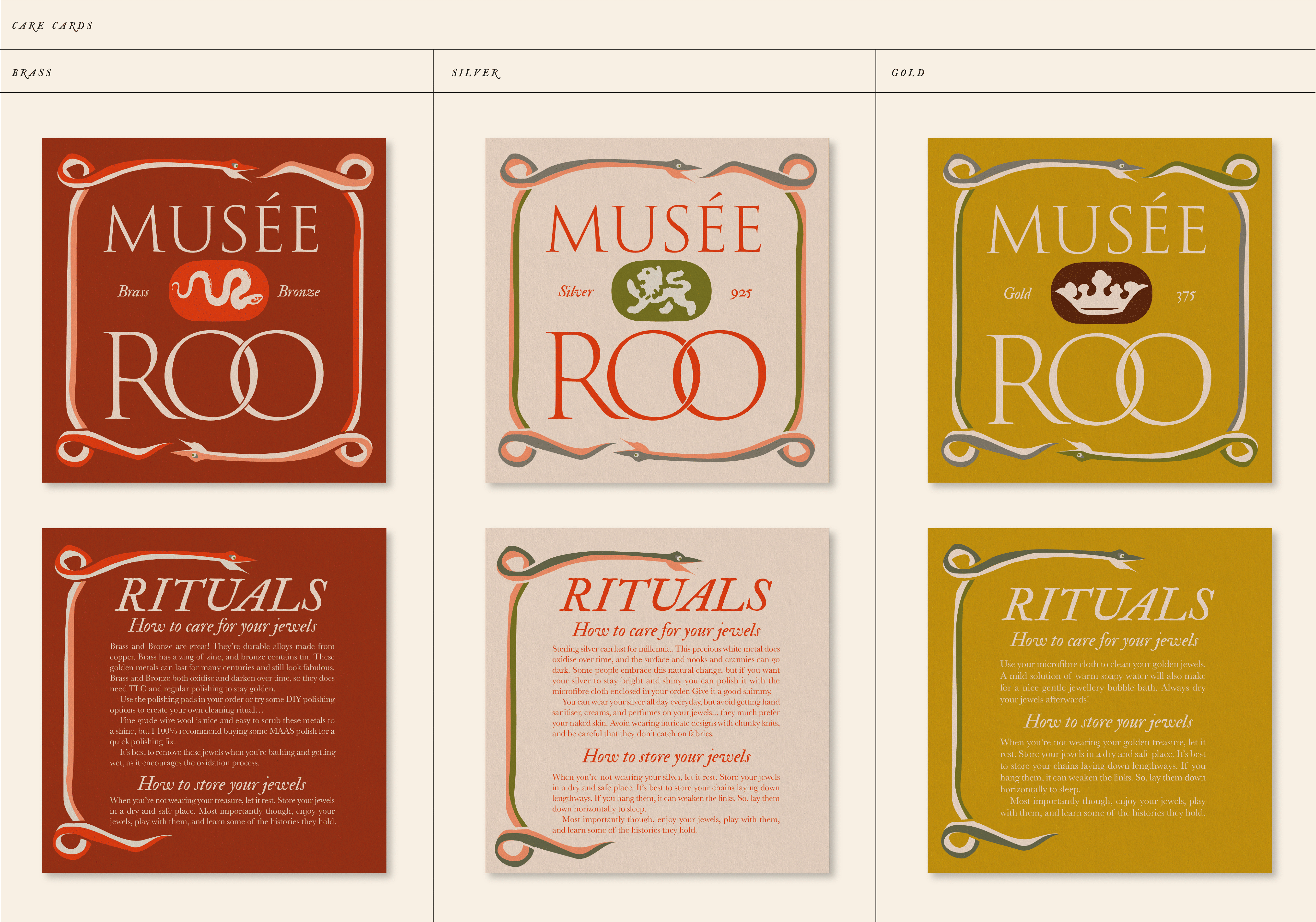
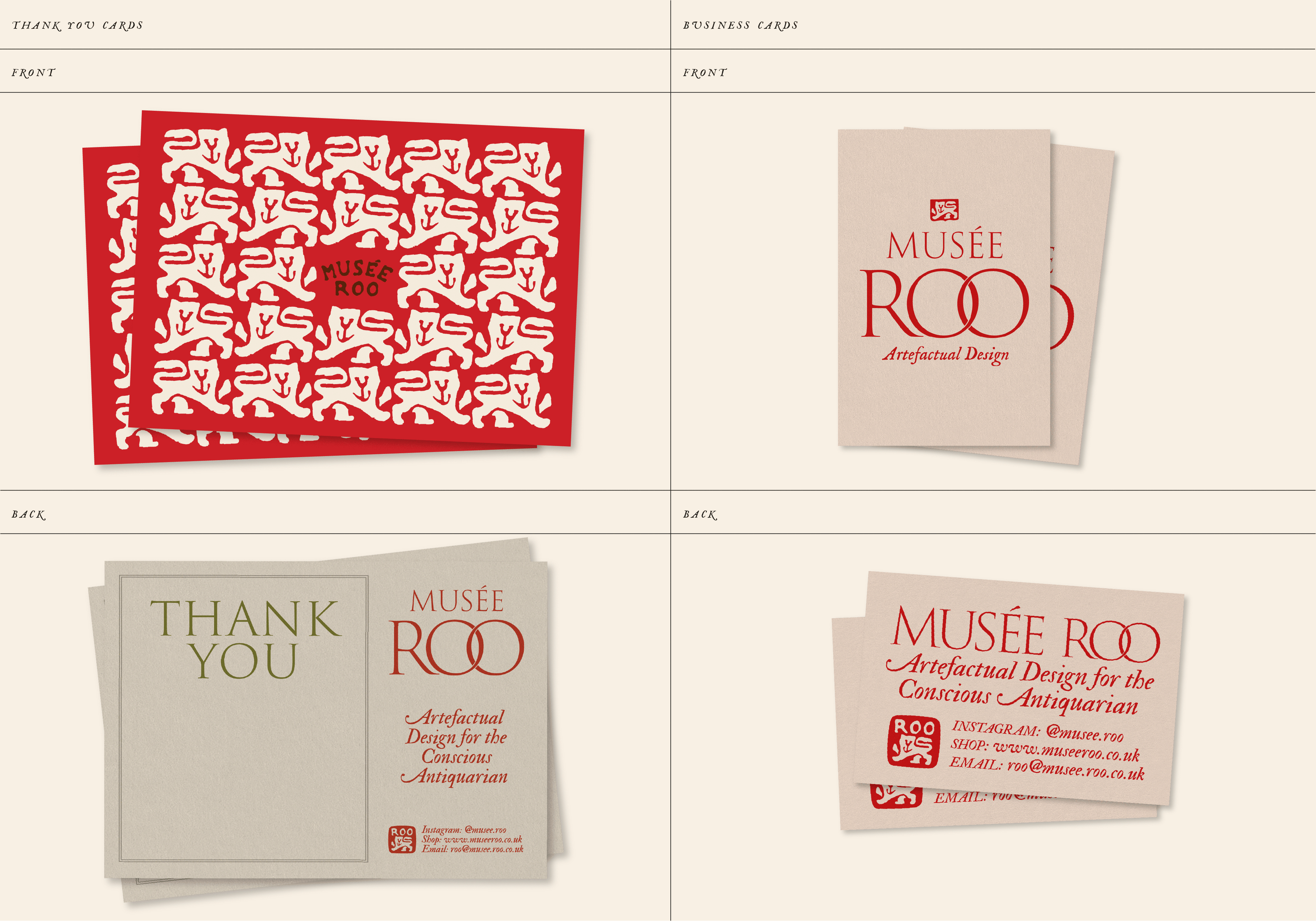
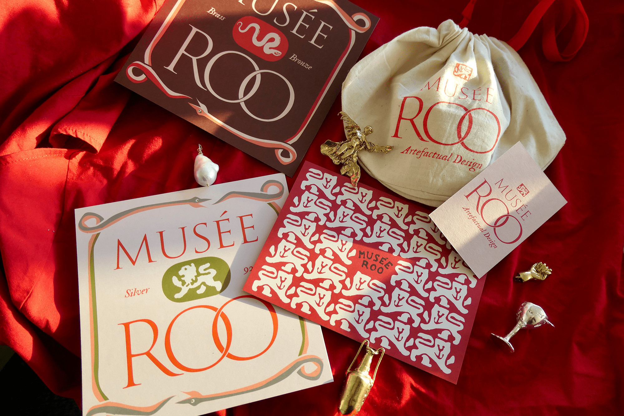
Our pet project from 2021, a rebrand for Musée Roo, jewellery designer based in Bristol, UK.
Roo creates historical jewellery for the conscious antiquarian, all traditionally hand crafted from recycled and ethically sourced materials.
Our pet project from 2021, a rebrand for Musée Roo, jewellery designer based in Bristol, UK.
Roo creates historical jewellery for the conscious antiquarian, all traditionally hand crafted from recycled and ethically sourced materials.
Our Response:
The stamps and hallmarks are an integral part of any jewellery making process, but even more so when using recycled metals. Roo wanted to forefront this idea throughout the branding and so we created a suite of various marks and stamps based on antique hallmarks and expanded these out across all applications.
The stamps and hallmarks are an integral part of any jewellery making process, but even more so when using recycled metals. Roo wanted to forefront this idea throughout the branding and so we created a suite of various marks and stamps based on antique hallmarks and expanded these out across all applications.
Client Testimonial:
BB did my whole branding shebang! They helped turn my historically inspired jewellery business into a brand. Hot damn it was worth my investment. I supplied BB with lots of antique and vintage images as reference, and after a few presentations rounds, I was well and truly the happiest bunny around. BB well surpassed my expectations. They designed me a core logo, a suite of secondary logos and icons, a palette of brand colours and multiple fonts. I can easily apply and play around with these different elements on canva, which is lots of fun. They designed and developed the paraphernalia I send out with my jewellery orders — I now have swanky care cards (for each metal!!), postcards, business cards, and gift vouchers. I get so many compliments on my branding and ALL of the above. I can't recommend Rachel and Stina enough.
Roo Bannister, Director, Musée Roo


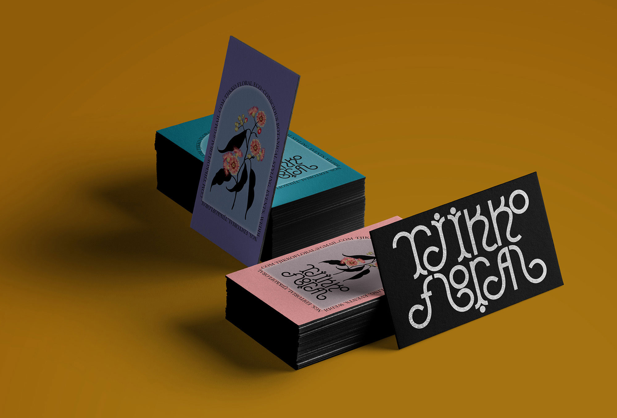
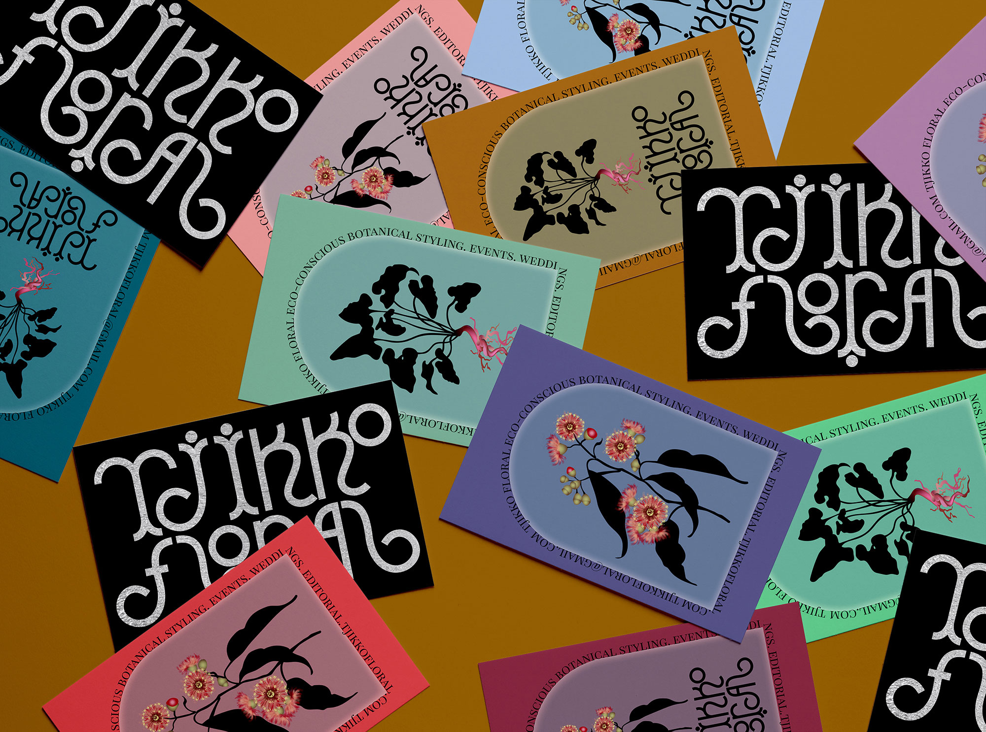
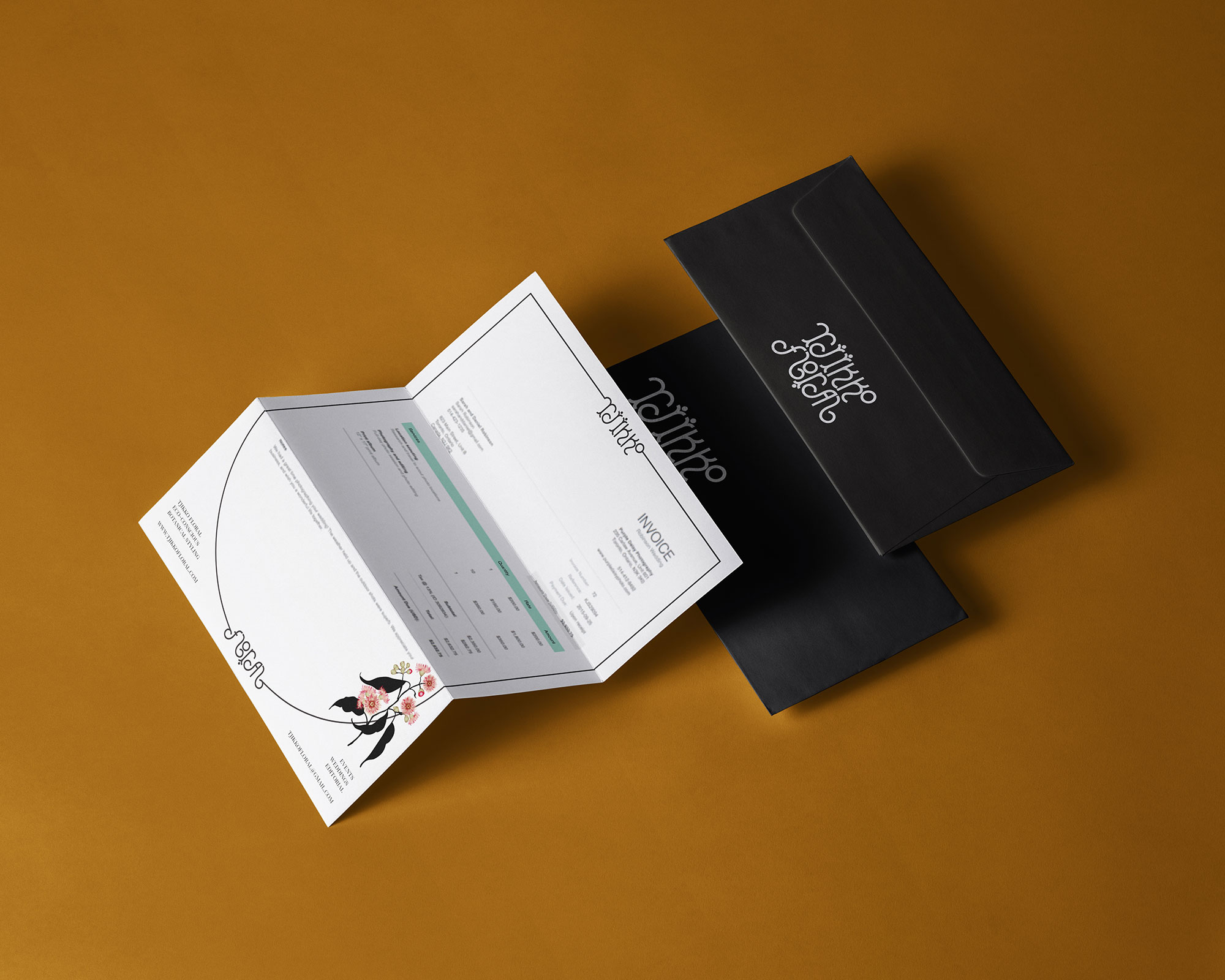
Client Brief:
We were tasked to create a utopian brand identiy for Tjikko Floral, an eco-conscious botanical stylist. The identity aspires towards Tjikko’s idea of an unfurling ecosystem, flourished with colour, variation, moist and mossy, dry and arid, with intricate shapes and coral like floral organisms, working perfectly in symbiosis with the most advanced human technology.
We were tasked to create a utopian brand identiy for Tjikko Floral, an eco-conscious botanical stylist. The identity aspires towards Tjikko’s idea of an unfurling ecosystem, flourished with colour, variation, moist and mossy, dry and arid, with intricate shapes and coral like floral organisms, working perfectly in symbiosis with the most advanced human technology.
Our Response:
We have created an identity that resonates with the clients vision. The custom logotype is fluid and organic, resembling an unfurling creeper that looks futurisitc and ancient at the same time.
We have created an identity that resonates with the clients vision. The custom logotype is fluid and organic, resembling an unfurling creeper that looks futurisitc and ancient at the same time.
Client Testimonial:
I just can't believe how accurately you telepathically visualised the concept after only a very short introduction. I'm actually just so moved! So excited, you guys are making my heart sing with every email!
Margie Lewis, Director, Tjikko Floral
I just can't believe how accurately you telepathically visualised the concept after only a very short introduction. I'm actually just so moved! So excited, you guys are making my heart sing with every email!
Margie Lewis, Director, Tjikko Floral

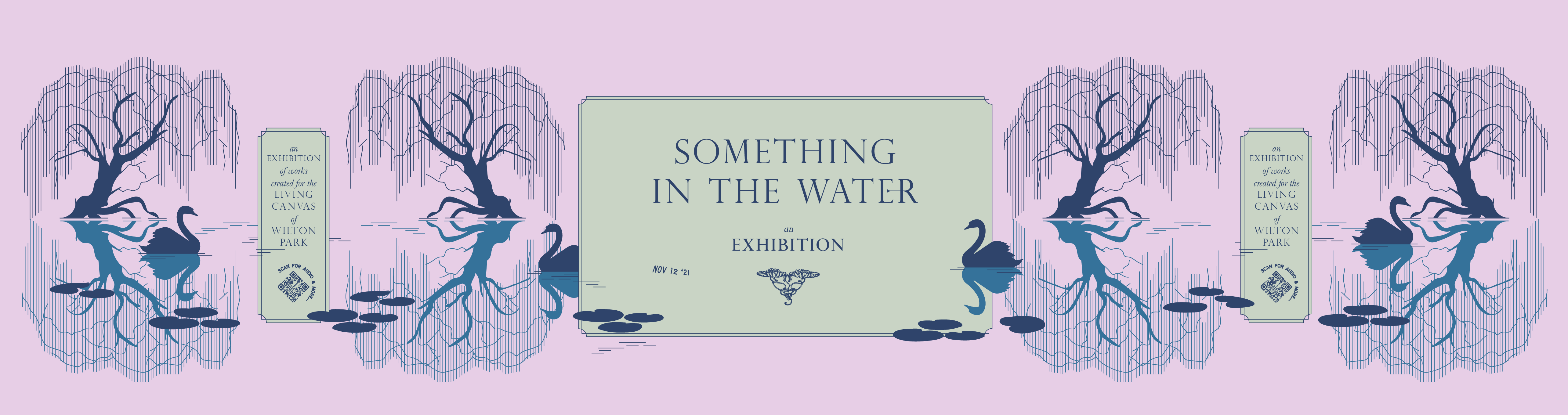
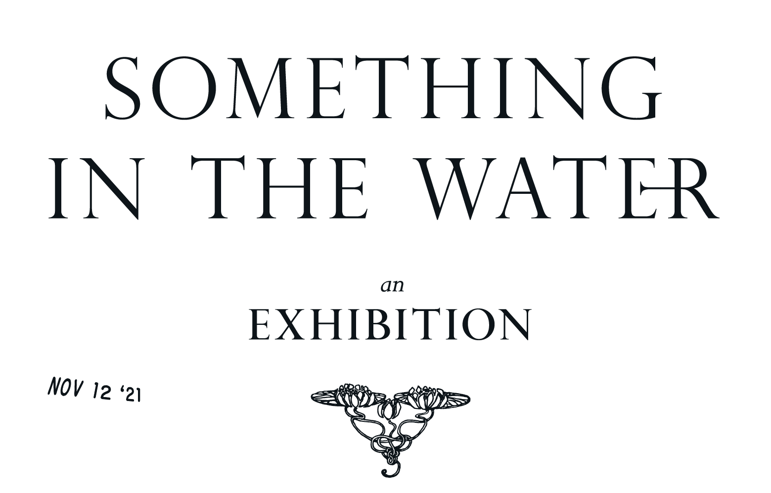
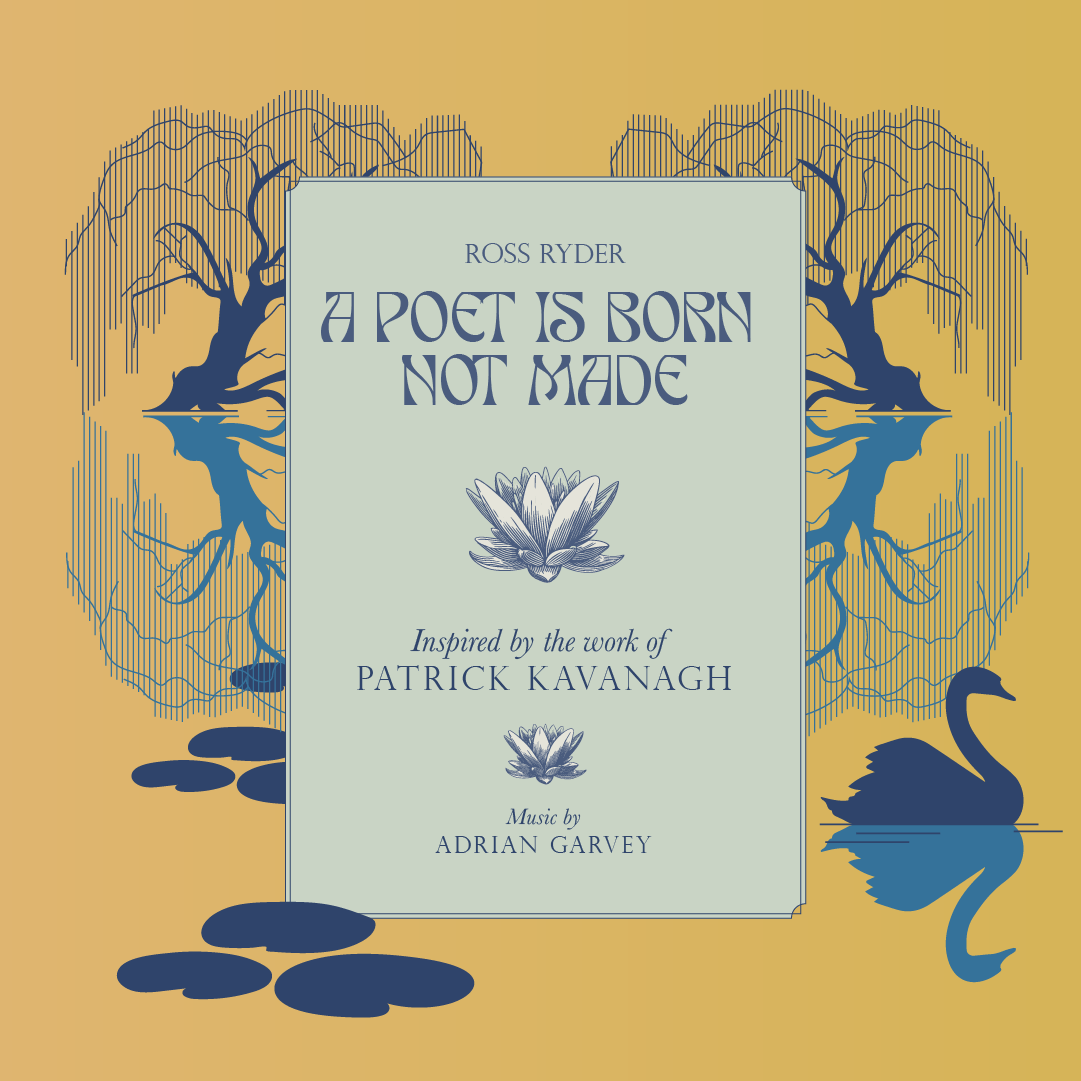
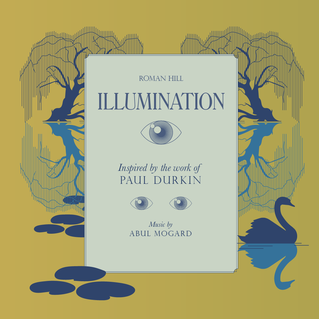
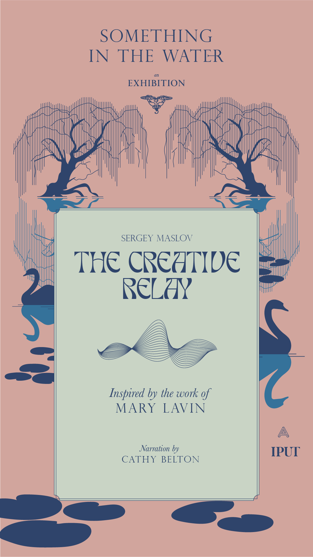
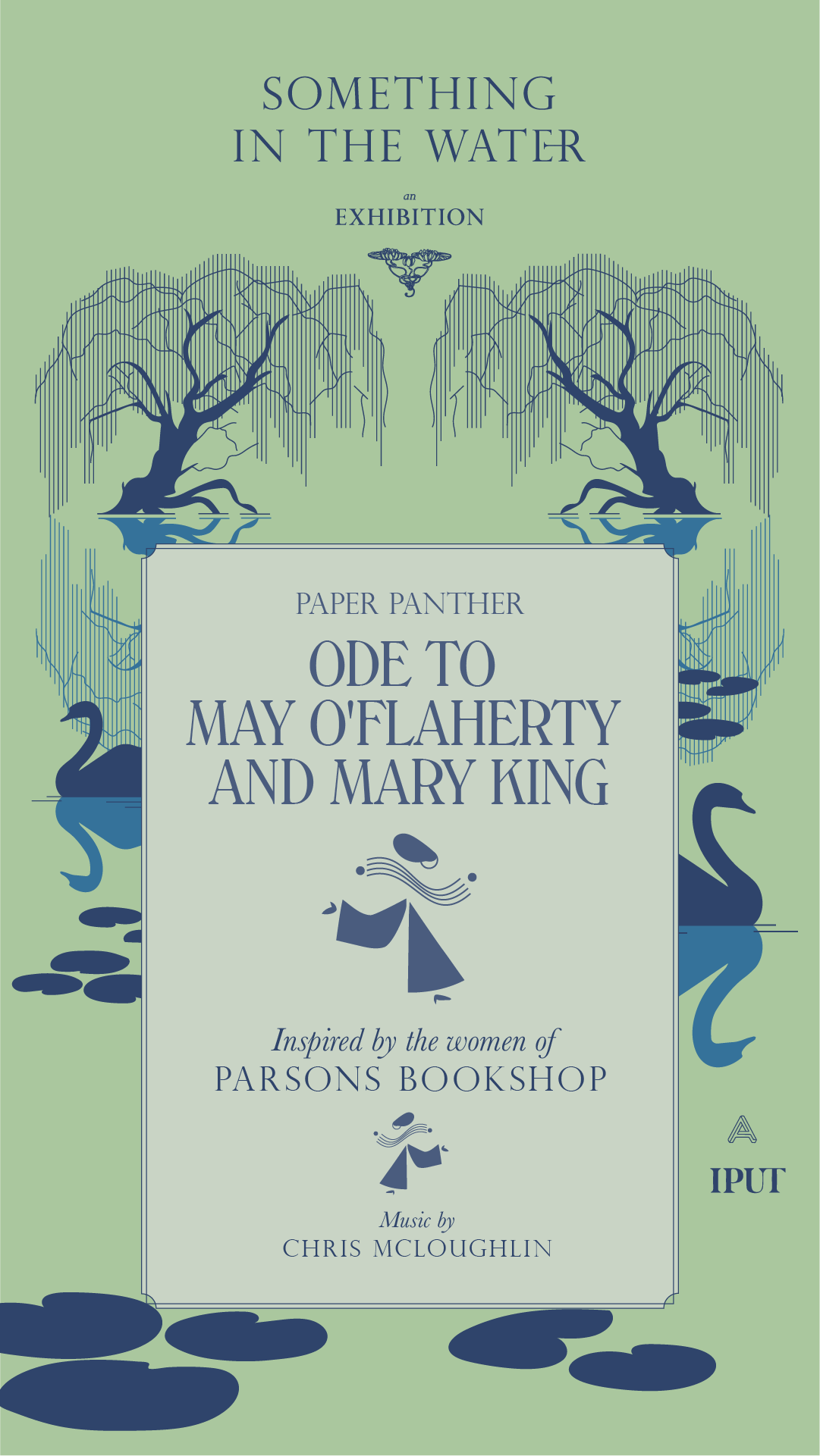
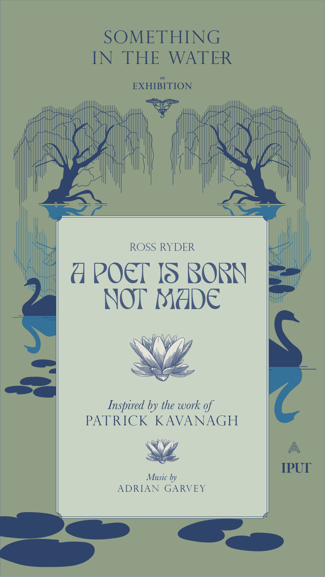
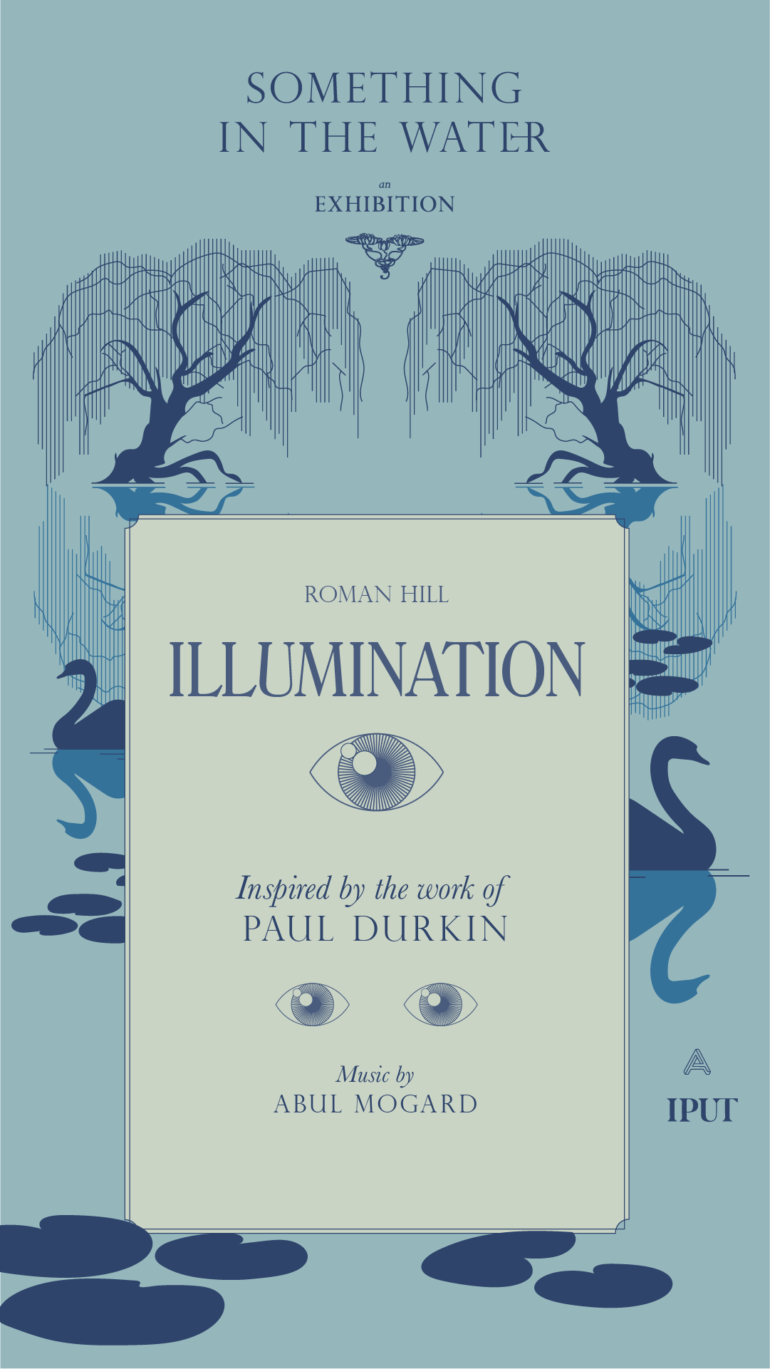
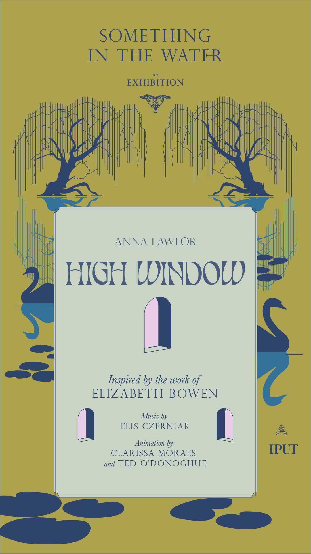
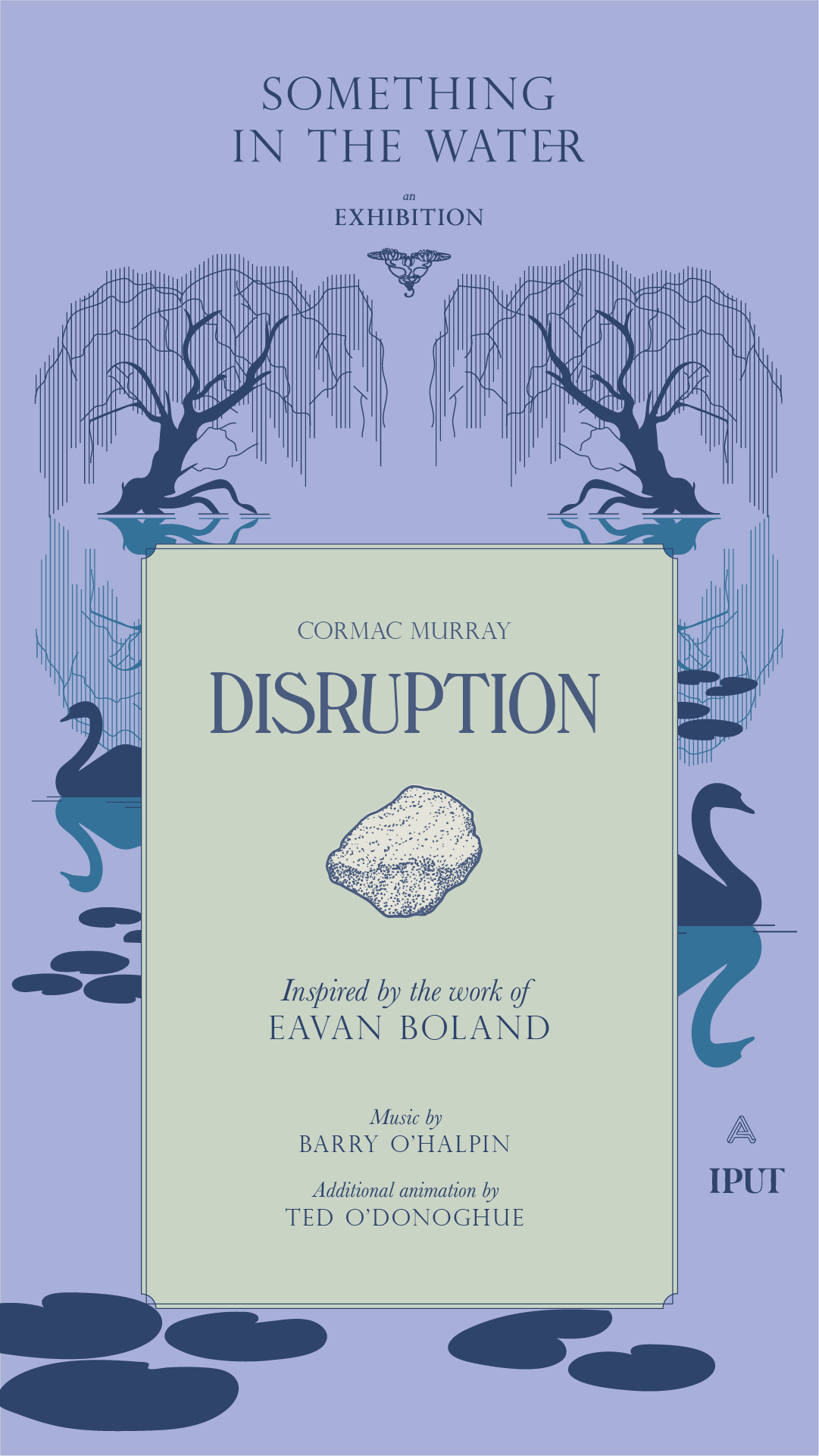
Client Brief:
Something in the Water was an exhibition of motion graphics pieces from 8 artists, displayed on a huge screen along the Grand Canal, Dublin. Taking inspiration from the literary history of the canal, the exhibition identity came to life as the unfolded dust jacket of a book.
Research began by looking at 20th century book covers of writers, antique book shops from the area and other printed ephemera from the Canal’s rich literary history. From these, the typographic style was developed and crafted into the main exhibition title.
Our Response:
The brand structure was also based on the exhibition as a book — each individual piece is like a chapter of the same book. We made bespoke social media assets for each artist to share with their followers and direct them to the exhibition’s channels, website and the exhibition itself.
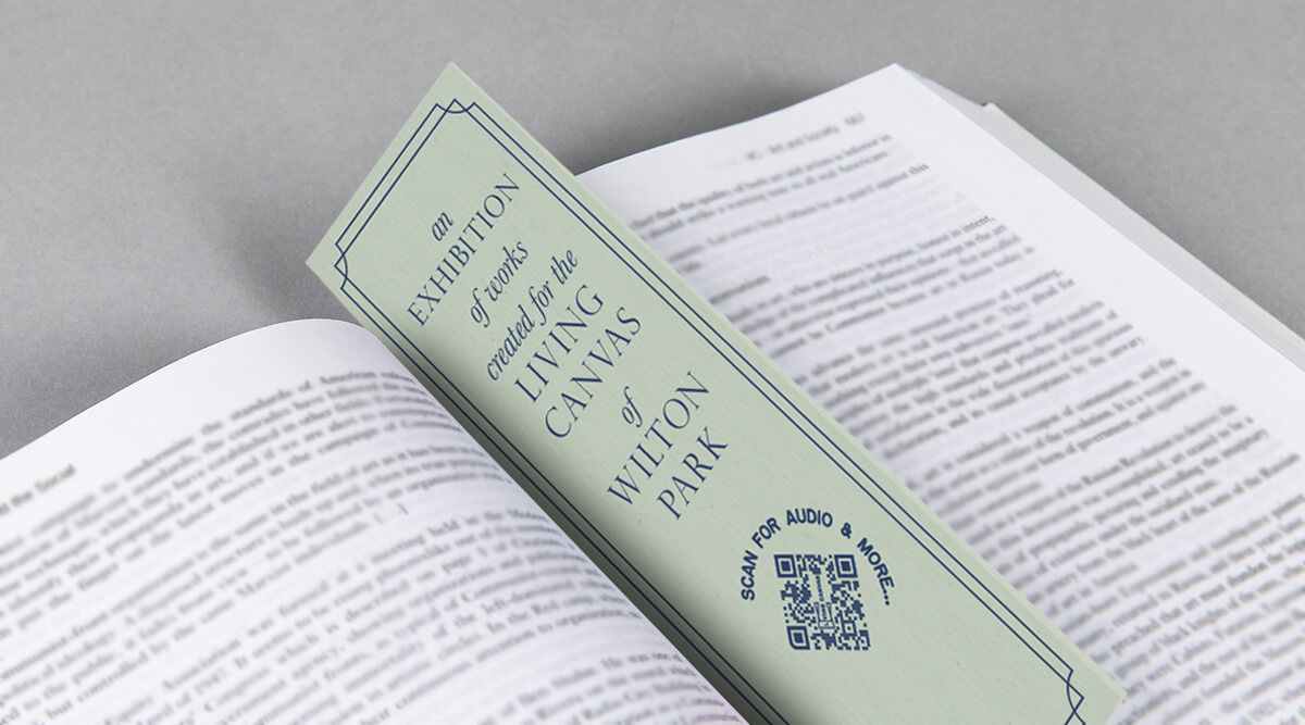
We created bookmarks with a QR code that were distributed in local bookshops. Turning the QR code on its side made it instantaneously decoractive!
The brand structure was also based on the exhibition as a book — each individual piece is like a chapter of the same book. We made bespoke social media assets for each artist to share with their followers and direct them to the exhibition’s channels, website and the exhibition itself.
We created bookmarks with a QR code that were distributed in local bookshops. Turning the QR code on its side made it instantaneously decoractive!


2021
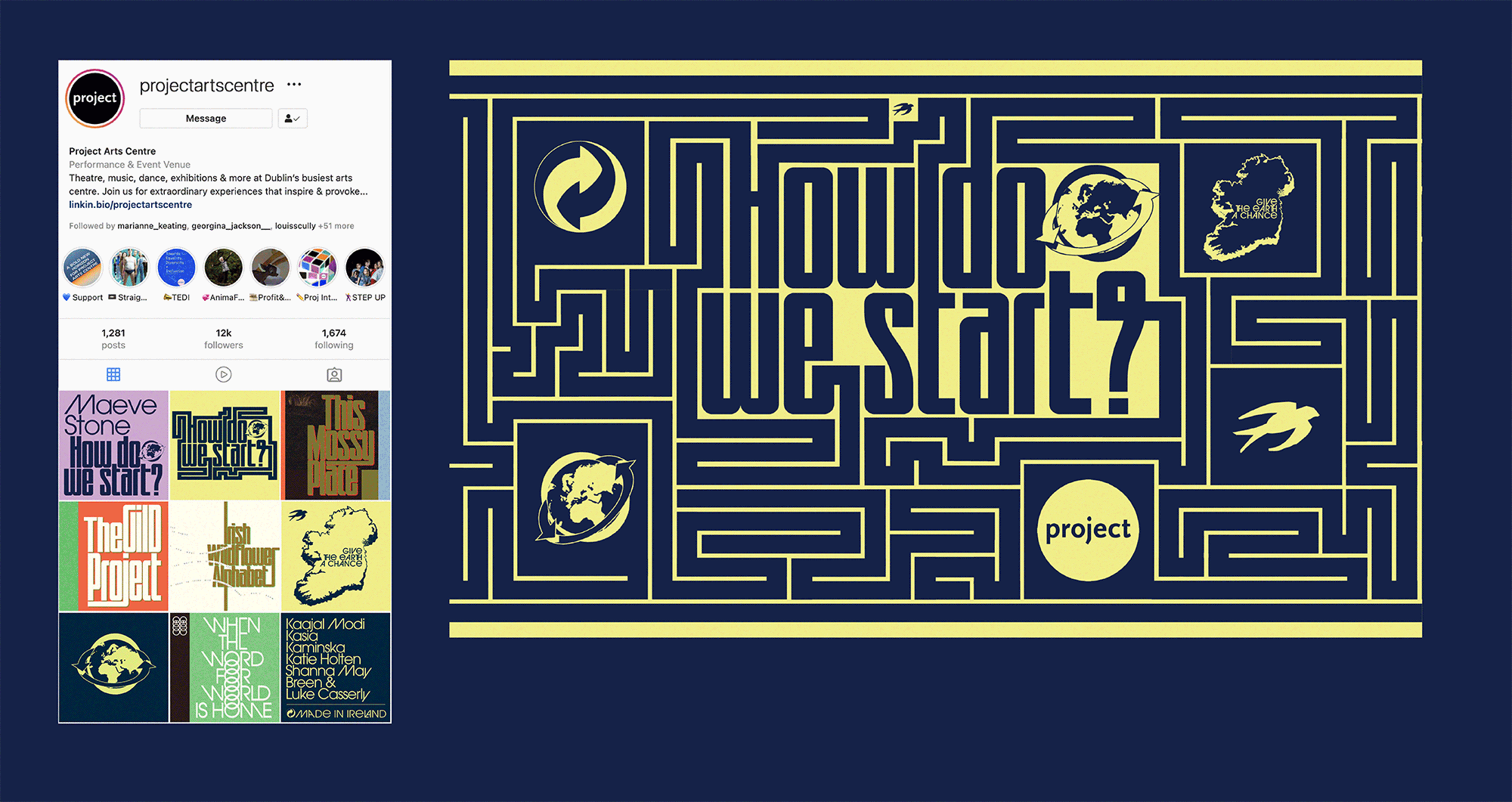
Client: Project Arts Centre
![]()
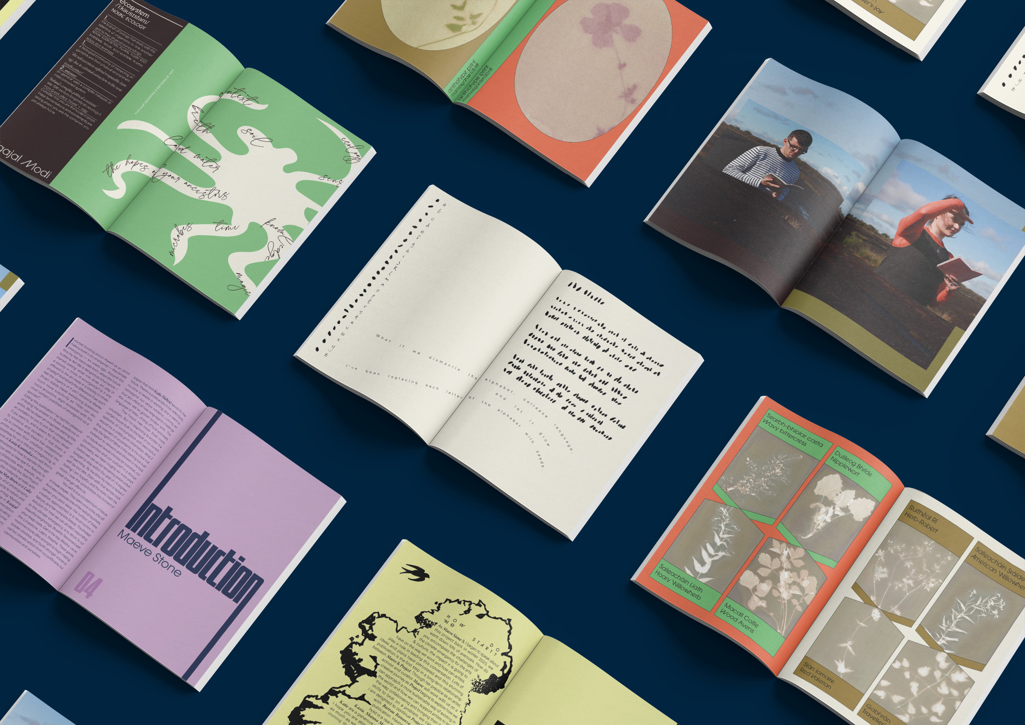
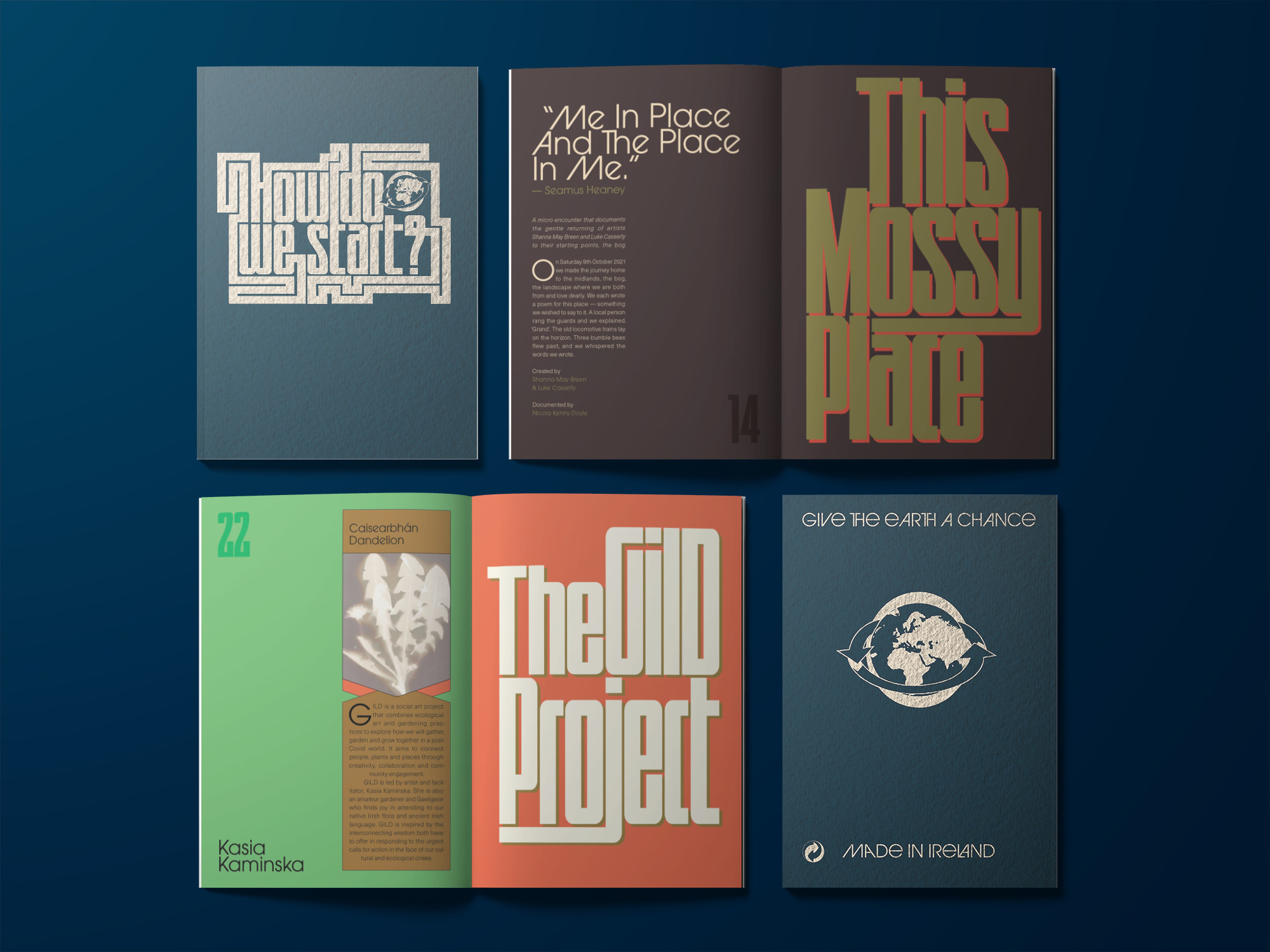
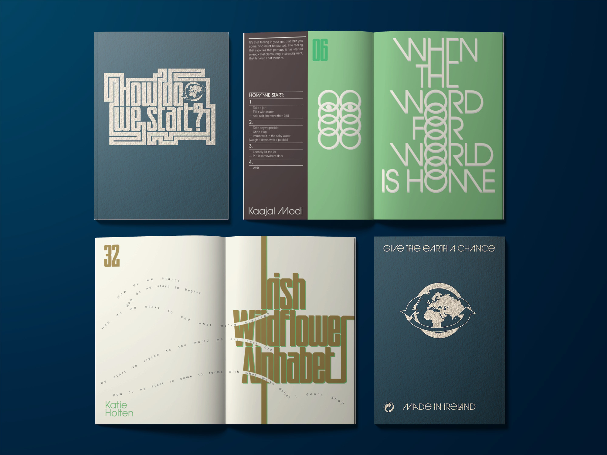
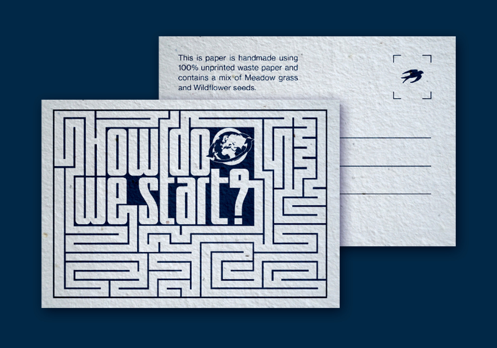
How Do We Start?Publication
Client: Project Arts Centre
How do you encompass the challenges of the climate emergency for the Arts & Culture, the impact it is going to have on the way we work and how can artists play a role in leading this conversation?
Commissioned by the Project Arts Centre, How Do We Start? explores how they as a cultural institution can approach a more sustainable way of existing in the world and how to support artists to lead the way by collaborating and bringing their dynamic skills to bear on the problem.
The publication was edited by Maeve Stone & Cian O’Brien, with contributions from; artists Kasia Kaminska, Shanna May Breen & Luke Casserly, Katie Holten and Kaajal Modi. The artists’s work explore the question ‘How Do We Start?’ in ways of practical instructions, poetry, speculations, image making, and language.
We were inspired by the pragmatic and instructional nature of the artist contributions to base the design on Make-and-Do-Books from our childhood. The aesthetic of these books with their bold colours and framed text and images became a starting point for the book. On the cover and on a postcard (printed on plantable paper stock with wild flower seeds), the question ‘How Do We Start?’ expands out into a maze from several directions and explores ways of answering itself. This theme was extended further in the promotional elements of the project.
A major challenge of the project was to justify the contradiction of producing an object that addresses the climate crisis. We talked directly with paper manufacturers and printers about how we could find ways to minimise the impact of production and waste by using plant based inks, recycled papers, available offcuts and how to minimise transport and deliveries. It was a great learning experience for us as designers of books that will inform the way we work in the future.
A major challenge of the project was to justify the contradiction of producing an object that addresses the climate crisis. We talked directly with paper manufacturers and printers about how we could find ways to minimise the impact of production and waste by using plant based inks, recycled papers, available offcuts and how to minimise transport and deliveries. It was a great learning experience for us as designers of books that will inform the way we work in the future.
2020
Big Art Energy
Client: Project Arts Centre
![]()
Big Art Energy
Publication
Client: Project Arts Centre
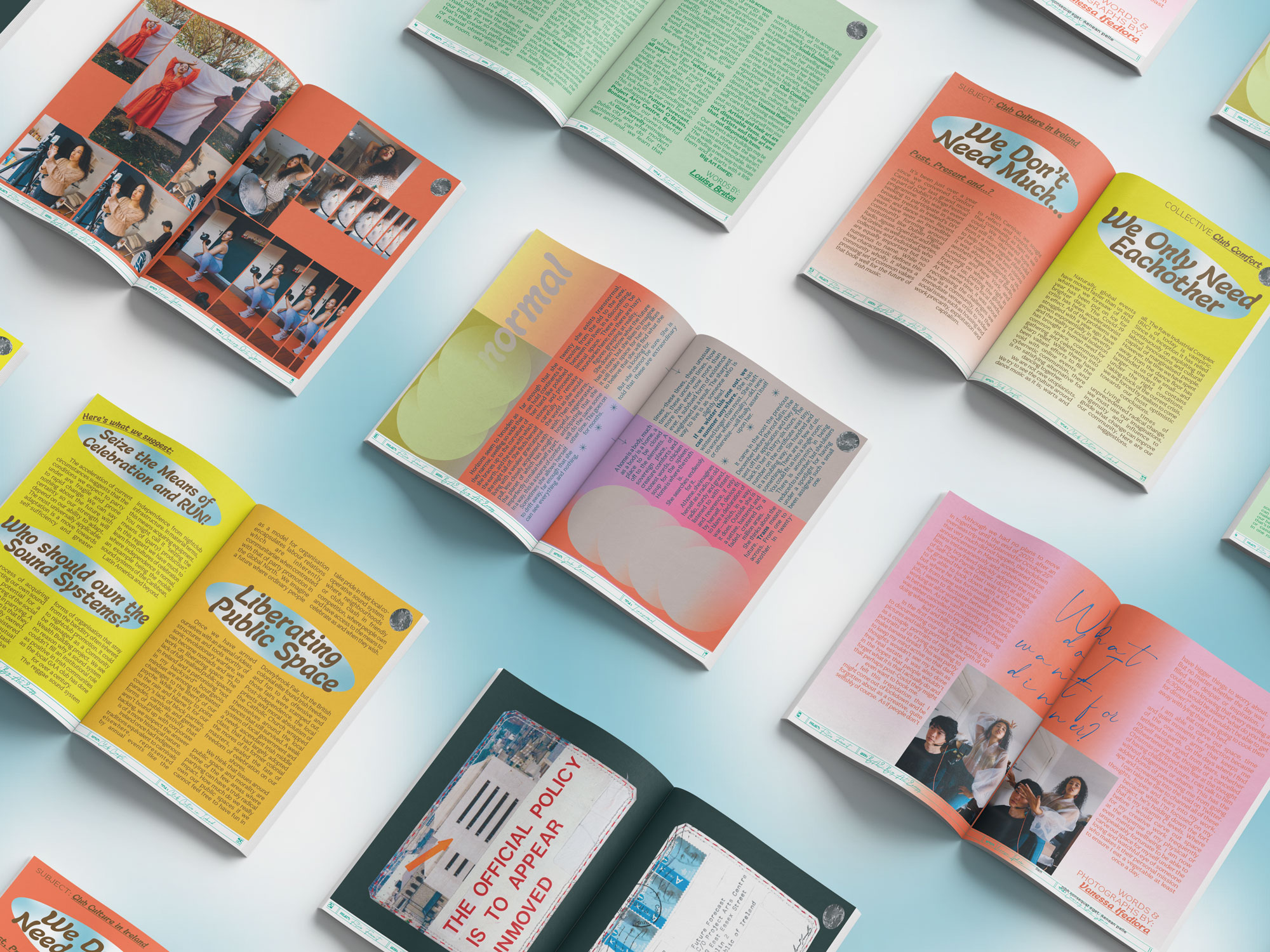
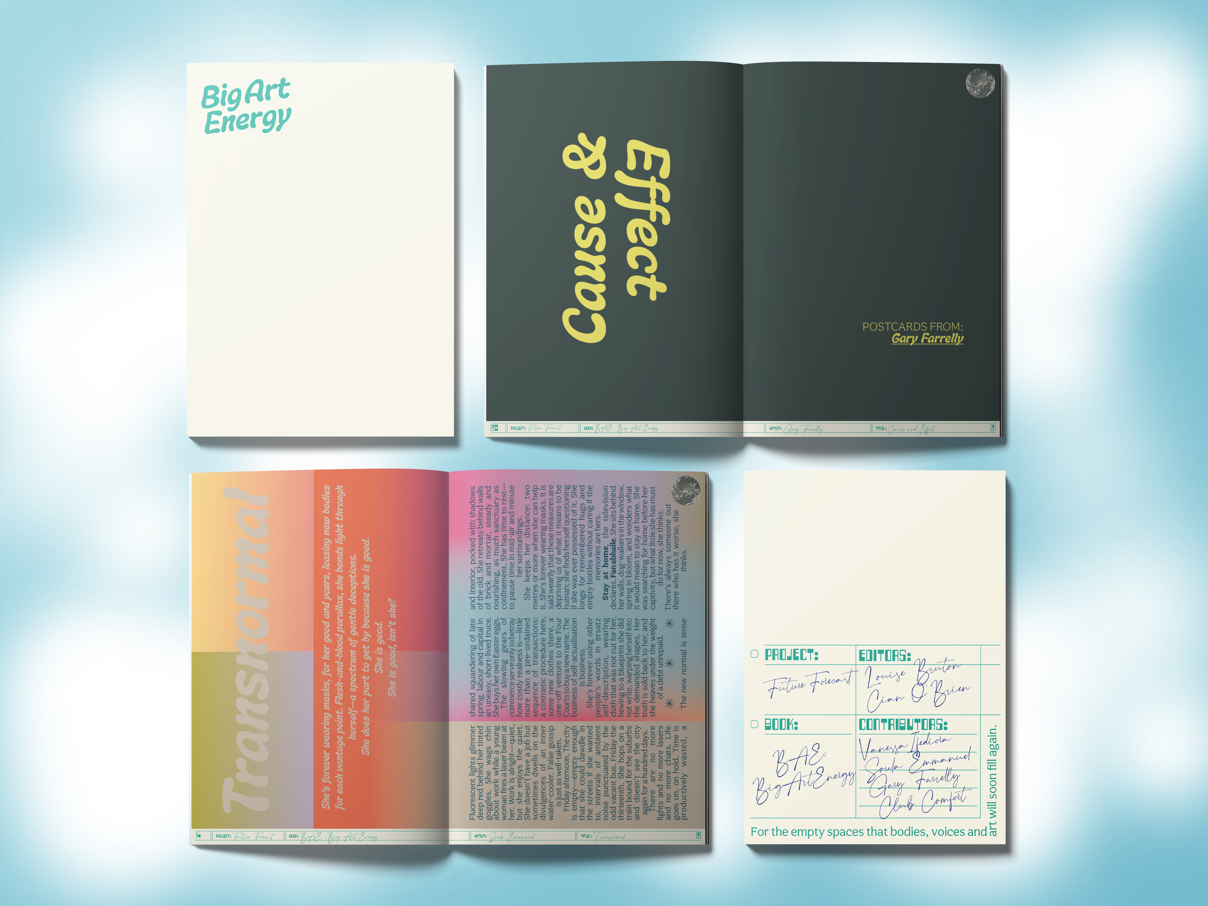
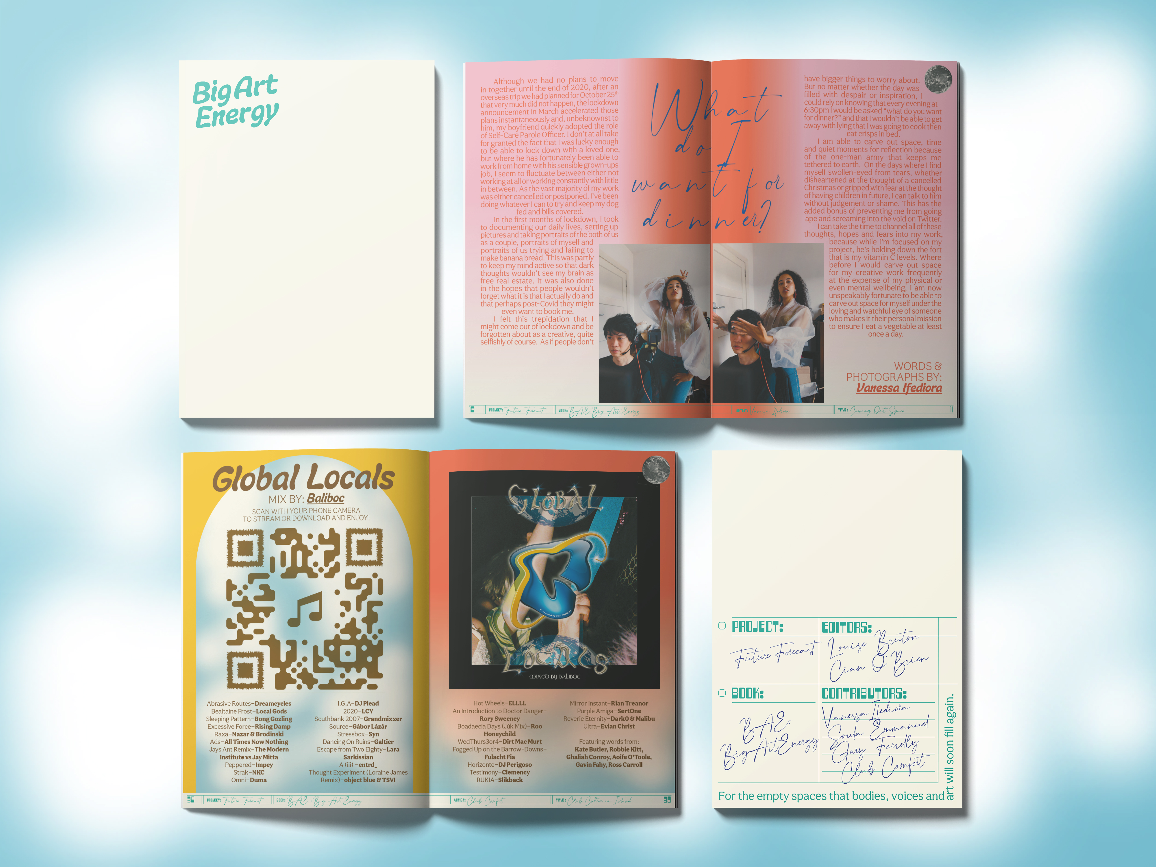
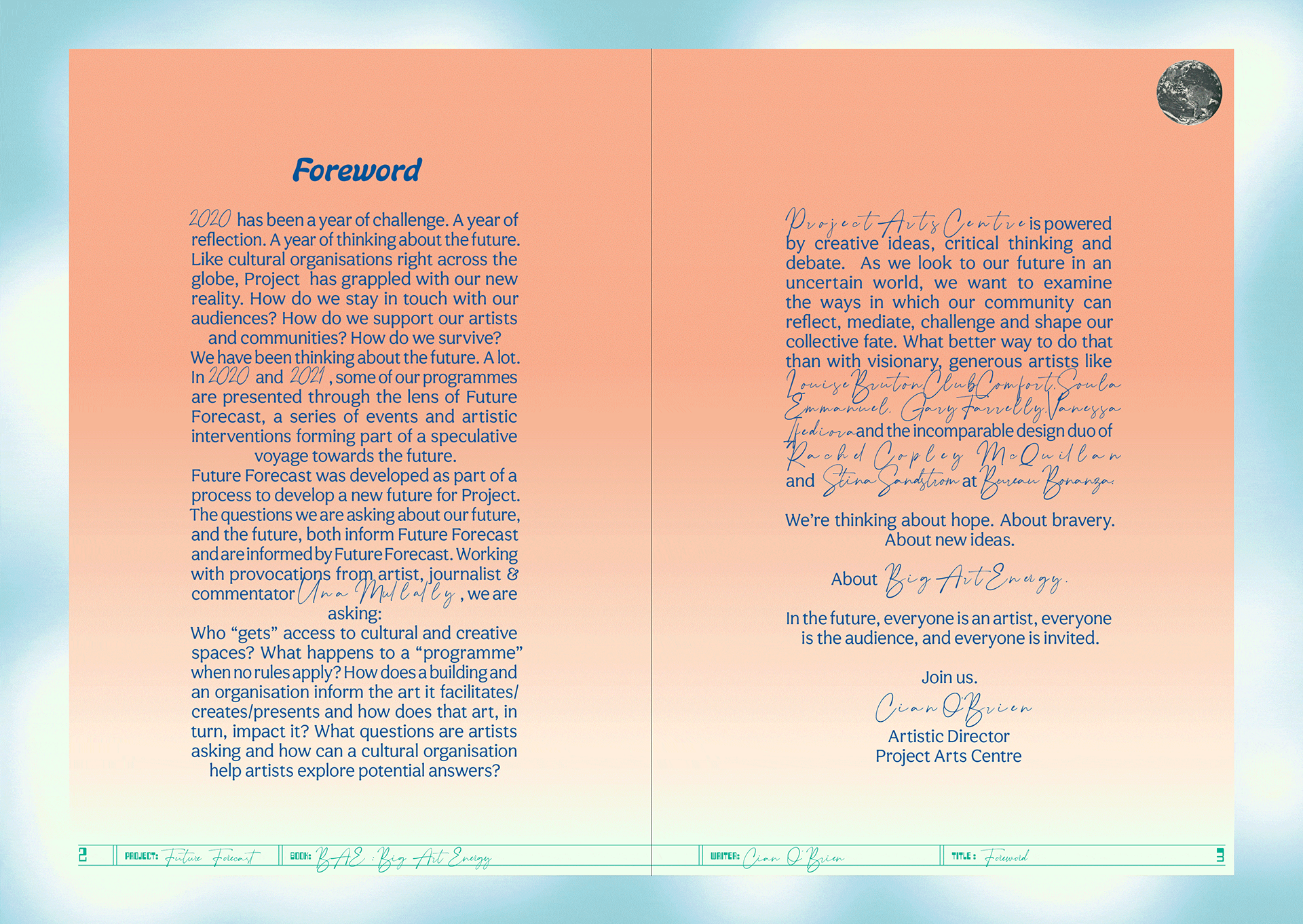
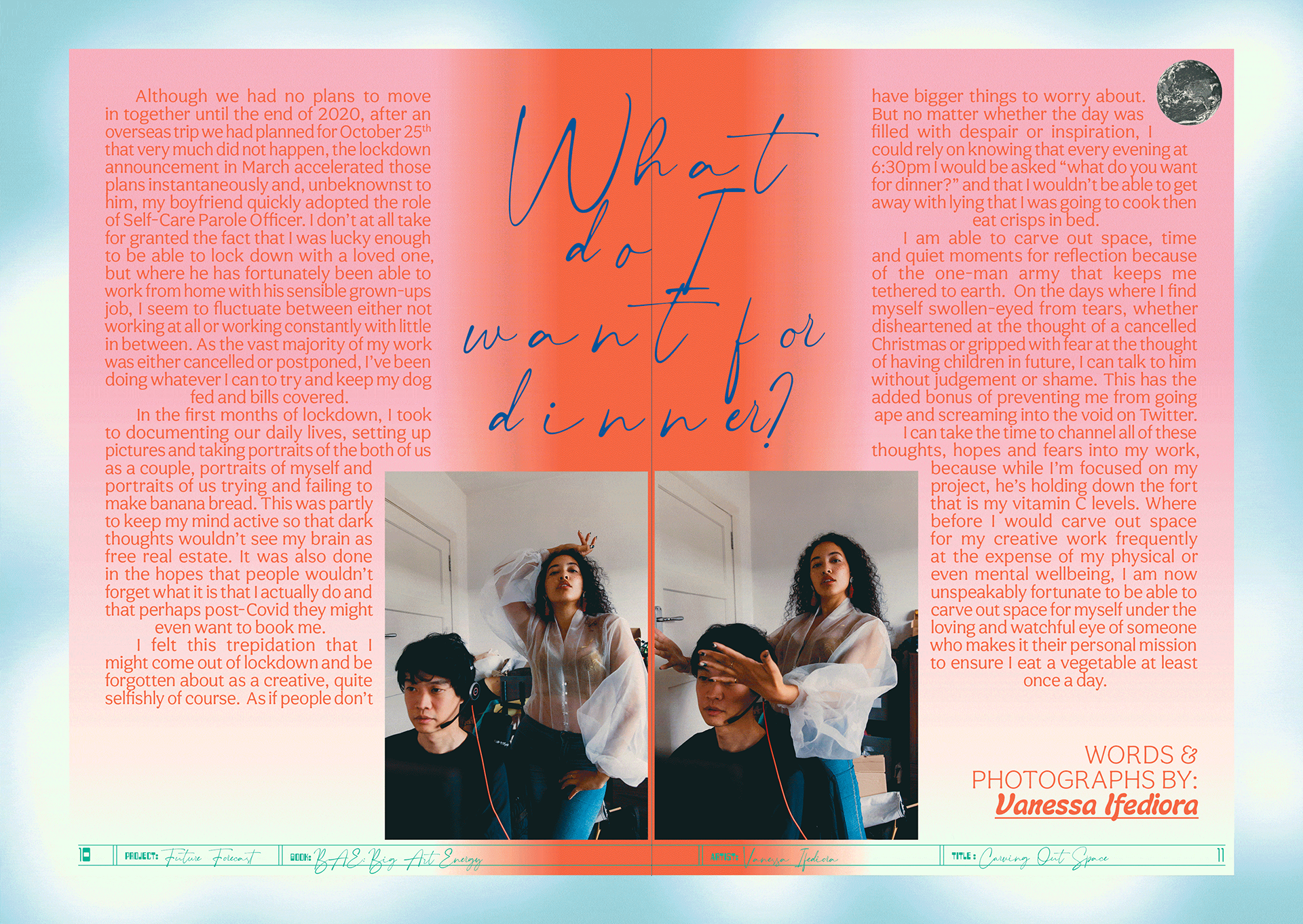
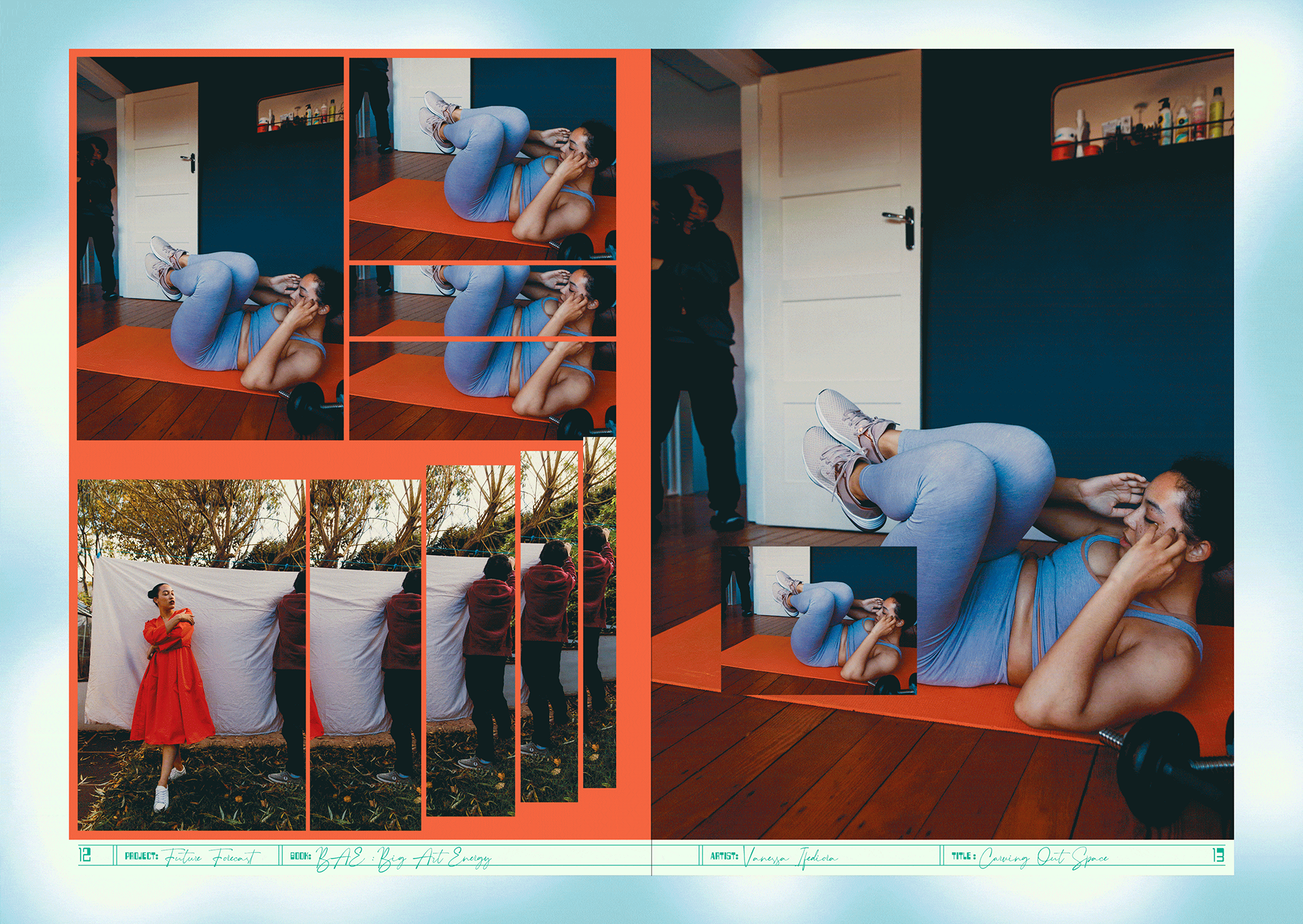
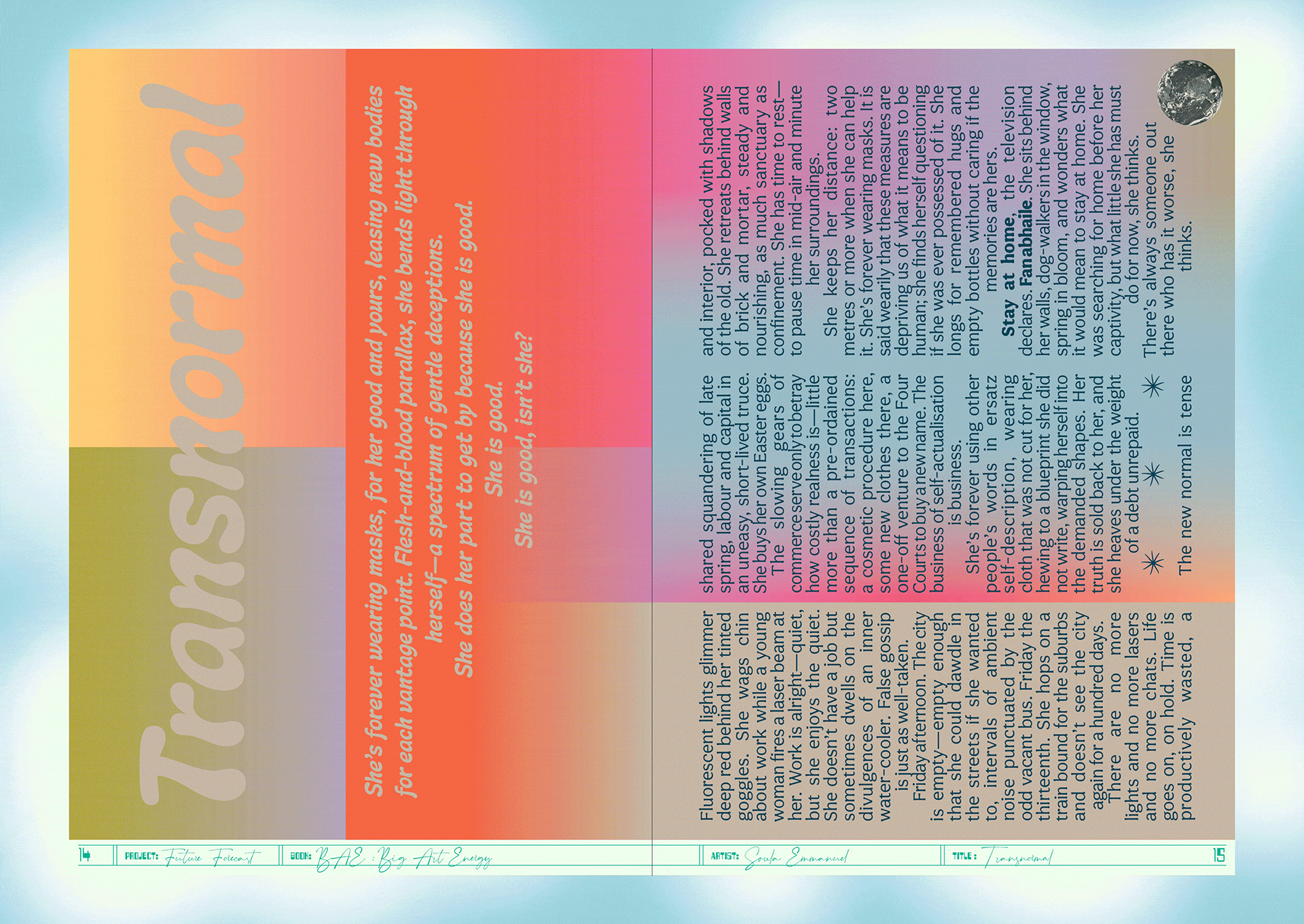
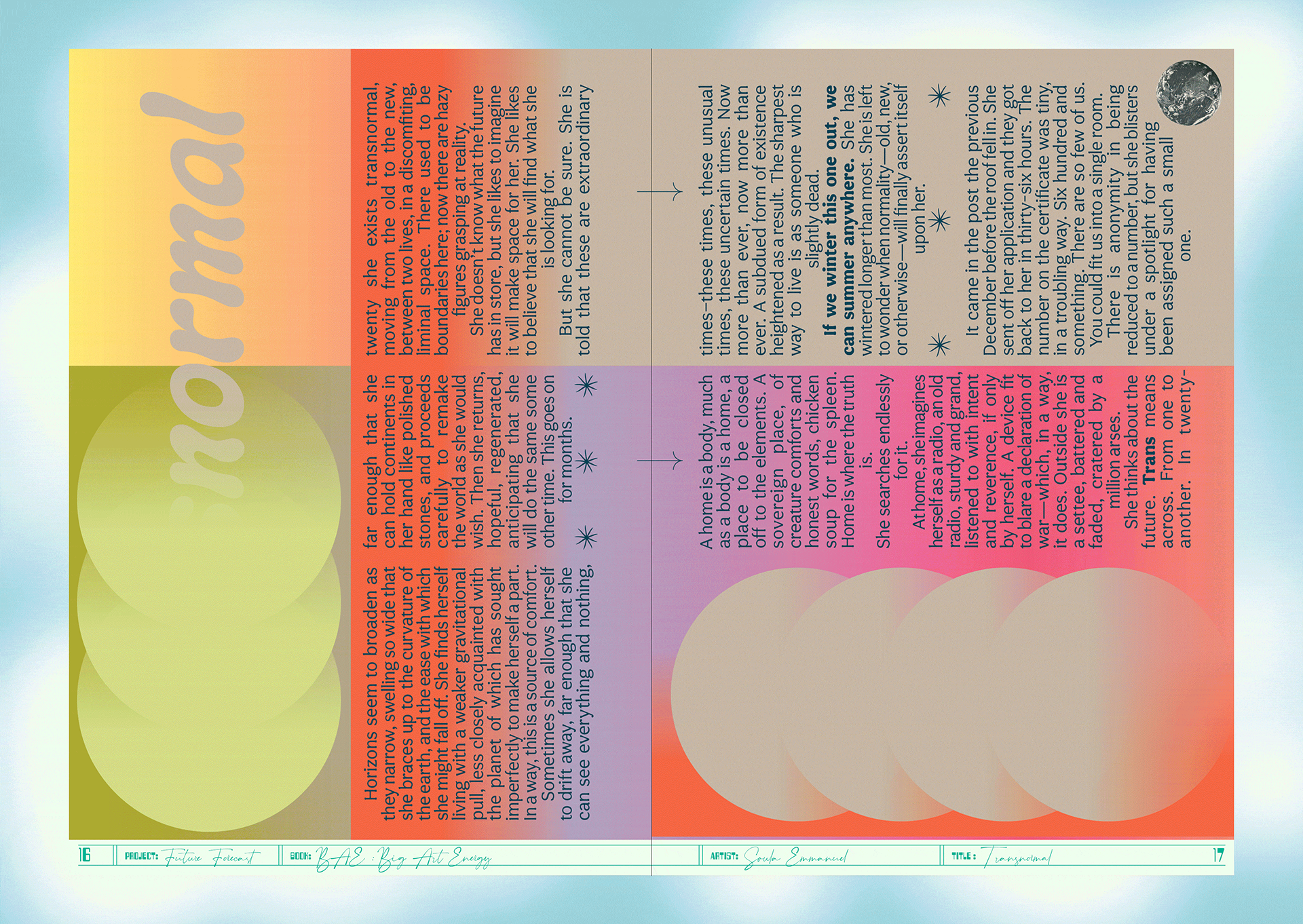
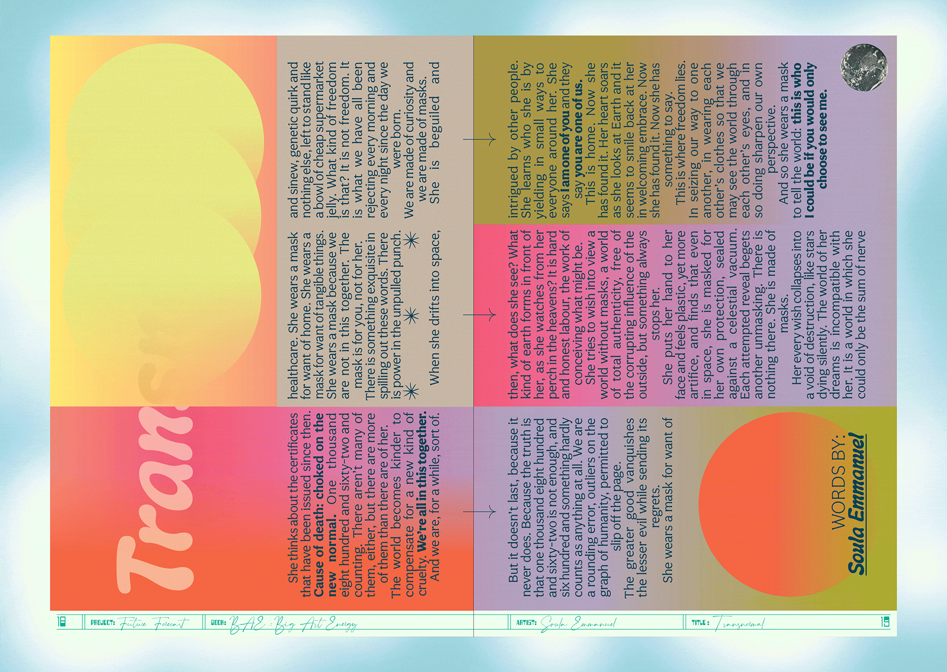
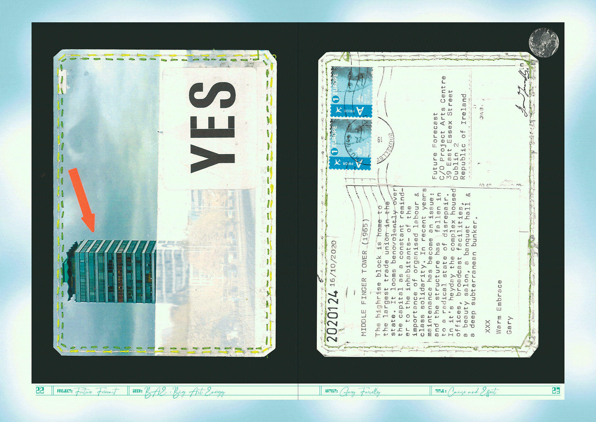
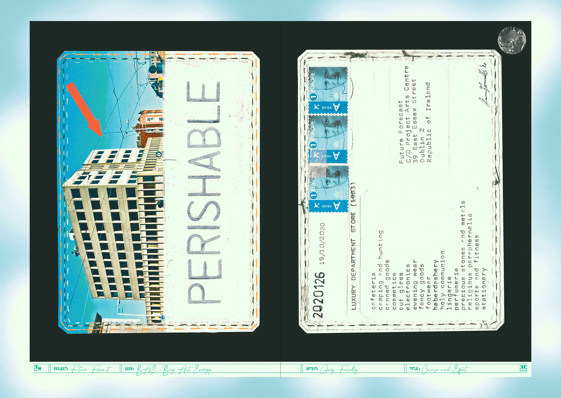
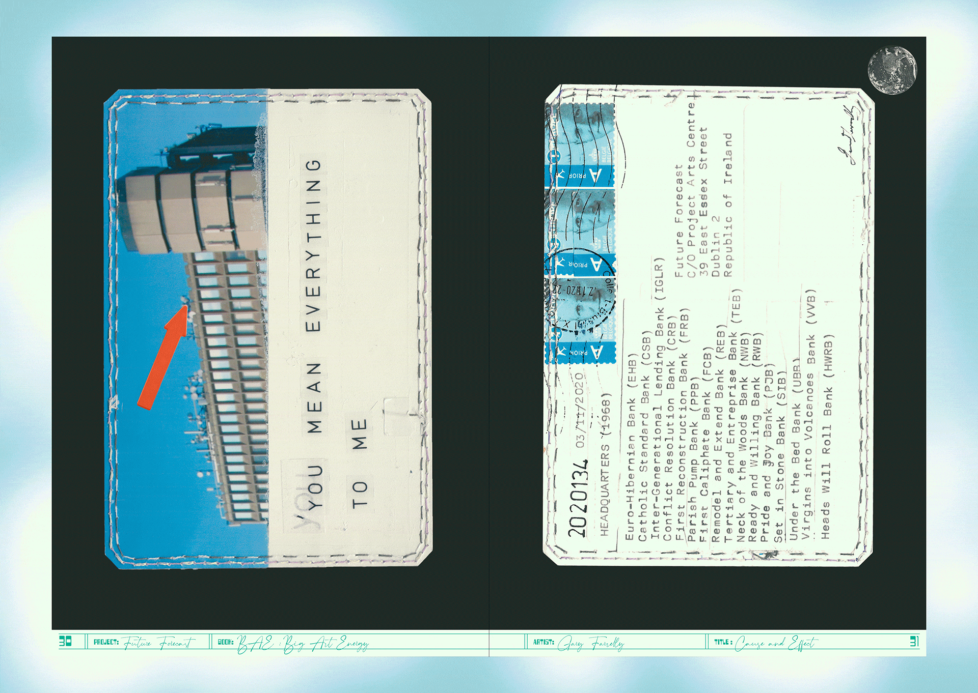
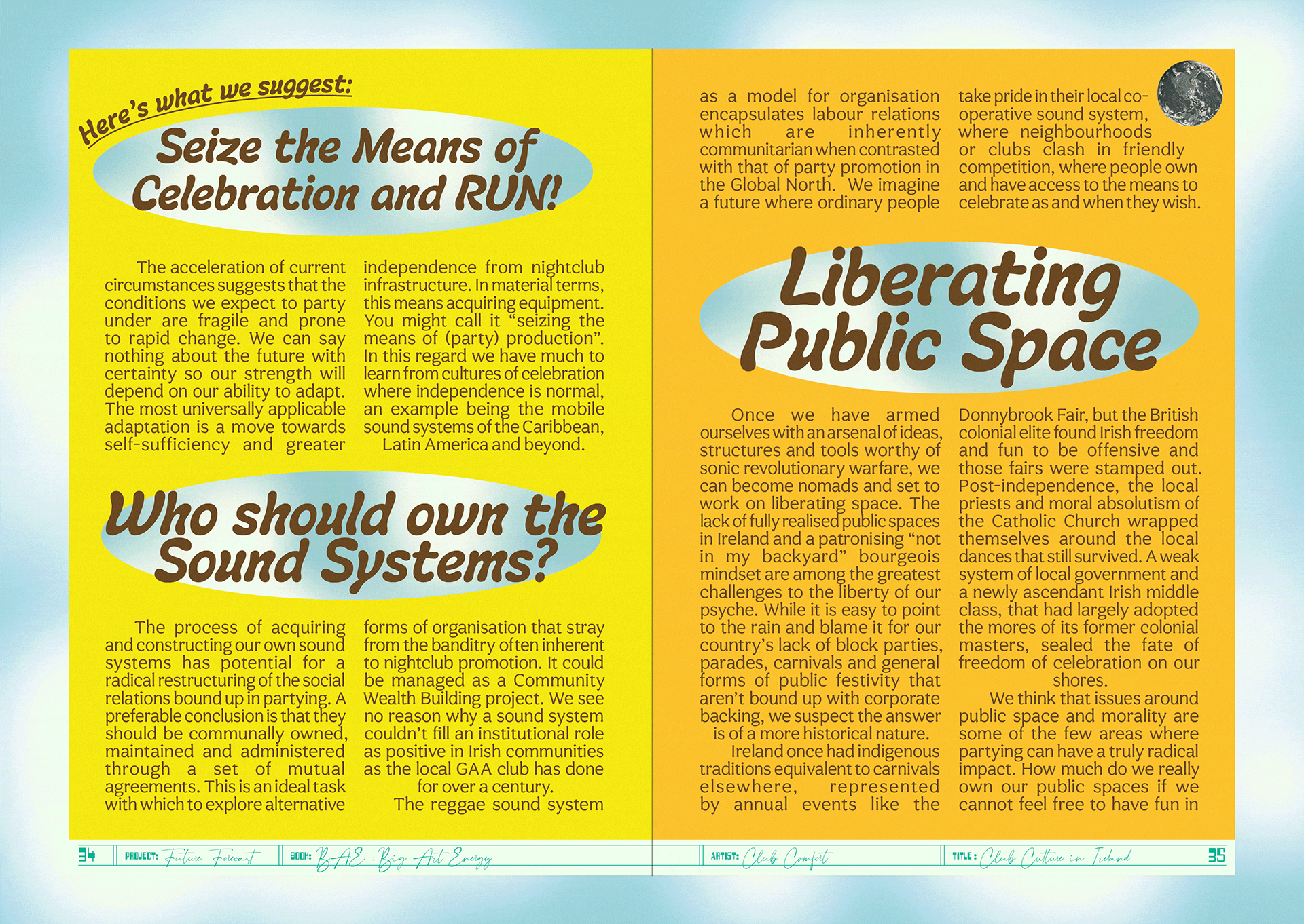
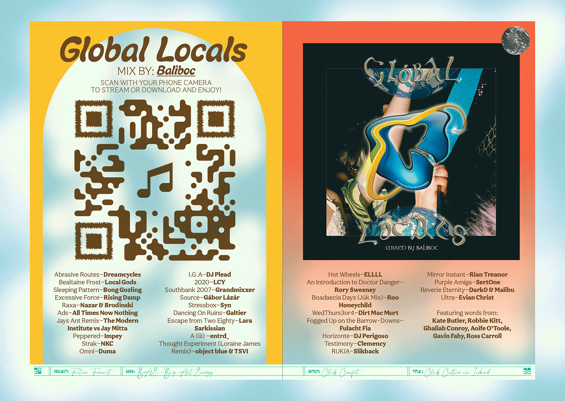
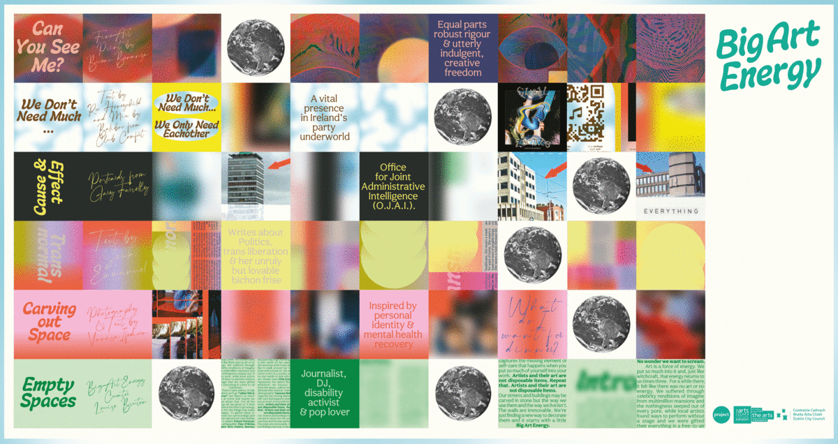
The art publication Big Art Energy was commissioned by the Project Arts Centre as part of Future Forecast—a series of events and artistic interventions forming part of a speculative voyage towards the future.
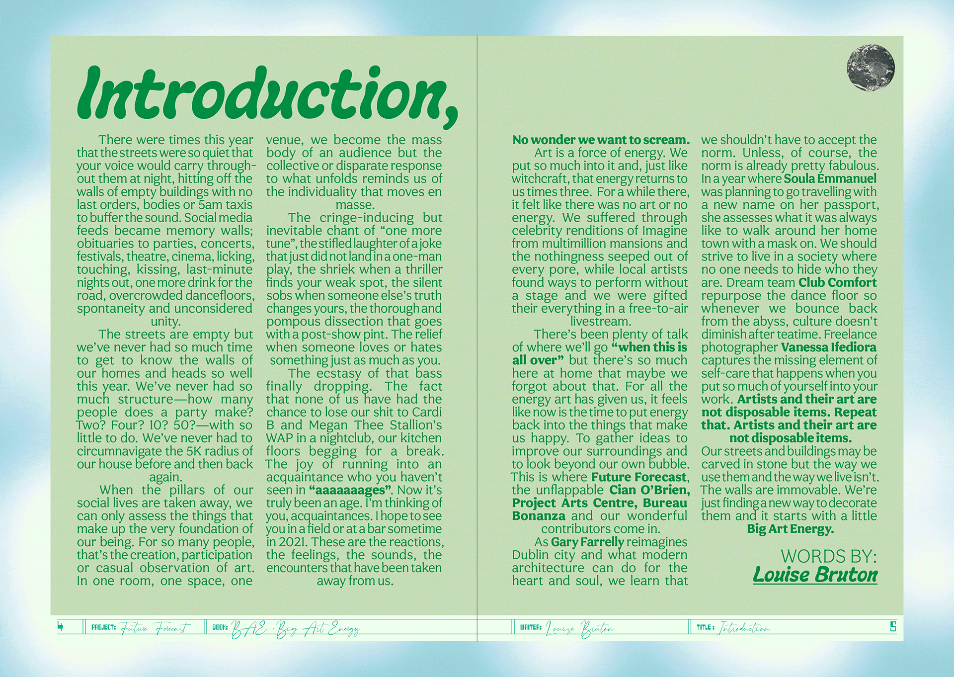
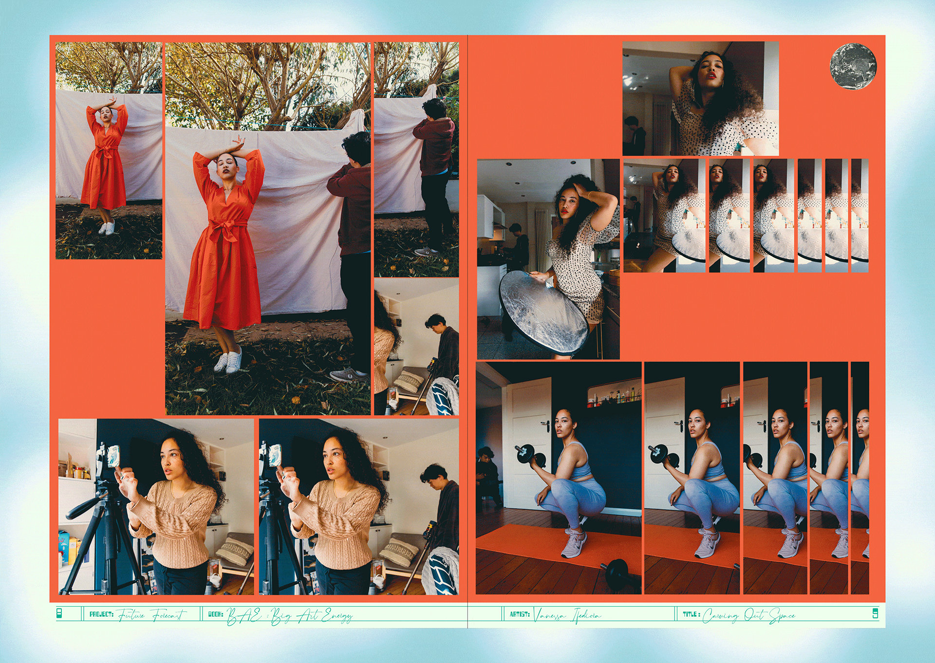
The publication was edited by Louise Bruton & Cian O’Brien, with contributions from; photographer Vanessa Ifediora, writer Soula Emmanuel, artist Gary Farrelly and party makers Club Comfort. Big Art Energy showcases these artists’ reactions to the pandemic, response to lockdown and forecasts of the future of their respective industry or field of art.
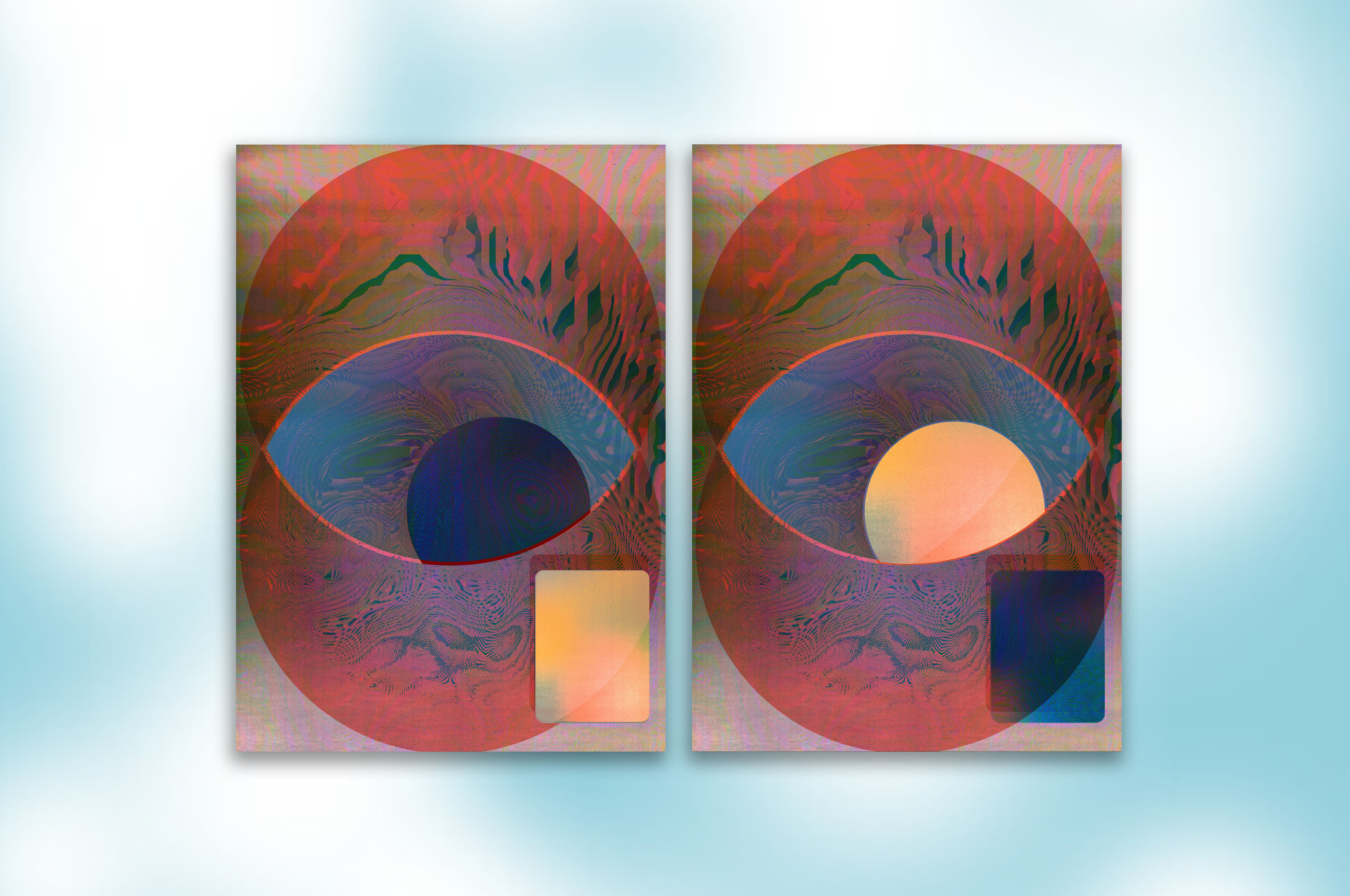
We designed a package to be sent out by post with the limited edition publication and our contribution the fine art print ‘Can You See Me?’, a happy accident sprung from a series of technological failures. A beautiful blur of a screenshot from FaceTime during a failing internet connection became an intriguing portrait of ourselves and our new way of working.
Initially inspired by journals, especially Aisling copy books, the book would act as diary or log book to record and express our inner thoughts and feelings during lockdown. Taking from those visual cues, the cover of the book is plain, quiet and still with the inside being akin the inside of your head and how you might be feeling in the midst of the pandemic—cluttered, maybe a little bit claustrophobic and anxious but colourful and beautiful and overall, hopeful.
The publication was edited by Louise Bruton & Cian O’Brien, with contributions from; photographer Vanessa Ifediora, writer Soula Emmanuel, artist Gary Farrelly and party makers Club Comfort. Big Art Energy showcases these artists’ reactions to the pandemic, response to lockdown and forecasts of the future of their respective industry or field of art.
We designed a package to be sent out by post with the limited edition publication and our contribution the fine art print ‘Can You See Me?’, a happy accident sprung from a series of technological failures. A beautiful blur of a screenshot from FaceTime during a failing internet connection became an intriguing portrait of ourselves and our new way of working.
Initially inspired by journals, especially Aisling copy books, the book would act as diary or log book to record and express our inner thoughts and feelings during lockdown. Taking from those visual cues, the cover of the book is plain, quiet and still with the inside being akin the inside of your head and how you might be feeling in the midst of the pandemic—cluttered, maybe a little bit claustrophobic and anxious but colourful and beautiful and overall, hopeful.
We employed a design process inspired by a common concept in architecture and city planning referred to as desire lines; “paths & tracks made over time by the wishes & feet of walkers, especially those paths that run contrary to design or planning”; or “free-will ways.” While first using a strict grid and typographic rules to create a foundation we then allowed our human instinct to take over and Big Art Energy to fill-in, spill over, doodle, colour-in, make notes in the margins and practice our autograph over and over, just like you would in a journal.
These interventions gave each section for the contributing artists a distinct look and feel specific to the content, yet, there remains a unity to the publication thanks to the rigour of the typography and editorial layout.
An extensive web, social media and print campaign gave BAE massive traction. As well as providing Project Arts Centre with a social media strategy and content, we created dynamic and personalised social media animations for all the contributing artists to share on their own social media platforms, while also providing all the necessary information for people interested in ordering the package. A billboard and posters outside of the Project put a smile on the faces of a few the passers-by in Temple Bar.


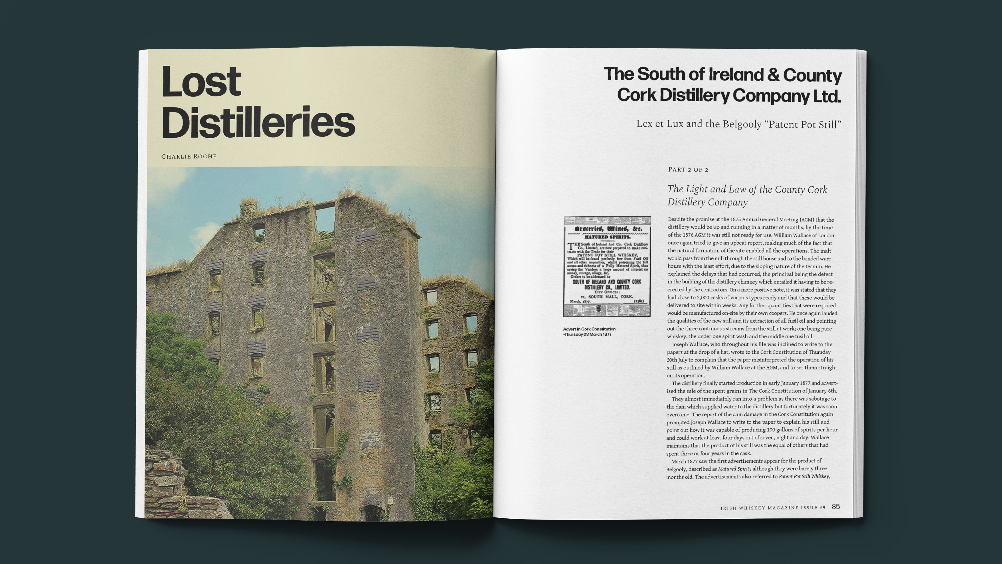
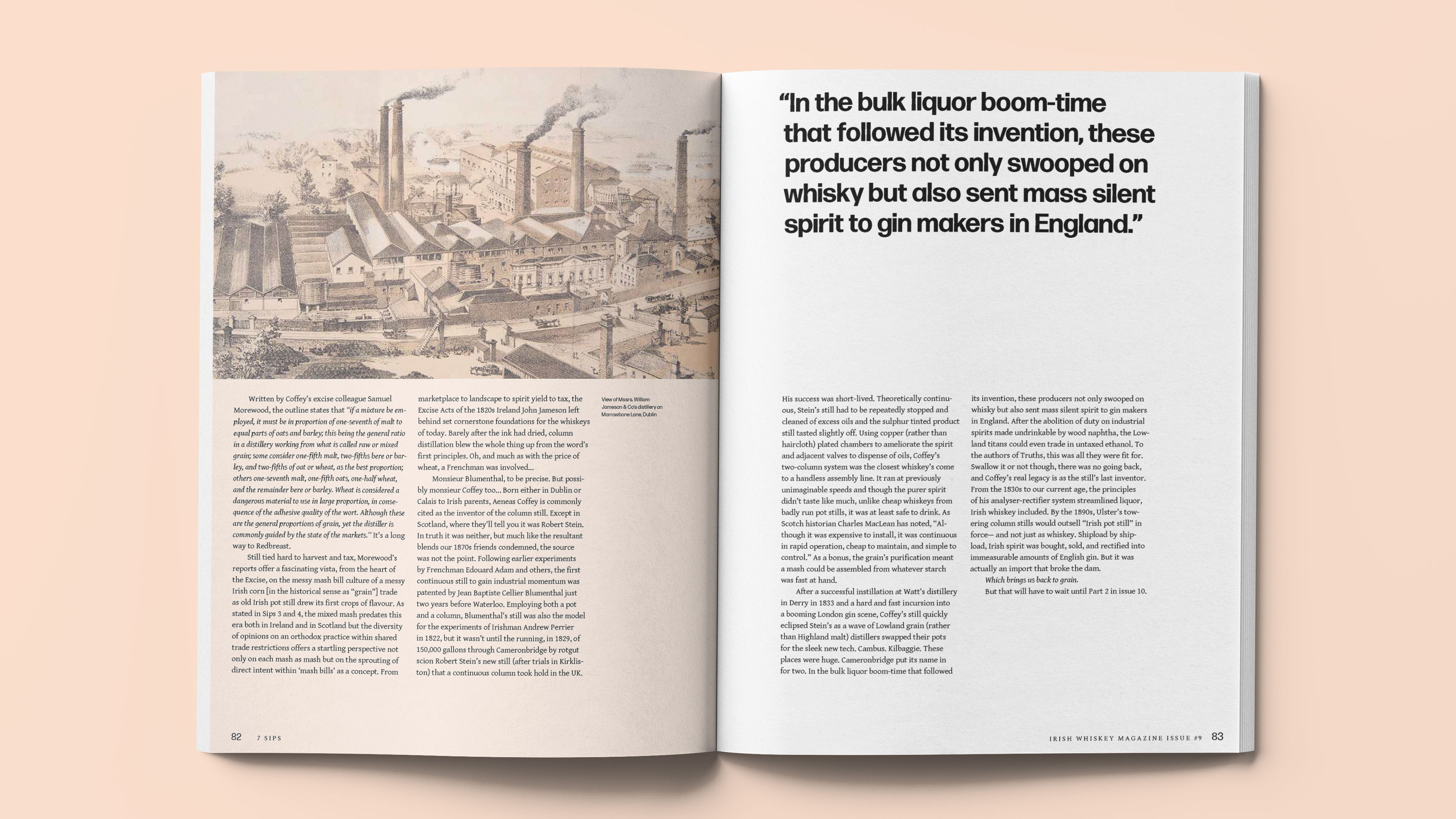
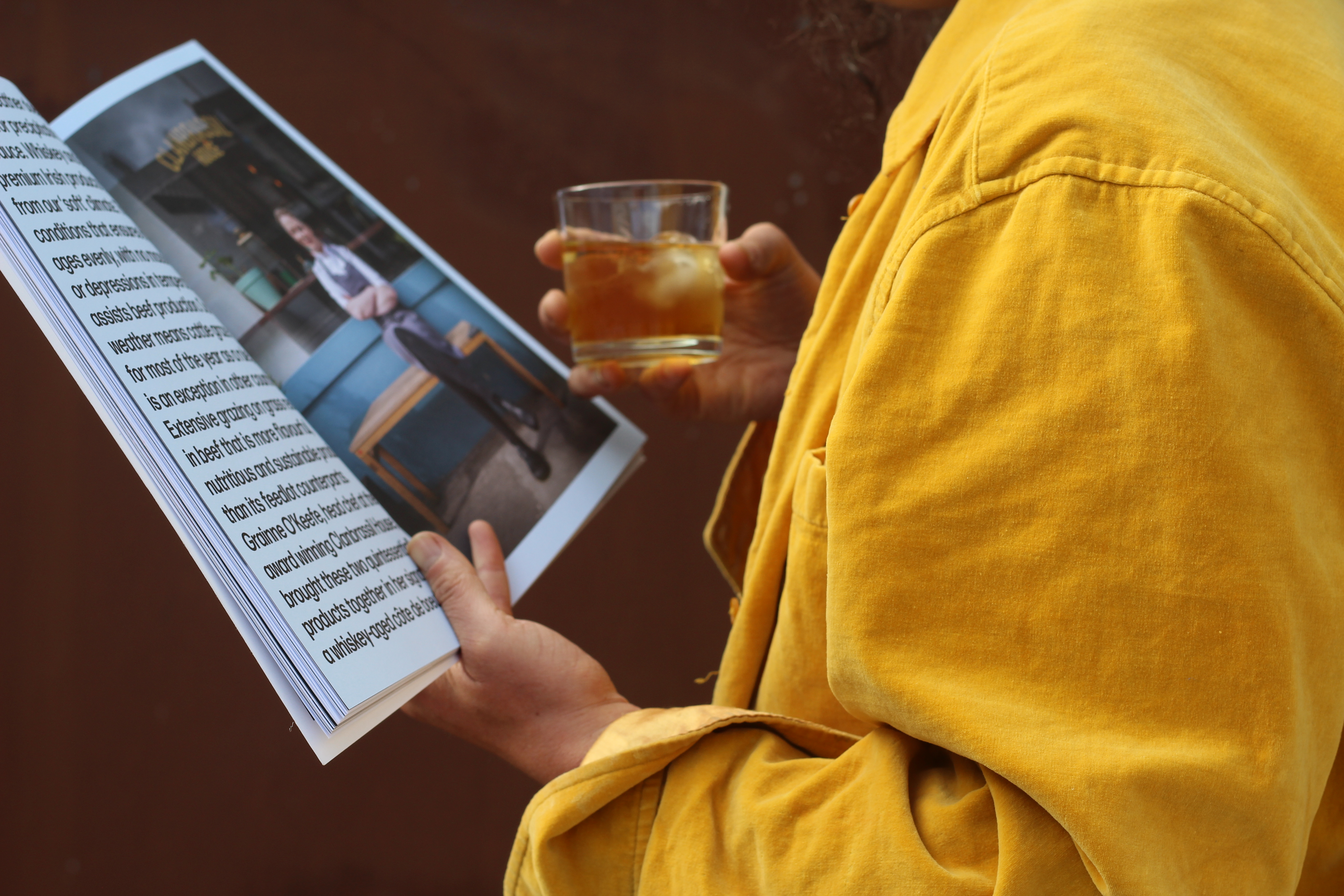
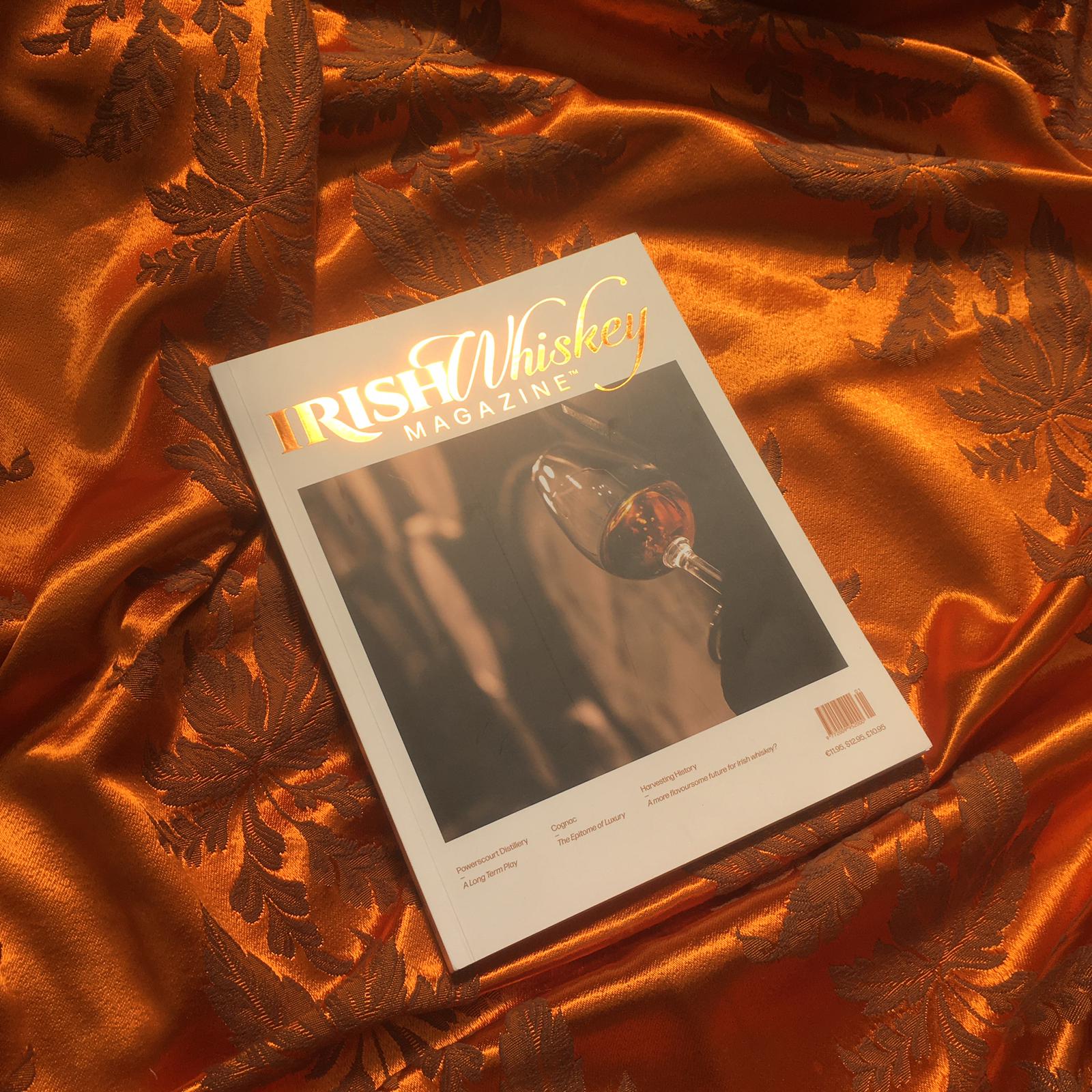
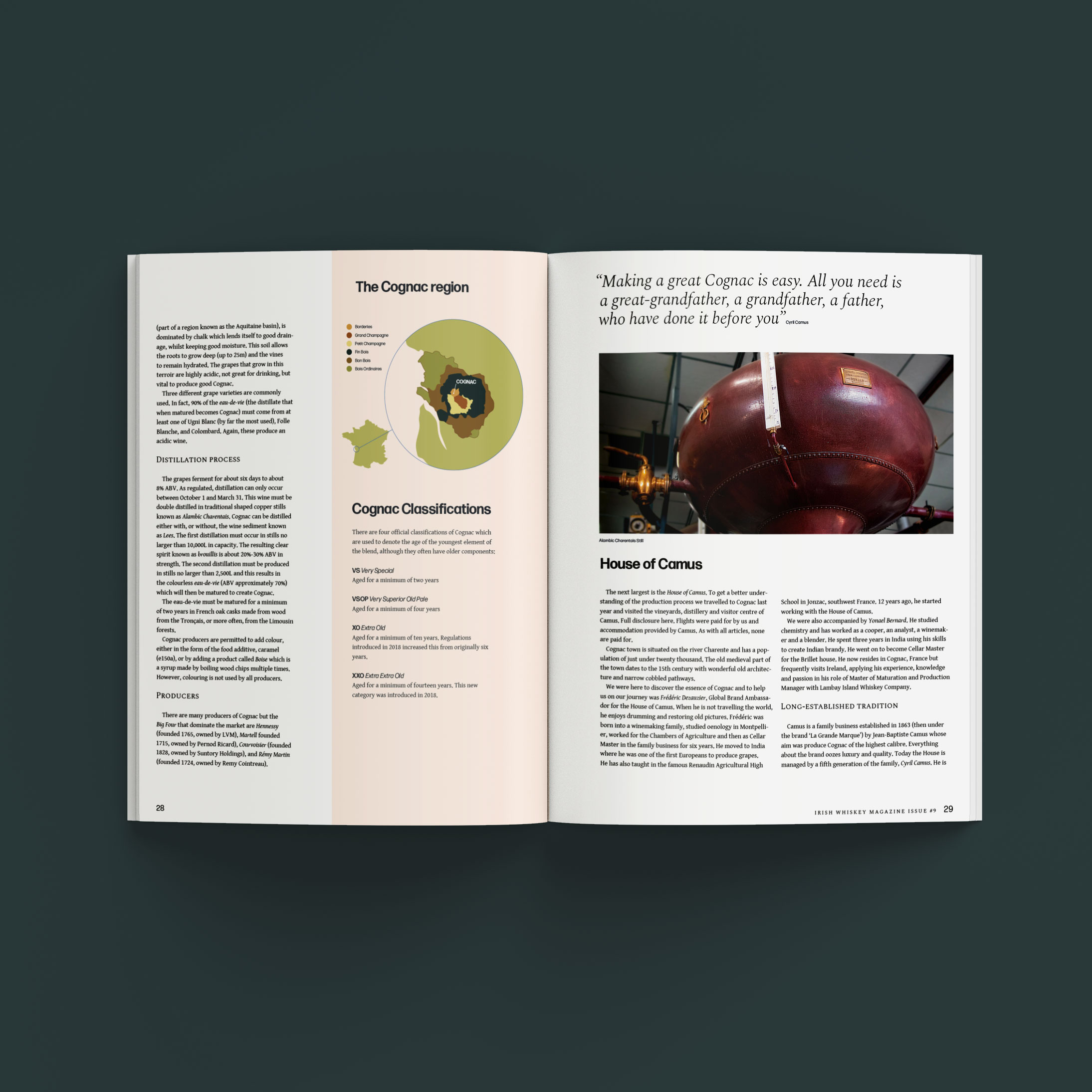
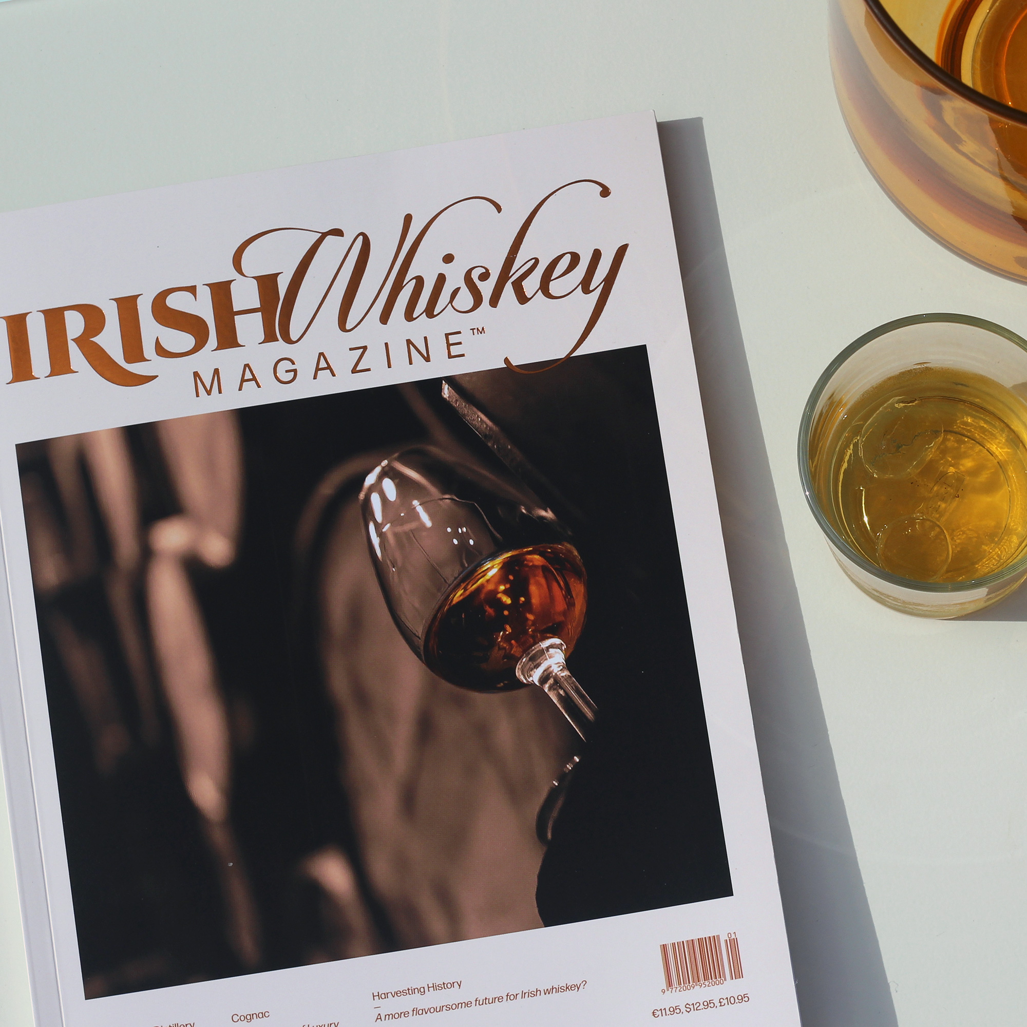
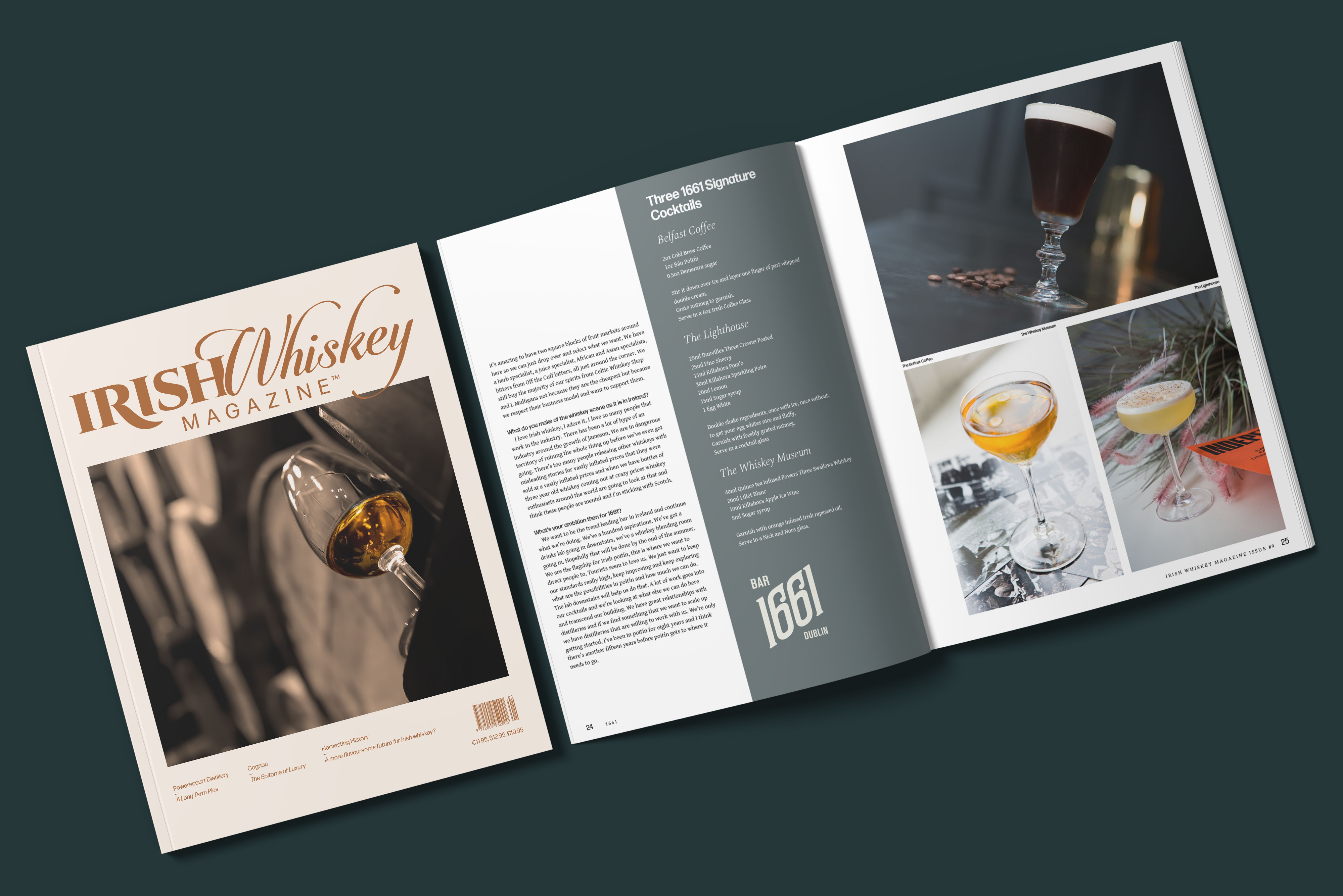
Client Brief:
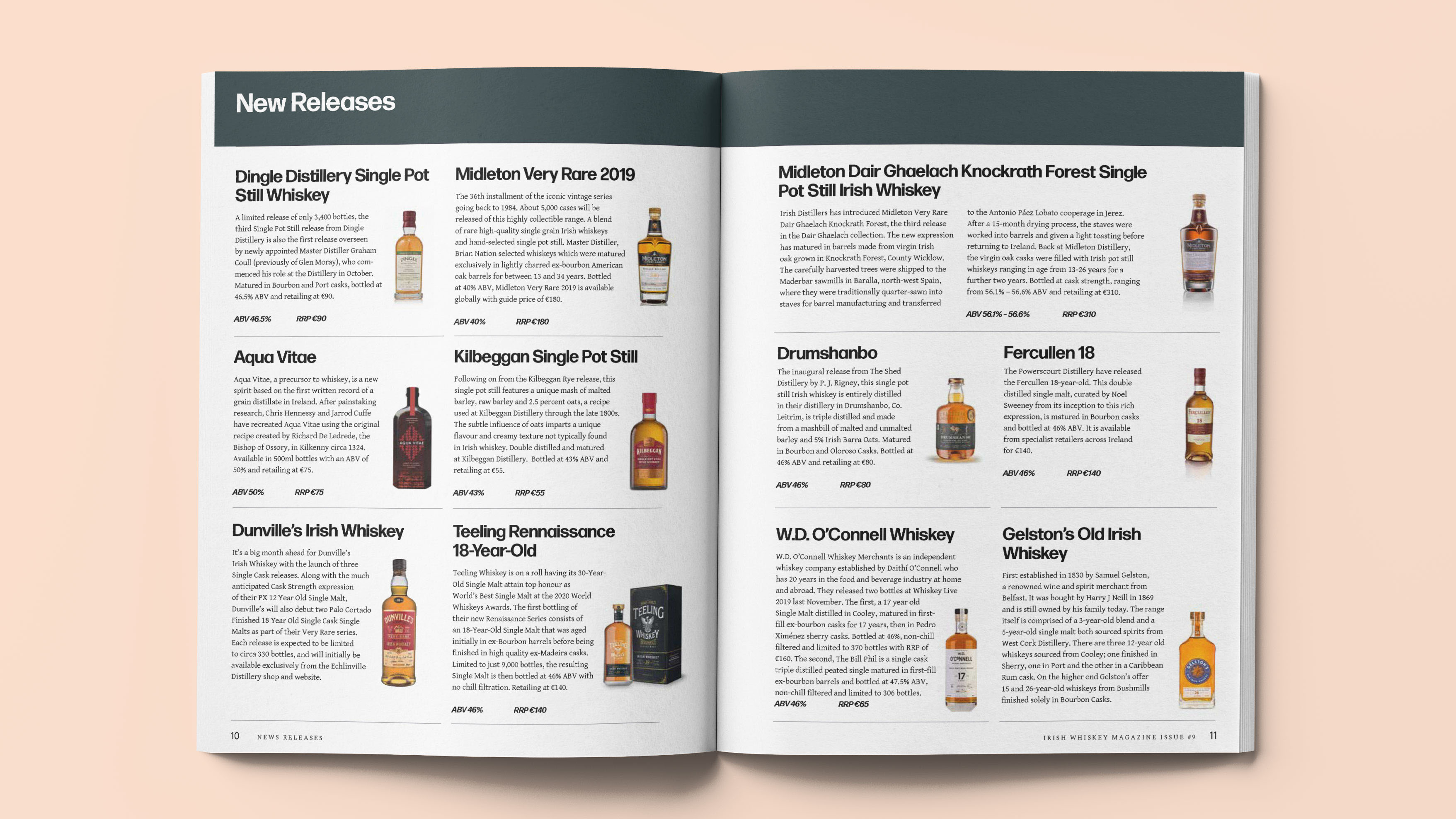
The editor of the specialist publication Irish Whiskey Magazine approached us with a desire to redesign. The previous design was a bit chaotically put together, lacking a sense of cohesion and flow.
After a thoghrough review of the previous issues we identified the key problems of the design;
Too many design variables — typefaces, colours, stock illustrations and pagestyles that lowered the standard of the magazine.
No editorial structure — no subheadings or introductions to articles, categorisation or editorial sequencing, which is key to drawing the reader in.
Our Response:
We created a typographic grid system that allowed for continuity and flexibility. We stripped down the brand elements and chose just two typefaces, a handful of colours, a custom illustration style.
We changed the format from standard A4 to a custom size that gives the magazine an air of exclusivity. Making for a more comfortable read, that oozes luxury and maturity.
We have established the new identity by employing this robust system within a slick new format.


2019
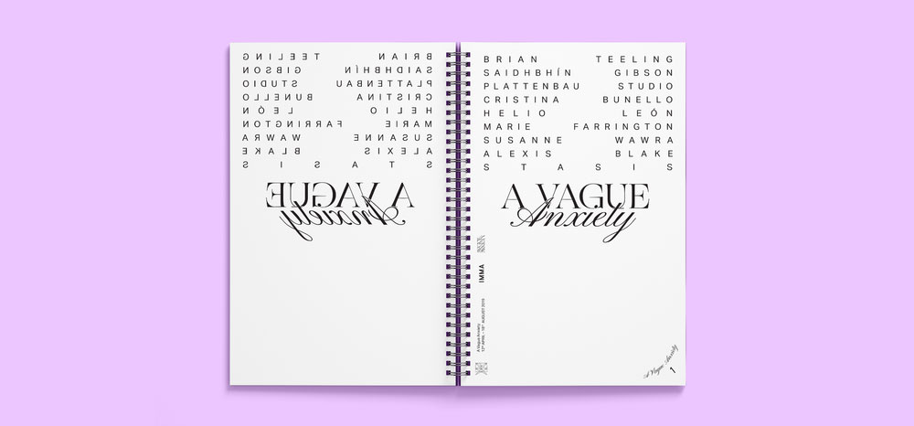
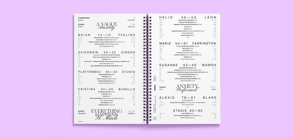
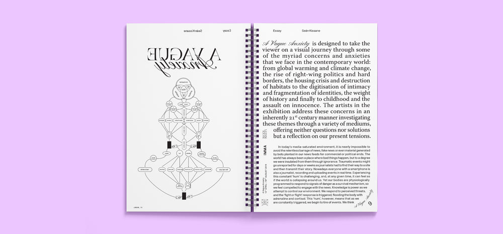
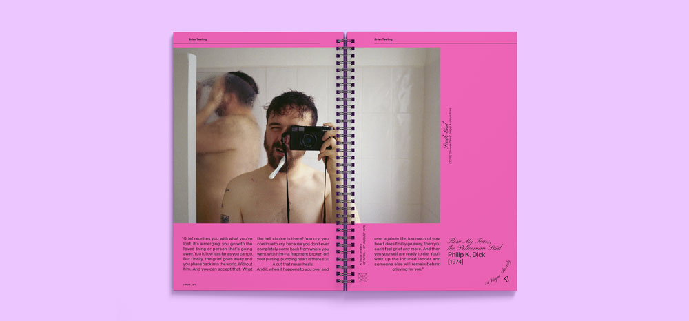
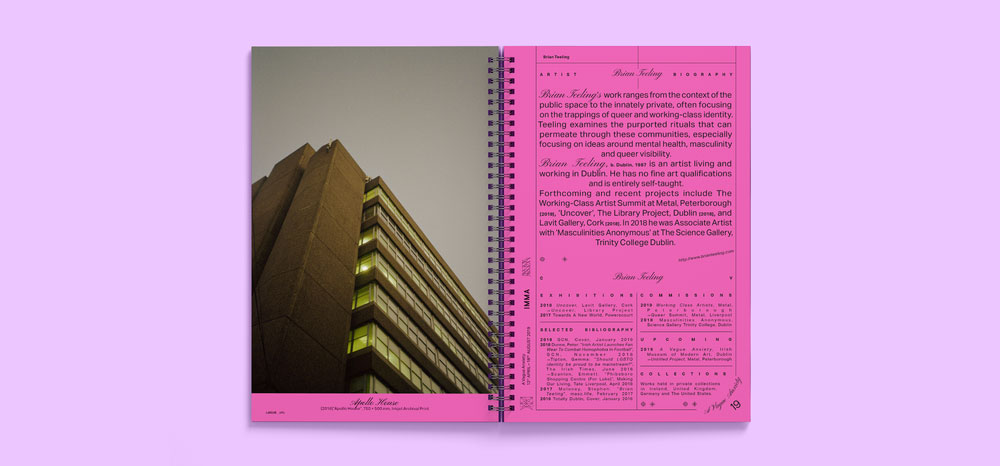
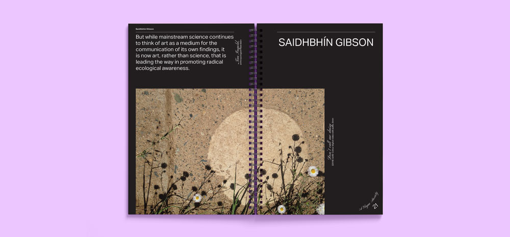
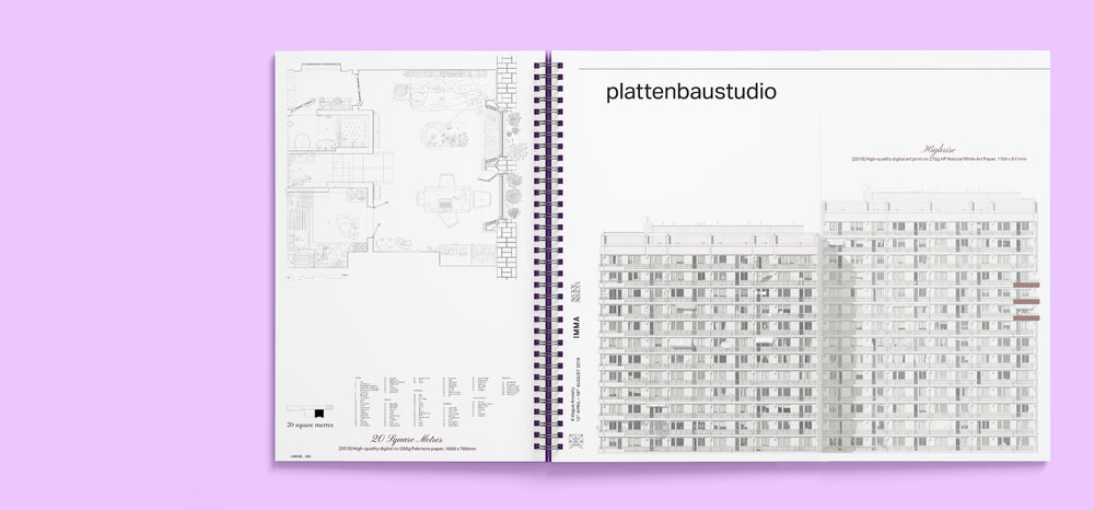
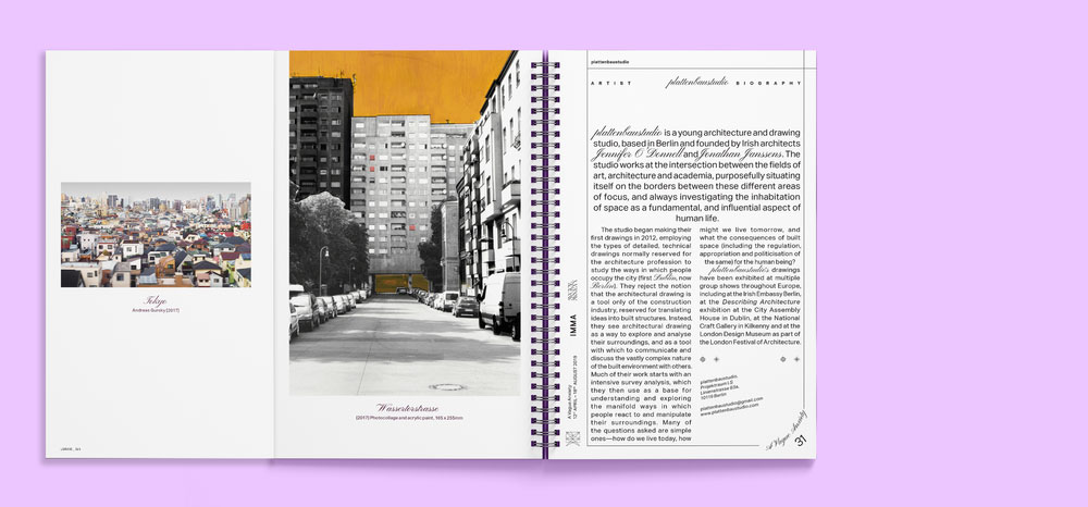
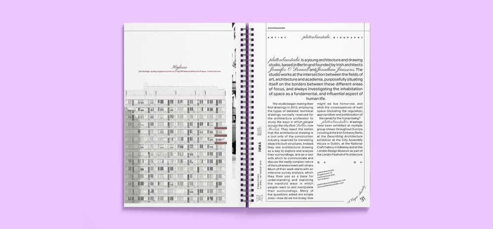
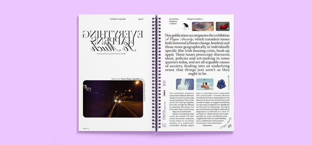
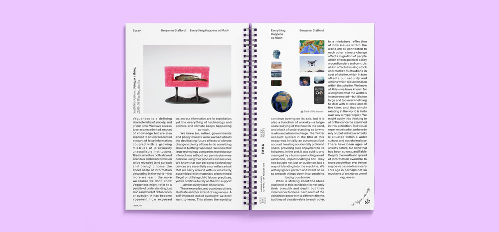
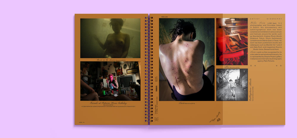
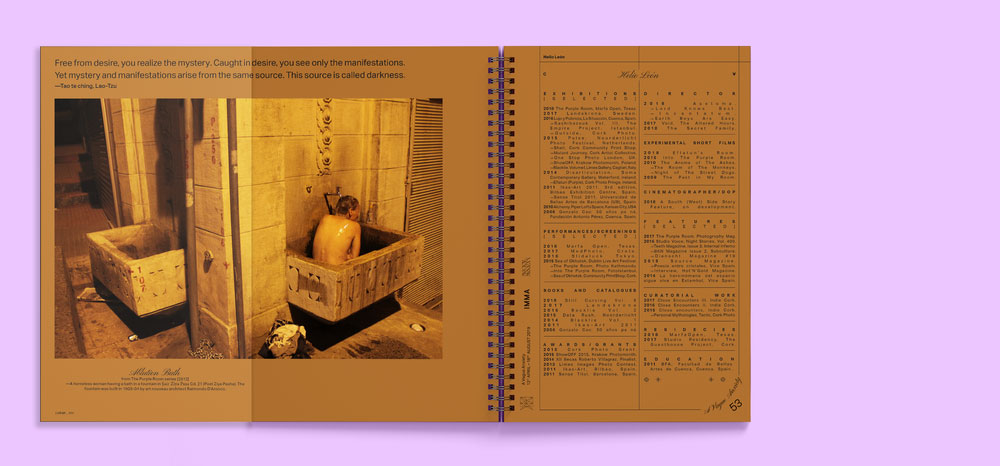
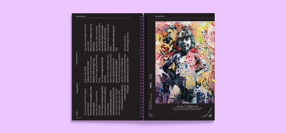
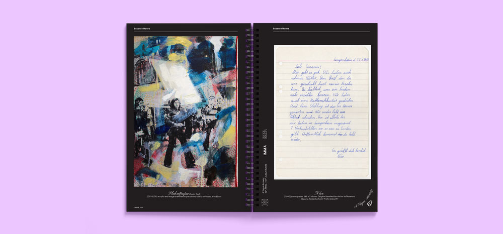
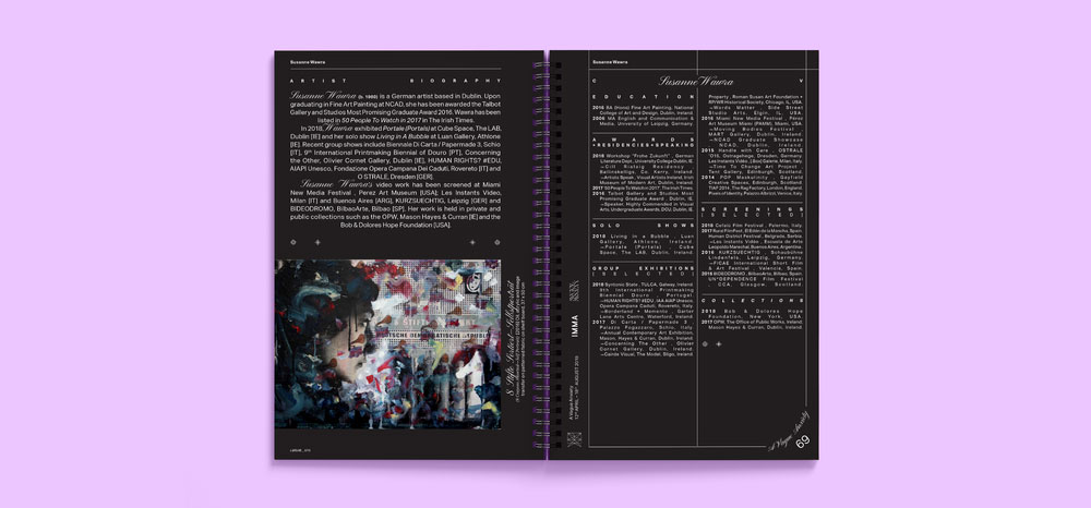
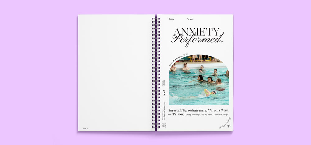
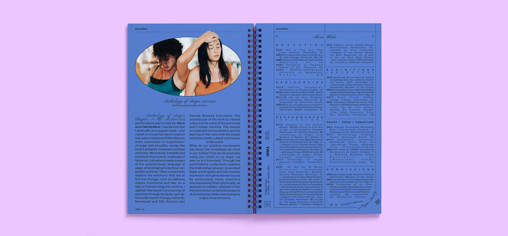
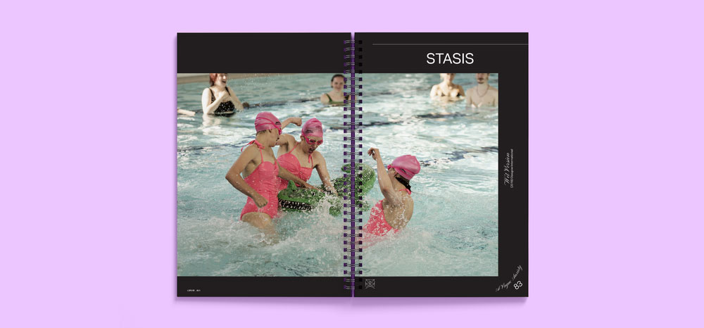
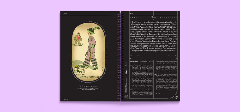
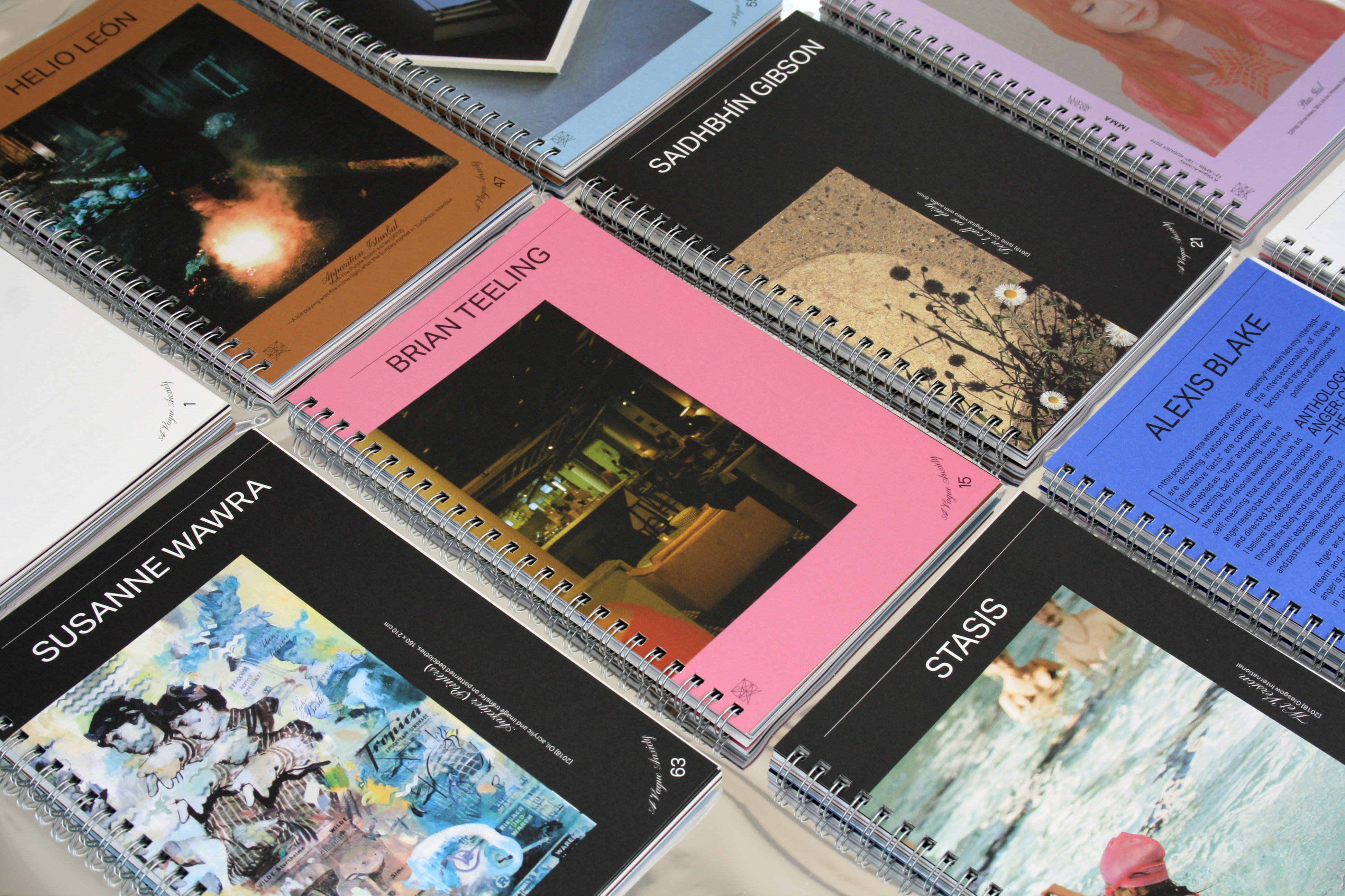
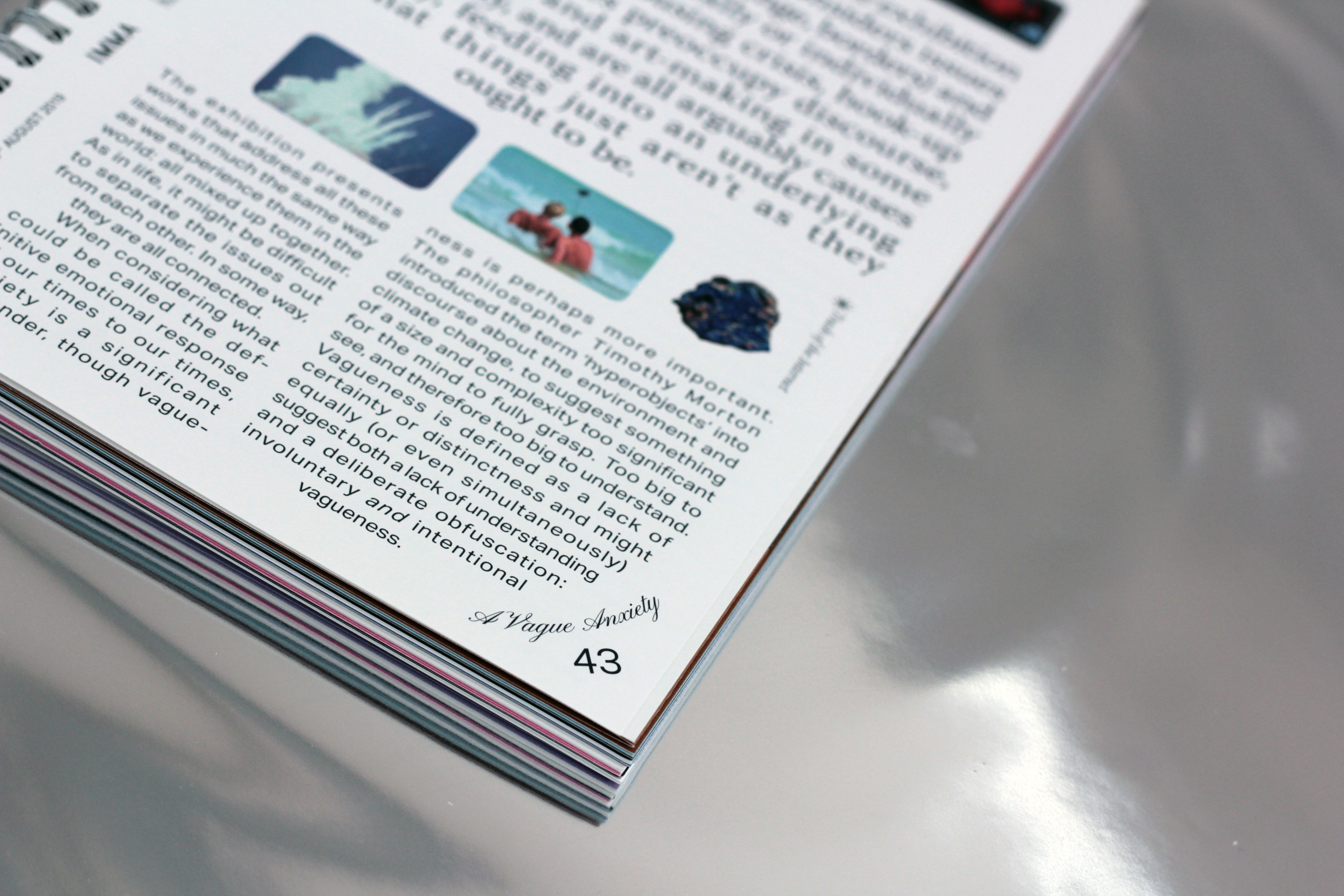
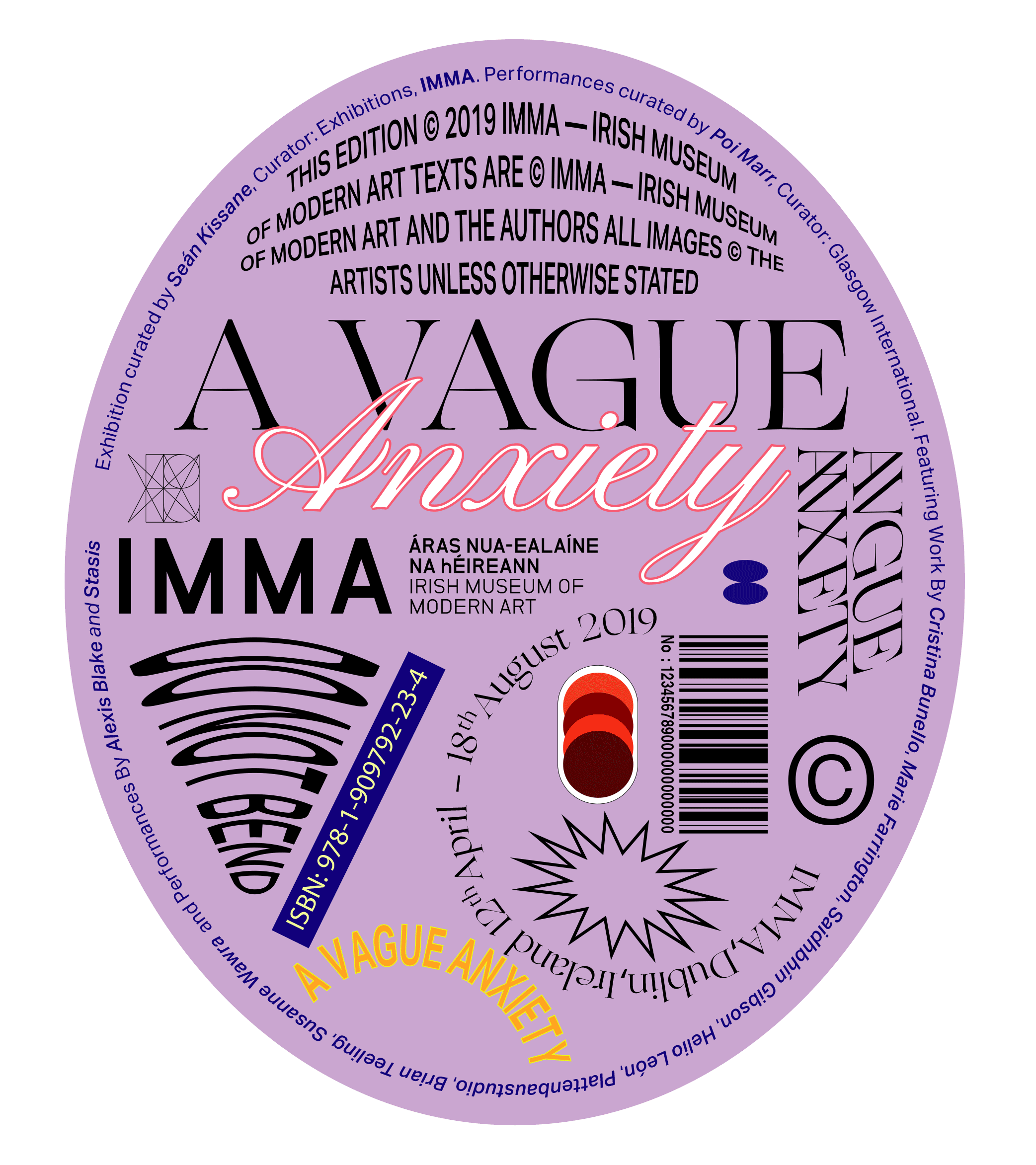
A Vague Anxiety
Exhibition Catalogue
Client: IMMA
Client Brief:
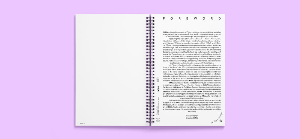
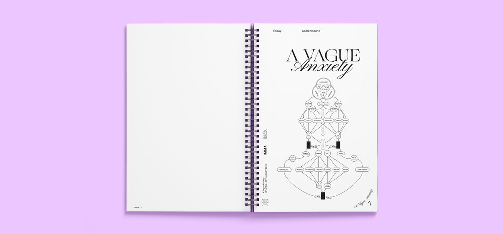
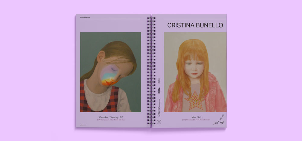
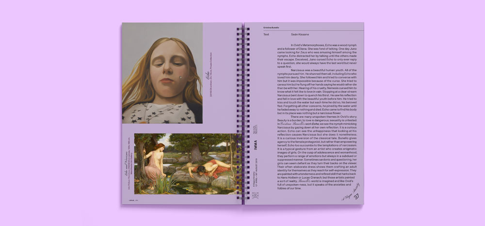
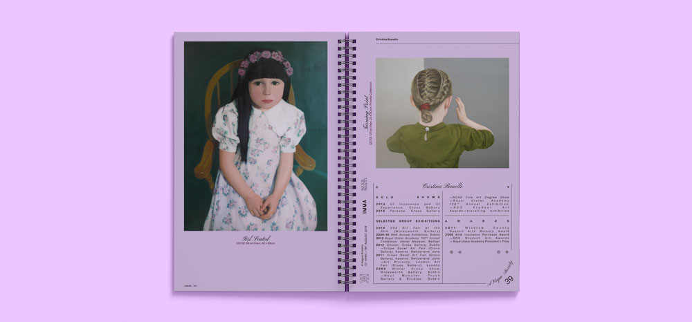
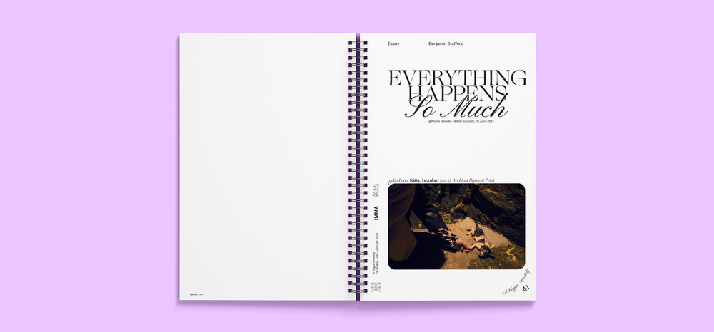
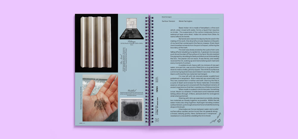
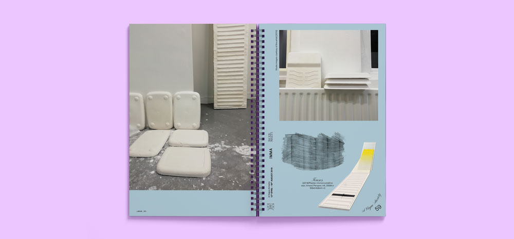
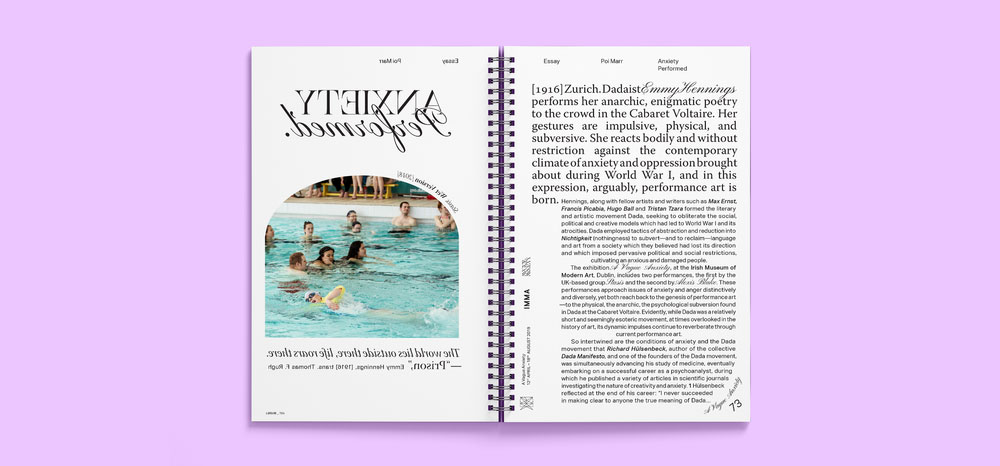
The exhibition title reflected on the rising levels of anxiety in our media-driven lives and how many of these concerns are constantly, and somewhat vaguely in the backdrop of our daily existence. IMMA required a publication to accompany the exhibitions
The group exhibition of nine emerging Irish and international artists addressed some of the broader concerns of Generation Y; from political points of departure such as borders, housing, and the environment, to the personal such as mental health, hook-up culture, gender identity and precarity; pressing issues in today’s society.
Our Response:
Inspired by our initial conversation with the curators of the show, where we discussed the non-linear reading habits of Generation Y, we created a coverless ring-bound publication that is designed to be read from any point within the book with no definite beginning or end. Not so much without a cover, but with many — for as it could be open on any page, every page potentially became a cover, giving the impression that we had made several different books and each contributing artist had a little book of their own.
Client Testimonial:
Having worked together producing an exhibition catalogue that pulled together content from disparate sources and in varying media, Bureau Bonanza created a beautiful end product with no fuss.
They were receptive to our needs and ideas while having a clear vision of what the finished work would look like. The process was clear, and the outcome looks great.
Benjamin Stafford, Assistant Curator, IMMA
2019
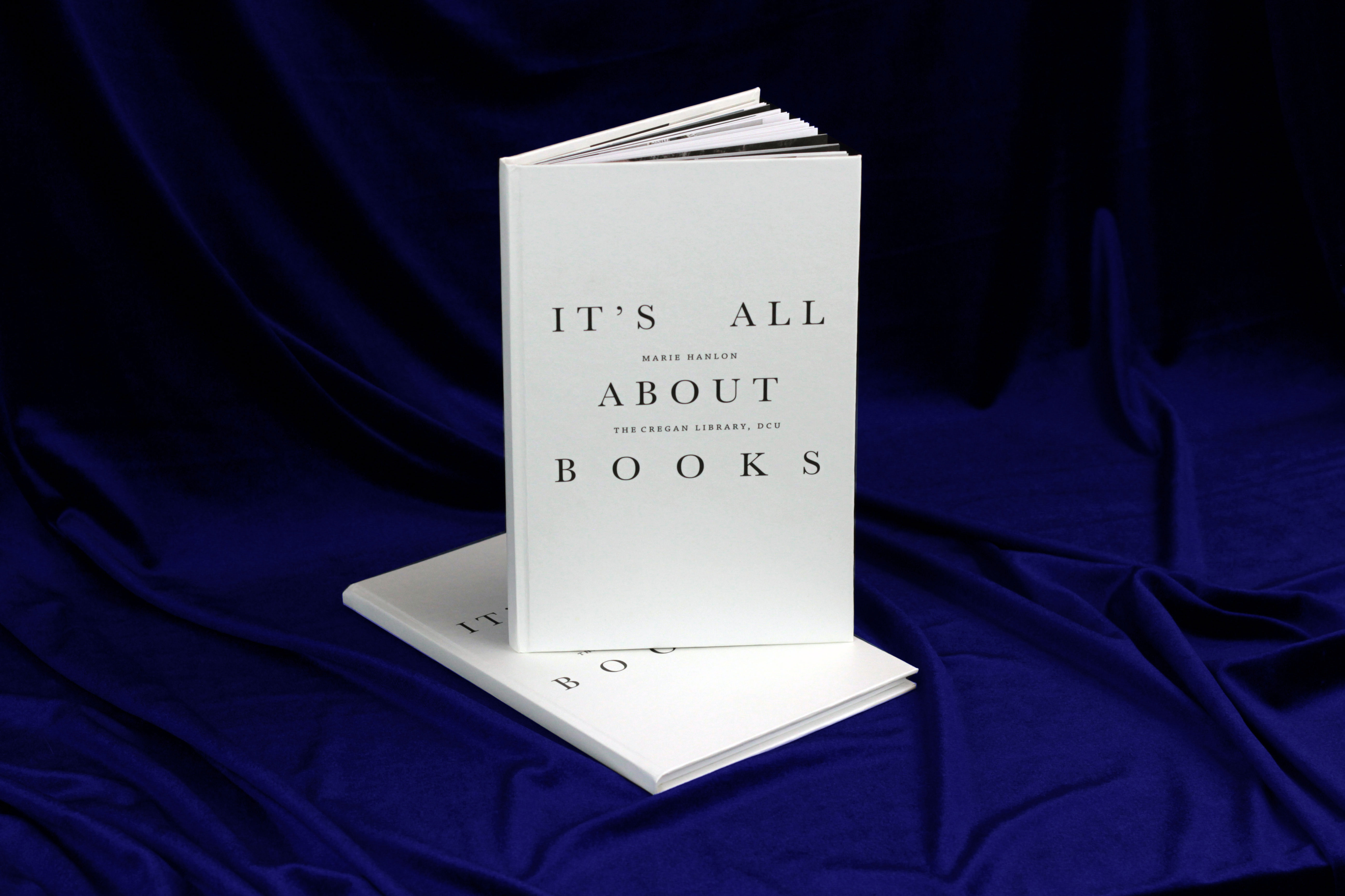
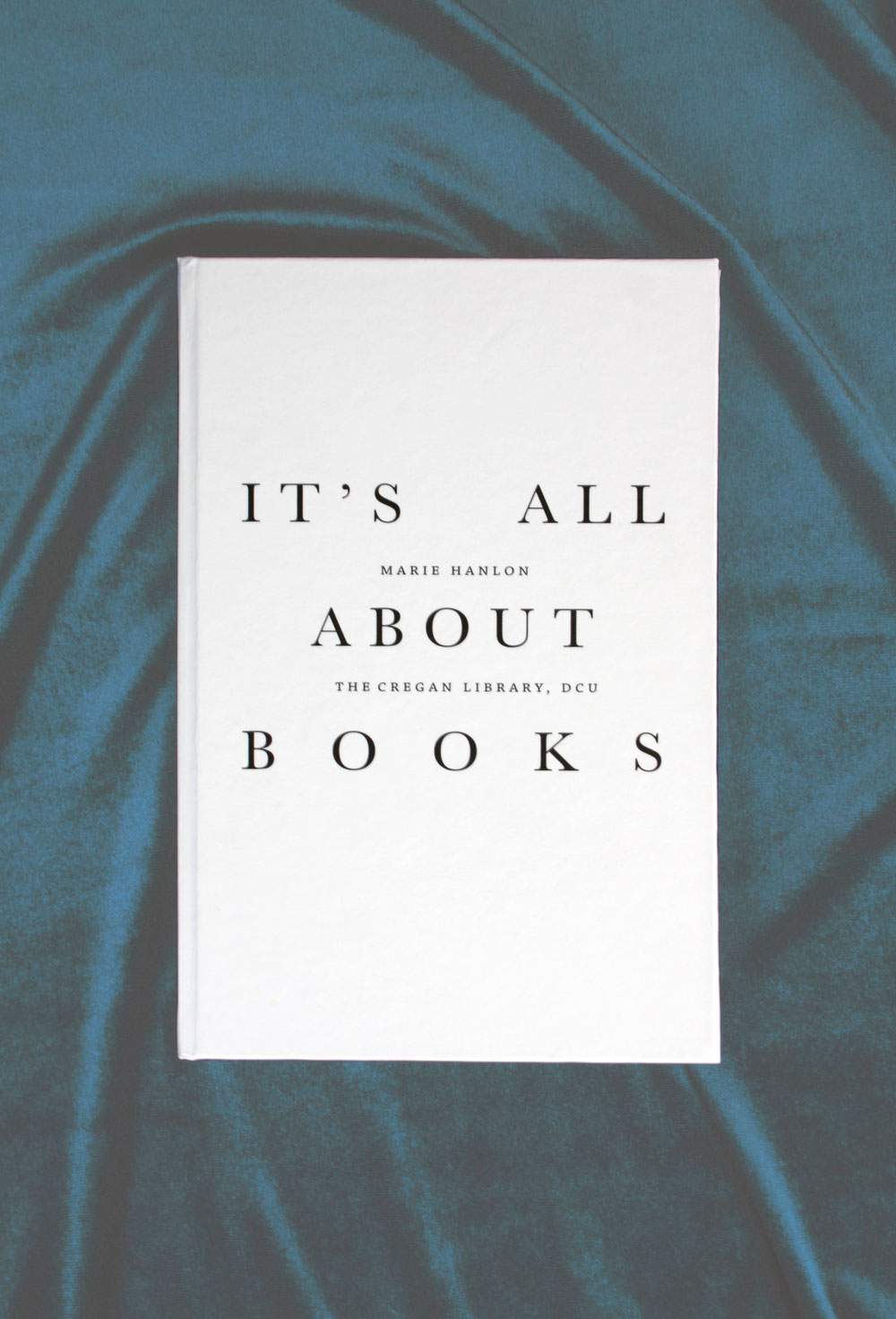
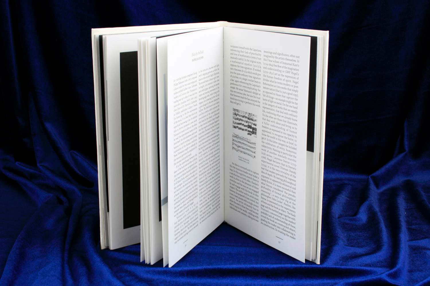
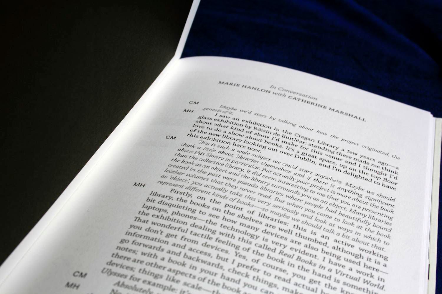
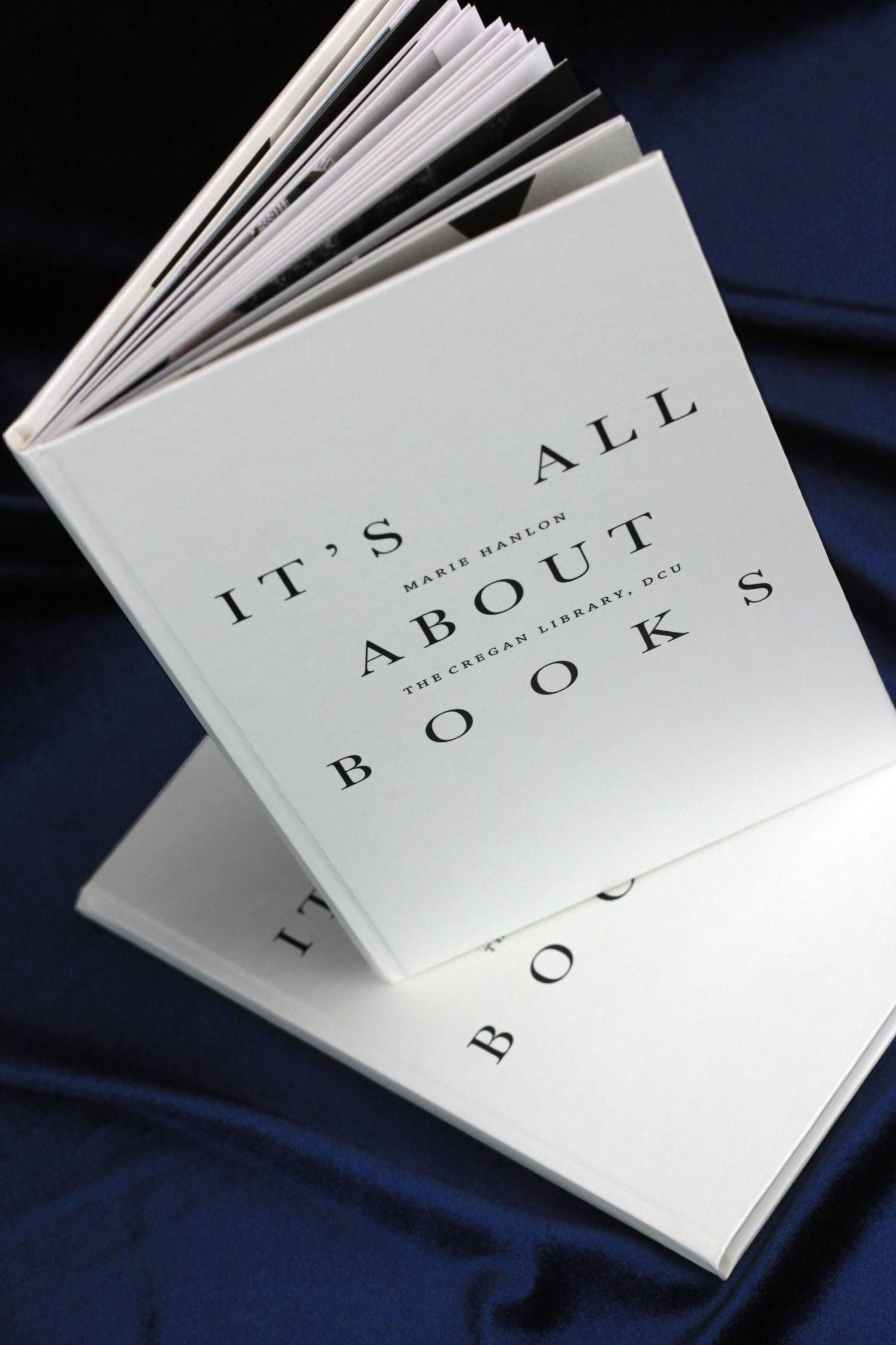
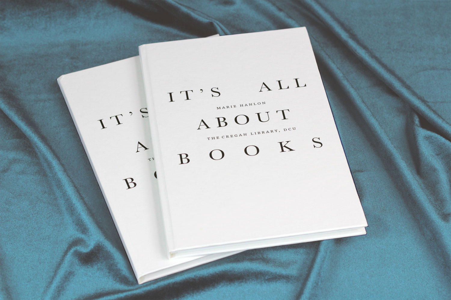
It’s All About Books
Exhibition Catalogue
Client: Marie Hanlon, Artist
It’s All About Books
Exhibition Catalogue
Client: Marie Hanlon, Artist
Client Brief:
Marie needed an exhibition catalogue for her show ‘It’s All About Books’ that was held in the DCU Library in early 2019.
Marie came to us with a very specific brief, including a wonderfully detailed mockup she had made herself. So from there, it was easy for us to meet all of her requirements and produce this little book in the short time we had.
Our Response:
As the show was indeed all about books, we created a classic hard back using traditional book typography.
This created a nice contrast with the imagery used in the book whilst maintainng a simple harmony with the exhibition as a whole.
As the show was indeed all about books, we created a classic hard back using traditional book typography.
This created a nice contrast with the imagery used in the book whilst maintainng a simple harmony with the exhibition as a whole.
Client Testimonial:
I was given a recommendation for Bureau Bonanza and am so glad I acted on it. Due to several factors time was very tight and I needed the designers to do exactly what they pledged to do. They delivered a beautiful catalogue, ahead of schedule, and were a pleasure to deal with.
Marie Hanlon, Independent Artist
2021
![]()
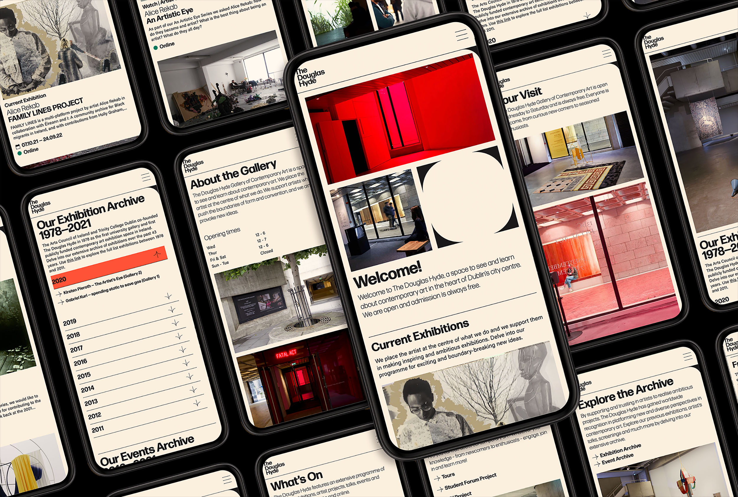
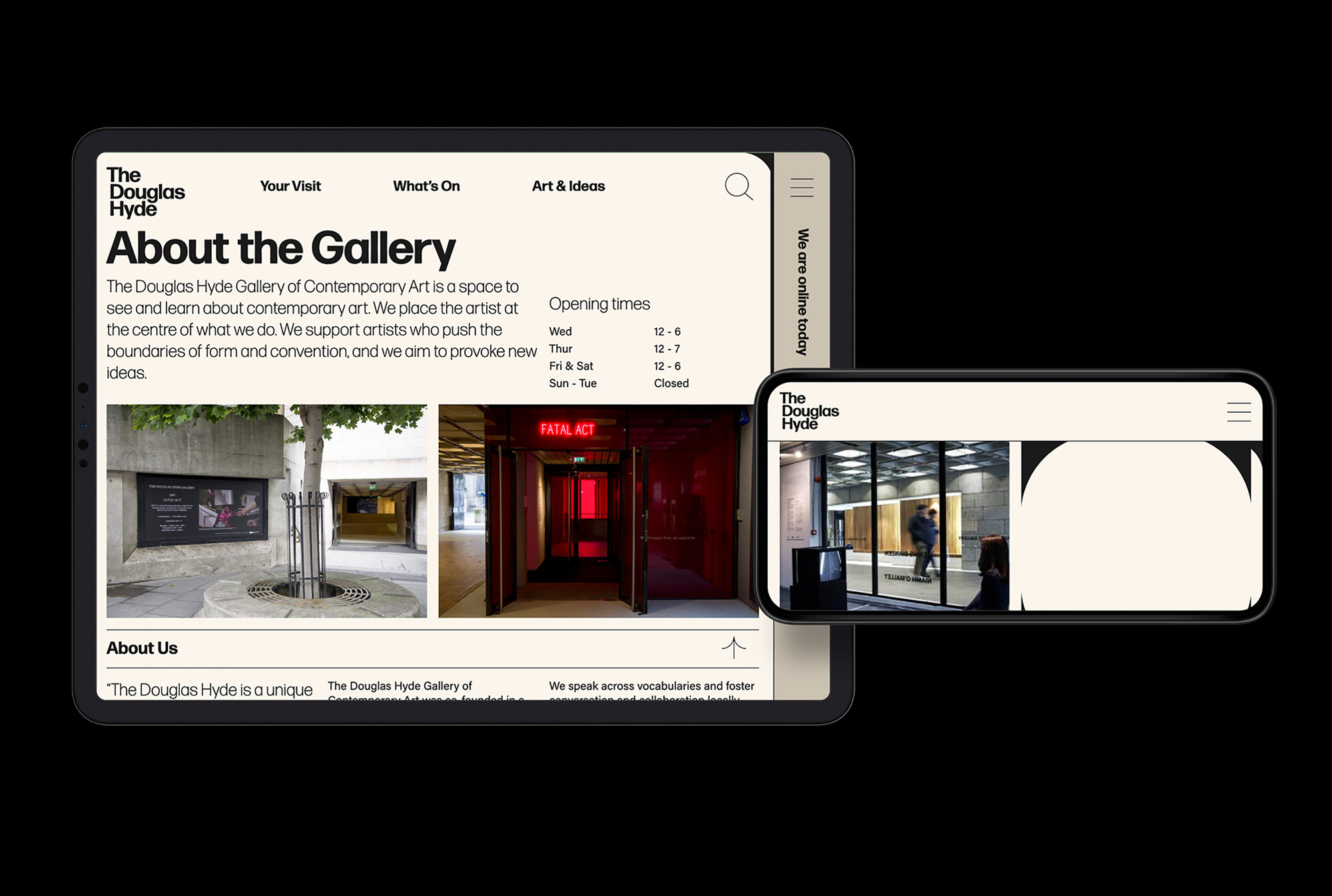
The Douglas Hyde
Brand Identity & Website Design
thedouglashyde.ie
Client: The Douglas Hyde
Developer: Alex Bradley
Winner
IDI Universal Design
Special Awards
![]()
Brand Identity & Website Design
thedouglashyde.ie
Client: The Douglas Hyde
Developer: Alex Bradley
Winner
IDI Universal Design
Special Awards
Client Brief:
Challenges that most contemporary art galleries struggle with have to do with accessibility and how to bring conversations about art to larger and non-traditional audiences. With this rebrand and website project we needed to create an accessible and friendly design that welcomes new engagement and does away with any perceived intimidation whilst still maintaining the intellectual reputation of the gallery.
Challenges that most contemporary art galleries struggle with have to do with accessibility and how to bring conversations about art to larger and non-traditional audiences. With this rebrand and website project we needed to create an accessible and friendly design that welcomes new engagement and does away with any perceived intimidation whilst still maintaining the intellectual reputation of the gallery.
Our Response:
The website and all other communications platforms needed a clear editorial structure that allows for tiered levels of engagement with an information system using headings, sub-heads, introductory paragraph-styles, ‘read more’ tags etc. going from engaging and welcoming to descriptive and informative to academic and critical.
A gallery in essence is an architectural space, thus the design was inspired by aspects of its architectural features. The concrete ceiling of the gallery and the Trinity Arts Block became the catalyst for the logo and subsequently the brand identity and look and feel of the website. The rounded shape of the ceiling cells create a tension between sharpness and smoothness and of the negative and positive space.
We worked closely with Learning & Engagement Curator of The Douglas Hyde, Fernando Sánchez-Migallón Cano and developer, Alex Bradley, to achieve a universal design. This included working with Knowbility to ensure the finished design was accessible to a wide range of people regardless of their age, size, ability or disability.
Through deconstructing and multiplying the mark and re-assembling the fragments of the original form, we developed a dynamic and modular system of symbols, icons and framing devices. The display type face (Forma) echoes that same tension between sharpness and smoothness whilst being high in contrast, legibility and character. Wanting to avoid the white cube aesthetic the colour scheme is led by a ‘muted’ charcoal black and warm off white that can be combined with the warm colours that compliments the grey concrete.
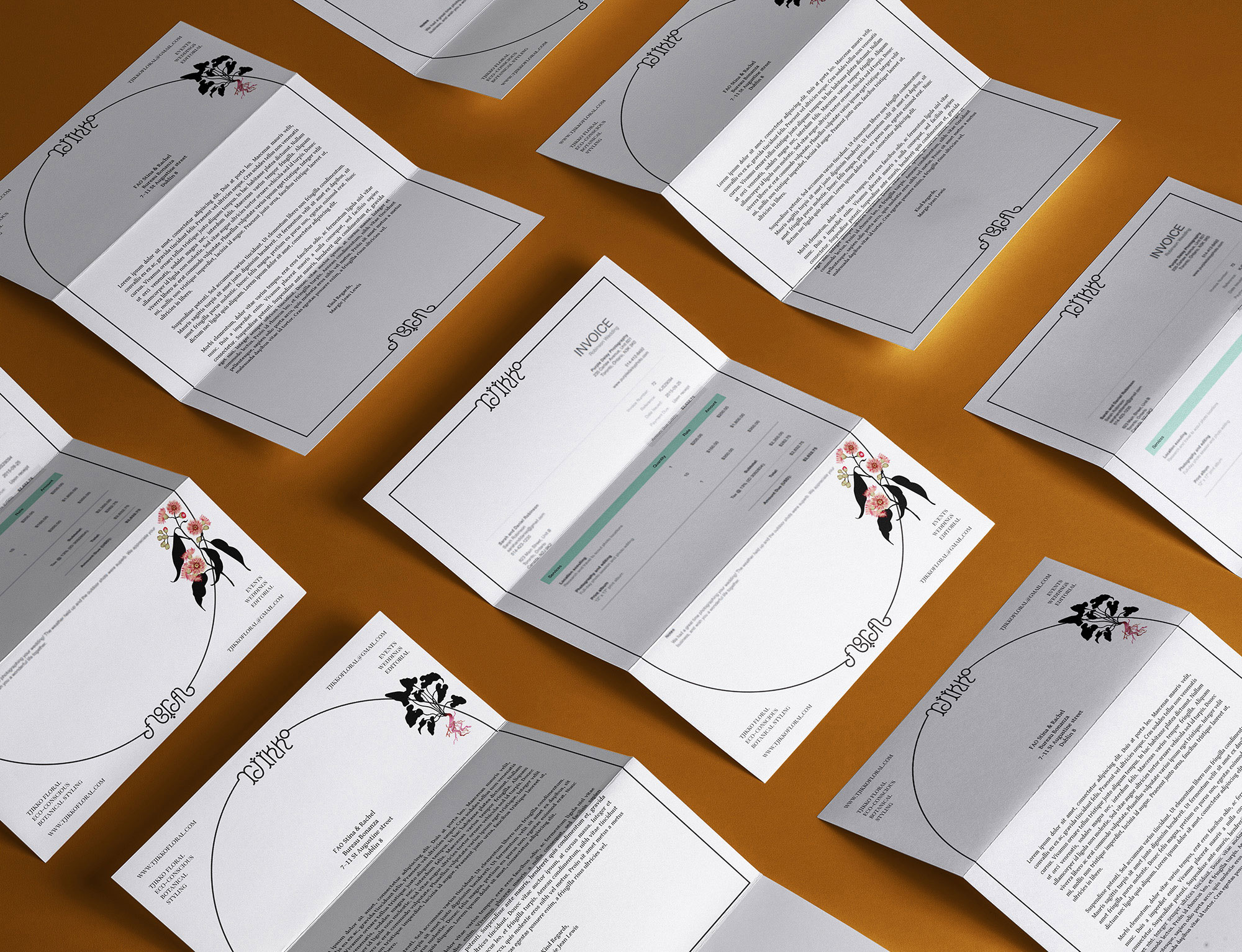
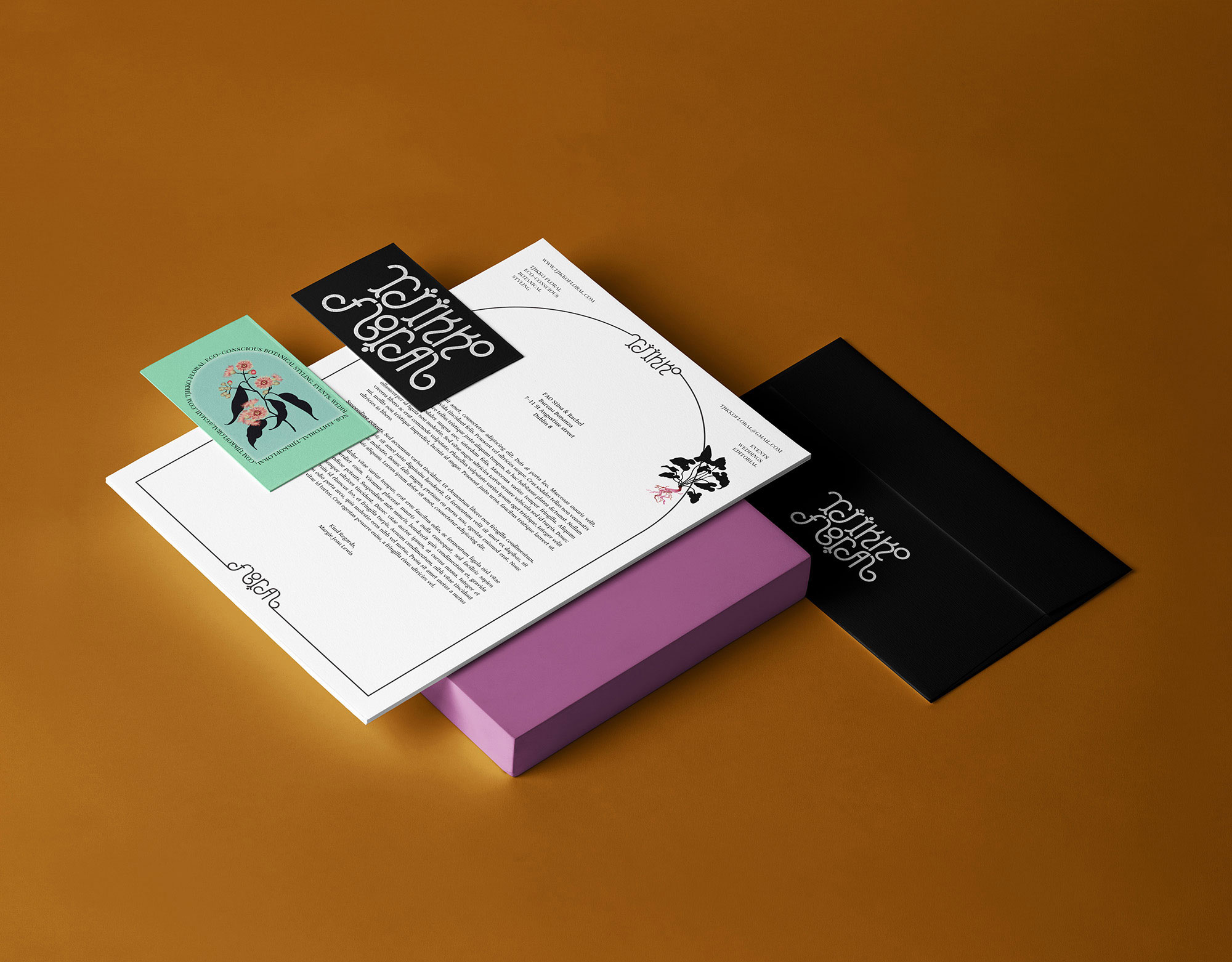
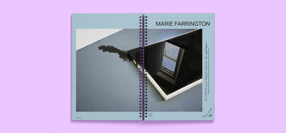
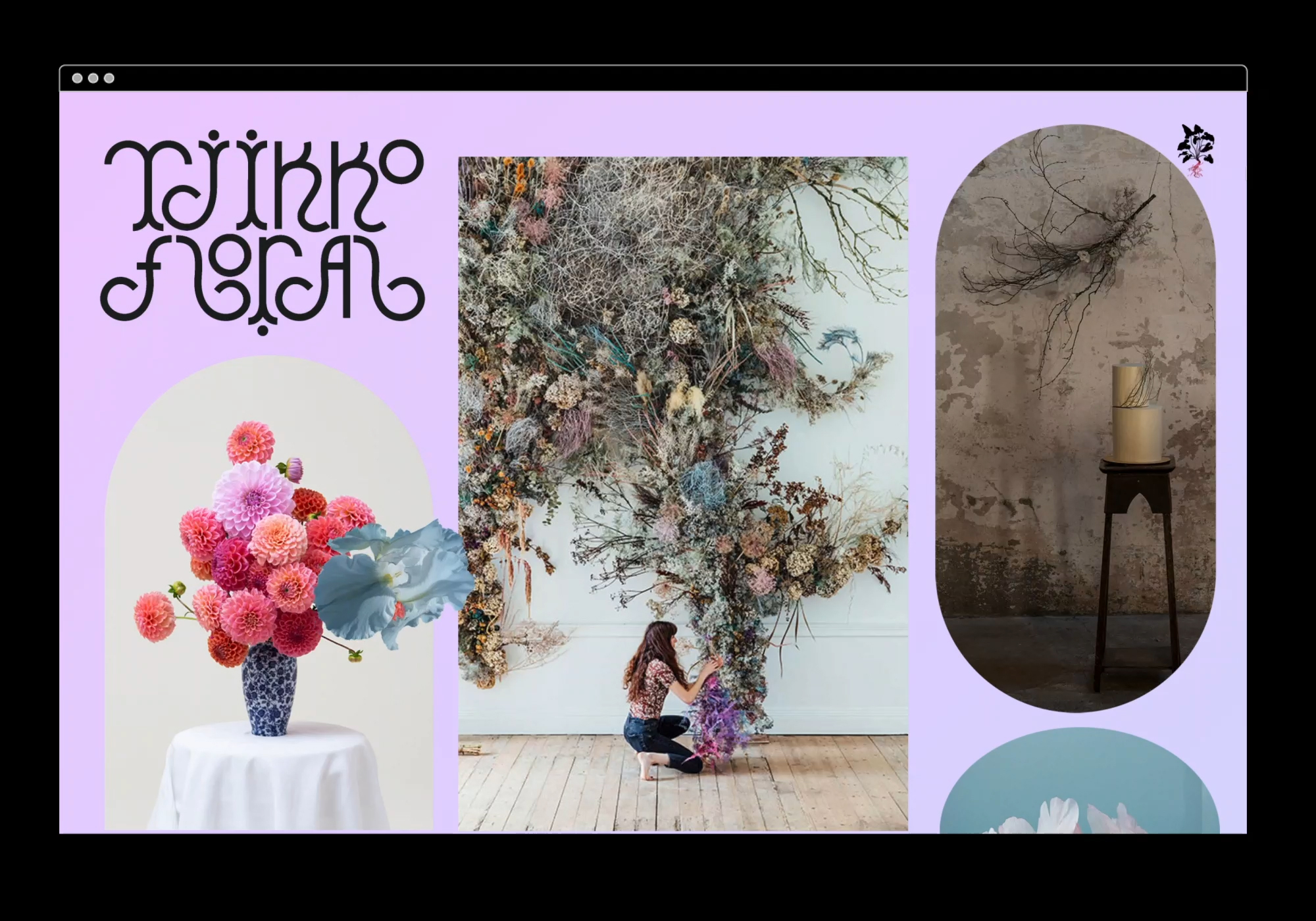
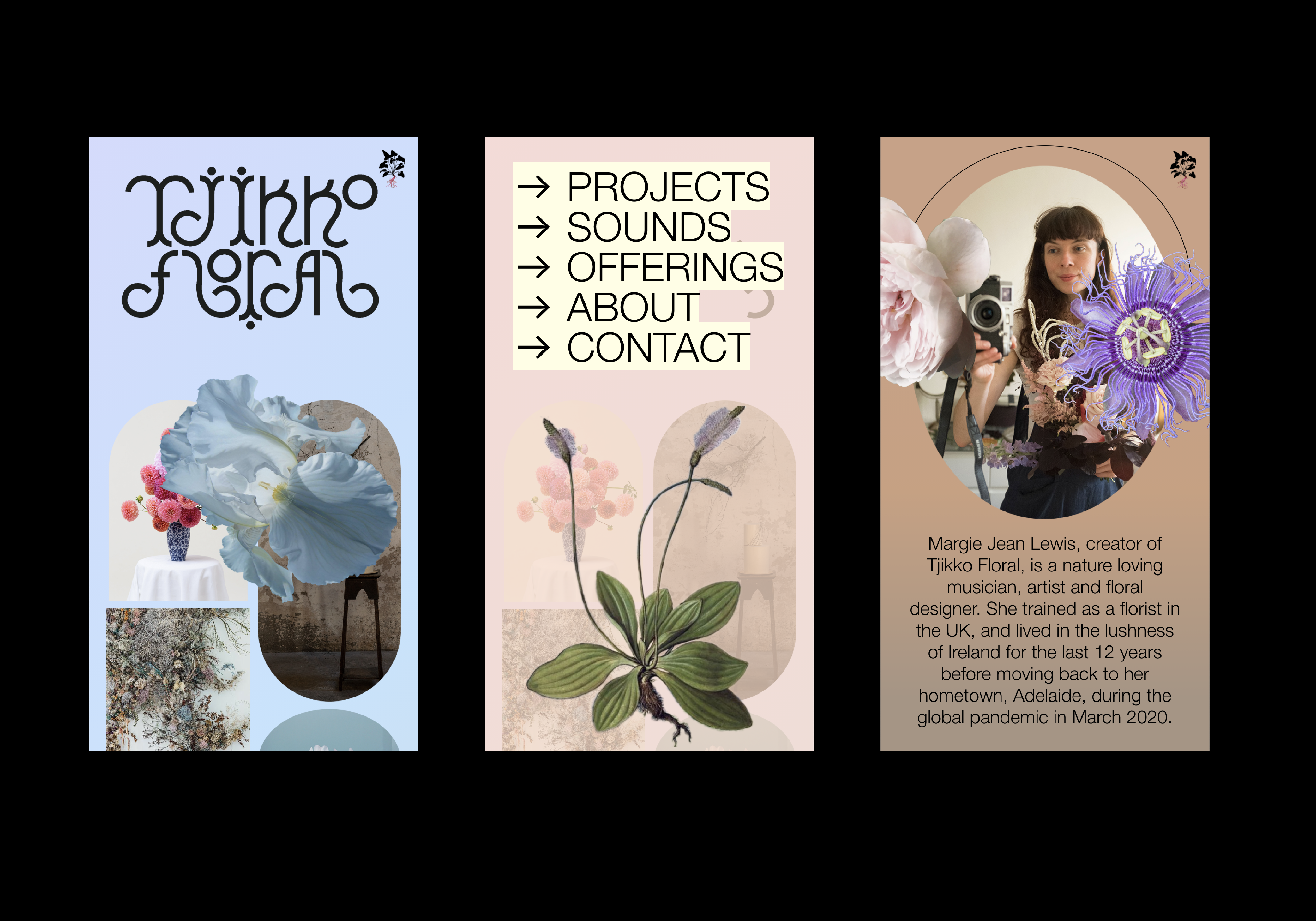
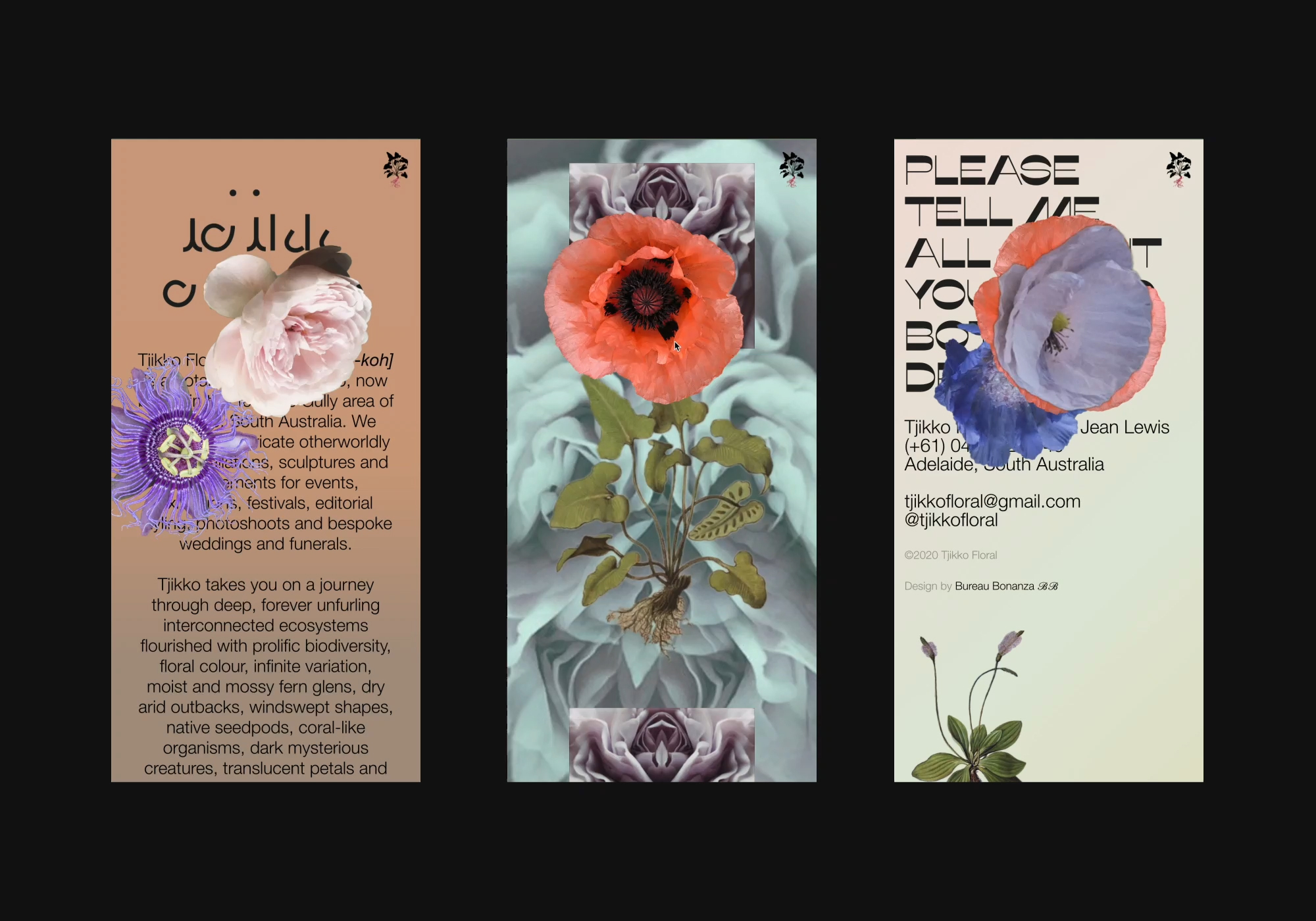
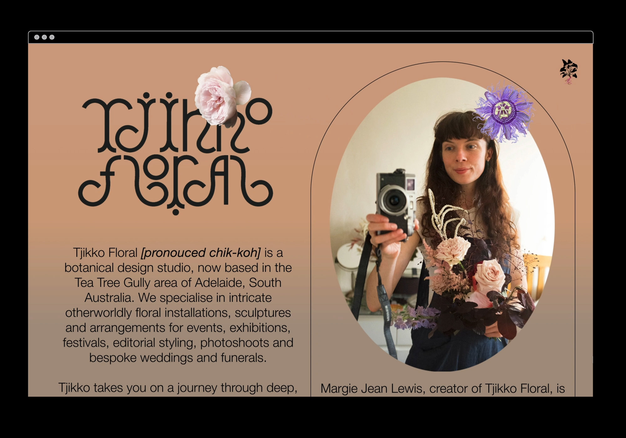
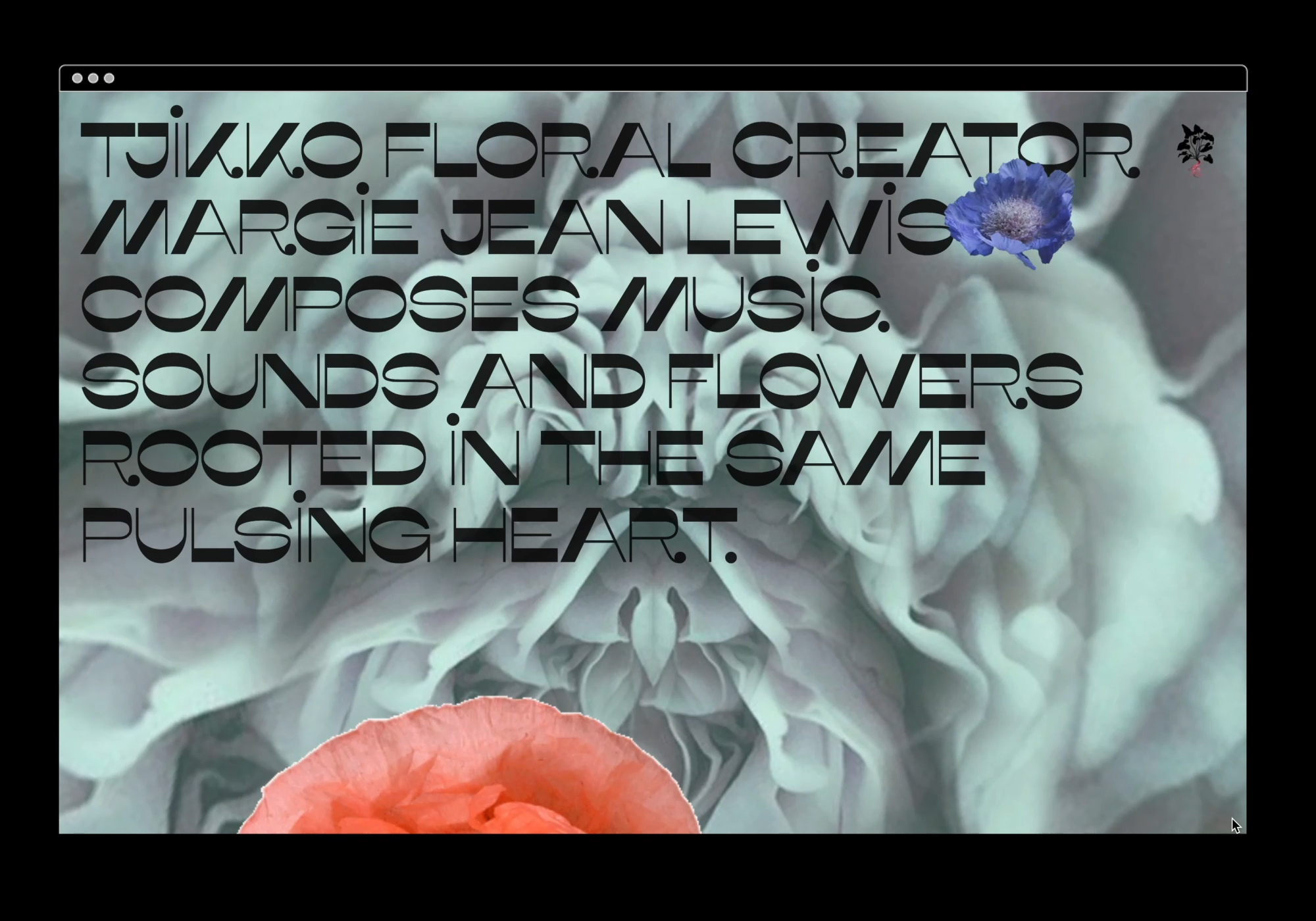
We designed and built an immersive portfolio website for eco-conscious botanical stylist, Tjikko Floral.
Based in Adelaide, Australia, floral artist and musician, Margie Lewis, wanted to slowly merge her two professions into one fully immersive sonic and floral experience. Tjikkofloral.com showcases her intricate otherworldly floral design as well as hosting her music in a mesmerising parallax petal portal, encouraging you to have a listen and get lost in this wholly escapist experience. By combining Tjikko’s images and sounds with a diverse range of animated elements, framing devices and the applied branding, we created a functional site that is “an art piece in and of itself.”
Based in Adelaide, Australia, floral artist and musician, Margie Lewis, wanted to slowly merge her two professions into one fully immersive sonic and floral experience. Tjikkofloral.com showcases her intricate otherworldly floral design as well as hosting her music in a mesmerising parallax petal portal, encouraging you to have a listen and get lost in this wholly escapist experience. By combining Tjikko’s images and sounds with a diverse range of animated elements, framing devices and the applied branding, we created a functional site that is “an art piece in and of itself.”
Photography & Music: Margie Jean Lewis
![]()
Client Brief:
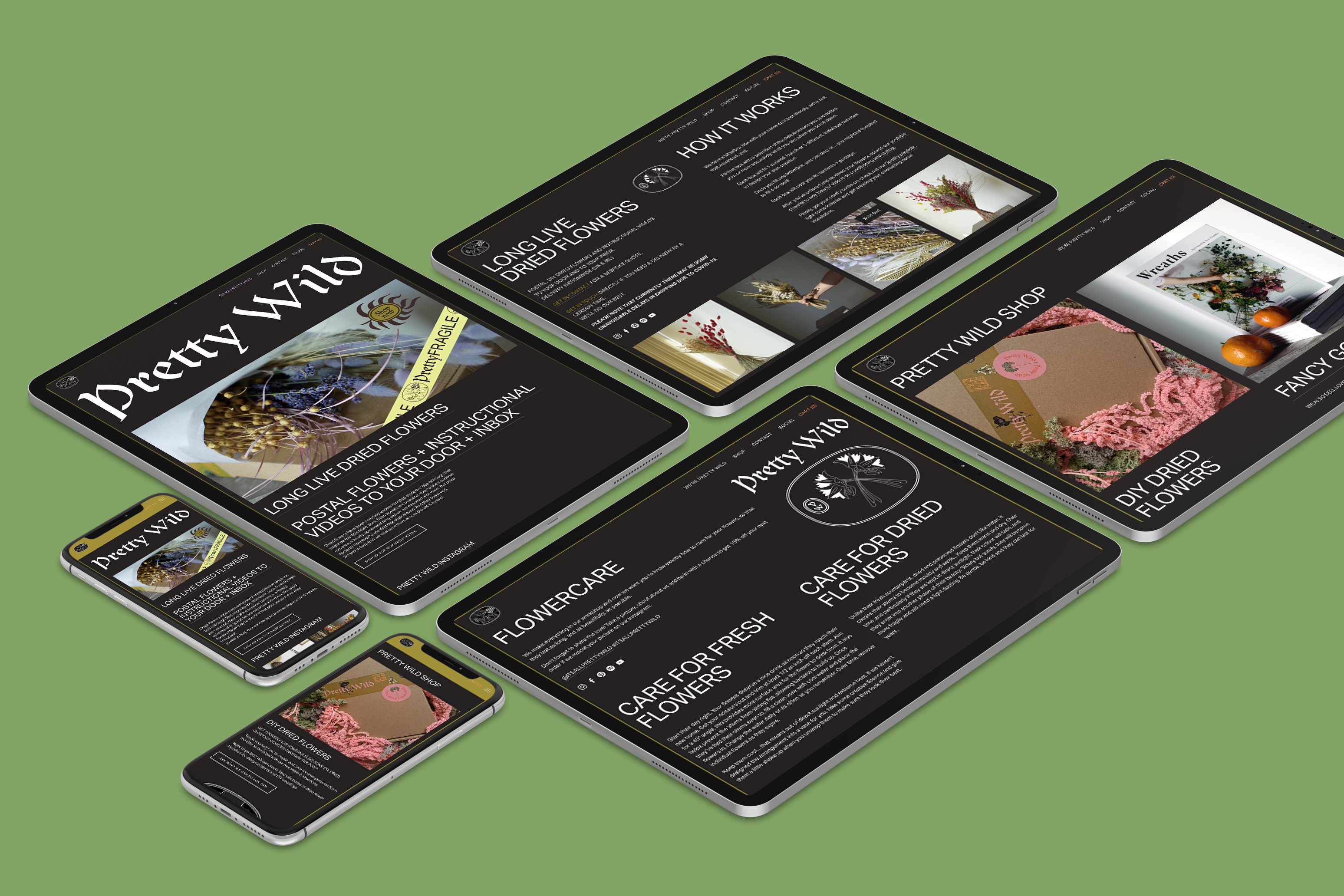
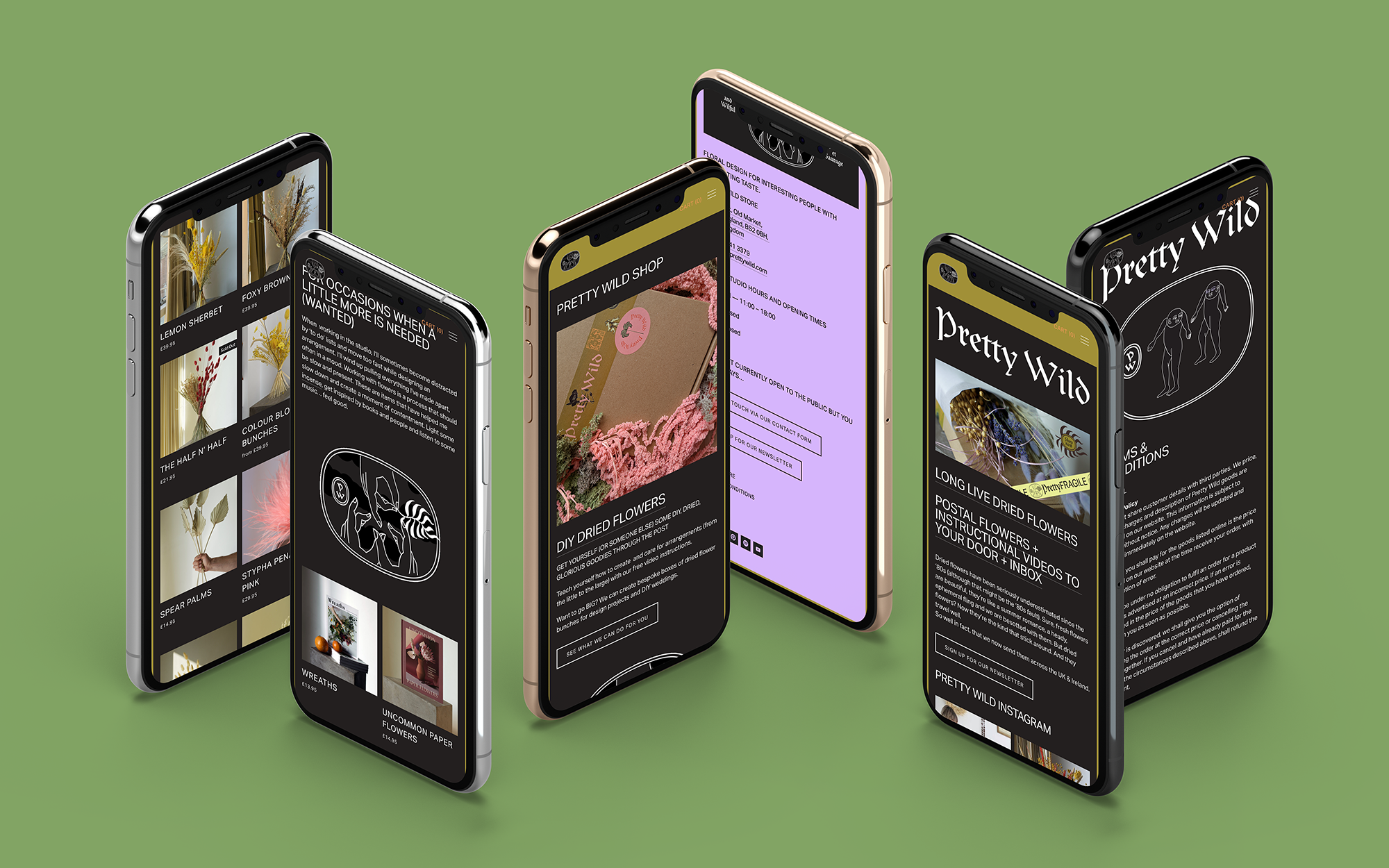
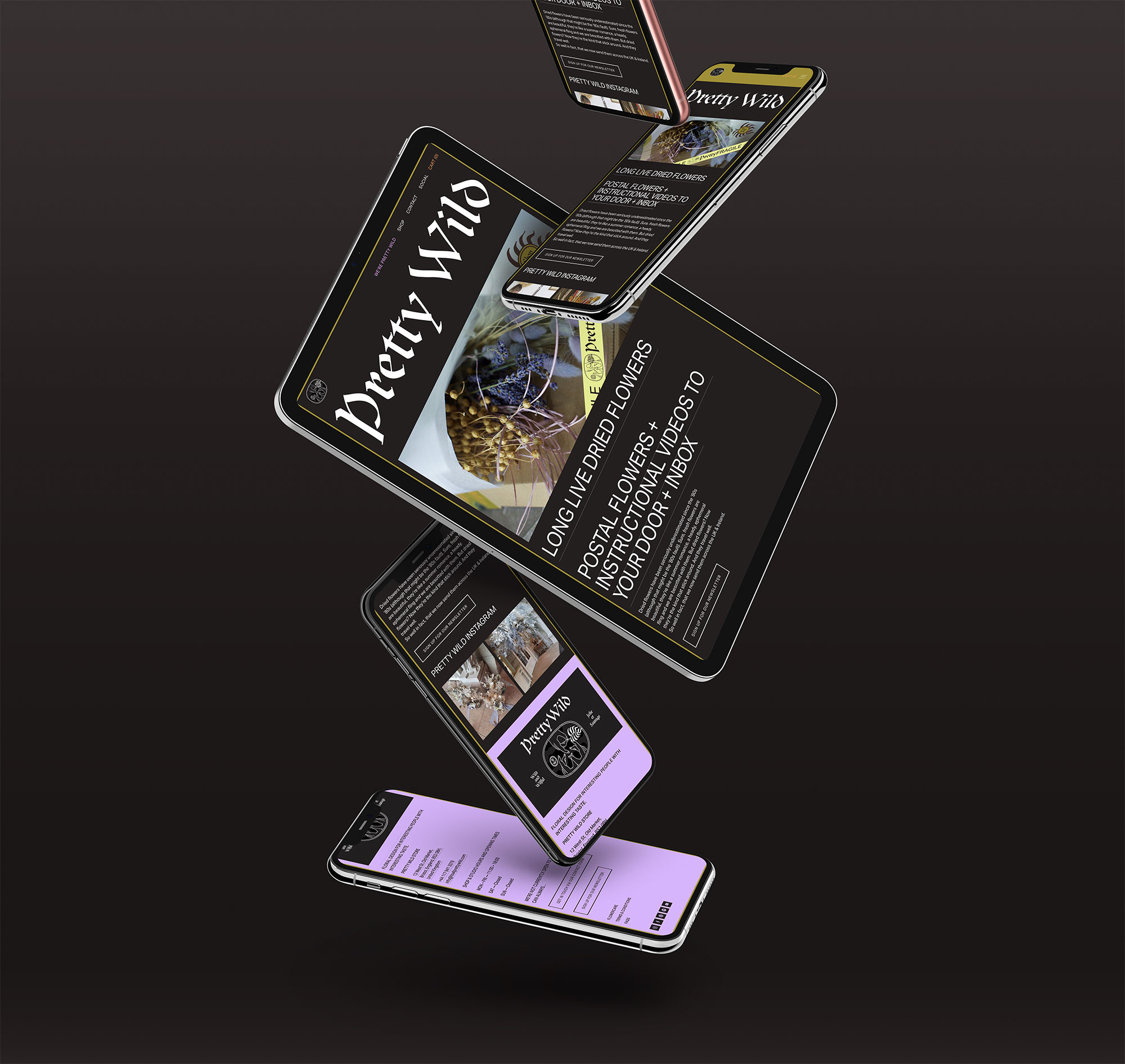
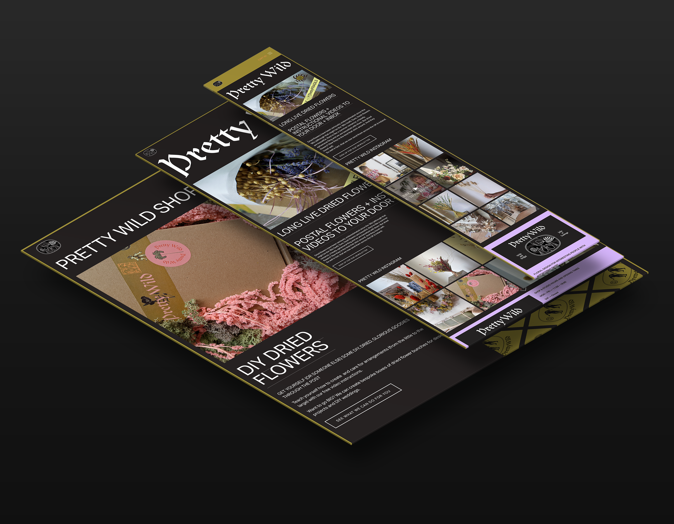
Bristol based Pretty Wild Floristry Studio and Shop needed to quickly adjust to the new restrictions her business was facing. With doors closed to the public, all shops and services had to adapt to a digital landscape and we were tasked with moving her business online.
Bristol based Pretty Wild Floristry Studio and Shop needed to quickly adjust to the new restrictions her business was facing. With doors closed to the public, all shops and services had to adapt to a digital landscape and we were tasked with moving her business online.
Our Response:
Ellen came to us with her idea—DIY DRIED FLOWERS AND INSTRUCTIONAL VIDEOS TO YOUR DOOR AND TO YOUR INBOX—and within a week, we made it a reality. We created an online shop and website that Ellen can easily update herself. Expanding and adapting to move with these changing times.
Ellen came to us with her idea—DIY DRIED FLOWERS AND INSTRUCTIONAL VIDEOS TO YOUR DOOR AND TO YOUR INBOX—and within a week, we made it a reality. We created an online shop and website that Ellen can easily update herself. Expanding and adapting to move with these changing times.
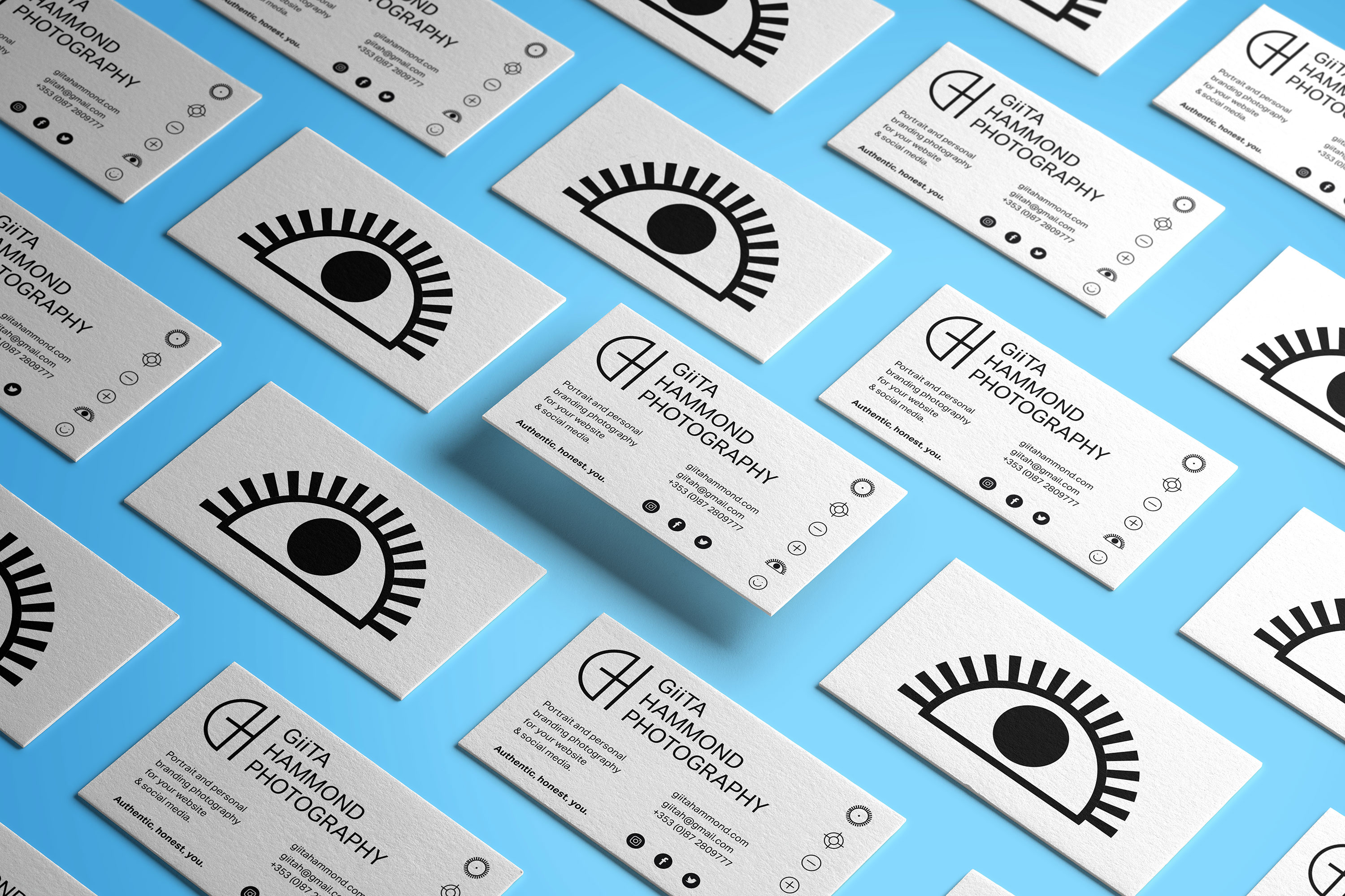
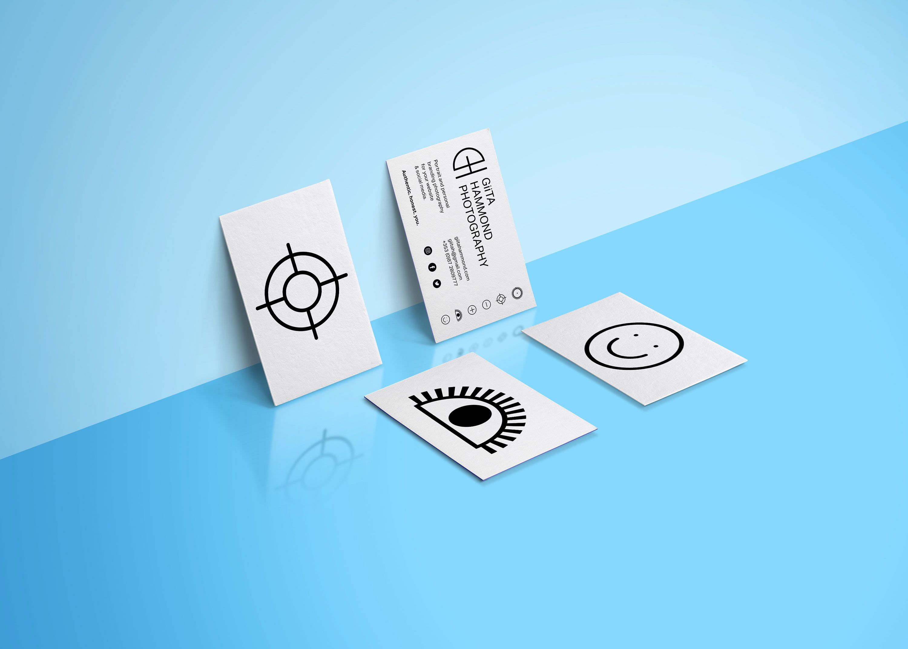
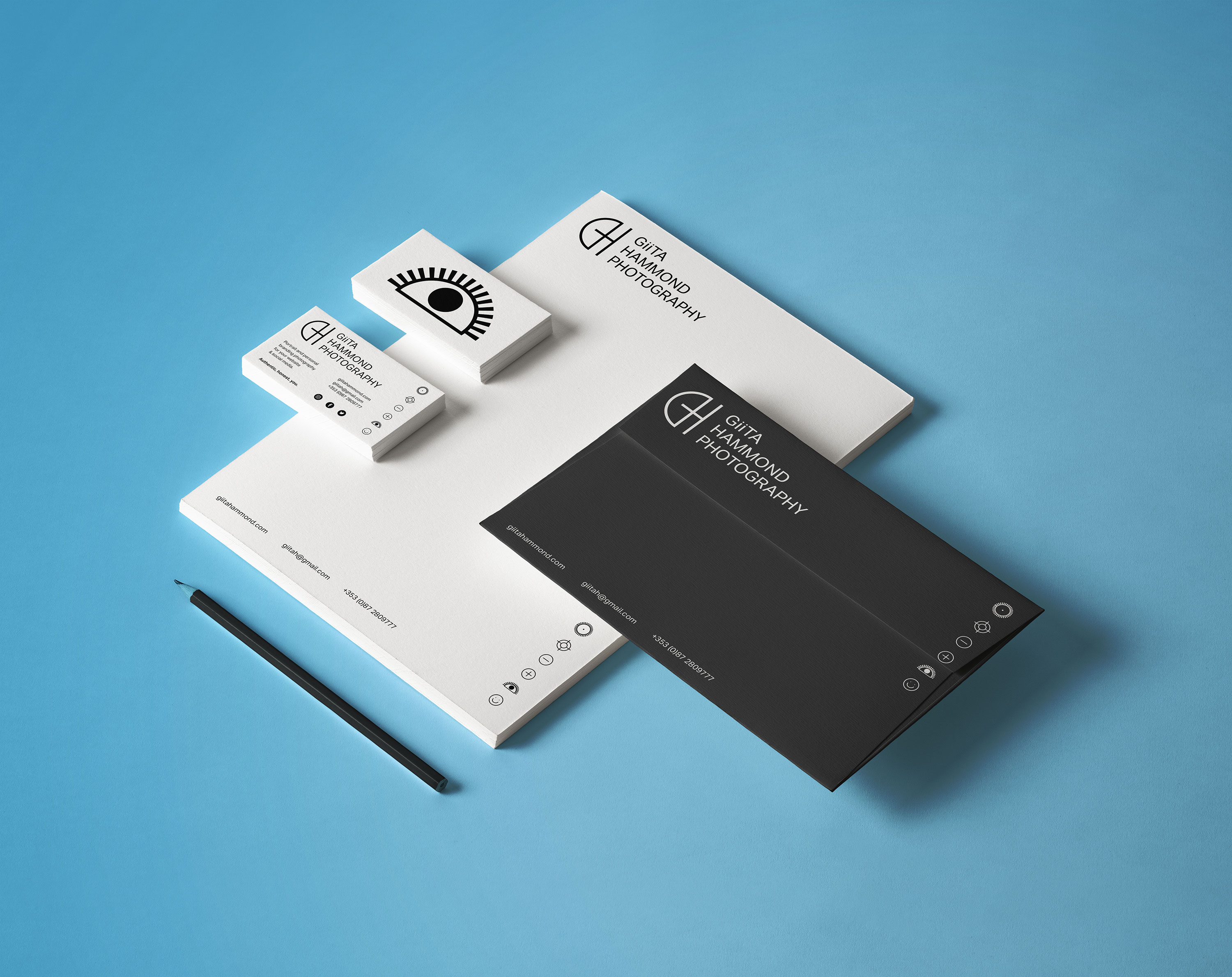
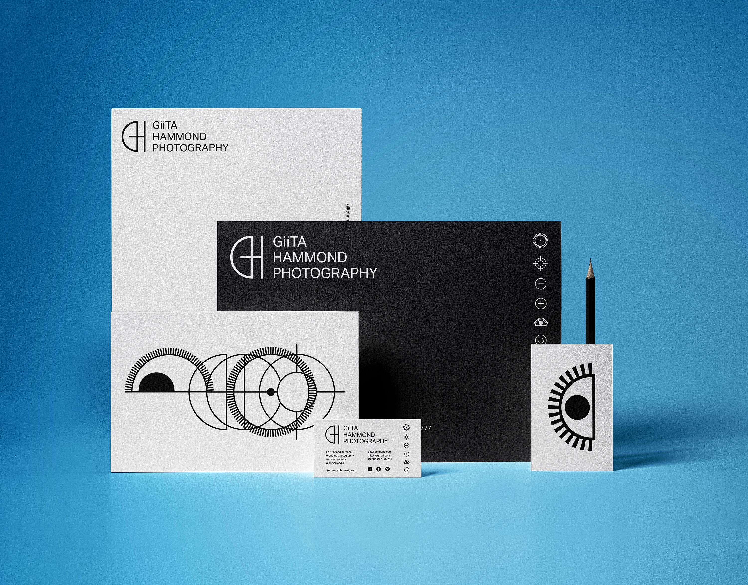
Client Brief:
Giita needed an identity and website refresh for her new photography business specialising in creative portraiture and personal branding photography. The main thing she wanted us to portray in the identity was friendliness and openness and her ability to put those she photographs at ease to be themselves and get the best shot.
Giita needed an identity and website refresh for her new photography business specialising in creative portraiture and personal branding photography. The main thing she wanted us to portray in the identity was friendliness and openness and her ability to put those she photographs at ease to be themselves and get the best shot.
Our Response:
We came up with a monogram and series of icons related to photography that when animated communicated what Giita is all about.
We came up with a monogram and series of icons related to photography that when animated communicated what Giita is all about.
Client Testimonial:
I approached BB to get help to spruce up my website and get a logo for my photography business. They took on board everything I said and created a beautiful contemporary website and an amazing logo. I have gotten so many compliments about the logo they created. Stina and Rachel were very easy to work with and understood exactly what I wanted. The end result far exceeded my expectations. I have recommended them to many friends and colleagues and would love to work with them again in the future.
I approached BB to get help to spruce up my website and get a logo for my photography business. They took on board everything I said and created a beautiful contemporary website and an amazing logo. I have gotten so many compliments about the logo they created. Stina and Rachel were very easy to work with and understood exactly what I wanted. The end result far exceeded my expectations. I have recommended them to many friends and colleagues and would love to work with them again in the future.
2021
![]()
The Douglas Hyde
Brand Identity & Website Design
thedouglashyde.ie
Client: The Douglas Hyde
Developer: Alex Bradley
Winner
IDI Universal Design
Special Awards
![]()
Brand Identity & Website Design
thedouglashyde.ie
Client: The Douglas Hyde
Developer: Alex Bradley
Winner
IDI Universal Design
Special Awards
Client Brief:
Challenges that most contemporary art galleries struggle with have to do with accessibility and how to bring conversations about art to larger and non-traditional audiences. With this rebrand and website project we needed to create an accessible and friendly design that welcomes new engagement and does away with any perceived intimidation whilst still maintaining the intellectual reputation of the gallery.
Challenges that most contemporary art galleries struggle with have to do with accessibility and how to bring conversations about art to larger and non-traditional audiences. With this rebrand and website project we needed to create an accessible and friendly design that welcomes new engagement and does away with any perceived intimidation whilst still maintaining the intellectual reputation of the gallery.
Our Response:
The website and all other communications platforms needed a clear editorial structure that allows for tiered levels of engagement with an information system using headings, sub-heads, introductory paragraph-styles, ‘read more’ tags etc. going from engaging and welcoming to descriptive and informative to academic and critical.
A gallery in essence is an architectural space, thus the design was inspired by aspects of its architectural features. The concrete ceiling of the gallery and the Trinity Arts Block became the catalyst for the logo and subsequently the brand identity and look and feel of the website. The rounded shape of the ceiling cells create a tension between sharpness and smoothness and of the negative and positive space.
The website and all other communications platforms needed a clear editorial structure that allows for tiered levels of engagement with an information system using headings, sub-heads, introductory paragraph-styles, ‘read more’ tags etc. going from engaging and welcoming to descriptive and informative to academic and critical.
A gallery in essence is an architectural space, thus the design was inspired by aspects of its architectural features. The concrete ceiling of the gallery and the Trinity Arts Block became the catalyst for the logo and subsequently the brand identity and look and feel of the website. The rounded shape of the ceiling cells create a tension between sharpness and smoothness and of the negative and positive space.
We worked closely with Learning & Engagement Curator of The Douglas Hyde, Fernando Sánchez-Migallón Cano and developer, Alex Bradley, to achieve a universal design. This included working with Knowbility to ensure the finished design was accessible to a wide range of people regardless of their age, size, ability or disability.
Through deconstructing and multiplying the mark and re-assembling the fragments of the original form, we developed a dynamic and modular system of symbols, icons and framing devices. The display type face (Forma) echoes that same tension between sharpness and smoothness whilst being high in contrast, legibility and character. Wanting to avoid the white cube aesthetic the colour scheme is led by a ‘muted’ charcoal black and warm off white that can be combined with the warm colours that compliments the grey concrete.
2021
Client: Project Arts Centre
![]()
How Do We Start?Publication
Client: Project Arts Centre
How do you encompass the challenges of the climate emergency for the Arts & Culture, the impact it is going to have on the way we work and how can artists play a role in leading this conversation?
Commissioned by the Project Arts Centre, How Do We Start? explores how they as a cultural institution can approach a more sustainable way of existing in the world and how to support artists to lead the way by collaborating and bringing their dynamic skills to bear on the problem.
The publication was edited by Maeve Stone & Cian O’Brien, with contributions from; artists Kasia Kaminska, Shanna May Breen & Luke Casserly, Katie Holten and Kaajal Modi. The artists’s work explore the question ‘How Do We Start?’ in ways of practical instructions, poetry, speculations, image making, and language.
Commissioned by the Project Arts Centre, How Do We Start? explores how they as a cultural institution can approach a more sustainable way of existing in the world and how to support artists to lead the way by collaborating and bringing their dynamic skills to bear on the problem.
The publication was edited by Maeve Stone & Cian O’Brien, with contributions from; artists Kasia Kaminska, Shanna May Breen & Luke Casserly, Katie Holten and Kaajal Modi. The artists’s work explore the question ‘How Do We Start?’ in ways of practical instructions, poetry, speculations, image making, and language.
We were inspired by the pragmatic and instructional nature of the artist contributions to base the design on Make-and-Do-Books from our childhood. The aesthetic of these books with their bold colours and framed text and images became a starting point for the book. On the cover and on a postcard (printed on plantable paper stock with wild flower seeds), the question ‘How Do We Start?’ expands out into a maze from several directions and explores ways of answering itself. This theme was extended further in the promotional elements of the project.
A major challenge of the project was to justify the contradiction of producing an object that addresses the climate crisis. We talked directly with paper manufacturers and printers about how we could find ways to minimise the impact of production and waste by using plant based inks, recycled papers, available offcuts and how to minimise transport and deliveries. It was a great learning experience for us as designers of books that will inform the way we work in the future.
A major challenge of the project was to justify the contradiction of producing an object that addresses the climate crisis. We talked directly with paper manufacturers and printers about how we could find ways to minimise the impact of production and waste by using plant based inks, recycled papers, available offcuts and how to minimise transport and deliveries. It was a great learning experience for us as designers of books that will inform the way we work in the future.
2020
Big Art Energy
Client: Project Arts Centre
![]()
Big Art Energy
Publication
Client: Project Arts Centre
The art publication Big Art Energy was commissioned by the Project Arts Centre as part of Future Forecast—a series of events and artistic interventions forming part of a speculative voyage towards the future.
The publication was edited by Louise Bruton & Cian O’Brien, with contributions from; photographer Vanessa Ifediora, writer Soula Emmanuel, artist Gary Farrelly and party makers Club Comfort. Big Art Energy showcases these artists’ reactions to the pandemic, response to lockdown and forecasts of the future of their respective industry or field of art.
We designed a package to be sent out by post with the limited edition publication and our contribution the fine art print ‘Can You See Me?’, a happy accident sprung from a series of technological failures. A beautiful blur of a screenshot from FaceTime during a failing internet connection became an intriguing portrait of ourselves and our new way of working.
Initially inspired by journals, especially Aisling copy books, the book would act as diary or log book to record and express our inner thoughts and feelings during lockdown. Taking from those visual cues, the cover of the book is plain, quiet and still with the inside being akin the inside of your head and how you might be feeling in the midst of the pandemic—cluttered, maybe a little bit claustrophobic and anxious but colourful and beautiful and overall, hopeful.
We employed a design process inspired by a common concept in architecture and city planning referred to as desire lines; “paths & tracks made over time by the wishes & feet of walkers, especially those paths that run contrary to design or planning”; or “free-will ways.” While first using a strict grid and typographic rules to create a foundation we then allowed our human instinct to take over and Big Art Energy to fill-in, spill over, doodle, colour-in, make notes in the margins and practice our autograph over and over, just like you would in a journal.
These interventions gave each section for the contributing artists a distinct look and feel specific to the content, yet, there remains a unity to the publication thanks to the rigour of the typography and editorial layout.
An extensive web, social media and print campaign gave BAE massive traction. As well as providing Project Arts Centre with a social media strategy and content, we created dynamic and personalised social media animations for all the contributing artists to share on their own social media platforms, while also providing all the necessary information for people interested in ordering the package. A billboard and posters outside of the Project put a smile on the faces of a few the passers-by in Temple Bar.
These interventions gave each section for the contributing artists a distinct look and feel specific to the content, yet, there remains a unity to the publication thanks to the rigour of the typography and editorial layout.
An extensive web, social media and print campaign gave BAE massive traction. As well as providing Project Arts Centre with a social media strategy and content, we created dynamic and personalised social media animations for all the contributing artists to share on their own social media platforms, while also providing all the necessary information for people interested in ordering the package. A billboard and posters outside of the Project put a smile on the faces of a few the passers-by in Temple Bar.
Client Brief:
We were tasked to create a utopian brand identiy for Tjikko Floral, an eco-conscious botanical stylist. The identity aspires towards Tjikko’s idea of an unfurling ecosystem, flourished with colour, variation, moist and mossy, dry and arid, with intricate shapes and coral like floral organisms, working perfectly in symbiosis with the most advanced human technology.
We were tasked to create a utopian brand identiy for Tjikko Floral, an eco-conscious botanical stylist. The identity aspires towards Tjikko’s idea of an unfurling ecosystem, flourished with colour, variation, moist and mossy, dry and arid, with intricate shapes and coral like floral organisms, working perfectly in symbiosis with the most advanced human technology.
Our Response:
We have created an identity that resonates with the clients vision. The custom logotype is fluid and organic, resembling an unfurling creeper that looks futurisitc and ancient at the same time.
We have created an identity that resonates with the clients vision. The custom logotype is fluid and organic, resembling an unfurling creeper that looks futurisitc and ancient at the same time.
Client Testimonial:
I just can't believe how accurately you telepathically visualised the concept after only a very short introduction. I'm actually just so moved! So excited, you guys are making my heart sing with every email!
Margie Lewis, Director, Tjikko Floral
I just can't believe how accurately you telepathically visualised the concept after only a very short introduction. I'm actually just so moved! So excited, you guys are making my heart sing with every email!
Margie Lewis, Director, Tjikko Floral
We designed and built an immersive portfolio website for eco-conscious botanical stylist, Tjikko Floral.
Based in Adelaide, Australia, floral artist and musician, Margie Lewis, wanted to slowly merge her two professions into one fully immersive sonic and floral experience. Tjikkofloral.com showcases her intricate otherworldly floral design as well as hosting her music in a mesmerising parallax petal portal, encouraging you to have a listen and get lost in this wholly escapist experience. By combining Tjikko’s images and sounds with a diverse range of animated elements, framing devices and the applied branding, we created a functional site that is “an art piece in and of itself.”
Based in Adelaide, Australia, floral artist and musician, Margie Lewis, wanted to slowly merge her two professions into one fully immersive sonic and floral experience. Tjikkofloral.com showcases her intricate otherworldly floral design as well as hosting her music in a mesmerising parallax petal portal, encouraging you to have a listen and get lost in this wholly escapist experience. By combining Tjikko’s images and sounds with a diverse range of animated elements, framing devices and the applied branding, we created a functional site that is “an art piece in and of itself.”
Photography & Music: Margie Jean Lewis
![]()
Client Brief:
Something in the Water was an exhibition of motion graphics pieces from 8 artists, displayed on a huge screen along the Grand Canal, Dublin. Taking inspiration from the literary history of the canal, the exhibition identity came to life as the unfolded dust jacket of a book.
Research began by looking at 20th century book covers of writers, antique book shops from the area and other printed ephemera from the Canal’s rich literary history. From these, the typographic style was developed and crafted into the main exhibition title.
Our Response:
The brand structure was also based on the exhibition as a book — each individual piece is like a chapter of the same book. We made bespoke social media assets for each artist to share with their followers and direct them to the exhibition’s channels, website and the exhibition itself.
We created bookmarks with a QR code that were distributed in local bookshops. Turning the QR code on its side made it instantaneously decoractive!
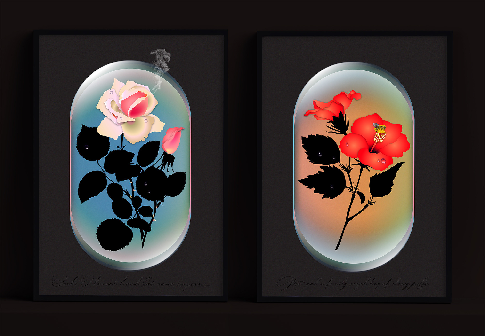
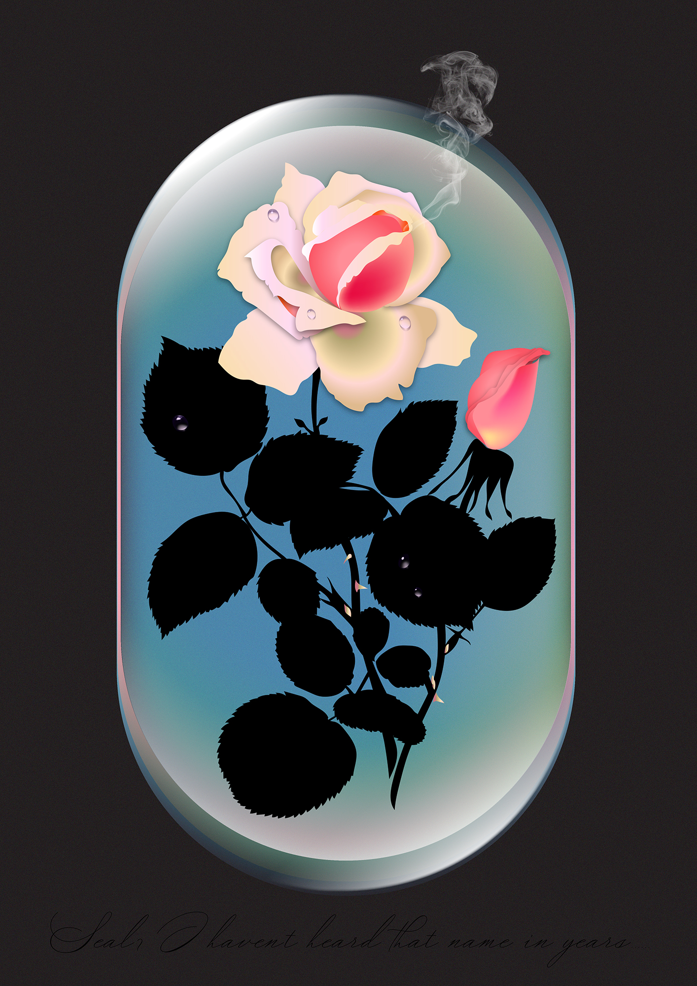
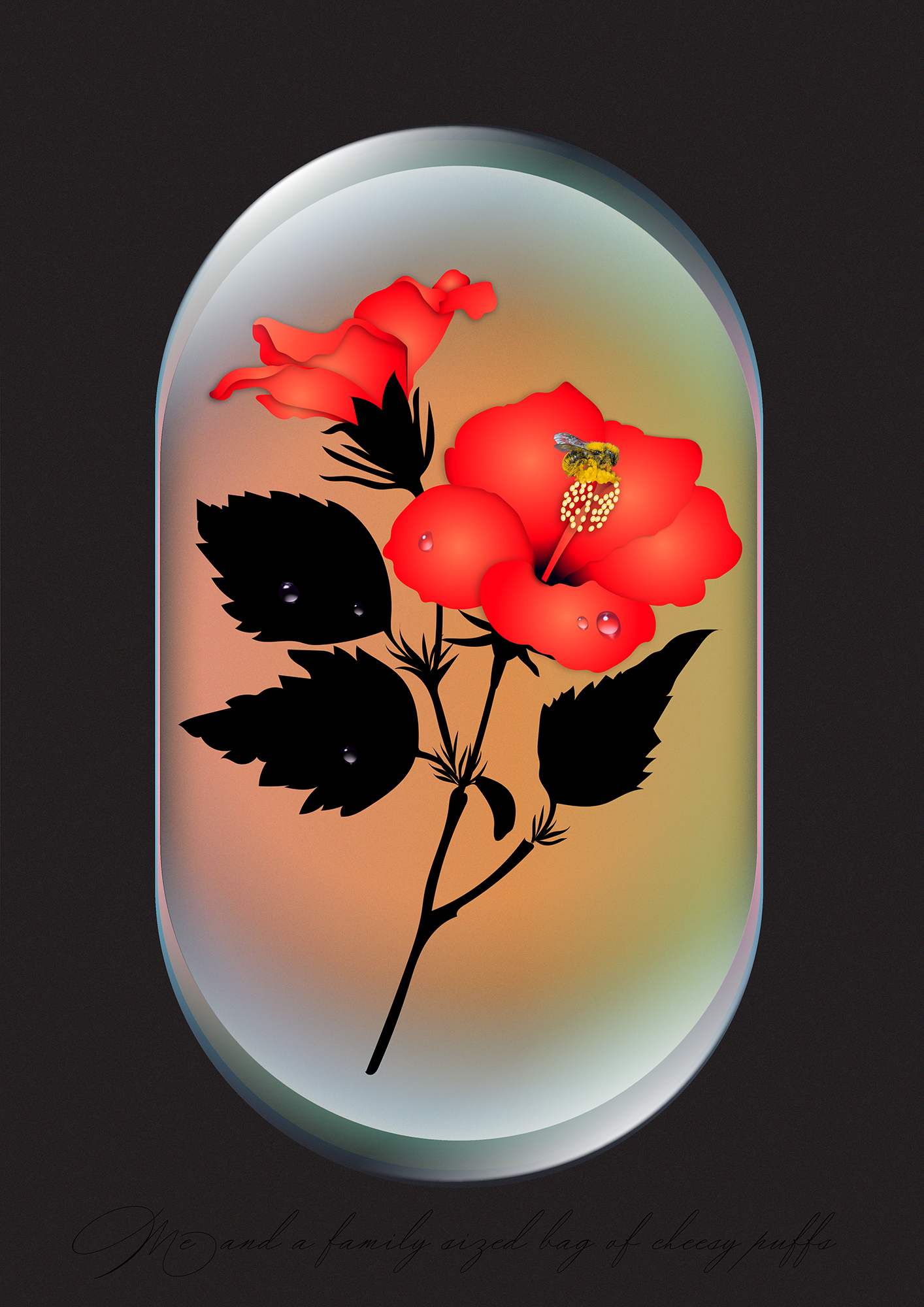
The fine art prints ‘Seal, I haven’t heard that name in years’ and ‘Me and a family sized bag of Cheesy Puffs’ were designed for the Hen’s Teeth G’wan Ireland exhibition, a great 2020 initiative supporting Irish artists, designers & photographers by showcasing and selling prints of their work.
In a year where many of us relied on the welcome comic relief of memes to get us through the day to day, we thought it would be fun to mess with their wholly transient nature and create something that could survive outside of our devices. Much like the poster itself, that has been elevated from a temporary advertising vessel, the meme too is now a piece of framed art in your home.
In a year where many of us relied on the welcome comic relief of memes to get us through the day to day, we thought it would be fun to mess with their wholly transient nature and create something that could survive outside of our devices. Much like the poster itself, that has been elevated from a temporary advertising vessel, the meme too is now a piece of framed art in your home.
Curation & Fine Art Printing: Hen’s Teeth


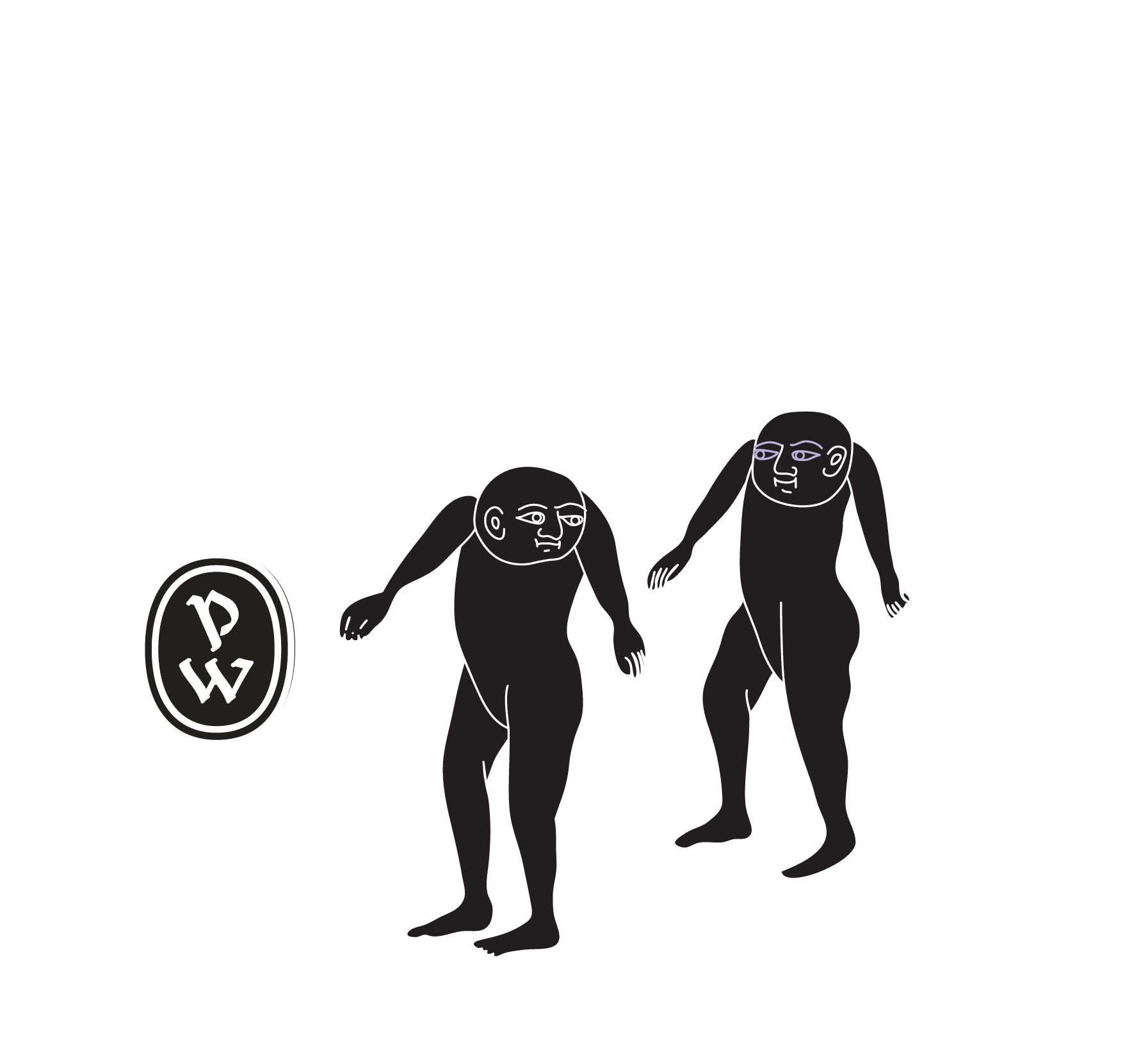
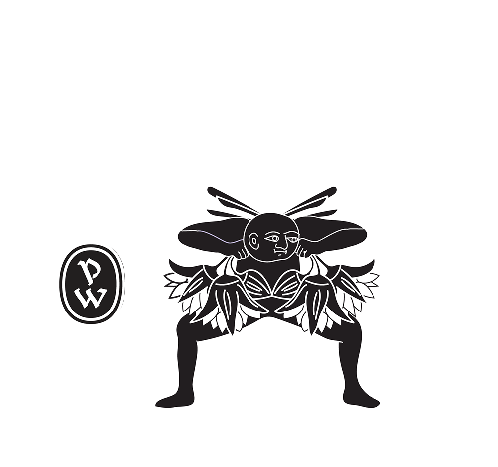
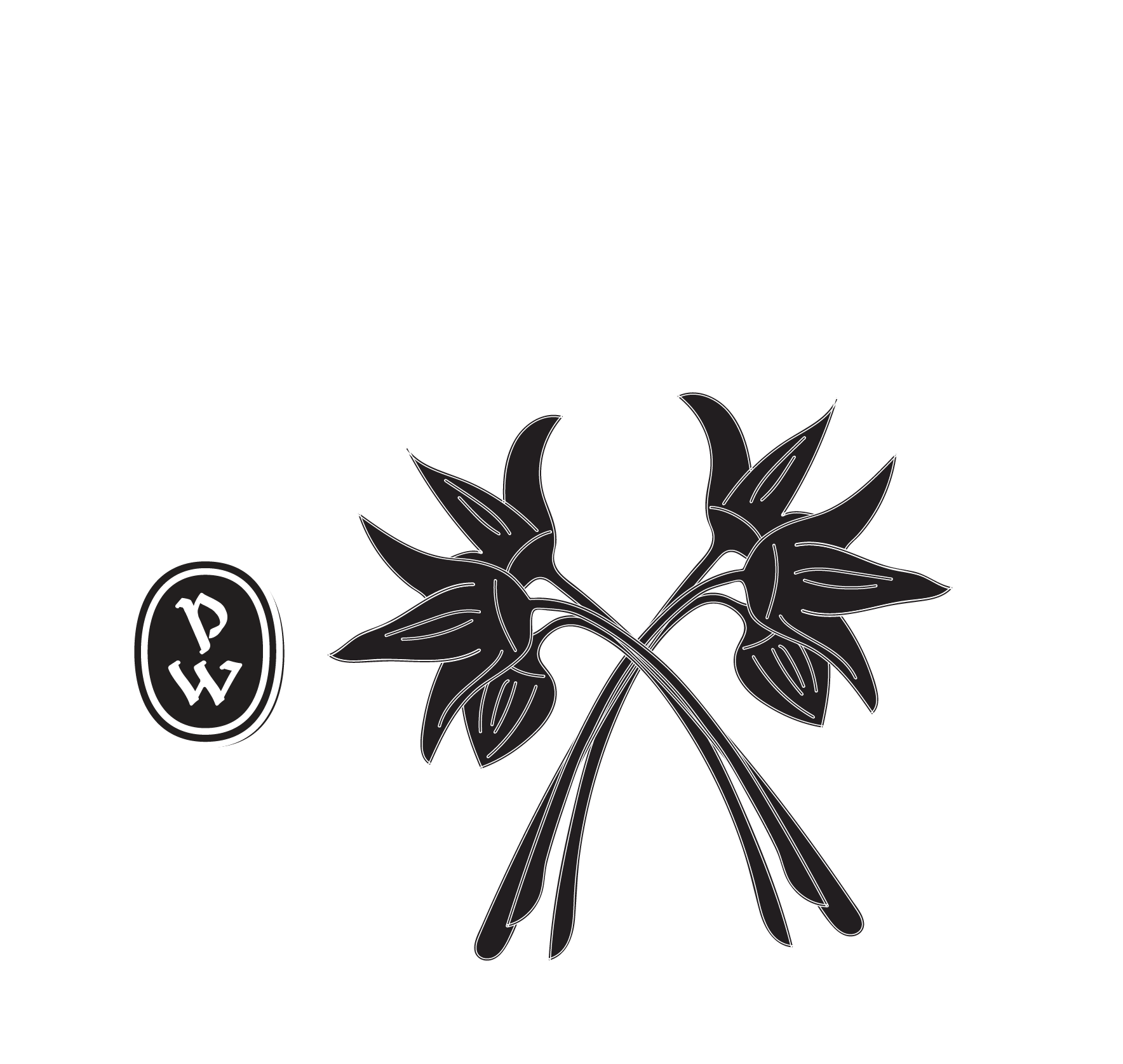
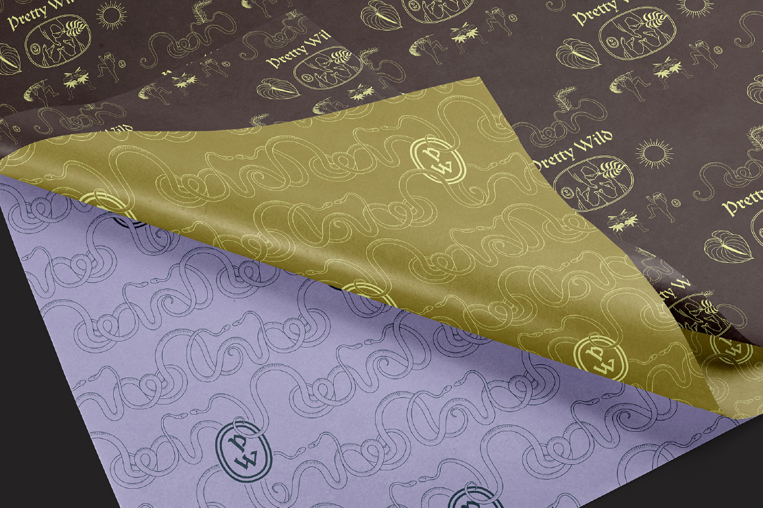
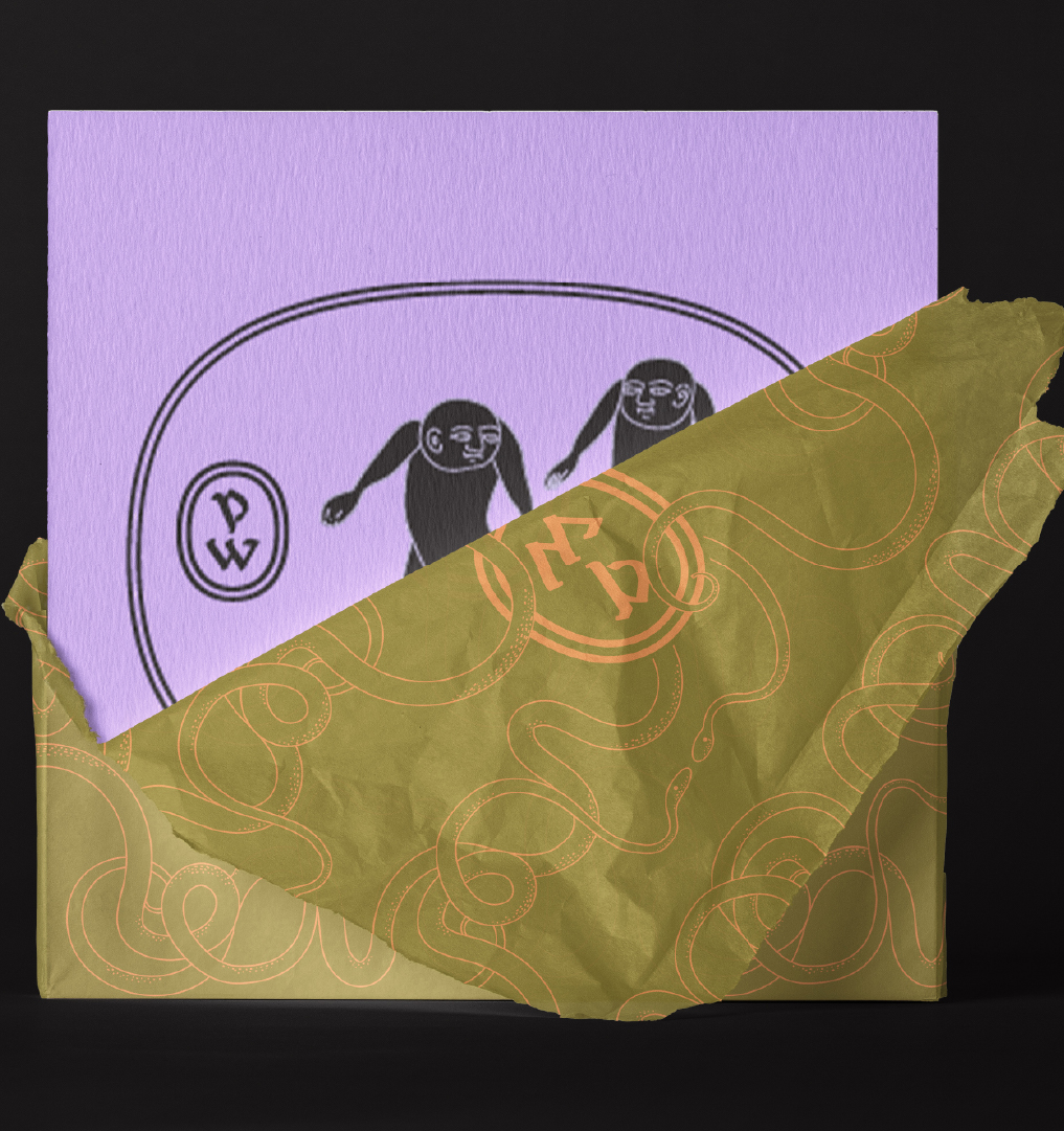
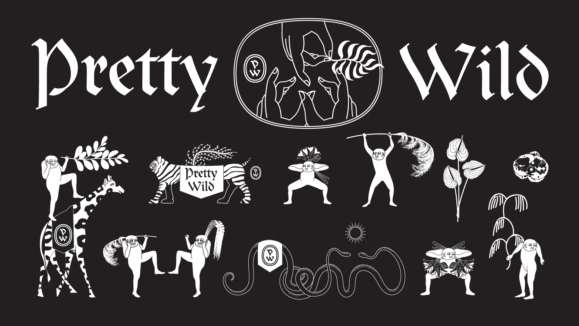
Client Brief:
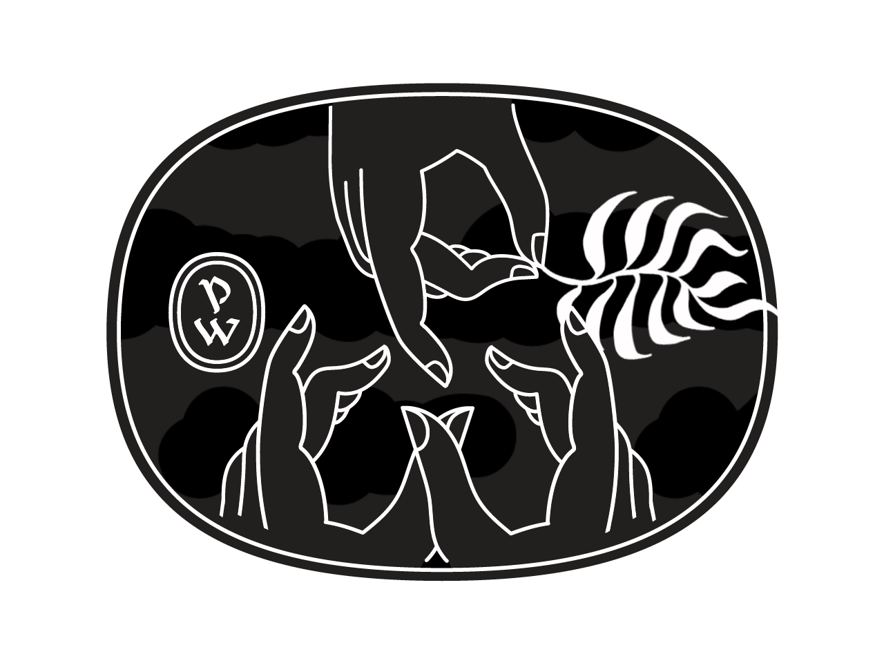
Pretty Wild is a Floristry Studio and Shop based in Bristol. Ellen needed a lot of bits designed for the rapidly expanding business such as business cards, care cards, branded wrapping tissue, stickers, tape etc. We needed to keep the existing legacy logotype but expand the brand identity with a colour way and a suite of illustartions and marks.
Pretty Wild is a Floristry Studio and Shop based in Bristol. Ellen needed a lot of bits designed for the rapidly expanding business such as business cards, care cards, branded wrapping tissue, stickers, tape etc. We needed to keep the existing legacy logotype but expand the brand identity with a colour way and a suite of illustartions and marks.
Our Response:
Inspired by gangster business cards, we created a three handed gang sign spelling out ‘PW’ as the central motif. Instead of simply repeating this same logo design across the whole suite of materials we created a whole gang of misfit characters that could inhabit the Pretty Wild world.
Inspired by gangster business cards, we created a three handed gang sign spelling out ‘PW’ as the central motif. Instead of simply repeating this same logo design across the whole suite of materials we created a whole gang of misfit characters that could inhabit the Pretty Wild world.
Client Testimonial:
Rachel and Stina, took a ball of tangled thoughts, ramblings and screenshots and distilled them in to a body of work that gives me such genuine and innocent pleasure.
‘I want flowers, but not flower flowers. I want romance but I don't want to be seen as romantic. I want androgyny. I want old and new. I want cool but not too cool. I want something that I'm happy to live through because, as a self-employed, creative person, I am my work.'
Ellen Kenny, Director, Pretty Wild


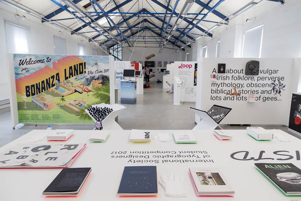
2017
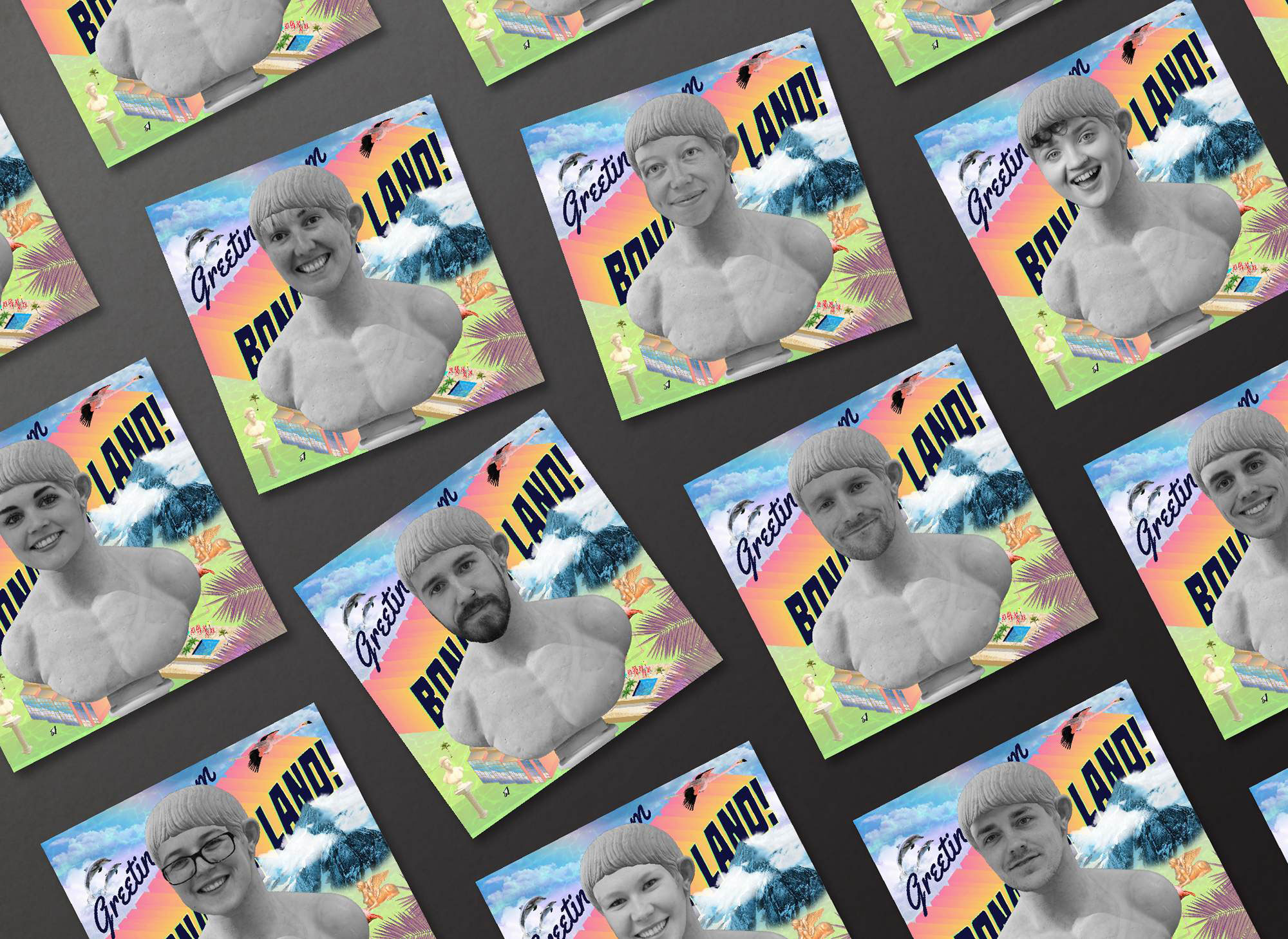
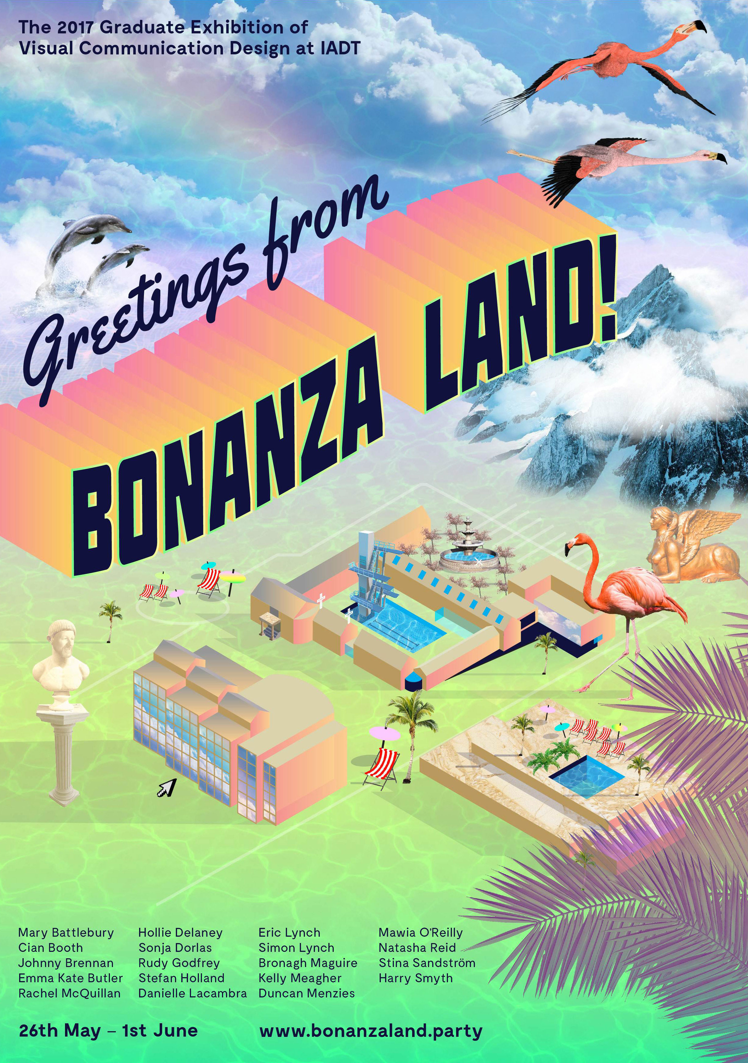
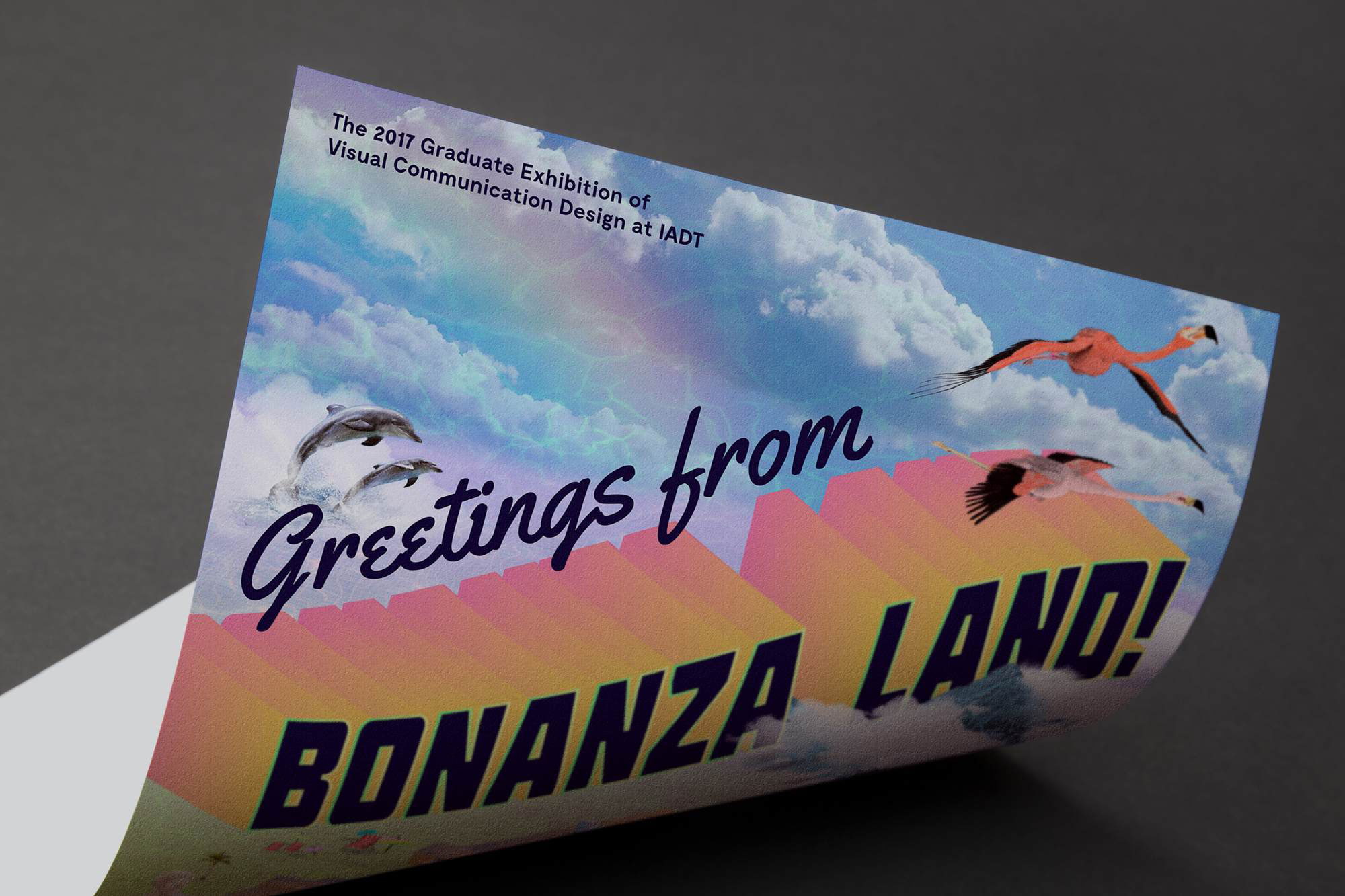
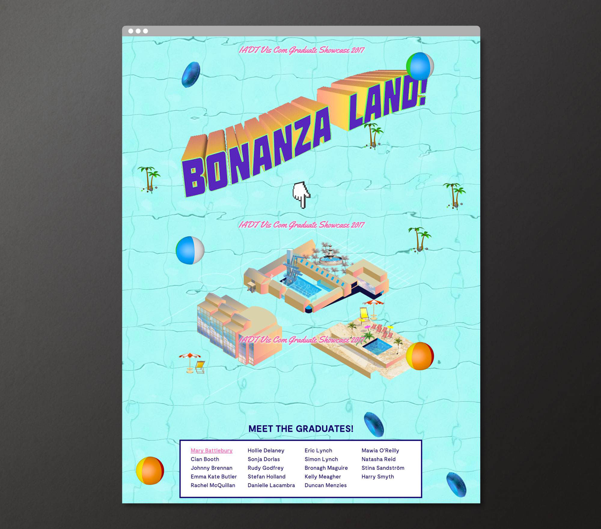
Bonanza Land!
IADT Visual Communications Graduate Exhibition 2017
![]()
Bonanza Land!
IADT Visual Communications Graduate Exhibition 2017
The concept for this project was born from the proposition that IADT is an Island—The Island of Art, Design and Technology. Away from the buzz and distractions of the city, Visual Communications students work in an intensely creative environment producing a bonanza of fantastical and innovative results. In order to entice visitors to make the journey out to this island to see the show, we needed to create a desirable and exciting destination.
The project required a promotional poster, social media campaign, promotional motion piece, website, and exhibition graphics & signage.
The project required a promotional poster, social media campaign, promotional motion piece, website, and exhibition graphics & signage.
We borrowed cues and marketing tools from the world of tourism and created a hyperreal holiday resort called BONANZA LAND! The very definition of bonanza is a large amount of something desirable, so for this reason the identity was ideal for the 2017 Visual Communications Graduate Showcase—a veritable Visual Communications bonanza!
Bonanza Land! is included in 2017 100 Archive Selection and also won the IDI Graduate Award for best use of illustration in design 2017.

2021
![]()
The Douglas Hyde
Brand Identity & Website Design
thedouglashyde.ie
Client: The Douglas Hyde
Developer: Alex Bradley
Winner
IDI Universal Design
Special Awards
![]()
Brand Identity & Website Design
thedouglashyde.ie
Client: The Douglas Hyde
Developer: Alex Bradley
Winner
IDI Universal Design
Special Awards
Client Brief:
Challenges that most contemporary art galleries struggle with have to do with accessibility and how to bring conversations about art to larger and non-traditional audiences. With this rebrand and website project we needed to create an accessible and friendly design that welcomes new engagement and does away with any perceived intimidation whilst still maintaining the intellectual reputation of the gallery.
Challenges that most contemporary art galleries struggle with have to do with accessibility and how to bring conversations about art to larger and non-traditional audiences. With this rebrand and website project we needed to create an accessible and friendly design that welcomes new engagement and does away with any perceived intimidation whilst still maintaining the intellectual reputation of the gallery.
Our Response:
The website and all other communications platforms needed a clear editorial structure that allows for tiered levels of engagement with an information system using headings, sub-heads, introductory paragraph-styles, ‘read more’ tags etc. going from engaging and welcoming to descriptive and informative to academic and critical.
A gallery in essence is an architectural space, thus the design was inspired by aspects of its architectural features. The concrete ceiling of the gallery and the Trinity Arts Block became the catalyst for the logo and subsequently the brand identity and look and feel of the website. The rounded shape of the ceiling cells create a tension between sharpness and smoothness and of the negative and positive space.
The website and all other communications platforms needed a clear editorial structure that allows for tiered levels of engagement with an information system using headings, sub-heads, introductory paragraph-styles, ‘read more’ tags etc. going from engaging and welcoming to descriptive and informative to academic and critical.
A gallery in essence is an architectural space, thus the design was inspired by aspects of its architectural features. The concrete ceiling of the gallery and the Trinity Arts Block became the catalyst for the logo and subsequently the brand identity and look and feel of the website. The rounded shape of the ceiling cells create a tension between sharpness and smoothness and of the negative and positive space.
We worked closely with Learning & Engagement Curator of The Douglas Hyde, Fernando Sánchez-Migallón Cano and developer, Alex Bradley, to achieve a universal design. This included working with Knowbility to ensure the finished design was accessible to a wide range of people regardless of their age, size, ability or disability.
Through deconstructing and multiplying the mark and re-assembling the fragments of the original form, we developed a dynamic and modular system of symbols, icons and framing devices. The display type face (Forma) echoes that same tension between sharpness and smoothness whilst being high in contrast, legibility and character. Wanting to avoid the white cube aesthetic the colour scheme is led by a ‘muted’ charcoal black and warm off white that can be combined with the warm colours that compliments the grey concrete.
2021
Client: Project Arts Centre
![]()
How Do We Start?Publication
Client: Project Arts Centre
How do you encompass the challenges of the climate emergency for the Arts & Culture, the impact it is going to have on the way we work and how can artists play a role in leading this conversation?
Commissioned by the Project Arts Centre, How Do We Start? explores how they as a cultural institution can approach a more sustainable way of existing in the world and how to support artists to lead the way by collaborating and bringing their dynamic skills to bear on the problem.
The publication was edited by Maeve Stone & Cian O’Brien, with contributions from; artists Kasia Kaminska, Shanna May Breen & Luke Casserly, Katie Holten and Kaajal Modi. The artists’s work explore the question ‘How Do We Start?’ in ways of practical instructions, poetry, speculations, image making, and language.
Commissioned by the Project Arts Centre, How Do We Start? explores how they as a cultural institution can approach a more sustainable way of existing in the world and how to support artists to lead the way by collaborating and bringing their dynamic skills to bear on the problem.
The publication was edited by Maeve Stone & Cian O’Brien, with contributions from; artists Kasia Kaminska, Shanna May Breen & Luke Casserly, Katie Holten and Kaajal Modi. The artists’s work explore the question ‘How Do We Start?’ in ways of practical instructions, poetry, speculations, image making, and language.
We were inspired by the pragmatic and instructional nature of the artist contributions to base the design on Make-and-Do-Books from our childhood. The aesthetic of these books with their bold colours and framed text and images became a starting point for the book. On the cover and on a postcard (printed on plantable paper stock with wild flower seeds), the question ‘How Do We Start?’ expands out into a maze from several directions and explores ways of answering itself. This theme was extended further in the promotional elements of the project.
A major challenge of the project was to justify the contradiction of producing an object that addresses the climate crisis. We talked directly with paper manufacturers and printers about how we could find ways to minimise the impact of production and waste by using plant based inks, recycled papers, available offcuts and how to minimise transport and deliveries. It was a great learning experience for us as designers of books that will inform the way we work in the future.
A major challenge of the project was to justify the contradiction of producing an object that addresses the climate crisis. We talked directly with paper manufacturers and printers about how we could find ways to minimise the impact of production and waste by using plant based inks, recycled papers, available offcuts and how to minimise transport and deliveries. It was a great learning experience for us as designers of books that will inform the way we work in the future.
2020
Big Art Energy
Client: Project Arts Centre
![]()
Big Art Energy
Publication
Client: Project Arts Centre
The art publication Big Art Energy was commissioned by the Project Arts Centre as part of Future Forecast—a series of events and artistic interventions forming part of a speculative voyage towards the future.
The publication was edited by Louise Bruton & Cian O’Brien, with contributions from; photographer Vanessa Ifediora, writer Soula Emmanuel, artist Gary Farrelly and party makers Club Comfort. Big Art Energy showcases these artists’ reactions to the pandemic, response to lockdown and forecasts of the future of their respective industry or field of art.
We designed a package to be sent out by post with the limited edition publication and our contribution the fine art print ‘Can You See Me?’, a happy accident sprung from a series of technological failures. A beautiful blur of a screenshot from FaceTime during a failing internet connection became an intriguing portrait of ourselves and our new way of working.
Initially inspired by journals, especially Aisling copy books, the book would act as diary or log book to record and express our inner thoughts and feelings during lockdown. Taking from those visual cues, the cover of the book is plain, quiet and still with the inside being akin the inside of your head and how you might be feeling in the midst of the pandemic—cluttered, maybe a little bit claustrophobic and anxious but colourful and beautiful and overall, hopeful.
The publication was edited by Louise Bruton & Cian O’Brien, with contributions from; photographer Vanessa Ifediora, writer Soula Emmanuel, artist Gary Farrelly and party makers Club Comfort. Big Art Energy showcases these artists’ reactions to the pandemic, response to lockdown and forecasts of the future of their respective industry or field of art.
We designed a package to be sent out by post with the limited edition publication and our contribution the fine art print ‘Can You See Me?’, a happy accident sprung from a series of technological failures. A beautiful blur of a screenshot from FaceTime during a failing internet connection became an intriguing portrait of ourselves and our new way of working.
Initially inspired by journals, especially Aisling copy books, the book would act as diary or log book to record and express our inner thoughts and feelings during lockdown. Taking from those visual cues, the cover of the book is plain, quiet and still with the inside being akin the inside of your head and how you might be feeling in the midst of the pandemic—cluttered, maybe a little bit claustrophobic and anxious but colourful and beautiful and overall, hopeful.
We employed a design process inspired by a common concept in architecture and city planning referred to as desire lines; “paths & tracks made over time by the wishes & feet of walkers, especially those paths that run contrary to design or planning”; or “free-will ways.” While first using a strict grid and typographic rules to create a foundation we then allowed our human instinct to take over and Big Art Energy to fill-in, spill over, doodle, colour-in, make notes in the margins and practice our autograph over and over, just like you would in a journal.
These interventions gave each section for the contributing artists a distinct look and feel specific to the content, yet, there remains a unity to the publication thanks to the rigour of the typography and editorial layout.
An extensive web, social media and print campaign gave BAE massive traction. As well as providing Project Arts Centre with a social media strategy and content, we created dynamic and personalised social media animations for all the contributing artists to share on their own social media platforms, while also providing all the necessary information for people interested in ordering the package. A billboard and posters outside of the Project put a smile on the faces of a few the passers-by in Temple Bar.
These interventions gave each section for the contributing artists a distinct look and feel specific to the content, yet, there remains a unity to the publication thanks to the rigour of the typography and editorial layout.
An extensive web, social media and print campaign gave BAE massive traction. As well as providing Project Arts Centre with a social media strategy and content, we created dynamic and personalised social media animations for all the contributing artists to share on their own social media platforms, while also providing all the necessary information for people interested in ordering the package. A billboard and posters outside of the Project put a smile on the faces of a few the passers-by in Temple Bar.
2019
Irish National Opera
Launch & Event Campaigns
Client: Irish National Opera
Irish National Opera
Launch & Event Campaigns
Client: Irish National Opera
Client Brief:
The client required several videos and still images for multiple social media campaigns for the 2019 – 2020 season of Opera. These had to work with the existing brand and imagery, and be adaptable as templates to be used for future posts throughout the season. The client wanted something elegant but contemporary that represented the brand and was fresh and fun at the same time.
The client required several videos and still images for multiple social media campaigns for the 2019 – 2020 season of Opera. These had to work with the existing brand and imagery, and be adaptable as templates to be used for future posts throughout the season. The client wanted something elegant but contemporary that represented the brand and was fresh and fun at the same time.
Our Response:
We created a series of videos and stills to be used as social media posts in the run up to the launch. Including teaser posts, countdown posts, launch animation posts and production imagery posts and stories. As well as a set of templates that can be used for any other events that occur within the 2019 – 2020 season.
We also created a social media campaign for a series of Opera talks that are held in the Italian Institute of Culture throughout the 2019 – 2020 season.
Client Testimonial:
We worked with Bureau Bonanza to create animated graphics to announce the launch of our new season programme. The team have a great design process, with lots of appetite for testing and adapting, great reaction to feedback and quick turnaround times, all of which were really valuable as we built the assets in advance of the launch.
Importantly, they were able to adapt the assets they created to allow us to optimise across multiple social platforms, getting the maximum value out of the work and ensuring the content looked great where ever it was seen.
Sarah Halpin
Digital Communications Manager, Irish National Opera
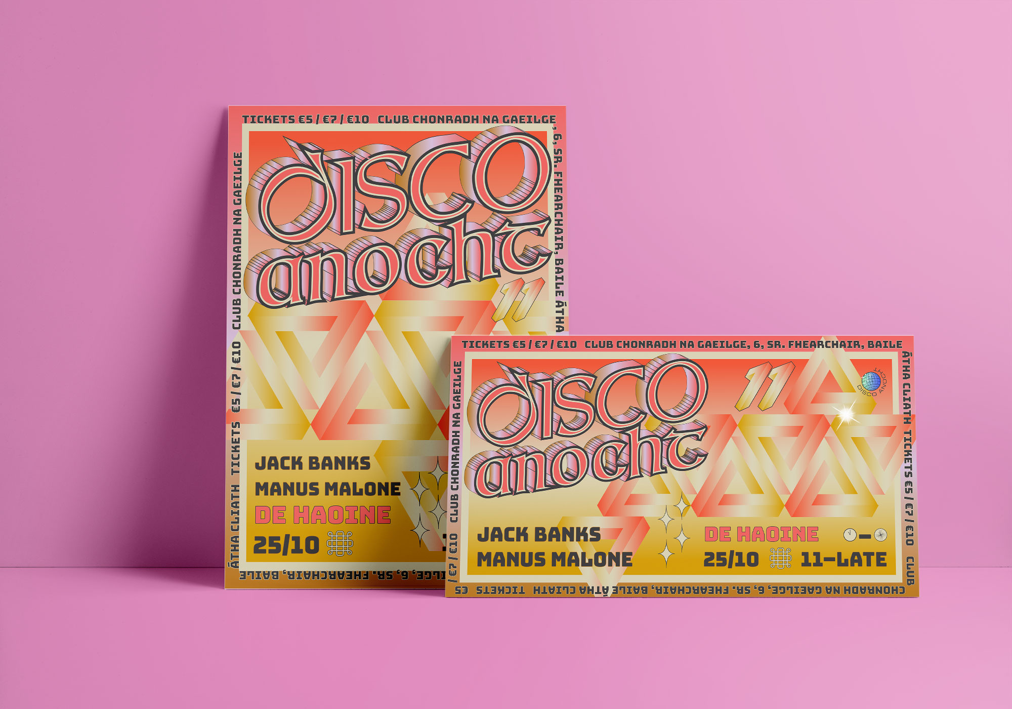
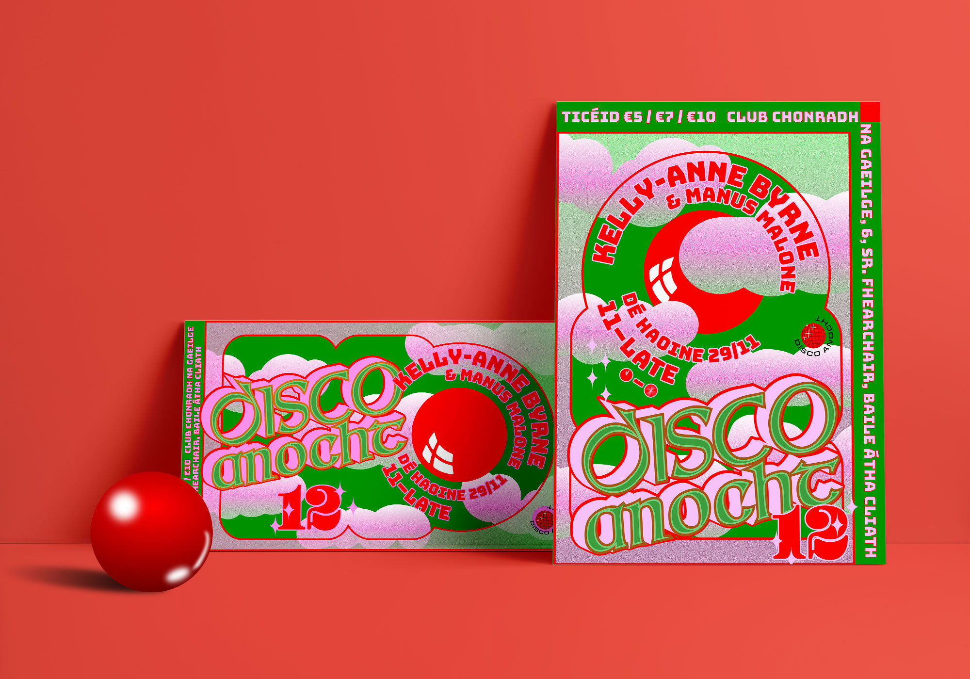
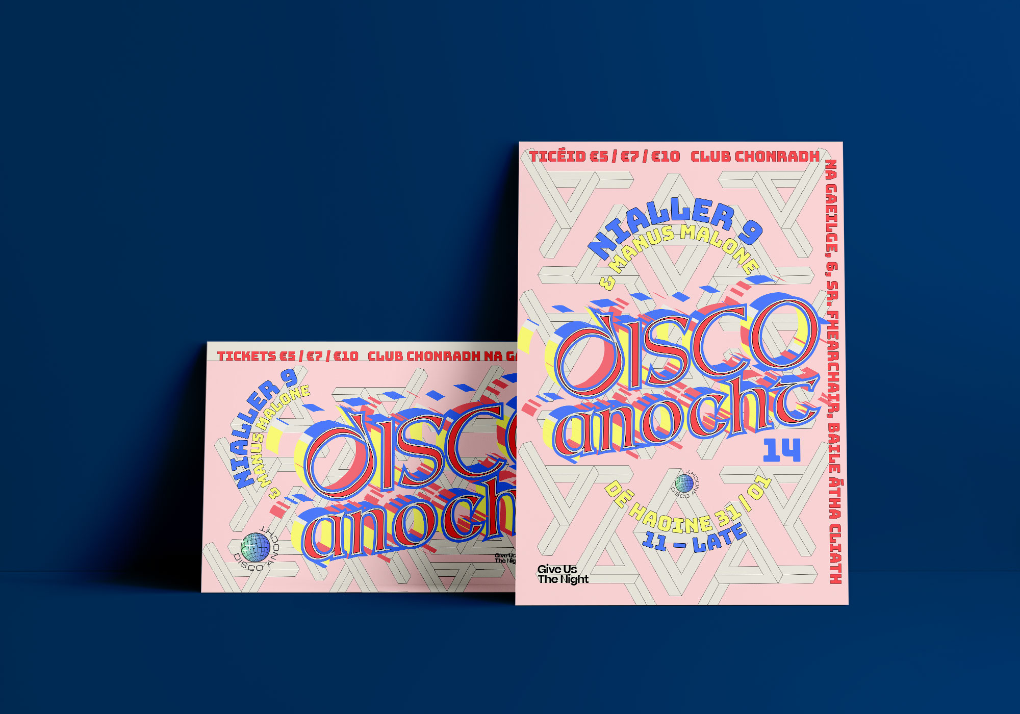
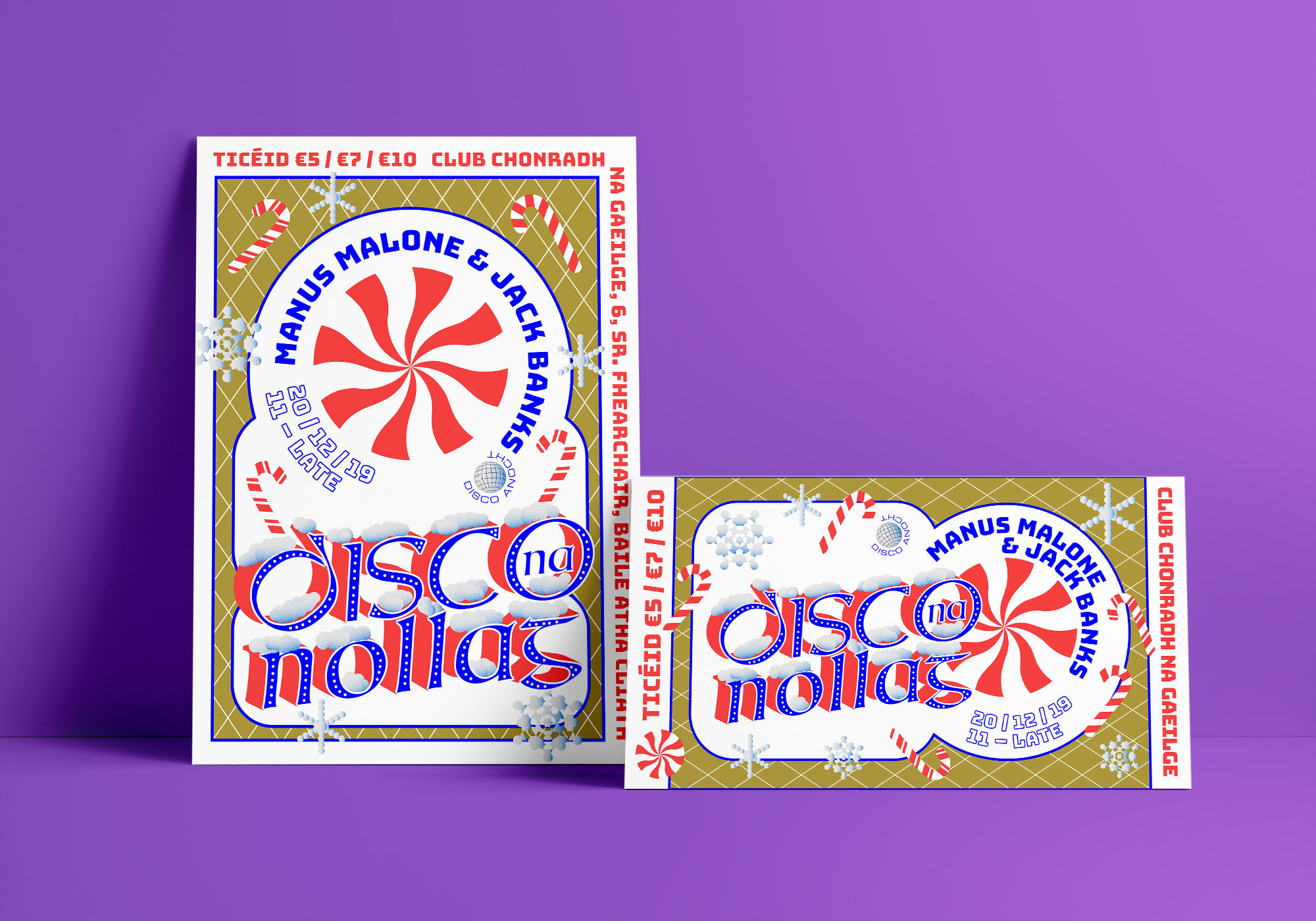
2019–2020
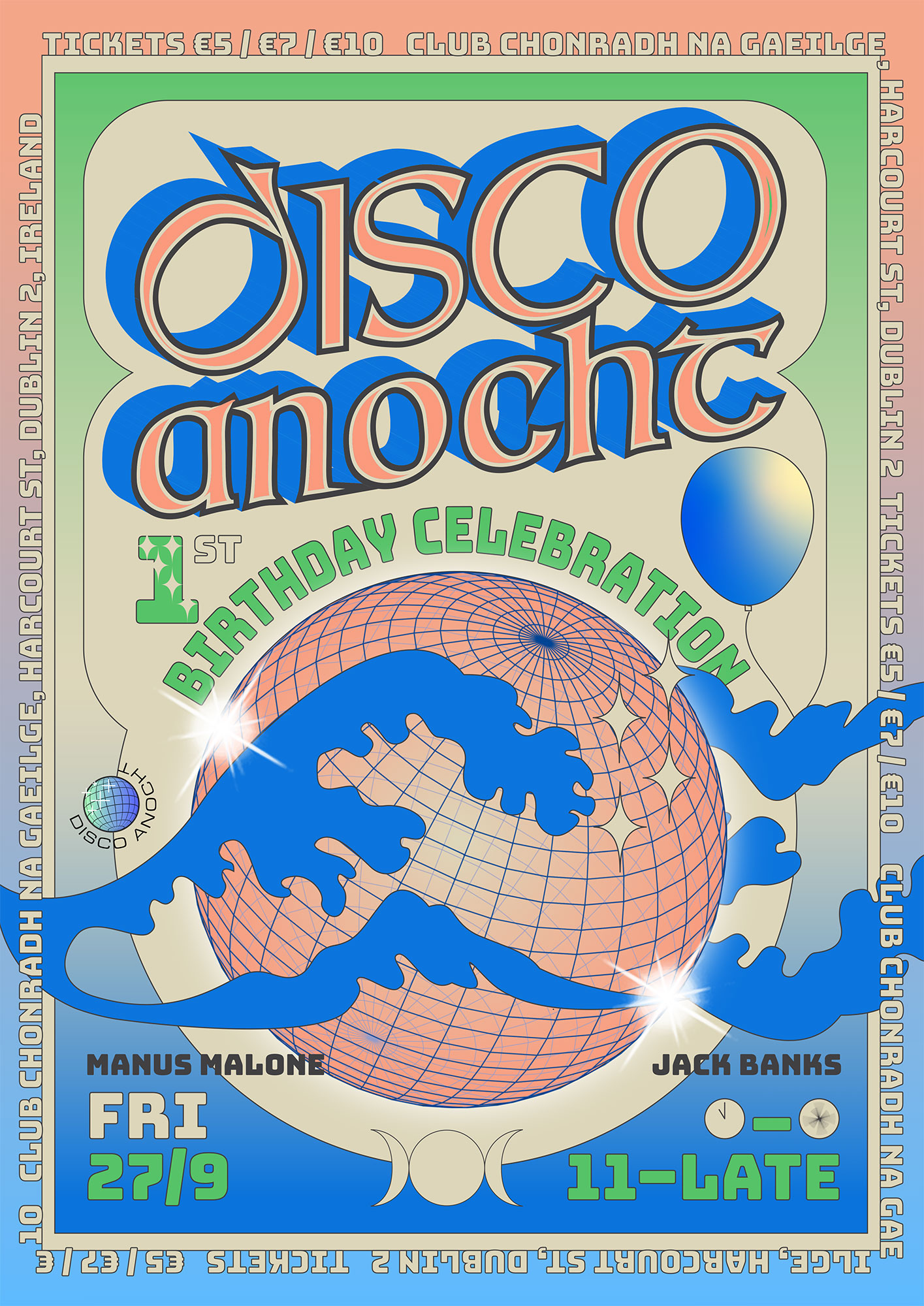
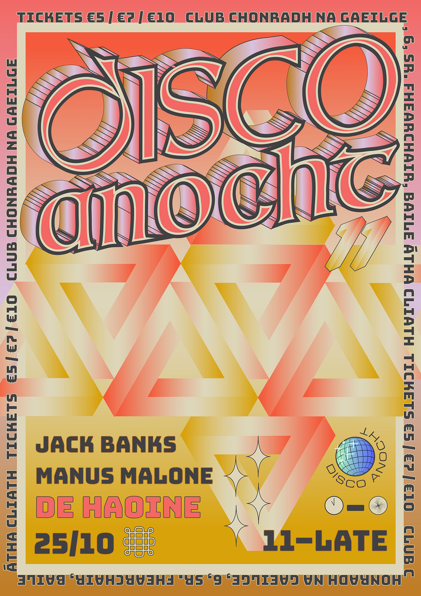
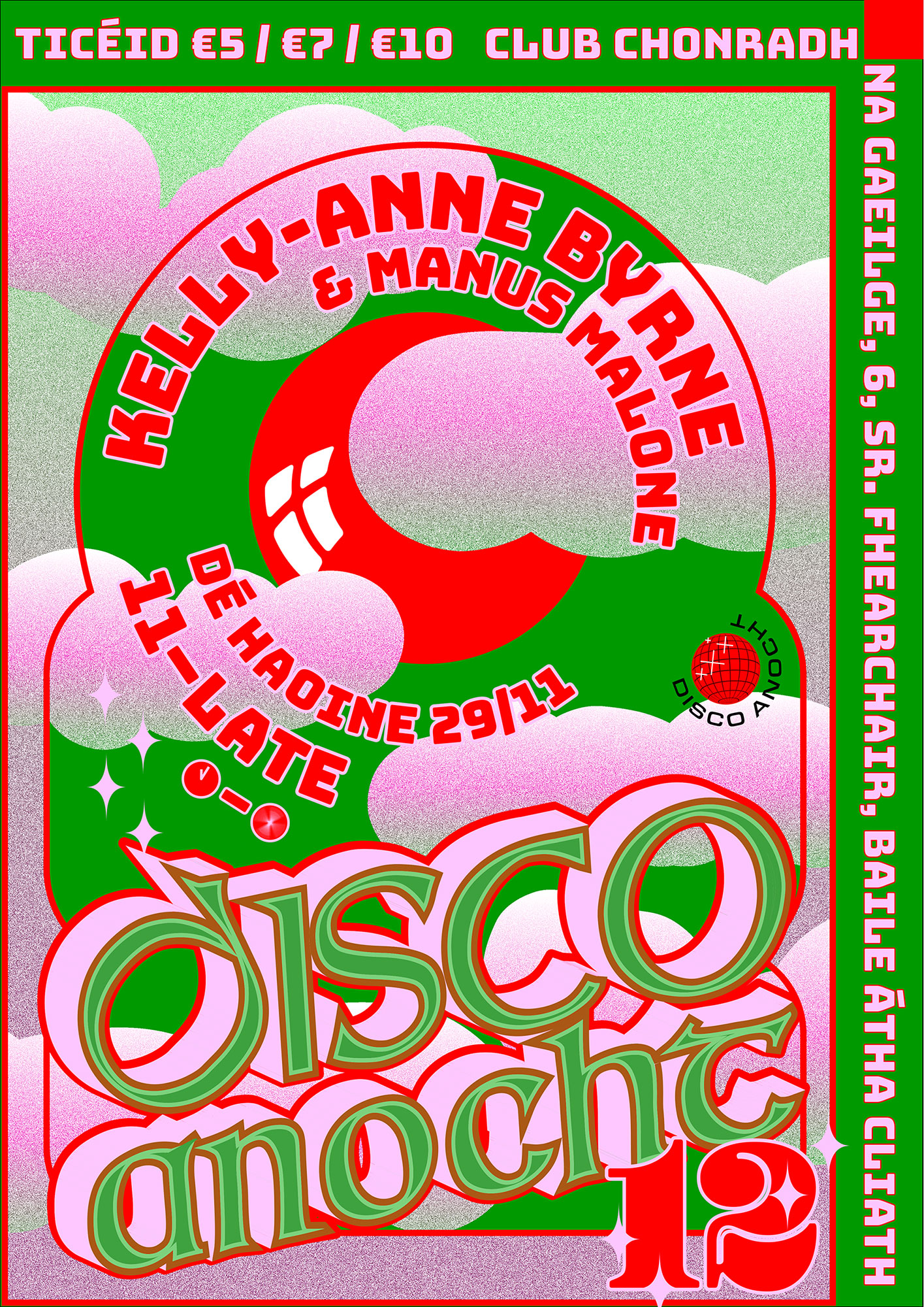
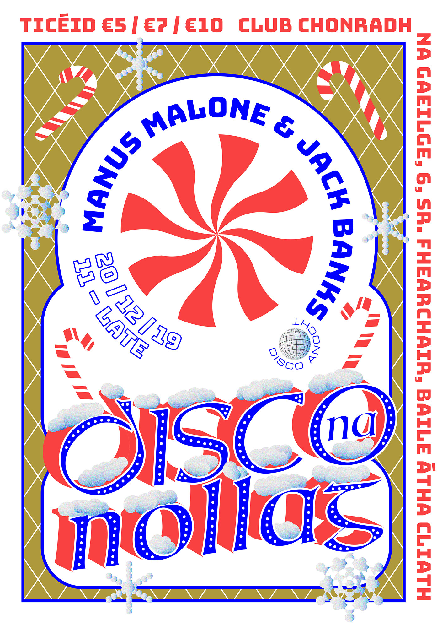
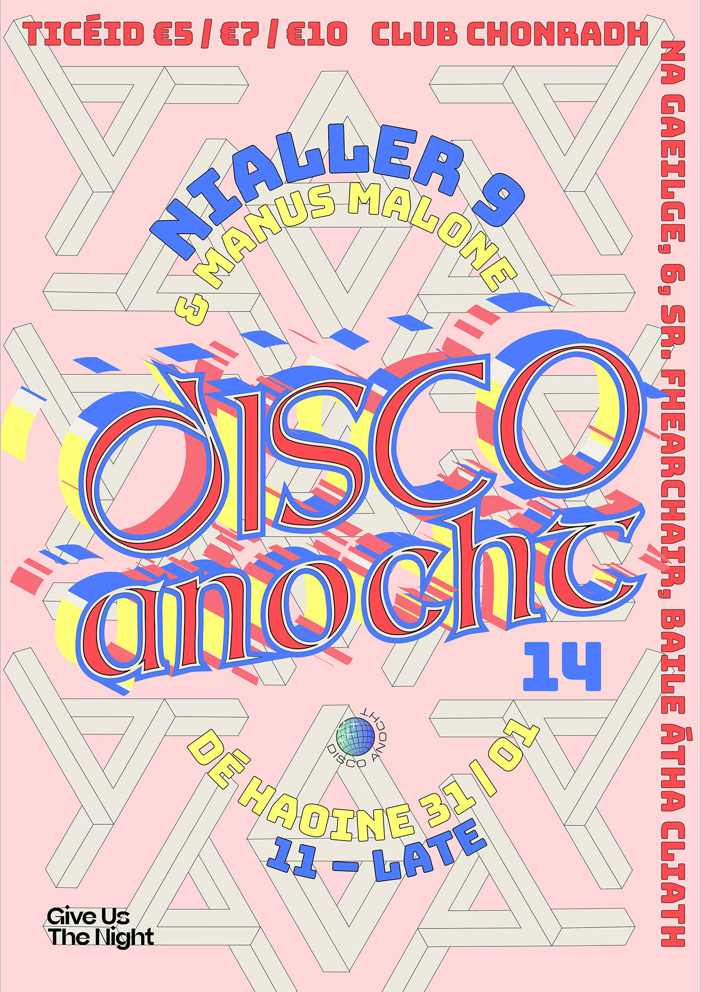
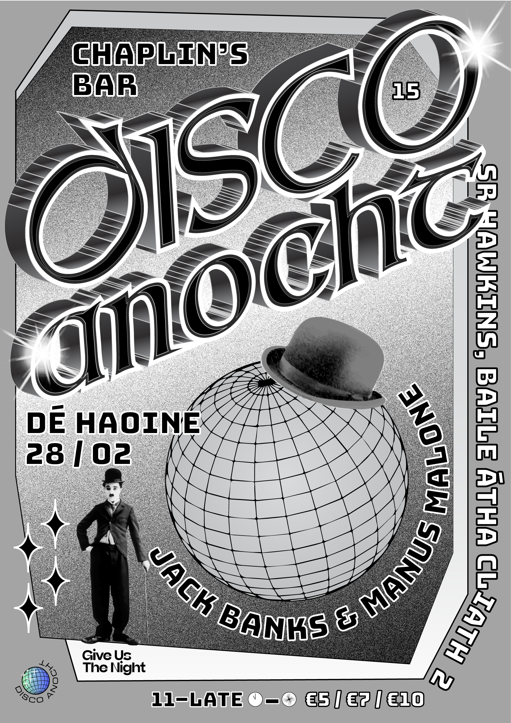
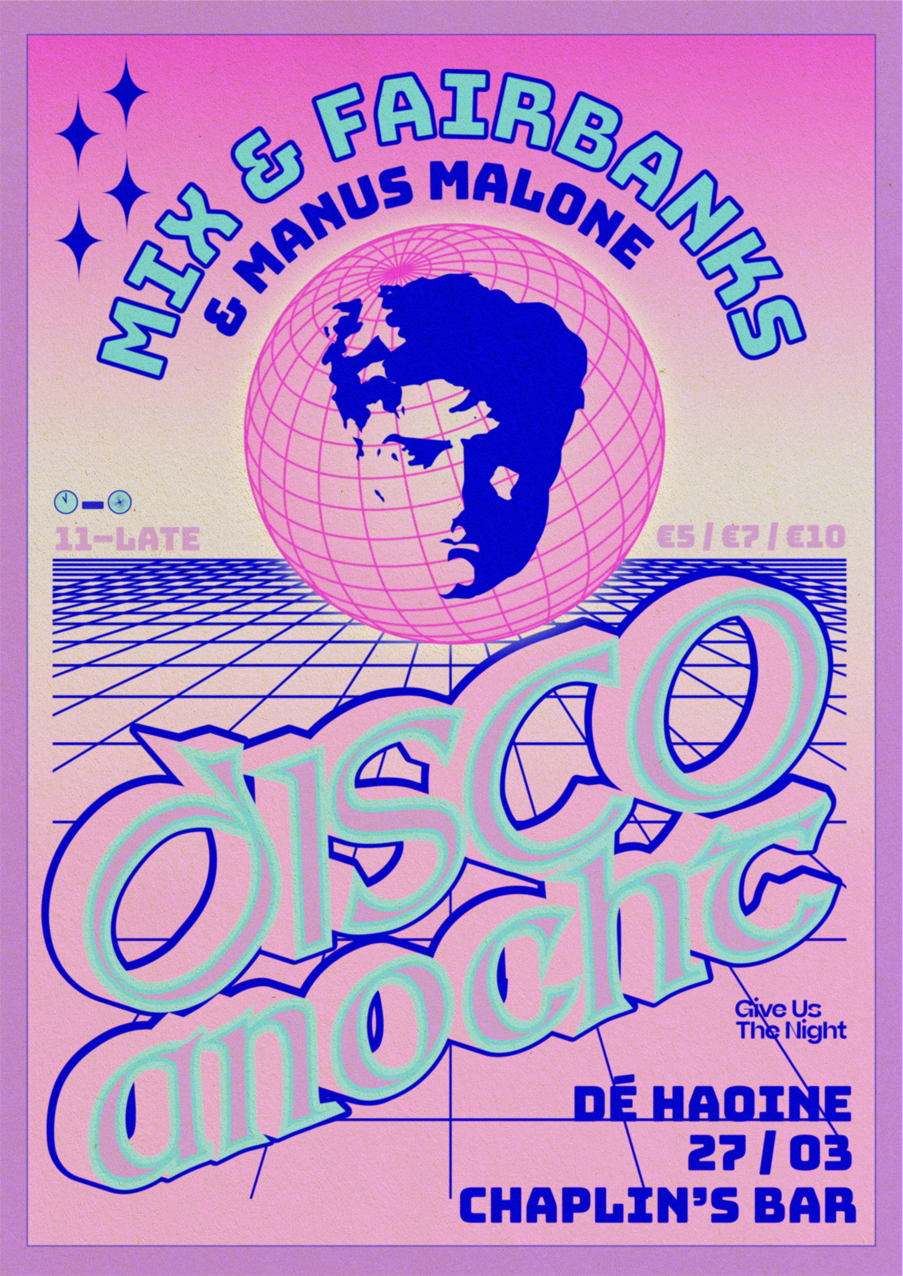
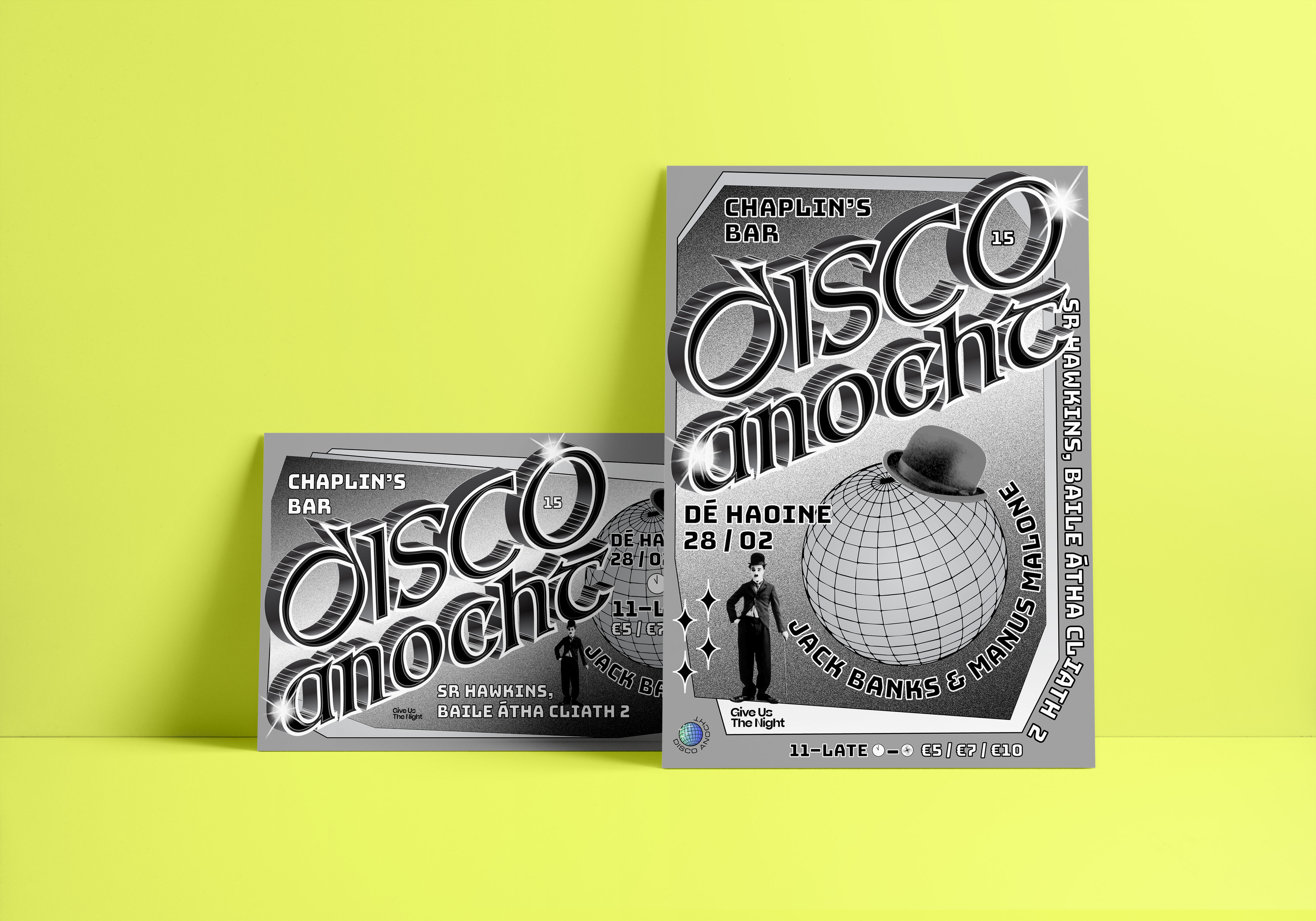
Disco Anocht
Club Night Promotion for print and social media
Clients: Seamas Hyland, Manus Malone & Jack Banks
![]()
Disco Anocht
Club Night Promotion for print and social media
Clients: Seamas Hyland, Manus Malone & Jack Banks
Client Brief:
Seamas and Manus asked us to create a poster design for Disco Anocht, a monthly Irish speaking rave up in Conradh na Gaeilge, Dublin. They required us to deliver new poster designs in print, as an animated Instagram square, Facebook Event banner and animated visuals to be projected on the night each month.
Our Response:
In the design we wanted to convey a combination or Irishness and Disco. We very much played up to stereotypes, but out of that came something really modern and cool that people just love!
In the design we wanted to convey a combination or Irishness and Disco. We very much played up to stereotypes, but out of that came something really modern and cool that people just love!
Client Testimonial:
These visuals have added hugely to our monthly events and helped give them a professional look and feel. Their service has always been quick and professional. I would definitely work with them again and also highly recommend BB to anyone looking for super creative graphics and a professional and friendly service.
Seamas Hyland, promoter


2021
Saltwater Grocery
Brand Identity
Client:
Karl Whelan & Niall Sabongi
Winner
New Branding Schemes
Visual Communication
![]()
Brand Identity
Client:
Karl Whelan & Niall Sabongi
Winner
New Branding Schemes
Visual Communication
Client Brief:
Saltwater Grocery, a gourmet food store that specialises in seafood, founded by chefs Karl Whelan and Niall Sabongi is situated on Terenure Road East. Originally a butchers, the shop was in need of a revamp and the new venture in need of a new brand identity.
Karl and Niall pride themselves on sourcing fresh, sustainable seafood and hand selected artisan products and they needed a brand to reflect this. They came to us with examples of what they wanted and asked us to recreate a vintage style grocery that looked ‘like it has always been there’.
Our Response:
Together with interior specialists, AB Projects, we created an extensive brand and scheme for the store. The starting point was a suite of classic logos and a colour palette inspired by French Boulangeries. The suite included various marks for multiple applications; including a fancy, ornamented logo resembling an opened clam, and a purely typographic logo.
The flexible identity was designed and customised to fit the many elements from the shop interior and exterior shop signs (painted and gilded to the highest standard by Mac Signs) as well as extensive packaging, printed and digital materials, paying close attention to ensure we were sourcing the most environmentally friendly materials and working with printers that could provide such materials.
Design Assistance:
Rebecca Wright
Interior Design & Architecture:
Ahmad Fakhry & Andrew Burdock / AB Projects
Sign Painting:
Cormac Dillon & Louise Gardiner / Mack Signs
Photography:
Shantanu Starick
Rebecca Wright
Interior Design & Architecture:
Ahmad Fakhry & Andrew Burdock / AB Projects
Sign Painting:
Cormac Dillon & Louise Gardiner / Mack Signs
Photography:
Shantanu Starick
Client Brief:
Pretty Wild is a Floristry Studio and Shop based in Bristol. Ellen needed a lot of bits designed for the rapidly expanding business such as business cards, care cards, branded wrapping tissue, stickers, tape etc. We needed to keep the existing legacy logotype but expand the brand identity with a colour way and a suite of illustartions and marks.
Pretty Wild is a Floristry Studio and Shop based in Bristol. Ellen needed a lot of bits designed for the rapidly expanding business such as business cards, care cards, branded wrapping tissue, stickers, tape etc. We needed to keep the existing legacy logotype but expand the brand identity with a colour way and a suite of illustartions and marks.
Our Response:
Inspired by gangster business cards, we created a three handed gang sign spelling out ‘PW’ as the central motif. Instead of simply repeating this same logo design across the whole suite of materials we created a whole gang of misfit characters that could inhabit the Pretty Wild world.
Inspired by gangster business cards, we created a three handed gang sign spelling out ‘PW’ as the central motif. Instead of simply repeating this same logo design across the whole suite of materials we created a whole gang of misfit characters that could inhabit the Pretty Wild world.
Client Testimonial:
Rachel and Stina, took a ball of tangled thoughts, ramblings and screenshots and distilled them in to a body of work that gives me such genuine and innocent pleasure.
‘I want flowers, but not flower flowers. I want romance but I don't want to be seen as romantic. I want androgyny. I want old and new. I want cool but not too cool. I want something that I'm happy to live through because, as a self-employed, creative person, I am my work.'
Ellen Kenny, Director, Pretty Wild
2021
![]()
The Douglas Hyde
Brand Identity & Website Design
thedouglashyde.ie
Client: The Douglas Hyde
Developer: Alex Bradley
Winner
IDI Universal Design
Special Awards
![]()
Brand Identity & Website Design
thedouglashyde.ie
Client: The Douglas Hyde
Developer: Alex Bradley
Winner
IDI Universal Design
Special Awards
Client Brief:
Challenges that most contemporary art galleries struggle with have to do with accessibility and how to bring conversations about art to larger and non-traditional audiences. With this rebrand and website project we needed to create an accessible and friendly design that welcomes new engagement and does away with any perceived intimidation whilst still maintaining the intellectual reputation of the gallery.
Challenges that most contemporary art galleries struggle with have to do with accessibility and how to bring conversations about art to larger and non-traditional audiences. With this rebrand and website project we needed to create an accessible and friendly design that welcomes new engagement and does away with any perceived intimidation whilst still maintaining the intellectual reputation of the gallery.
Our Response:
The website and all other communications platforms needed a clear editorial structure that allows for tiered levels of engagement with an information system using headings, sub-heads, introductory paragraph-styles, ‘read more’ tags etc. going from engaging and welcoming to descriptive and informative to academic and critical.
A gallery in essence is an architectural space, thus the design was inspired by aspects of its architectural features. The concrete ceiling of the gallery and the Trinity Arts Block became the catalyst for the logo and subsequently the brand identity and look and feel of the website. The rounded shape of the ceiling cells create a tension between sharpness and smoothness and of the negative and positive space.
The website and all other communications platforms needed a clear editorial structure that allows for tiered levels of engagement with an information system using headings, sub-heads, introductory paragraph-styles, ‘read more’ tags etc. going from engaging and welcoming to descriptive and informative to academic and critical.
A gallery in essence is an architectural space, thus the design was inspired by aspects of its architectural features. The concrete ceiling of the gallery and the Trinity Arts Block became the catalyst for the logo and subsequently the brand identity and look and feel of the website. The rounded shape of the ceiling cells create a tension between sharpness and smoothness and of the negative and positive space.
We worked closely with Learning & Engagement Curator of The Douglas Hyde, Fernando Sánchez-Migallón Cano and developer, Alex Bradley, to achieve a universal design. This included working with Knowbility to ensure the finished design was accessible to a wide range of people regardless of their age, size, ability or disability.
Through deconstructing and multiplying the mark and re-assembling the fragments of the original form, we developed a dynamic and modular system of symbols, icons and framing devices. The display type face (Forma) echoes that same tension between sharpness and smoothness whilst being high in contrast, legibility and character. Wanting to avoid the white cube aesthetic the colour scheme is led by a ‘muted’ charcoal black and warm off white that can be combined with the warm colours that compliments the grey concrete.
2021
Saltwater Grocery
Brand Identity
Client:
Karl Whelan & Niall Sabongi
Winner
New Branding Schemes
Visual Communication
![]()
Brand Identity
Client:
Karl Whelan & Niall Sabongi
Winner
New Branding Schemes
Visual Communication
Client Brief:
Saltwater Grocery, a gourmet food store that specialises in seafood, founded by chefs Karl Whelan and Niall Sabongi is situated on Terenure Road East. Originally a butchers, the shop was in need of a revamp and the new venture in need of a new brand identity.
Karl and Niall pride themselves on sourcing fresh, sustainable seafood and hand selected artisan products and they needed a brand to reflect this. They came to us with examples of what they wanted and asked us to recreate a vintage style grocery that looked ‘like it has always been there’.
Saltwater Grocery, a gourmet food store that specialises in seafood, founded by chefs Karl Whelan and Niall Sabongi is situated on Terenure Road East. Originally a butchers, the shop was in need of a revamp and the new venture in need of a new brand identity.
Karl and Niall pride themselves on sourcing fresh, sustainable seafood and hand selected artisan products and they needed a brand to reflect this. They came to us with examples of what they wanted and asked us to recreate a vintage style grocery that looked ‘like it has always been there’.
Our Response:
Together with interior specialists, AB Projects, we created an extensive brand and scheme for the store. The starting point was a suite of classic logos and a colour palette inspired by French Boulangeries. The suite included various marks for multiple applications; including a fancy, ornamented logo resembling an opened clam, and a purely typographic logo.
The flexible identity was designed and customised to fit the many elements from the shop interior and exterior shop signs (painted and gilded to the highest standard by Mac Signs) as well as extensive packaging, printed and digital materials, paying close attention to ensure we were sourcing the most environmentally friendly materials and working with printers that could provide such materials.
Together with interior specialists, AB Projects, we created an extensive brand and scheme for the store. The starting point was a suite of classic logos and a colour palette inspired by French Boulangeries. The suite included various marks for multiple applications; including a fancy, ornamented logo resembling an opened clam, and a purely typographic logo.
The flexible identity was designed and customised to fit the many elements from the shop interior and exterior shop signs (painted and gilded to the highest standard by Mac Signs) as well as extensive packaging, printed and digital materials, paying close attention to ensure we were sourcing the most environmentally friendly materials and working with printers that could provide such materials.
Design Assistance:
Rebecca Wright
Interior Design & Architecture:
Ahmad Fakhry & Andrew Burdock / AB Projects
Sign Painting:
Cormac Dillon & Louise Gardiner / Mack Signs
Photography:
Shantanu Starick
Rebecca Wright
Interior Design & Architecture:
Ahmad Fakhry & Andrew Burdock / AB Projects
Sign Painting:
Cormac Dillon & Louise Gardiner / Mack Signs
Photography:
Shantanu Starick
Client Brief:
Something in the Water was an exhibition of motion graphics pieces from 8 artists, displayed on a huge screen along the Grand Canal, Dublin. Taking inspiration from the literary history of the canal, the exhibition identity came to life as the unfolded dust jacket of a book.
Research began by looking at 20th century book covers of writers, antique book shops from the area and other printed ephemera from the Canal’s rich literary history. From these, the typographic style was developed and crafted into the main exhibition title.
Our Response:
The brand structure was also based on the exhibition as a book — each individual piece is like a chapter of the same book. We made bespoke social media assets for each artist to share with their followers and direct them to the exhibition’s channels, website and the exhibition itself.
We created bookmarks with a QR code that were distributed in local bookshops. Turning the QR code on its side made it instantaneously decoractive!
2017
Bonanza Land!
IADT Visual Communications Graduate Exhibition 2017
![]()
Bonanza Land!
IADT Visual Communications Graduate Exhibition 2017
The concept for this project was born from the proposition that IADT is an Island—The Island of Art, Design and Technology. Away from the buzz and distractions of the city, Visual Communications students work in an intensely creative environment producing a bonanza of fantastical and innovative results. In order to entice visitors to make the journey out to this island to see the show, we needed to create a desirable and exciting destination.
The project required a promotional poster, social media campaign, promotional motion piece, website, and exhibition graphics & signage.
The project required a promotional poster, social media campaign, promotional motion piece, website, and exhibition graphics & signage.
We borrowed cues and marketing tools from the world of tourism and created a hyperreal holiday resort called BONANZA LAND! The very definition of bonanza is a large amount of something desirable, so for this reason the identity was ideal for the 2017 Visual Communications Graduate Showcase—a veritable Visual Communications bonanza!
Bonanza Land! is included in 2017 100 Archive Selection and also won the IDI Graduate Award for best use of illustration in design 2017.
The fine art prints ‘Seal, I haven’t heard that name in years’ and ‘Me and a family sized bag of Cheesy Puffs’ were designed for the Hen’s Teeth G’wan Ireland exhibition, a great 2020 initiative supporting Irish artists, designers & photographers by showcasing and selling prints of their work.
In a year where many of us relied on the welcome comic relief of memes to get us through the day to day, we thought it would be fun to mess with their wholly transient nature and create something that could survive outside of our devices. Much like the poster itself, that has been elevated from a temporary advertising vessel, the meme too is now a piece of framed art in your home.
In a year where many of us relied on the welcome comic relief of memes to get us through the day to day, we thought it would be fun to mess with their wholly transient nature and create something that could survive outside of our devices. Much like the poster itself, that has been elevated from a temporary advertising vessel, the meme too is now a piece of framed art in your home.
Curation & Fine Art Printing: Hen’s Teeth
2021
Client: Project Arts Centre
![]()
How Do We Start?Publication
Client: Project Arts Centre
How do you encompass the challenges of the climate emergency for the Arts & Culture, the impact it is going to have on the way we work and how can artists play a role in leading this conversation?
Commissioned by the Project Arts Centre, How Do We Start? explores how they as a cultural institution can approach a more sustainable way of existing in the world and how to support artists to lead the way by collaborating and bringing their dynamic skills to bear on the problem.
The publication was edited by Maeve Stone & Cian O’Brien, with contributions from; artists Kasia Kaminska, Shanna May Breen & Luke Casserly, Katie Holten and Kaajal Modi. The artists’s work explore the question ‘How Do We Start?’ in ways of practical instructions, poetry, speculations, image making, and language.
Commissioned by the Project Arts Centre, How Do We Start? explores how they as a cultural institution can approach a more sustainable way of existing in the world and how to support artists to lead the way by collaborating and bringing their dynamic skills to bear on the problem.
The publication was edited by Maeve Stone & Cian O’Brien, with contributions from; artists Kasia Kaminska, Shanna May Breen & Luke Casserly, Katie Holten and Kaajal Modi. The artists’s work explore the question ‘How Do We Start?’ in ways of practical instructions, poetry, speculations, image making, and language.
We were inspired by the pragmatic and instructional nature of the artist contributions to base the design on Make-and-Do-Books from our childhood. The aesthetic of these books with their bold colours and framed text and images became a starting point for the book. On the cover and on a postcard (printed on plantable paper stock with wild flower seeds), the question ‘How Do We Start?’ expands out into a maze from several directions and explores ways of answering itself. This theme was extended further in the promotional elements of the project.
A major challenge of the project was to justify the contradiction of producing an object that addresses the climate crisis. We talked directly with paper manufacturers and printers about how we could find ways to minimise the impact of production and waste by using plant based inks, recycled papers, available offcuts and how to minimise transport and deliveries. It was a great learning experience for us as designers of books that will inform the way we work in the future.
A major challenge of the project was to justify the contradiction of producing an object that addresses the climate crisis. We talked directly with paper manufacturers and printers about how we could find ways to minimise the impact of production and waste by using plant based inks, recycled papers, available offcuts and how to minimise transport and deliveries. It was a great learning experience for us as designers of books that will inform the way we work in the future.
2020
Big Art Energy
Client: Project Arts Centre
![]()
Big Art Energy
Publication
Client: Project Arts Centre
The art publication Big Art Energy was commissioned by the Project Arts Centre as part of Future Forecast—a series of events and artistic interventions forming part of a speculative voyage towards the future.
The publication was edited by Louise Bruton & Cian O’Brien, with contributions from; photographer Vanessa Ifediora, writer Soula Emmanuel, artist Gary Farrelly and party makers Club Comfort. Big Art Energy showcases these artists’ reactions to the pandemic, response to lockdown and forecasts of the future of their respective industry or field of art.
We designed a package to be sent out by post with the limited edition publication and our contribution the fine art print ‘Can You See Me?’, a happy accident sprung from a series of technological failures. A beautiful blur of a screenshot from FaceTime during a failing internet connection became an intriguing portrait of ourselves and our new way of working.
Initially inspired by journals, especially Aisling copy books, the book would act as diary or log book to record and express our inner thoughts and feelings during lockdown. Taking from those visual cues, the cover of the book is plain, quiet and still with the inside being akin the inside of your head and how you might be feeling in the midst of the pandemic—cluttered, maybe a little bit claustrophobic and anxious but colourful and beautiful and overall, hopeful.
The publication was edited by Louise Bruton & Cian O’Brien, with contributions from; photographer Vanessa Ifediora, writer Soula Emmanuel, artist Gary Farrelly and party makers Club Comfort. Big Art Energy showcases these artists’ reactions to the pandemic, response to lockdown and forecasts of the future of their respective industry or field of art.
We designed a package to be sent out by post with the limited edition publication and our contribution the fine art print ‘Can You See Me?’, a happy accident sprung from a series of technological failures. A beautiful blur of a screenshot from FaceTime during a failing internet connection became an intriguing portrait of ourselves and our new way of working.
Initially inspired by journals, especially Aisling copy books, the book would act as diary or log book to record and express our inner thoughts and feelings during lockdown. Taking from those visual cues, the cover of the book is plain, quiet and still with the inside being akin the inside of your head and how you might be feeling in the midst of the pandemic—cluttered, maybe a little bit claustrophobic and anxious but colourful and beautiful and overall, hopeful.
We employed a design process inspired by a common concept in architecture and city planning referred to as desire lines; “paths & tracks made over time by the wishes & feet of walkers, especially those paths that run contrary to design or planning”; or “free-will ways.” While first using a strict grid and typographic rules to create a foundation we then allowed our human instinct to take over and Big Art Energy to fill-in, spill over, doodle, colour-in, make notes in the margins and practice our autograph over and over, just like you would in a journal.
These interventions gave each section for the contributing artists a distinct look and feel specific to the content, yet, there remains a unity to the publication thanks to the rigour of the typography and editorial layout.
An extensive web, social media and print campaign gave BAE massive traction. As well as providing Project Arts Centre with a social media strategy and content, we created dynamic and personalised social media animations for all the contributing artists to share on their own social media platforms, while also providing all the necessary information for people interested in ordering the package. A billboard and posters outside of the Project put a smile on the faces of a few the passers-by in Temple Bar.
These interventions gave each section for the contributing artists a distinct look and feel specific to the content, yet, there remains a unity to the publication thanks to the rigour of the typography and editorial layout.
An extensive web, social media and print campaign gave BAE massive traction. As well as providing Project Arts Centre with a social media strategy and content, we created dynamic and personalised social media animations for all the contributing artists to share on their own social media platforms, while also providing all the necessary information for people interested in ordering the package. A billboard and posters outside of the Project put a smile on the faces of a few the passers-by in Temple Bar.