

2021
![]()
The Douglas Hyde
Brand Identity & Website Design
thedouglashyde.ie
Client: The Douglas Hyde
Developer: Alex Bradley
Winner
IDI Universal Design
Special Awards
![]()
Brand Identity & Website Design
thedouglashyde.ie
Client: The Douglas Hyde
Developer: Alex Bradley
Winner
IDI Universal Design
Special Awards

Client Brief:
Challenges that most contemporary art galleries struggle with have to do with accessibility and how to bring conversations about art to larger and non-traditional audiences. With this rebrand and website project we needed to create an accessible and friendly design that welcomes new engagement and does away with any perceived intimidation whilst still maintaining the intellectual reputation of the gallery.
Challenges that most contemporary art galleries struggle with have to do with accessibility and how to bring conversations about art to larger and non-traditional audiences. With this rebrand and website project we needed to create an accessible and friendly design that welcomes new engagement and does away with any perceived intimidation whilst still maintaining the intellectual reputation of the gallery.
Our Response:
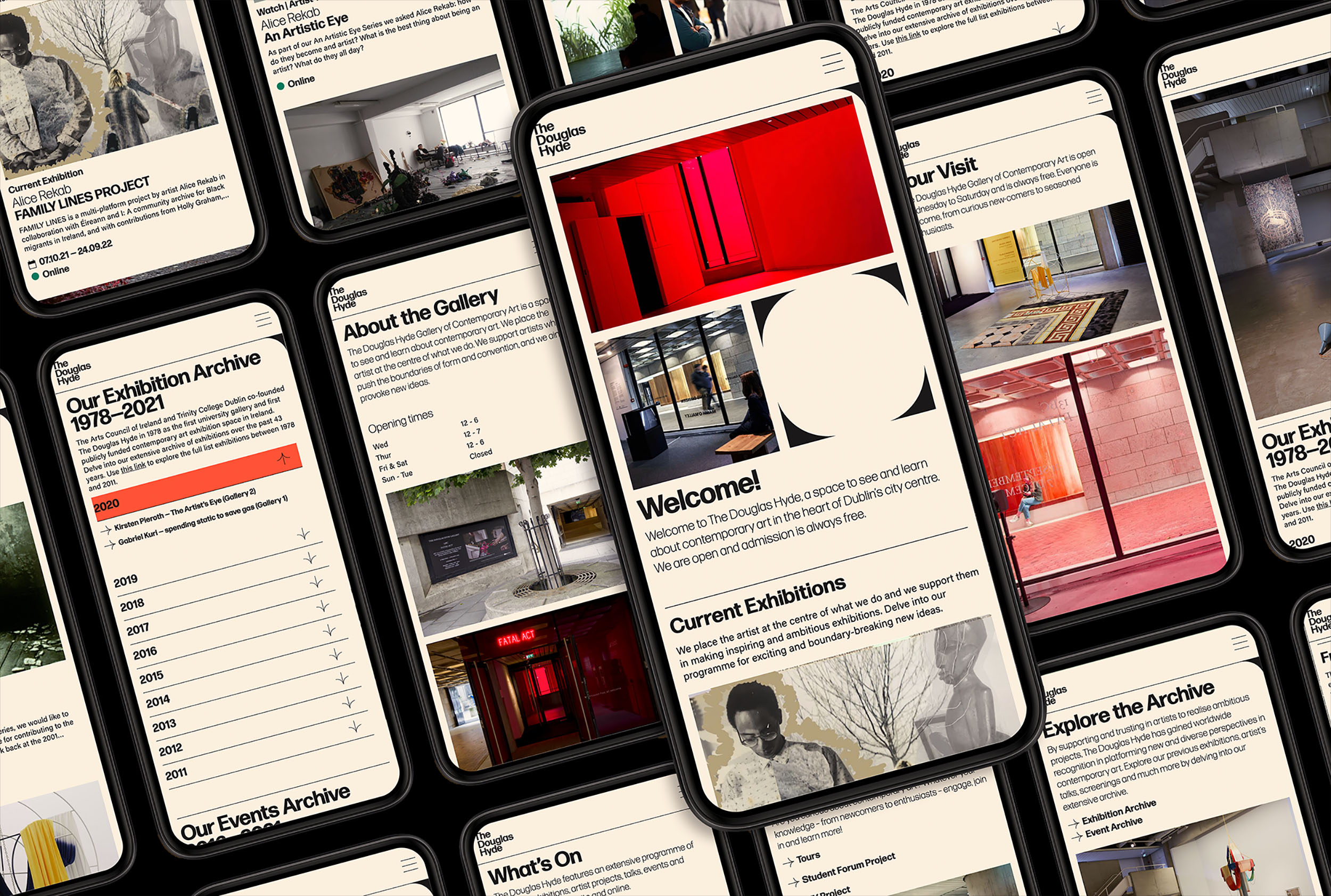
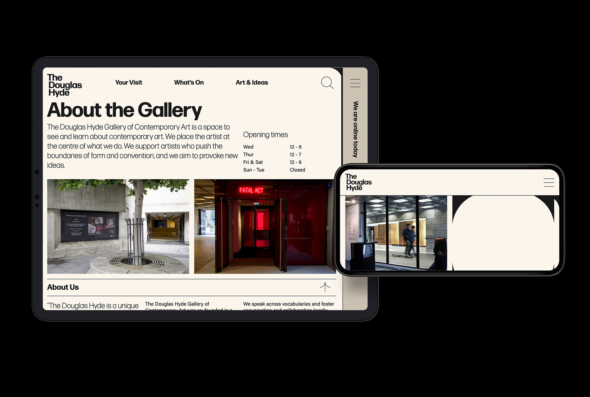
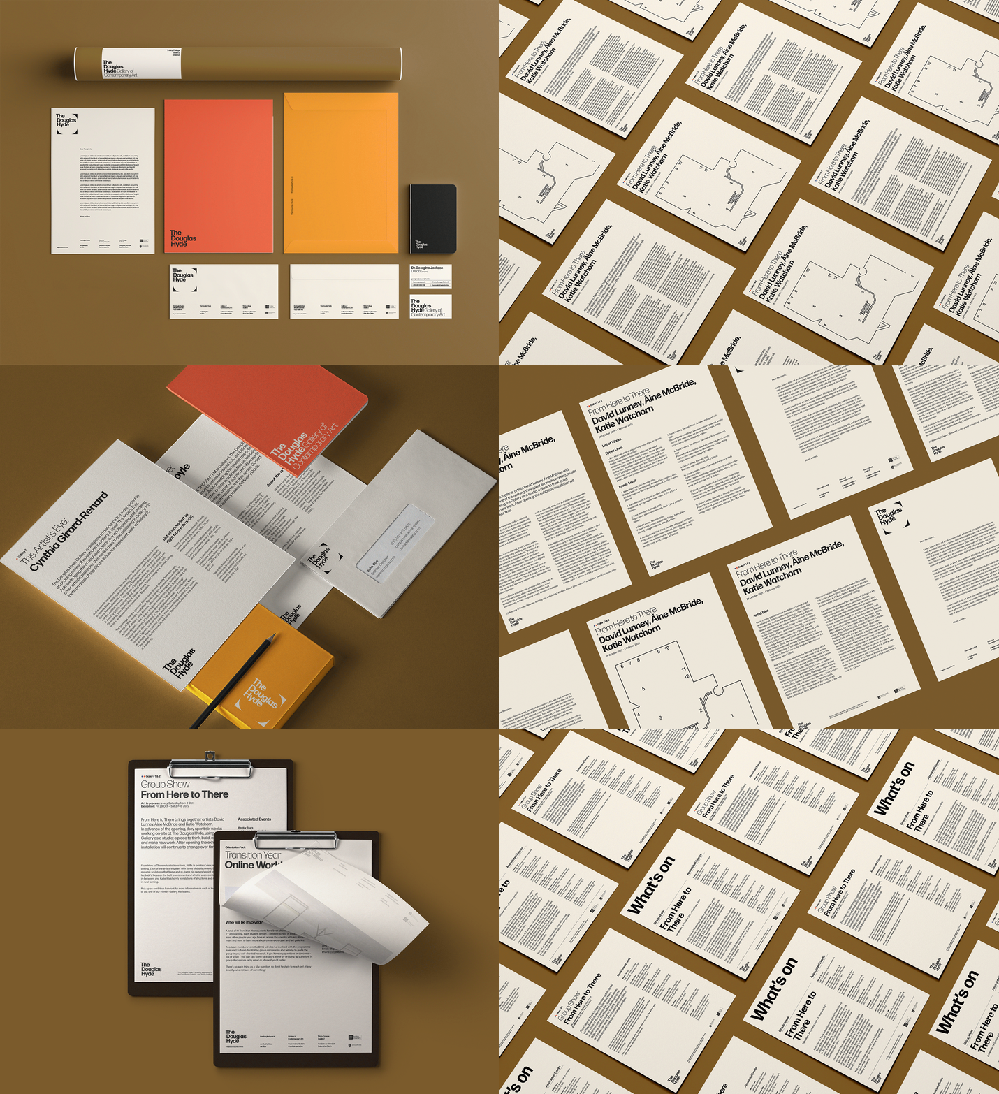
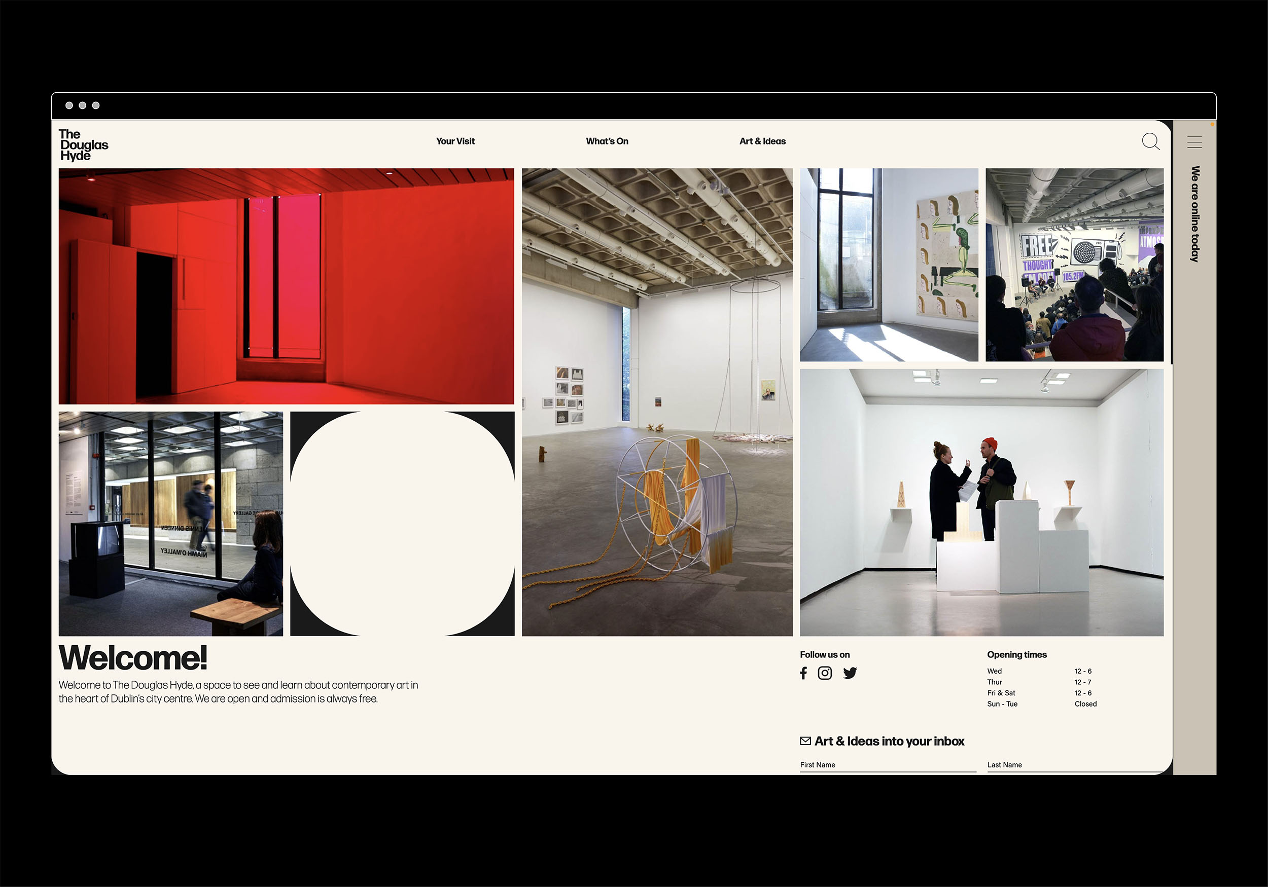
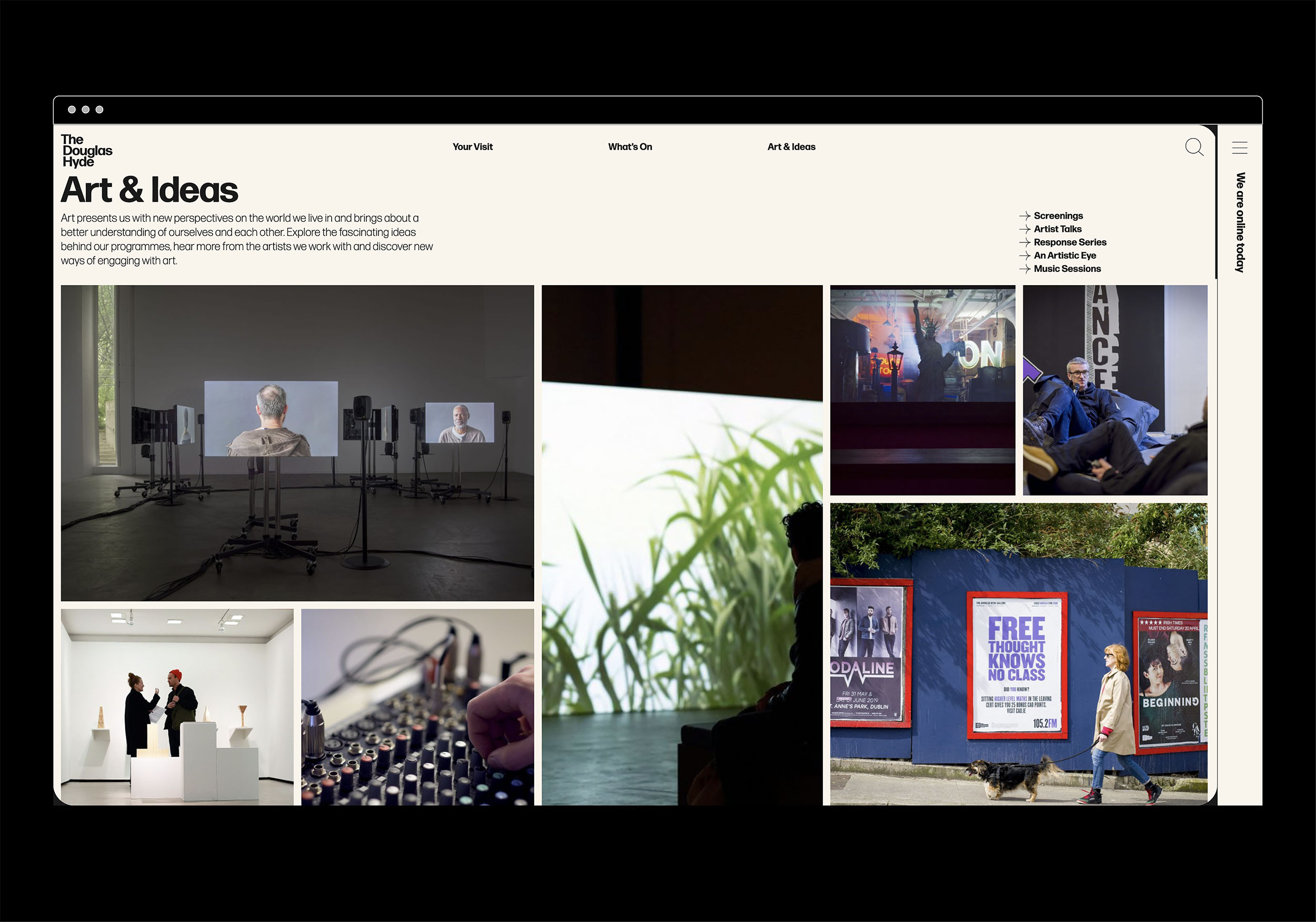
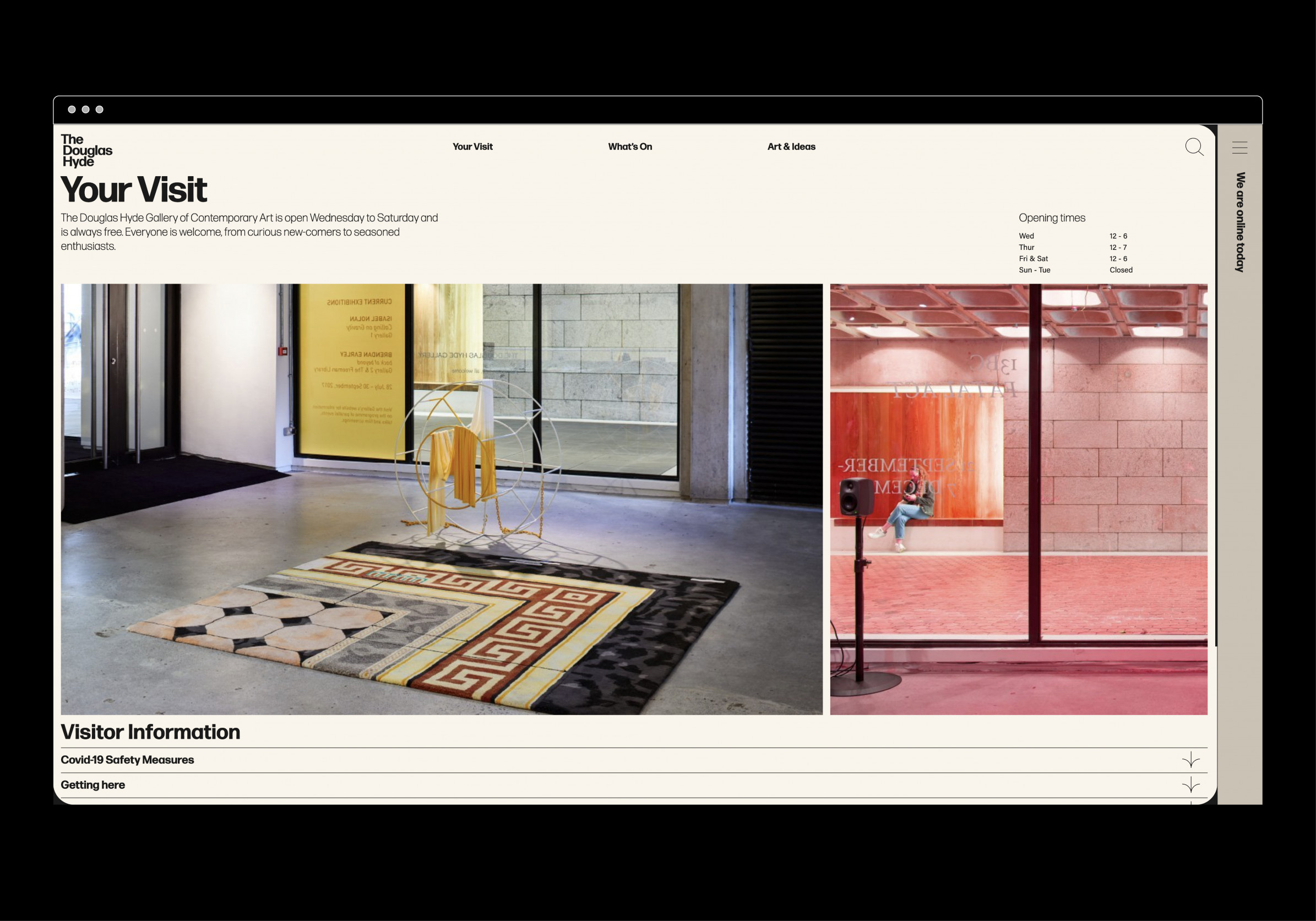
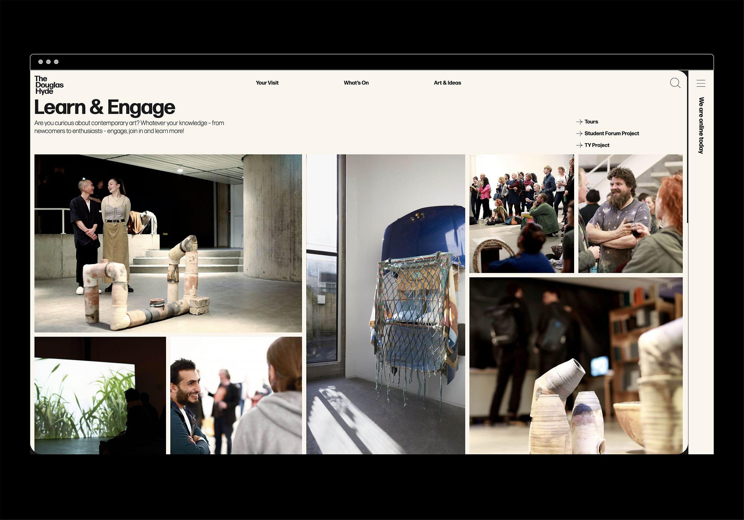
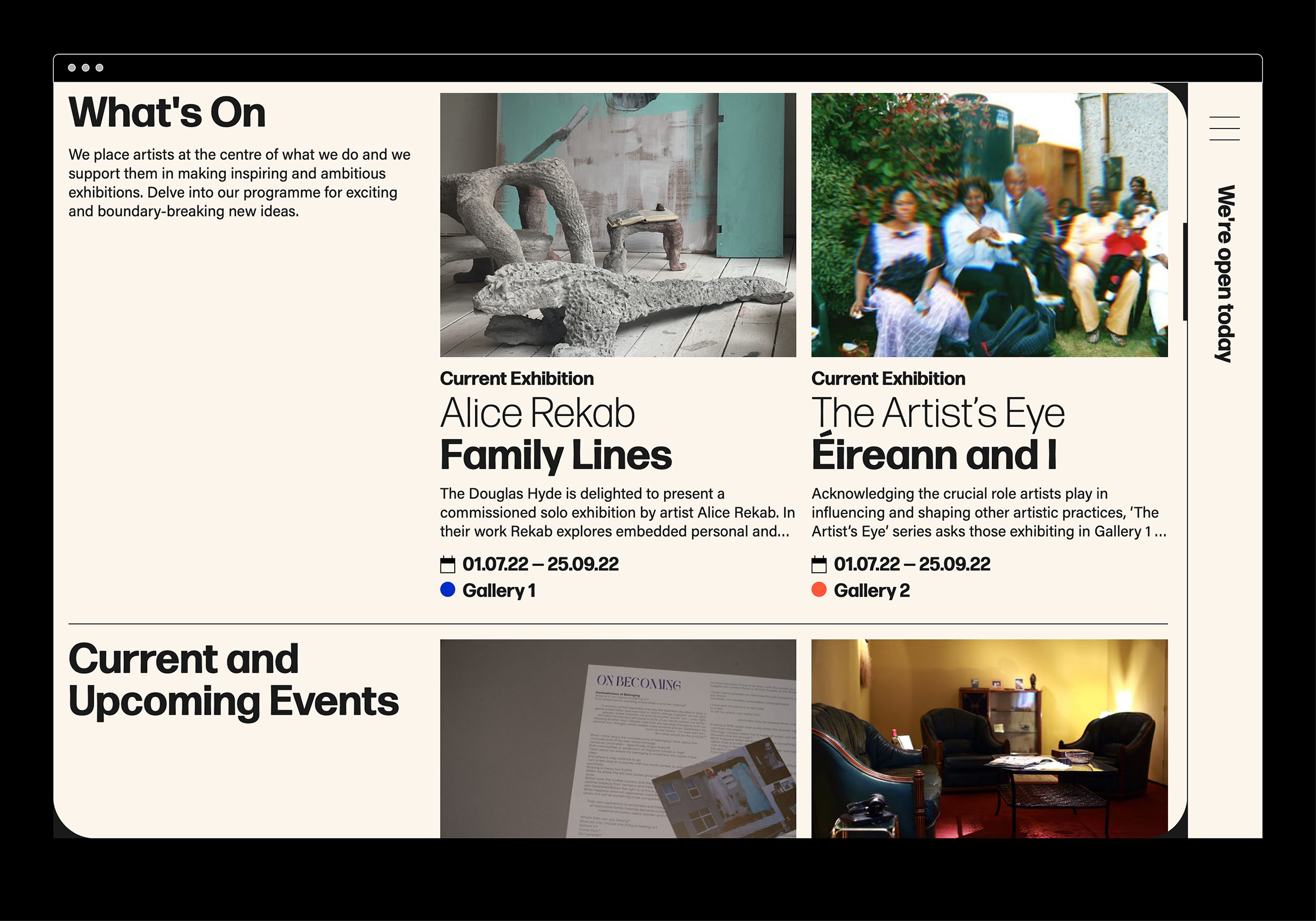
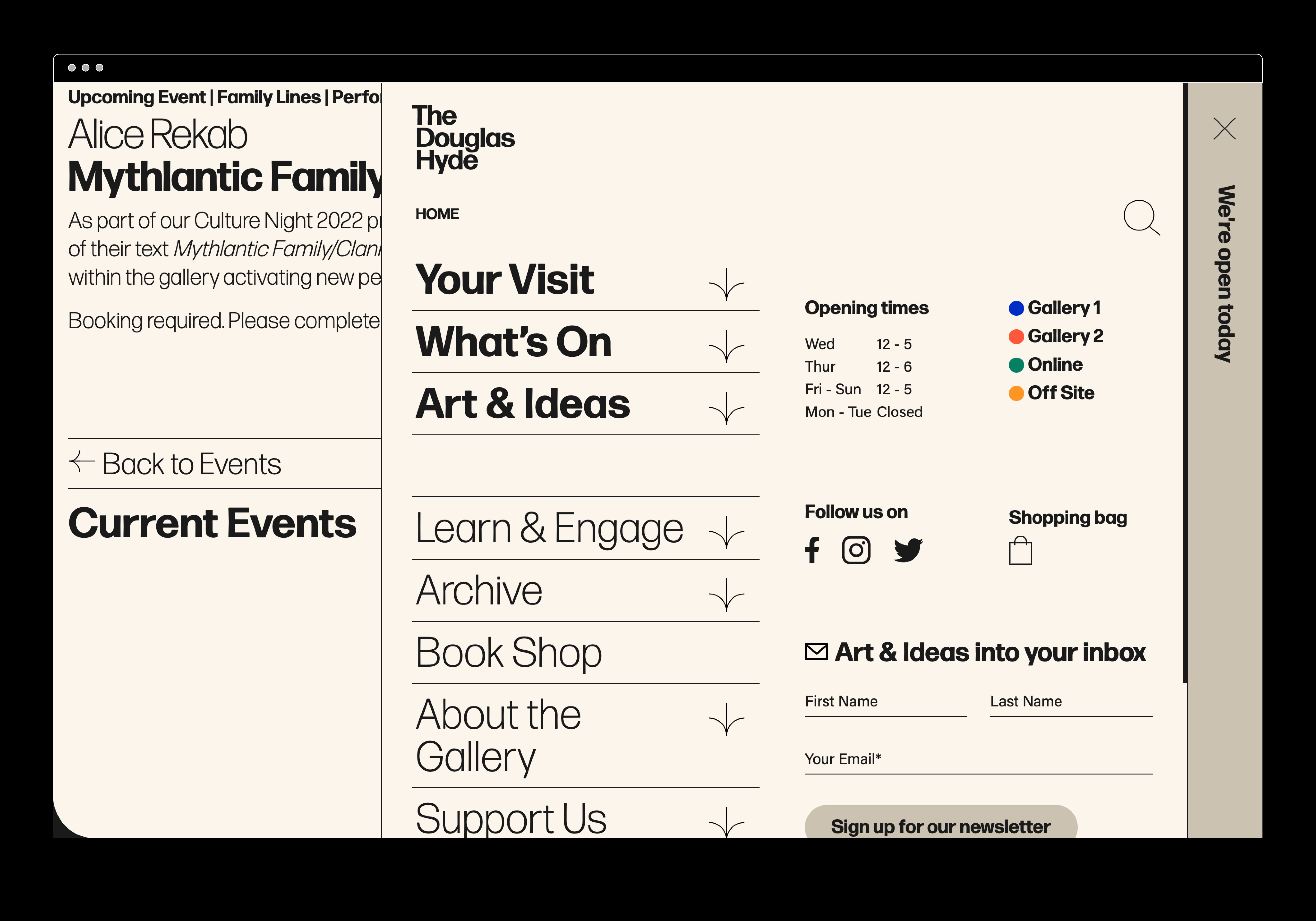
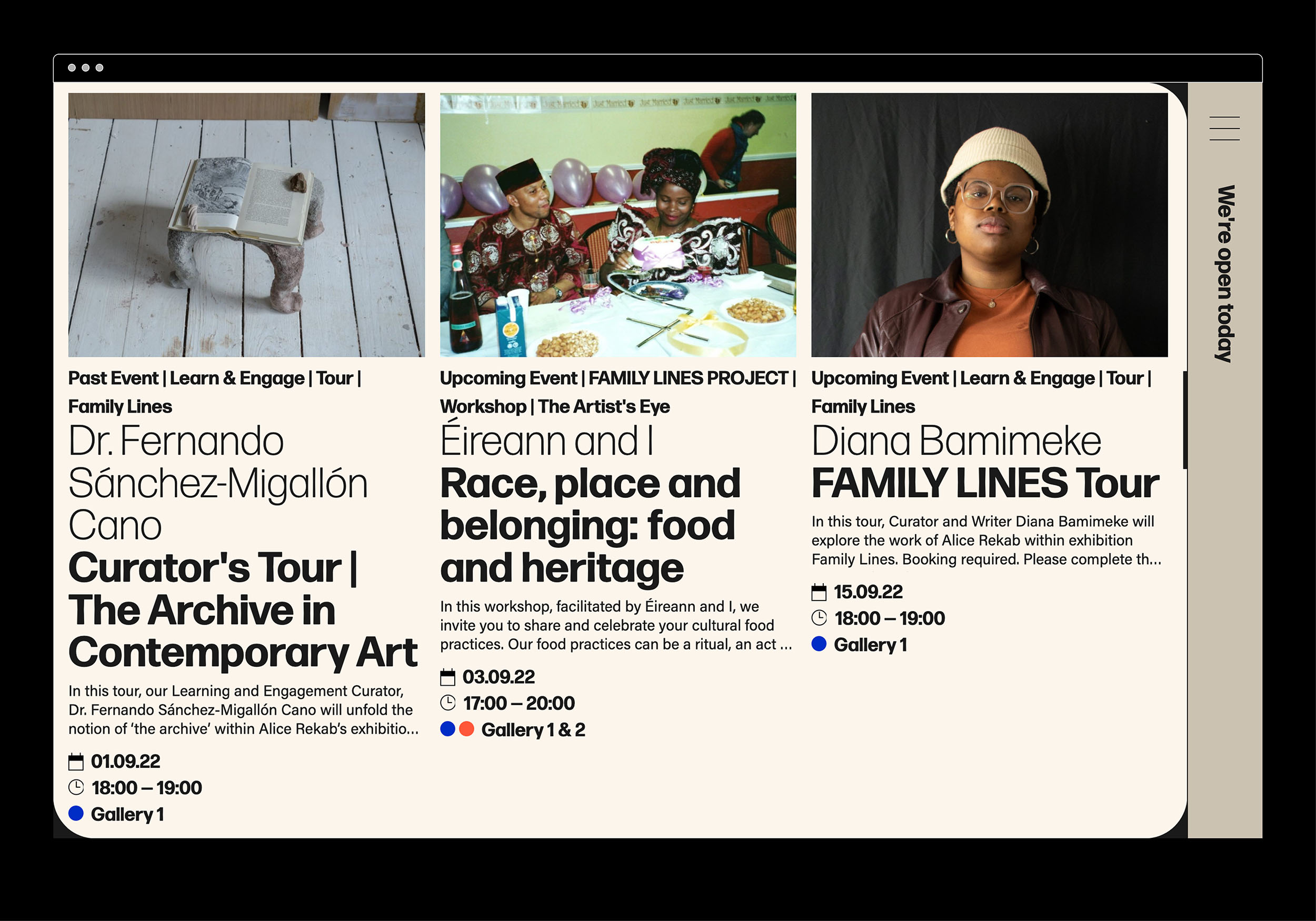
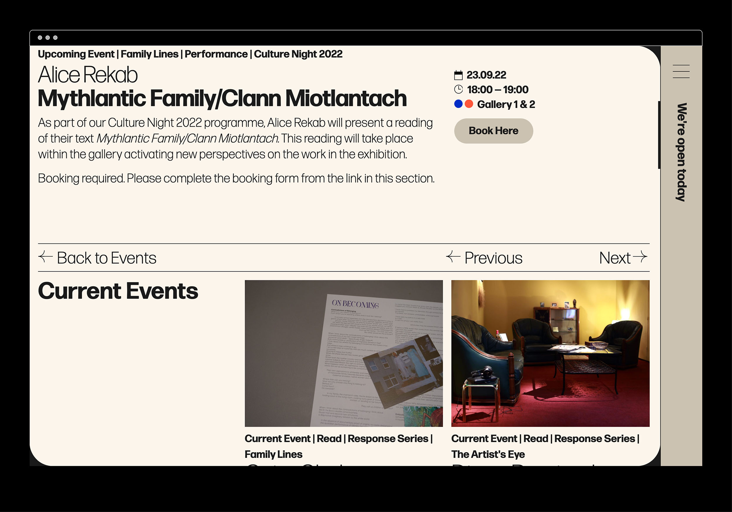
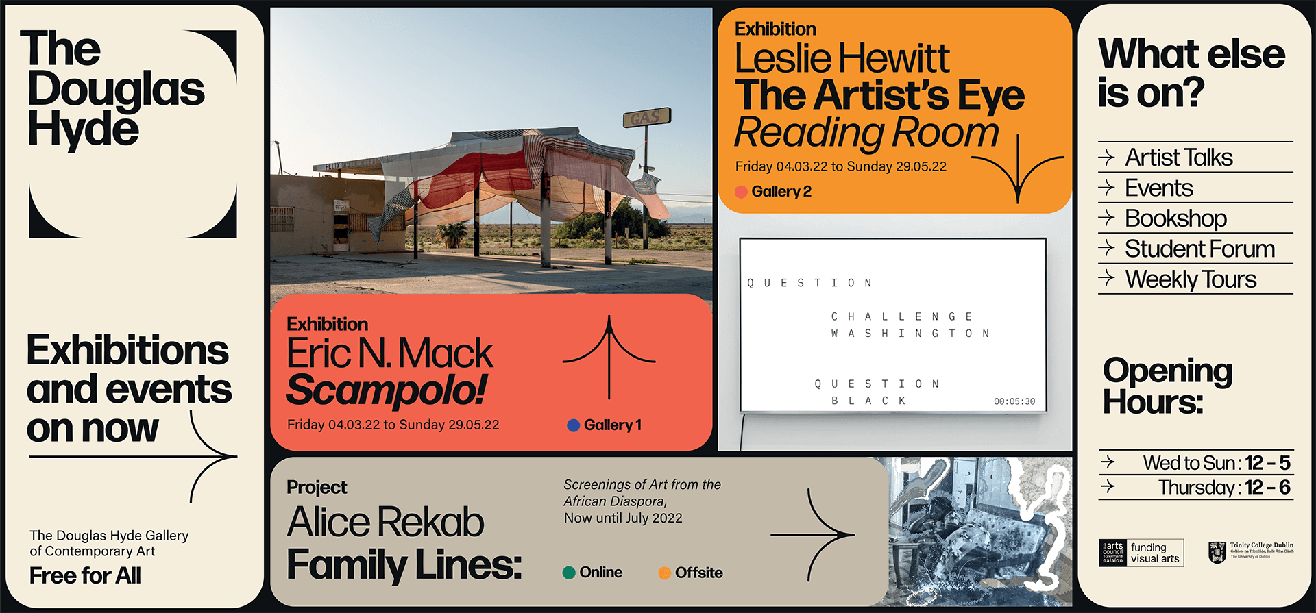
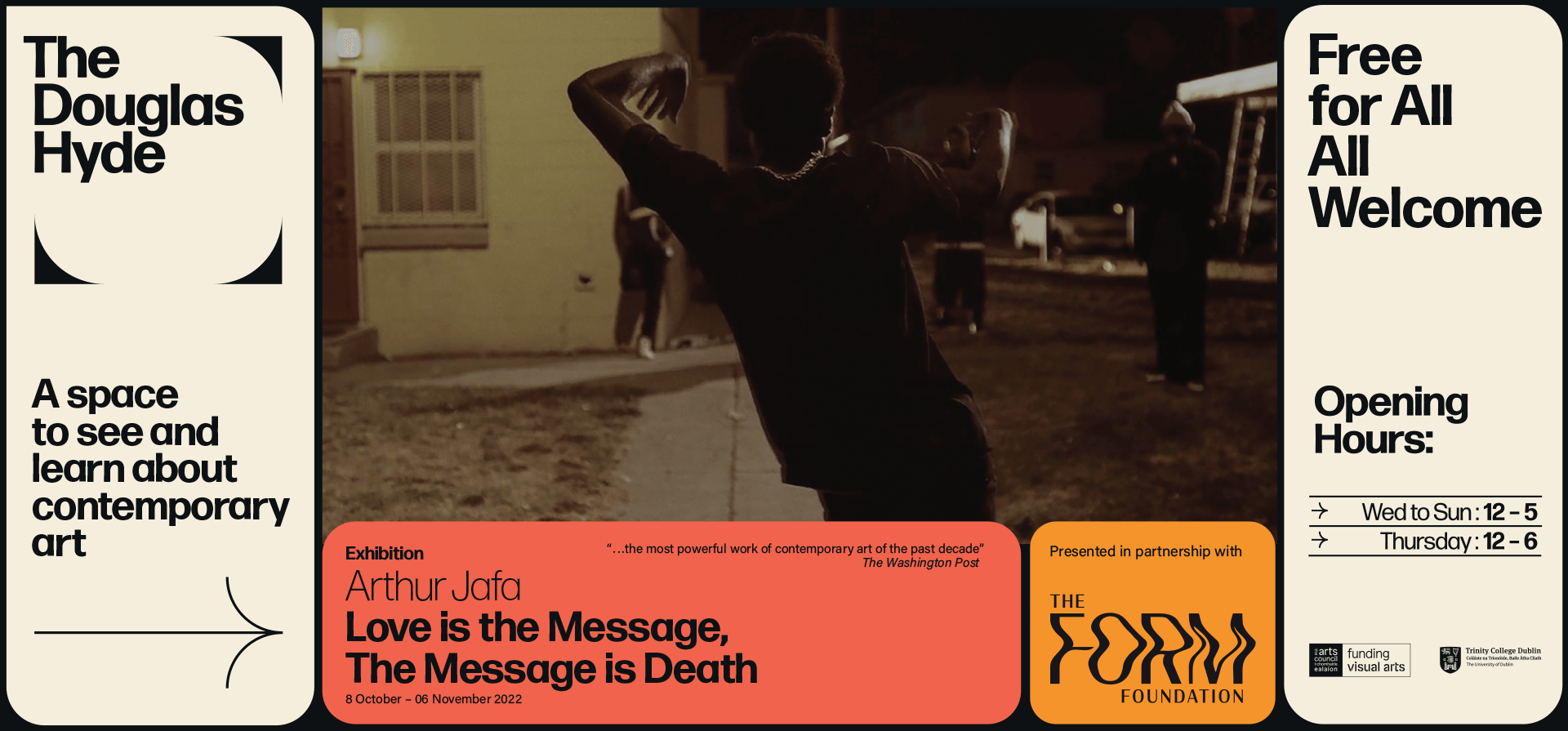
The website and all other communications platforms needed a clear editorial structure that allows for tiered levels of engagement with an information system using headings, sub-heads, introductory paragraph-styles, ‘read more’ tags etc. going from engaging and welcoming to descriptive and informative to academic and critical.
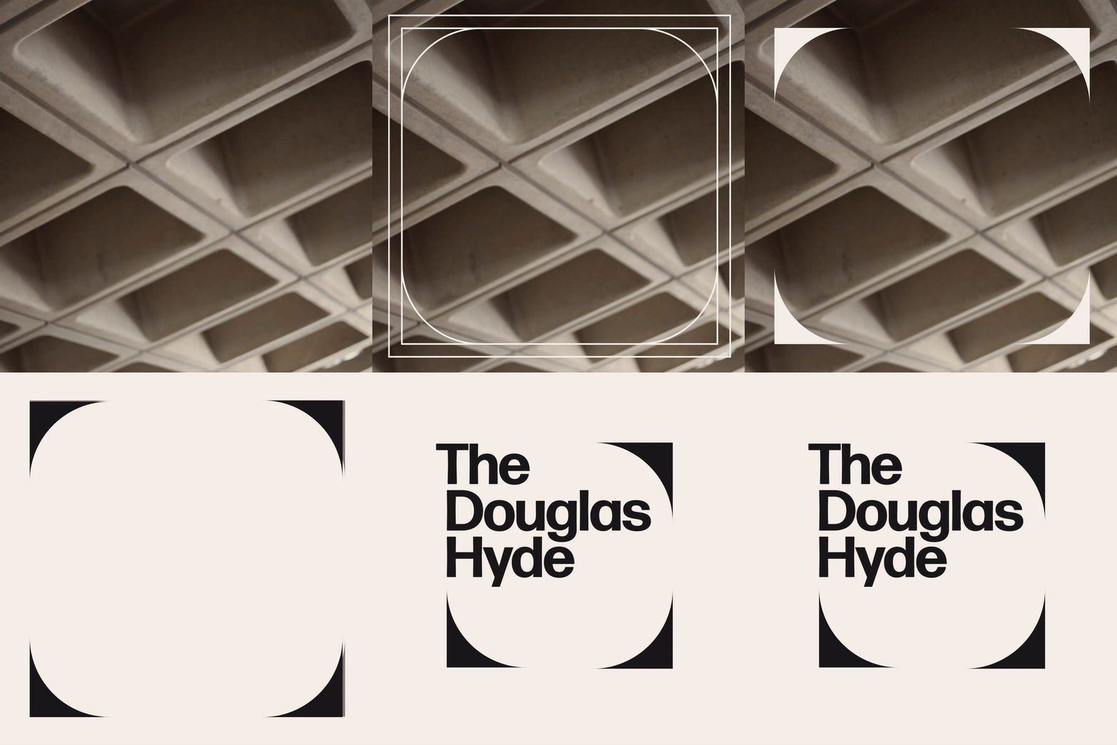
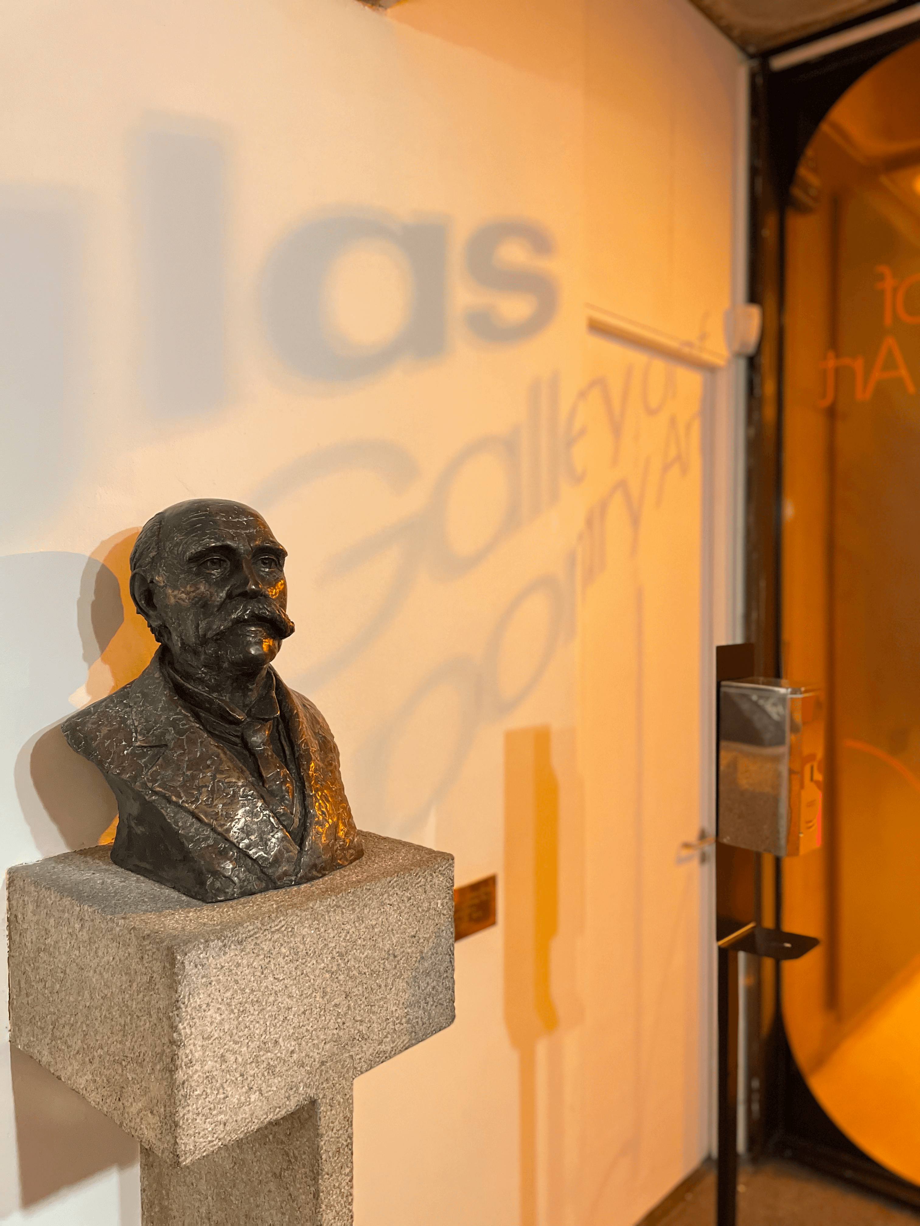
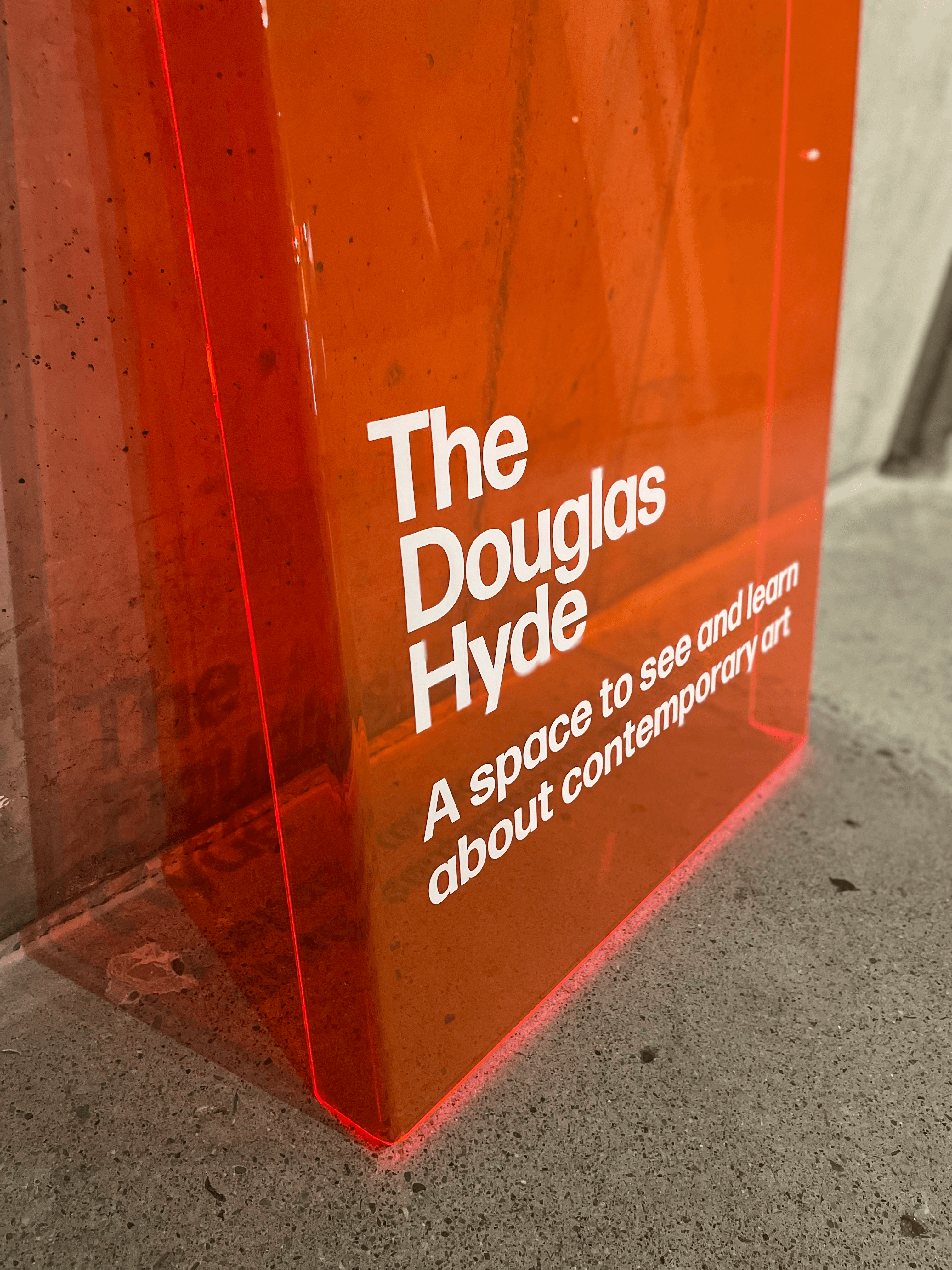
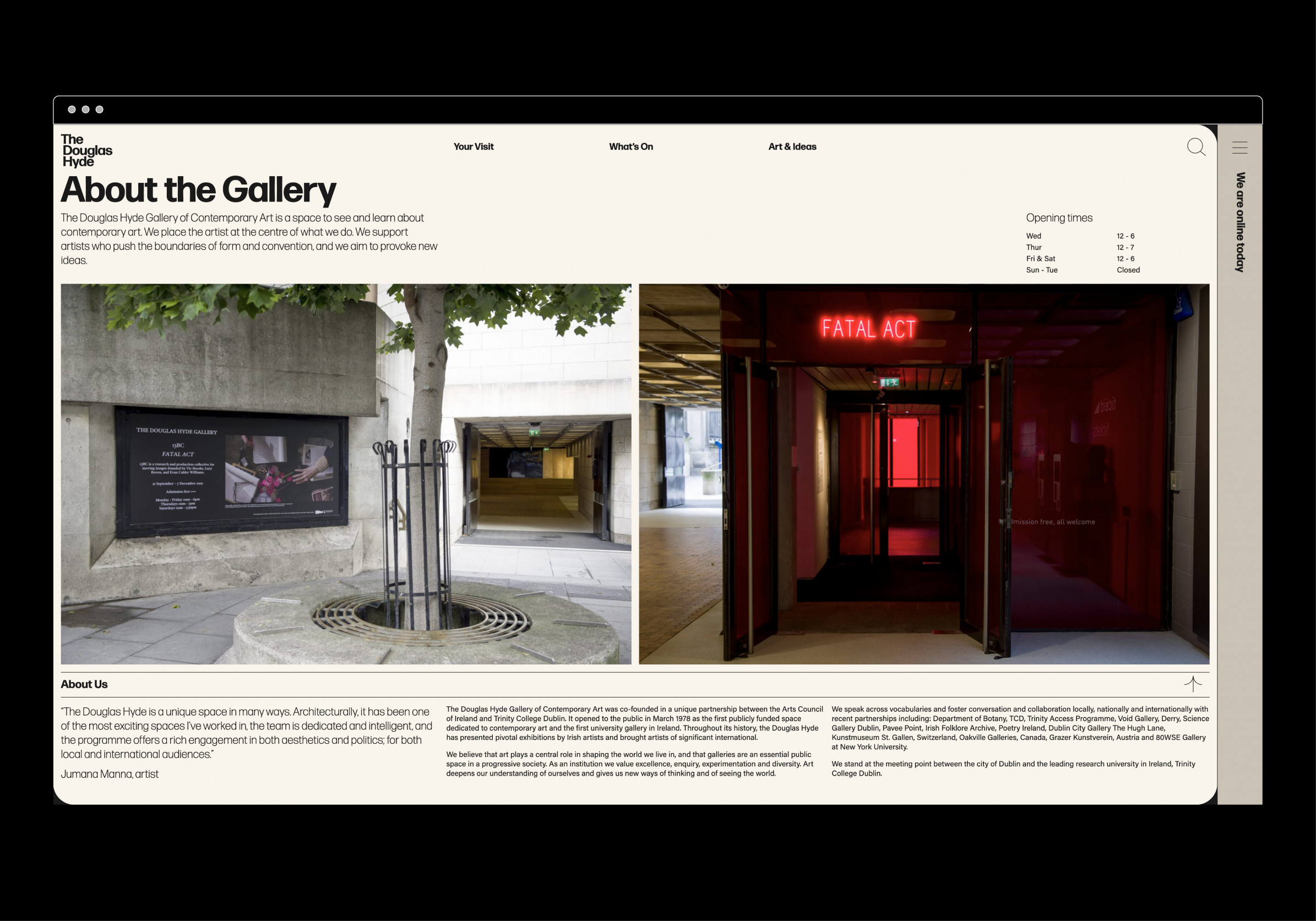
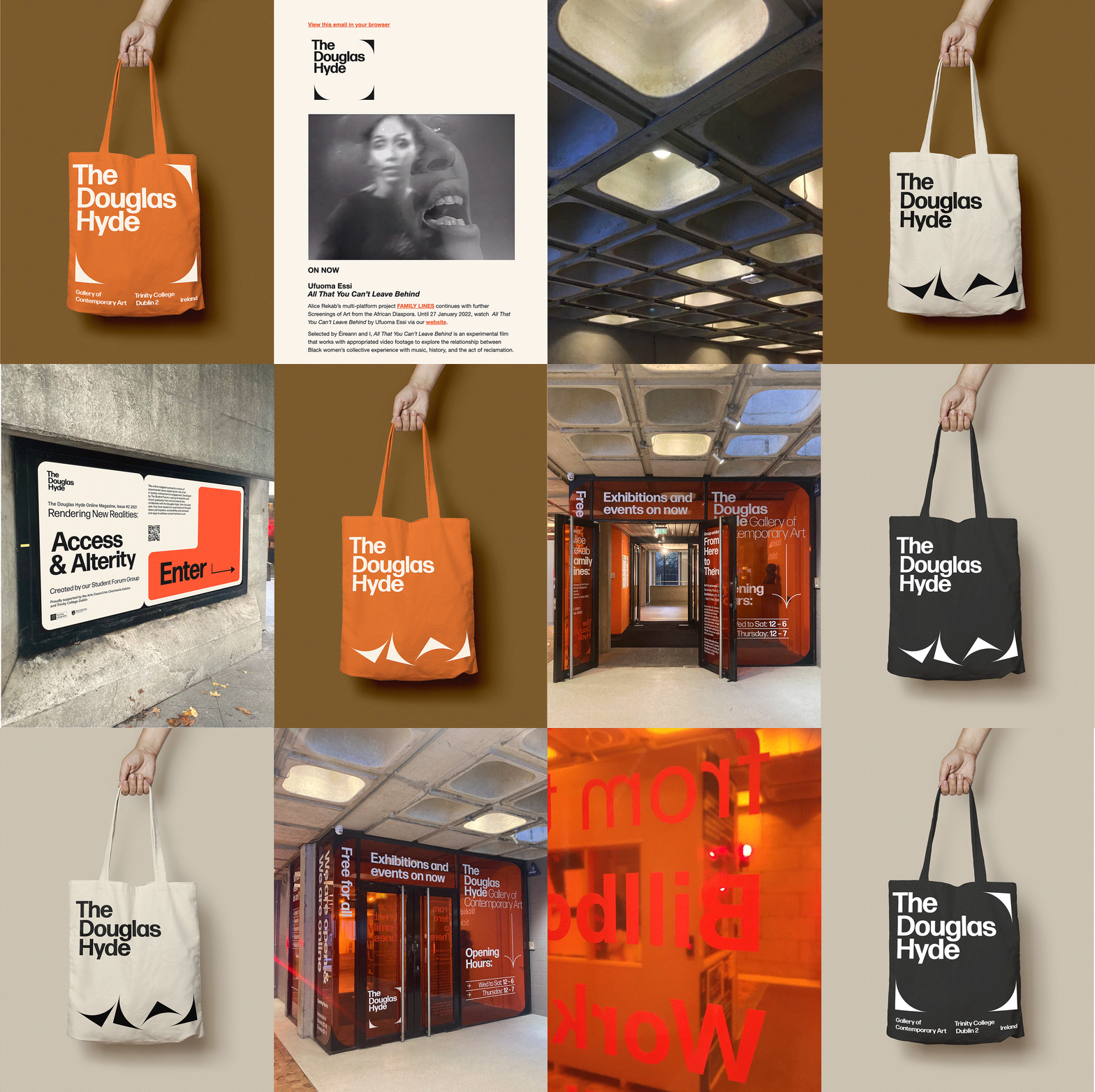
A gallery in essence is an architectural space, thus the design was inspired by aspects of its architectural features. The concrete ceiling of the gallery and the Trinity Arts Block became the catalyst for the logo and subsequently the brand identity and look and feel of the website. The rounded shape of the ceiling cells create a tension between sharpness and smoothness and of the negative and positive space.
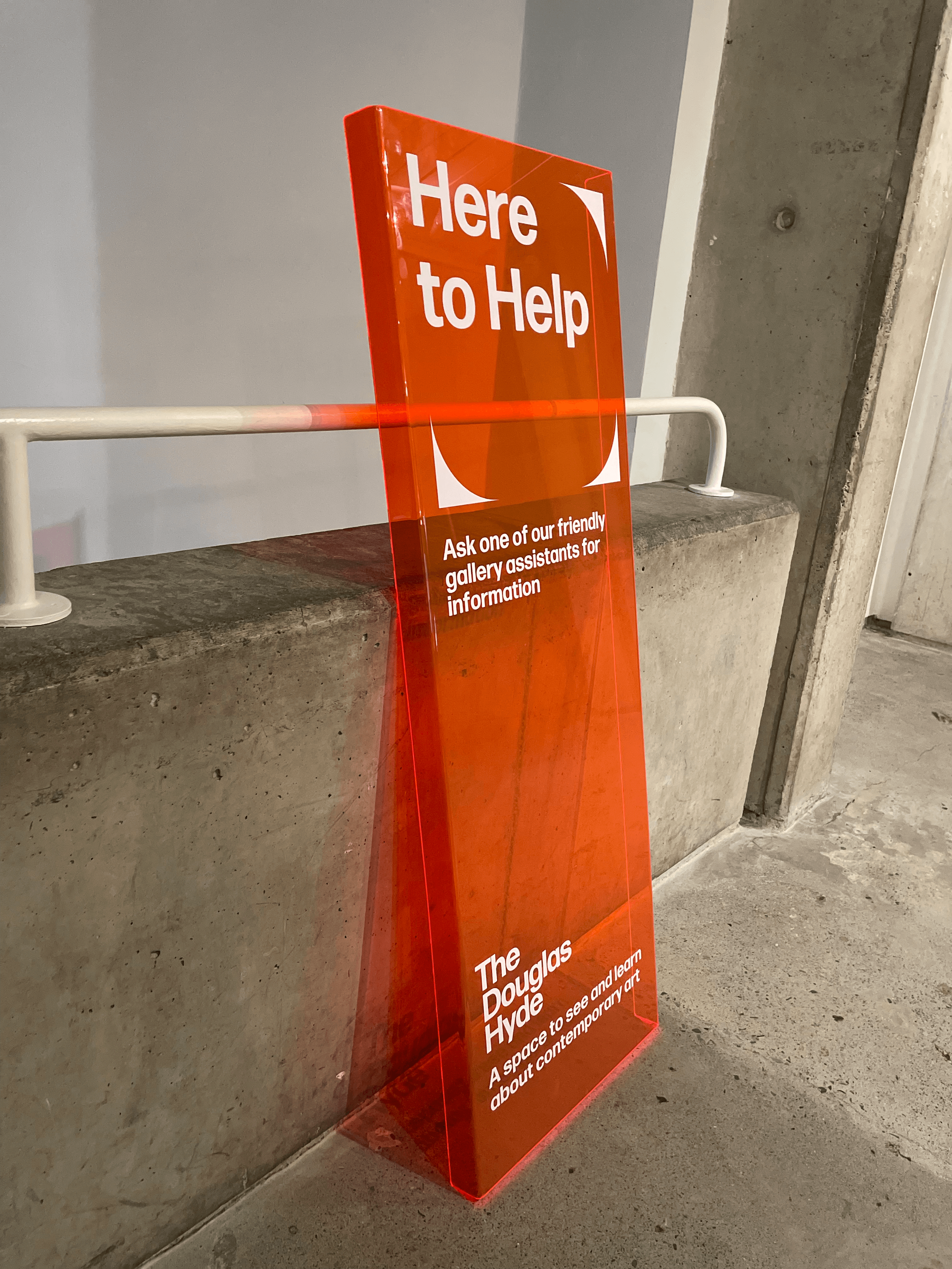
We worked closely with Learning & Engagement Curator of The Douglas Hyde, Fernando Sánchez-Migallón Cano and developer, Alex Bradley, to achieve a universal design. This included working with Knowbility to ensure the finished design was accessible to a wide range of people regardless of their age, size, ability or disability.
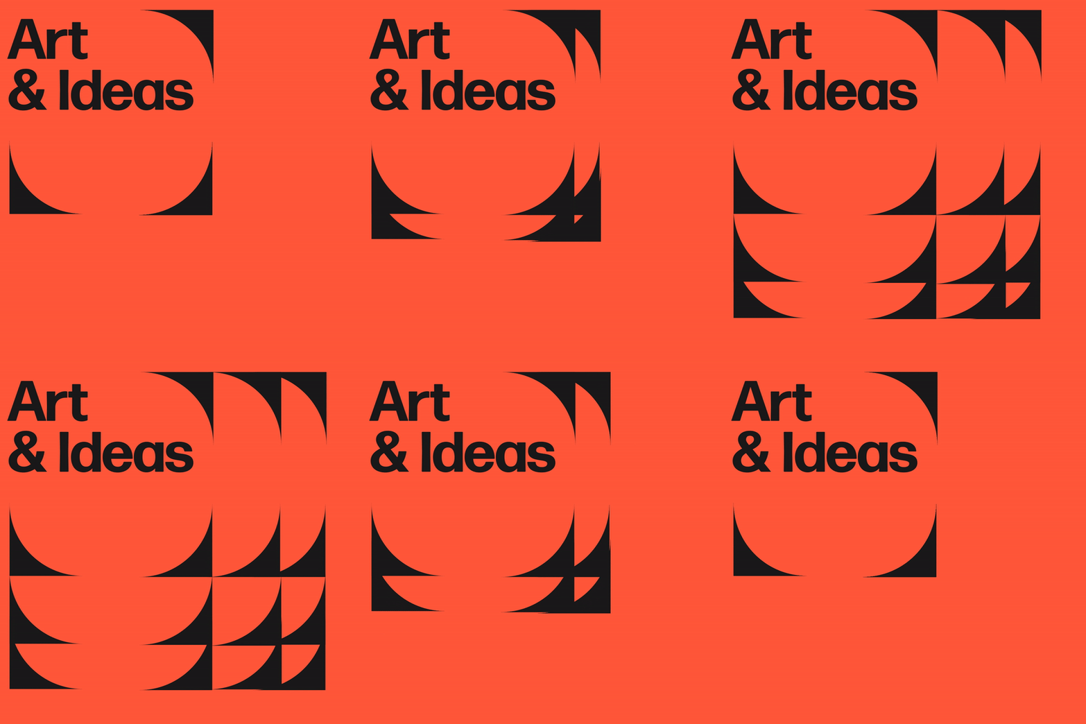
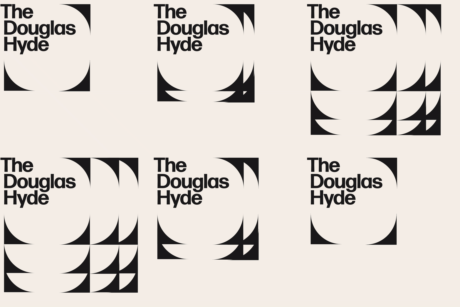
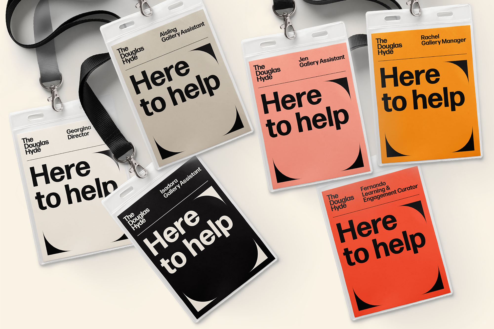
Through deconstructing and multiplying the mark and re-assembling the fragments of the original form, we developed a dynamic and modular system of symbols, icons and framing devices. The display type face (Forma) echoes that same tension between sharpness and smoothness whilst being high in contrast, legibility and character. Wanting to avoid the white cube aesthetic the colour scheme is led by a ‘muted’ charcoal black and warm off white that can be combined with the warm colours that compliments the grey concrete.





2021
Saltwater Grocery
Brand Identity
Client:
Karl Whelan & Niall Sabongi
Winner
New Branding Schemes
Visual Communication
![]()
Brand Identity
Client:
Karl Whelan & Niall Sabongi
Winner
New Branding Schemes
Visual Communication

Client Brief:
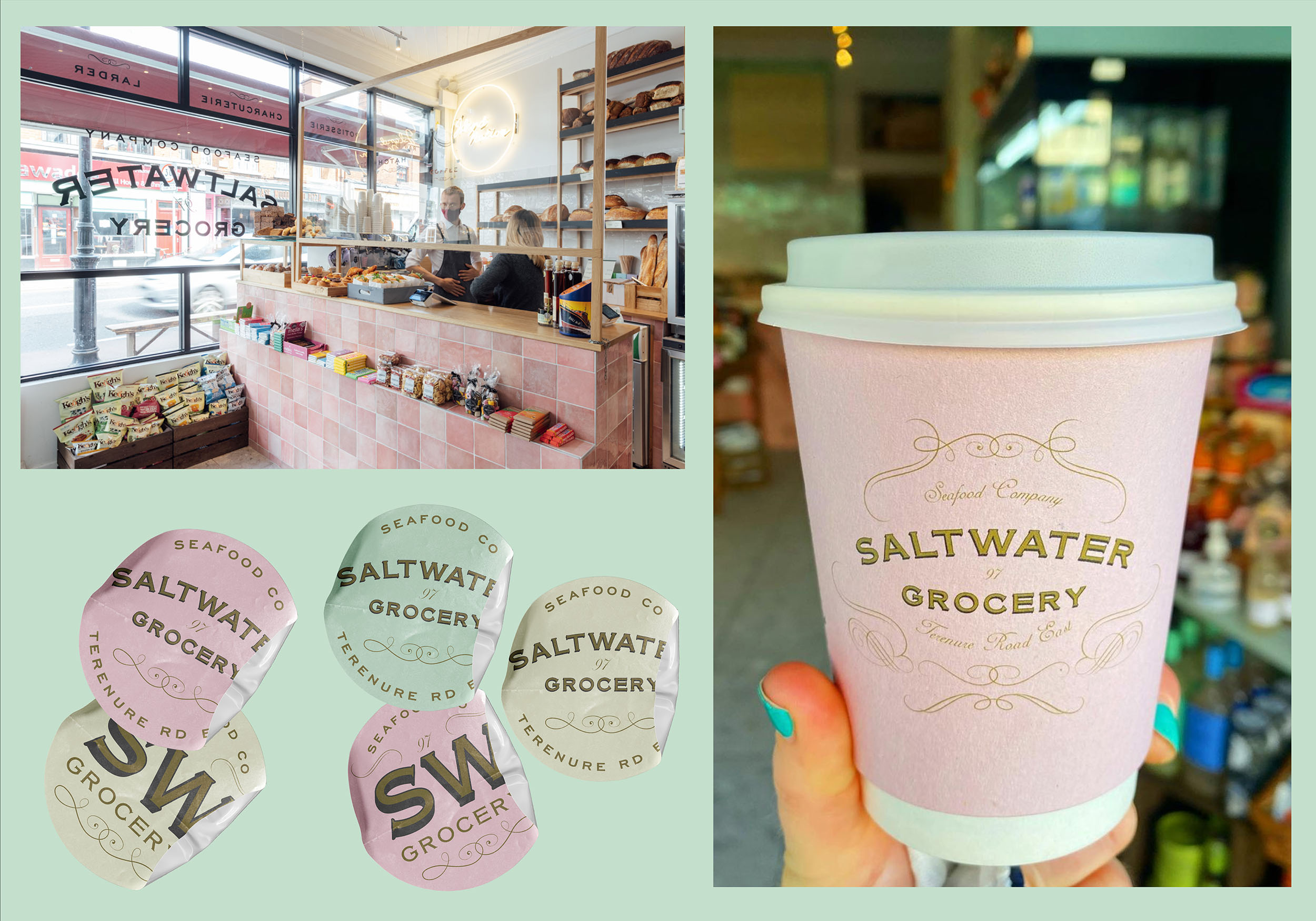
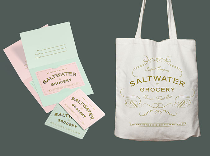
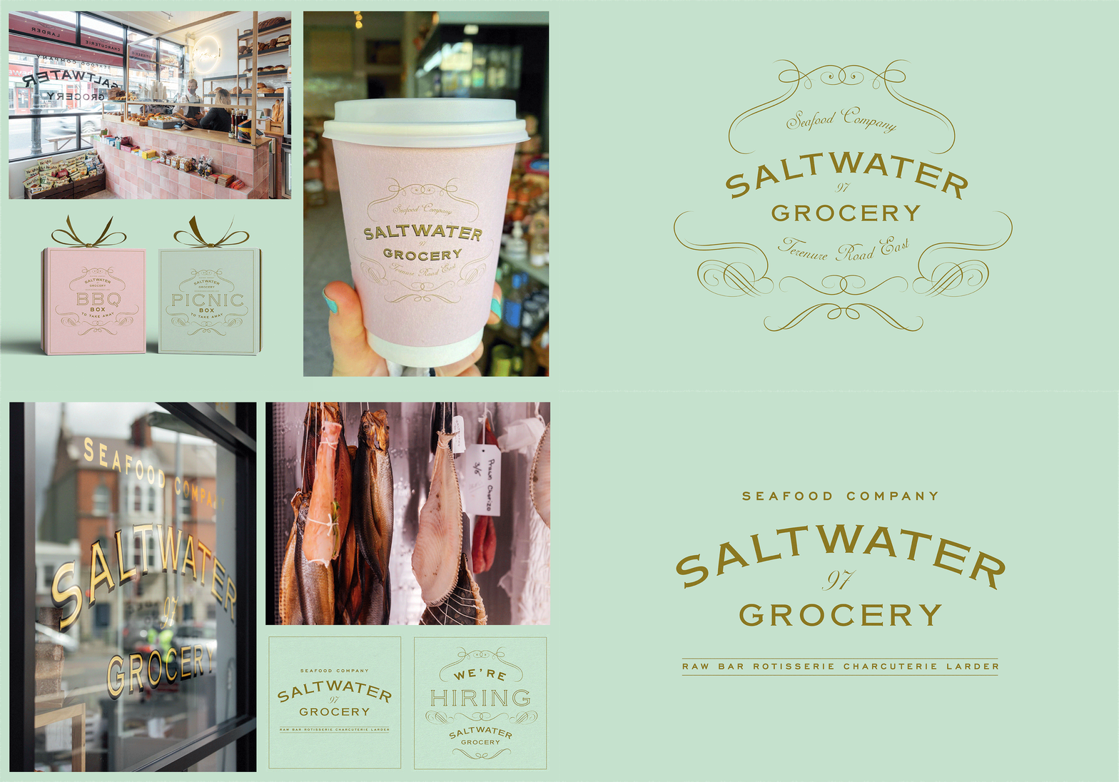
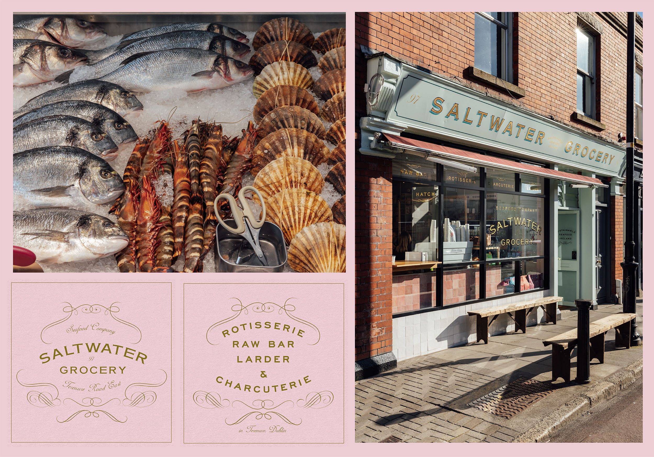
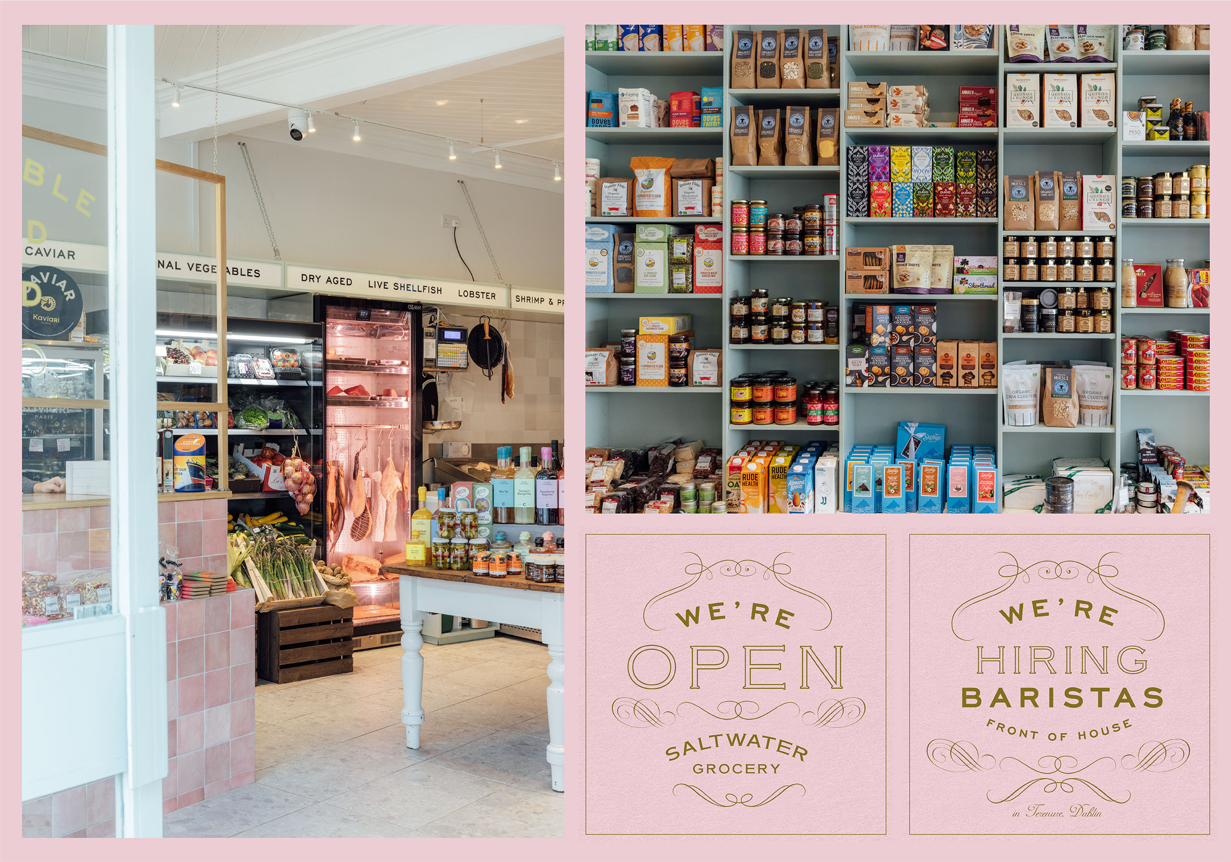
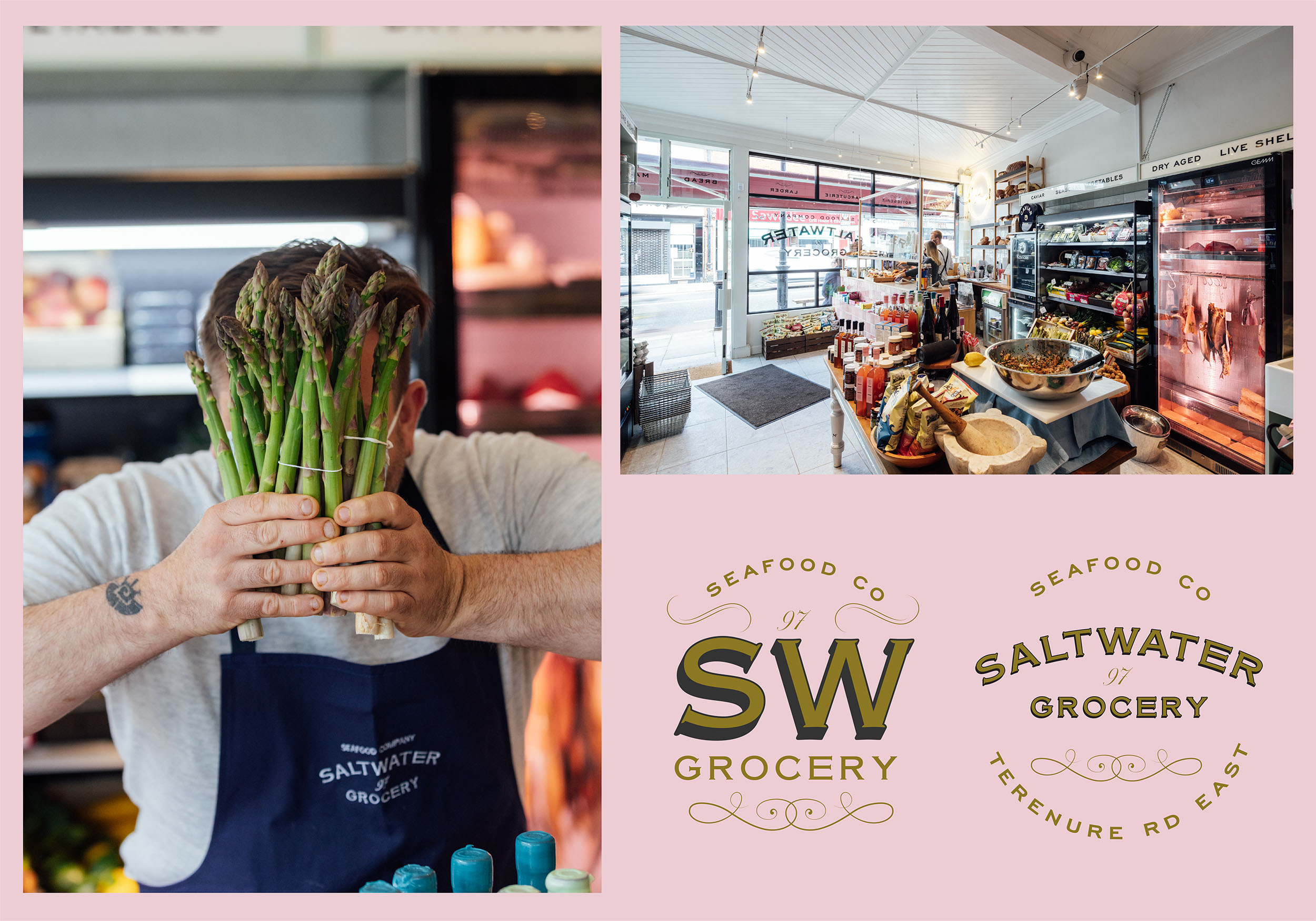
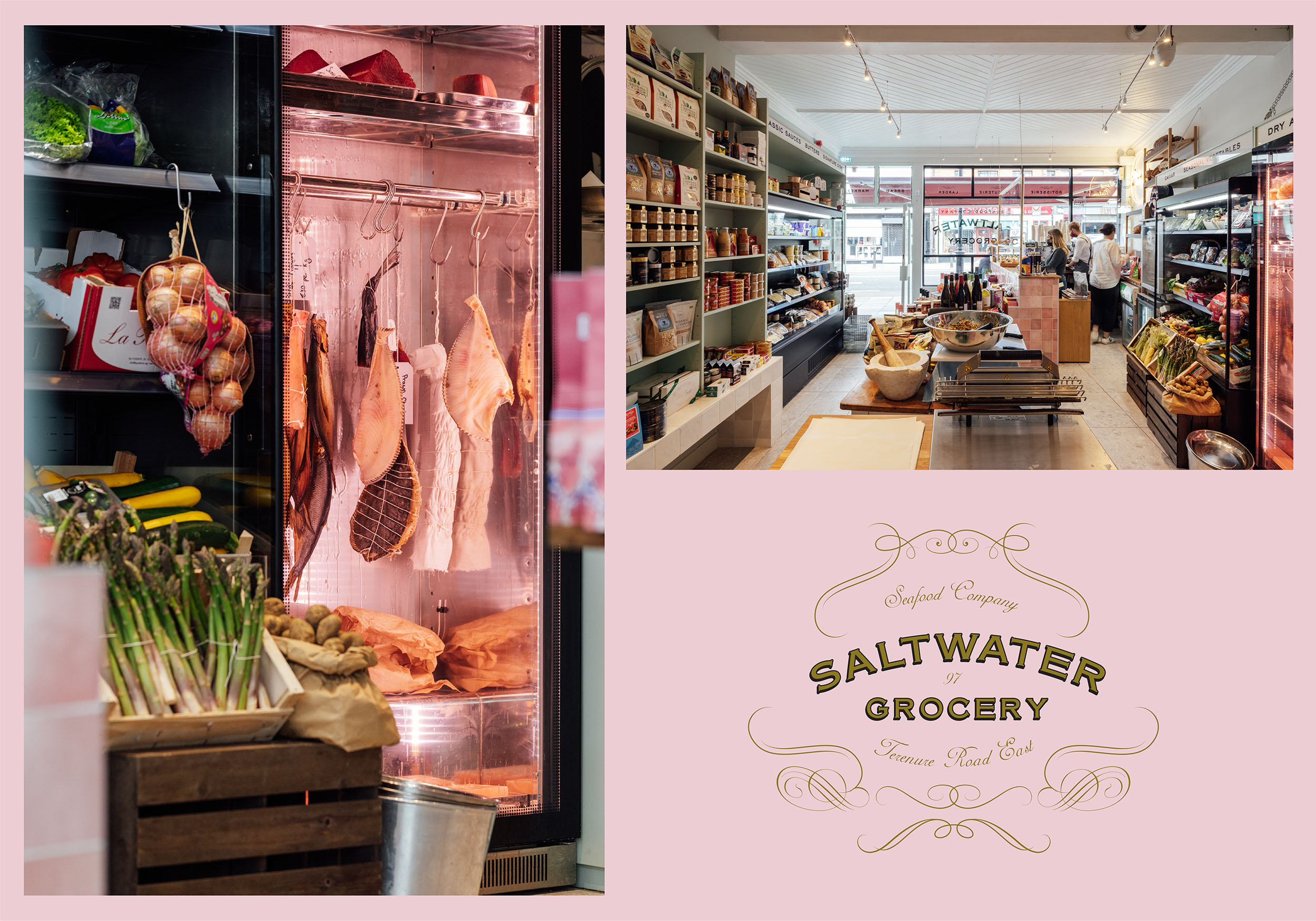
Saltwater Grocery, a gourmet food store that specialises in seafood, founded by chefs Karl Whelan and Niall Sabongi is situated on Terenure Road East. Originally a butchers, the shop was in need of a revamp and the new venture in need of a new brand identity.
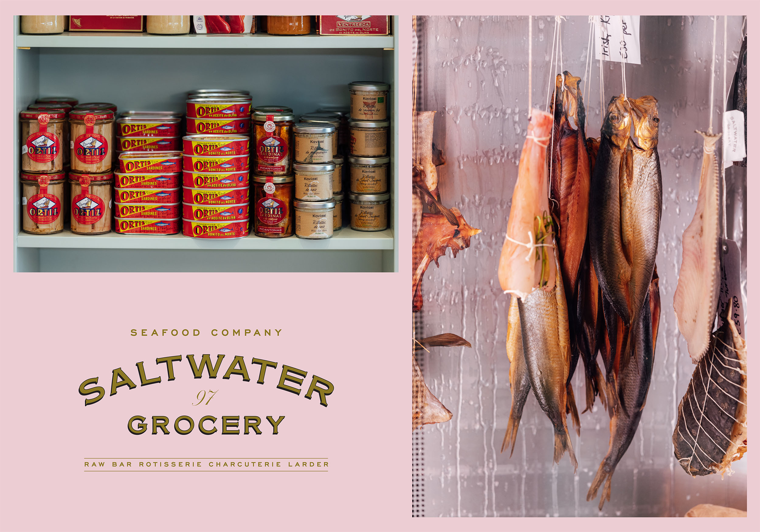
Karl and Niall pride themselves on sourcing fresh, sustainable seafood and hand selected artisan products and they needed a brand to reflect this. They came to us with examples of what they wanted and asked us to recreate a vintage style grocery that looked ‘like it has always been there’.
Our Response:
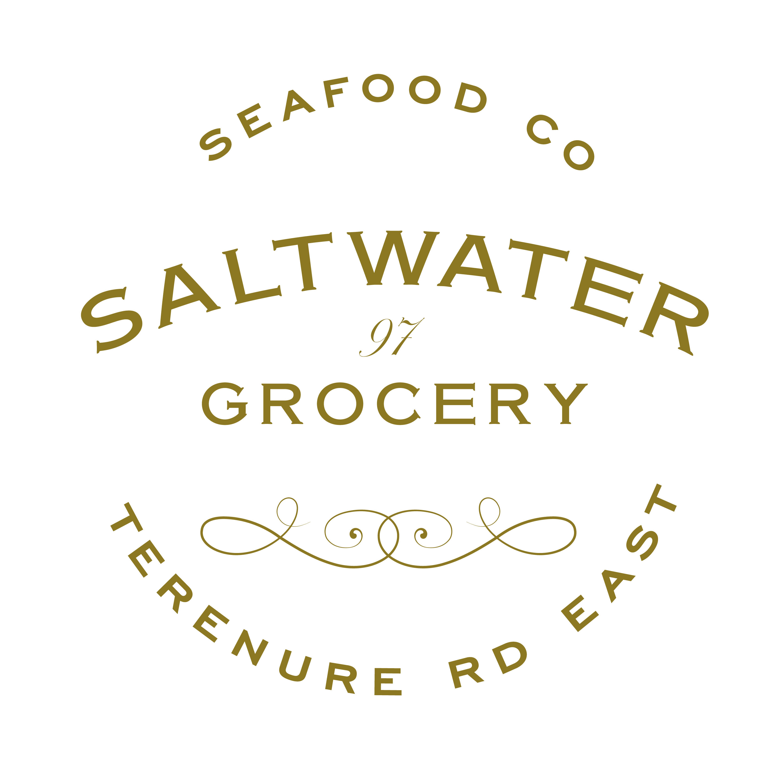
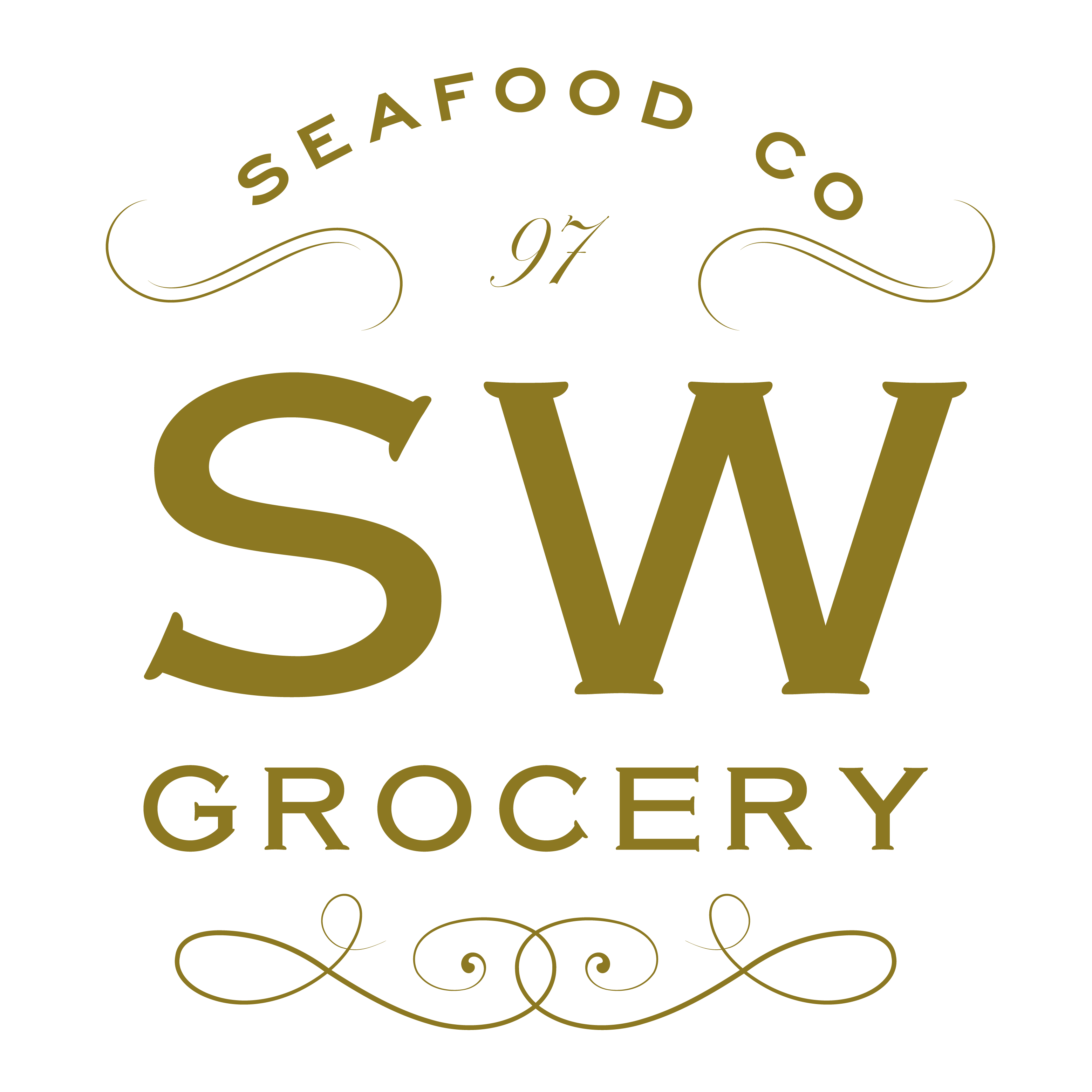
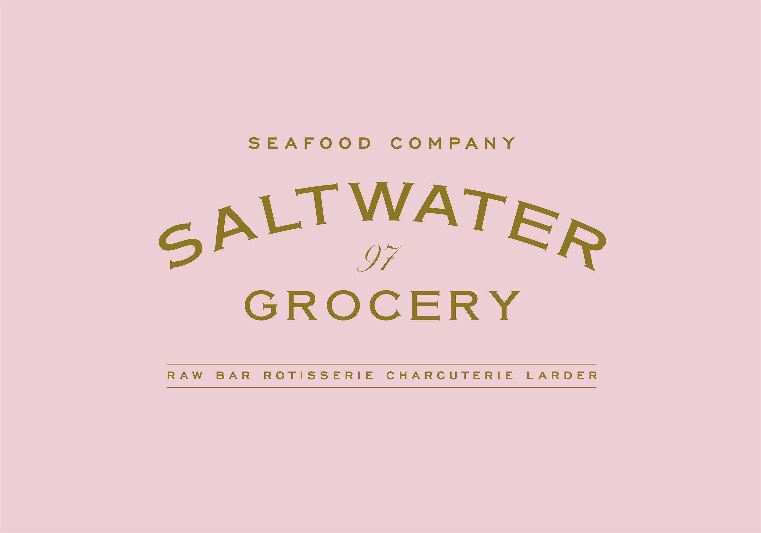
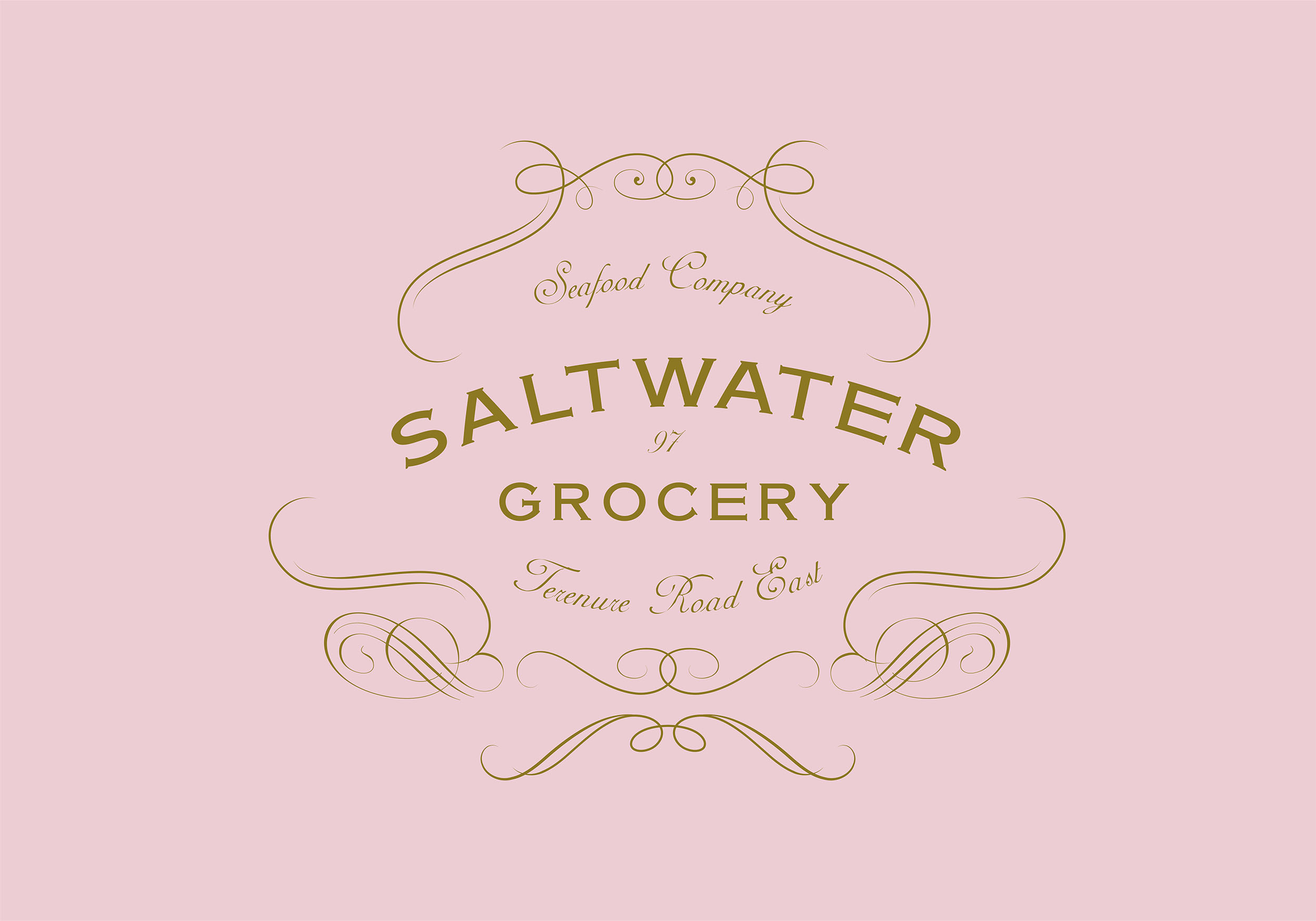
Together with interior specialists, AB Projects, we created an extensive brand and scheme for the store. The starting point was a suite of classic logos and a colour palette inspired by French Boulangeries. The suite included various marks for multiple applications; including a fancy, ornamented logo resembling an opened clam, and a purely typographic logo.
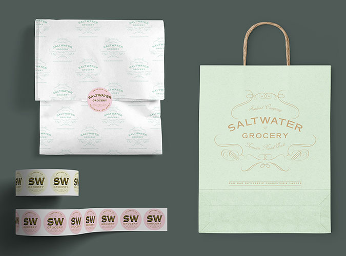
The flexible identity was designed and customised to fit the many elements from the shop interior and exterior shop signs (painted and gilded to the highest standard by Mac Signs) as well as extensive packaging, printed and digital materials, paying close attention to ensure we were sourcing the most environmentally friendly materials and working with printers that could provide such materials.
Design Assistance:
Rebecca Wright
Interior Design & Architecture:
Ahmad Fakhry & Andrew Burdock / AB Projects
Sign Painting:
Cormac Dillon & Louise Gardiner / Mack Signs
Photography:
Shantanu Starick
Rebecca Wright
Interior Design & Architecture:
Ahmad Fakhry & Andrew Burdock / AB Projects
Sign Painting:
Cormac Dillon & Louise Gardiner / Mack Signs
Photography:
Shantanu Starick



Client Brief:
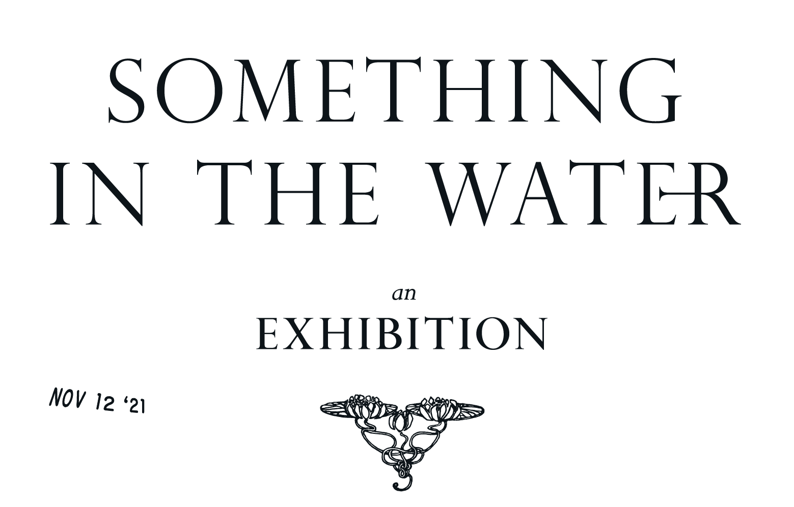
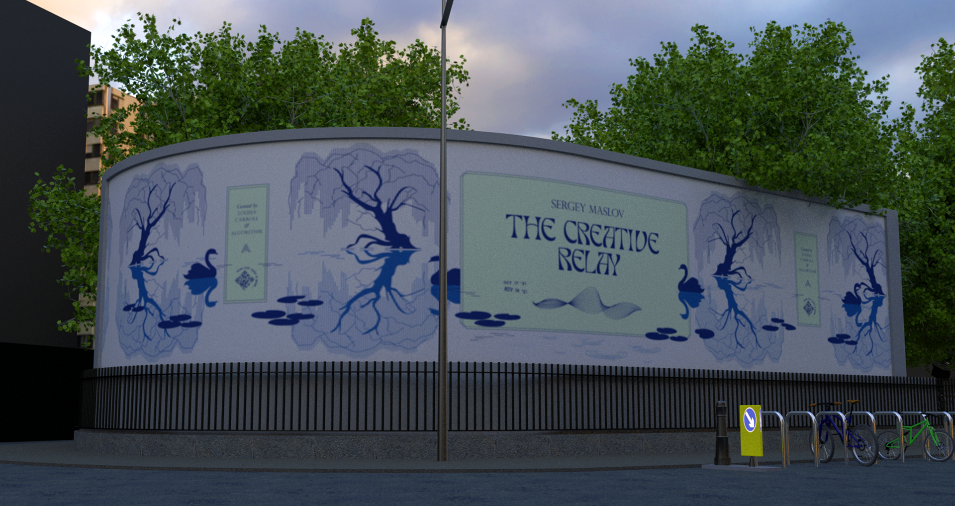
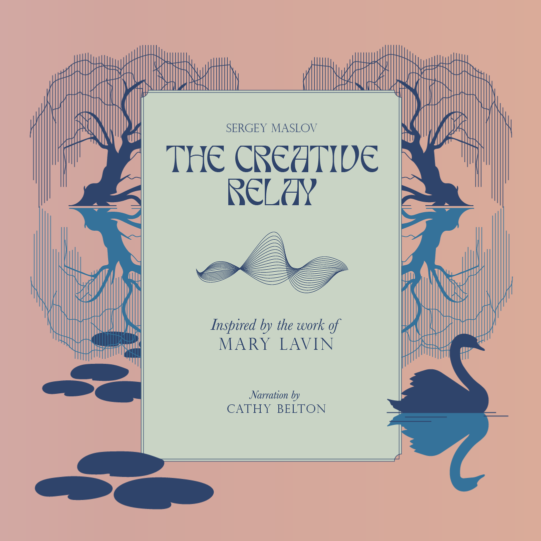
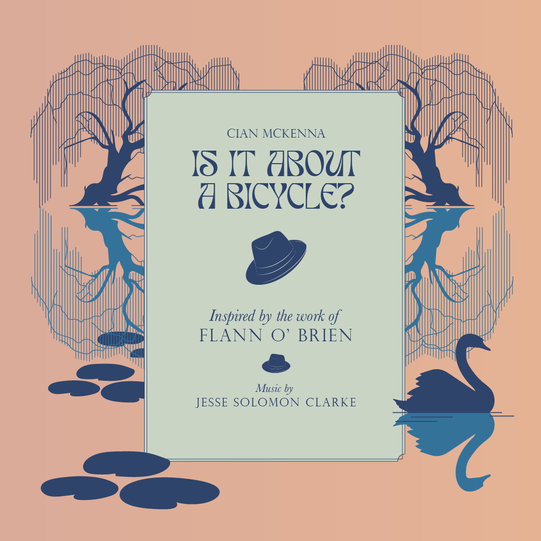
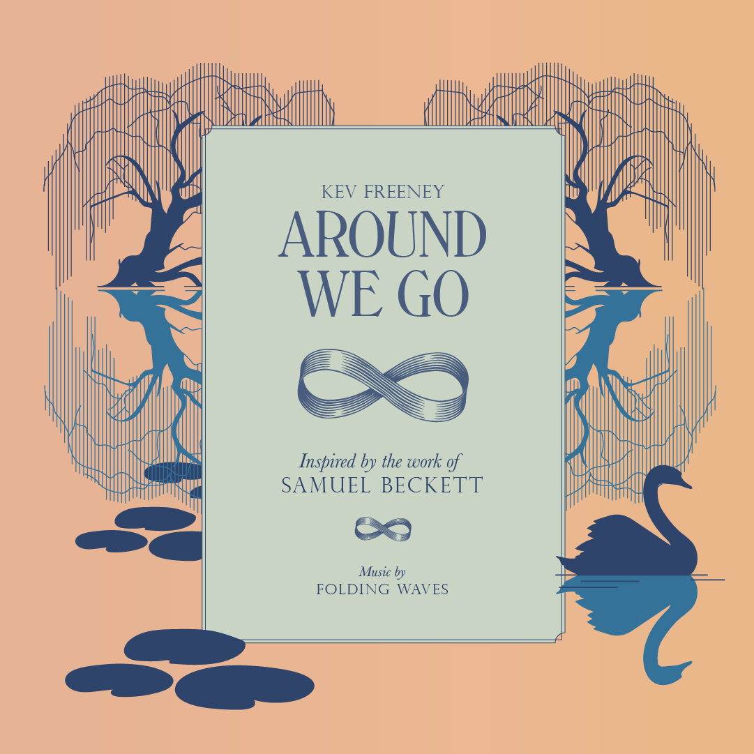
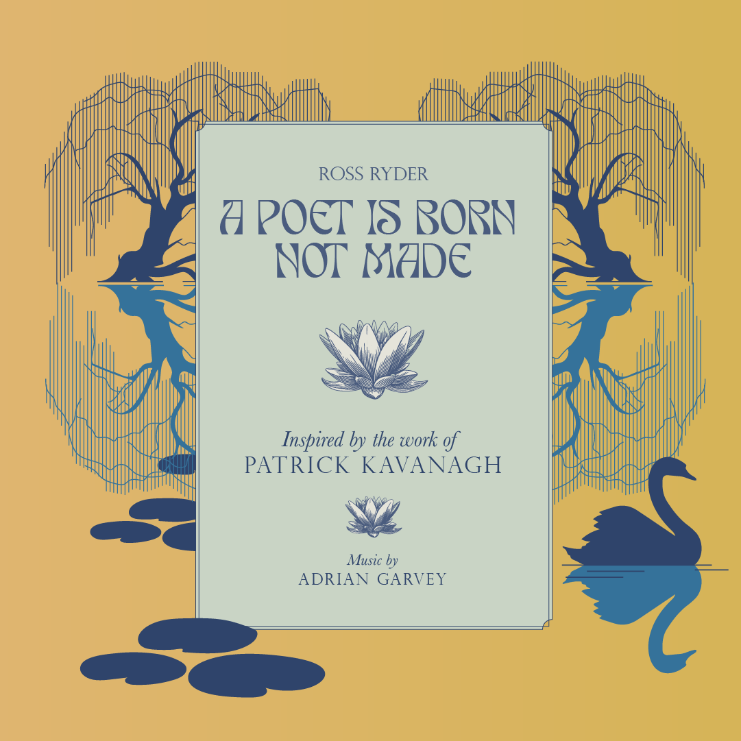
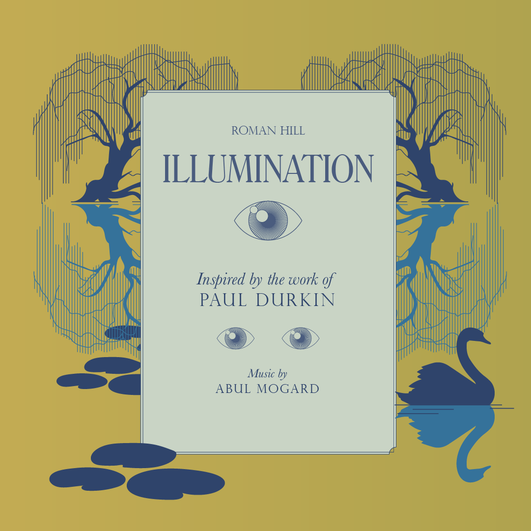
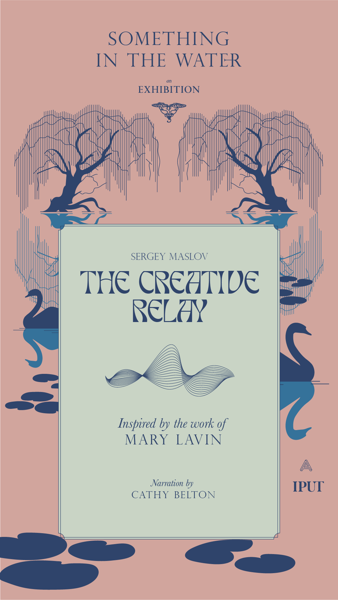
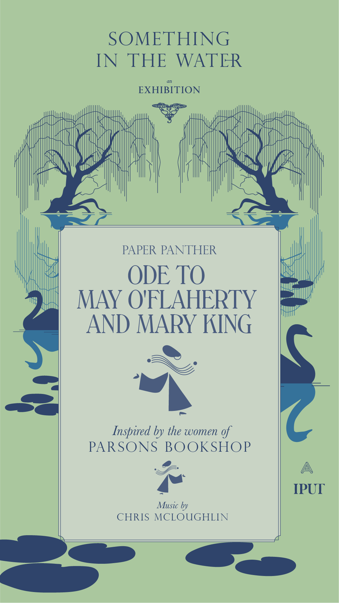
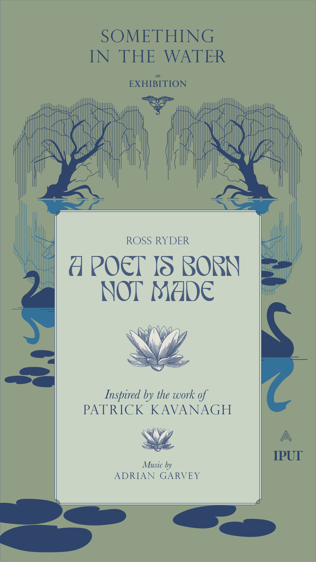
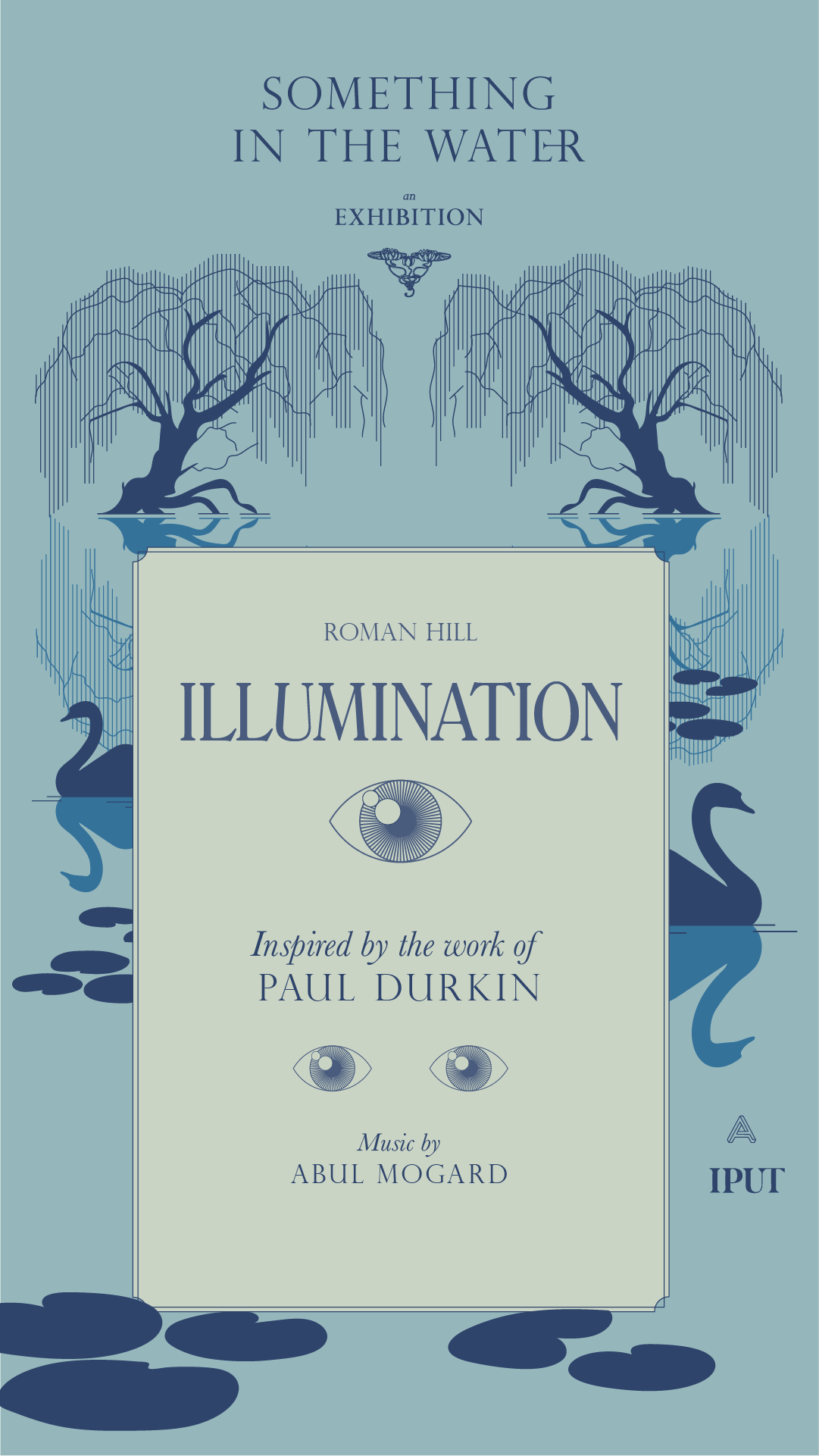
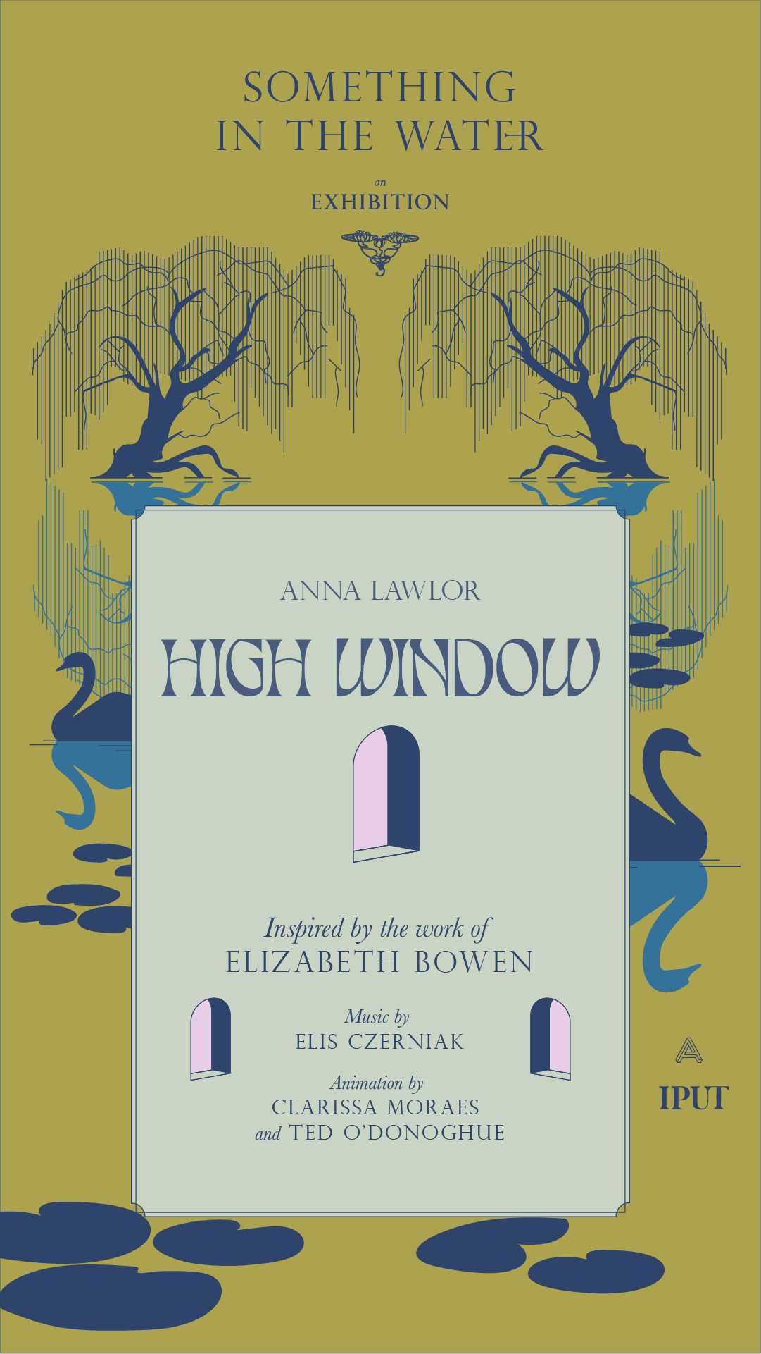
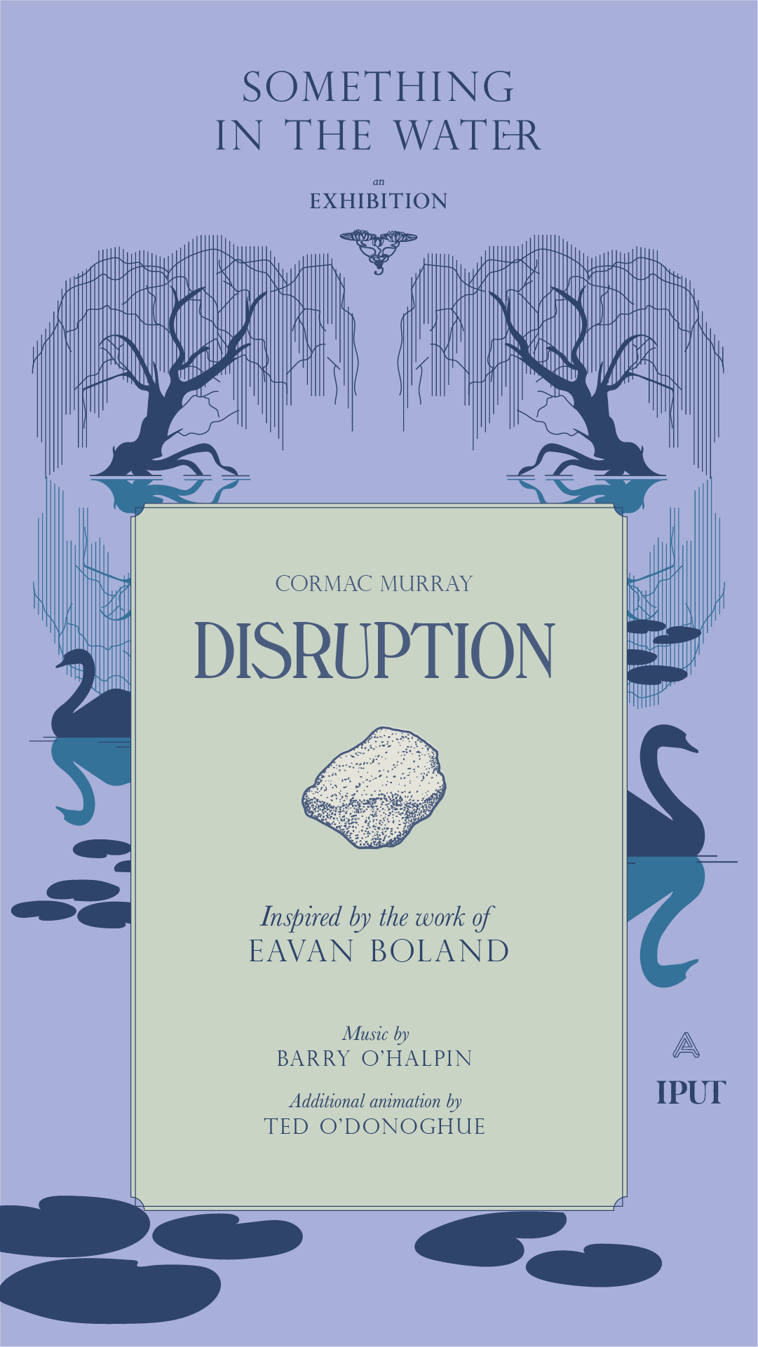
Something in the Water was an exhibition of motion graphics pieces from 8 artists, displayed on a huge screen along the Grand Canal, Dublin. Taking inspiration from the literary history of the canal, the exhibition identity came to life as the unfolded dust jacket of a book.
Research began by looking at 20th century book covers of writers, antique book shops from the area and other printed ephemera from the Canal’s rich literary history. From these, the typographic style was developed and crafted into the main exhibition title.
Our Response:
The brand structure was also based on the exhibition as a book — each individual piece is like a chapter of the same book. We made bespoke social media assets for each artist to share with their followers and direct them to the exhibition’s channels, website and the exhibition itself.
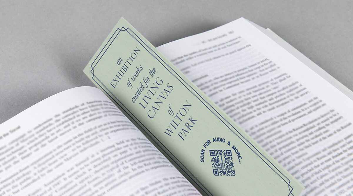
We created bookmarks with a QR code that were distributed in local bookshops. Turning the QR code on its side made it instantaneously decoractive!







2017
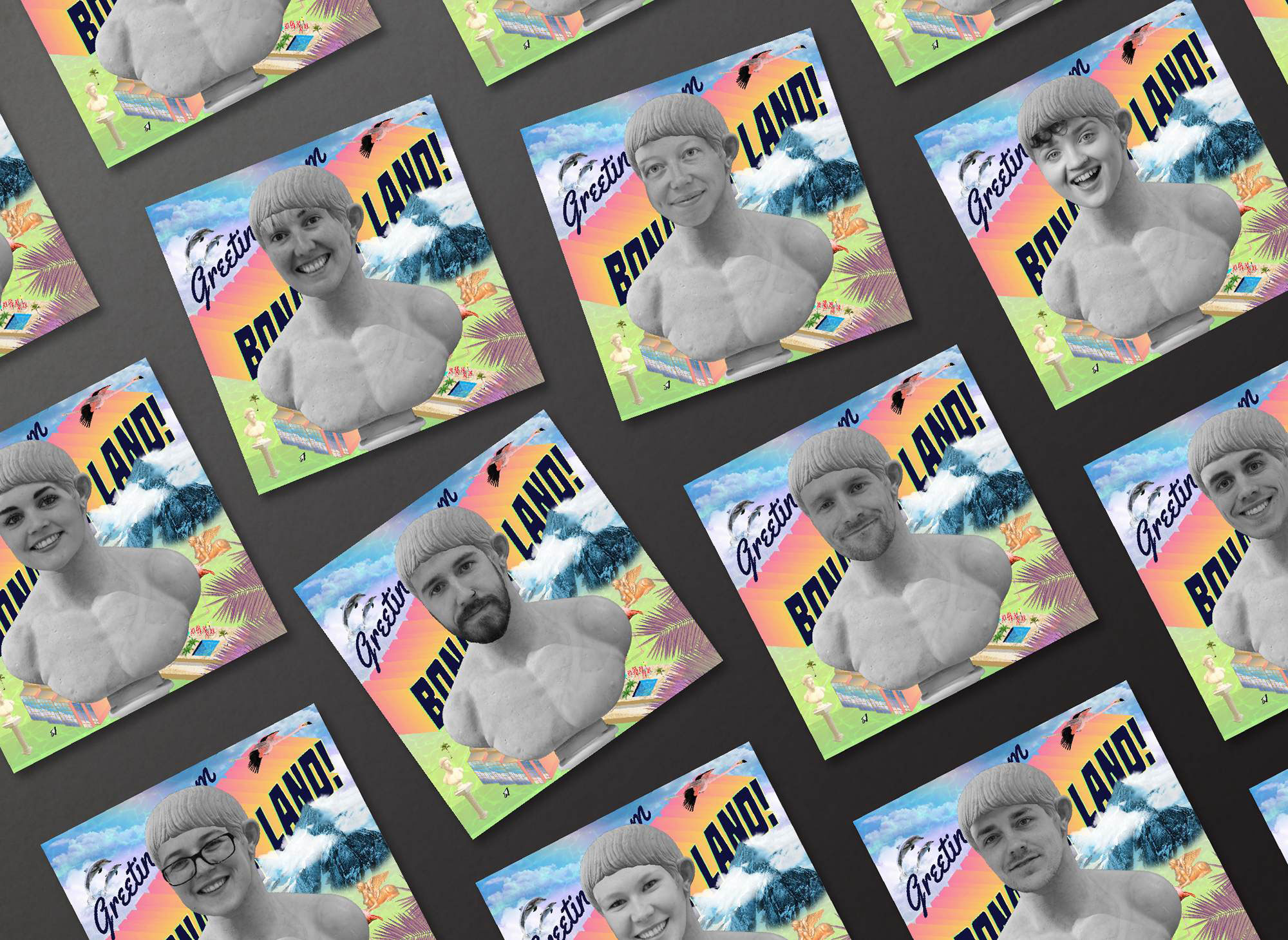
Bonanza Land!
IADT Visual Communications Graduate Exhibition 2017
![]()
Bonanza Land!
IADT Visual Communications Graduate Exhibition 2017

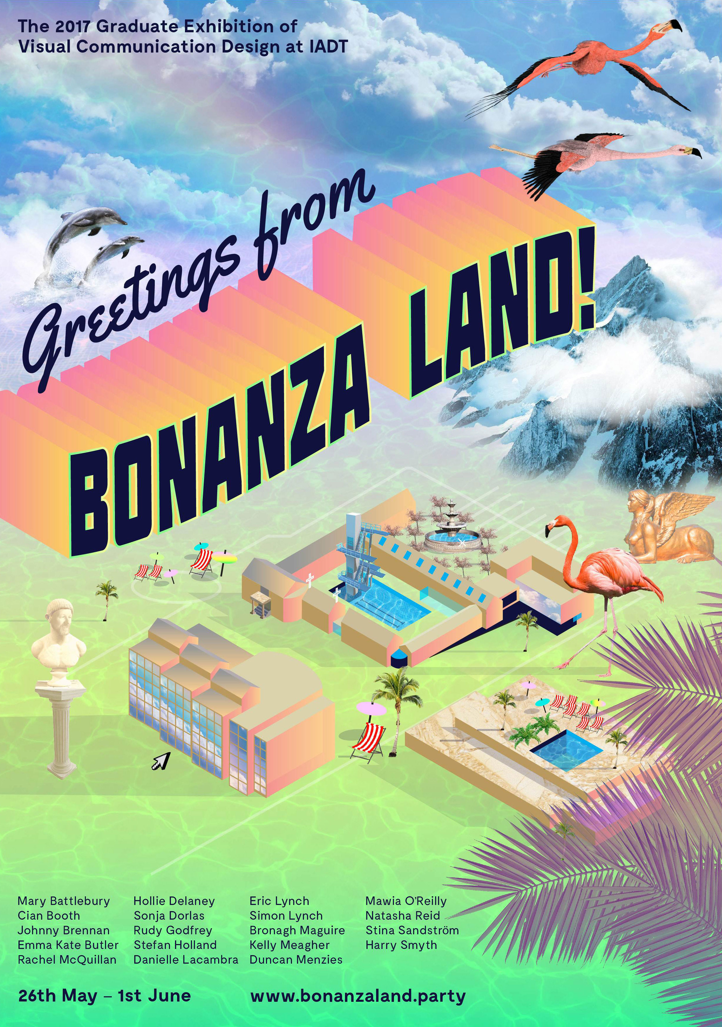
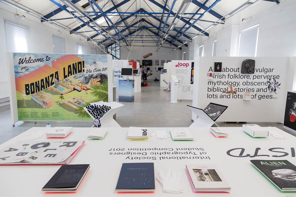
The concept for this project was born from the proposition that IADT is an Island—The Island of Art, Design and Technology. Away from the buzz and distractions of the city, Visual Communications students work in an intensely creative environment producing a bonanza of fantastical and innovative results. In order to entice visitors to make the journey out to this island to see the show, we needed to create a desirable and exciting destination.
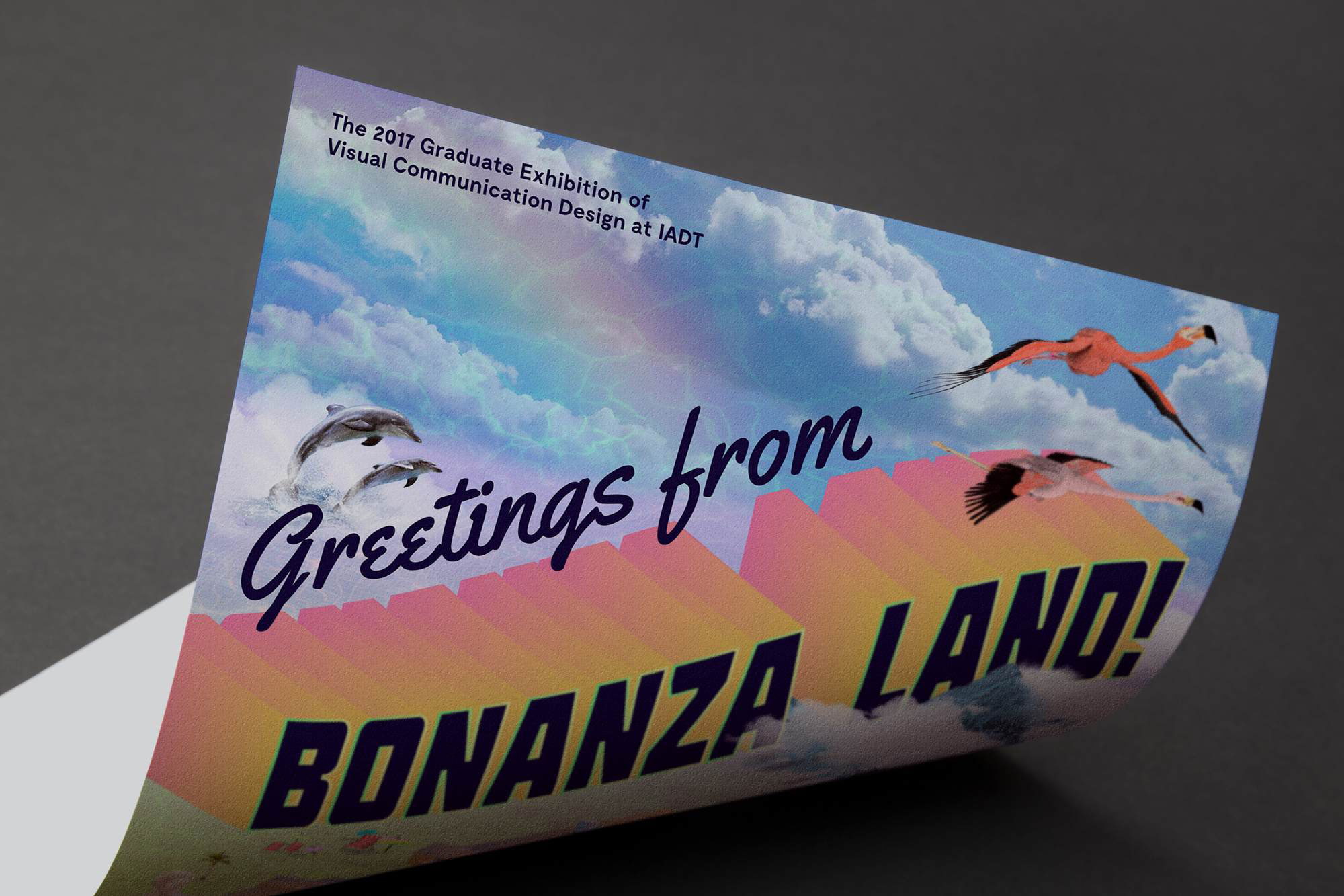
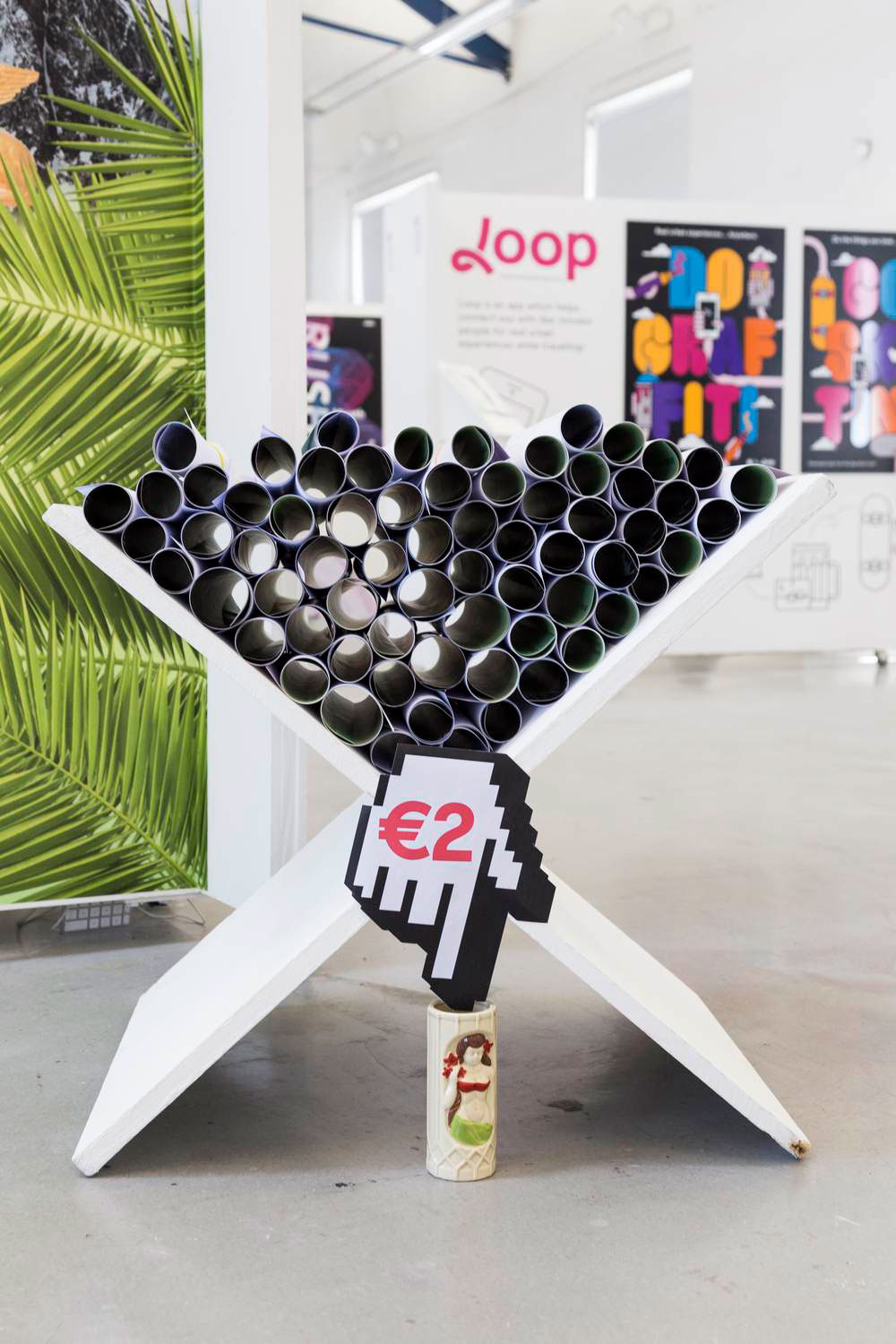
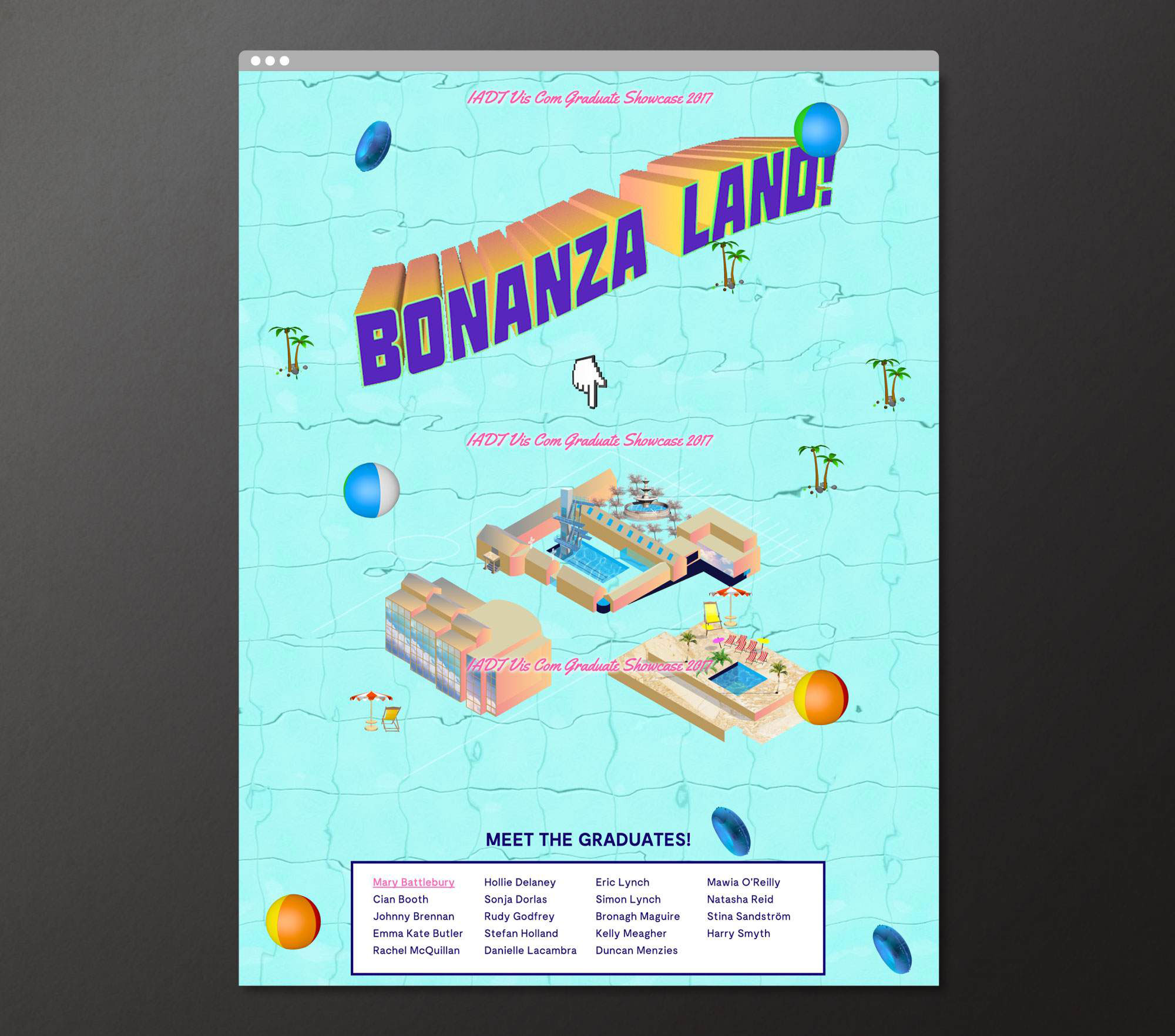
The project required a promotional poster, social media campaign, promotional motion piece, website, and exhibition graphics & signage.
The project required a promotional poster, social media campaign, promotional motion piece, website, and exhibition graphics & signage.
We borrowed cues and marketing tools from the world of tourism and created a hyperreal holiday resort called BONANZA LAND! The very definition of bonanza is a large amount of something desirable, so for this reason the identity was ideal for the 2017 Visual Communications Graduate Showcase—a veritable Visual Communications bonanza!
Bonanza Land! is included in 2017 100 Archive Selection and also won the IDI Graduate Award for best use of illustration in design 2017.
