
We create extraordinary, engaging and robust design for entrepreneurs, artists and organisations.


Client Brief:
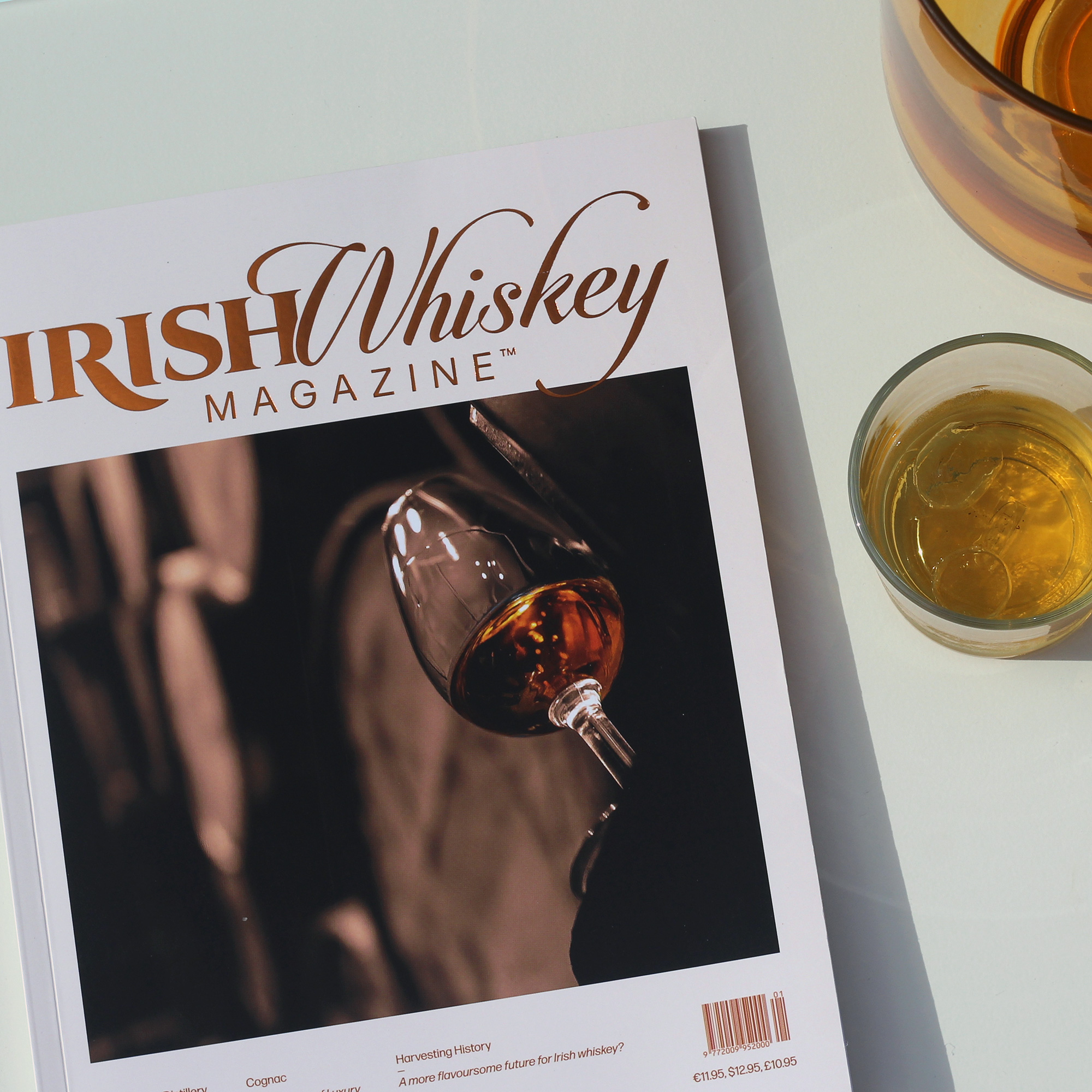
The editor of the specialist publication Irish Whiskey Magazine approached us with a desire to redesign. The previous design was a bit chaotically put together, lacking a sense of cohesion and flow.
After a thoghrough review of the previous issues we identified the key problems of the design;
Too many design variables — typefaces, colours, stock illustrations and pagestyles that lowered the standard of the magazine.
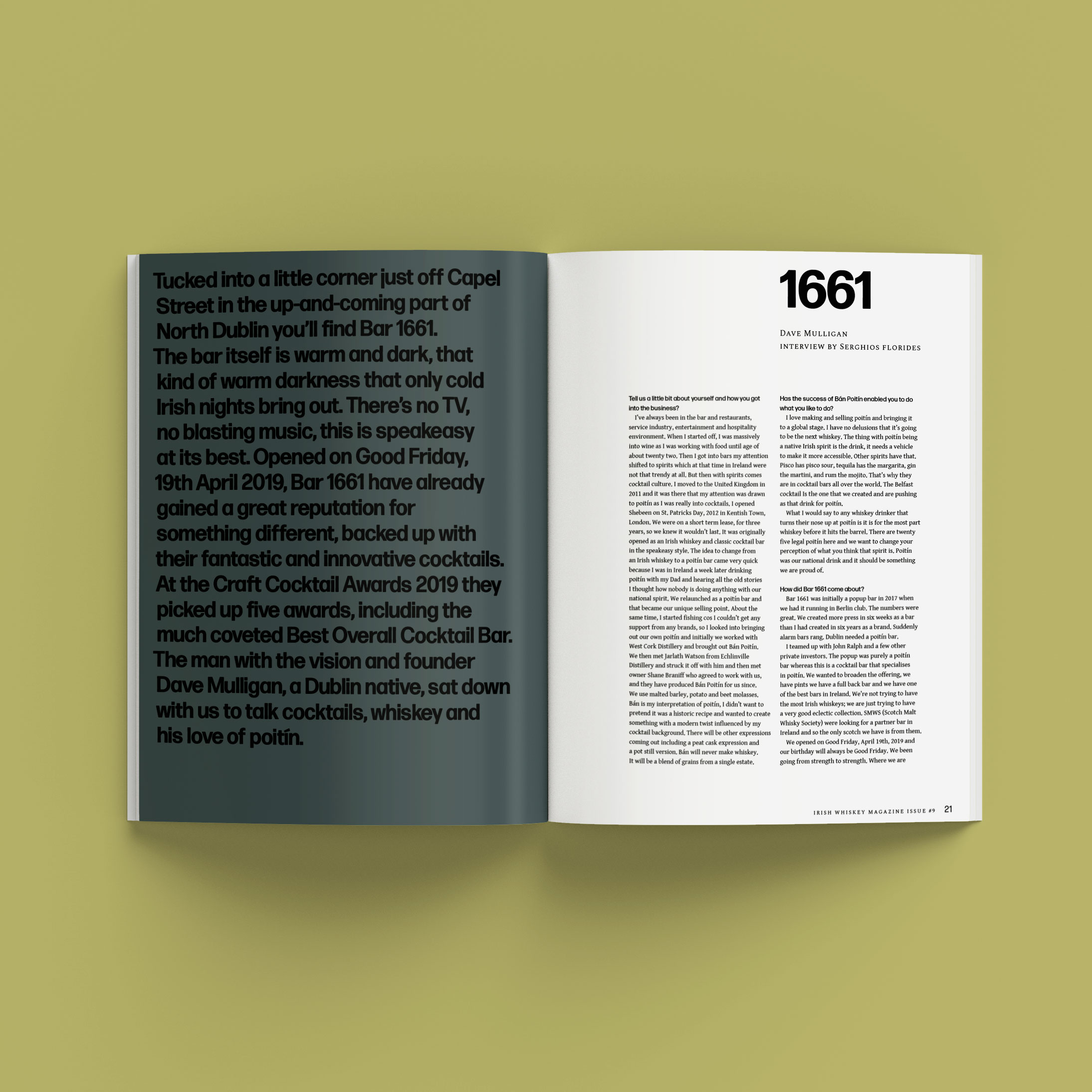
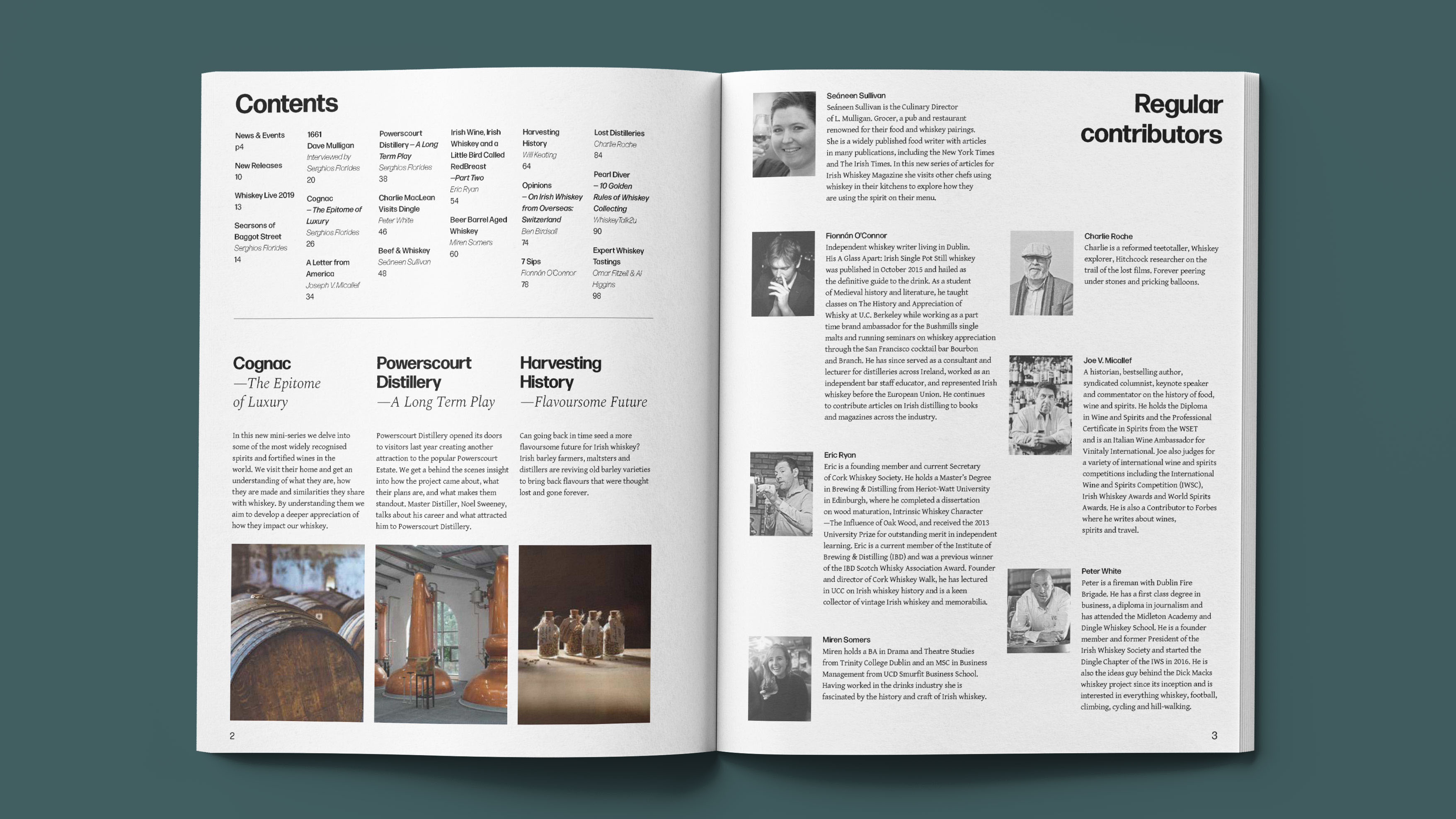
No editorial structure — no subheadings or introductions to articles, categorisation or editorial sequencing, which is key to drawing the reader in.
Our Response:
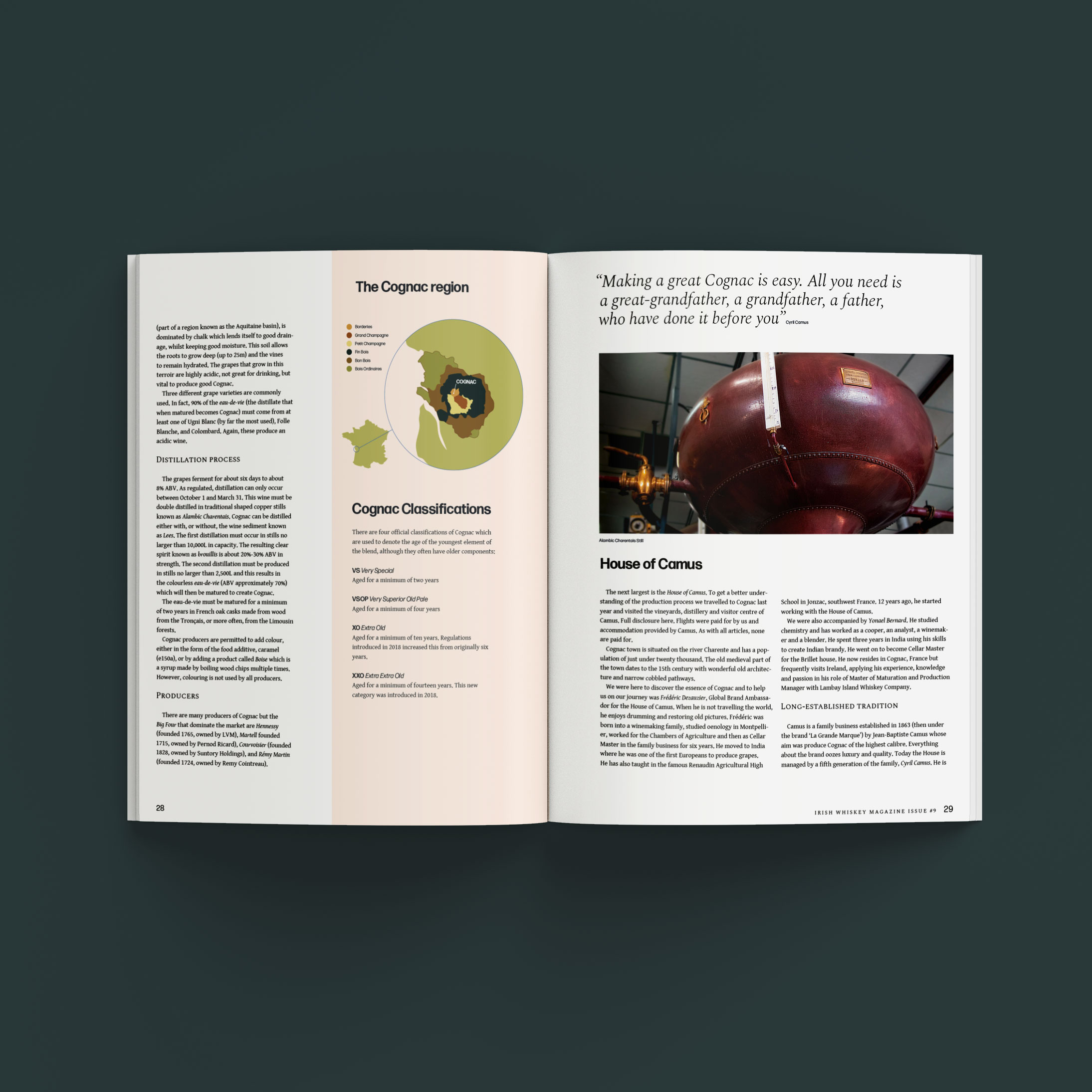
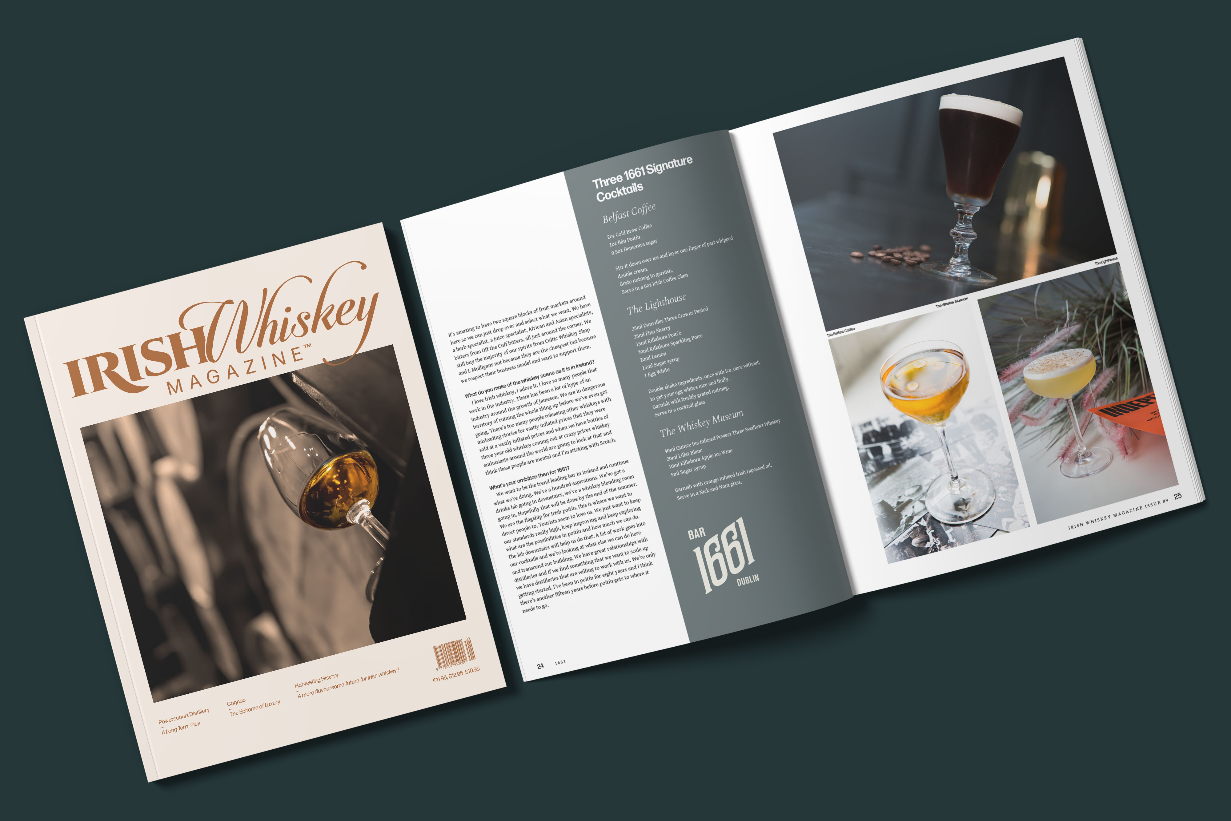
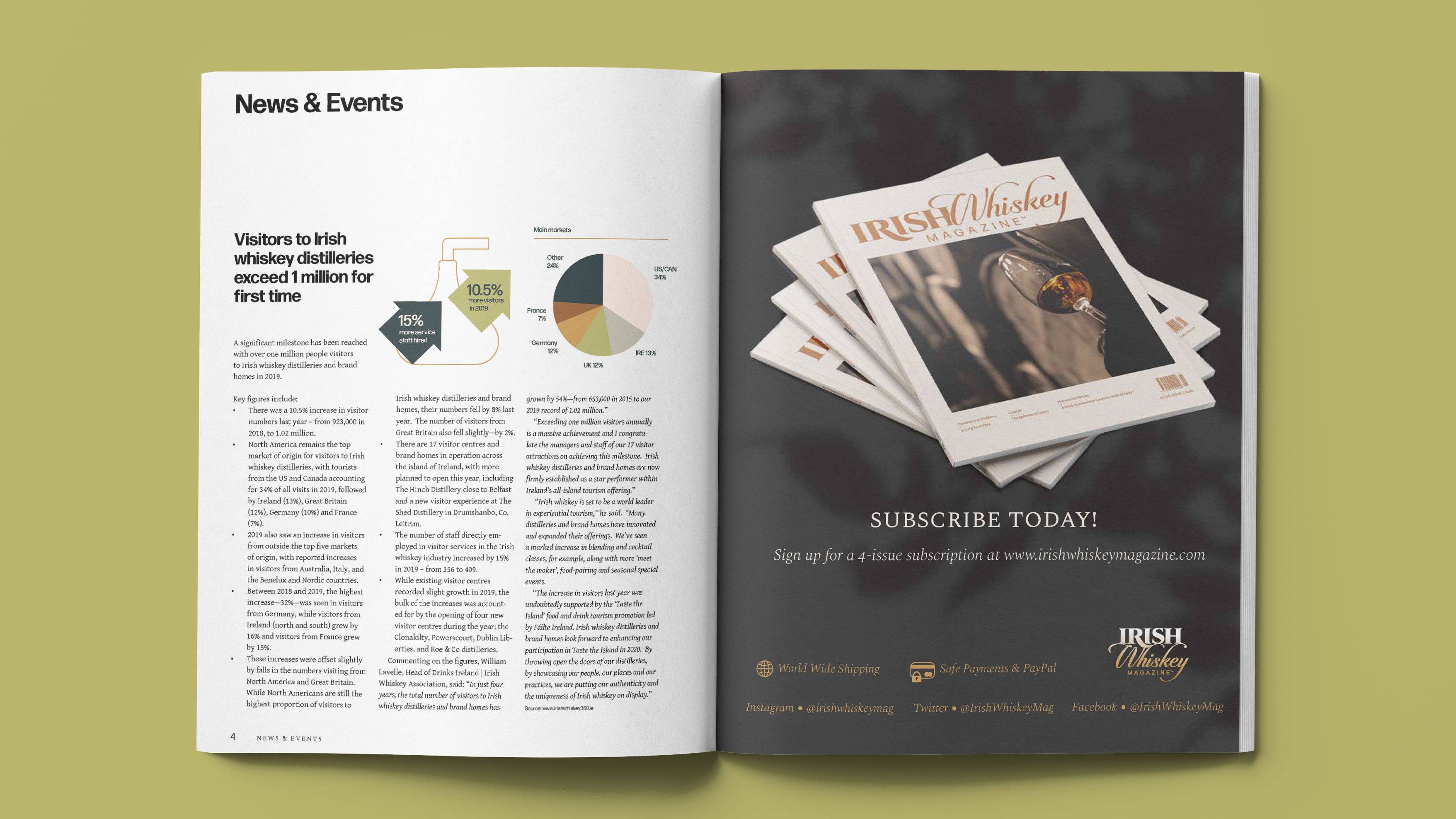
We created a typographic grid system that allowed for continuity and flexibility. We stripped down the brand elements and chose just two typefaces, a handful of colours, a custom illustration style.
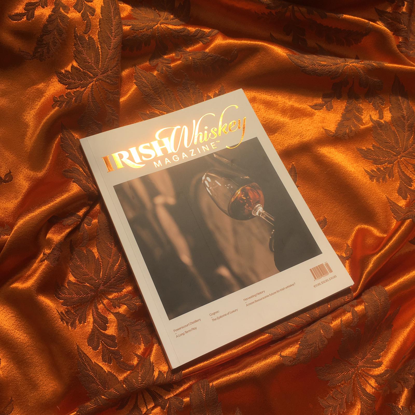
We changed the format from standard A4 to a custom size that gives the magazine an air of exclusivity. Making for a more comfortable read, that oozes luxury and maturity.
We have established the new identity by employing this robust system within a slick new format.