

2021
![]()
The Douglas Hyde
Brand Identity & Website Design
thedouglashyde.ie
Client: The Douglas Hyde
Developer: Alex Bradley
Winner
IDI Universal Design
Special Awards
![]()
Brand Identity & Website Design
thedouglashyde.ie
Client: The Douglas Hyde
Developer: Alex Bradley
Winner
IDI Universal Design
Special Awards

Client Brief:
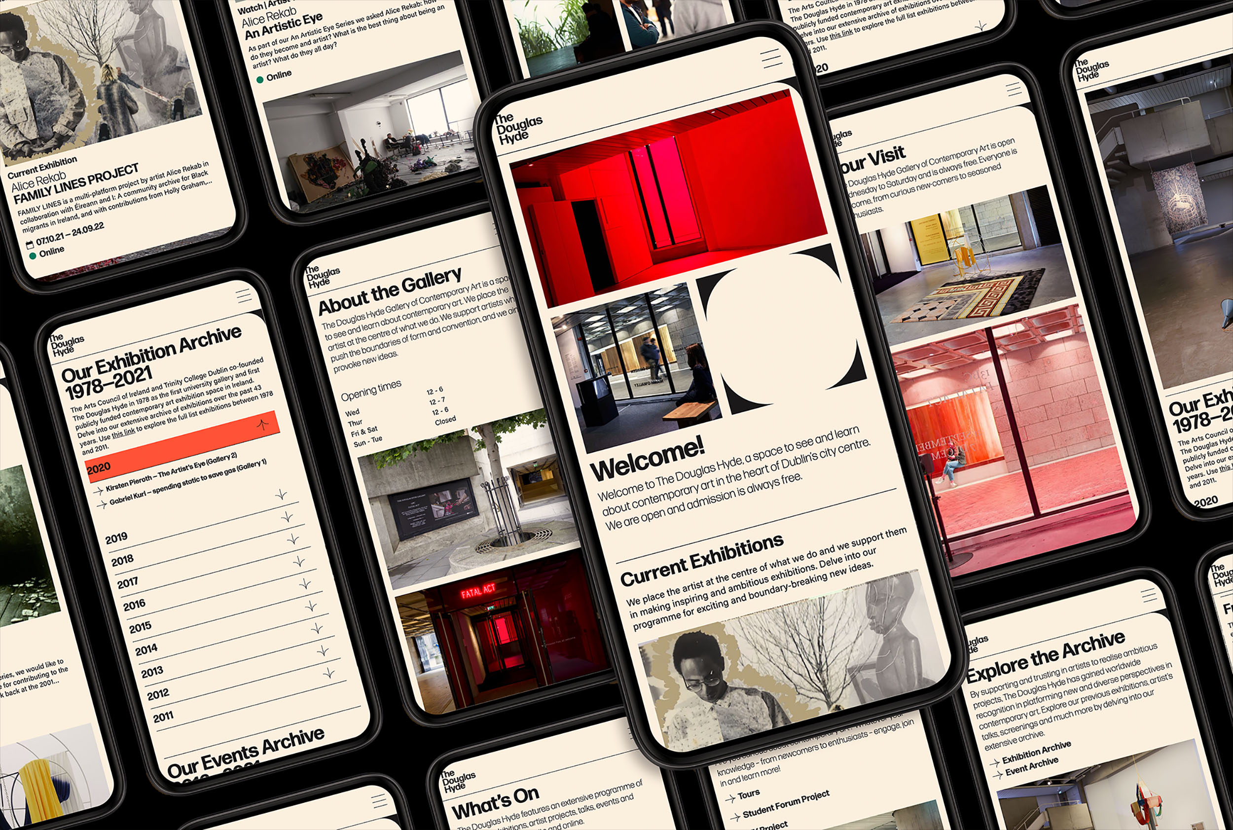
Challenges that most contemporary art galleries struggle with have to do with accessibility and how to bring conversations about art to larger and non-traditional audiences. With this rebrand and website project we needed to create an accessible and friendly design that welcomes new engagement and does away with any perceived intimidation whilst still maintaining the intellectual reputation of the gallery.
Challenges that most contemporary art galleries struggle with have to do with accessibility and how to bring conversations about art to larger and non-traditional audiences. With this rebrand and website project we needed to create an accessible and friendly design that welcomes new engagement and does away with any perceived intimidation whilst still maintaining the intellectual reputation of the gallery.
Our Response:
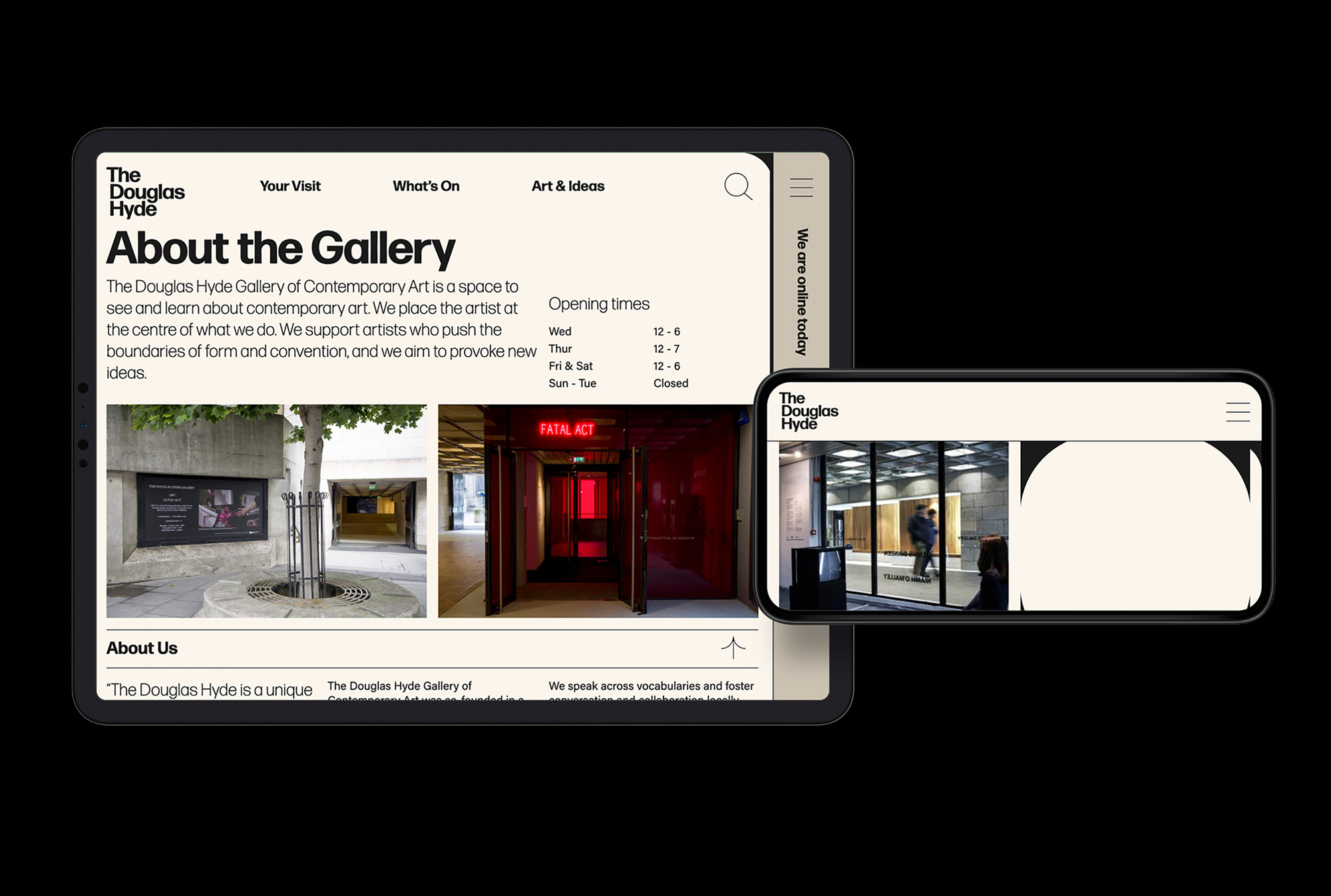
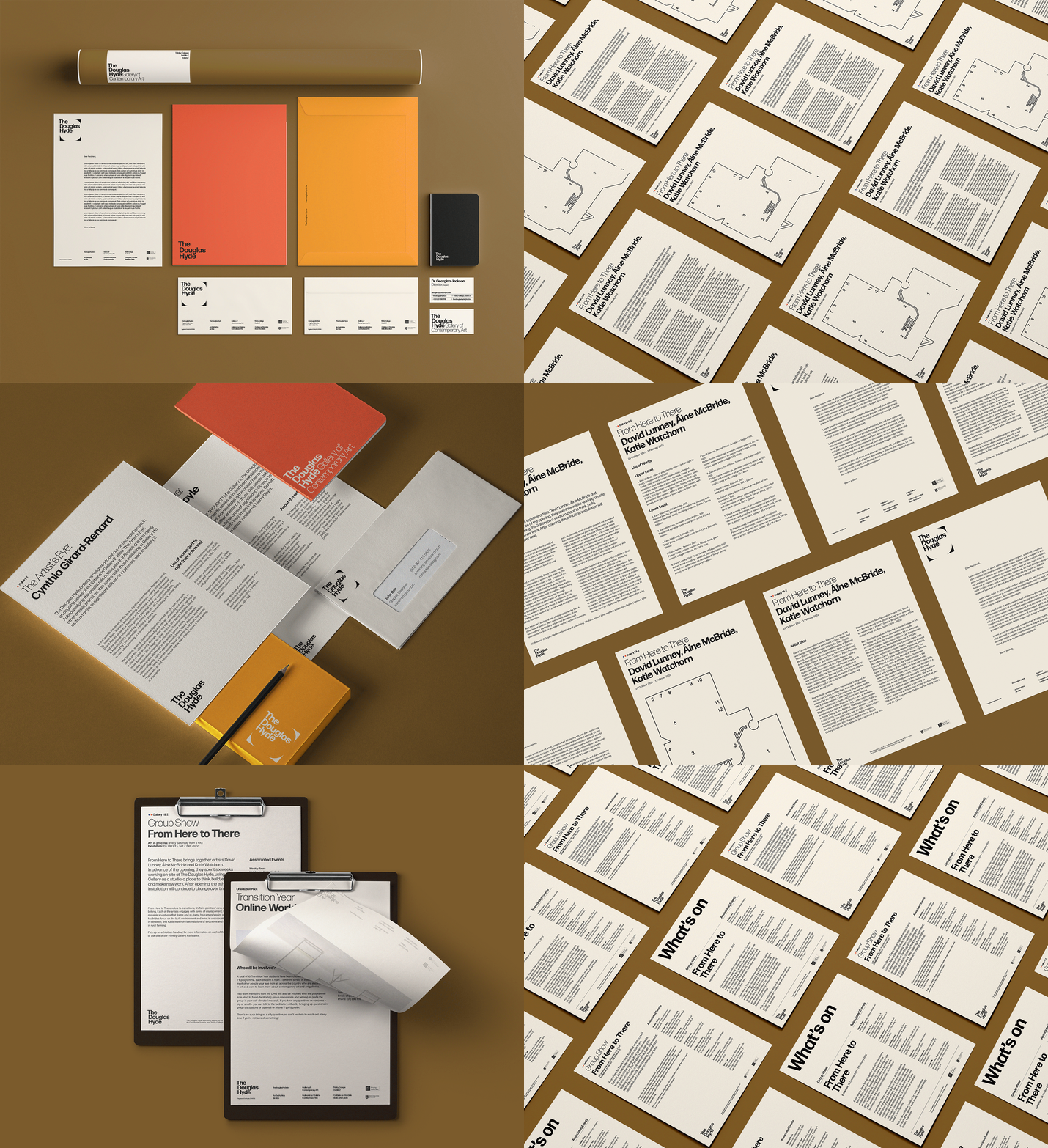
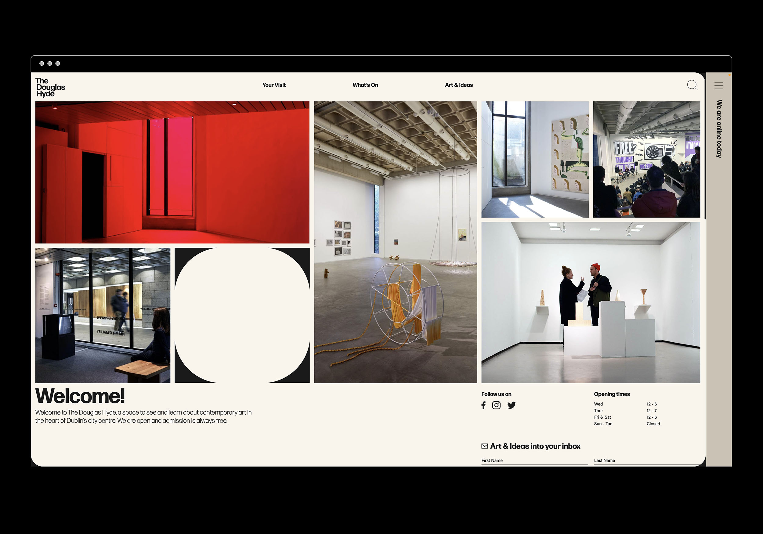
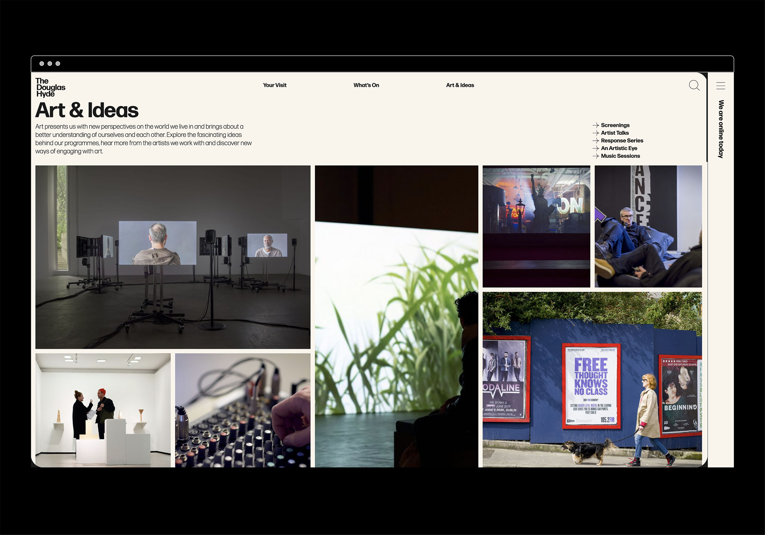
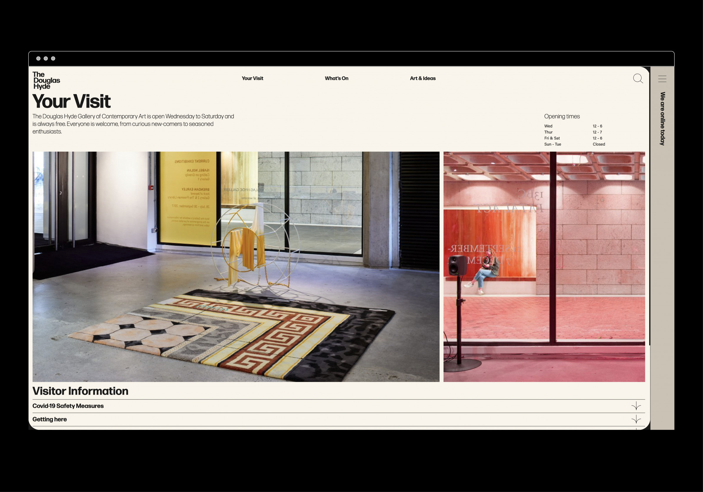
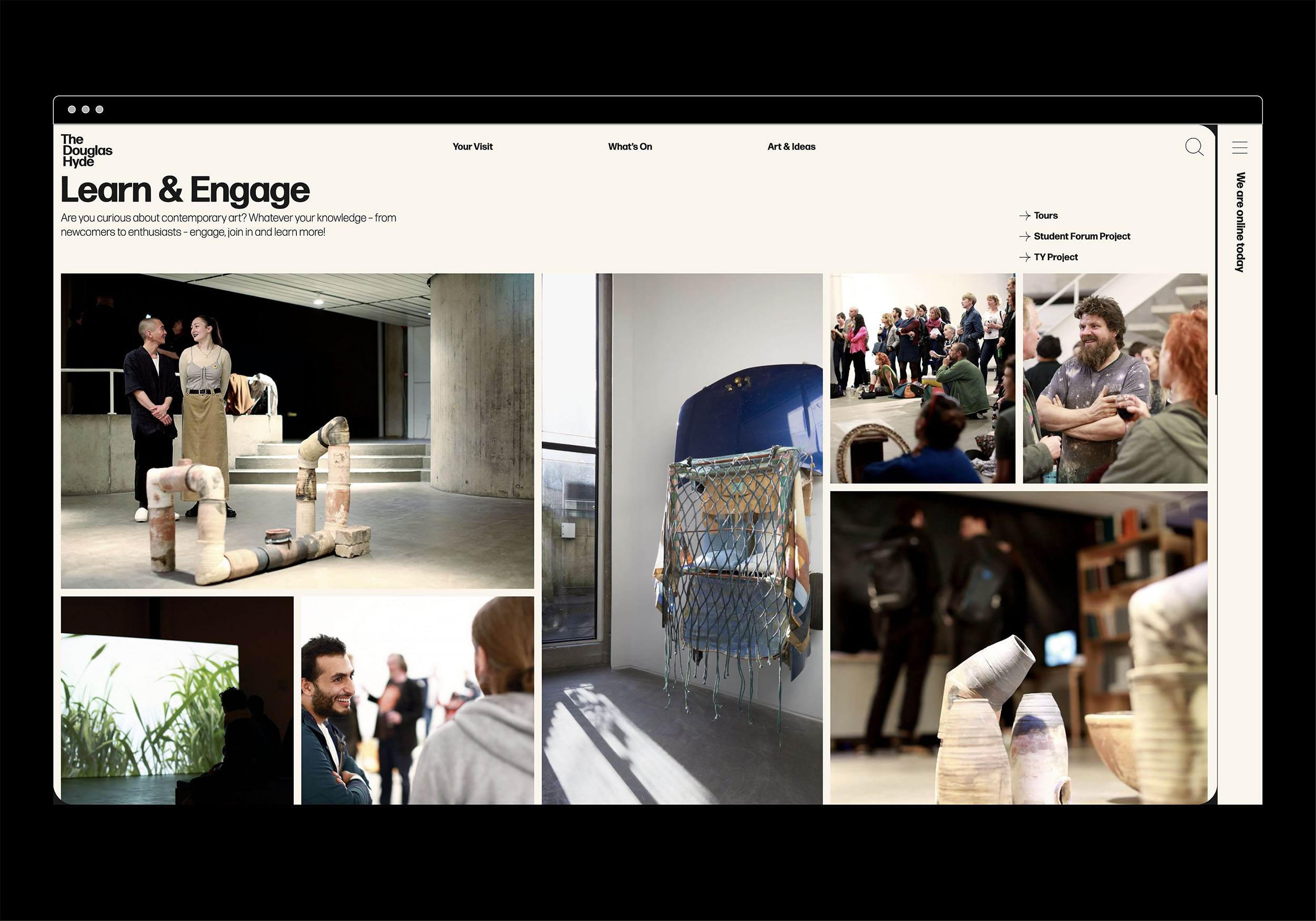
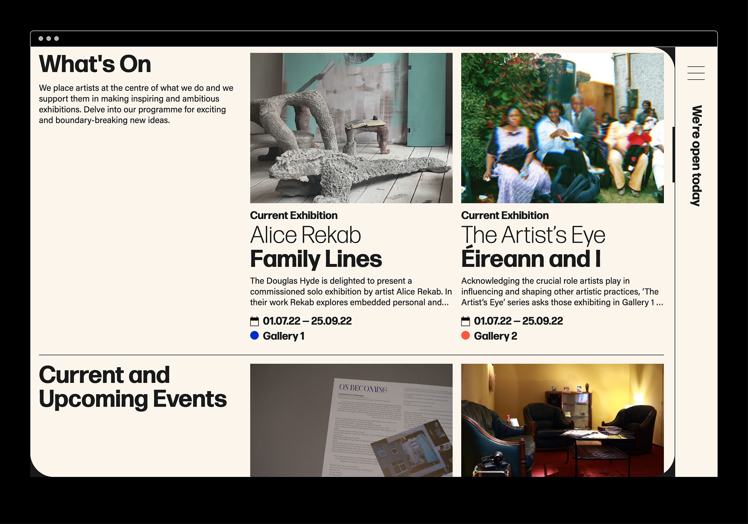
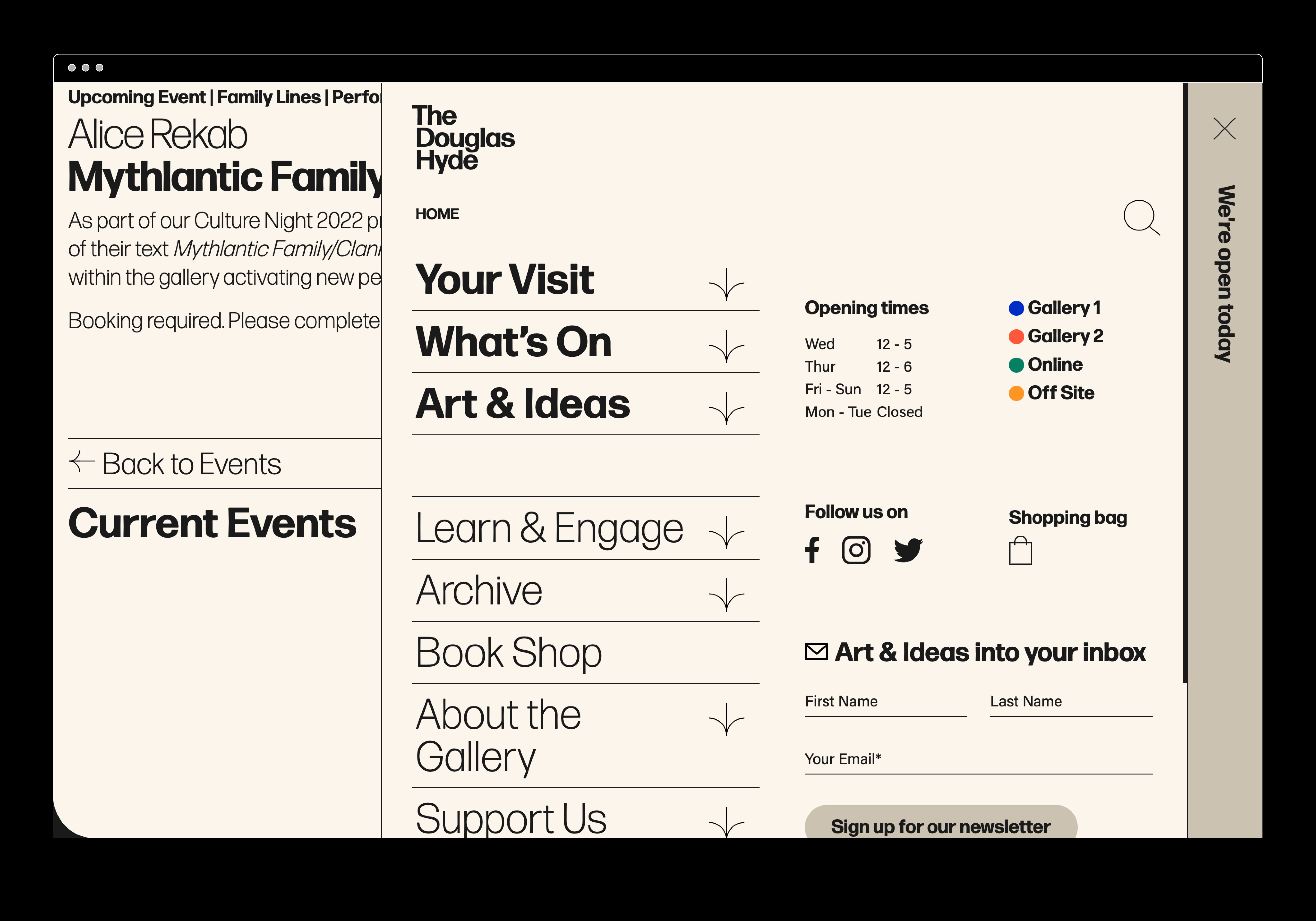
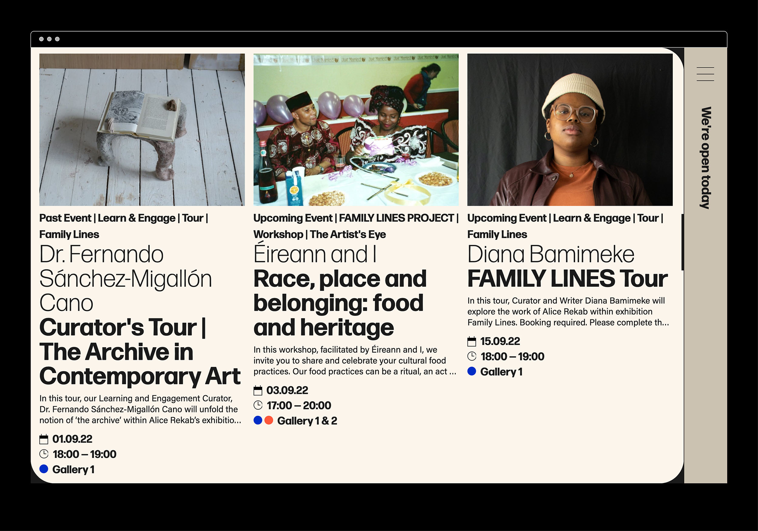
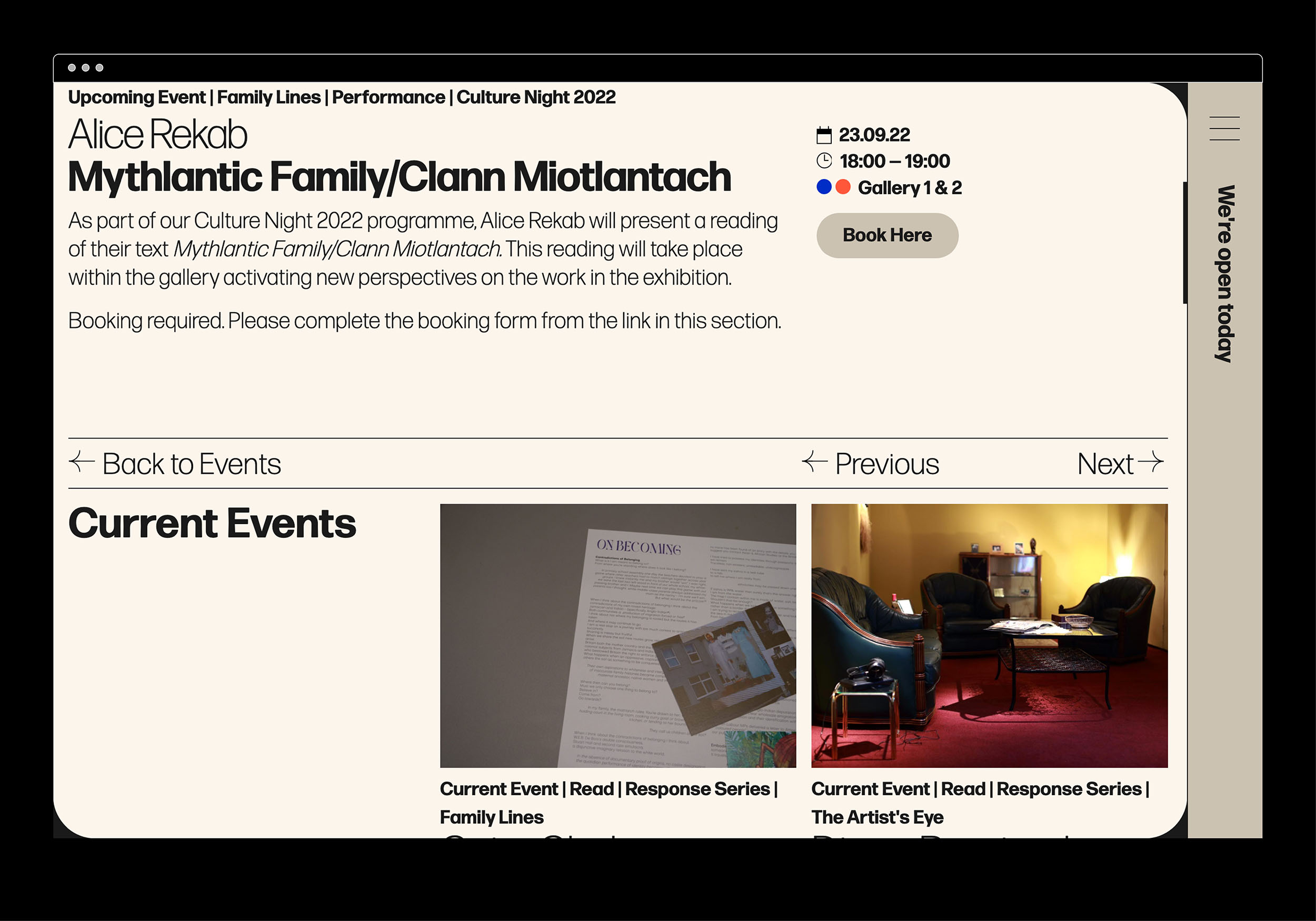
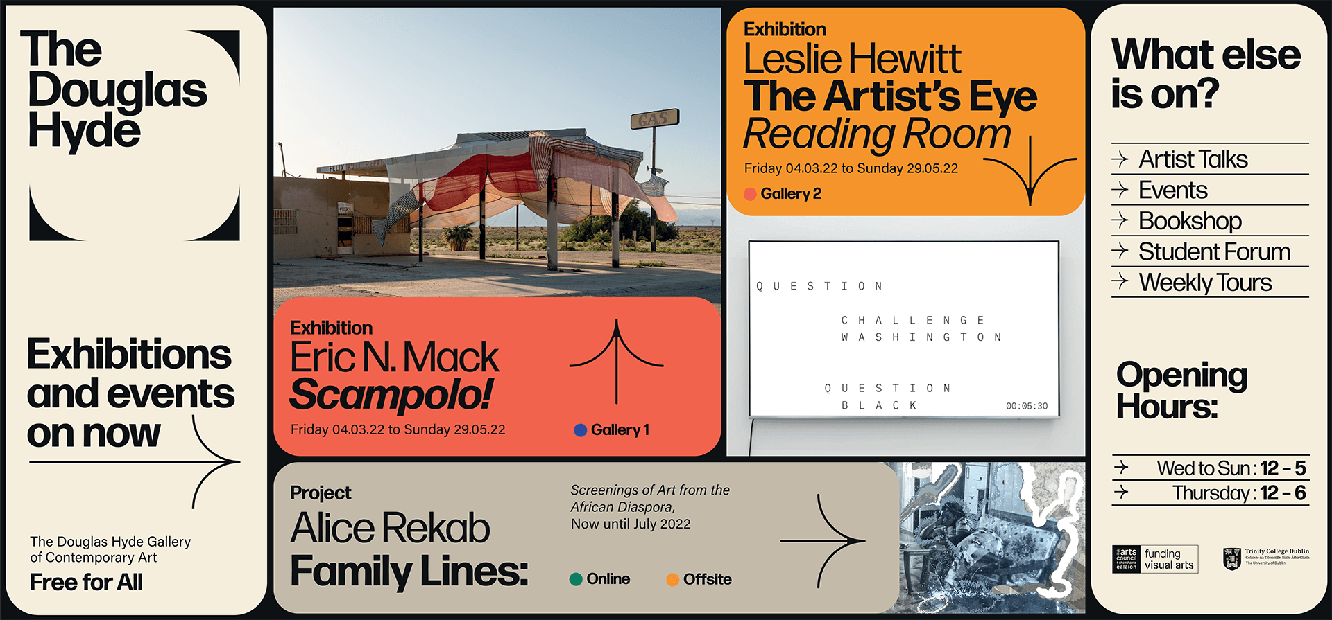
The website and all other communications platforms needed a clear editorial structure that allows for tiered levels of engagement with an information system using headings, sub-heads, introductory paragraph-styles, ‘read more’ tags etc. going from engaging and welcoming to descriptive and informative to academic and critical.
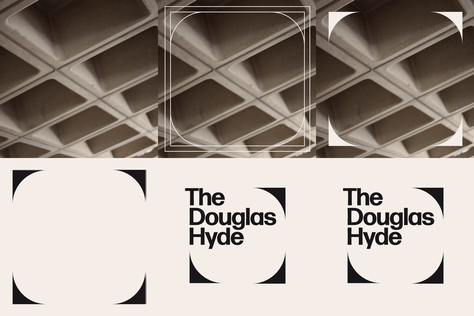
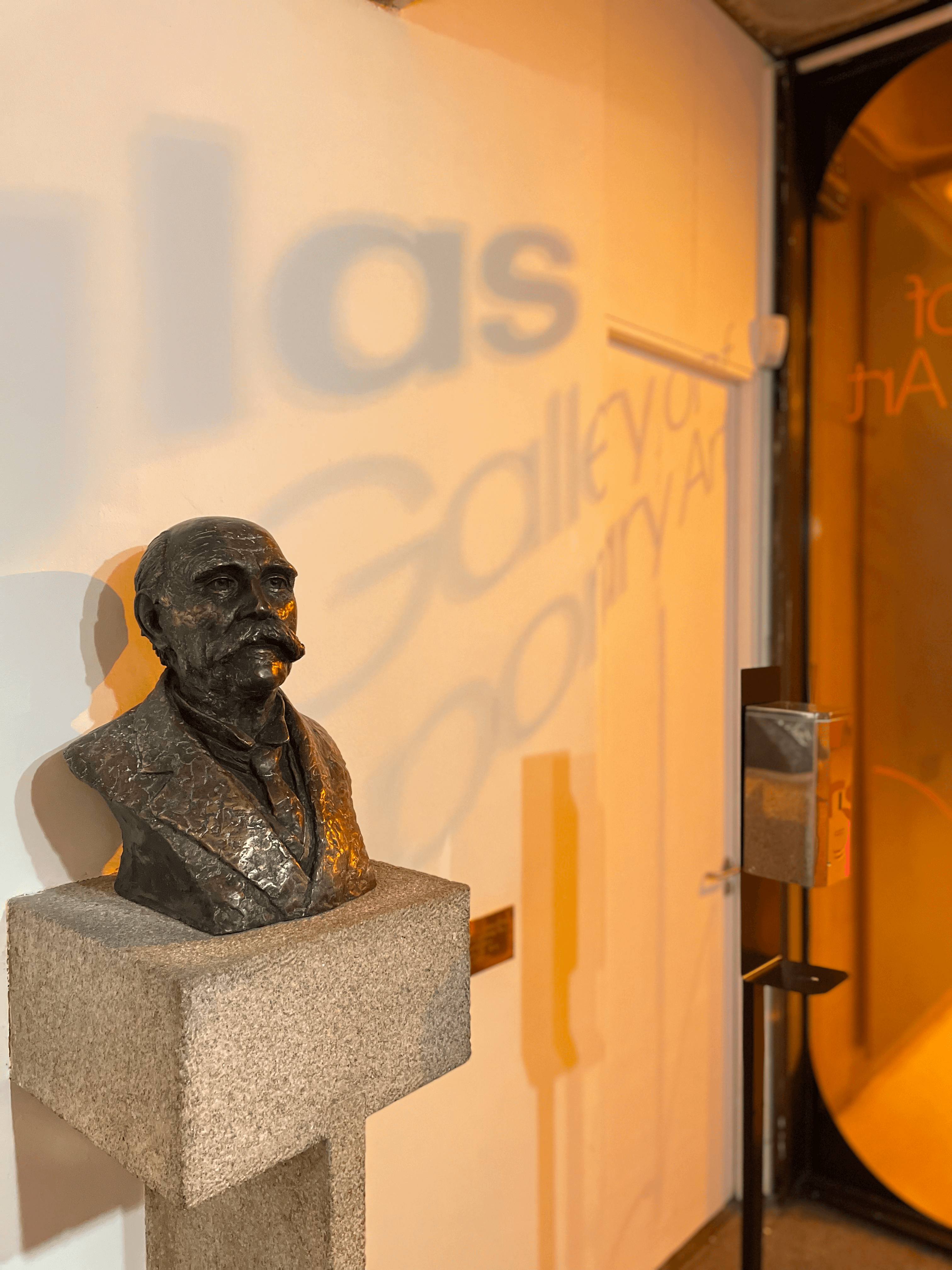
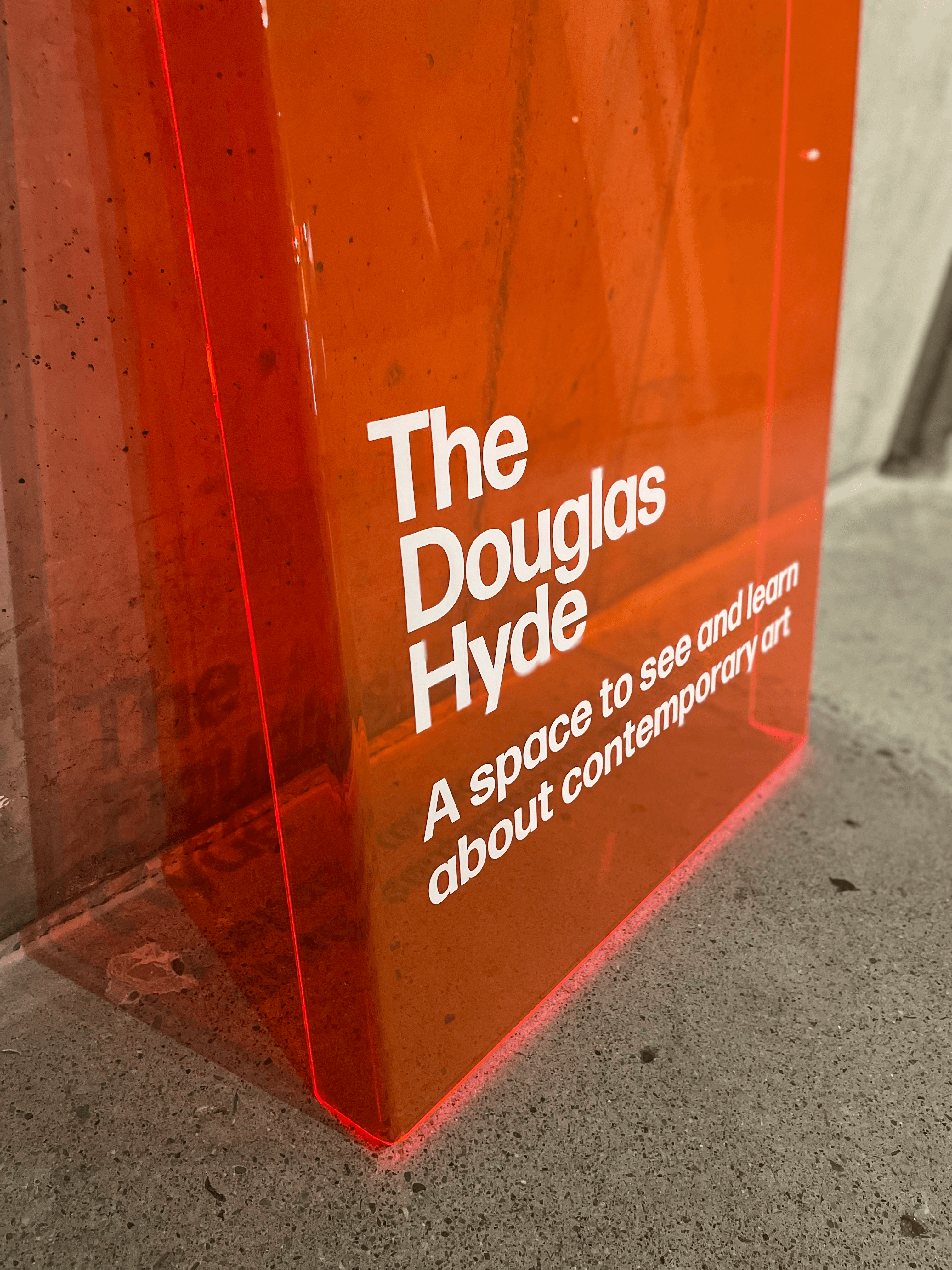
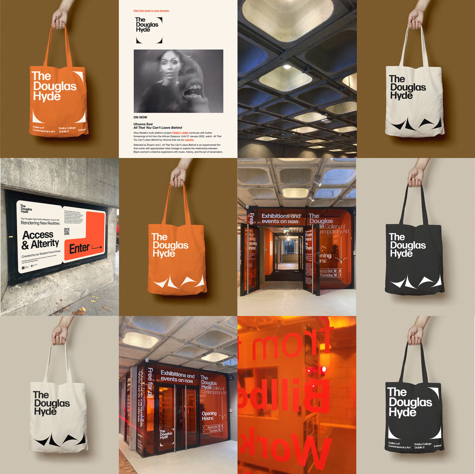
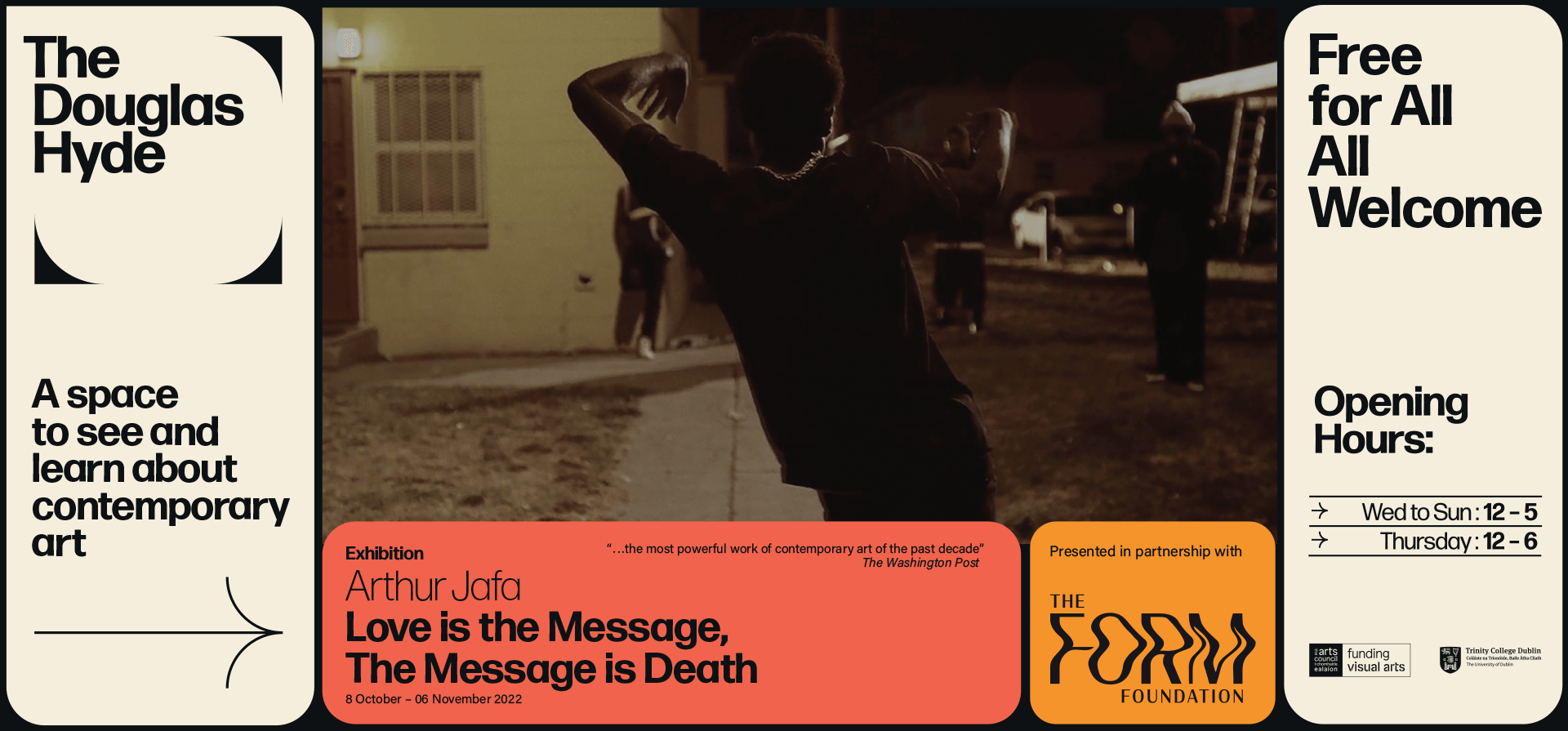
A gallery in essence is an architectural space, thus the design was inspired by aspects of its architectural features. The concrete ceiling of the gallery and the Trinity Arts Block became the catalyst for the logo and subsequently the brand identity and look and feel of the website. The rounded shape of the ceiling cells create a tension between sharpness and smoothness and of the negative and positive space.
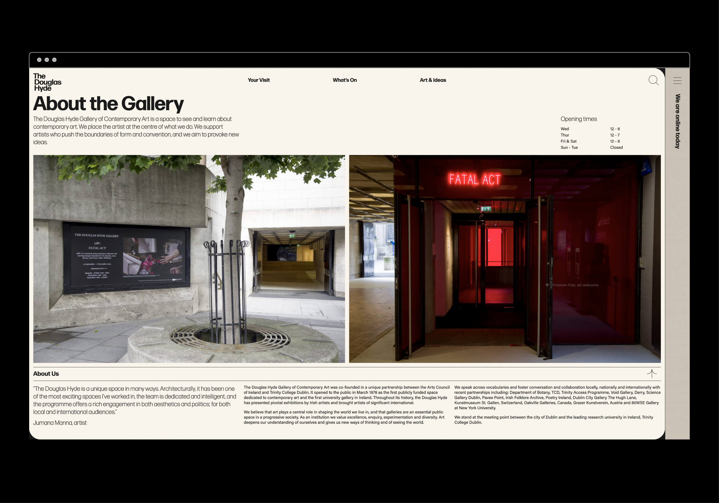
We worked closely with Learning & Engagement Curator of The Douglas Hyde, Fernando Sánchez-Migallón Cano and developer, Alex Bradley, to achieve a universal design. This included working with Knowbility to ensure the finished design was accessible to a wide range of people regardless of their age, size, ability or disability.
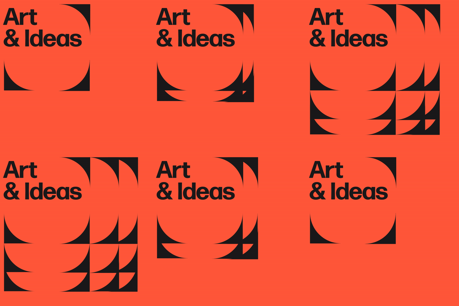
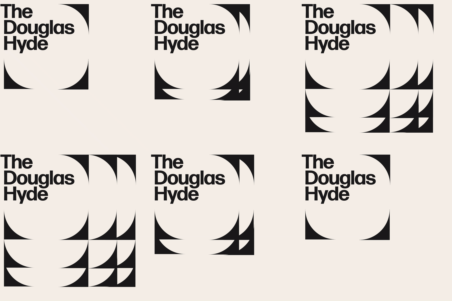
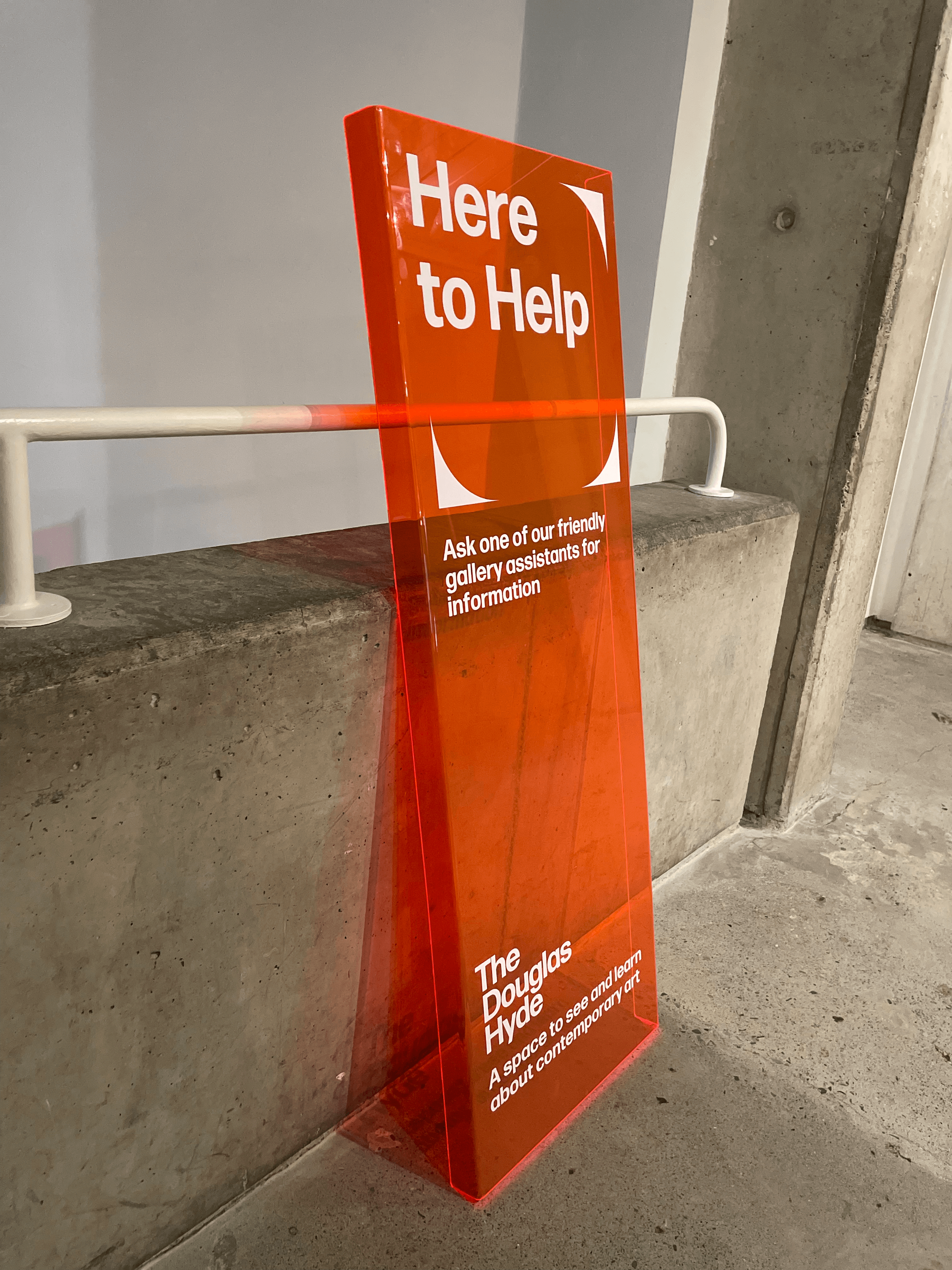
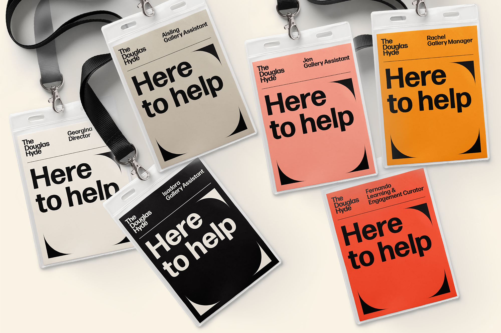
Through deconstructing and multiplying the mark and re-assembling the fragments of the original form, we developed a dynamic and modular system of symbols, icons and framing devices. The display type face (Forma) echoes that same tension between sharpness and smoothness whilst being high in contrast, legibility and character. Wanting to avoid the white cube aesthetic the colour scheme is led by a ‘muted’ charcoal black and warm off white that can be combined with the warm colours that compliments the grey concrete.




How do you encompass the challenges of the climate emergency for the Arts & Culture, the impact it is going to have on the way we work and how can artists play a role in leading this conversation?
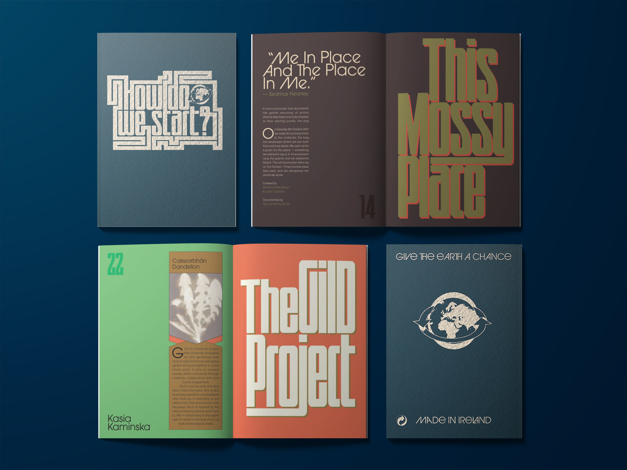
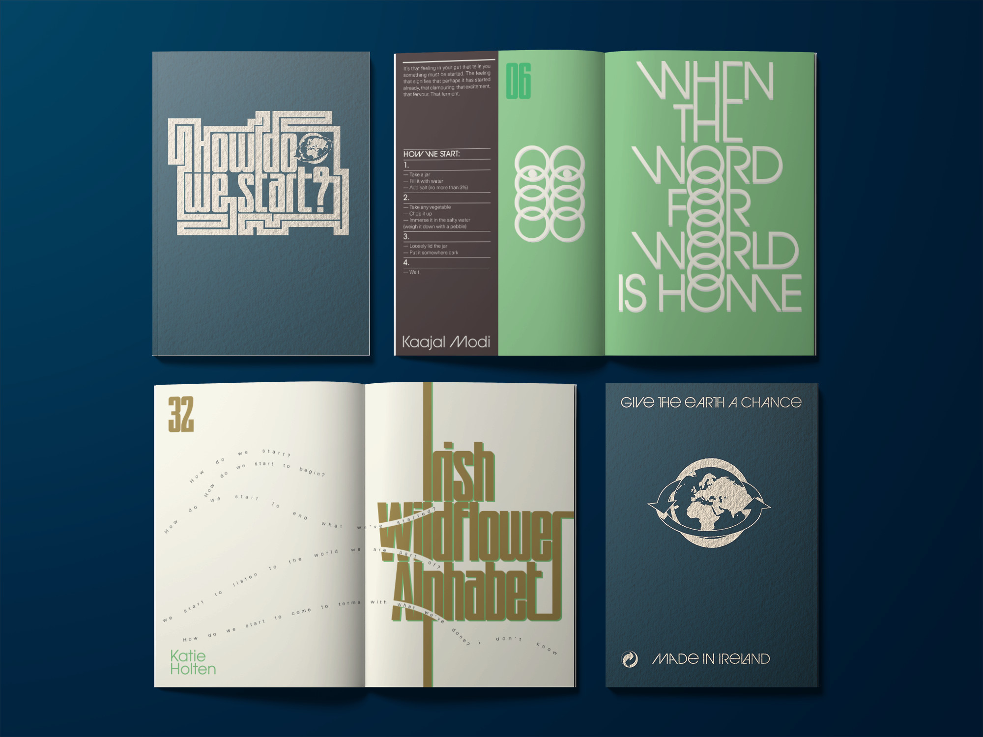
Commissioned by the Project Arts Centre, How Do We Start? explores how they as a cultural institution can approach a more sustainable way of existing in the world and how to support artists to lead the way by collaborating and bringing their dynamic skills to bear on the problem.
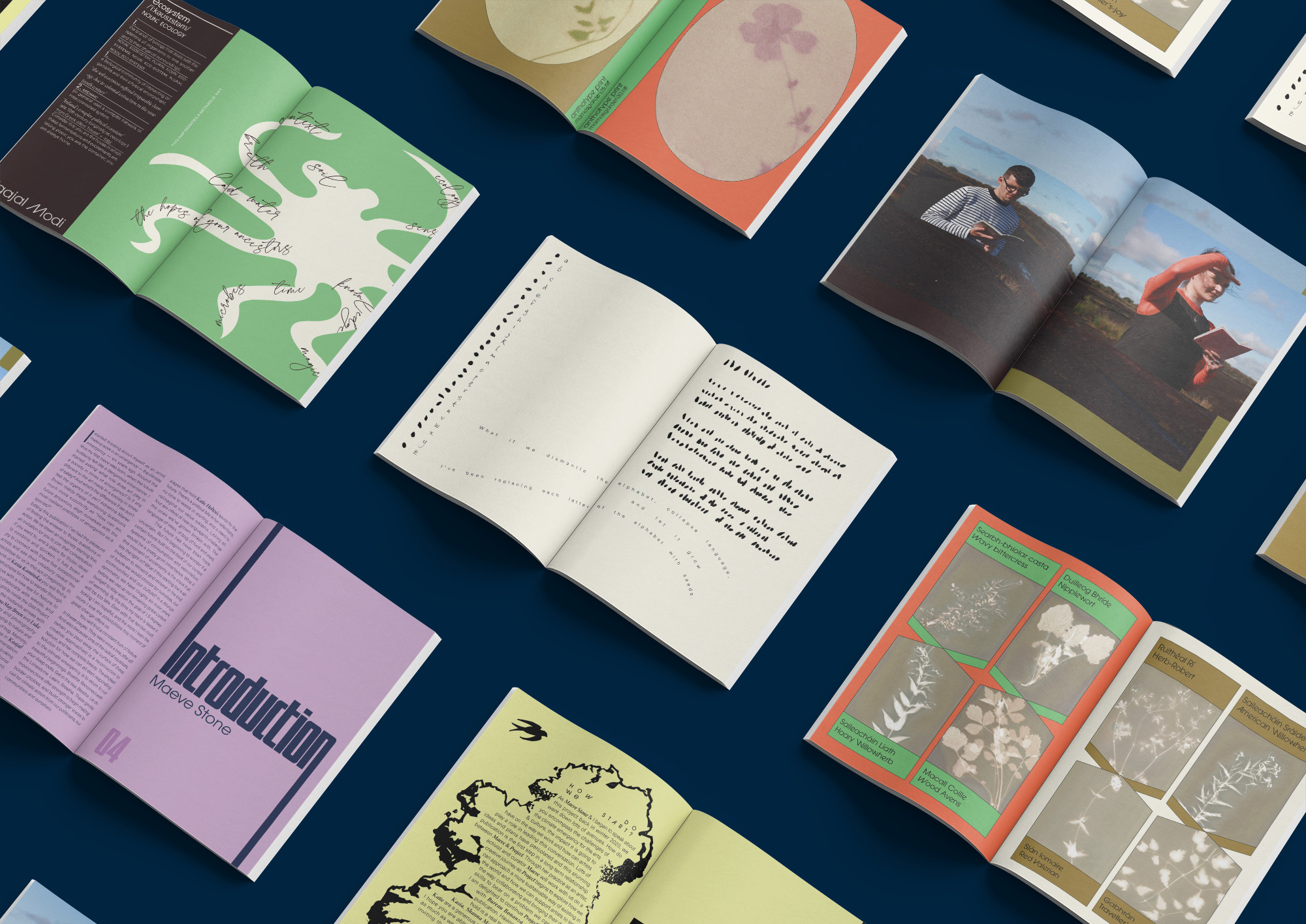
The publication was edited by Maeve Stone & Cian O’Brien, with contributions from; artists Kasia Kaminska, Shanna May Breen & Luke Casserly, Katie Holten and Kaajal Modi. The artists’s work explore the question ‘How Do We Start?’ in ways of practical instructions, poetry, speculations, image making, and language.
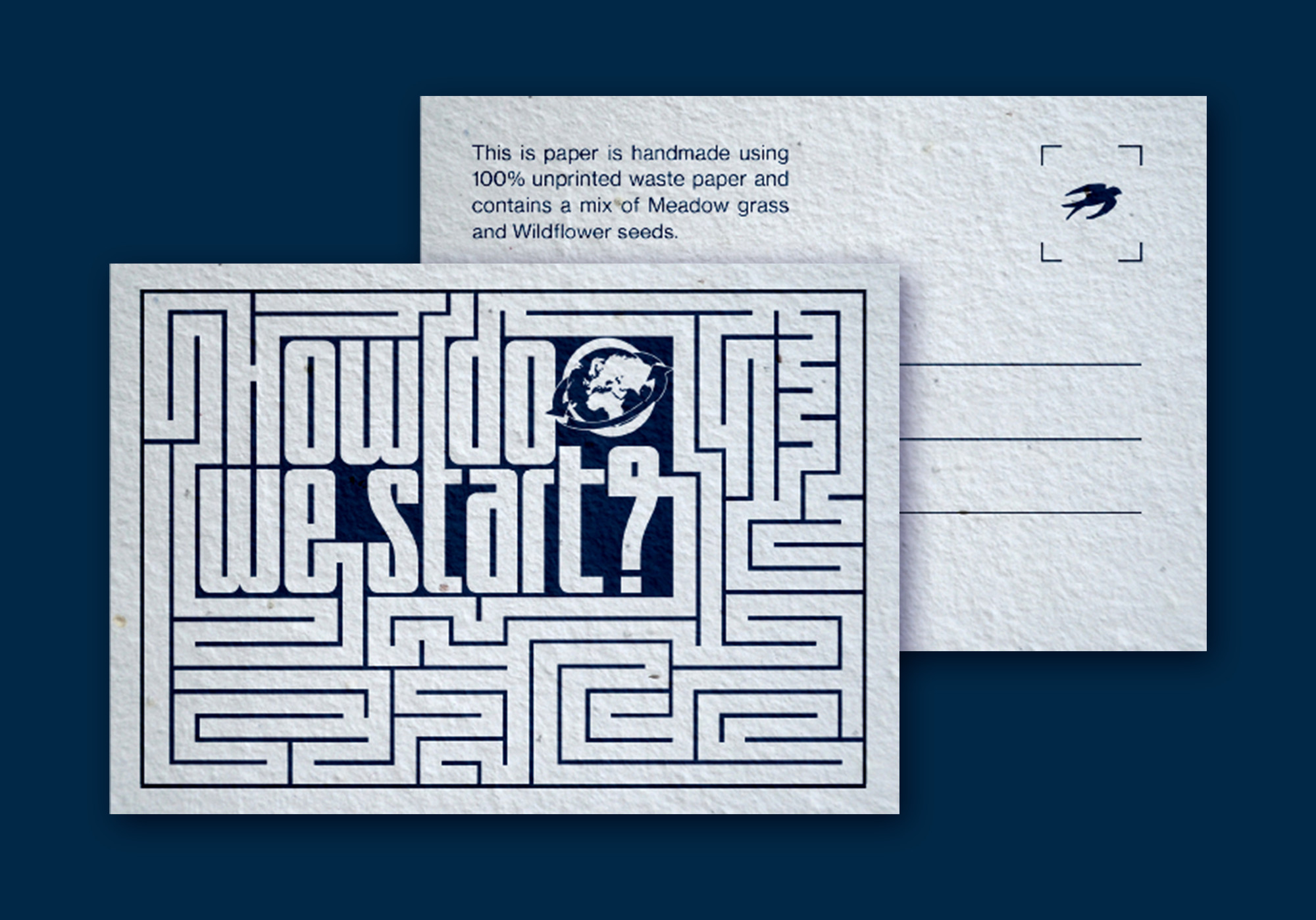
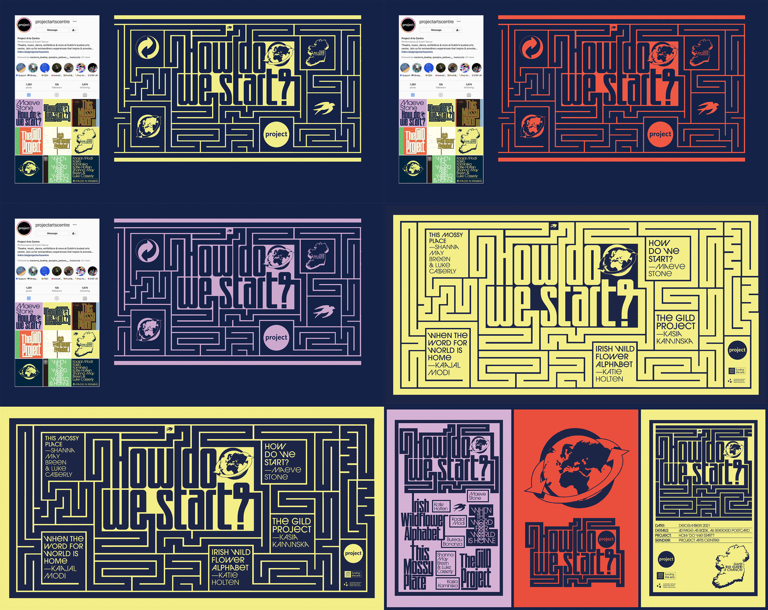
We were inspired by the pragmatic and instructional nature of the artist contributions to base the design on Make-and-Do-Books from our childhood. The aesthetic of these books with their bold colours and framed text and images became a starting point for the book. On the cover and on a postcard (printed on plantable paper stock with wild flower seeds), the question ‘How Do We Start?’ expands out into a maze from several directions and explores ways of answering itself. This theme was extended further in the promotional elements of the project.
A major challenge of the project was to justify the contradiction of producing an object that addresses the climate crisis. We talked directly with paper manufacturers and printers about how we could find ways to minimise the impact of production and waste by using plant based inks, recycled papers, available offcuts and how to minimise transport and deliveries. It was a great learning experience for us as designers of books that will inform the way we work in the future.
A major challenge of the project was to justify the contradiction of producing an object that addresses the climate crisis. We talked directly with paper manufacturers and printers about how we could find ways to minimise the impact of production and waste by using plant based inks, recycled papers, available offcuts and how to minimise transport and deliveries. It was a great learning experience for us as designers of books that will inform the way we work in the future.
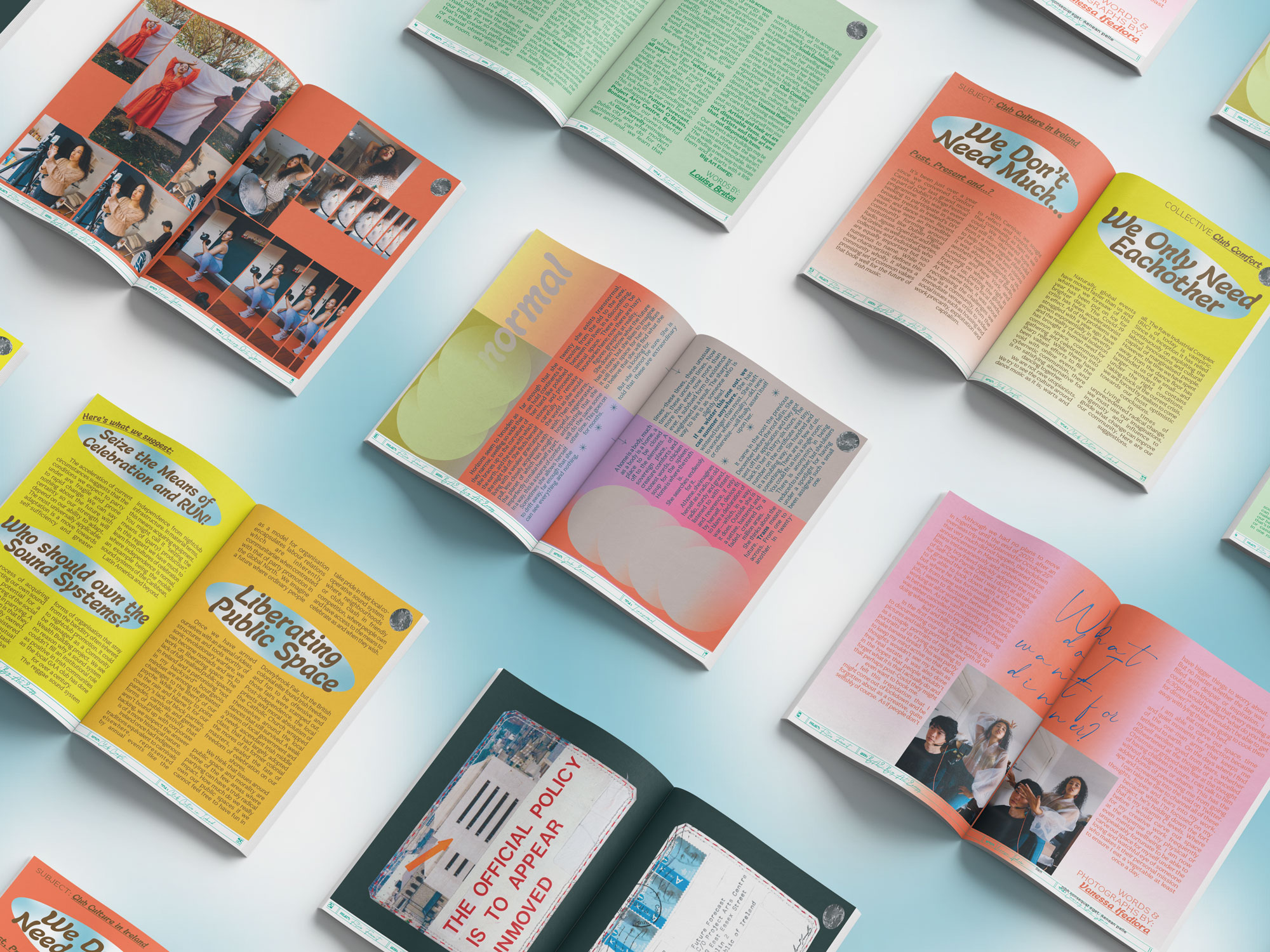
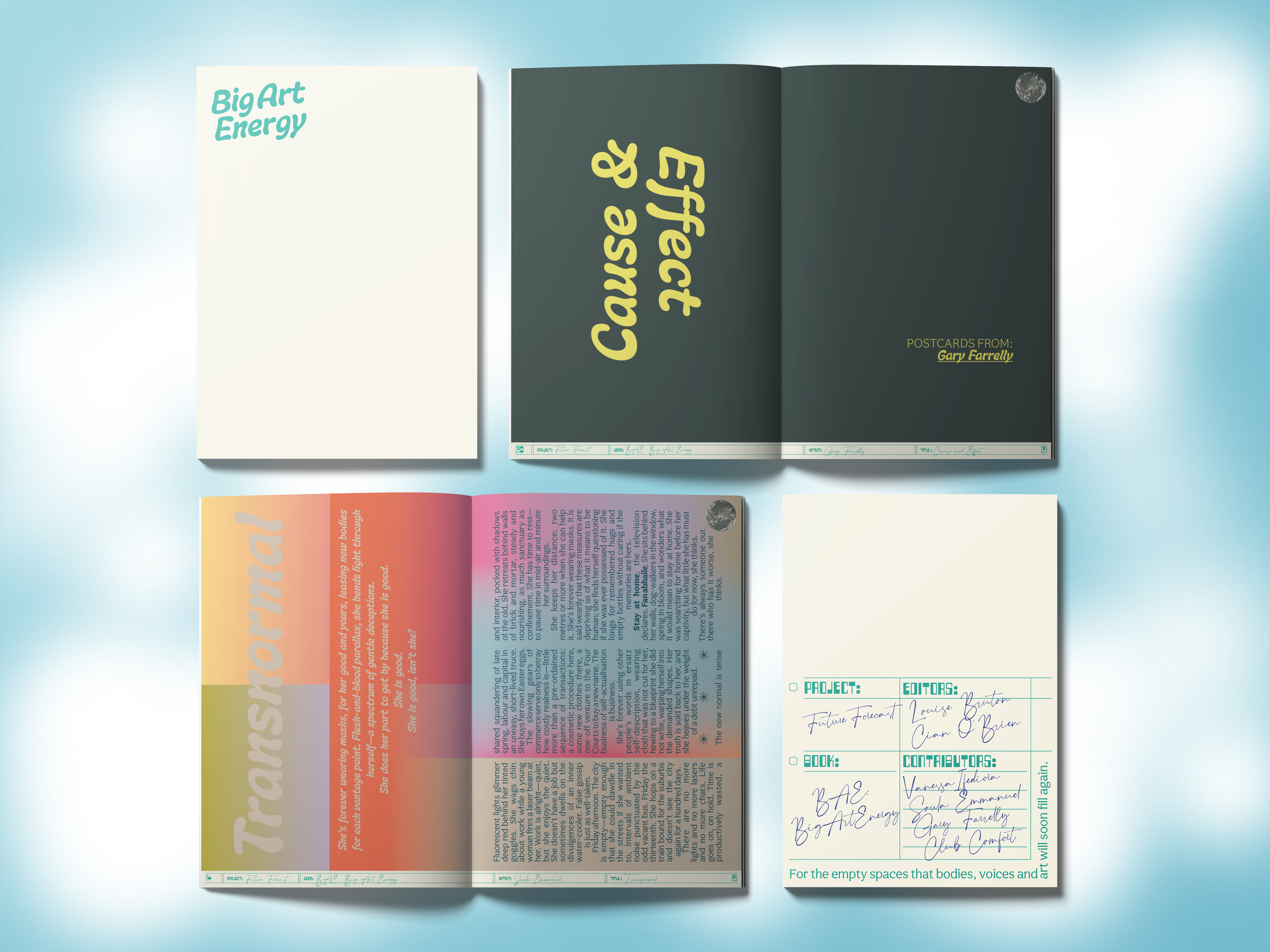
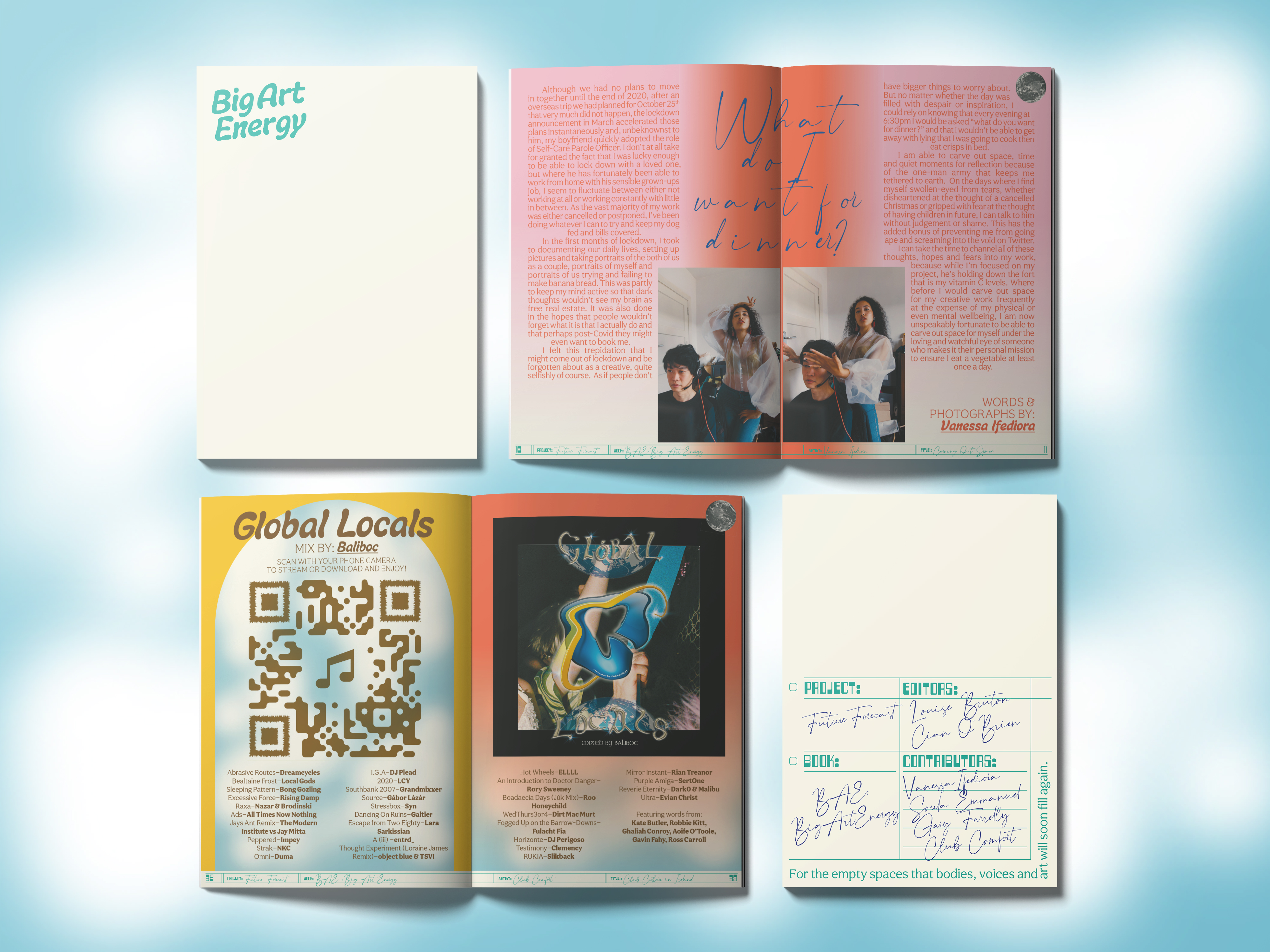
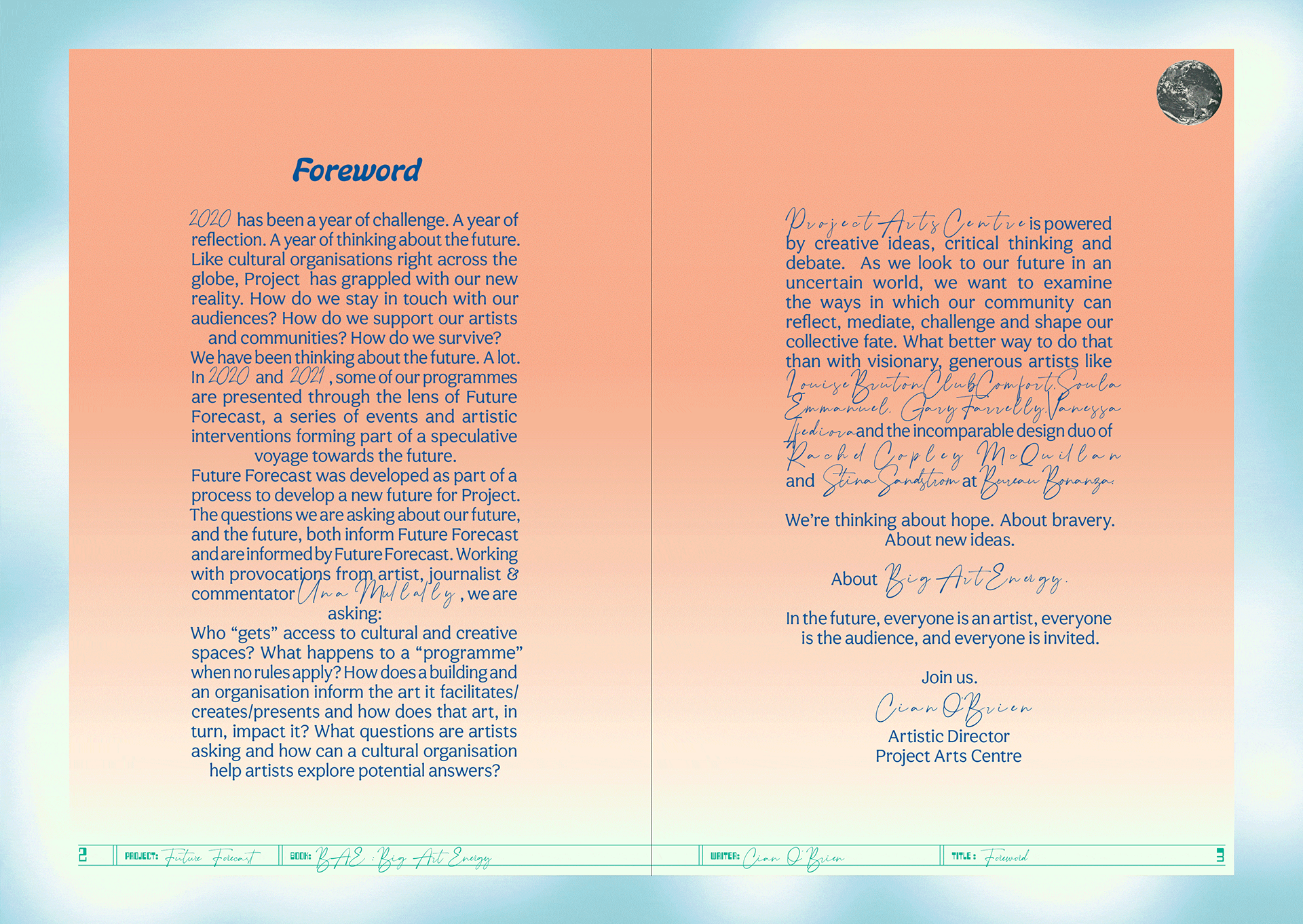
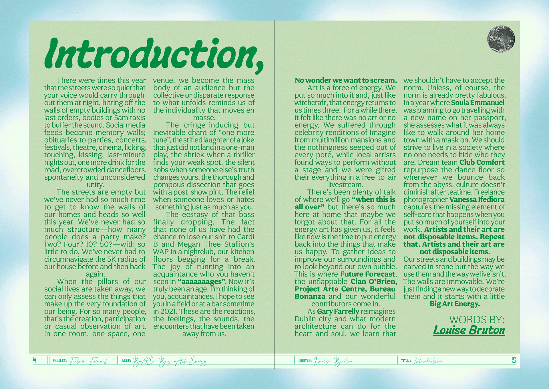
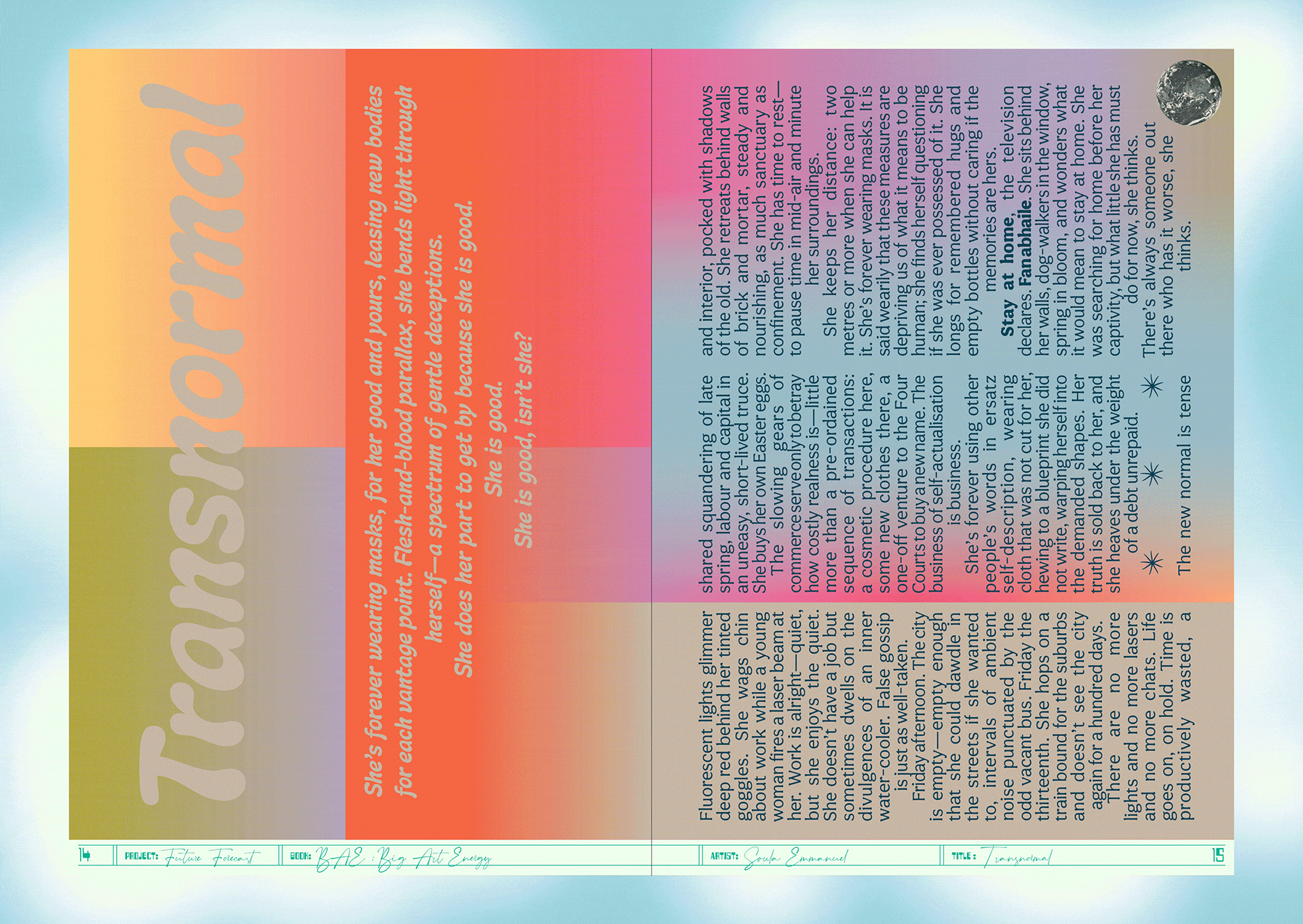
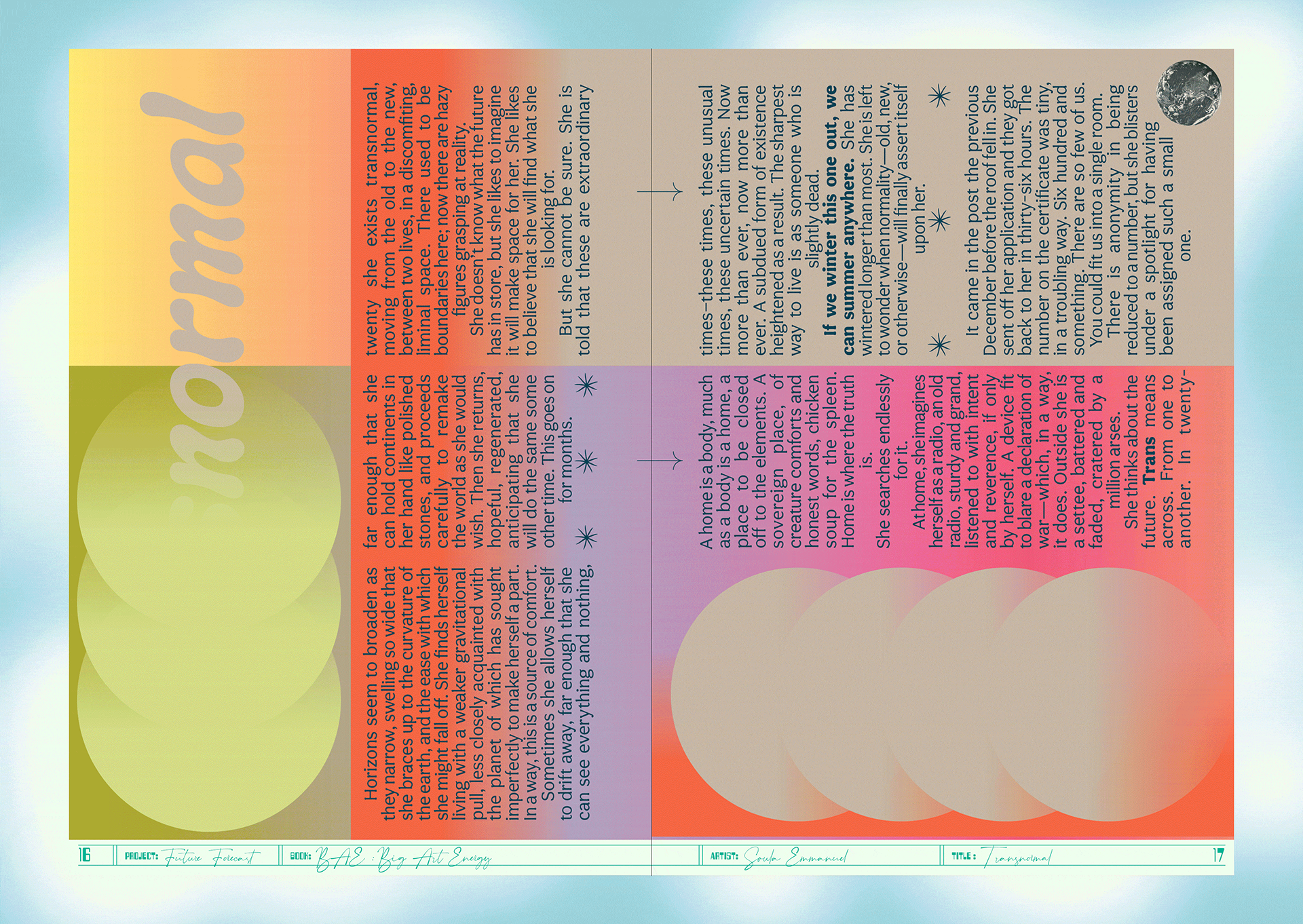
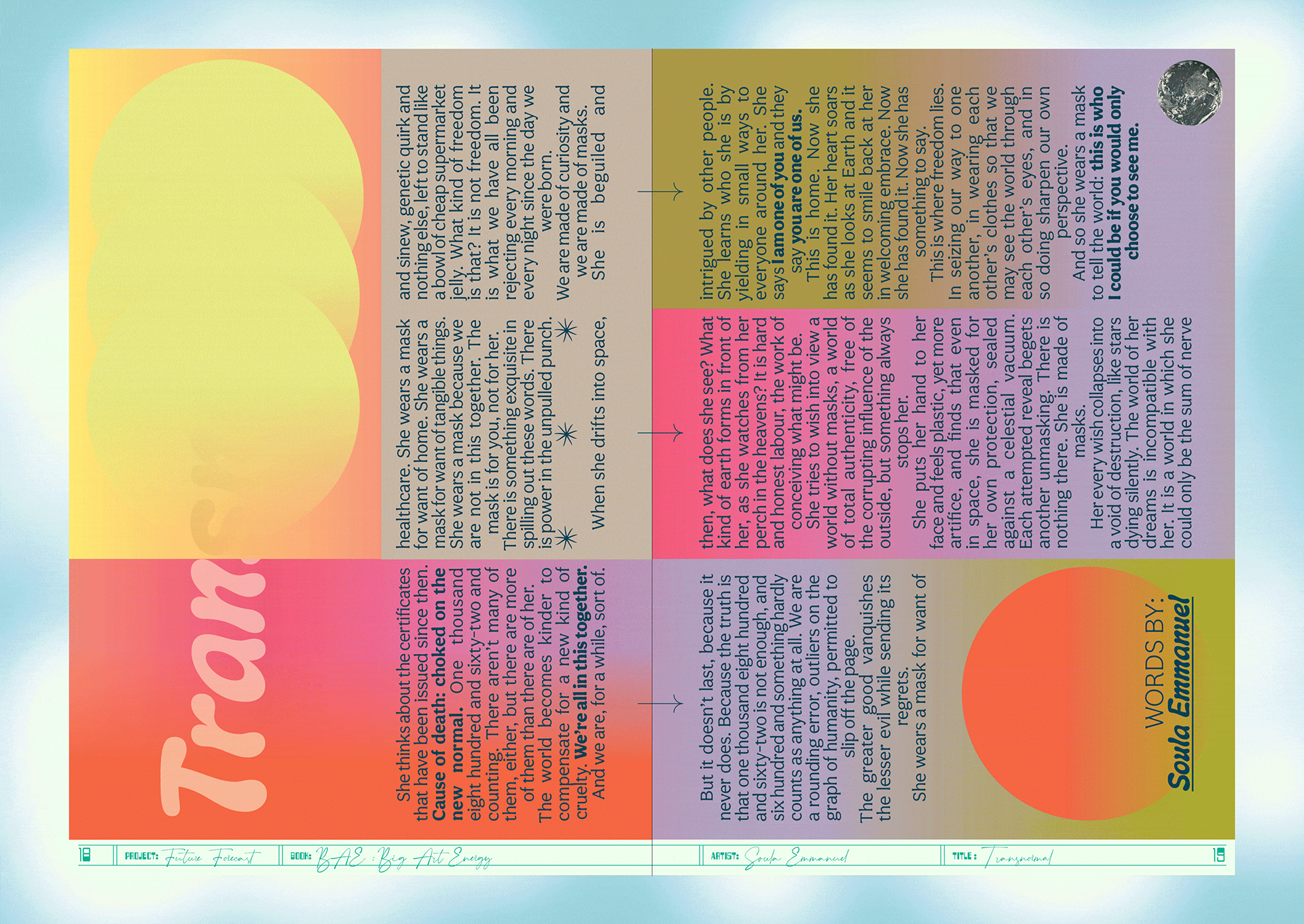
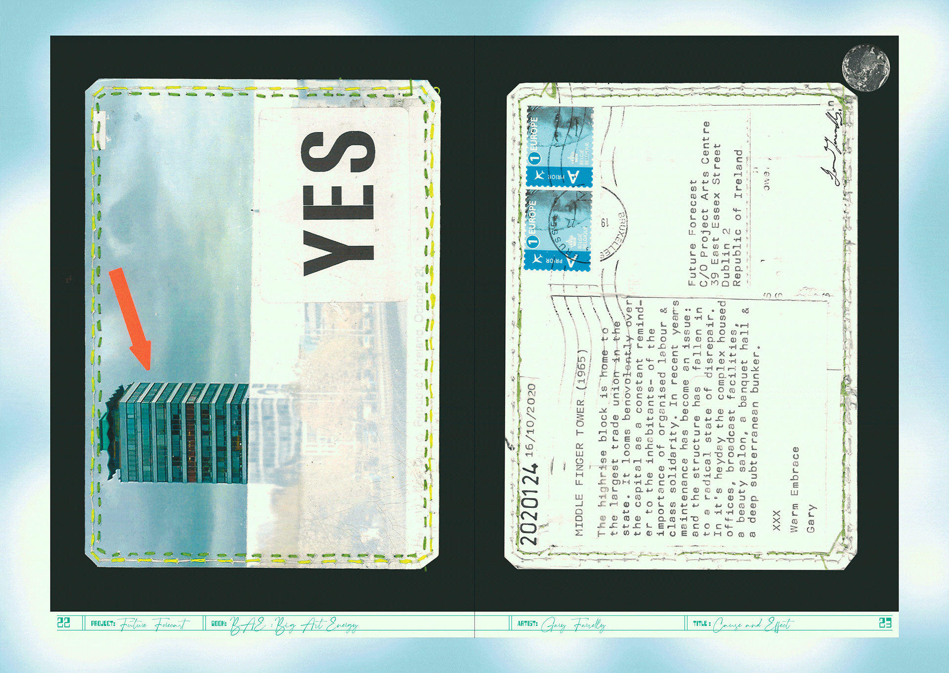
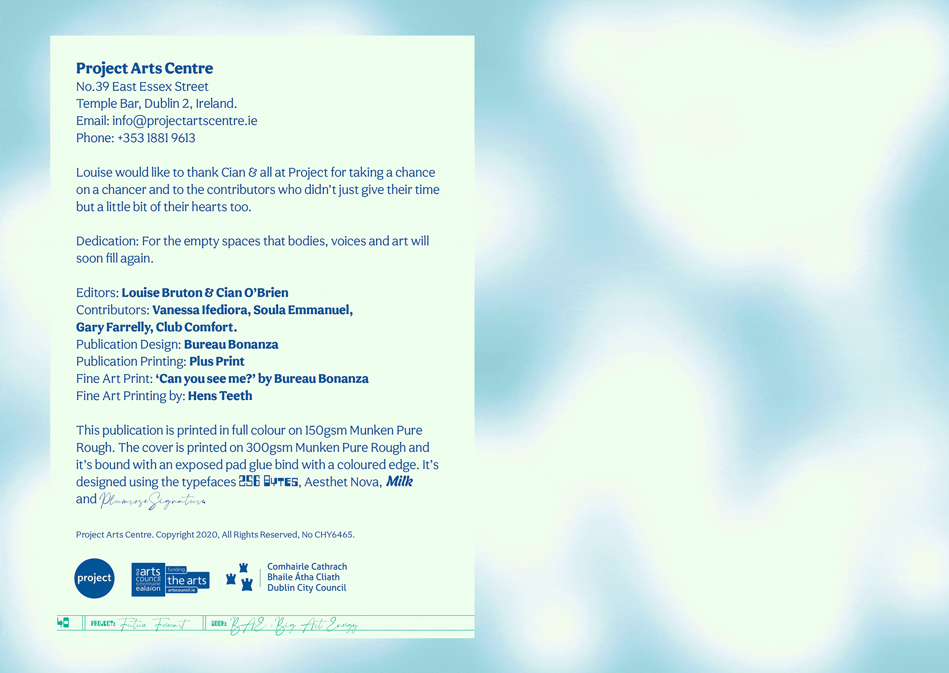
The art publication Big Art Energy was commissioned by the Project Arts Centre as part of Future Forecast—a series of events and artistic interventions forming part of a speculative voyage towards the future.
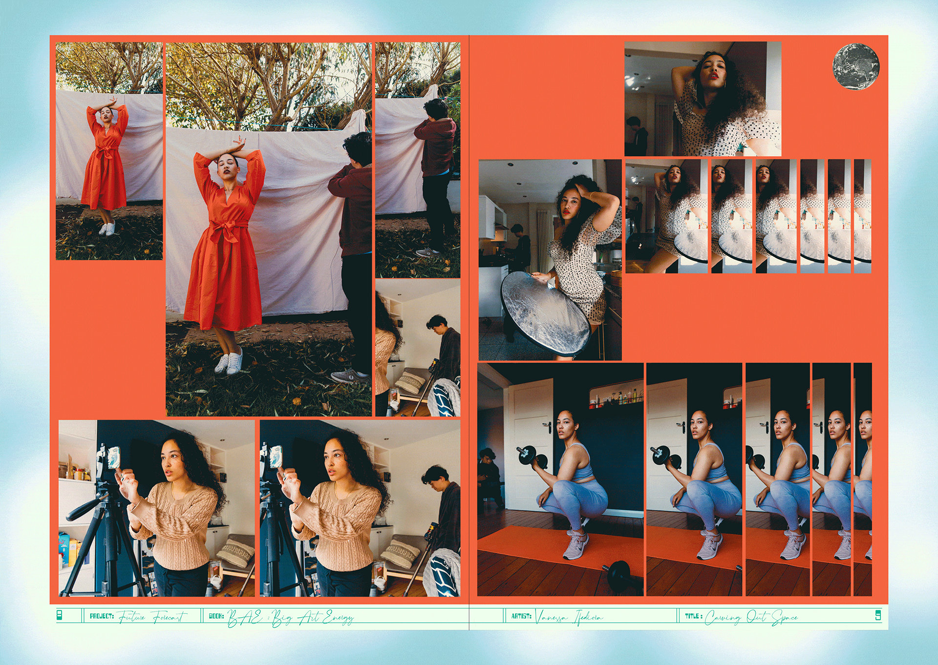
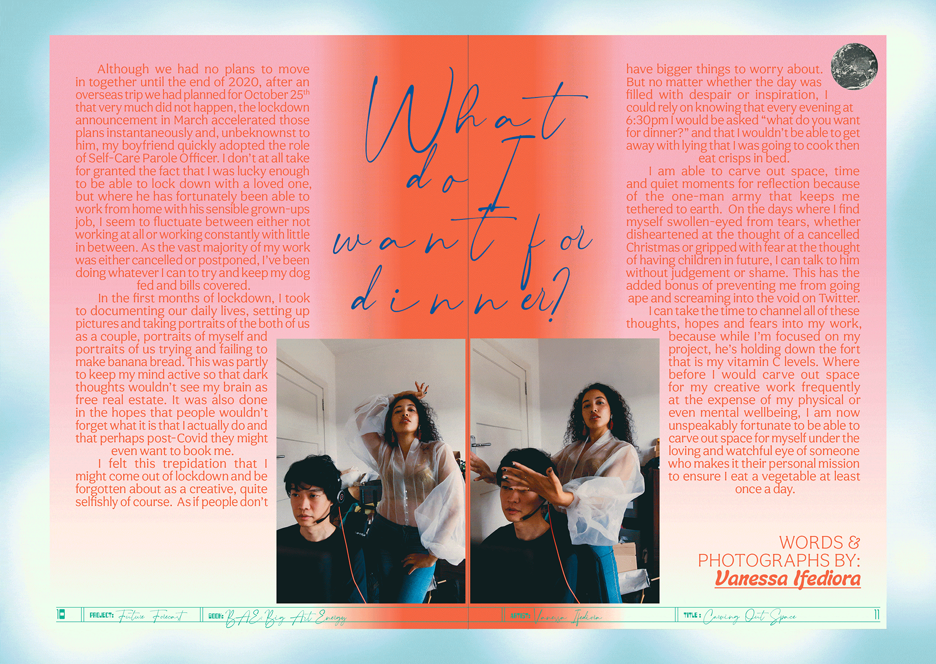
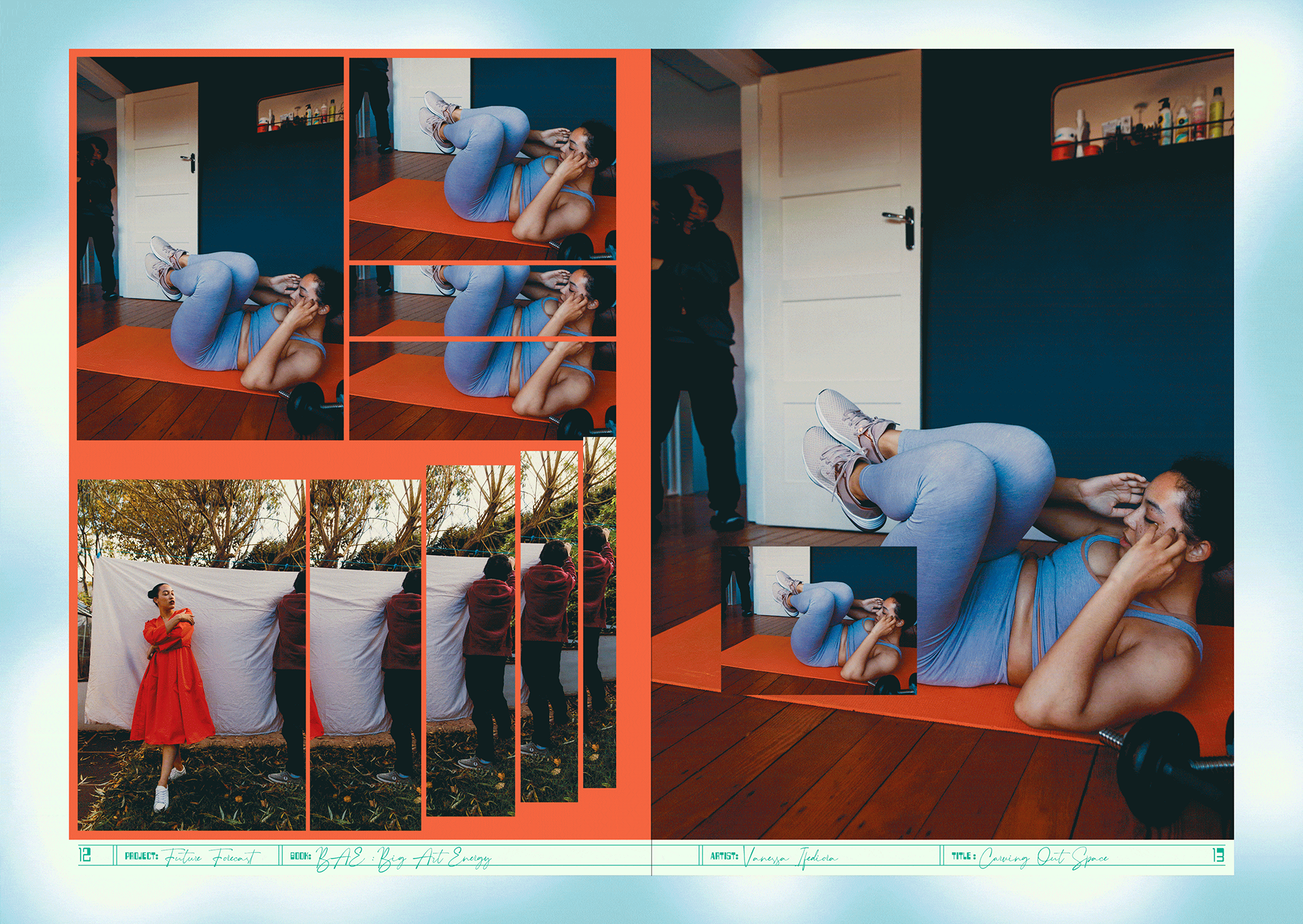
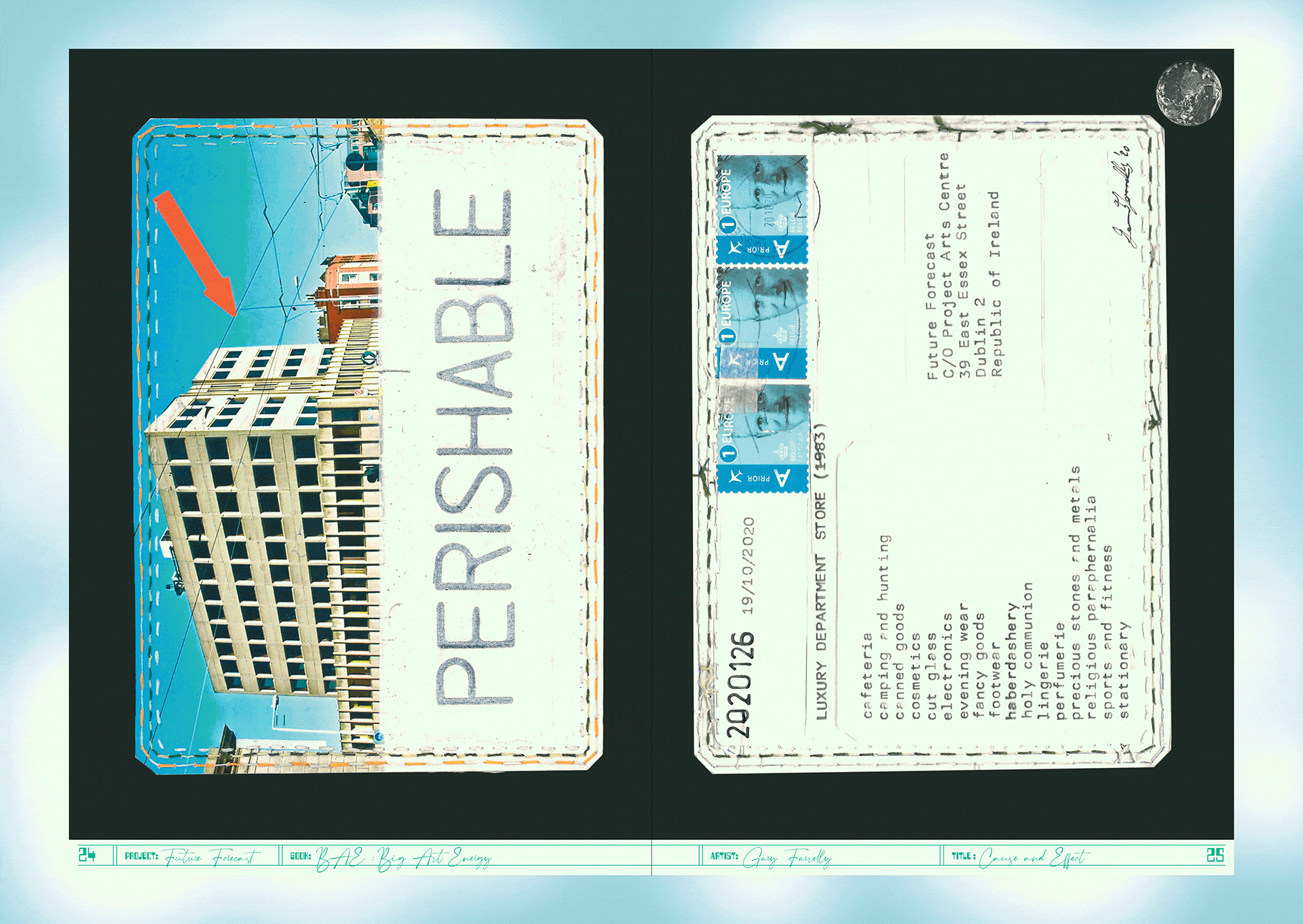
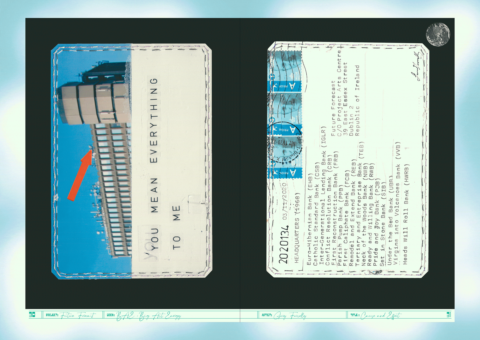
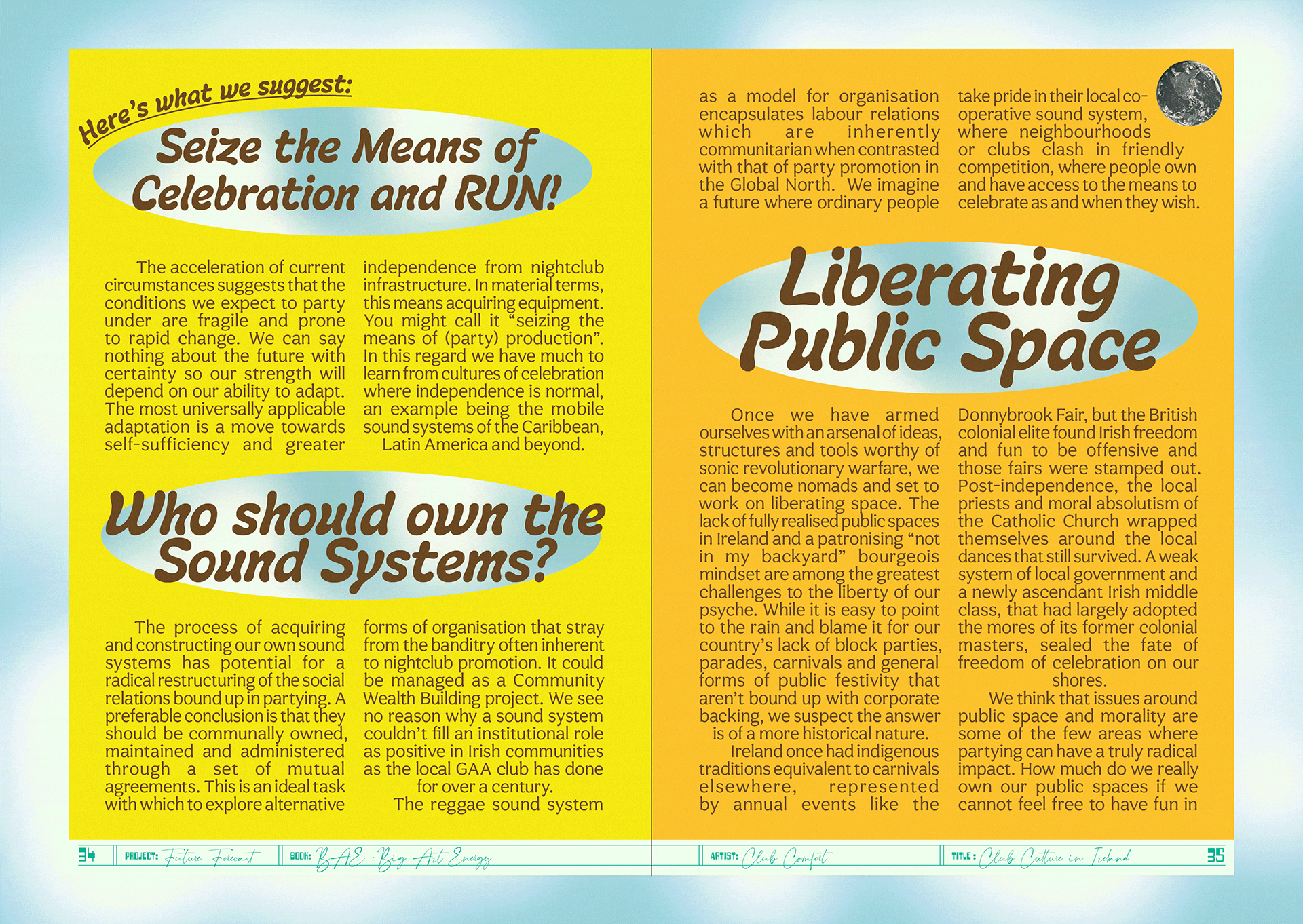
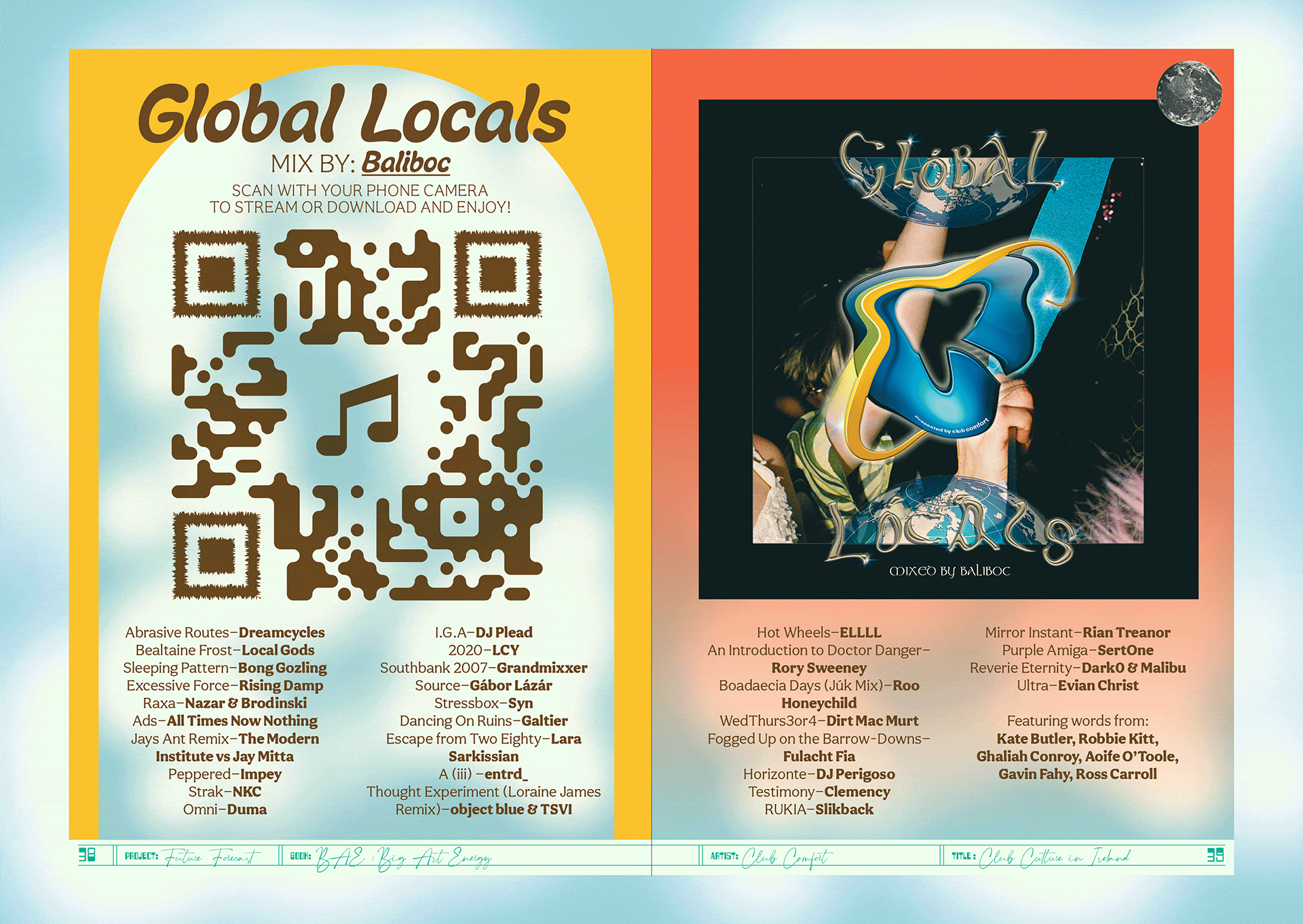
The publication was edited by Louise Bruton & Cian O’Brien, with contributions from; photographer Vanessa Ifediora, writer Soula Emmanuel, artist Gary Farrelly and party makers Club Comfort. Big Art Energy showcases these artists’ reactions to the pandemic, response to lockdown and forecasts of the future of their respective industry or field of art.
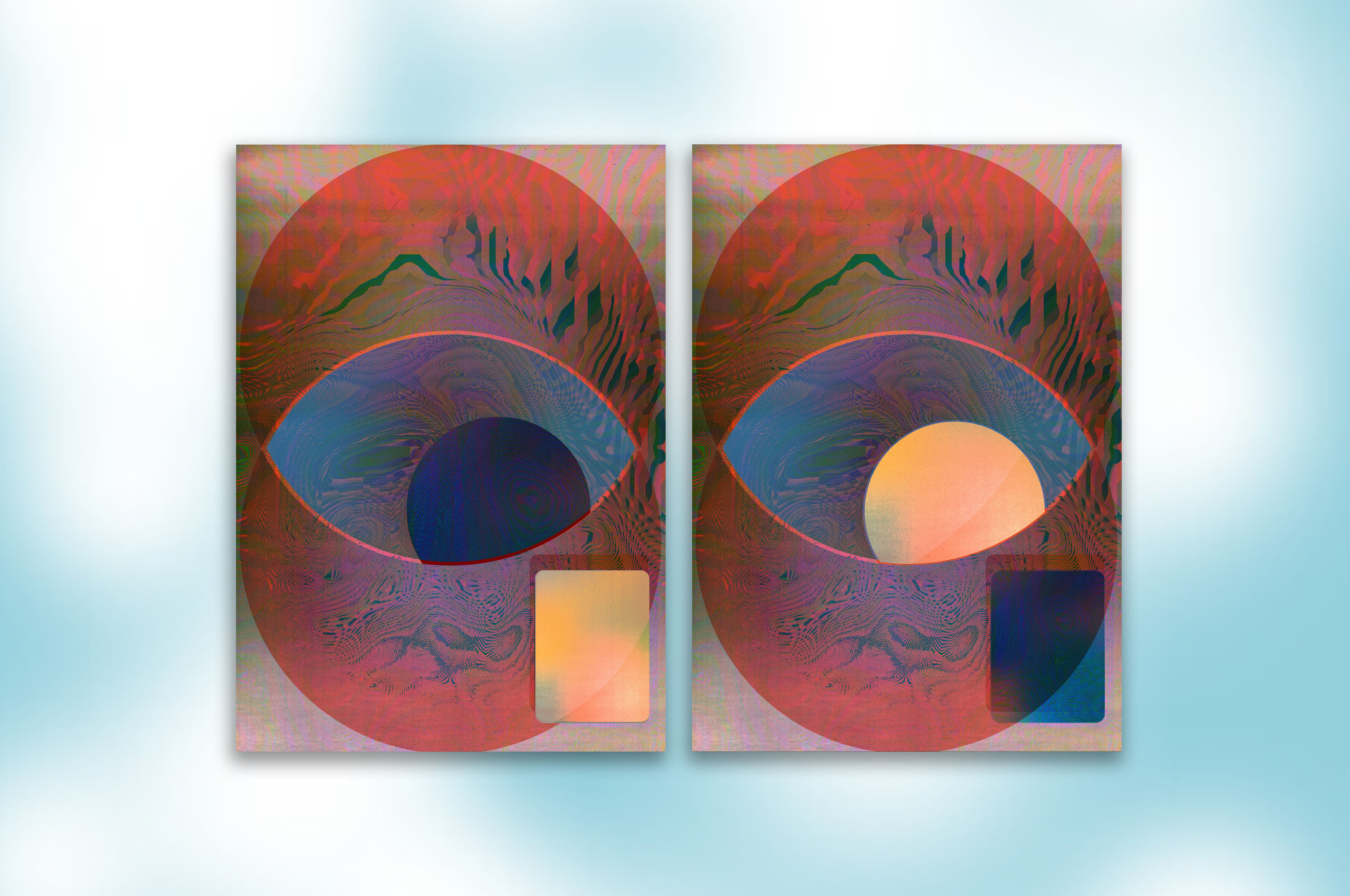
We designed a package to be sent out by post with the limited edition publication and our contribution the fine art print ‘Can You See Me?’, a happy accident sprung from a series of technological failures. A beautiful blur of a screenshot from FaceTime during a failing internet connection became an intriguing portrait of ourselves and our new way of working.
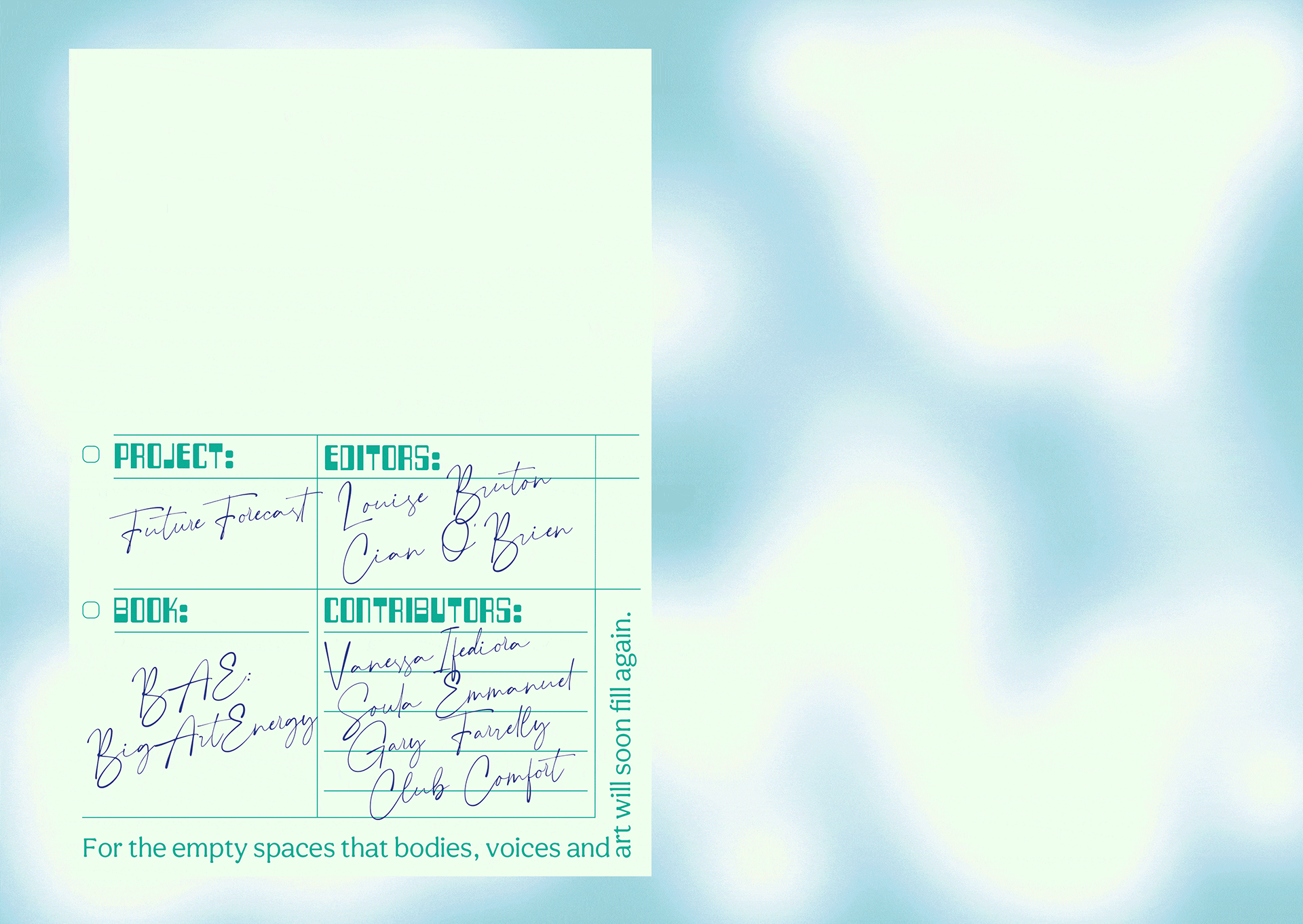
Initially inspired by journals, especially Aisling copy books, the book would act as diary or log book to record and express our inner thoughts and feelings during lockdown. Taking from those visual cues, the cover of the book is plain, quiet and still with the inside being akin the inside of your head and how you might be feeling in the midst of the pandemic—cluttered, maybe a little bit claustrophobic and anxious but colourful and beautiful and overall, hopeful.
We employed a design process inspired by a common concept in architecture and city planning referred to as desire lines; “paths & tracks made over time by the wishes & feet of walkers, especially those paths that run contrary to design or planning”; or “free-will ways.” While first using a strict grid and typographic rules to create a foundation we then allowed our human instinct to take over and Big Art Energy to fill-in, spill over, doodle, colour-in, make notes in the margins and practice our autograph over and over, just like you would in a journal.
These interventions gave each section for the contributing artists a distinct look and feel specific to the content, yet, there remains a unity to the publication thanks to the rigour of the typography and editorial layout.
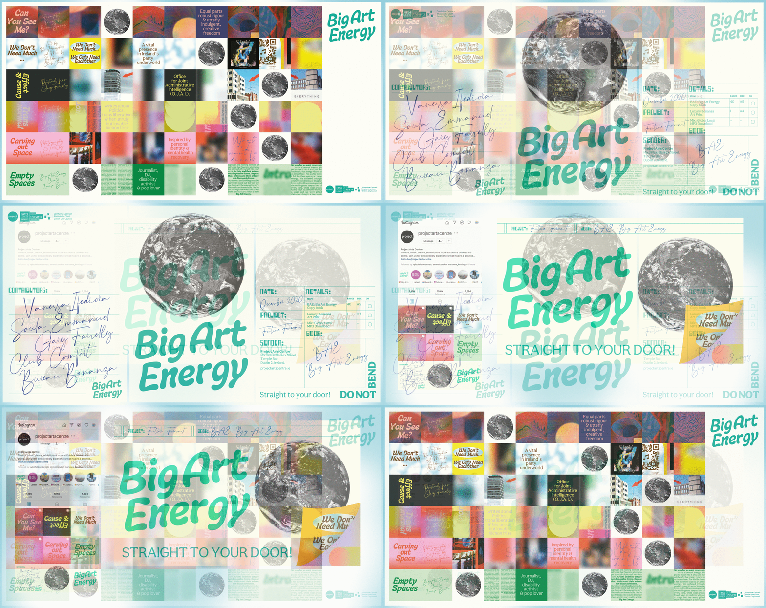
An extensive web, social media and print campaign gave BAE massive traction. As well as providing Project Arts Centre with a social media strategy and content, we created dynamic and personalised social media animations for all the contributing artists to share on their own social media platforms, while also providing all the necessary information for people interested in ordering the package. A billboard and posters outside of the Project put a smile on the faces of a few the passers-by in Temple Bar.







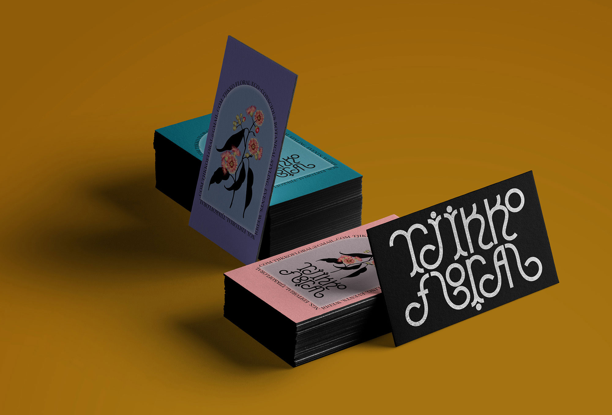
Client Brief:
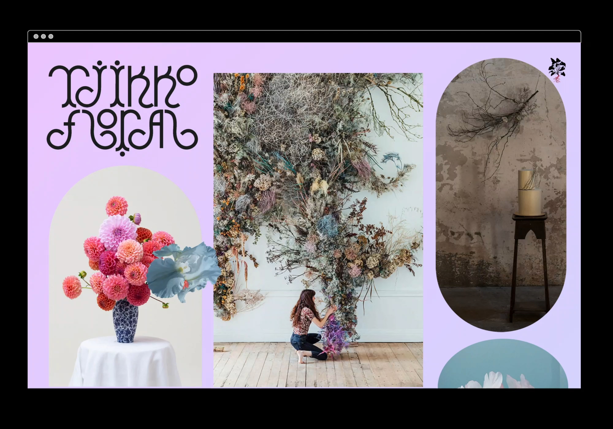
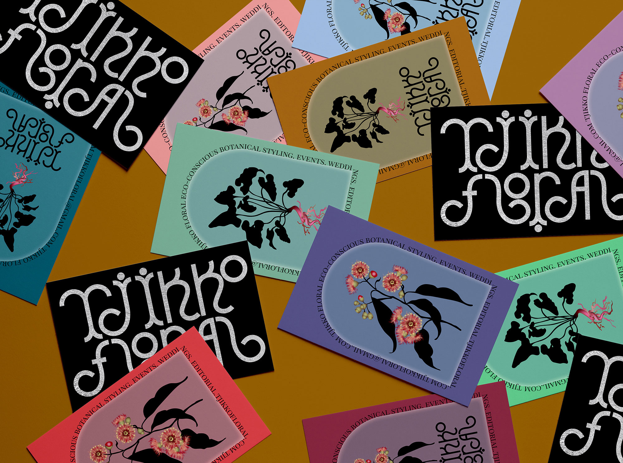
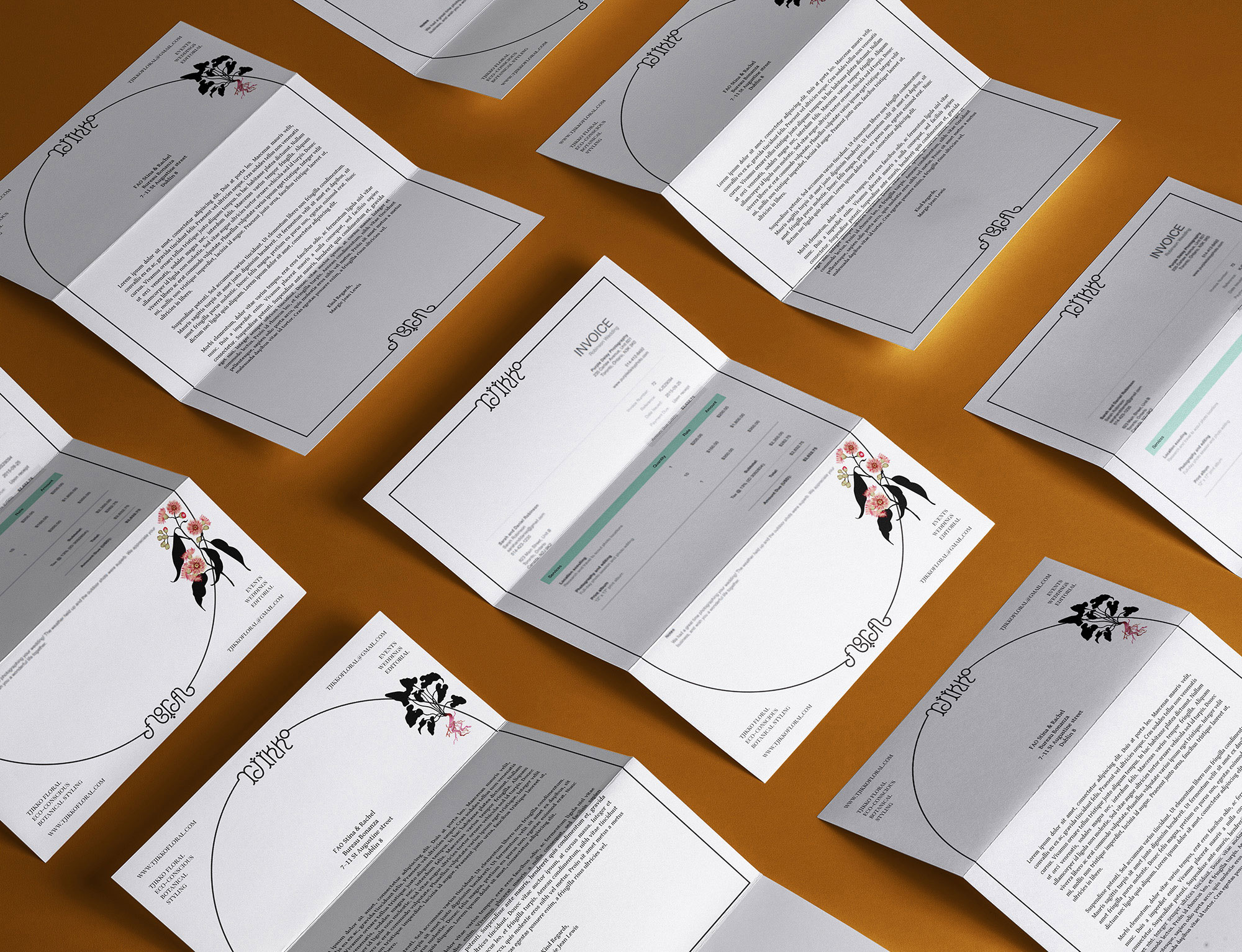
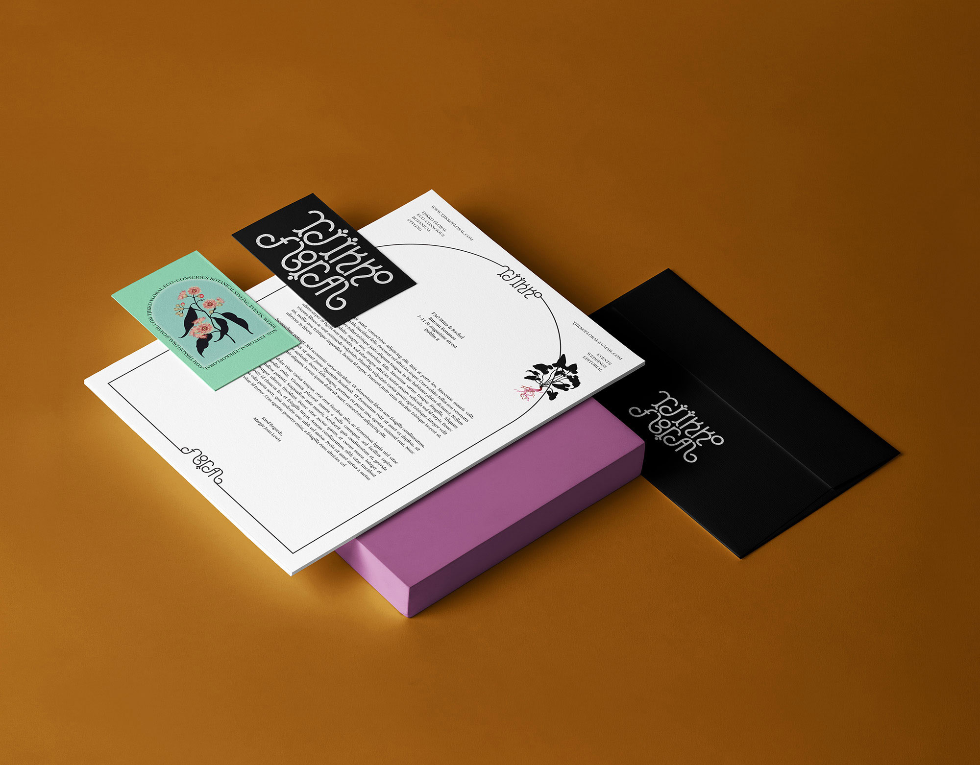
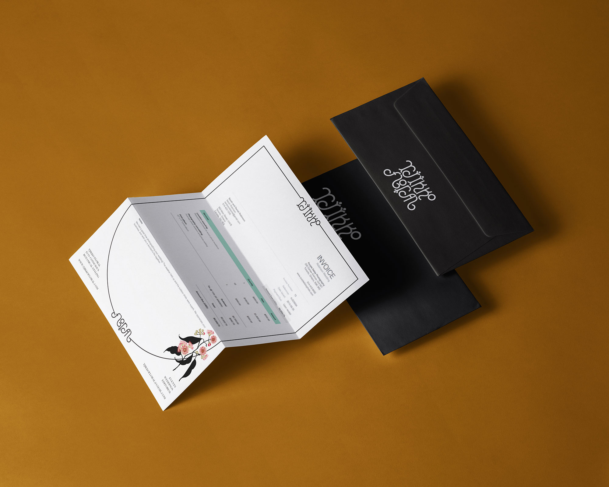
We were tasked to create a utopian brand identiy for Tjikko Floral, an eco-conscious botanical stylist. The identity aspires towards Tjikko’s idea of an unfurling ecosystem, flourished with colour, variation, moist and mossy, dry and arid, with intricate shapes and coral like floral organisms, working perfectly in symbiosis with the most advanced human technology.
We were tasked to create a utopian brand identiy for Tjikko Floral, an eco-conscious botanical stylist. The identity aspires towards Tjikko’s idea of an unfurling ecosystem, flourished with colour, variation, moist and mossy, dry and arid, with intricate shapes and coral like floral organisms, working perfectly in symbiosis with the most advanced human technology.
Our Response:
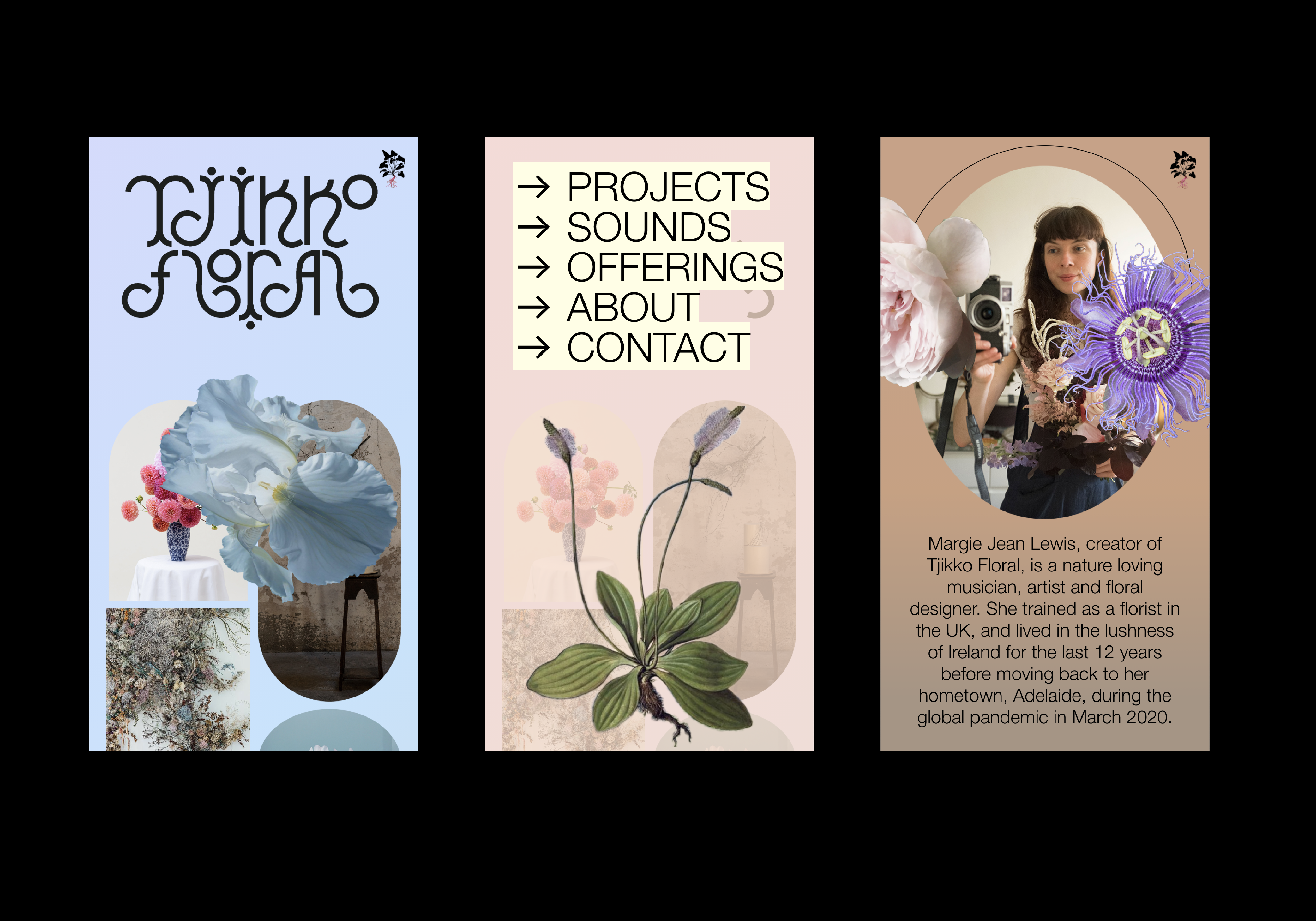
We have created an identity that resonates with the clients vision. The custom logotype is fluid and organic, resembling an unfurling creeper that looks futurisitc and ancient at the same time.
We have created an identity that resonates with the clients vision. The custom logotype is fluid and organic, resembling an unfurling creeper that looks futurisitc and ancient at the same time.
Client Testimonial:
I just can't believe how accurately you telepathically visualised the concept after only a very short introduction. I'm actually just so moved! So excited, you guys are making my heart sing with every email!
Margie Lewis, Director, Tjikko Floral
I just can't believe how accurately you telepathically visualised the concept after only a very short introduction. I'm actually just so moved! So excited, you guys are making my heart sing with every email!
Margie Lewis, Director, Tjikko Floral


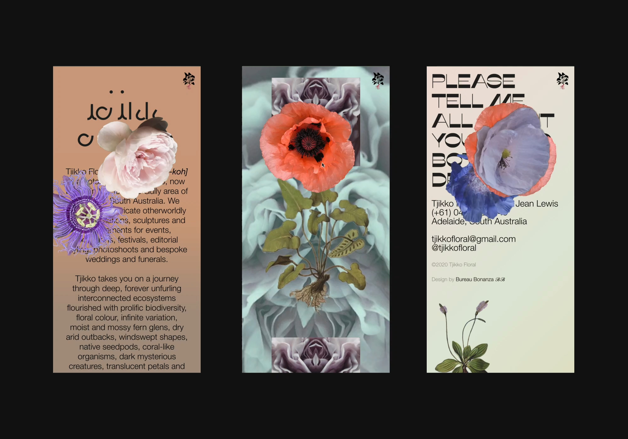
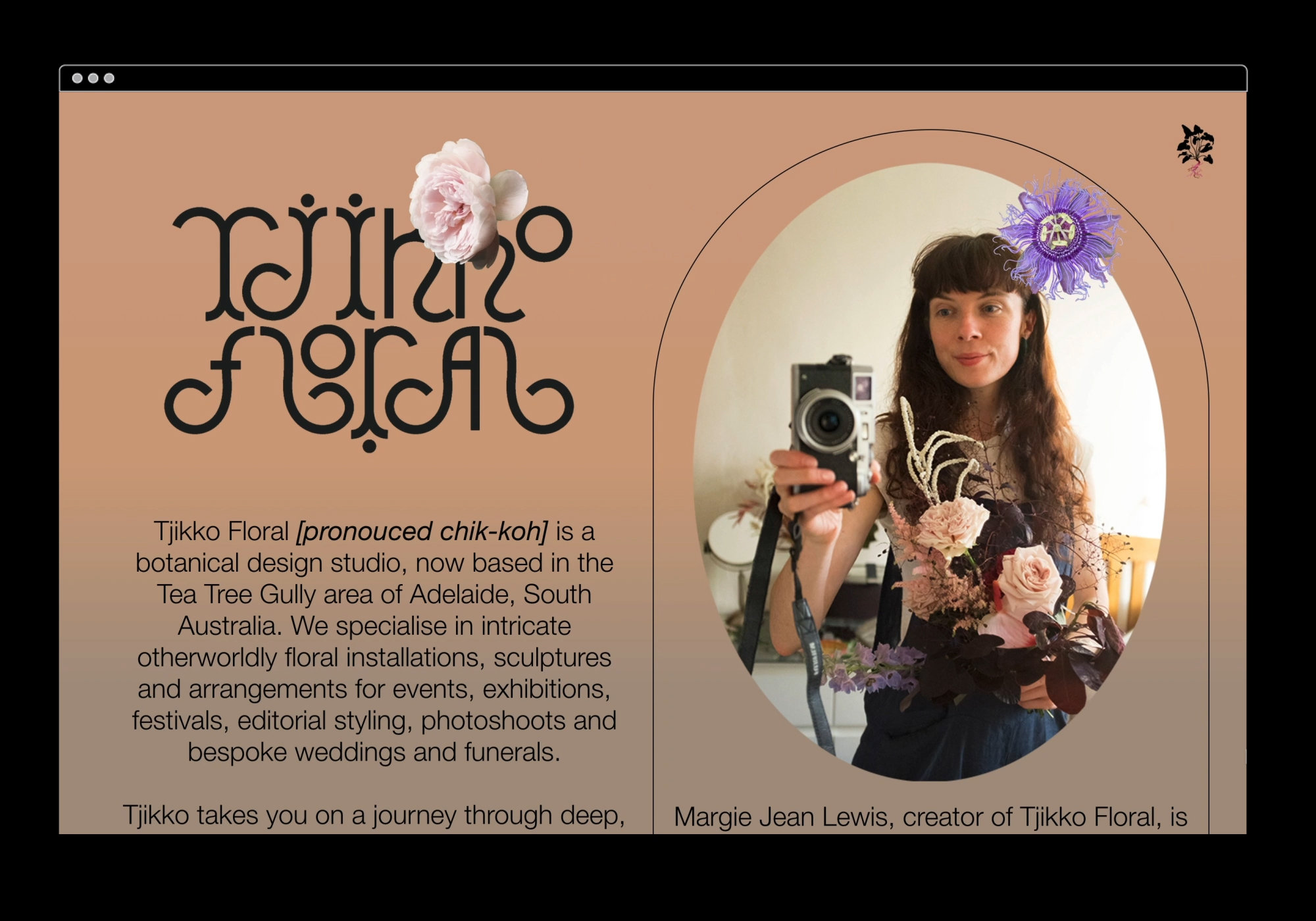
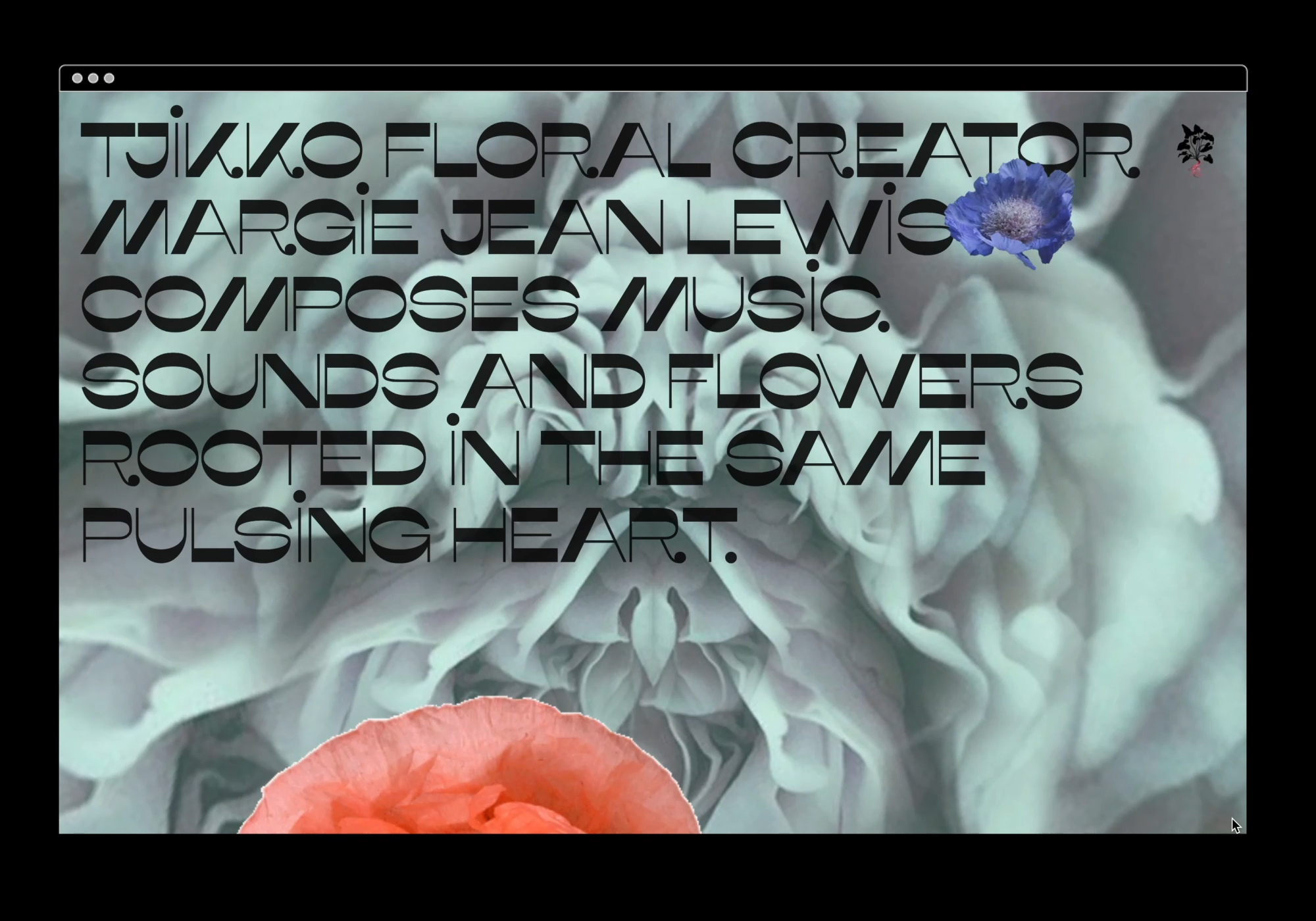
We designed and built an immersive portfolio website for eco-conscious botanical stylist, Tjikko Floral.
Based in Adelaide, Australia, floral artist and musician, Margie Lewis, wanted to slowly merge her two professions into one fully immersive sonic and floral experience. Tjikkofloral.com showcases her intricate otherworldly floral design as well as hosting her music in a mesmerising parallax petal portal, encouraging you to have a listen and get lost in this wholly escapist experience. By combining Tjikko’s images and sounds with a diverse range of animated elements, framing devices and the applied branding, we created a functional site that is “an art piece in and of itself.”
Based in Adelaide, Australia, floral artist and musician, Margie Lewis, wanted to slowly merge her two professions into one fully immersive sonic and floral experience. Tjikkofloral.com showcases her intricate otherworldly floral design as well as hosting her music in a mesmerising parallax petal portal, encouraging you to have a listen and get lost in this wholly escapist experience. By combining Tjikko’s images and sounds with a diverse range of animated elements, framing devices and the applied branding, we created a functional site that is “an art piece in and of itself.”
Photography & Music: Margie Jean Lewis
![]()
