
We create extraordinary, engaging and robust design for entrepreneurs, artists and organisations.

2021
![]()
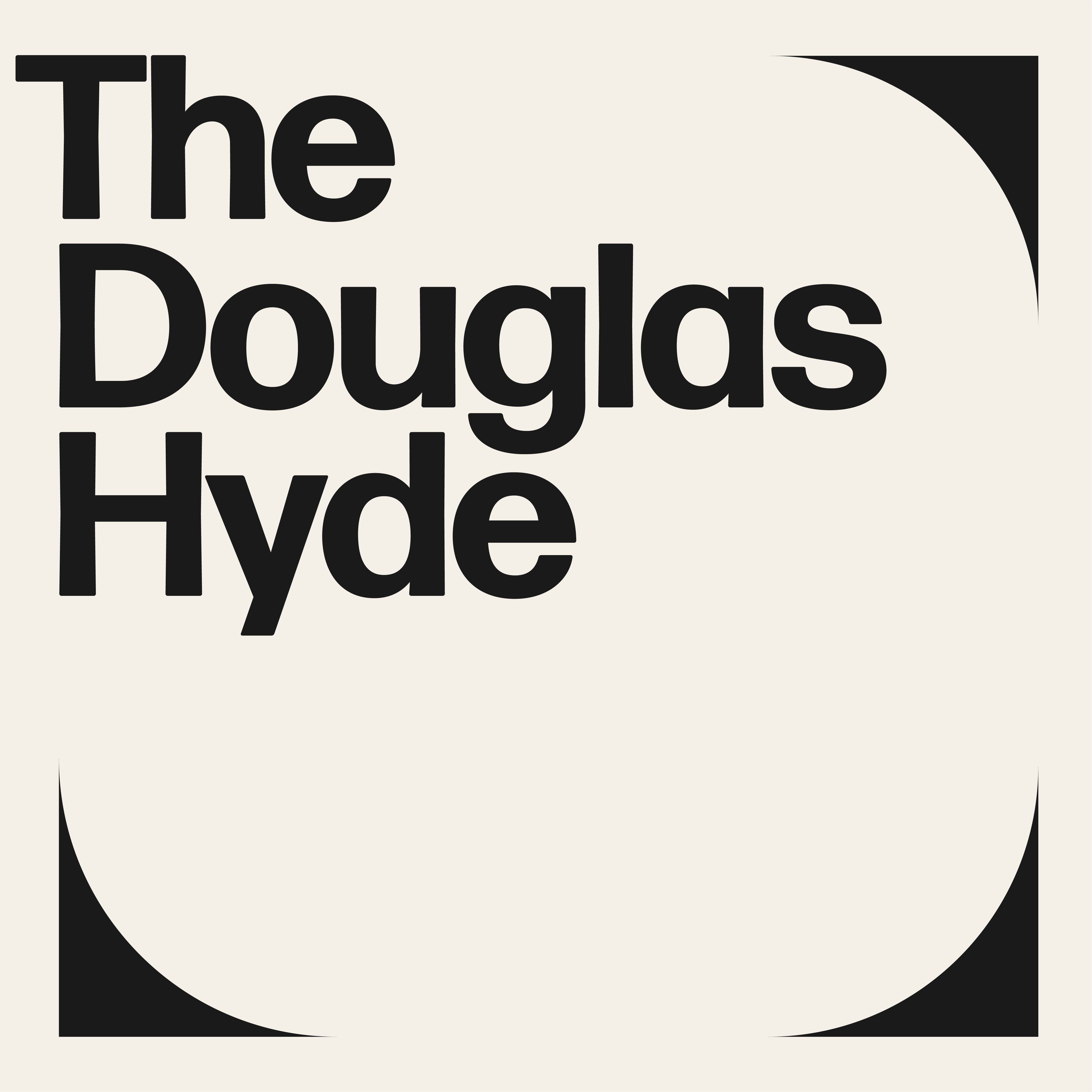
The Douglas Hyde
Brand Identity & Website Design
thedouglashyde.ie
Client: The Douglas Hyde
Developer: Alex Bradley
Winner
IDI Universal Design
Special Awards
![]()
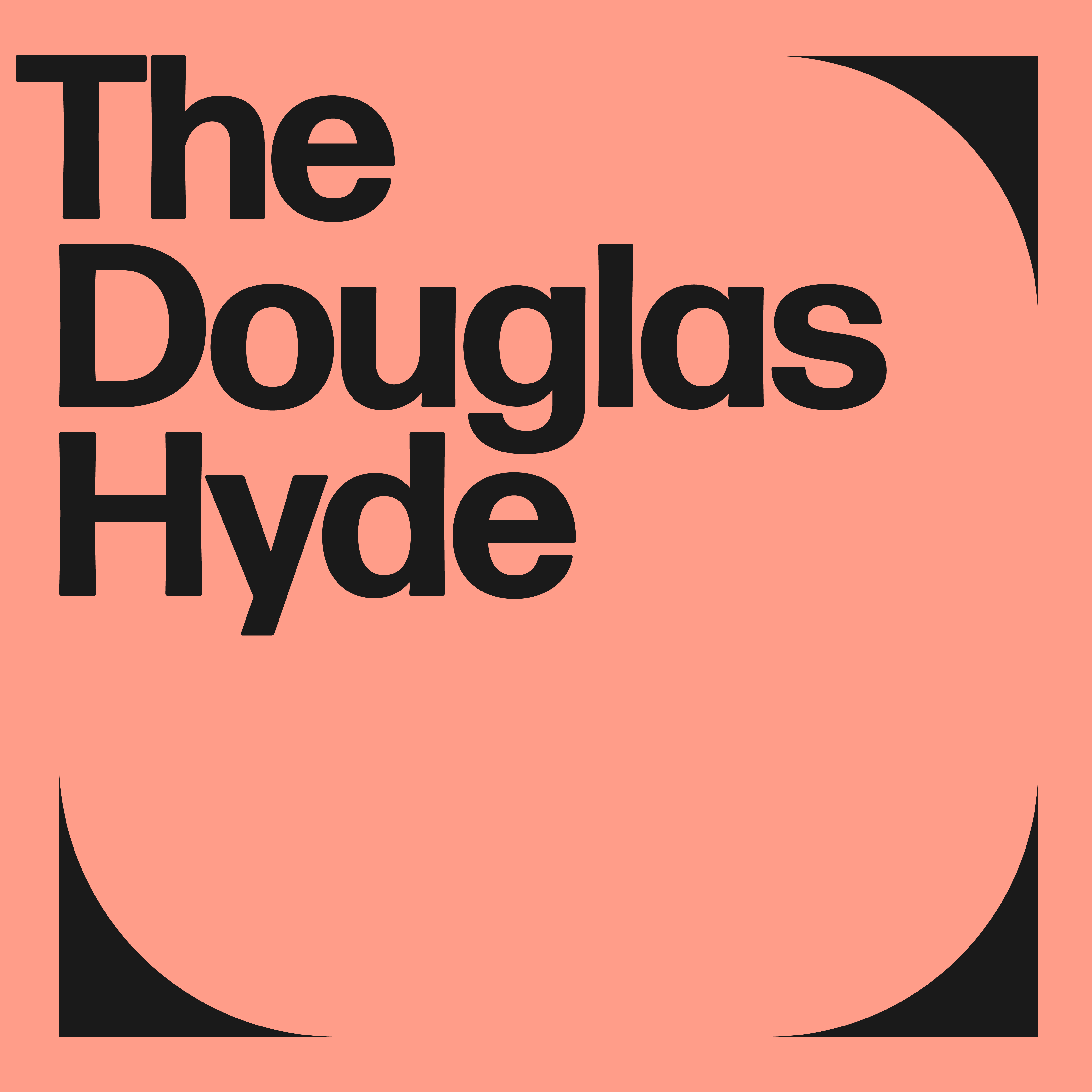
Brand Identity & Website Design
thedouglashyde.ie
Client: The Douglas Hyde
Developer: Alex Bradley
Winner
IDI Universal Design
Special Awards
Client Brief:
Challenges that most contemporary art galleries struggle with have to do with accessibility and how to bring conversations about art to larger and non-traditional audiences. With this rebrand and website project we needed to create an accessible and friendly design that welcomes new engagement and does away with any perceived intimidation whilst still maintaining the intellectual reputation of the gallery.
Challenges that most contemporary art galleries struggle with have to do with accessibility and how to bring conversations about art to larger and non-traditional audiences. With this rebrand and website project we needed to create an accessible and friendly design that welcomes new engagement and does away with any perceived intimidation whilst still maintaining the intellectual reputation of the gallery.
Our Response:
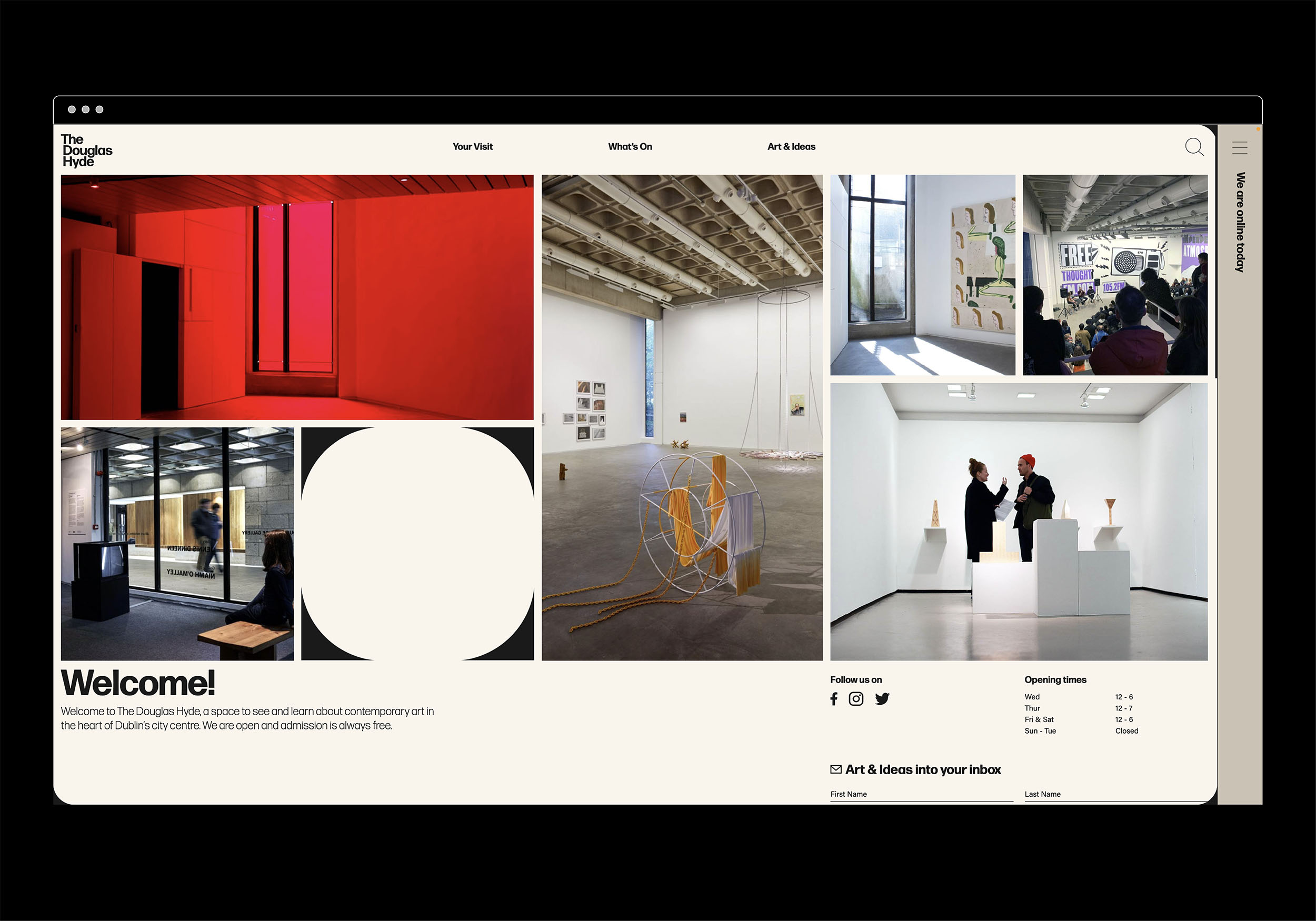
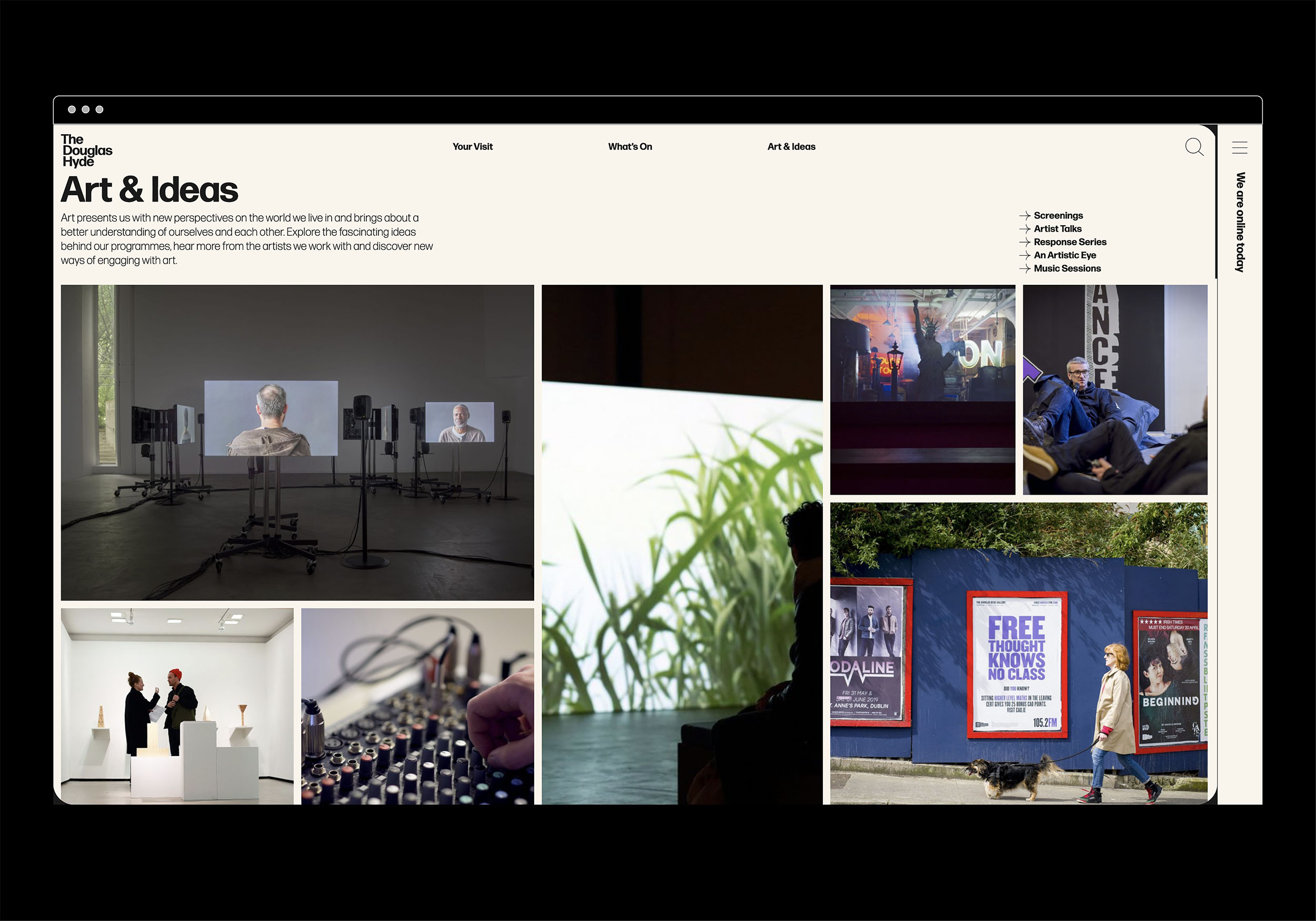
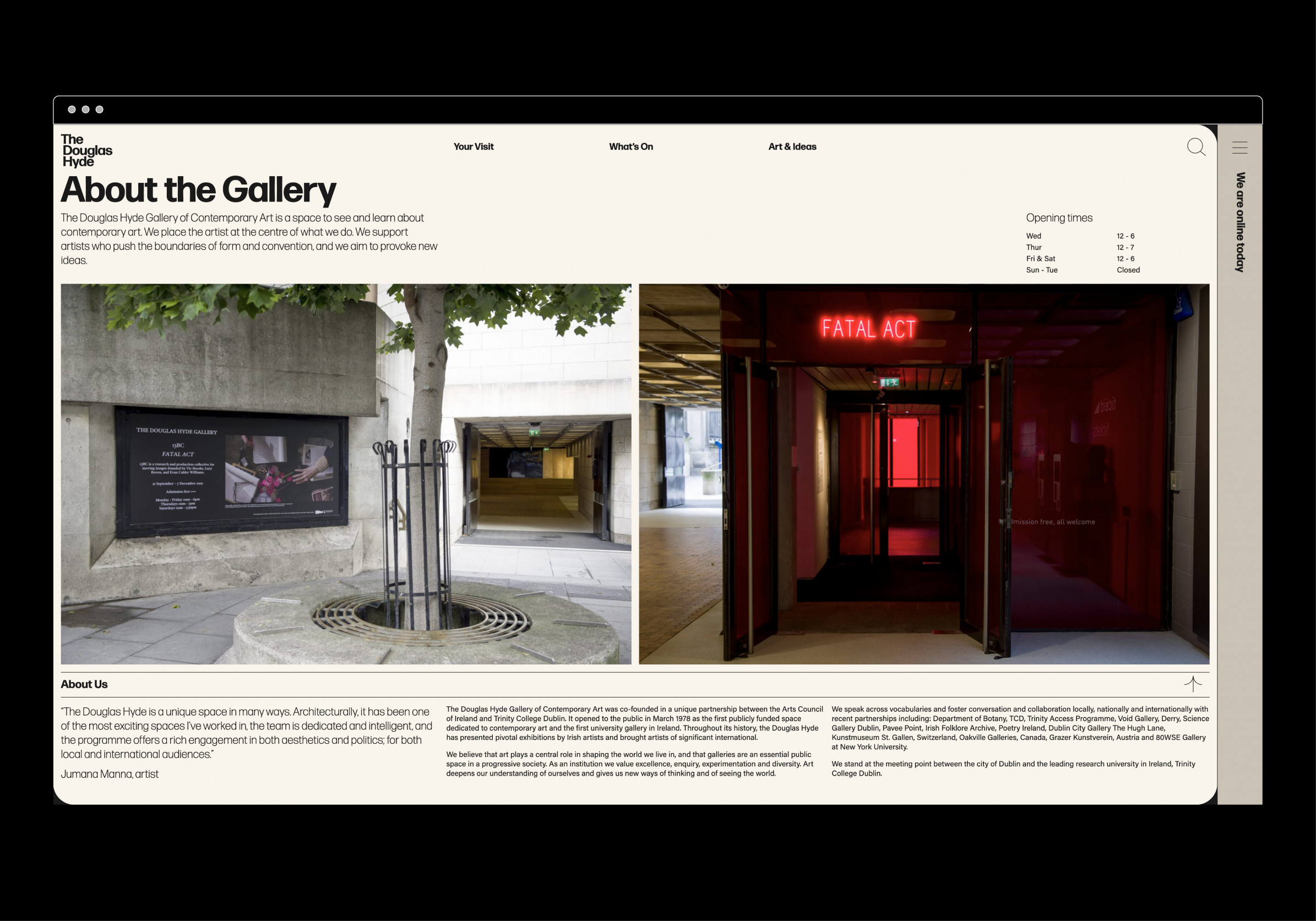
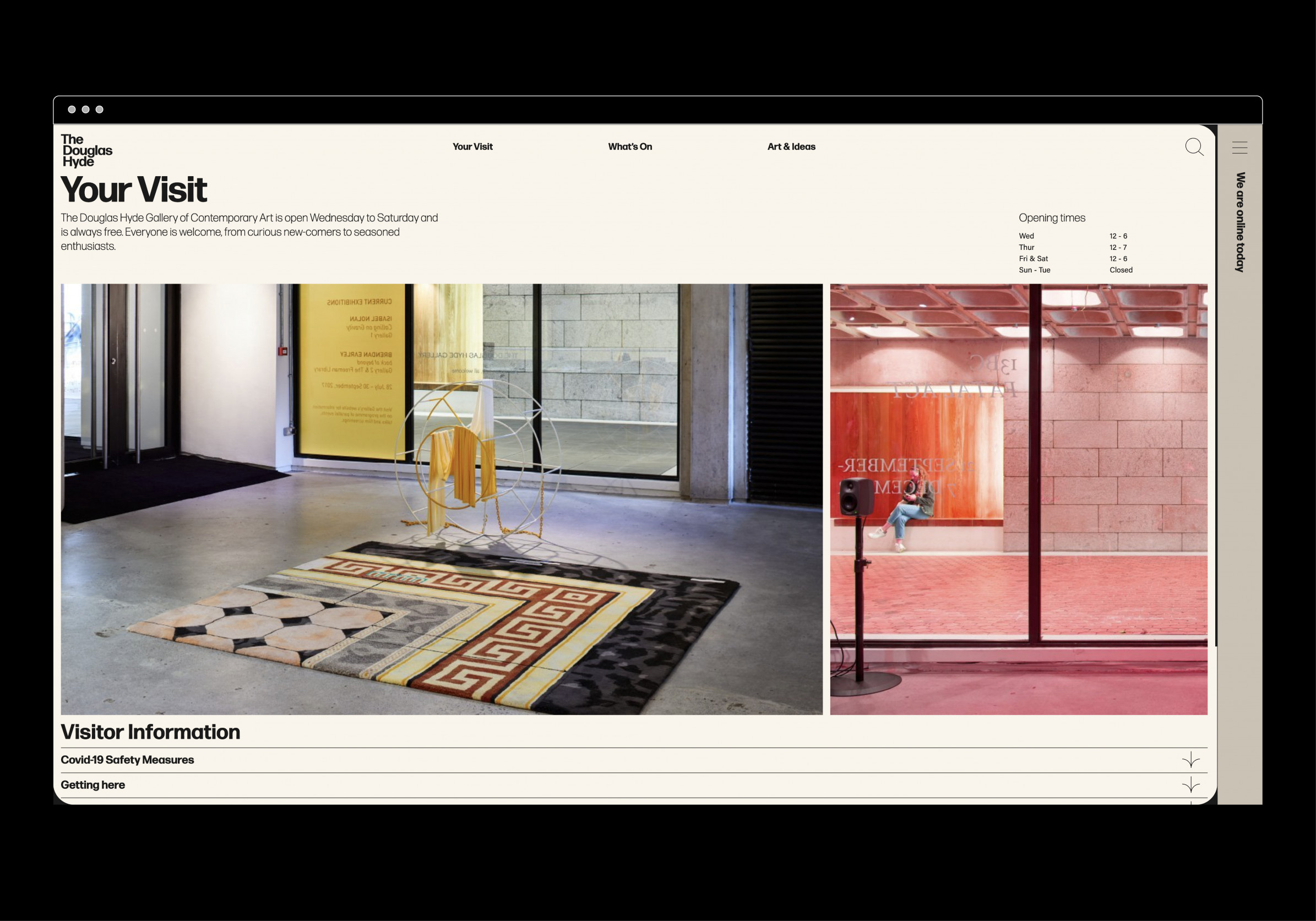
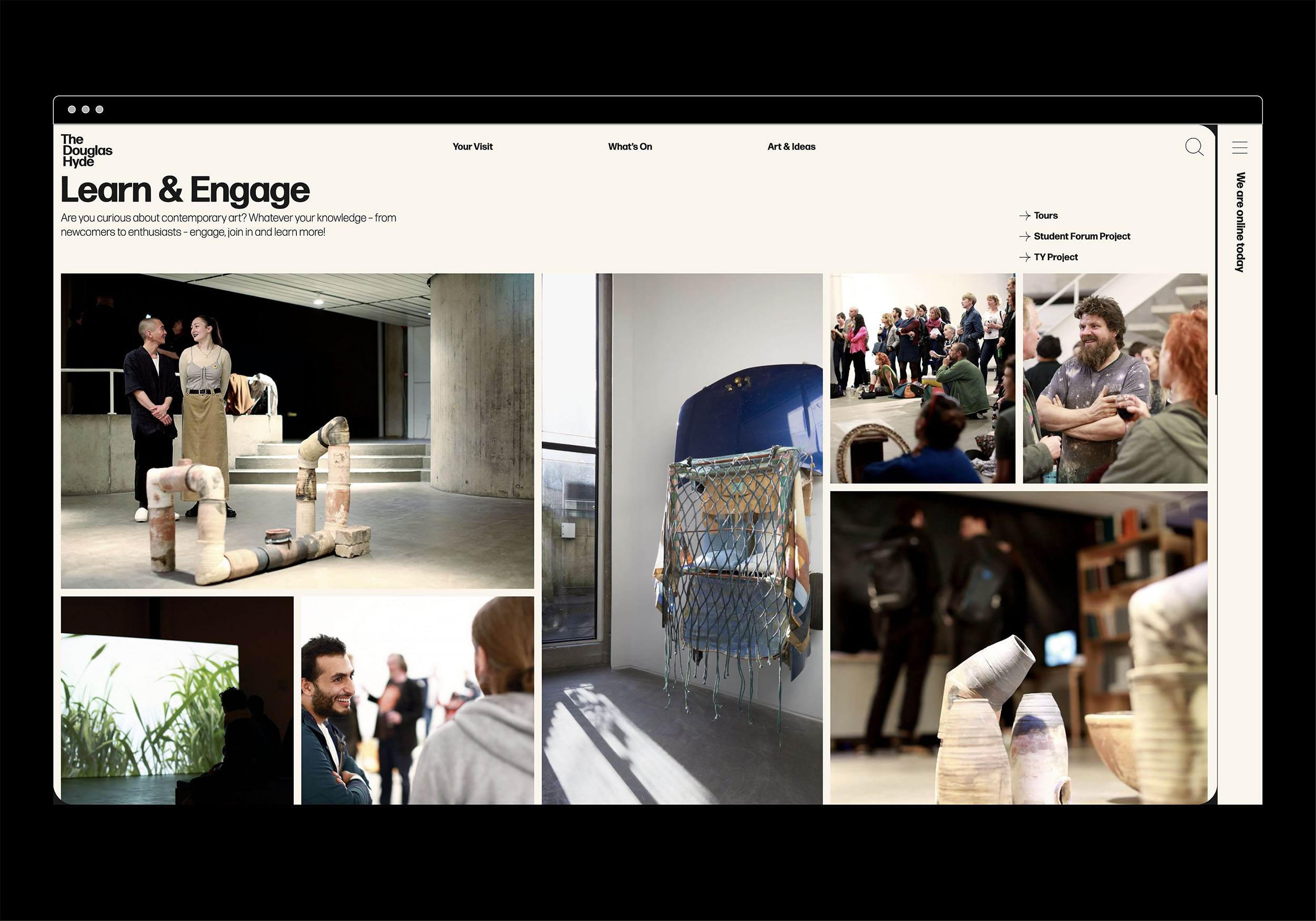
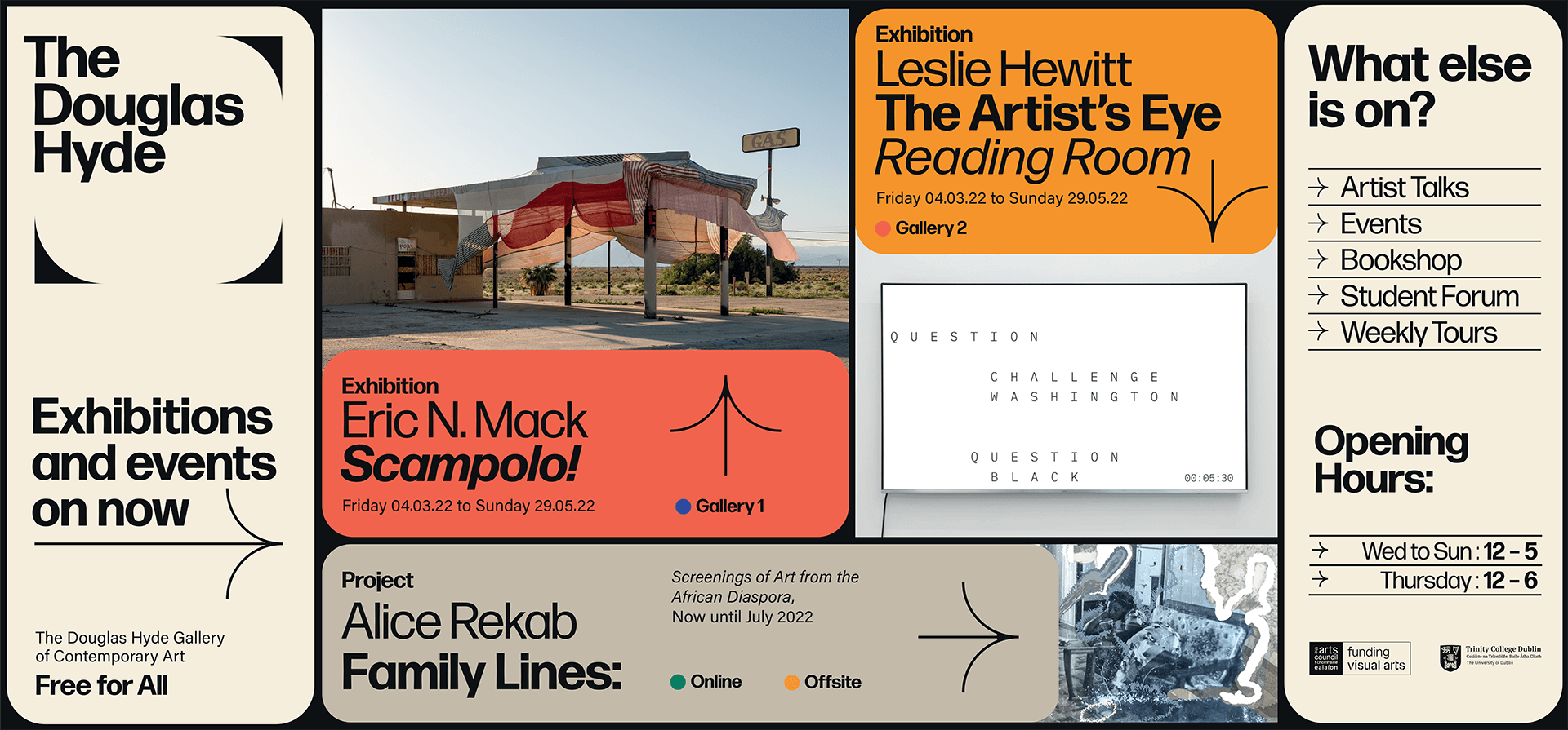
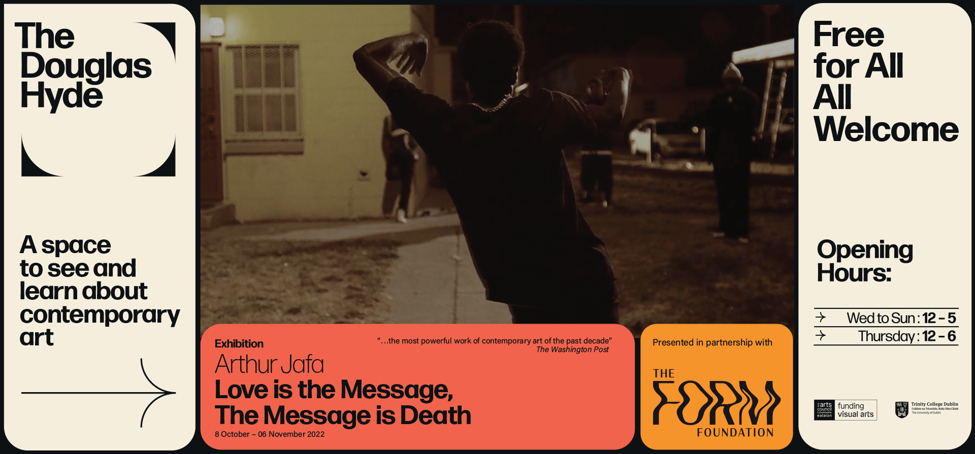
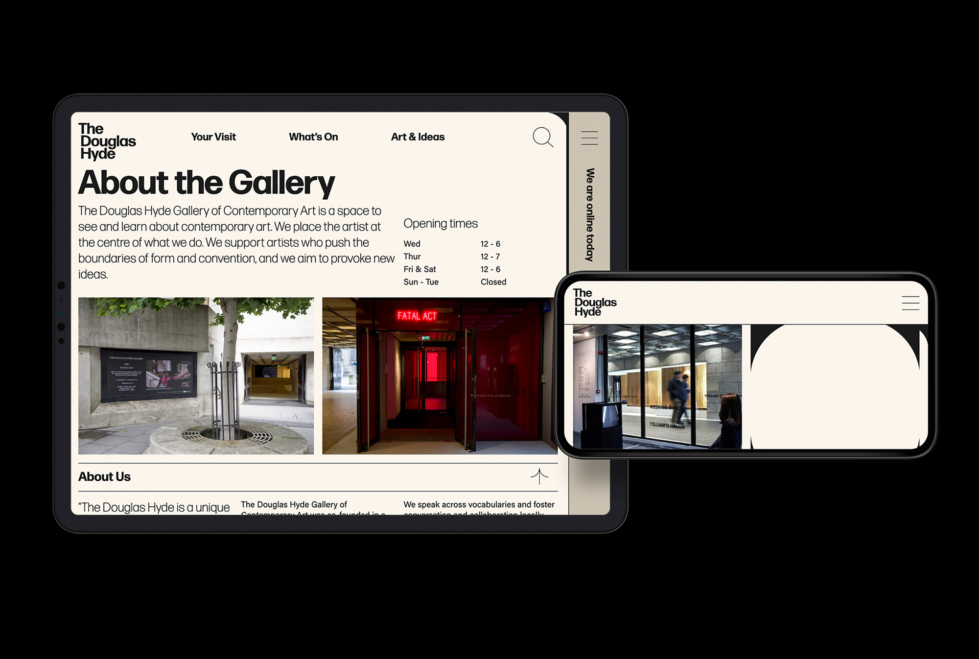
The website and all other communications platforms needed a clear editorial structure that allows for tiered levels of engagement with an information system using headings, sub-heads, introductory paragraph-styles, ‘read more’ tags etc. going from engaging and welcoming to descriptive and informative to academic and critical.
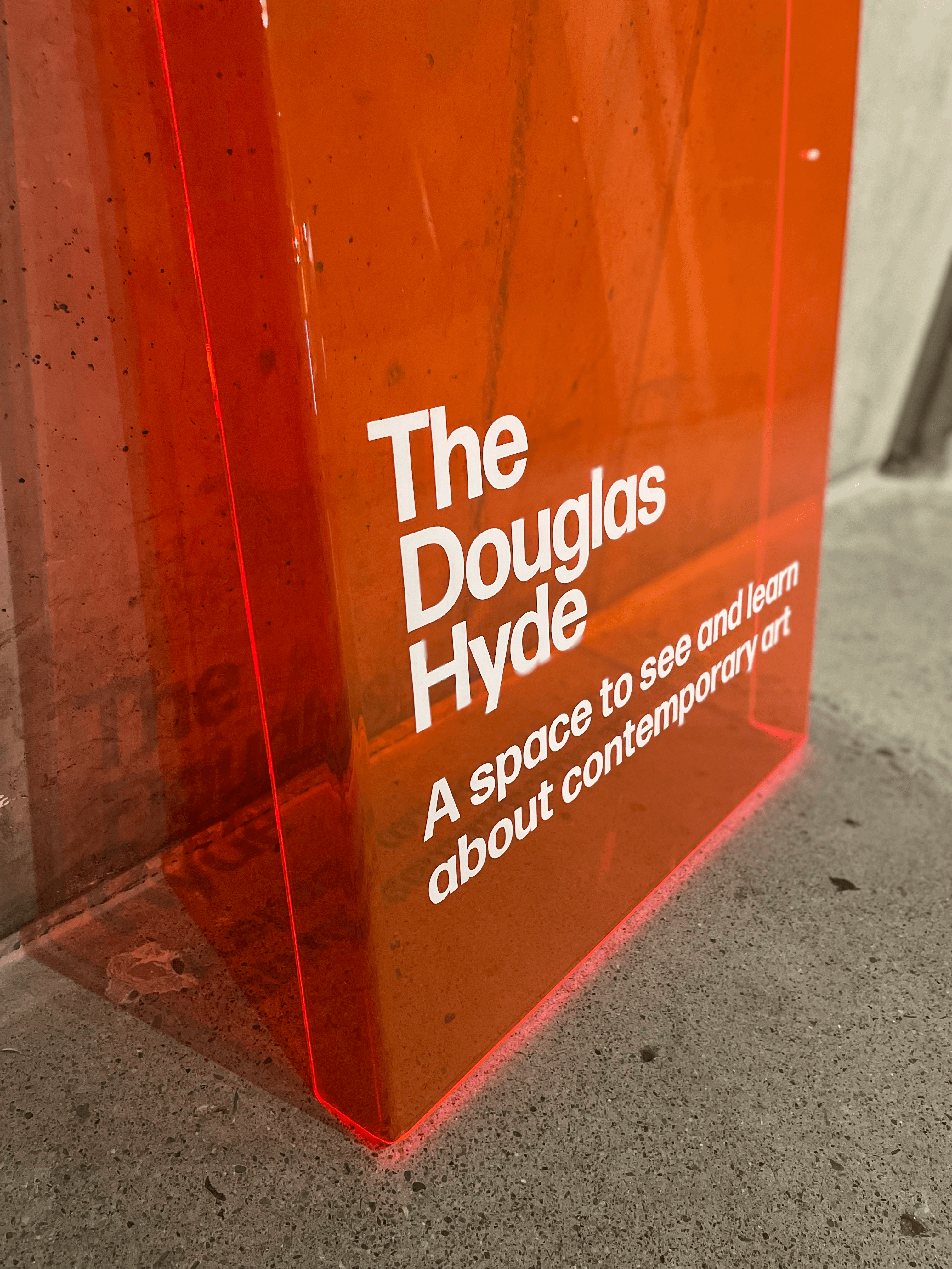
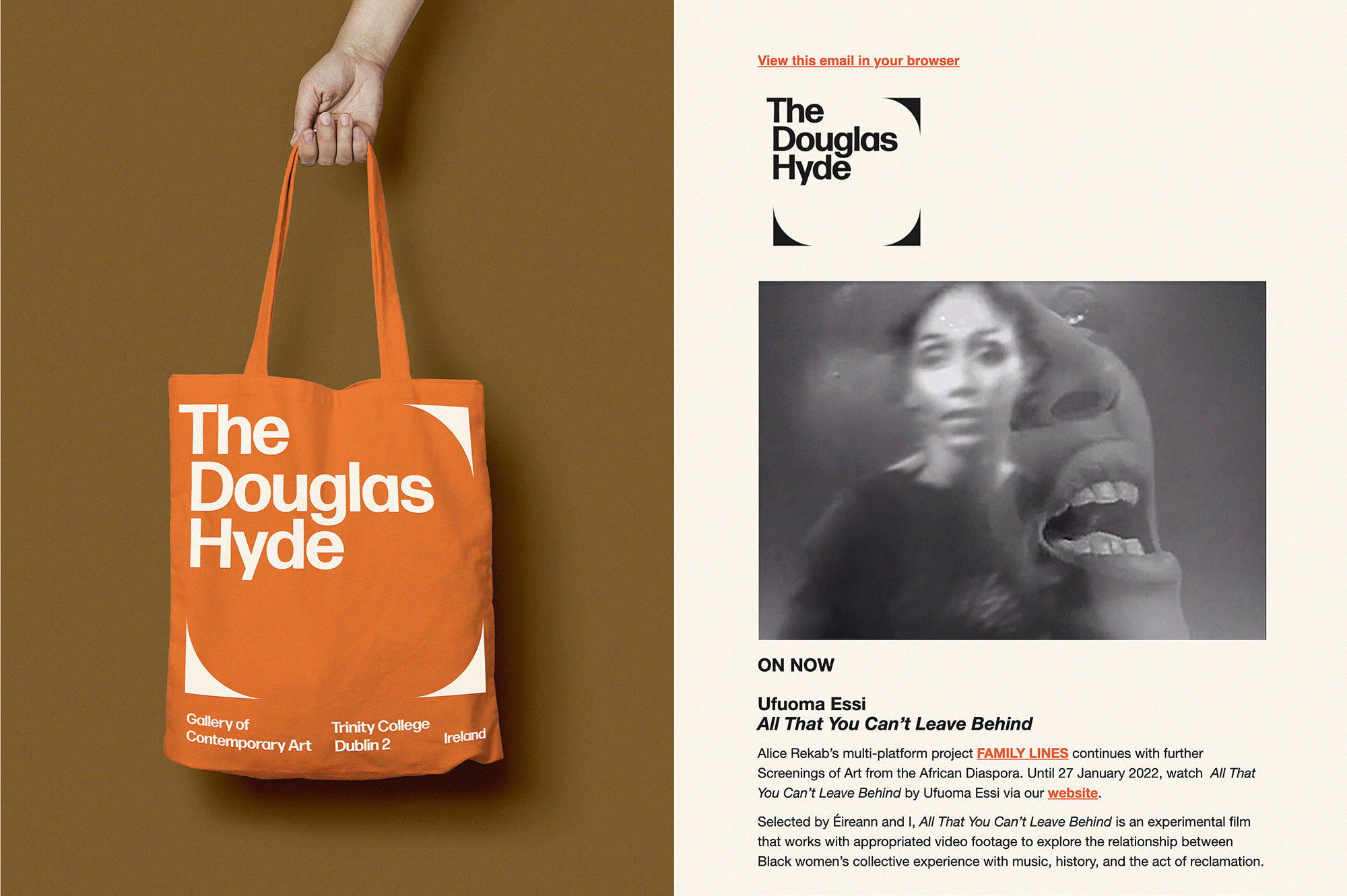
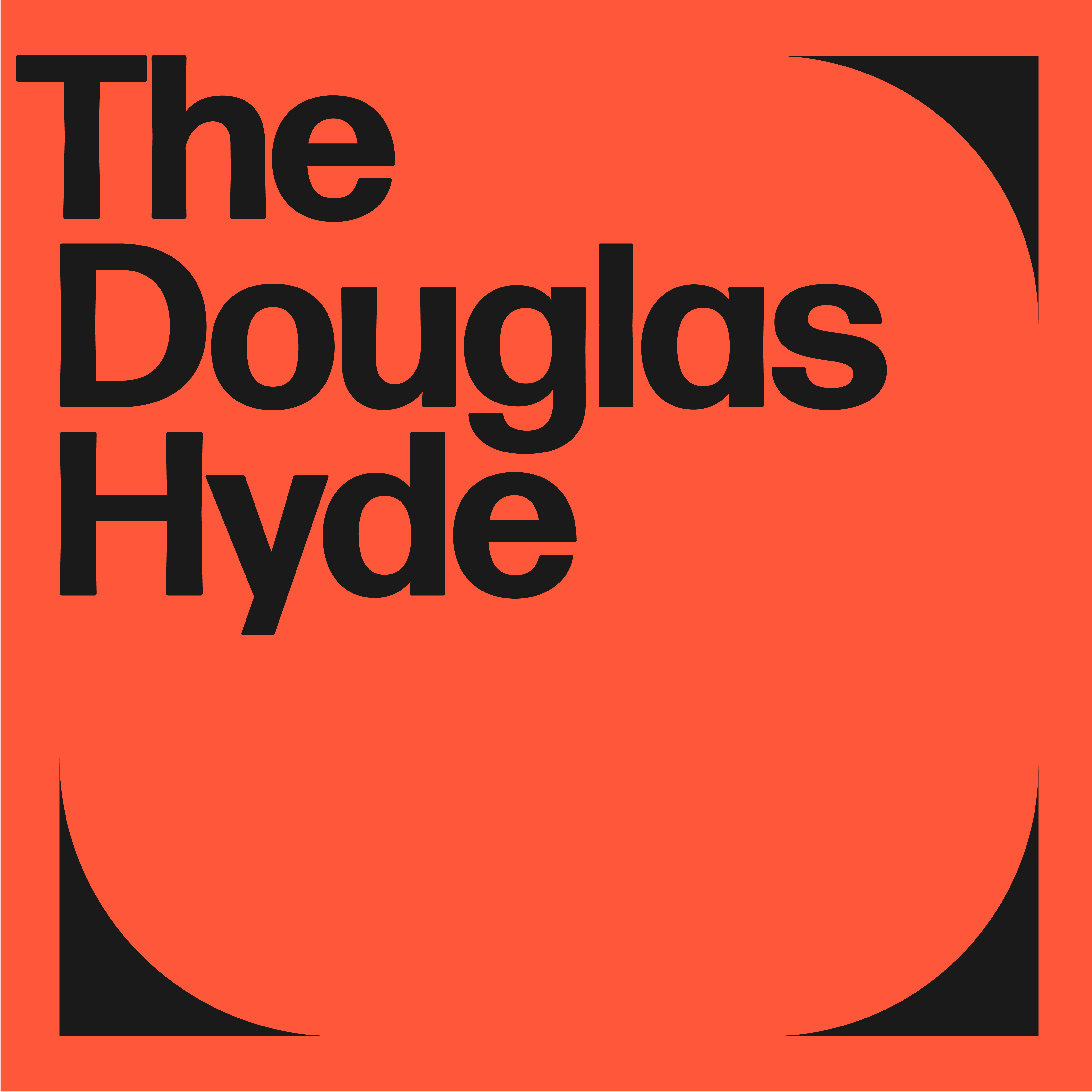
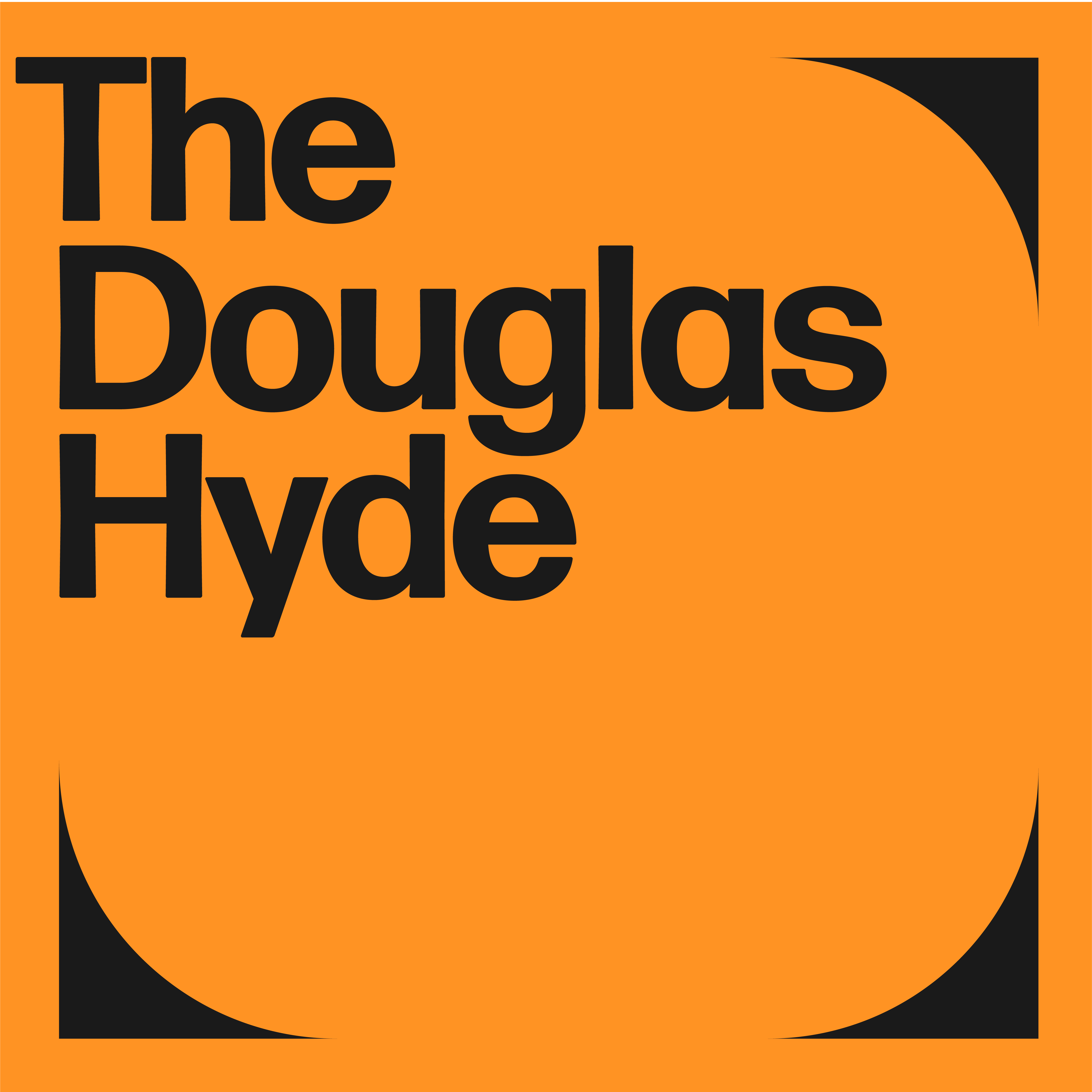
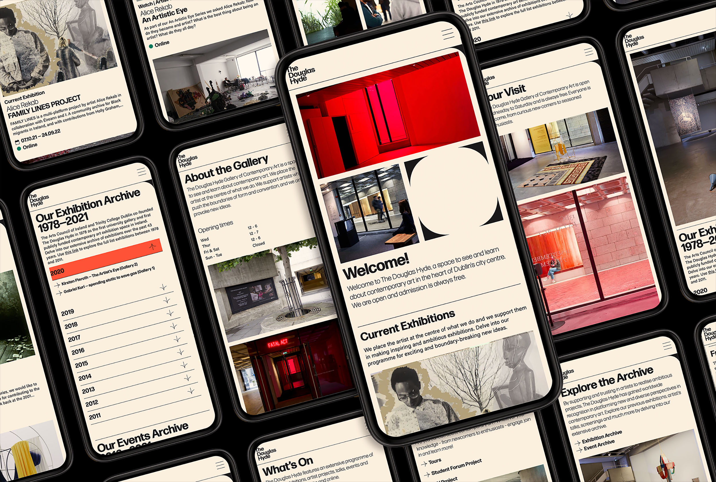
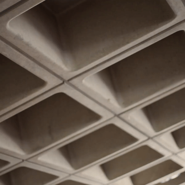
A gallery in essence is an architectural space, thus the design was inspired by aspects of its architectural features. The concrete ceiling of the gallery and the Trinity Arts Block became the catalyst for the logo and subsequently the brand identity and look and feel of the website. The rounded shape of the ceiling cells create a tension between sharpness and smoothness and of the negative and positive space.
The website and all other communications platforms needed a clear editorial structure that allows for tiered levels of engagement with an information system using headings, sub-heads, introductory paragraph-styles, ‘read more’ tags etc. going from engaging and welcoming to descriptive and informative to academic and critical.
A gallery in essence is an architectural space, thus the design was inspired by aspects of its architectural features. The concrete ceiling of the gallery and the Trinity Arts Block became the catalyst for the logo and subsequently the brand identity and look and feel of the website. The rounded shape of the ceiling cells create a tension between sharpness and smoothness and of the negative and positive space.
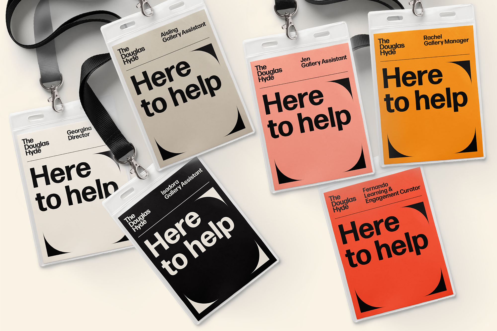
We worked closely with Learning & Engagement Curator of The Douglas Hyde, Fernando Sánchez-Migallón Cano and developer, Alex Bradley, to achieve a universal design. This included working with Knowbility to ensure the finished design was accessible to a wide range of people regardless of their age, size, ability or disability.
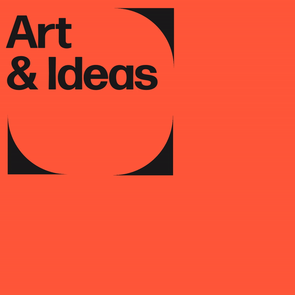
Through deconstructing and multiplying the mark and re-assembling the fragments of the original form, we developed a dynamic and modular system of symbols, icons and framing devices. The display type face (Forma) echoes that same tension between sharpness and smoothness whilst being high in contrast, legibility and character. Wanting to avoid the white cube aesthetic the colour scheme is led by a ‘muted’ charcoal black and warm off white that can be combined with the warm colours that compliments the grey concrete.