
2022
Client: Dublin Theatre Festival
Dublin Theatre Festival
Campaign Identity 2022
Campaign Identity 2022
Client: Dublin Theatre Festival
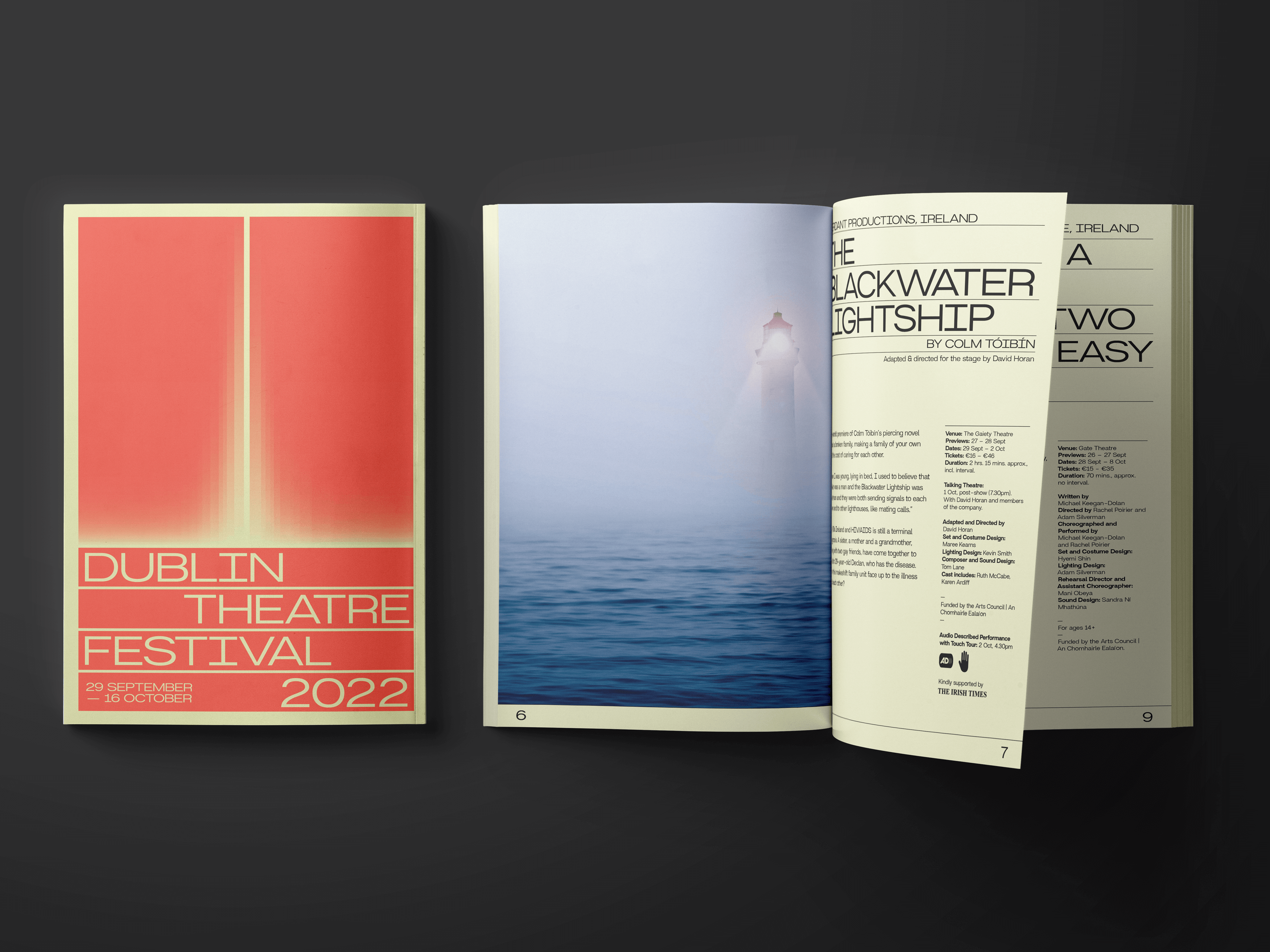
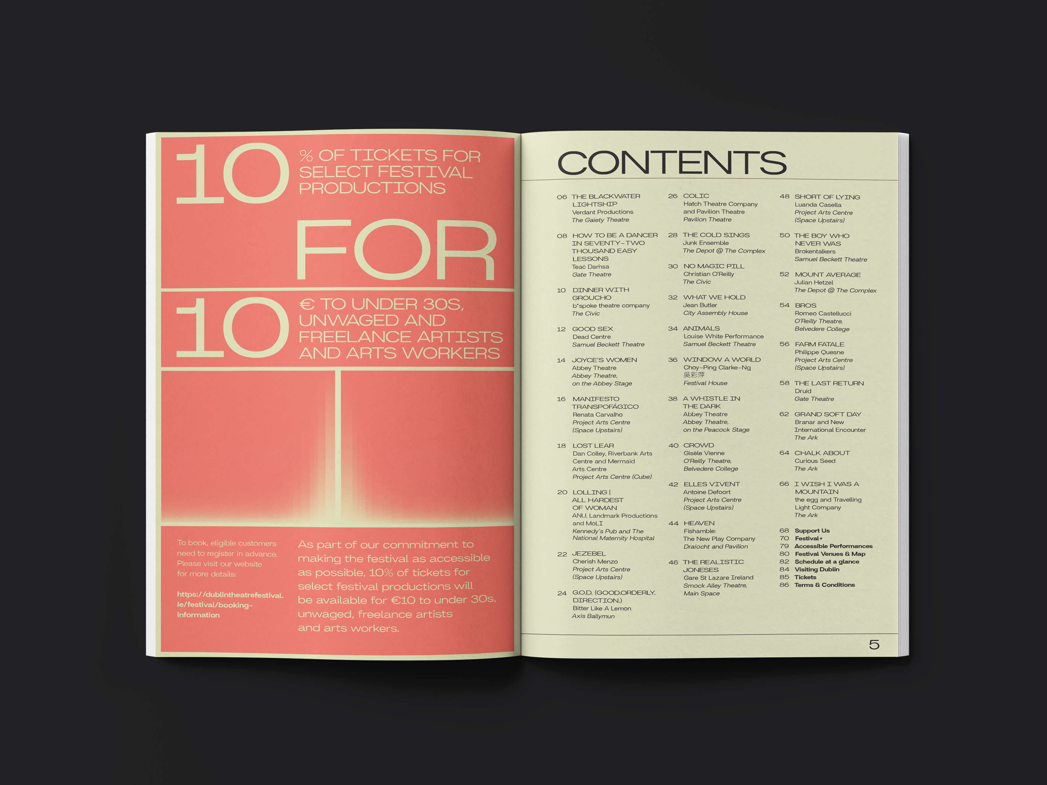
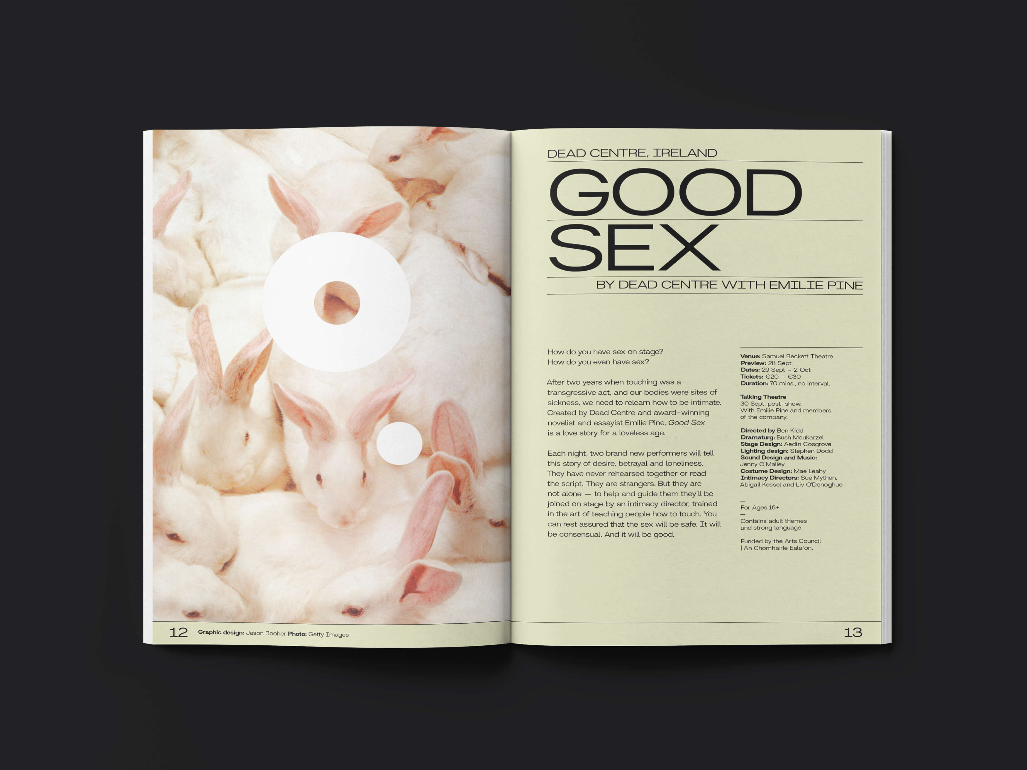
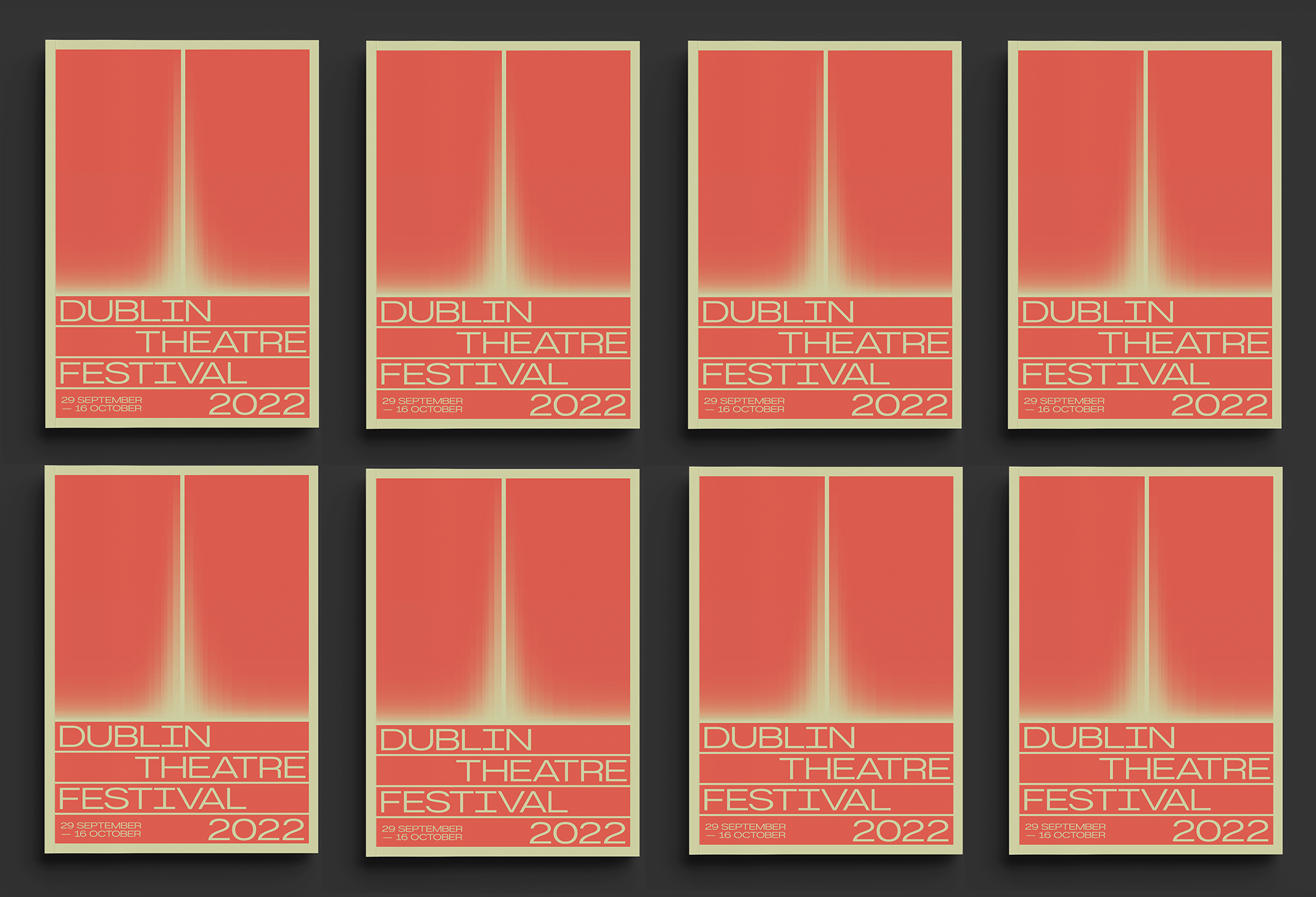
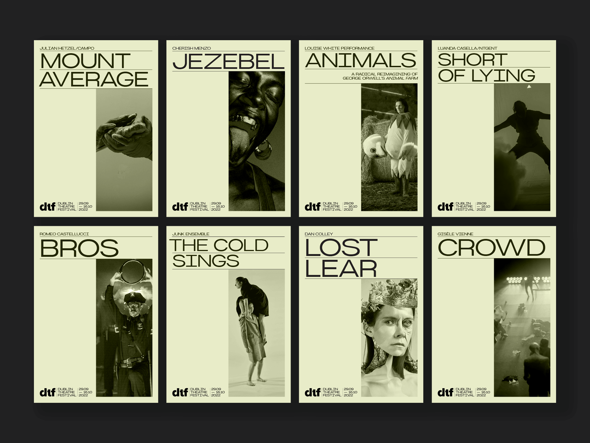
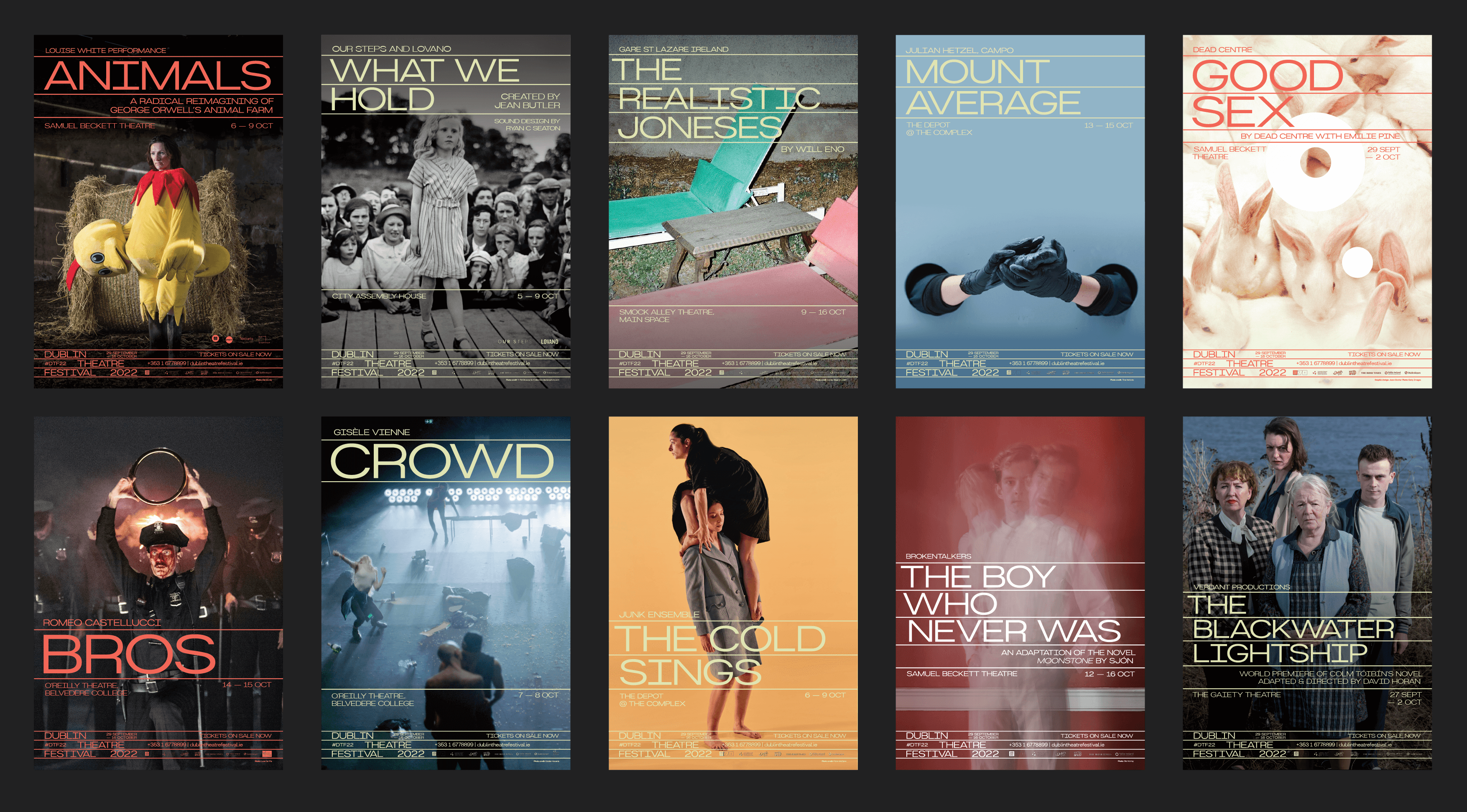
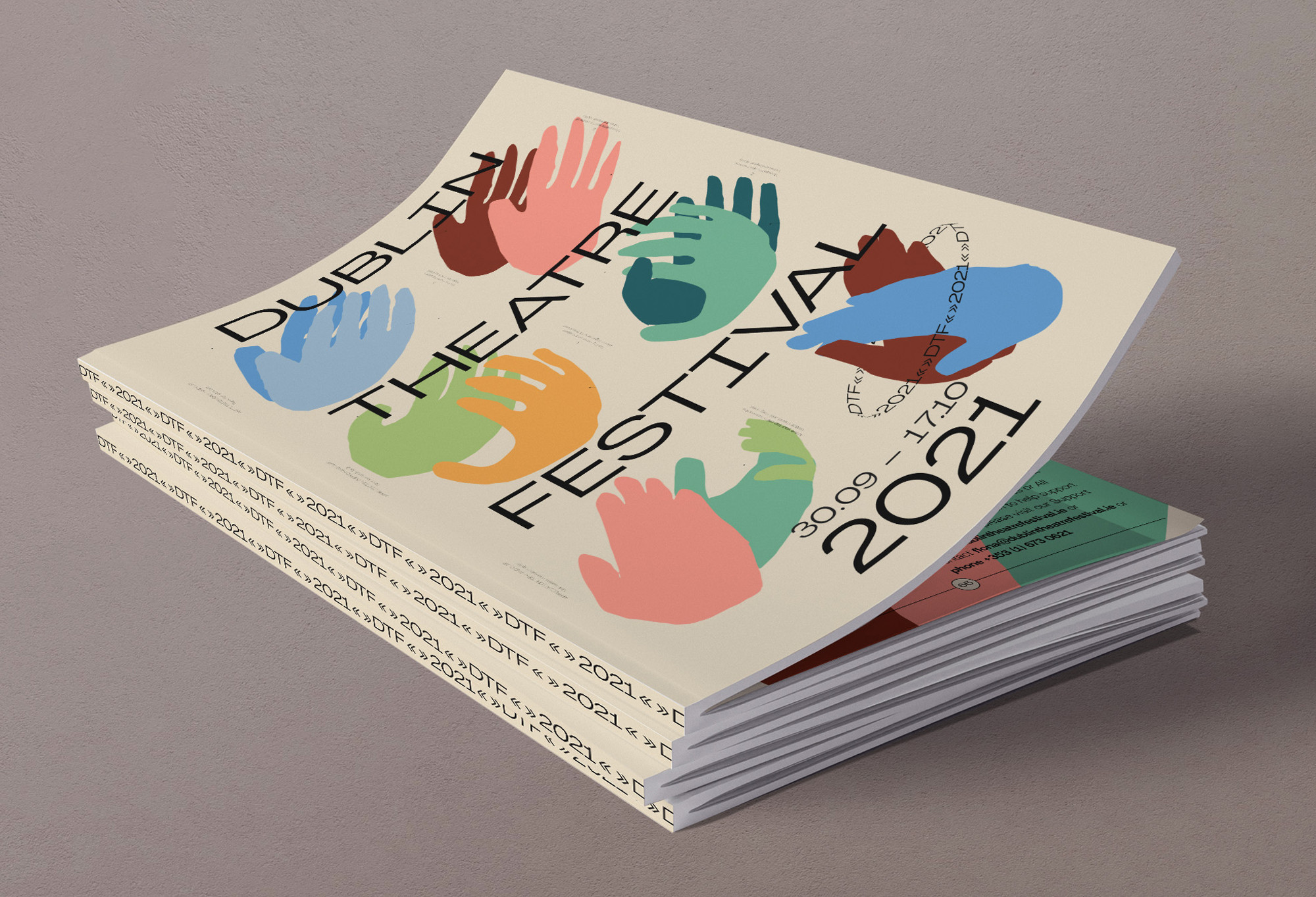
The 2022 Dublin Theatre Festival Campaign was all about the power theatre bringing people together again with Dublin City at the centre of it all — cementing the festival’s presence on the international stage.
We all missed the buzz of lively foyers and packed theatres and so, having navigated two years of disruption, the 2022 festival returned with full capacity houses and a restored international presence. DTF22 brought exciting Irish premieres and exceptional international works that engaged with a diverse range of contemporary topics to Dublin City.
The 2022 festival programme had a strong emphasis on movement and bodies. Appropriate, after years of being apart and meeting each other on screens, that there was a return to the somatic and an affirmation of the power of coming together. The dialogue between vibrant Irish theatre culture and international practice was a key part of the festival, that aimed to inspire artists and audiences alike.
We created a very simple but effective illustration that captured the essence
of the anticipation of theatre (the opening curtain reveal) whilst also
alluding to Dublin city (the Spire).
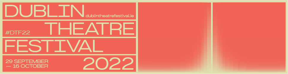
The flexible illustration and type combination formed the basis for all outputs and could be easily adapted across many dimensions, platforms both print and digital. The typographic design echoed and complimented the illustration and the whole campaign truly came to life when animated with kinetic typography.
This element of dynamism was key to creating a cohesive campaign across all platforms from digital screens in Dublin Airport and train stations to television advertising and across the website and social media campaign.
We have been working with Bureau Bonanza for more than 18 months. They have designed all collateral — brochure, posters, advertisements etc for the 2021 and 2022 festival as well as other supporting material. I highly, highly recommend working with them. Rachel and Stina are brilliantly creative, collaborative and dedicated as well as being brilliant communicators and are a pleasure to work with.
Derval Mellett
— Head of Marketing & Development,
Dublin Theatre Festival
Derval Mellett
— Head of Marketing & Development,
Dublin Theatre Festival


2022
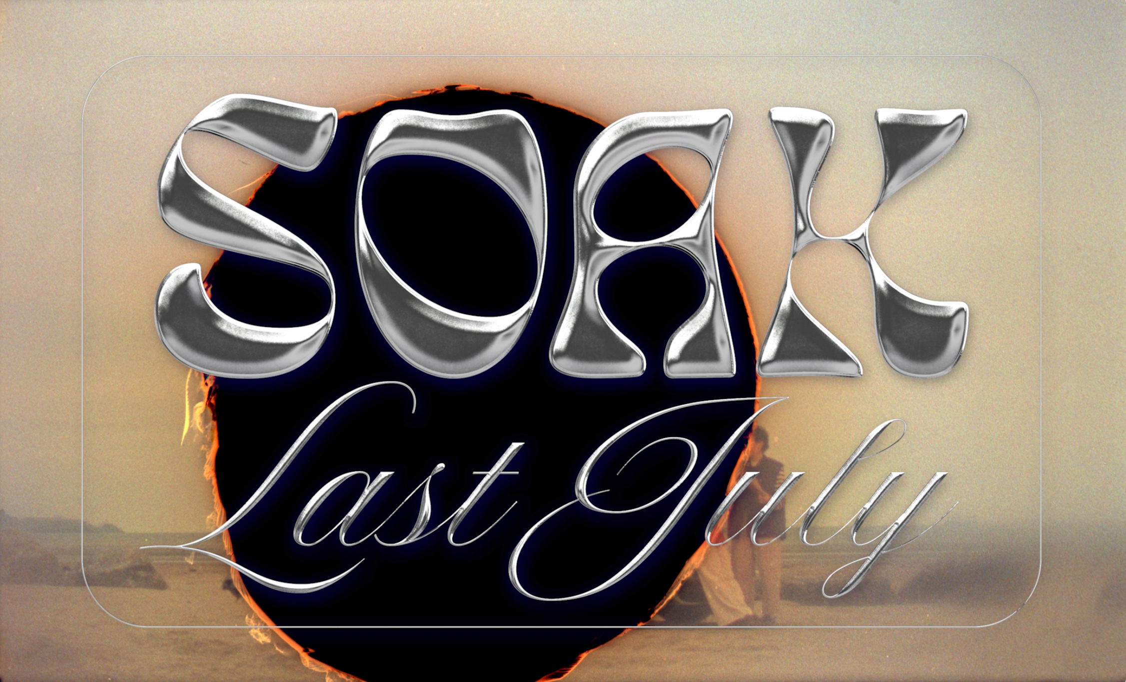
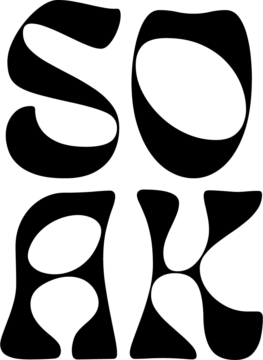
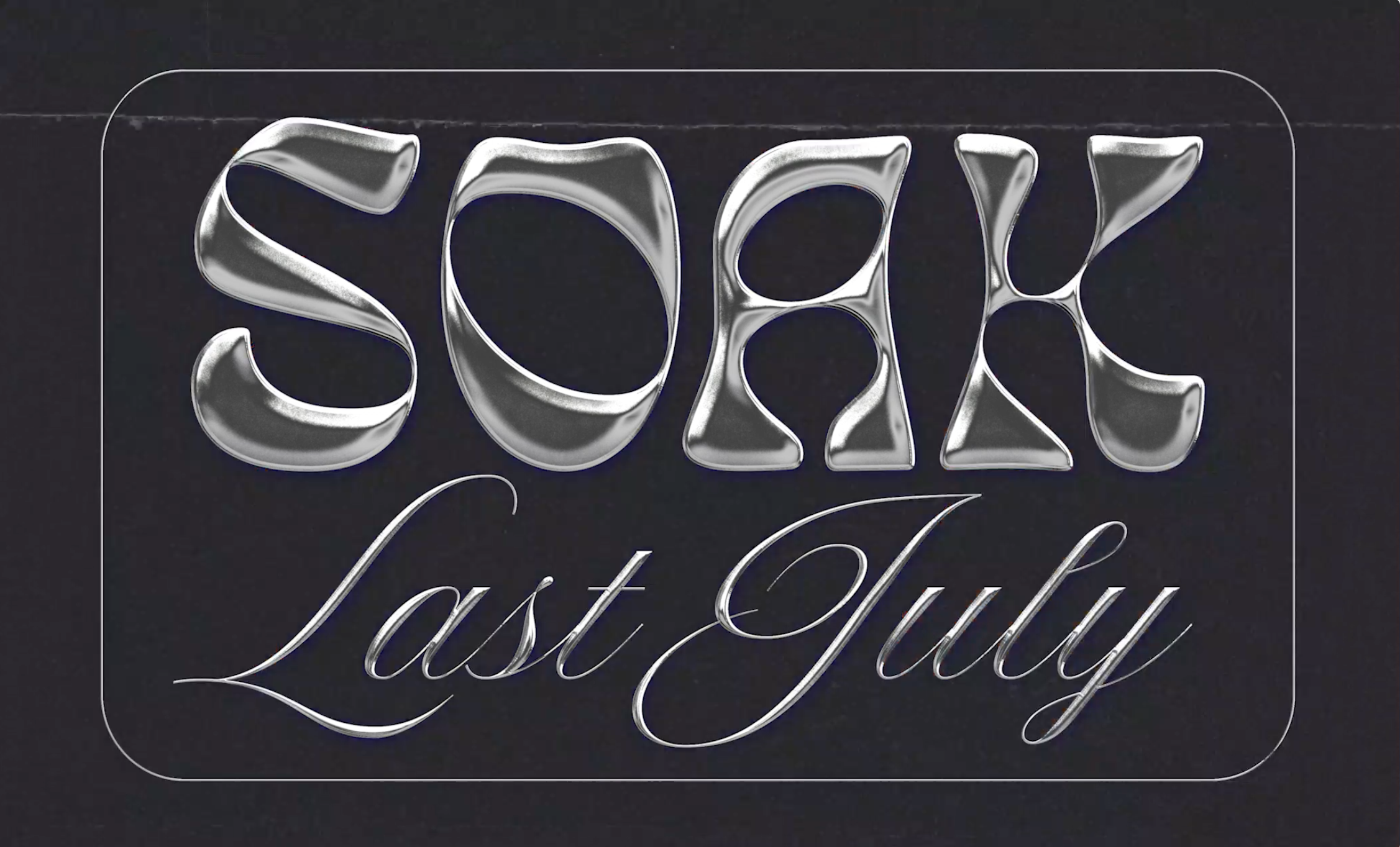
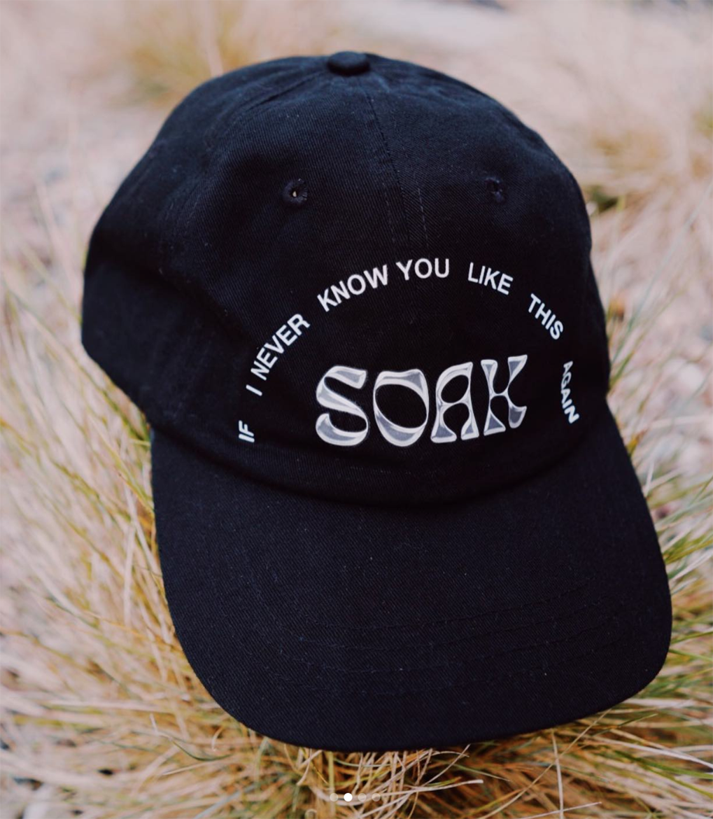
SOAK
Logo Design
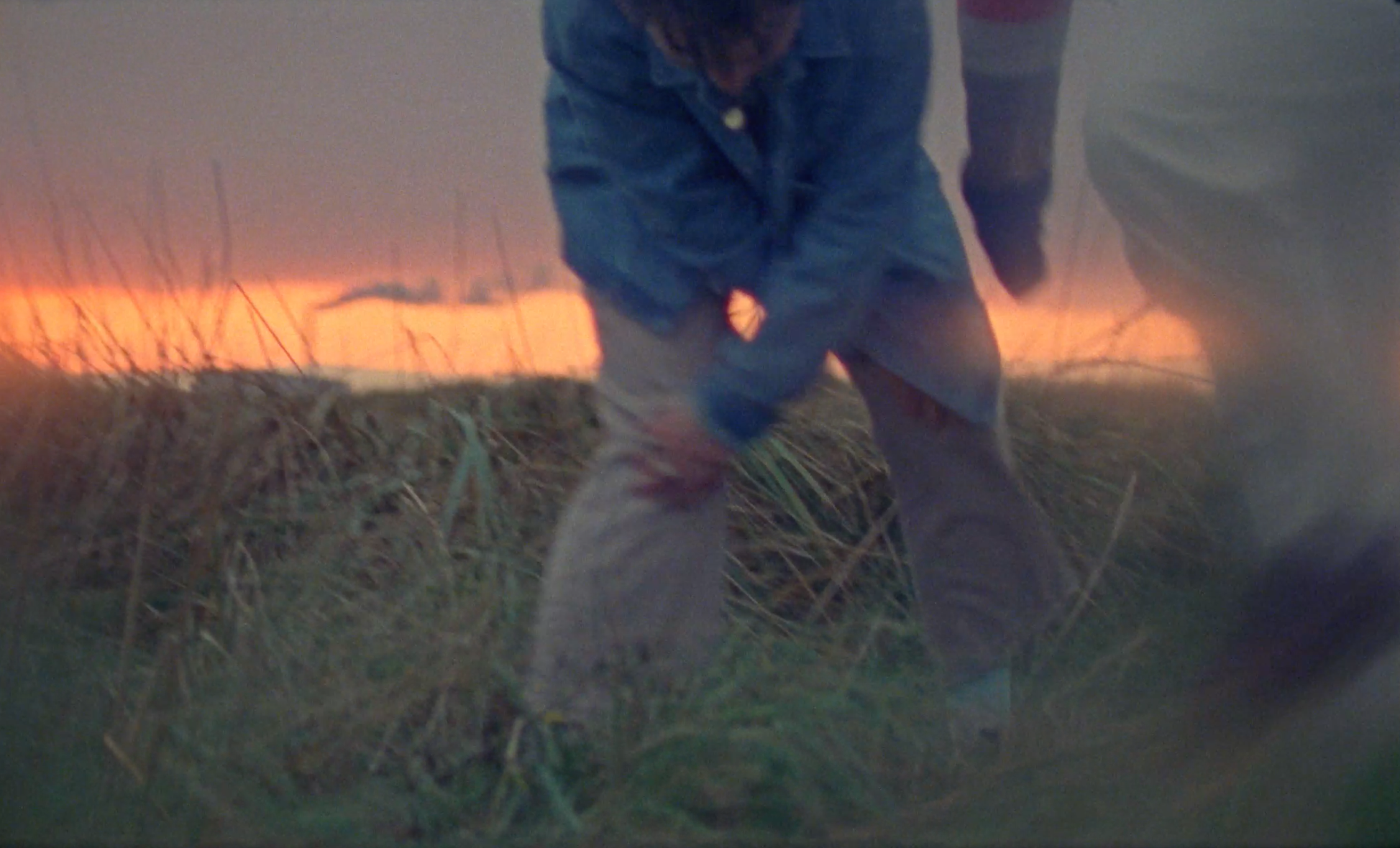
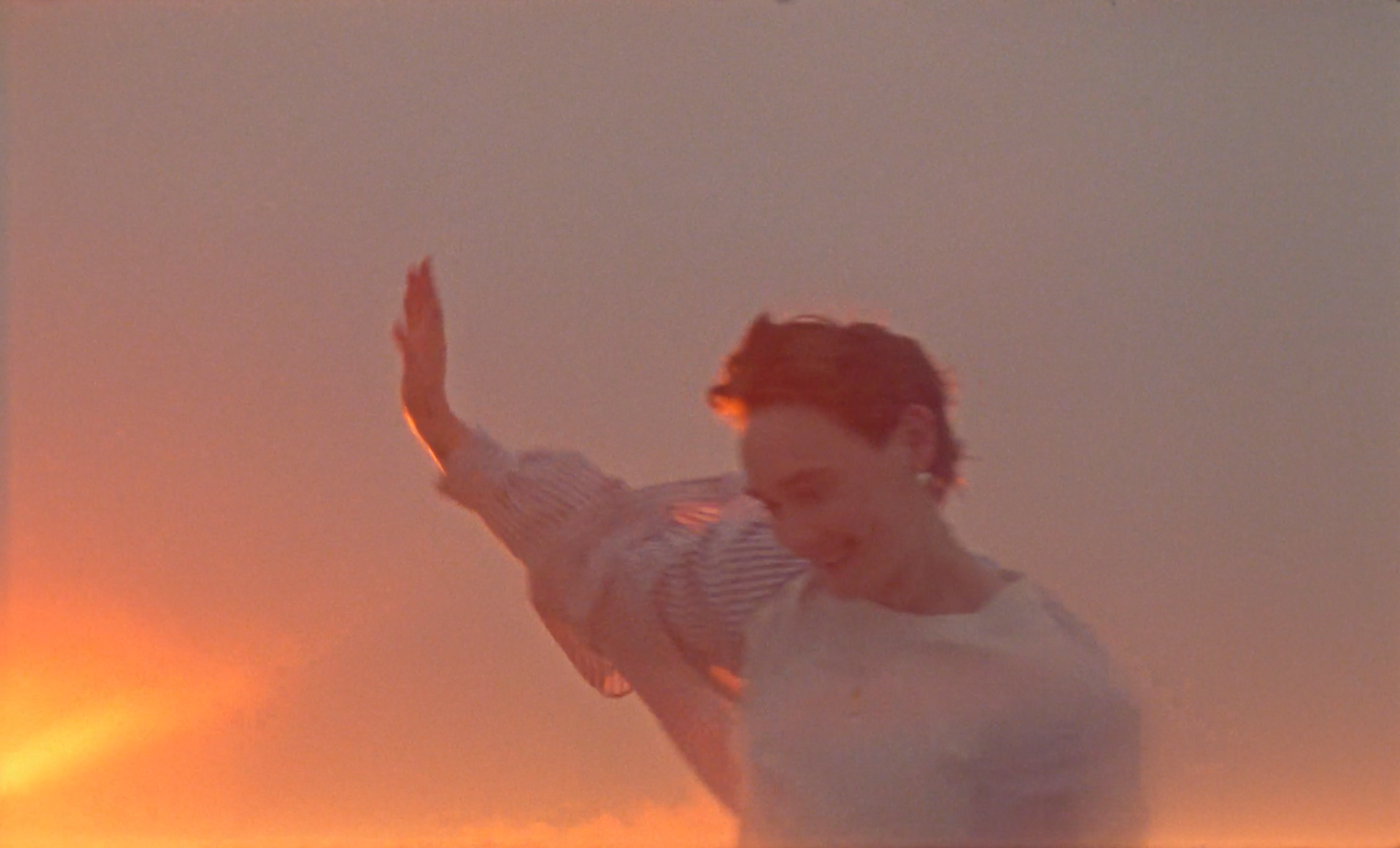
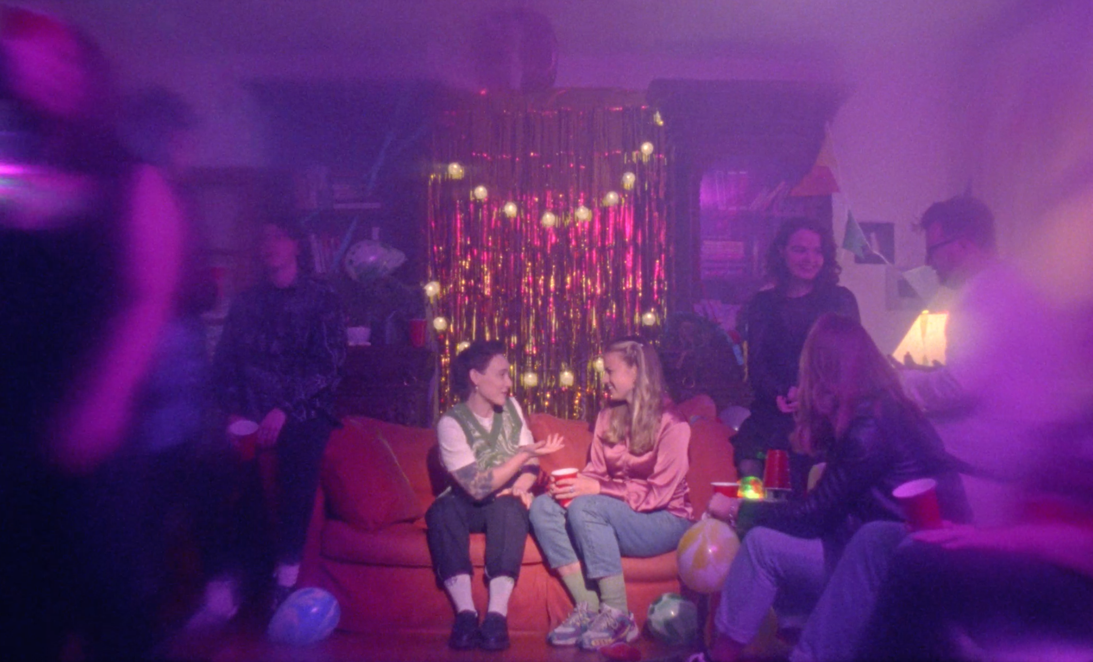
& Film Titles Last July
SOAK // Rough Trade // Ellius Grace // Motherland
![]()
SOAK
Logo Design
& Film Titles Last July
SOAK // Rough Trade // Ellius Grace // Motherland
Client Brief:
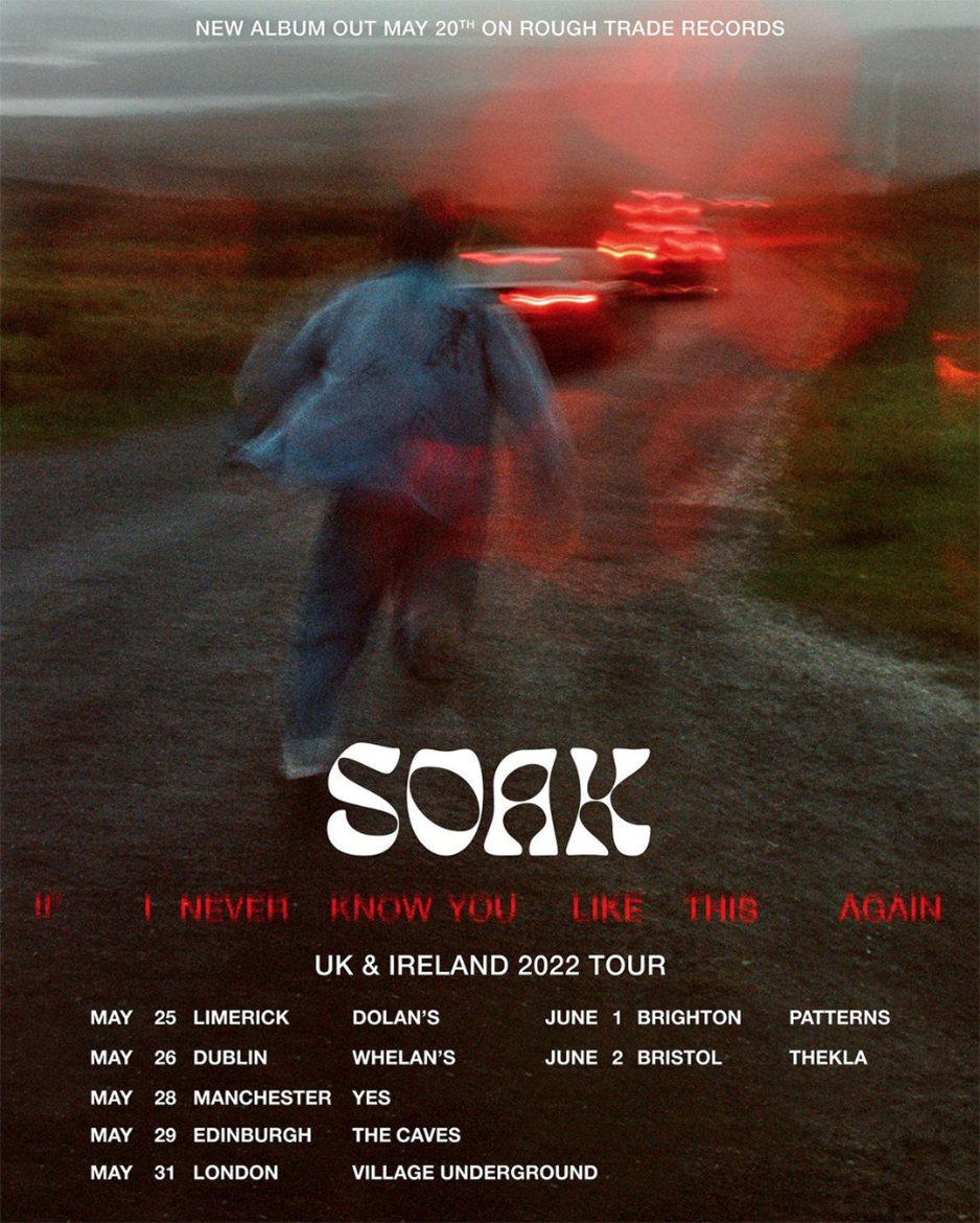
Northern Irish singer-songwriter SOAK approached us to create their new logo to coinside with the release of their third studio album, If I Never Know You Like This Again.
The brief was to switch it up with a new logo and create something kinda pretty but kinda messy at the same time and playful.
As well as the logo, we created the film titles for the video of the first single release from the album, Last July.
Our Response:
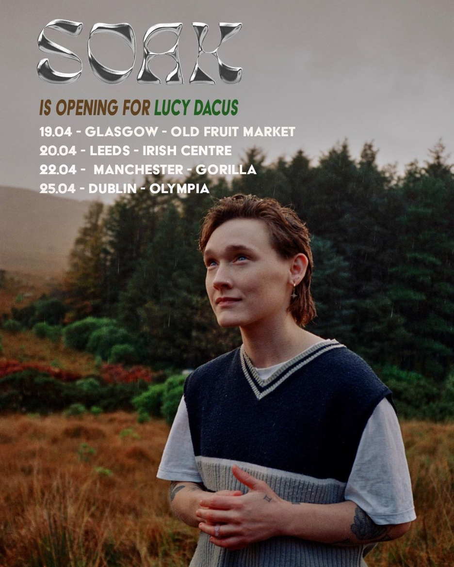
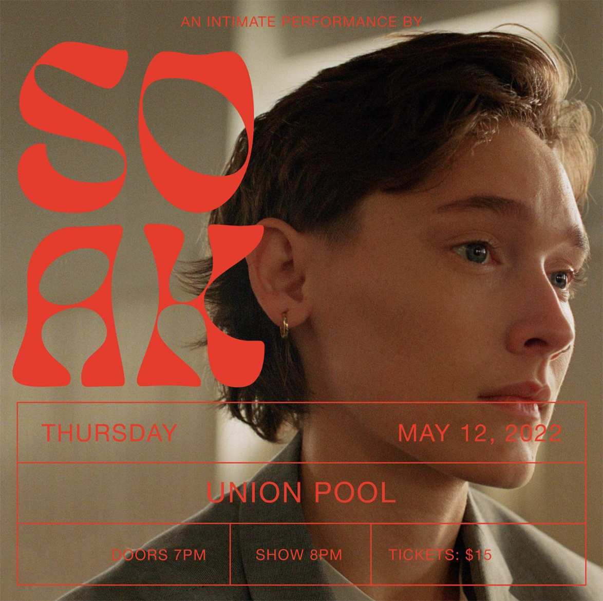
We created a logo that was adaptable for use across many formats, not just the album, but tour posters, merch and of course music videos.
The name ‘Soak’ is a phonetic portmanteau of ‘soul’ and ‘folk.’ To emphasise the folk element, the logo was created using the typeface, Eckmannpsych, a psychedelic version of Eckmannschrift by Otto Eckmann. It seems to be heavily rooted in late sixties and early seventies aesthetics, but it was first published in 1900. We then customised it to soften it and give balance to the soul element.


2021
Client: Dublin Theatre Festival
![]()
Dublin Theatre Festival
Campaign Identity 2021
Campaign Identity 2021
Client: Dublin Theatre Festival
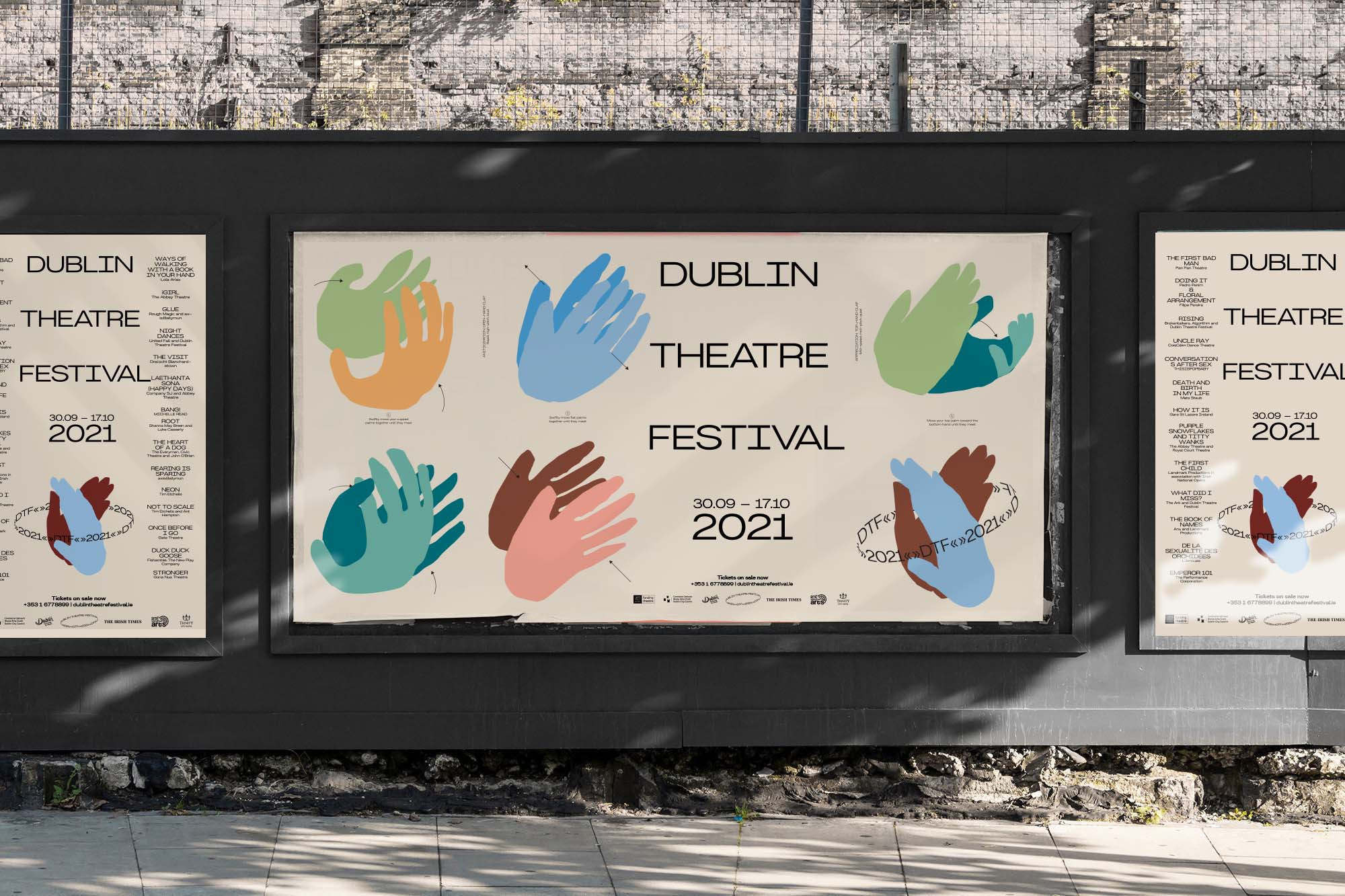
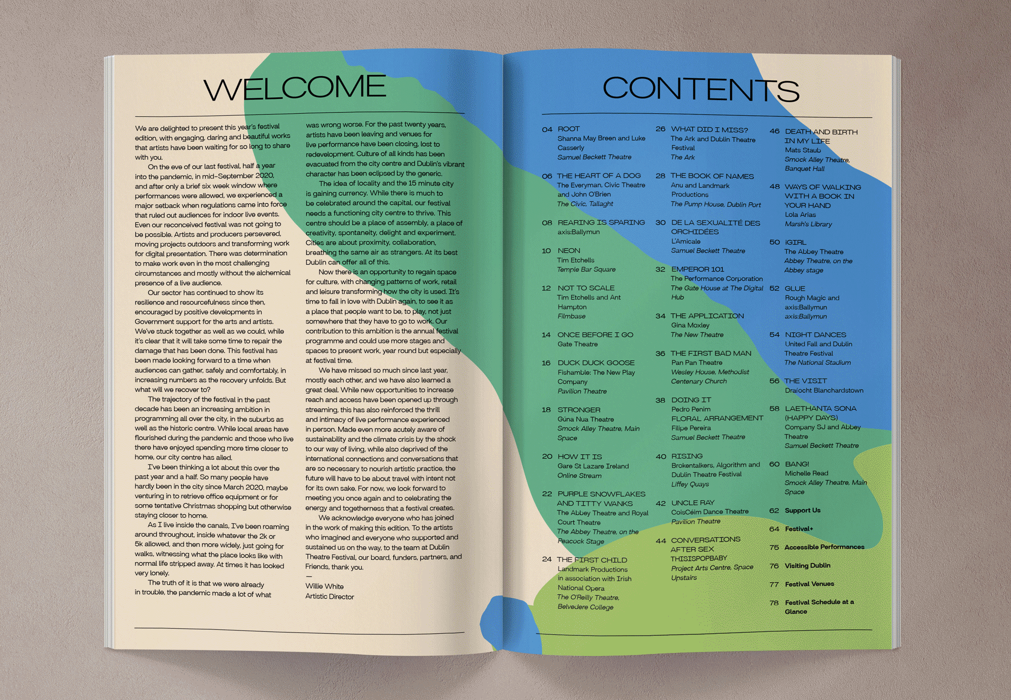
In 2021 Dublin Theatre Festival hoped to welcome their audience back to theatre post-Covid while also develop points of entry for new, more diverse audience. They wanted a visually striking campaign, instantly recognisable, that would reinforce the vital role of theatre in society.
As theatre has faced a shutdown we looked back at when the industry went dark before, and remembered what happened next. After the first world war, global recession and Spanish flu, there followed an era of social, artistic and cultural dynamism remembered as the Roaring 20s or Les Annes folles “the crazy years.”
We wanted the 2021 campaign to emphasise this potential of theatre to return with a new energy and optimism that included everyone after this collective trauma. We are at the very beginning of a new historically important cultural era, so we asked, are you going to be part of it?
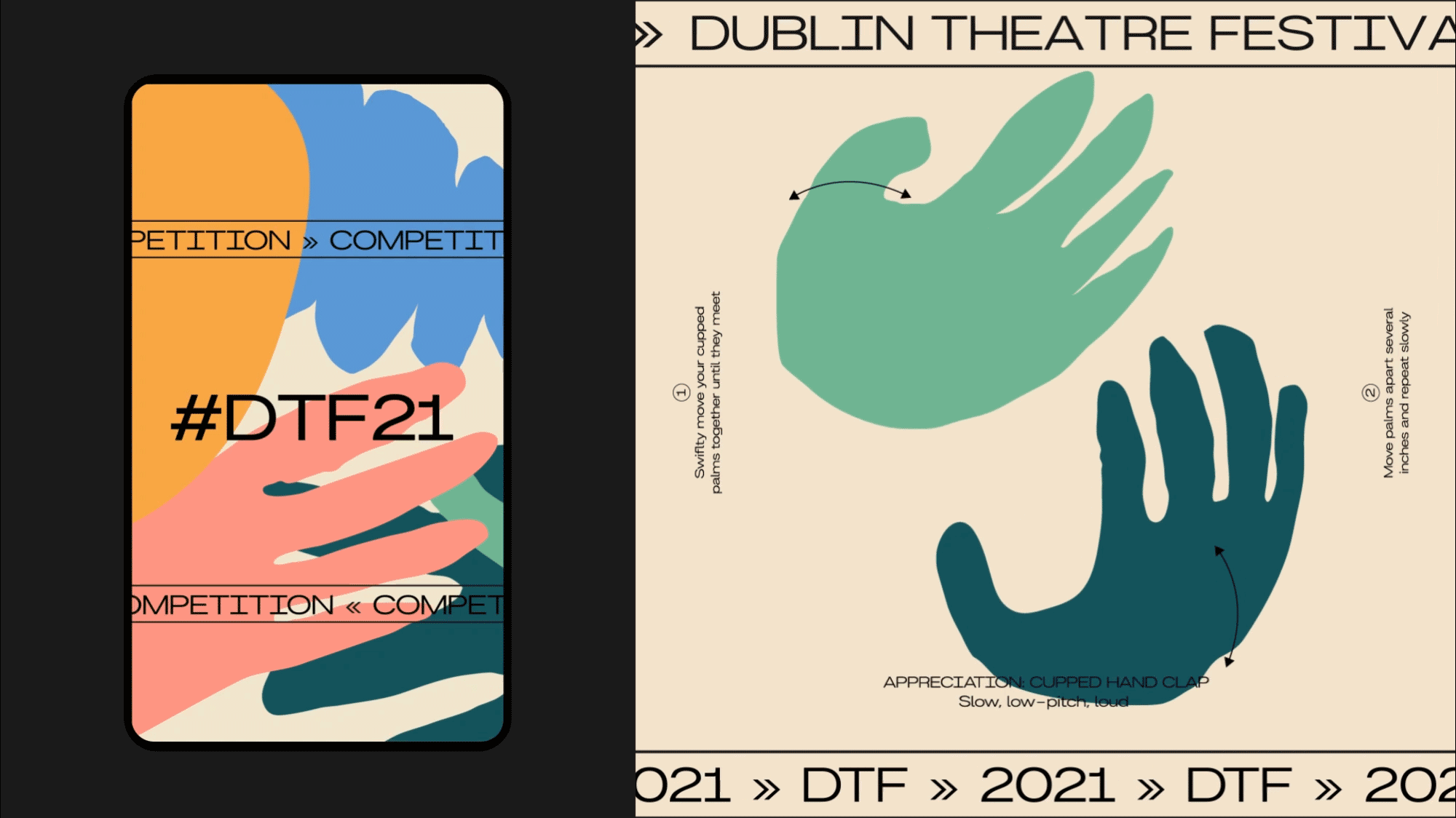
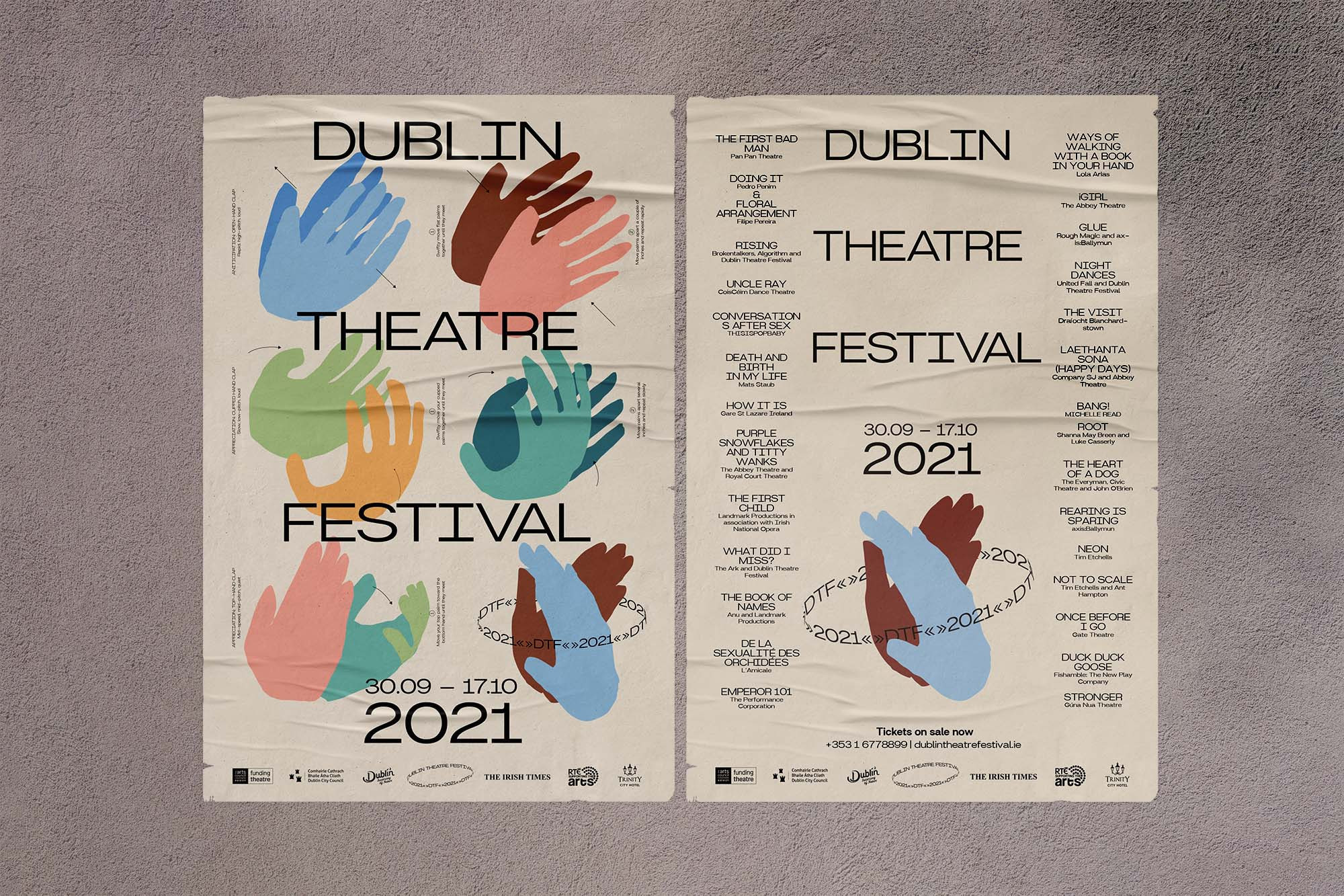
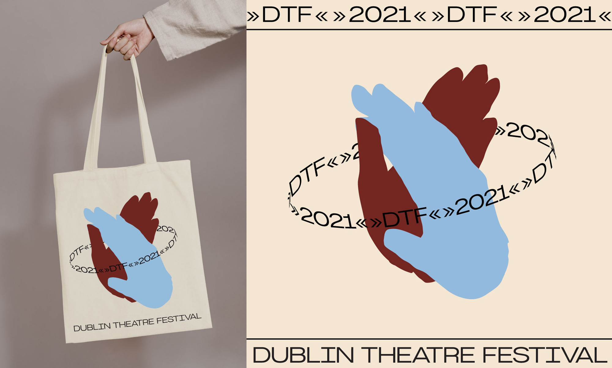
What is unique about live theatre is the parity between audience and production. The role of the audience member is instrumental both in the anticipation and appreciation of the production. We created a set of hand instructions for theatre goers upon their return to the venues, just incase they’d forgotten ‘How to Clap’. While the images of the clapping hands are encouraging audiences new and old, its also a playful nod to the collective experience of hand-washing instruction-signs during the pandemic.
The 2021 campaign was developed around these colourful illustrations of clapping instructions to work in tandem with production images and information across all applications.
The 2021 campaign was developed around these colourful illustrations of clapping instructions to work in tandem with production images and information across all applications.
We have been working with Bureau Bonanza for more than 18 months. They have designed all collateral — brochure, posters, advertisements etc for the 2021 and 2022 festival as well as other supporting material. I highly, highly recommend working with them. Rachel and Stina are brilliantly creative, collaborative and dedicated as well as being brilliant communicators and are a pleasure to work with.
Derval Mellett
— Head of Marketing & Development,
Dublin Theatre Festival
Derval Mellett
— Head of Marketing & Development,
Dublin Theatre Festival


2021
![]()
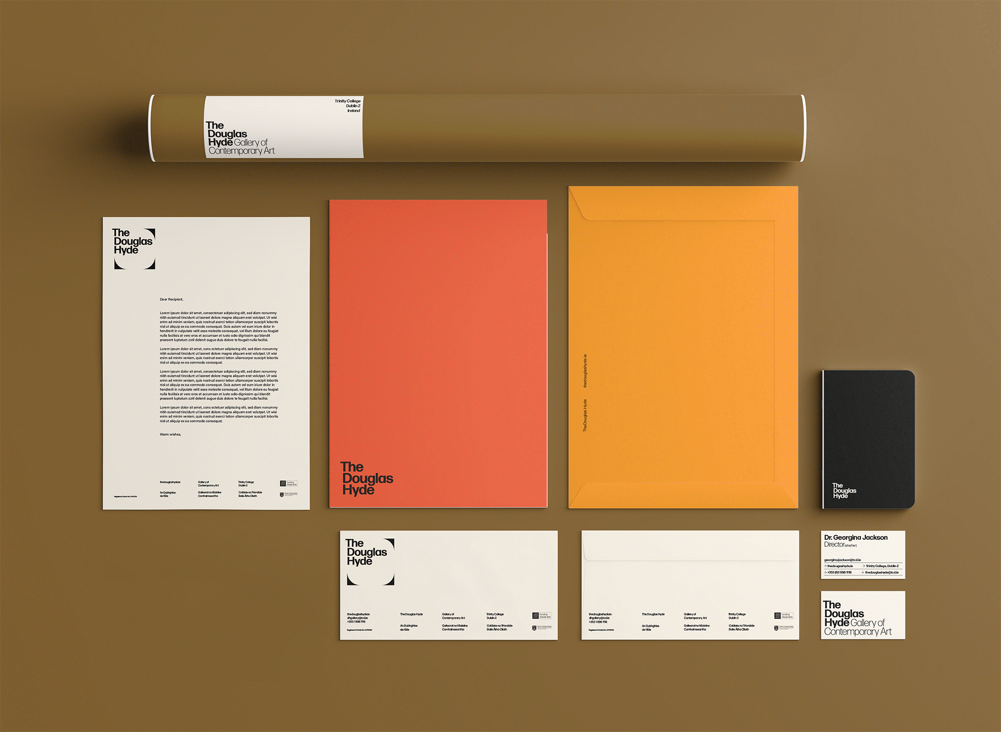
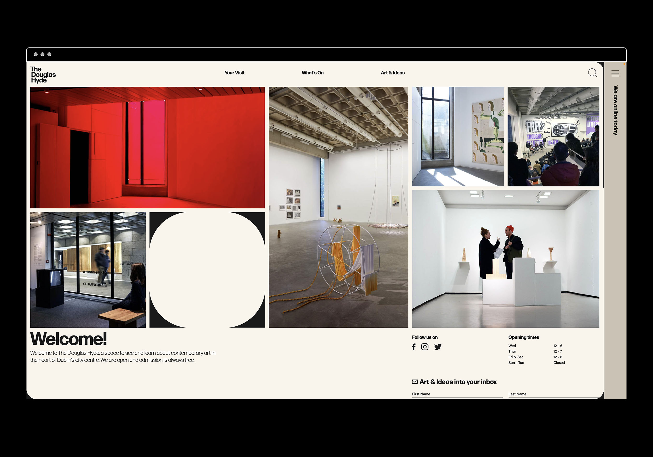
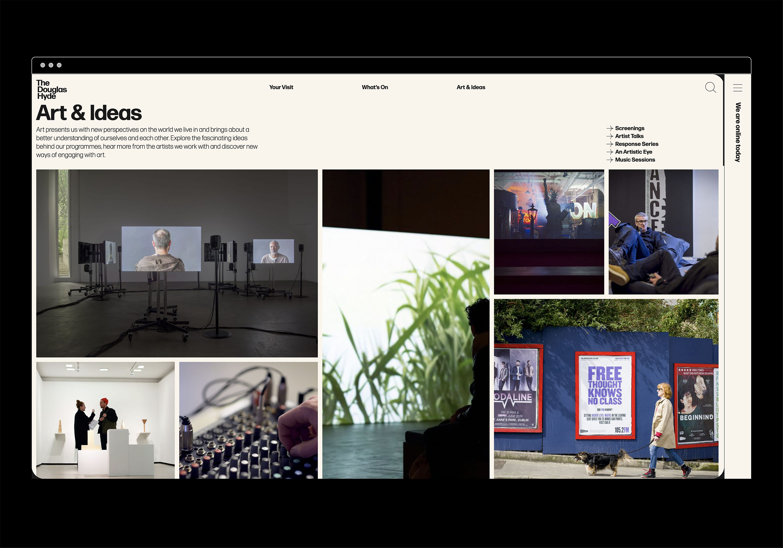
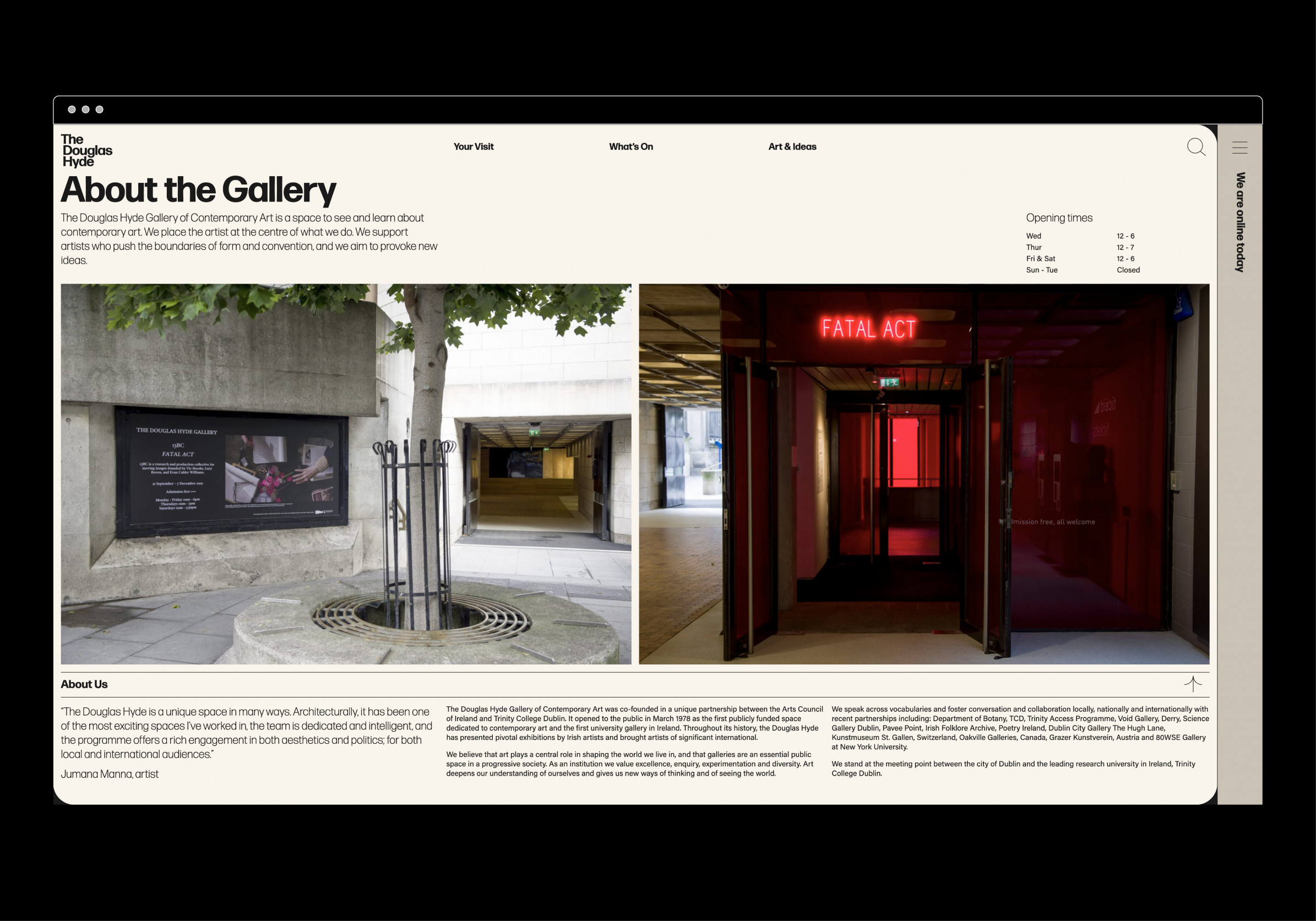
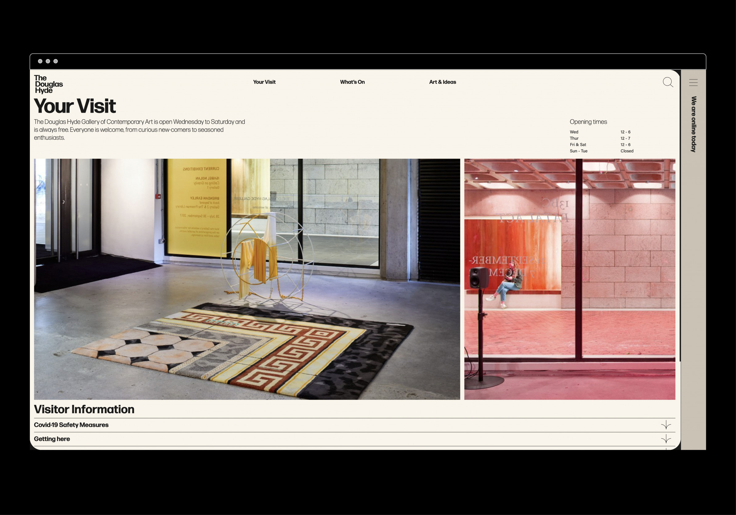
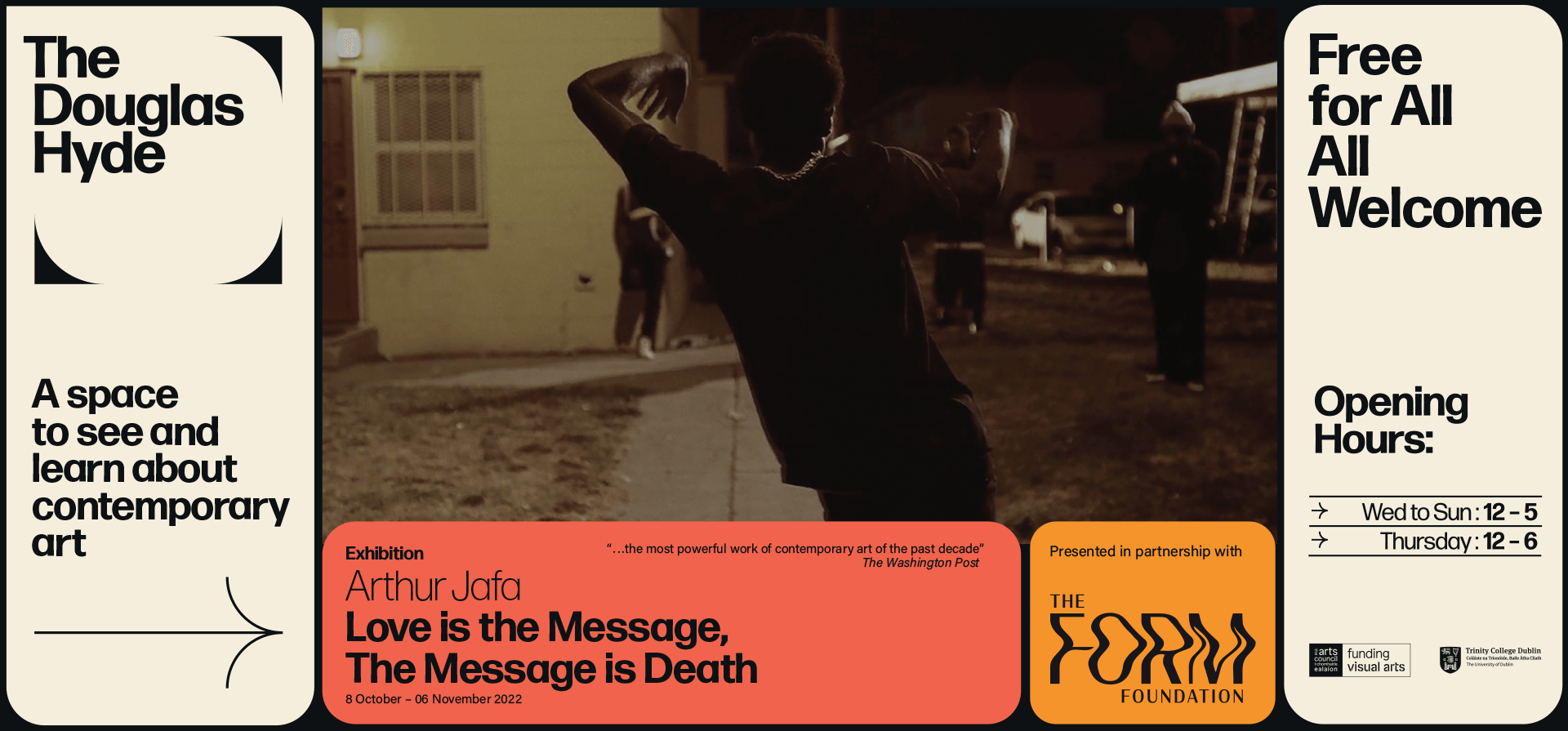
The Douglas Hyde
Brand Identity & Website Design
thedouglashyde.ie
Client: The Douglas Hyde
Developer: Alex Bradley
Winner
IDI Universal Design
Special Awards
![]()
Brand Identity & Website Design
thedouglashyde.ie
Client: The Douglas Hyde
Developer: Alex Bradley
Winner
IDI Universal Design
Special Awards
Client Brief:
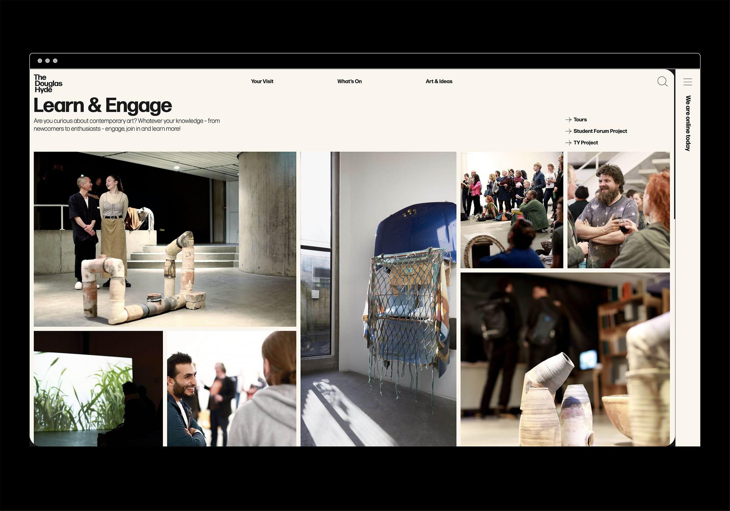
Challenges that most contemporary art galleries struggle with have to do with accessibility and how to bring conversations about art to larger and non-traditional audiences. With this rebrand and website project we needed to create an accessible and friendly design that welcomes new engagement and does away with any perceived intimidation whilst still maintaining the intellectual reputation of the gallery.
Challenges that most contemporary art galleries struggle with have to do with accessibility and how to bring conversations about art to larger and non-traditional audiences. With this rebrand and website project we needed to create an accessible and friendly design that welcomes new engagement and does away with any perceived intimidation whilst still maintaining the intellectual reputation of the gallery.
Our Response:
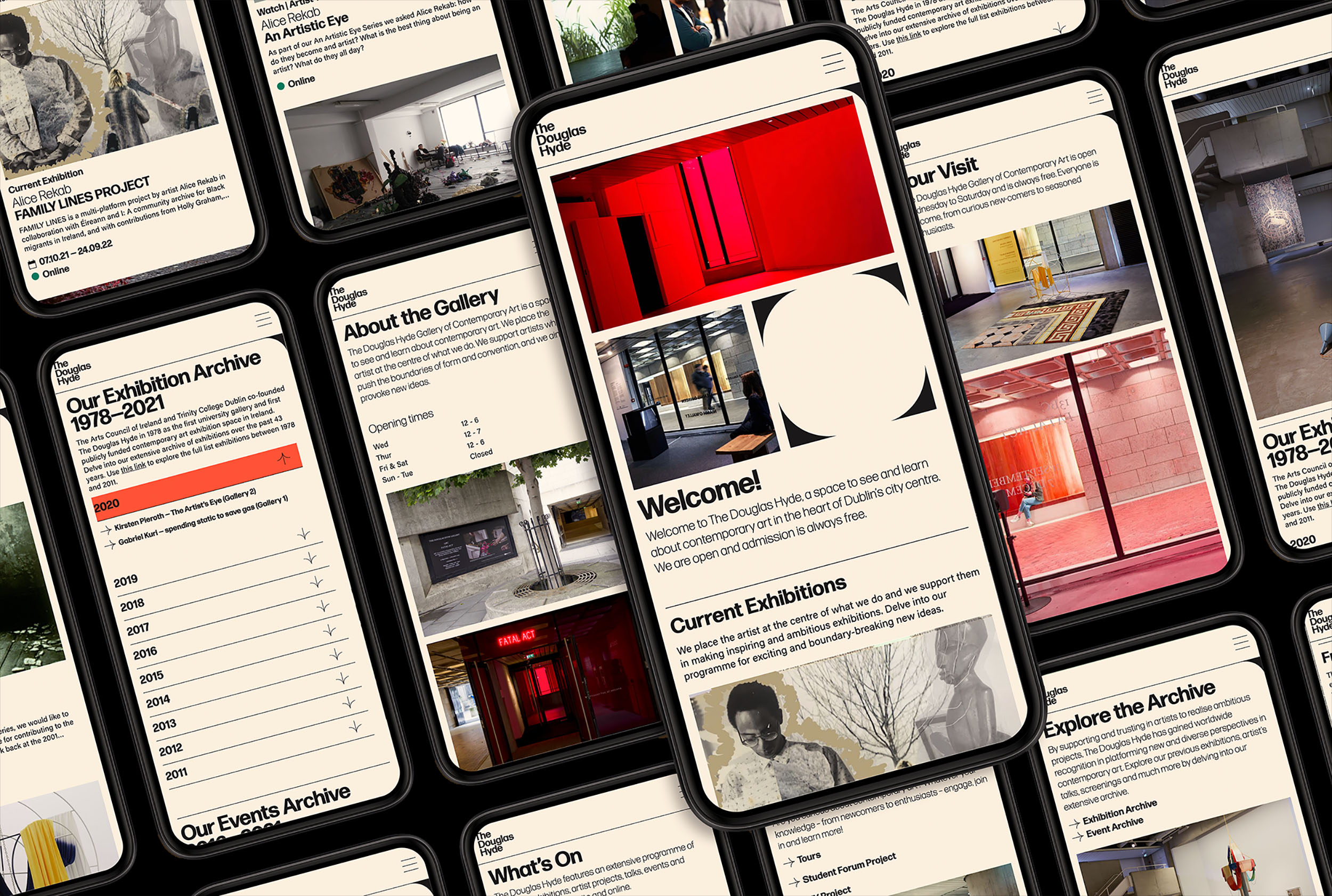
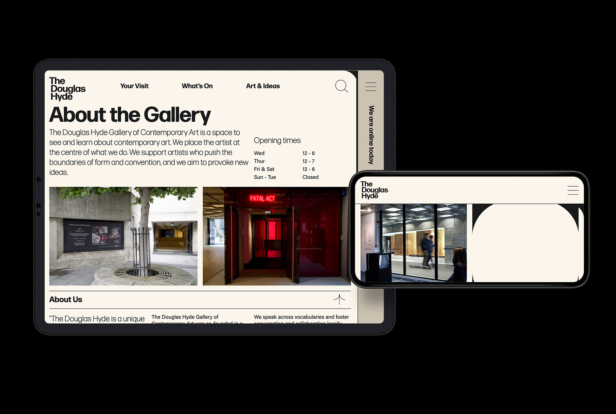
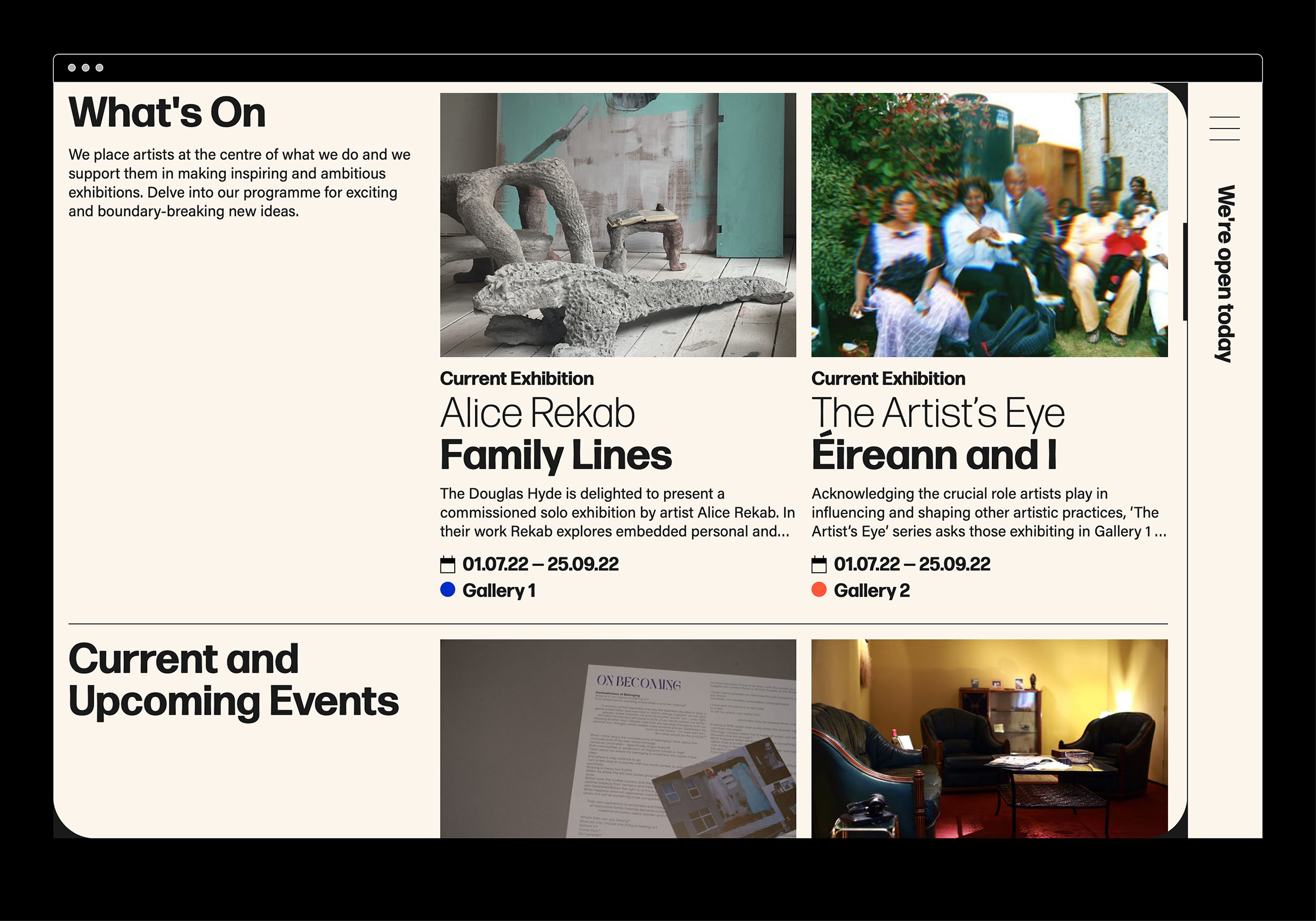
The website and all other communications platforms needed a clear editorial structure that allows for tiered levels of engagement with an information system using headings, sub-heads, introductory paragraph-styles, ‘read more’ tags etc. going from engaging and welcoming to descriptive and informative to academic and critical.
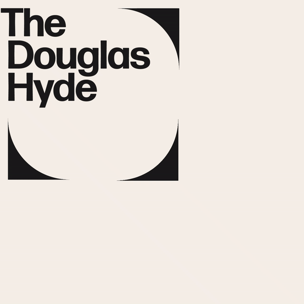
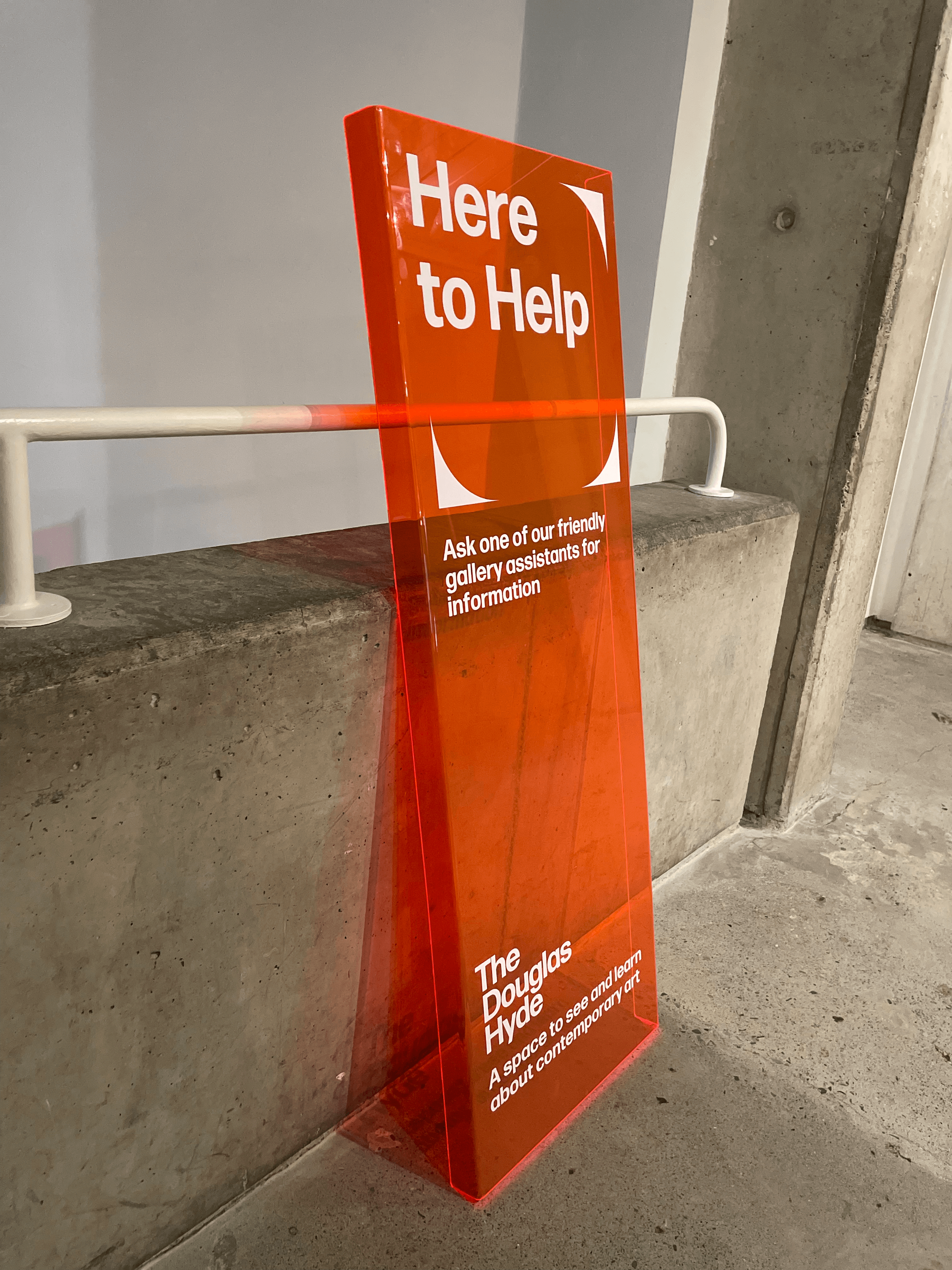
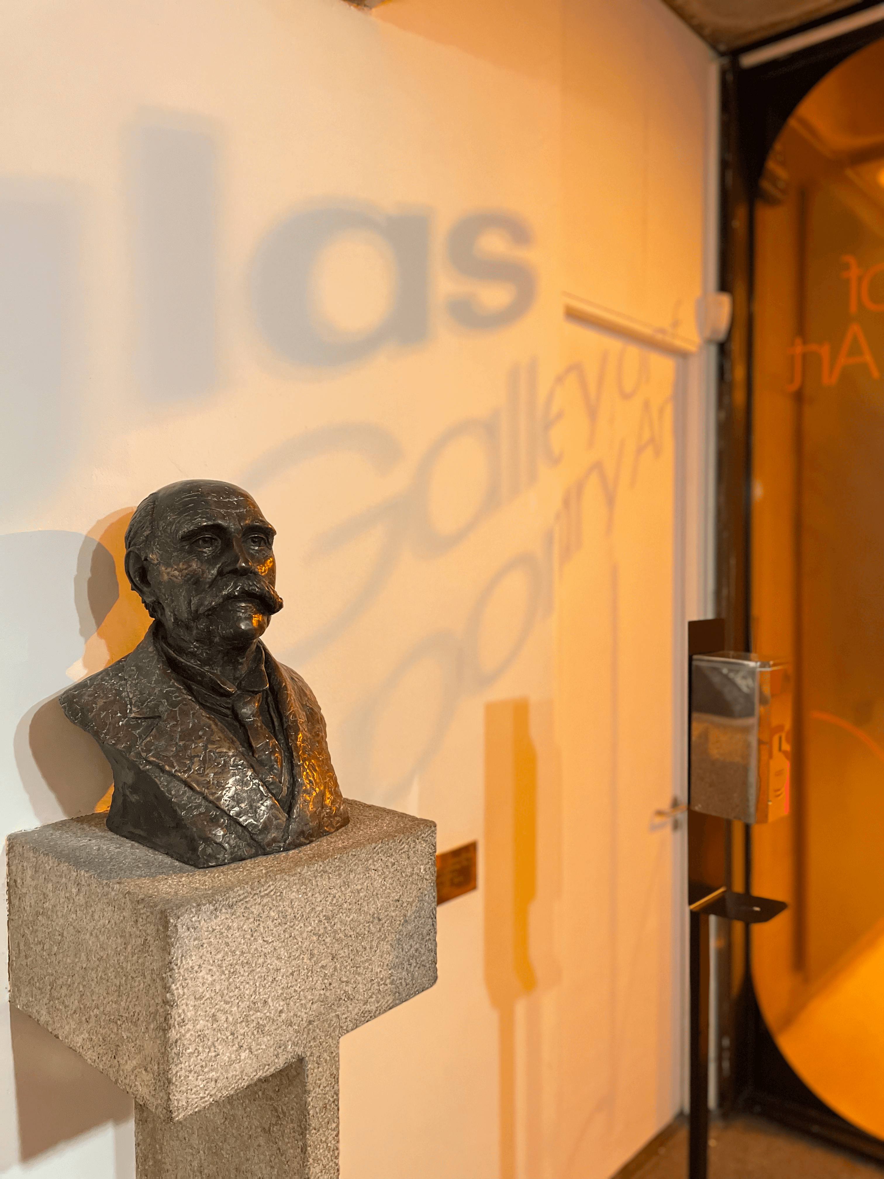
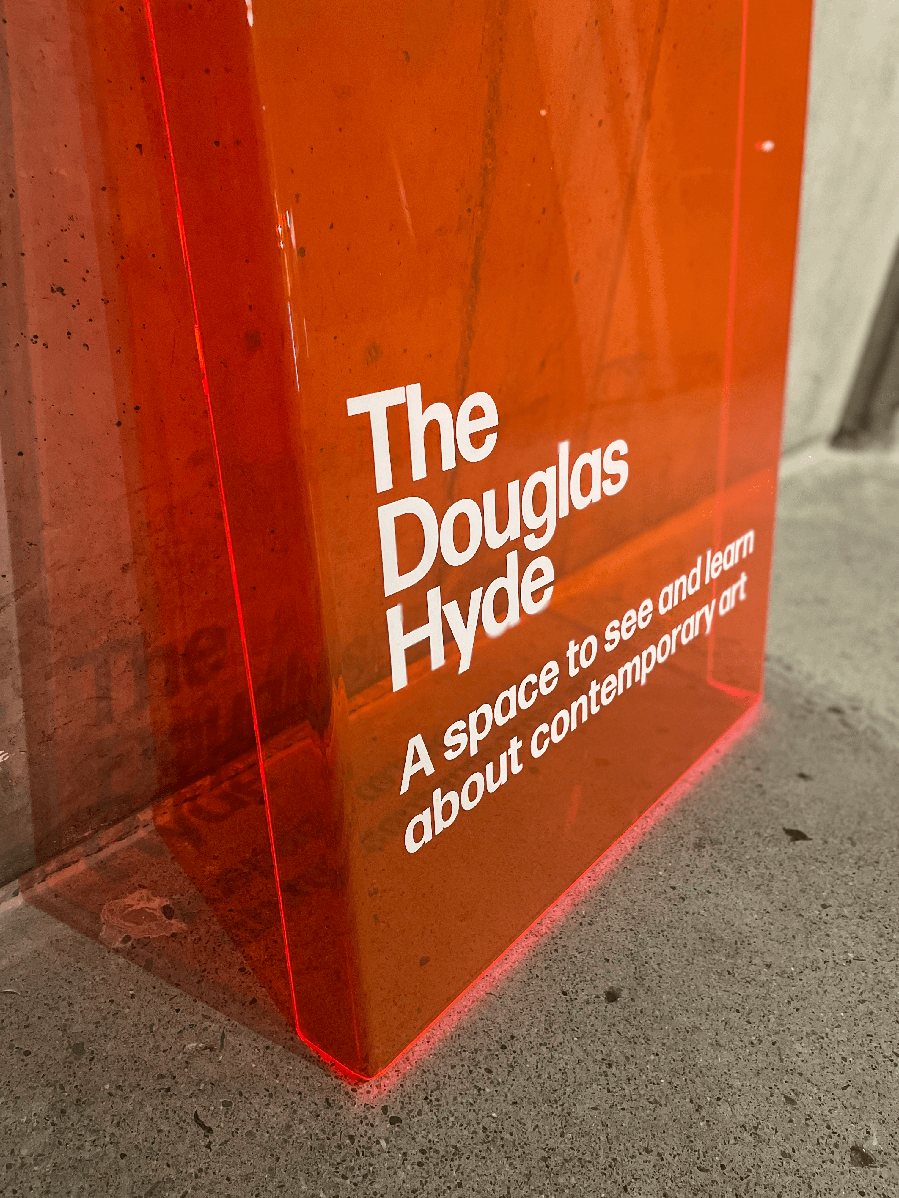
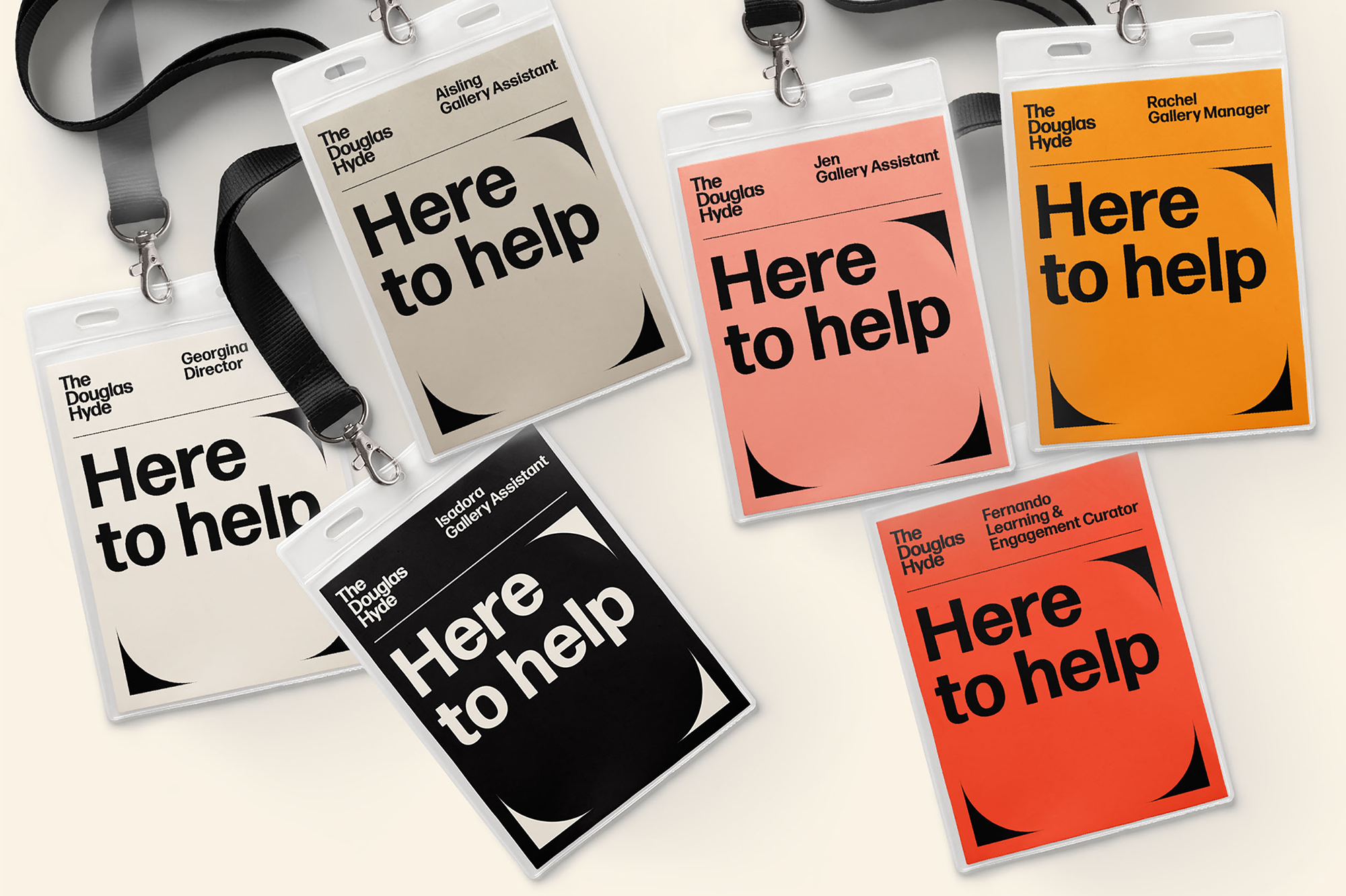
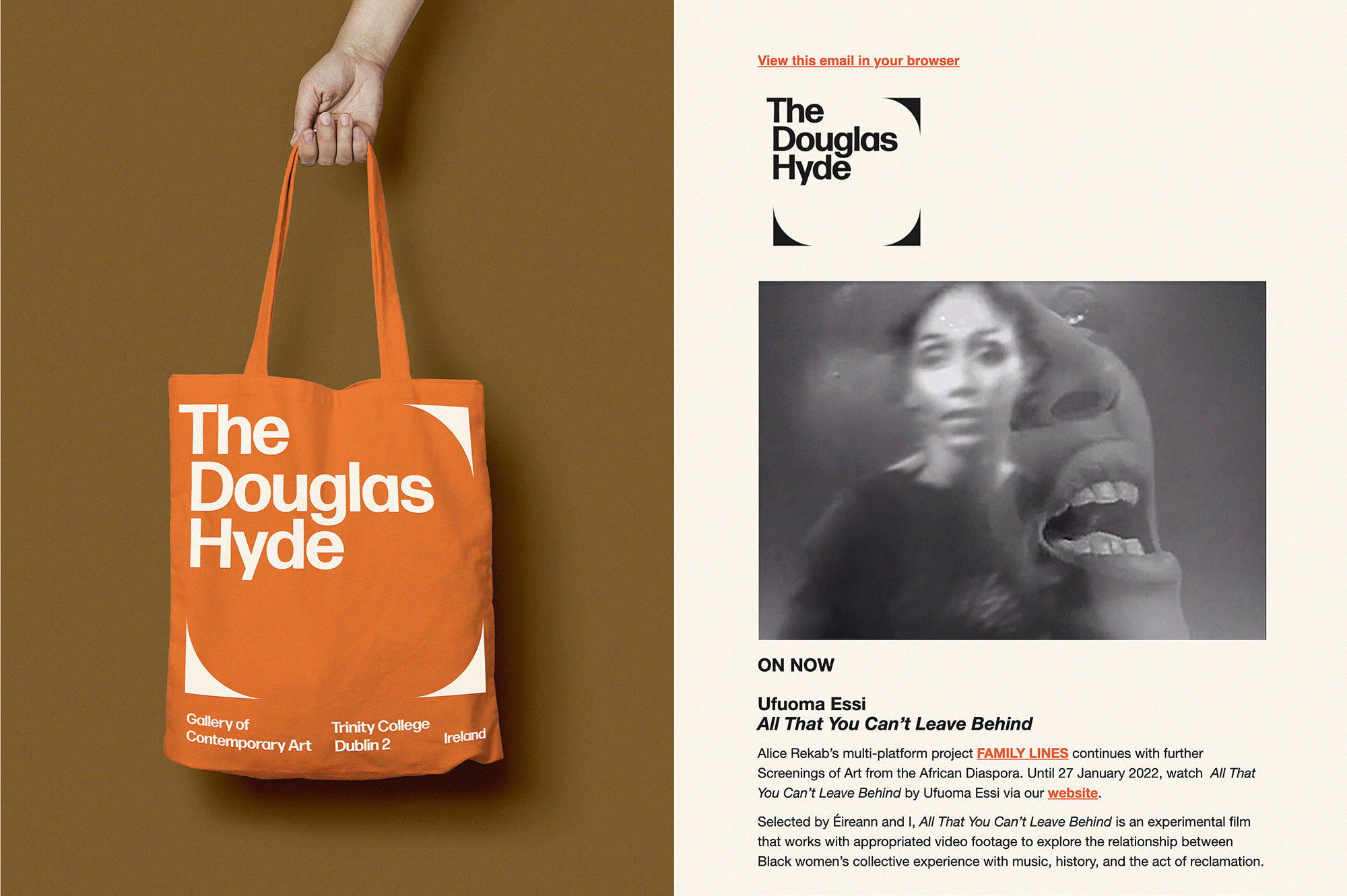
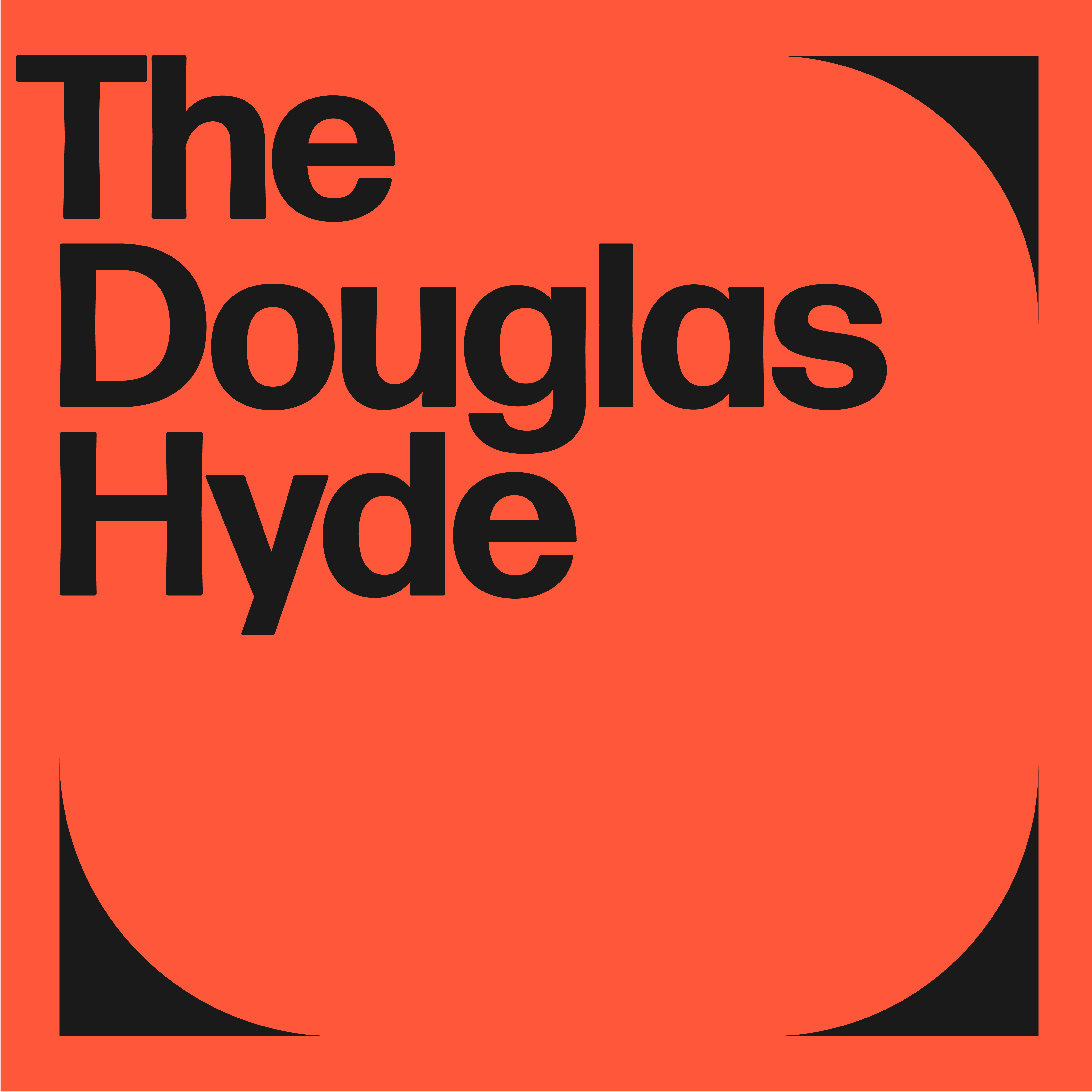
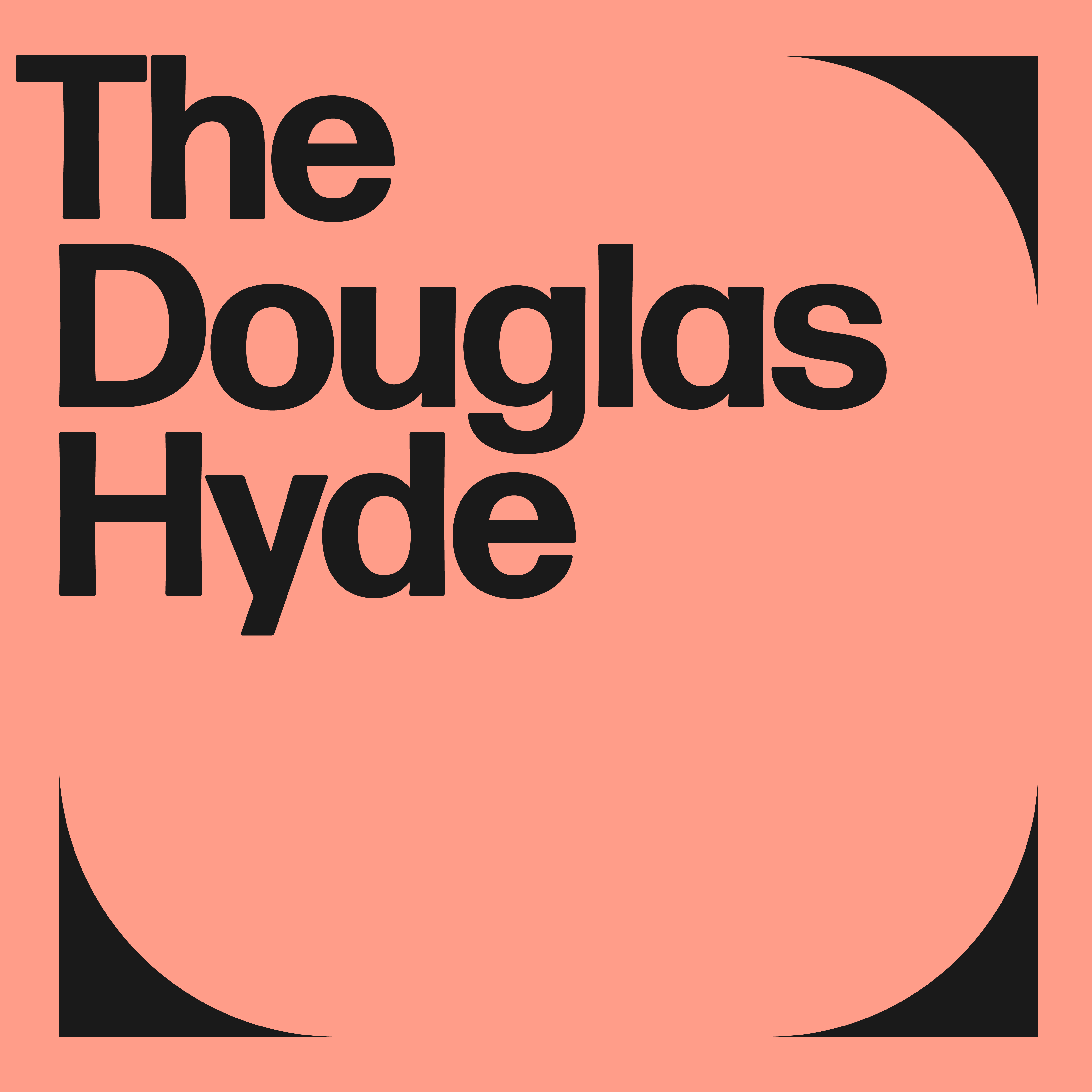
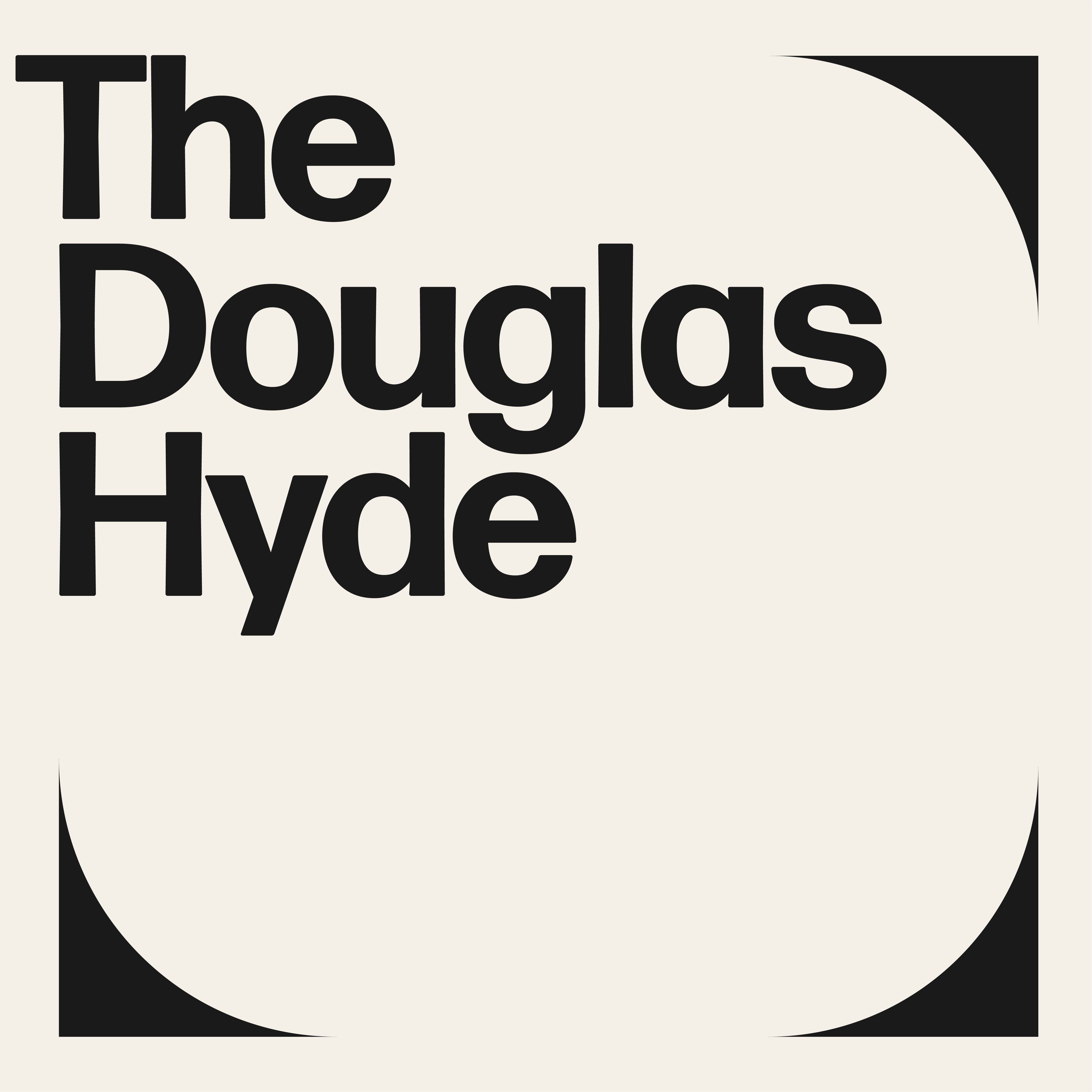
A gallery in essence is an architectural space, thus the design was inspired by aspects of its architectural features. The concrete ceiling of the gallery and the Trinity Arts Block became the catalyst for the logo and subsequently the brand identity and look and feel of the website. The rounded shape of the ceiling cells create a tension between sharpness and smoothness and of the negative and positive space.
We worked closely with Learning & Engagement Curator of The Douglas Hyde, Fernando Sánchez-Migallón Cano and developer, Alex Bradley, to achieve a universal design. This included working with Knowbility to ensure the finished design was accessible to a wide range of people regardless of their age, size, ability or disability.
Through deconstructing and multiplying the mark and re-assembling the fragments of the original form, we developed a dynamic and modular system of symbols, icons and framing devices. The display type face (Forma) echoes that same tension between sharpness and smoothness whilst being high in contrast, legibility and character. Wanting to avoid the white cube aesthetic the colour scheme is led by a ‘muted’ charcoal black and warm off white that can be combined with the warm colours that compliments the grey concrete.
The website and all other communications platforms needed a clear editorial structure that allows for tiered levels of engagement with an information system using headings, sub-heads, introductory paragraph-styles, ‘read more’ tags etc. going from engaging and welcoming to descriptive and informative to academic and critical.
A gallery in essence is an architectural space, thus the design was inspired by aspects of its architectural features. The concrete ceiling of the gallery and the Trinity Arts Block became the catalyst for the logo and subsequently the brand identity and look and feel of the website. The rounded shape of the ceiling cells create a tension between sharpness and smoothness and of the negative and positive space.
We worked closely with Learning & Engagement Curator of The Douglas Hyde, Fernando Sánchez-Migallón Cano and developer, Alex Bradley, to achieve a universal design. This included working with Knowbility to ensure the finished design was accessible to a wide range of people regardless of their age, size, ability or disability.
Through deconstructing and multiplying the mark and re-assembling the fragments of the original form, we developed a dynamic and modular system of symbols, icons and framing devices. The display type face (Forma) echoes that same tension between sharpness and smoothness whilst being high in contrast, legibility and character. Wanting to avoid the white cube aesthetic the colour scheme is led by a ‘muted’ charcoal black and warm off white that can be combined with the warm colours that compliments the grey concrete.
We worked with Bureau Bonanza on the rebranding and new website for The Douglas Hyde Gallery in Dublin in 2021 and continue to work with them. From the start of the rebranding process, with the critical questions they asked and the informative workshops that they held, to our exciting new logo (tracing to our iconic architecture), our attractive orange signage and throughout the work we do with them, Rachel and Stina bring innovation, creativity and curiosity to everything. Their rebranding and website redesign has been transformative for the organisation presentating a new image for the Gallery; one that is exciting, open, dynamic, and reflective of our vision and strategic goals. Our online content and archive are accessible and appealing to a wider audience, delivering active engagement with our programming in locally, nationally and internationally. Bureau Bonanza are fantastic, a joy to work with, and the end results surpass all expectations, I could not recommend them more highly!
—Georgina Jackson, Director, The Douglas Hyde


2021
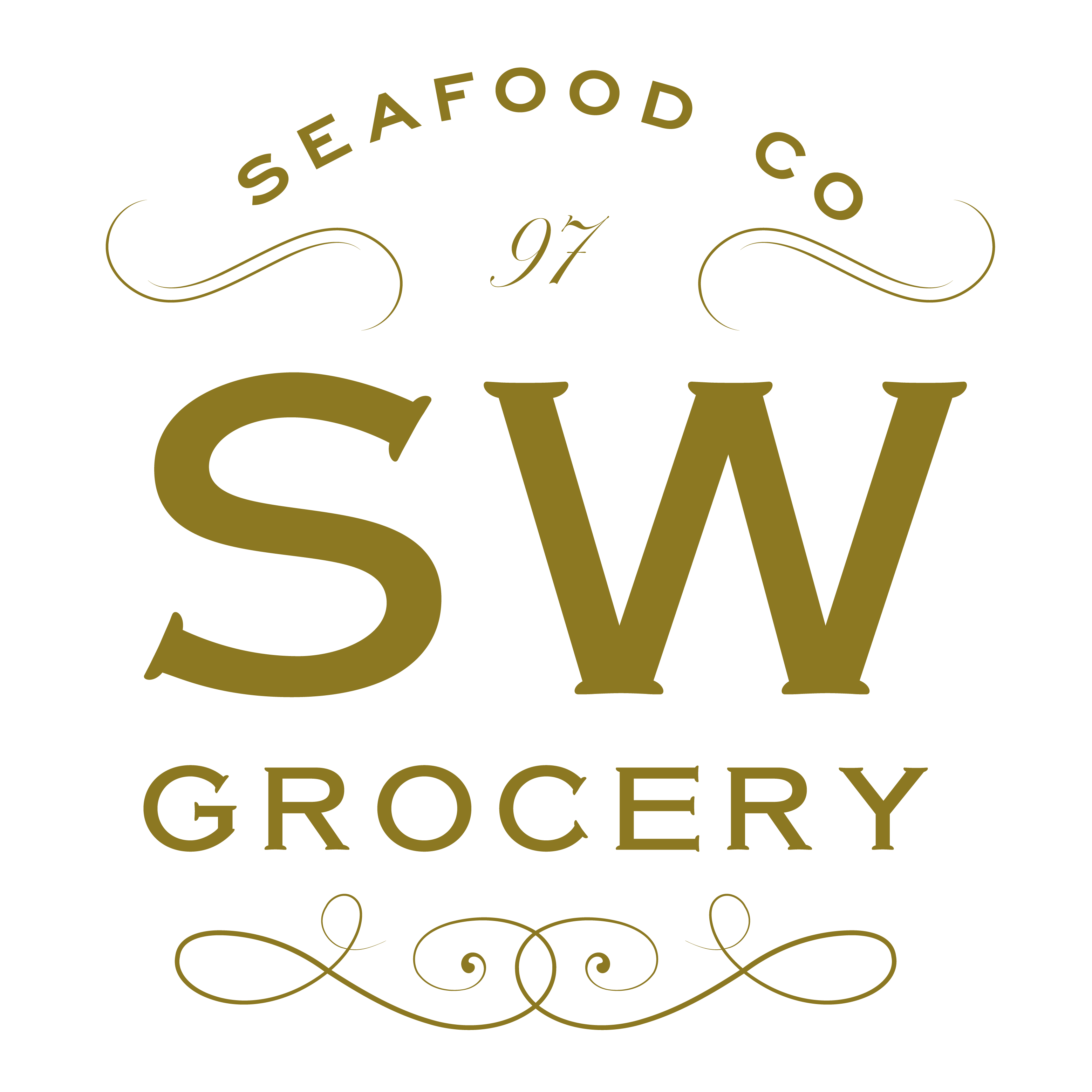
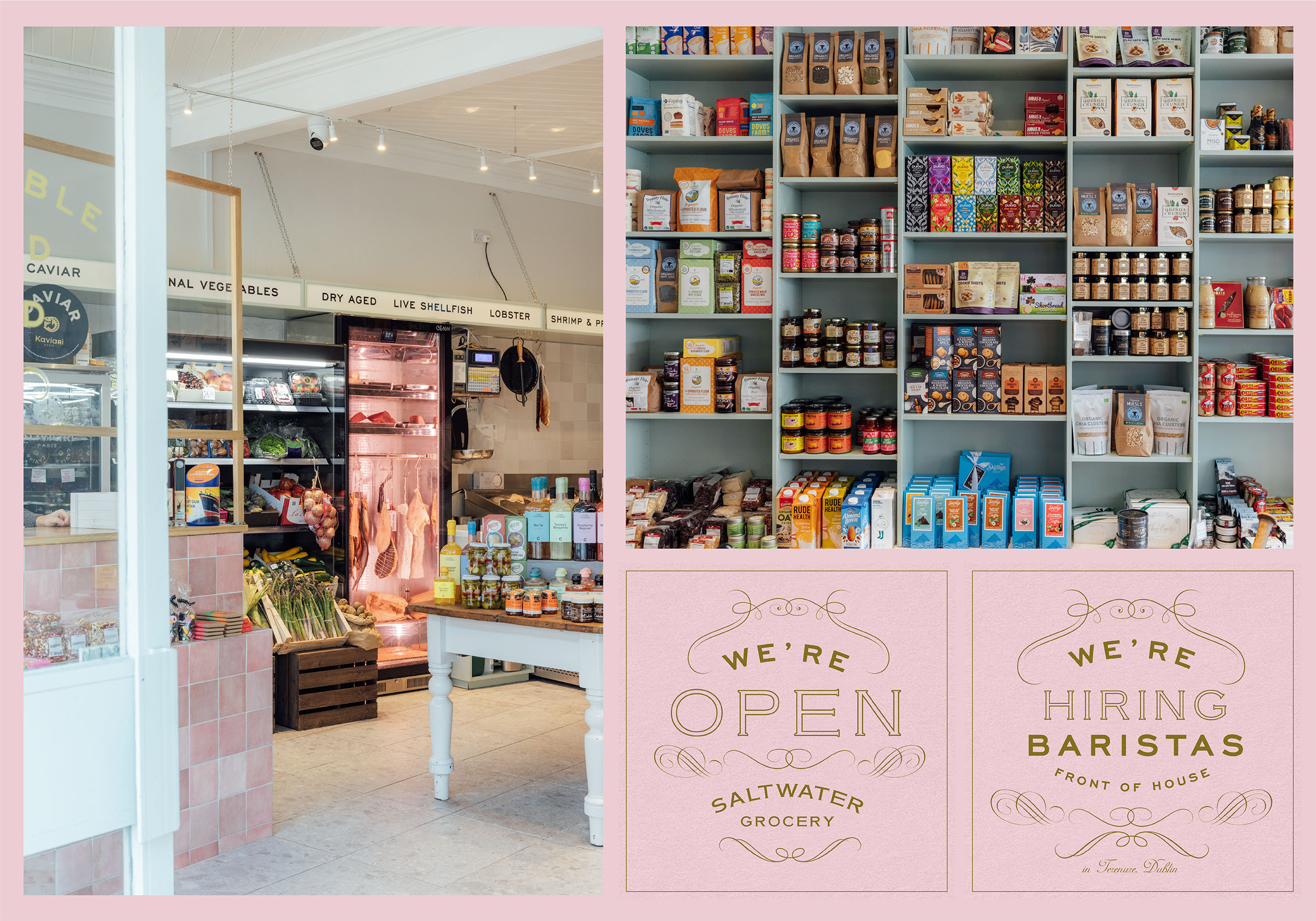
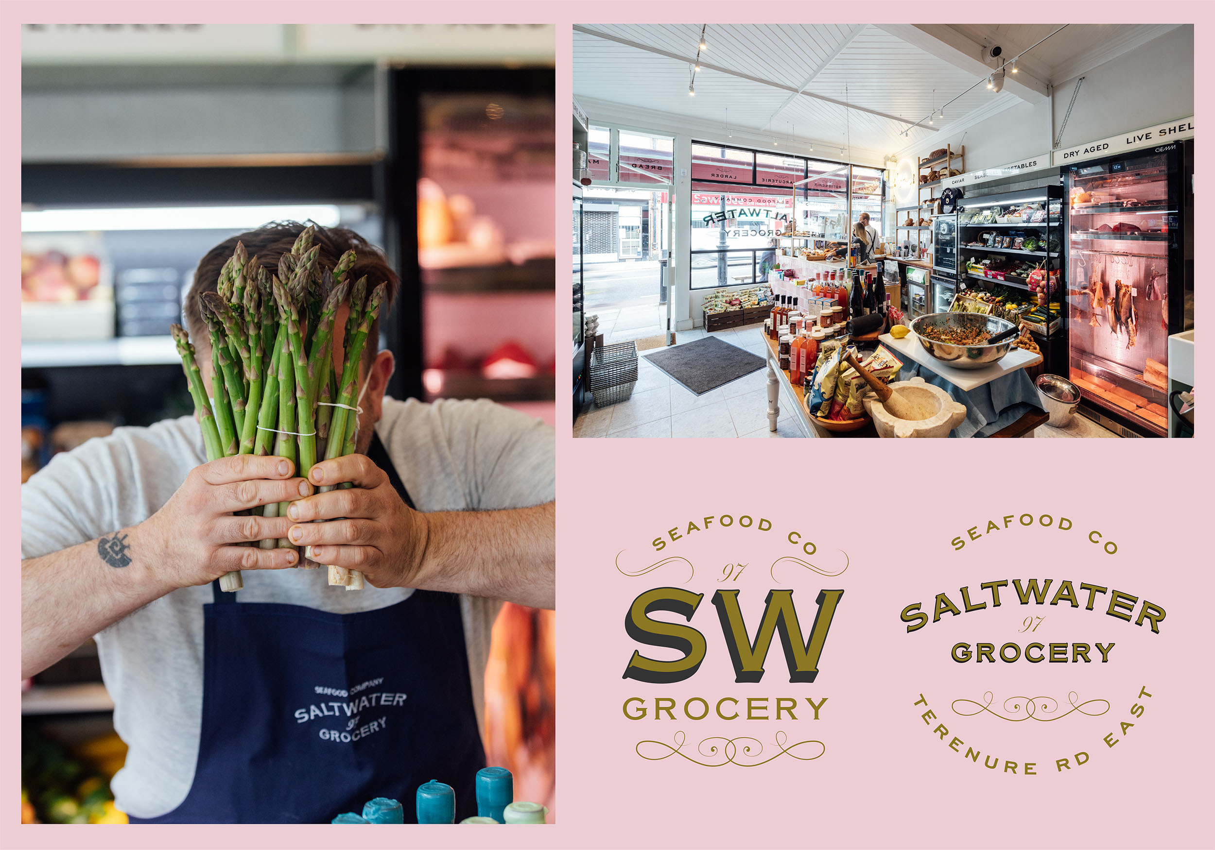
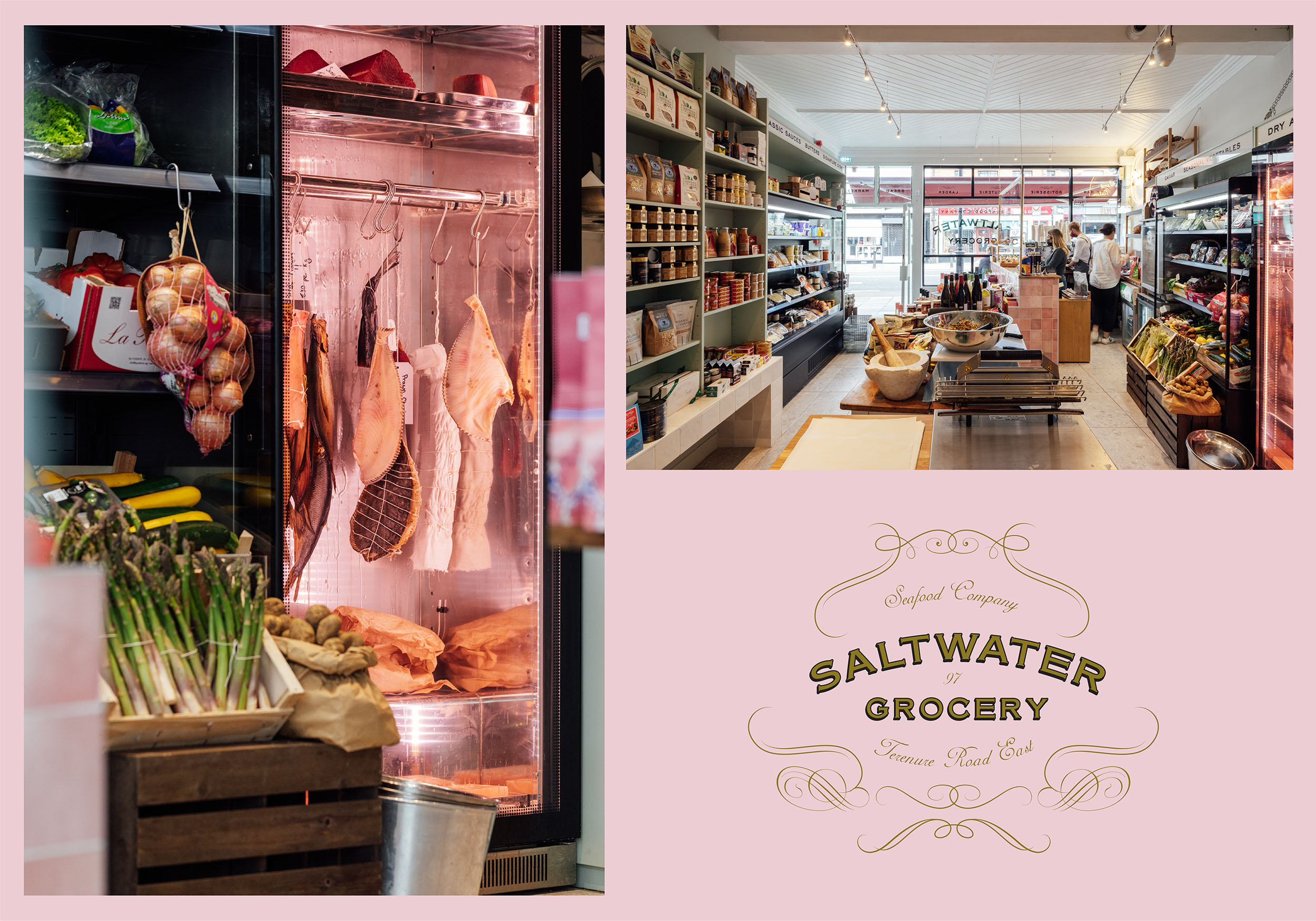
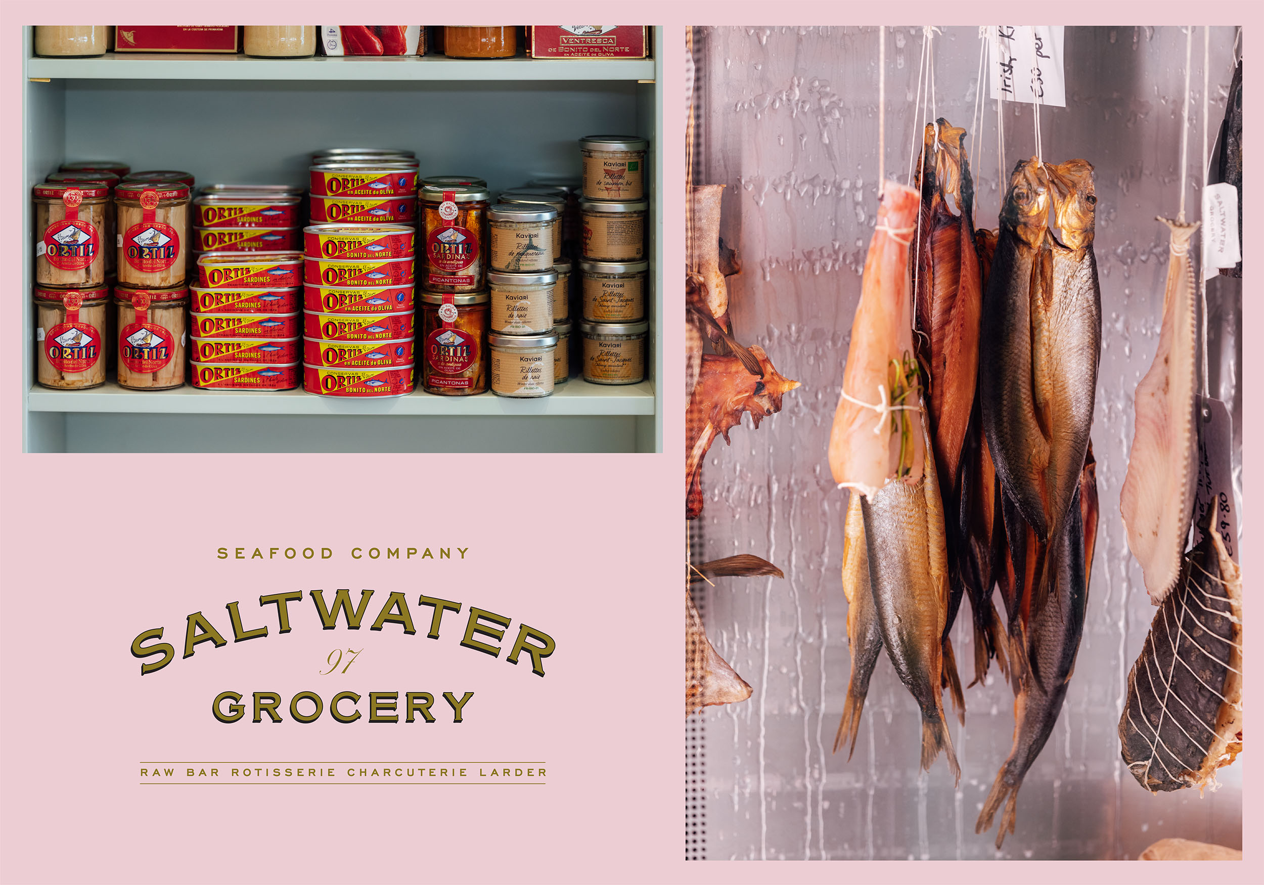
Saltwater Grocery
Brand Identity
Client:
Karl Whelan & Niall Sabongi
Winner
New Branding Schemes
Visual Communication
![]()
Brand Identity
Client:
Karl Whelan & Niall Sabongi
Winner
New Branding Schemes
Visual Communication
Client Brief:
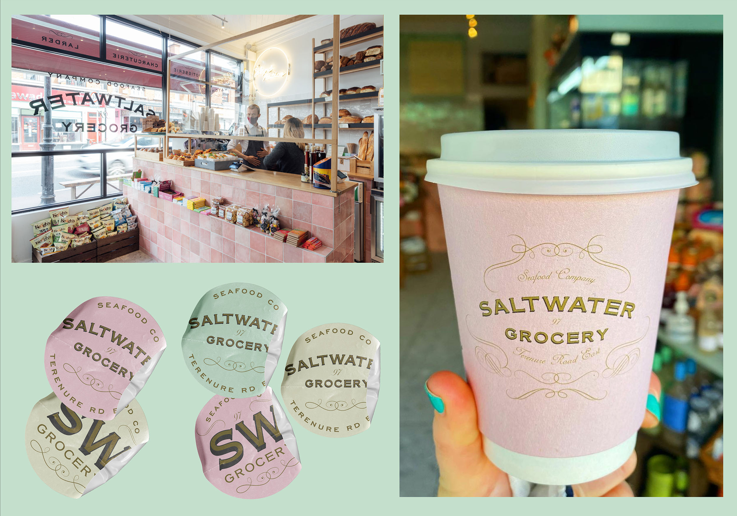
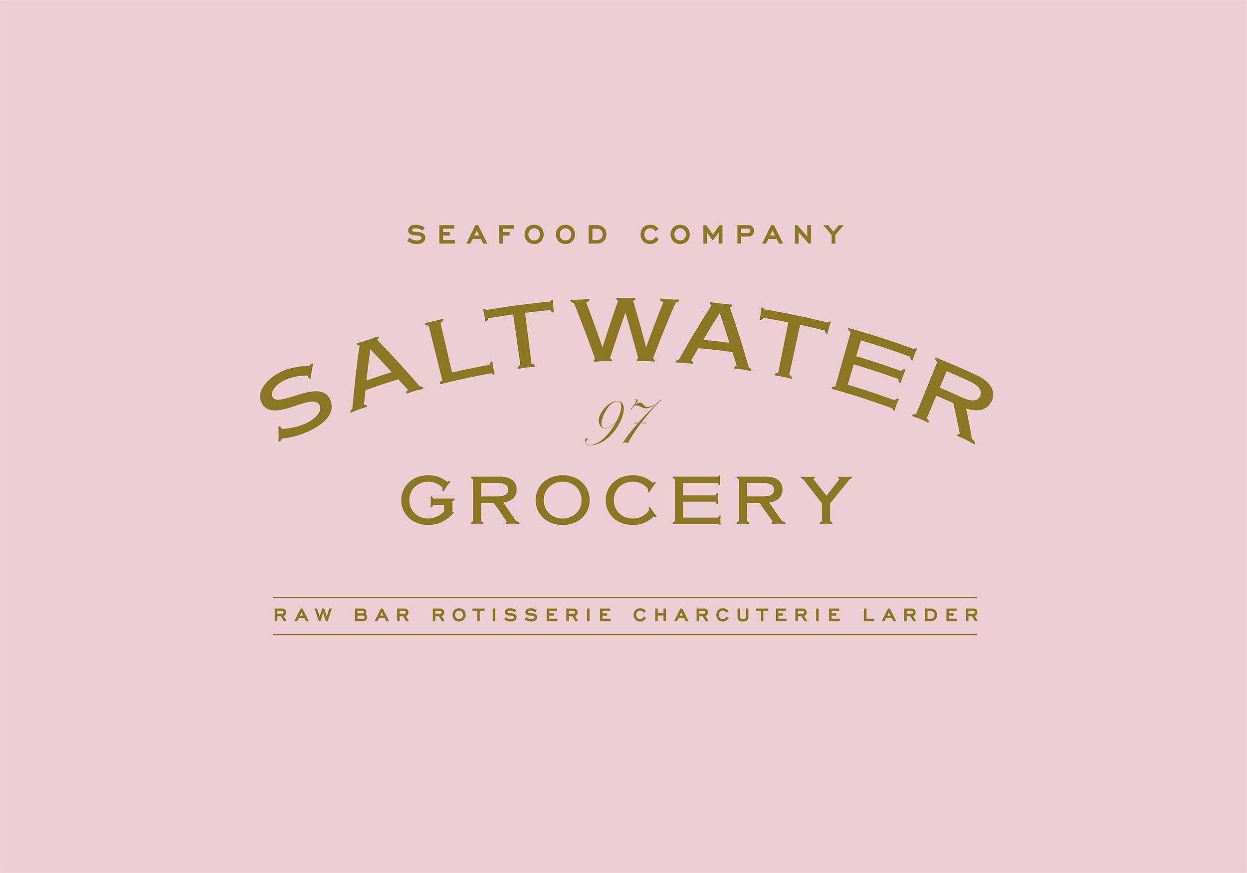
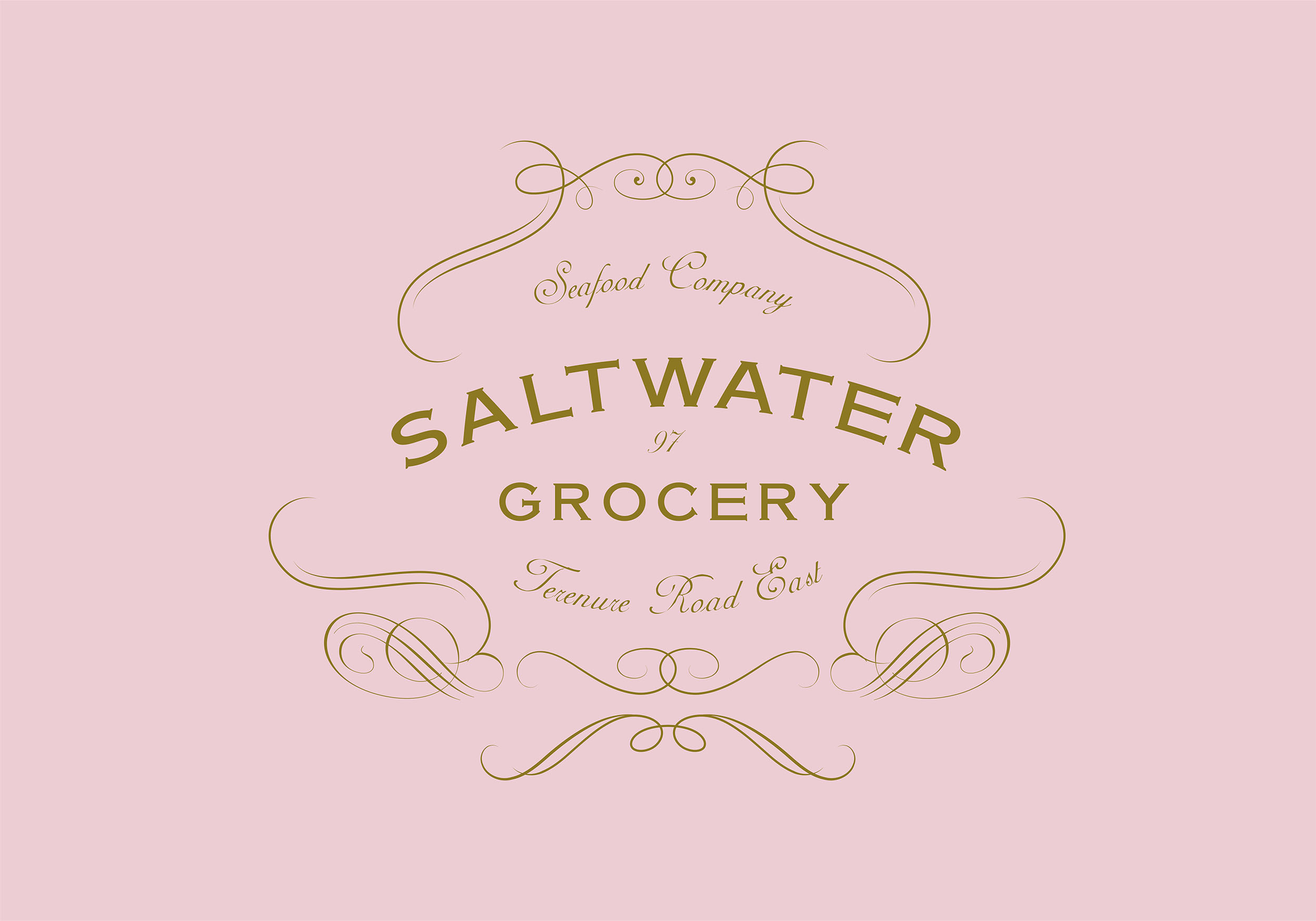
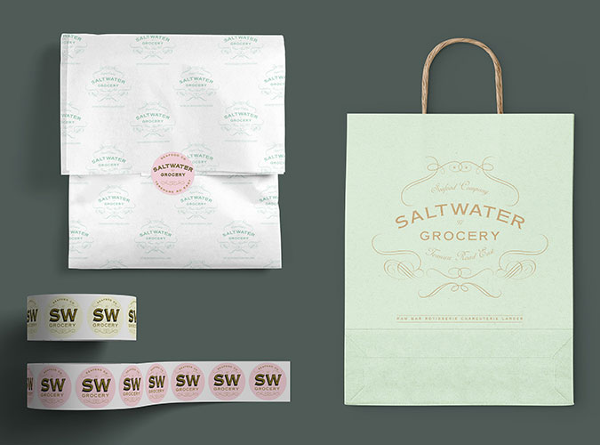
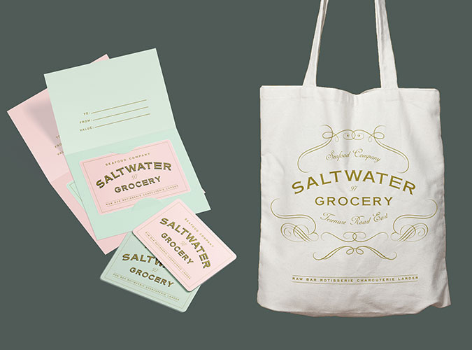
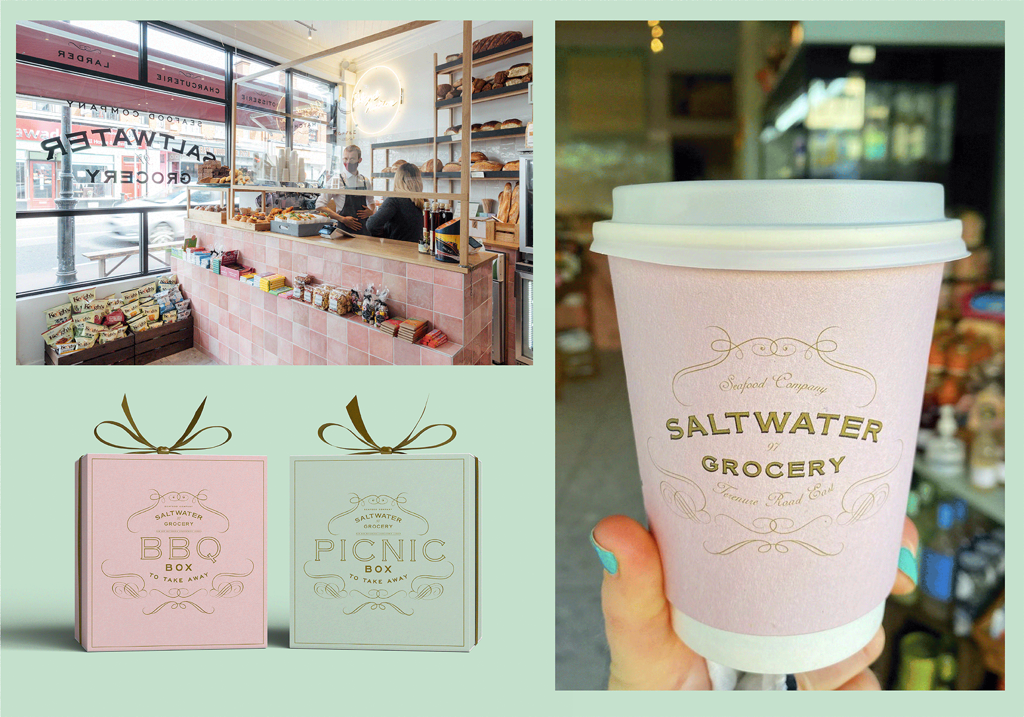
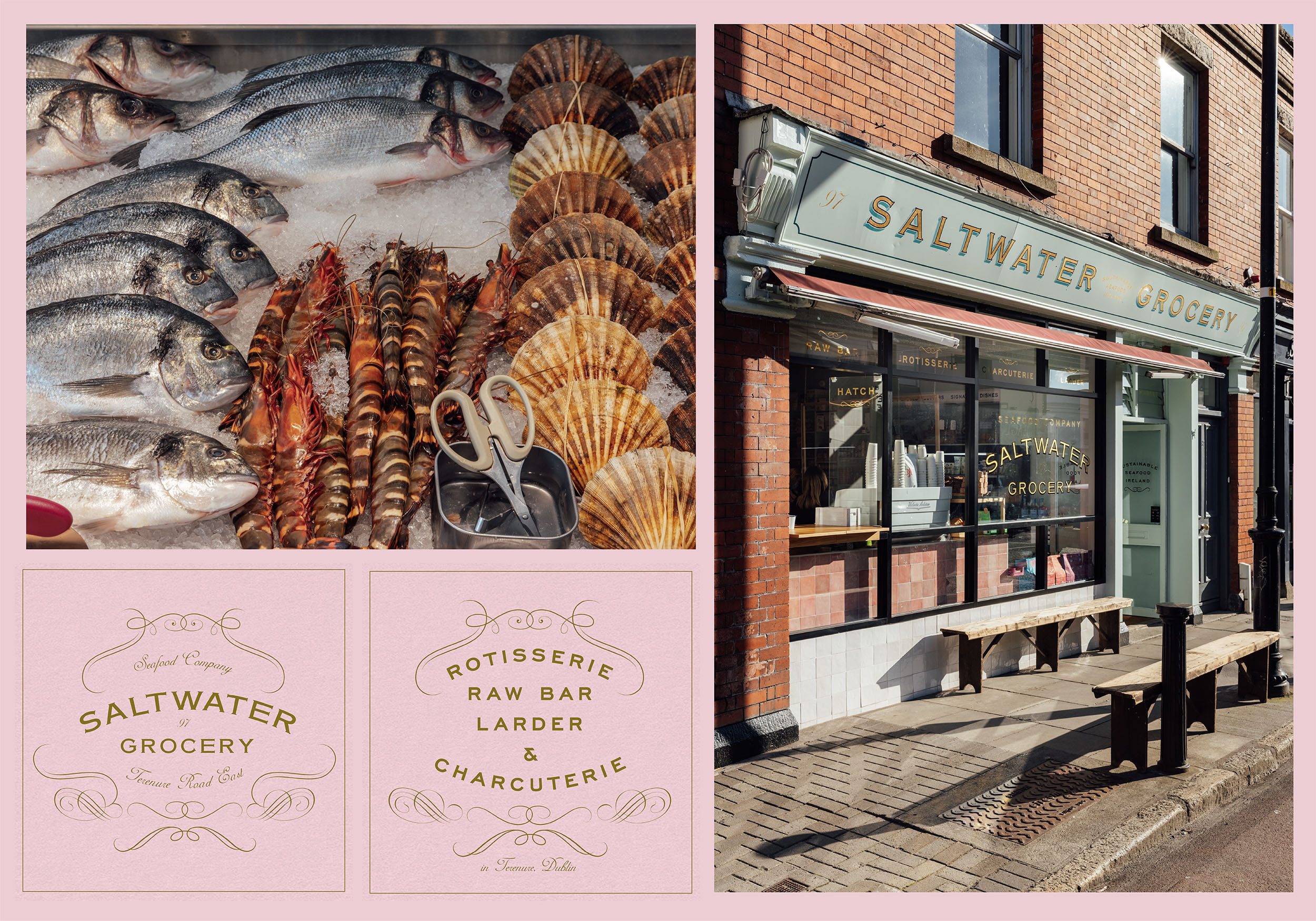
Saltwater Grocery, a gourmet food store that specialises in seafood, founded by chefs Karl Whelan and Niall Sabongi is situated on Terenure Road East. Originally a butchers, the shop was in need of a revamp and the new venture in need of a new brand identity.
Karl and Niall pride themselves on sourcing fresh, sustainable seafood and hand selected artisan products and they needed a brand to reflect this. They came to us with examples of what they wanted and asked us to recreate a vintage style grocery that looked ‘like it has always been there’.
Our Response:
Together with interior specialists, AB Projects, we created an extensive brand and scheme for the store. The starting point was a suite of classic logos and a colour palette inspired by French Boulangeries. The suite included various marks for multiple applications; including a fancy, ornamented logo resembling an opened clam, and a purely typographic logo.
The flexible identity was designed and customised to fit the many elements from the shop interior and exterior shop signs (painted and gilded to the highest standard by Mac Signs) as well as extensive packaging, printed and digital materials, paying close attention to ensure we were sourcing the most environmentally friendly materials and working with printers that could provide such materials.
Design Assistance:
Rebecca Wright
Interior Design & Architecture:
Ahmad Fakhry & Andrew Burdock / AB Projects
Sign Painting:
Cormac Dillon & Louise Gardiner / Mack Signs
Photography:
Shantanu Starick
Rebecca Wright
Interior Design & Architecture:
Ahmad Fakhry & Andrew Burdock / AB Projects
Sign Painting:
Cormac Dillon & Louise Gardiner / Mack Signs
Photography:
Shantanu Starick