Client Brief:
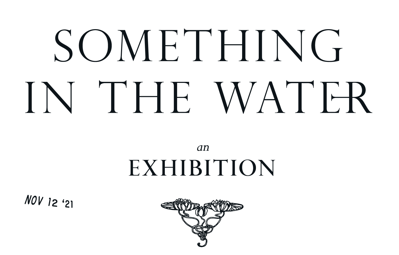
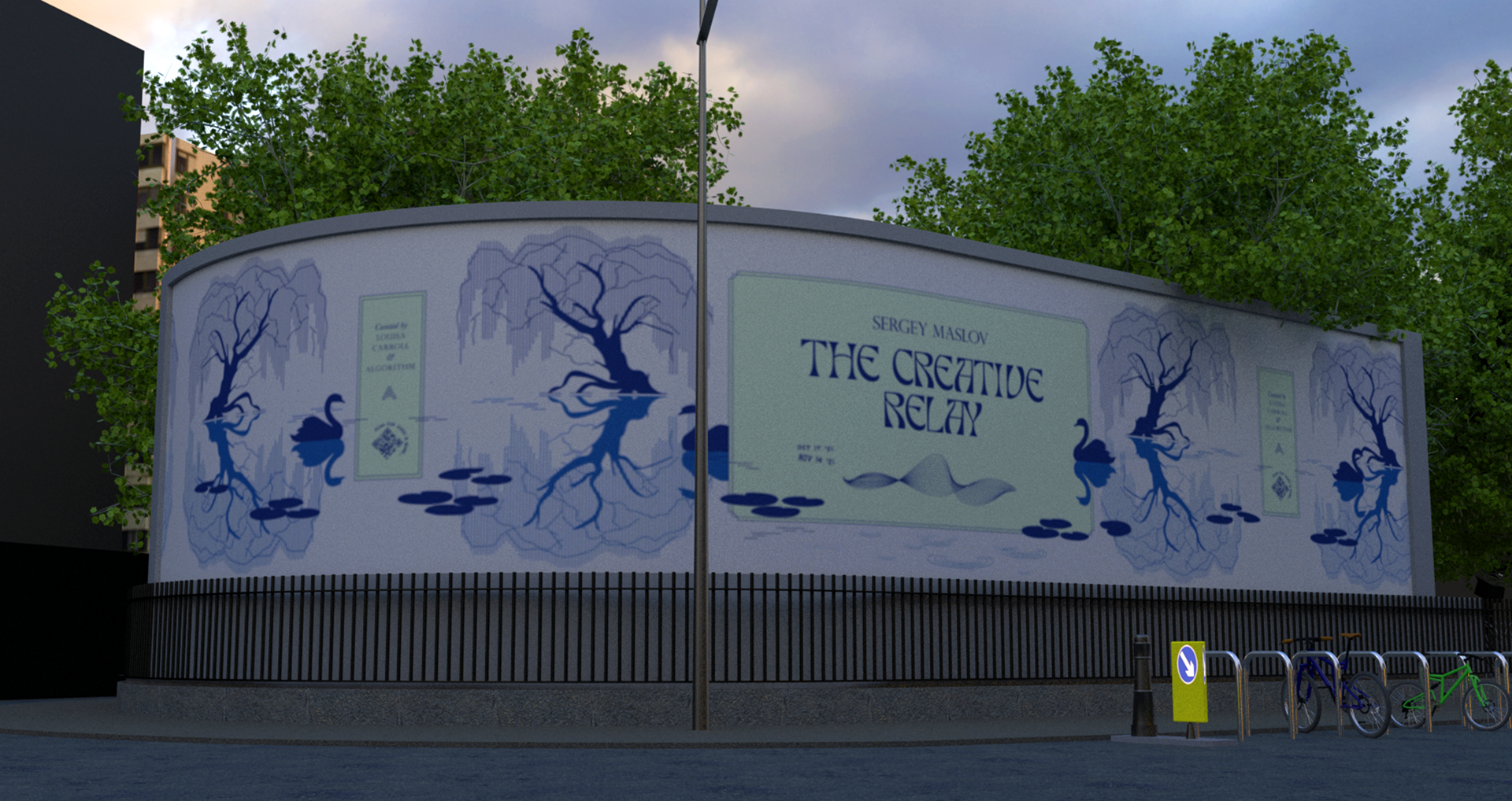
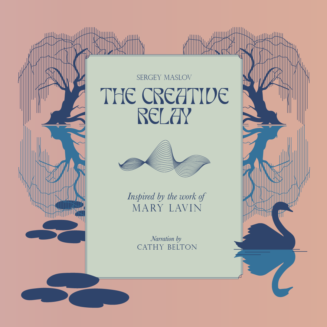
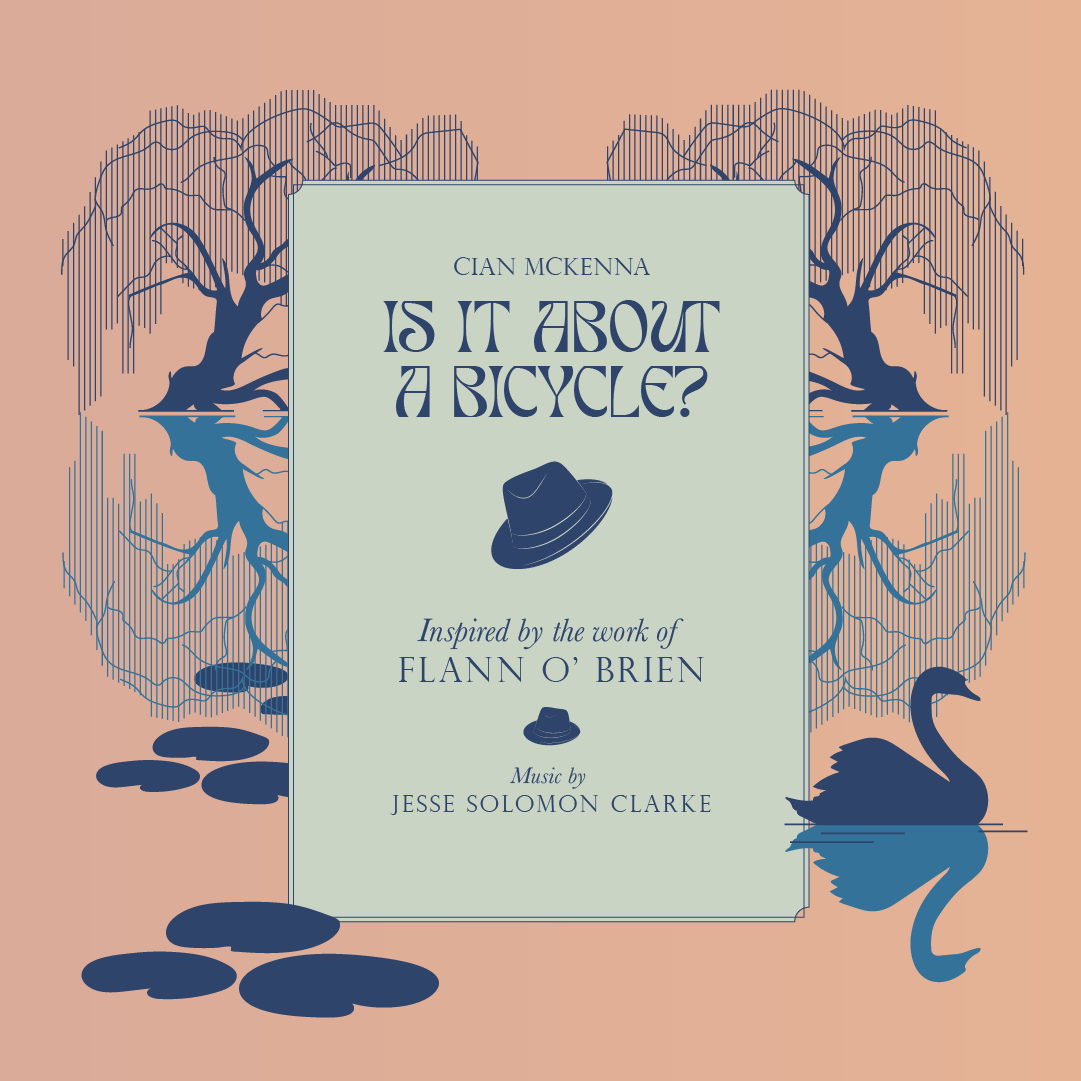
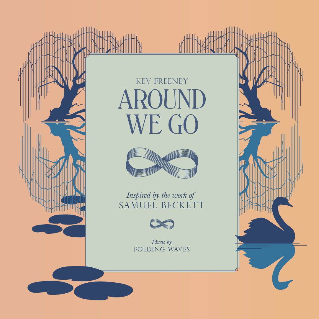
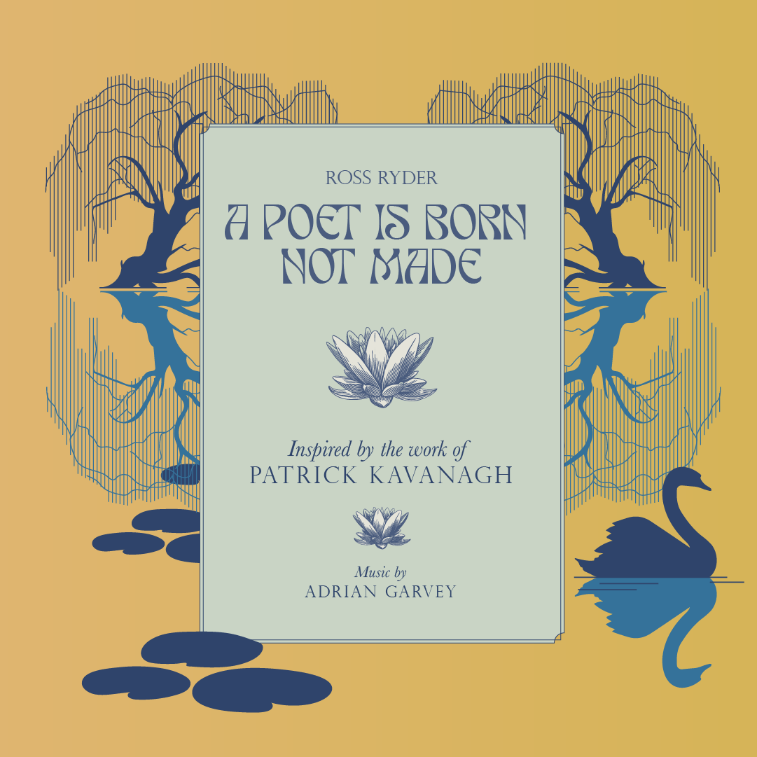
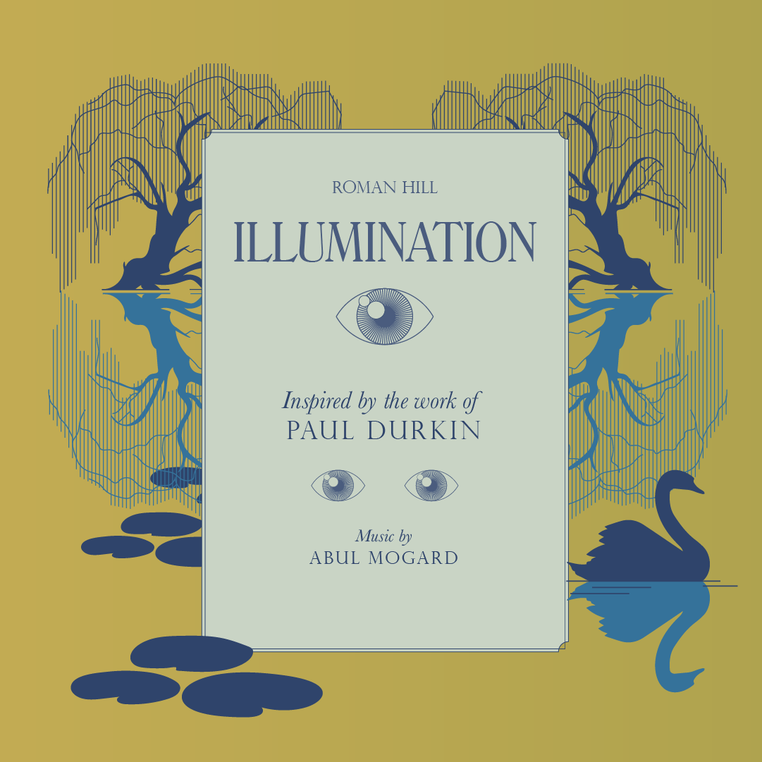
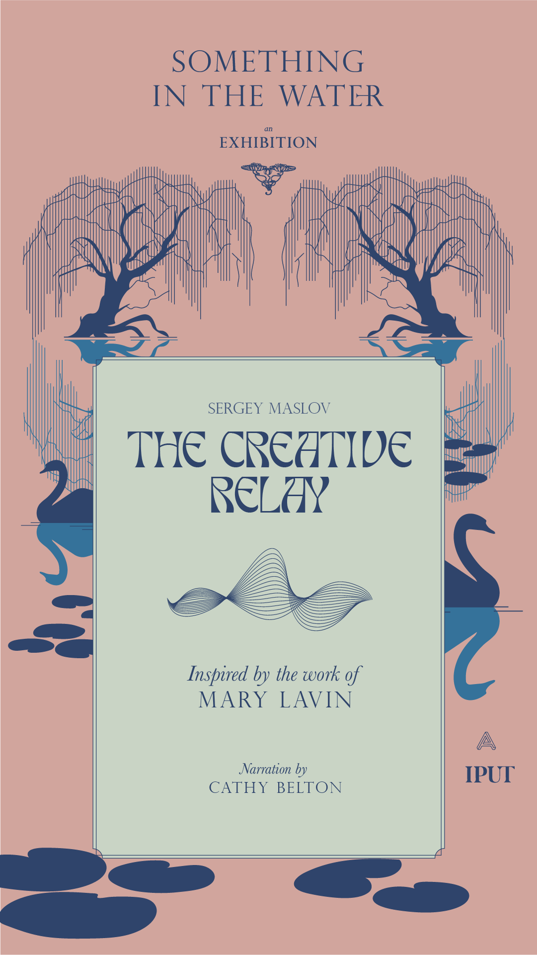
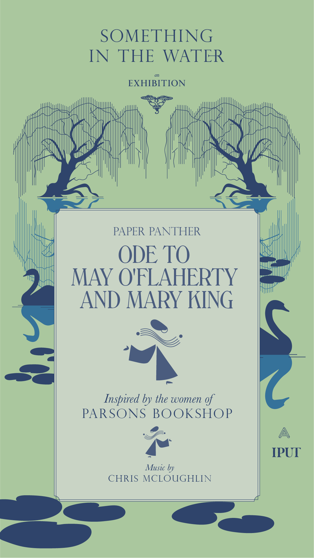
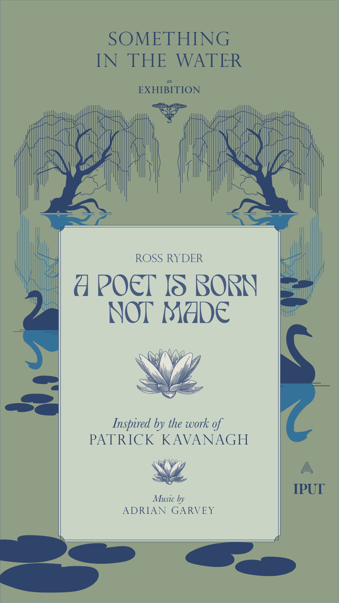
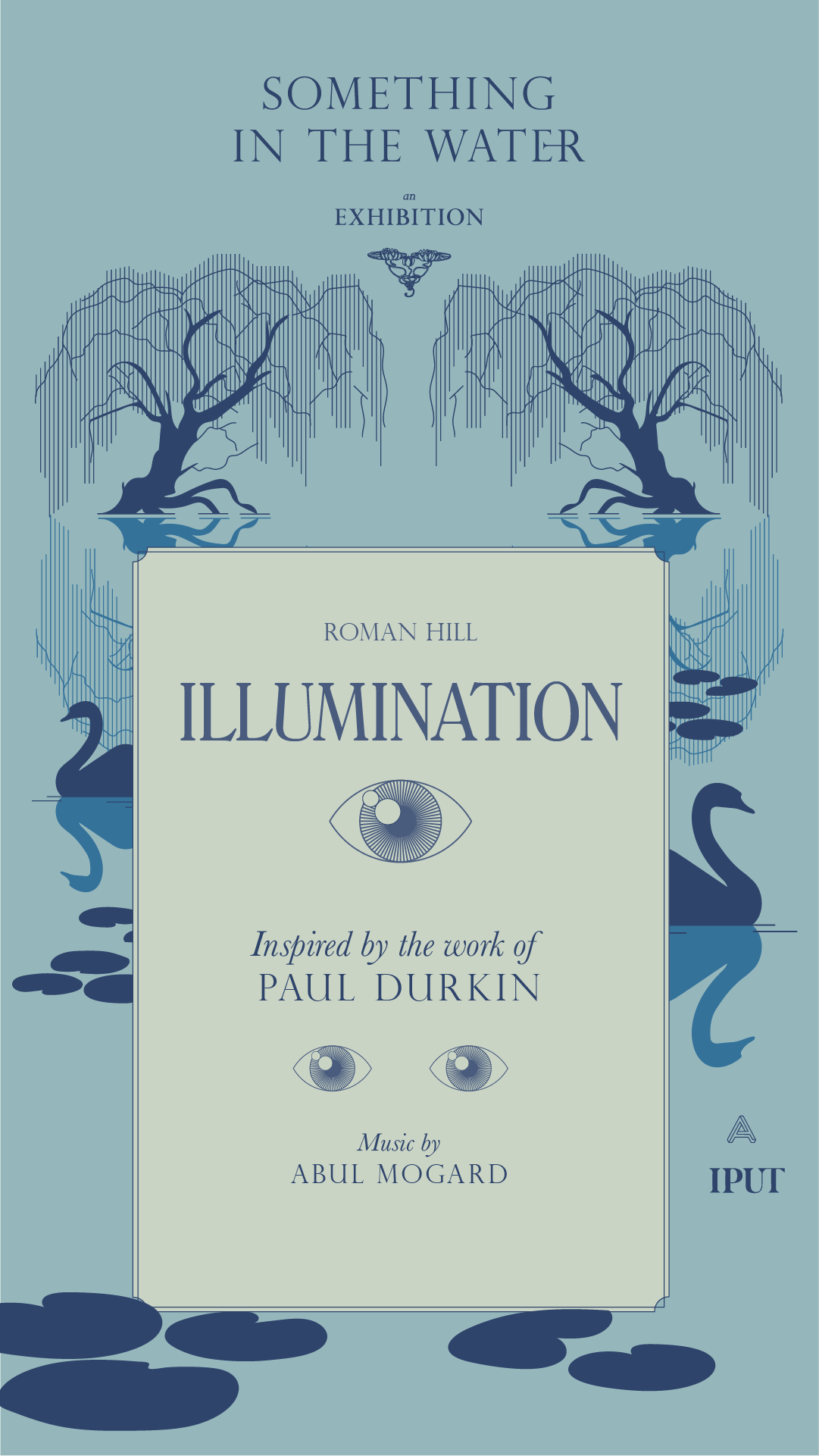
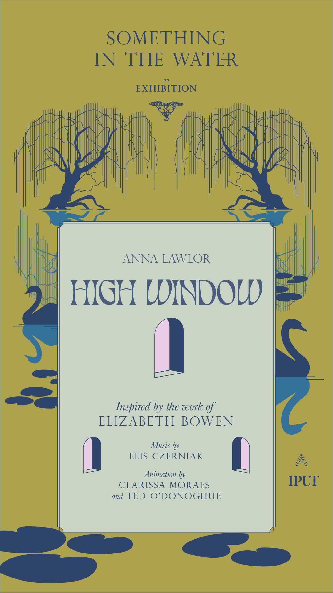
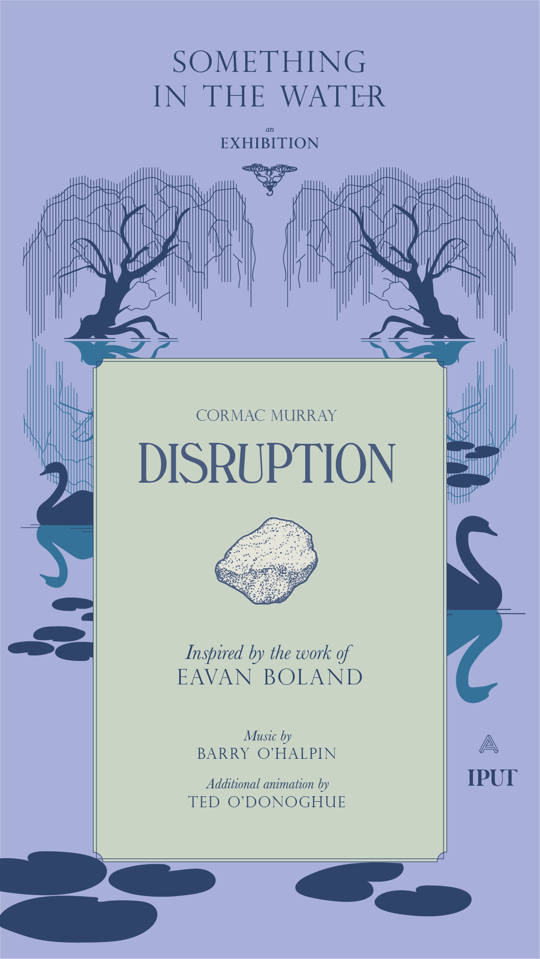
Something in the Water was an exhibition of motion graphics pieces from 8 artists, displayed on a huge screen along the Grand Canal, Dublin. Taking inspiration from the literary history of the canal, the exhibition identity came to life as the unfolded dust jacket of a book.
Research began by looking at 20th century book covers of writers, antique book shops from the area and other printed ephemera from the Canal’s rich literary history. From these, the typographic style was developed and crafted into the main exhibition title.
Our Response:
The brand structure was also based on the exhibition as a book — each individual piece is like a chapter of the same book. We made bespoke social media assets for each artist to share with their followers and direct them to the exhibition’s channels, website and the exhibition itself.
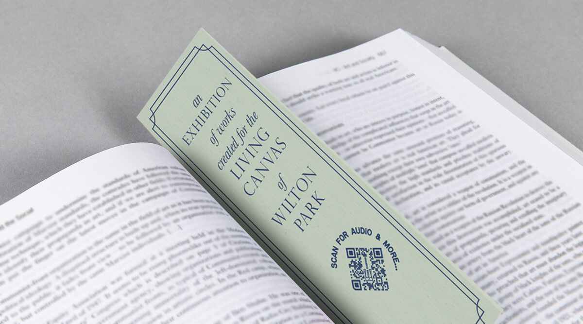
We created bookmarks with a QR code that were distributed in local bookshops. Turning the QR code on its side made it instantaneously decoractive!







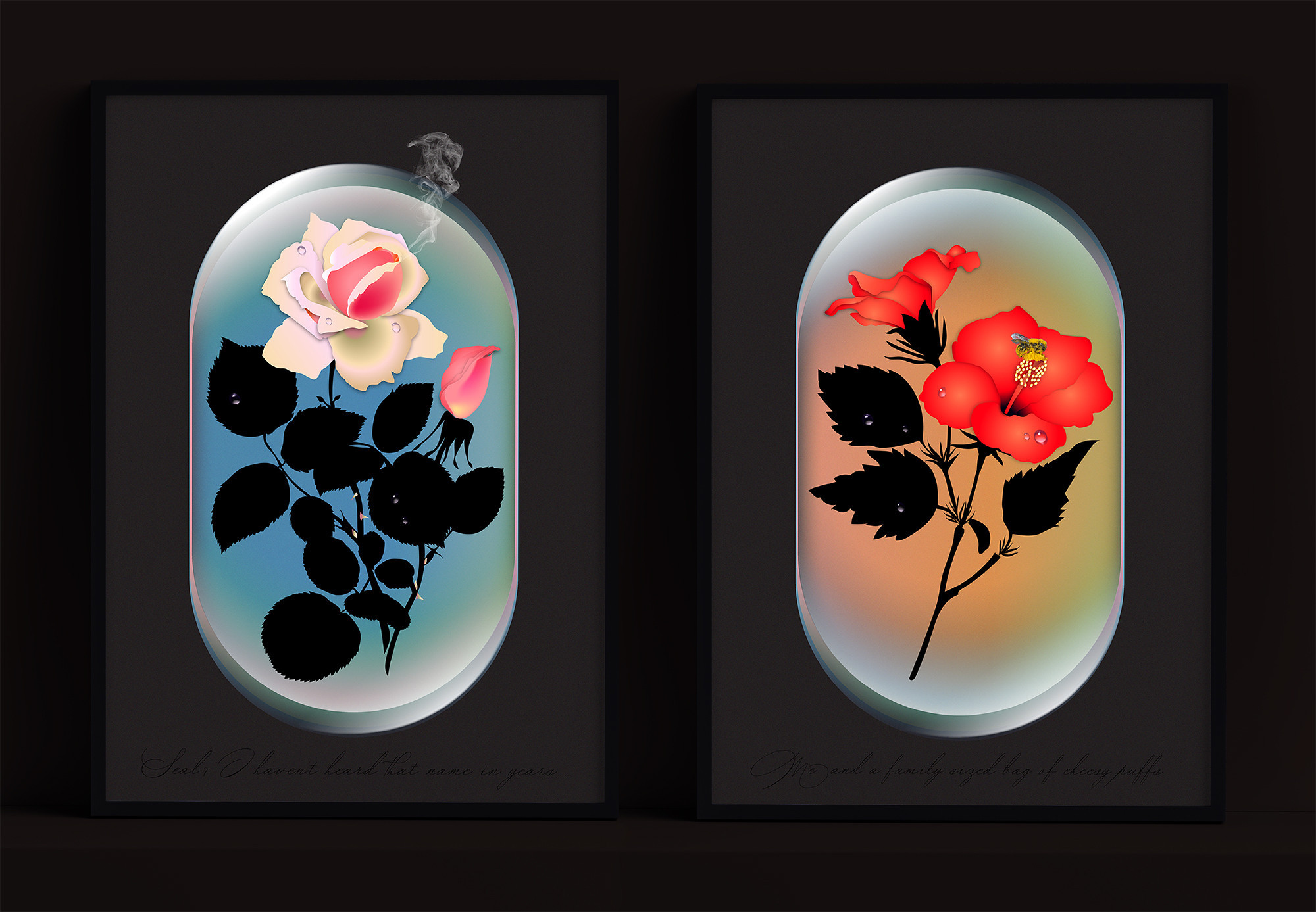
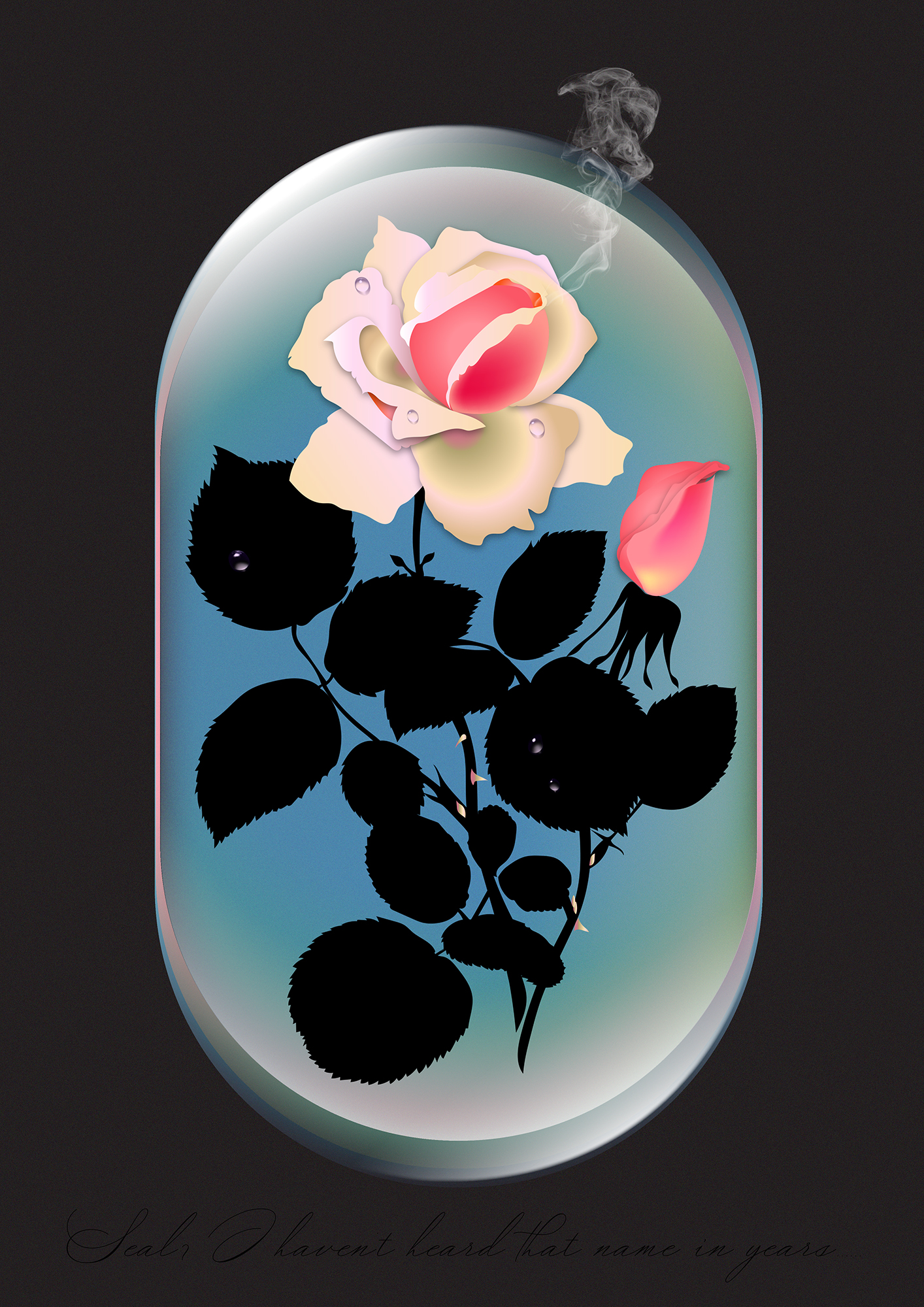
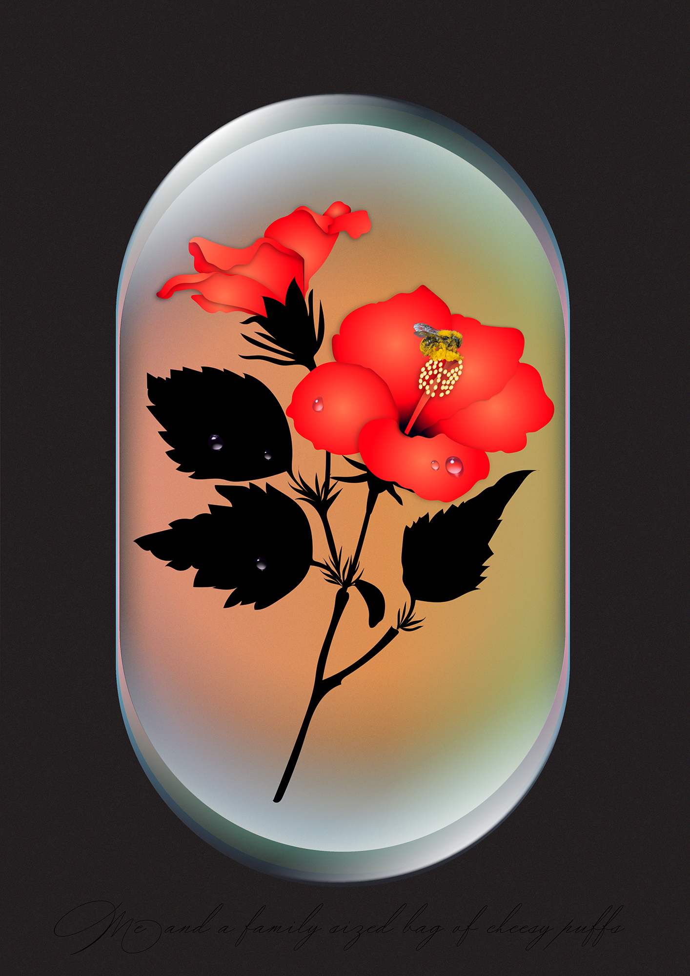
The fine art prints ‘Seal, I haven’t heard that name in years’ and ‘Me and a family sized bag of Cheesy Puffs’ were designed for the Hen’s Teeth G’wan Ireland exhibition, a great 2020 initiative supporting Irish artists, designers & photographers by showcasing and selling prints of their work.
In a year where many of us relied on the welcome comic relief of memes to get us through the day to day, we thought it would be fun to mess with their wholly transient nature and create something that could survive outside of our devices. Much like the poster itself, that has been elevated from a temporary advertising vessel, the meme too is now a piece of framed art in your home.
In a year where many of us relied on the welcome comic relief of memes to get us through the day to day, we thought it would be fun to mess with their wholly transient nature and create something that could survive outside of our devices. Much like the poster itself, that has been elevated from a temporary advertising vessel, the meme too is now a piece of framed art in your home.
Curation & Fine Art Printing: Hen’s Teeth
Client Brief:
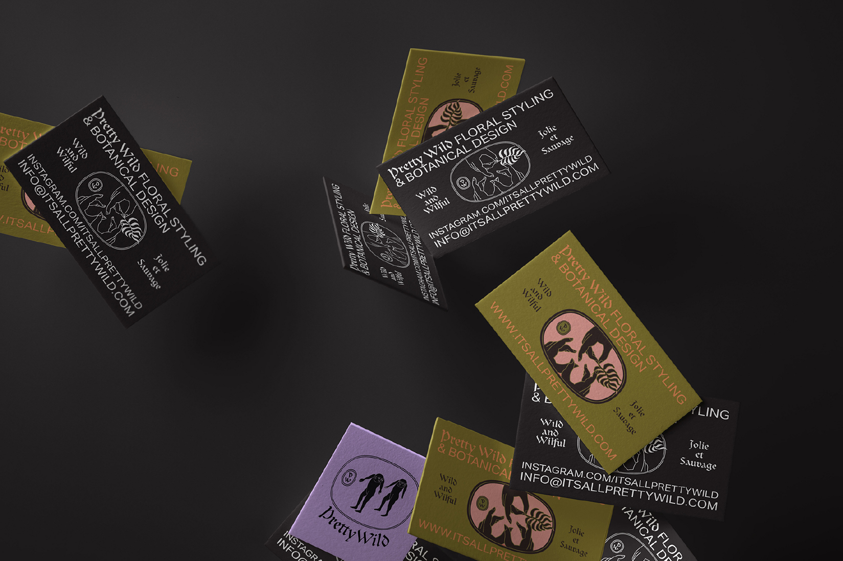
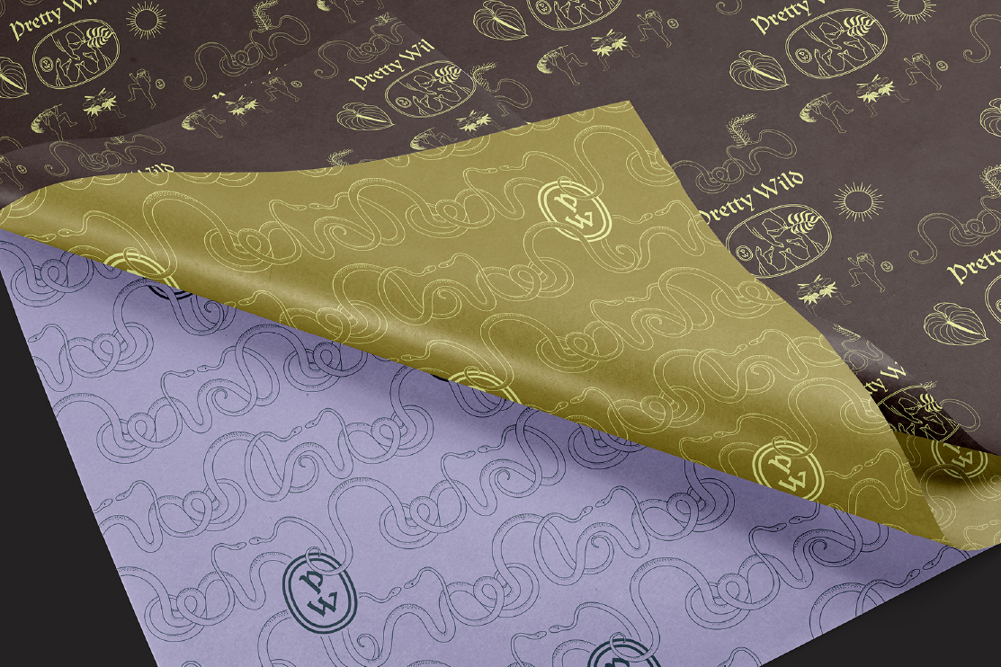
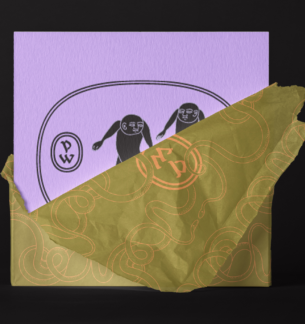
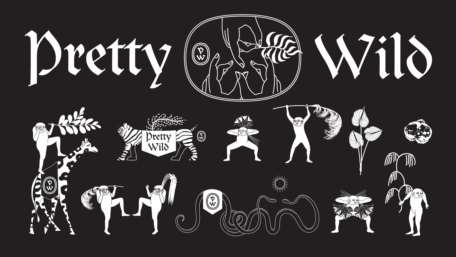
Pretty Wild is a Floristry Studio and Shop based in Bristol. Ellen needed a lot of bits designed for the rapidly expanding business such as business cards, care cards, branded wrapping tissue, stickers, tape etc. We needed to keep the existing legacy logotype but expand the brand identity with a colour way and a suite of illustartions and marks.
Pretty Wild is a Floristry Studio and Shop based in Bristol. Ellen needed a lot of bits designed for the rapidly expanding business such as business cards, care cards, branded wrapping tissue, stickers, tape etc. We needed to keep the existing legacy logotype but expand the brand identity with a colour way and a suite of illustartions and marks.
Our Response:
Inspired by gangster business cards, we created a three handed gang sign spelling out ‘PW’ as the central motif. Instead of simply repeating this same logo design across the whole suite of materials we created a whole gang of misfit characters that could inhabit the Pretty Wild world.
Inspired by gangster business cards, we created a three handed gang sign spelling out ‘PW’ as the central motif. Instead of simply repeating this same logo design across the whole suite of materials we created a whole gang of misfit characters that could inhabit the Pretty Wild world.
Client Testimonial:
Rachel and Stina, took a ball of tangled thoughts, ramblings and screenshots and distilled them in to a body of work that gives me such genuine and innocent pleasure.
‘I want flowers, but not flower flowers. I want romance but I don't want to be seen as romantic. I want androgyny. I want old and new. I want cool but not too cool. I want something that I'm happy to live through because, as a self-employed, creative person, I am my work.'
Ellen Kenny, Director, Pretty Wild



2017
Bonanza Land!
IADT Visual Communications Graduate Exhibition 2017
![]()
Bonanza Land!
IADT Visual Communications Graduate Exhibition 2017

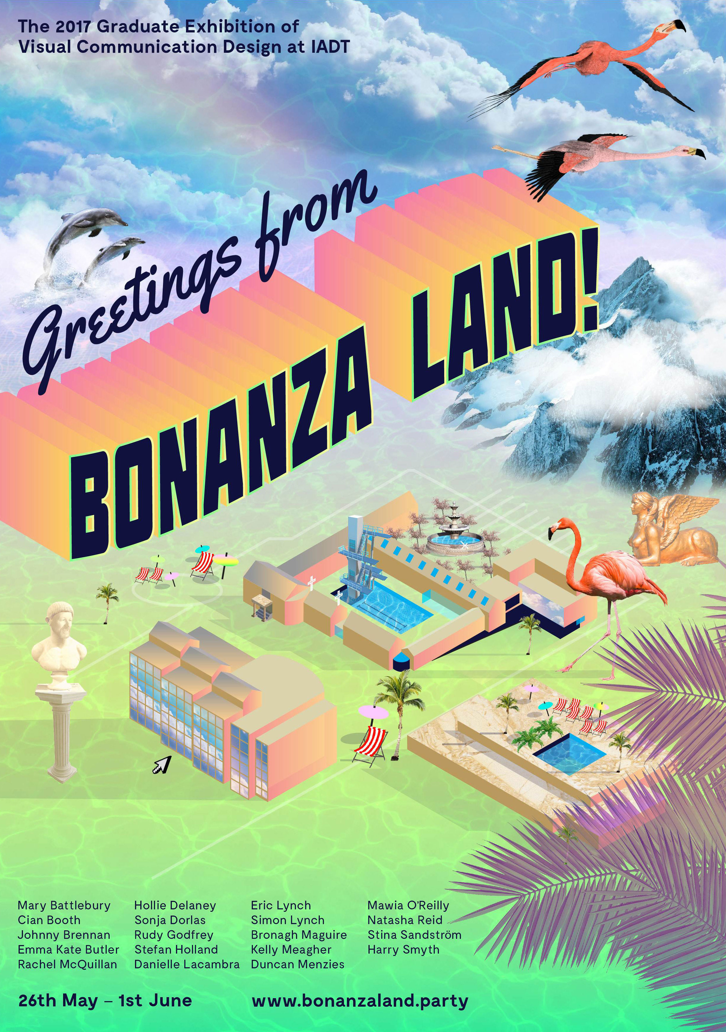
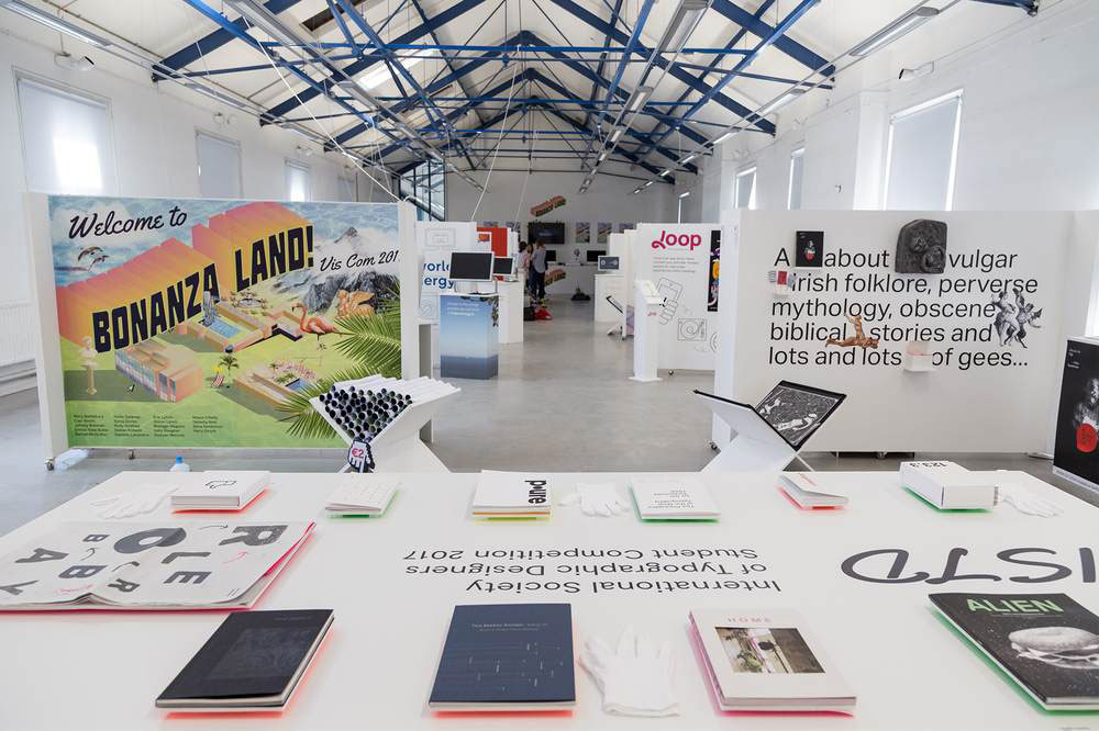
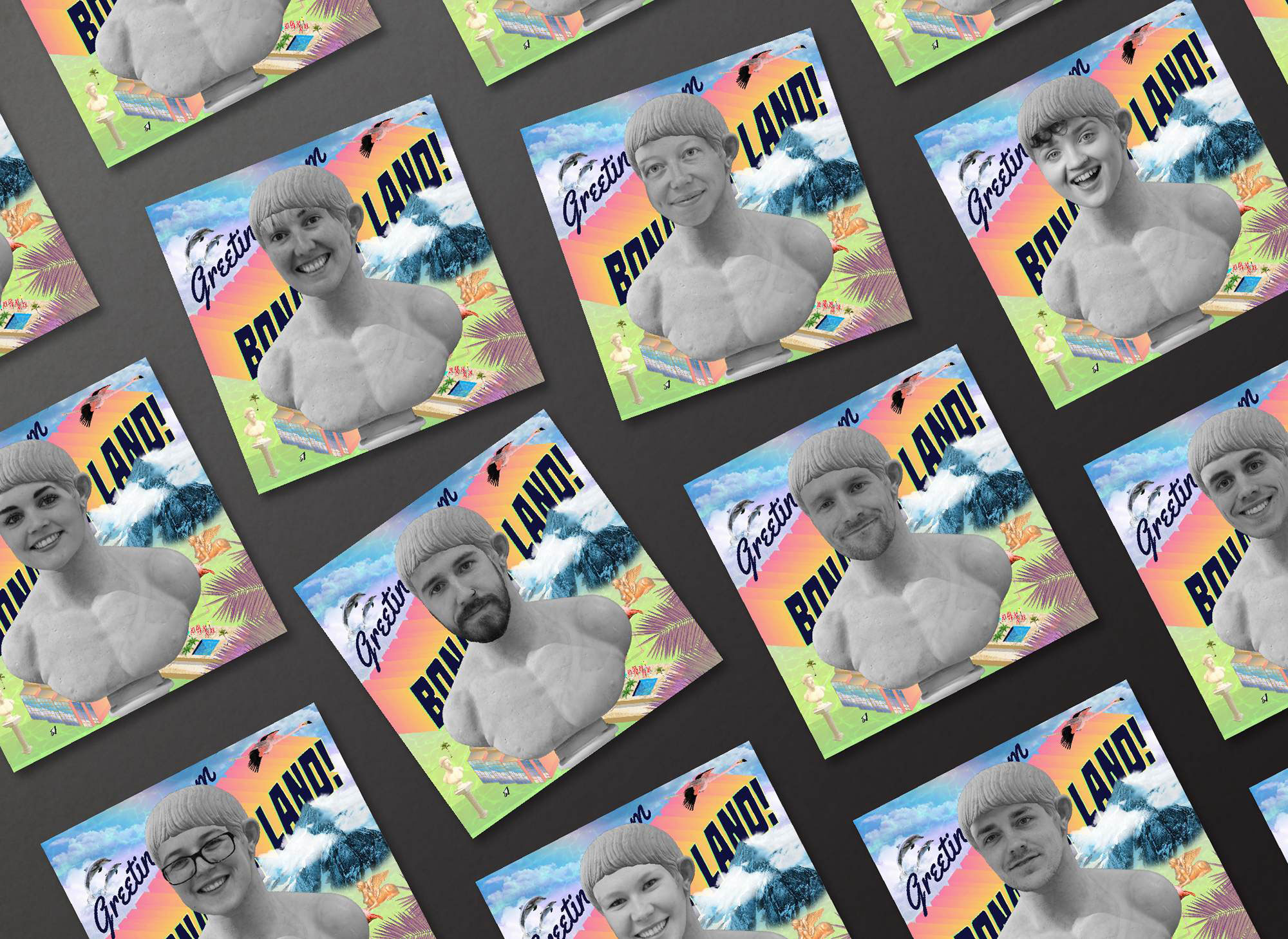
The concept for this project was born from the proposition that IADT is an Island—The Island of Art, Design and Technology. Away from the buzz and distractions of the city, Visual Communications students work in an intensely creative environment producing a bonanza of fantastical and innovative results. In order to entice visitors to make the journey out to this island to see the show, we needed to create a desirable and exciting destination.
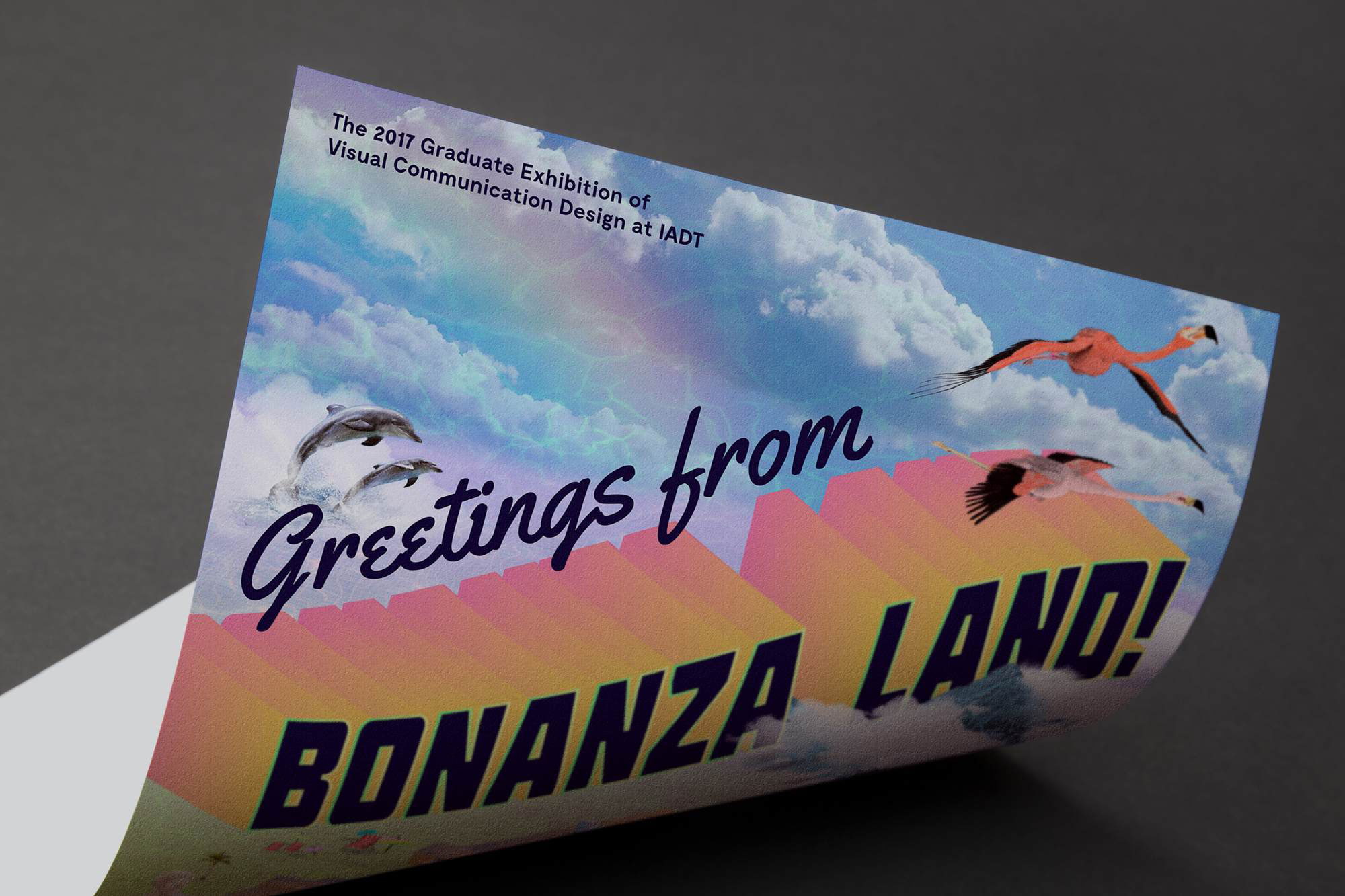
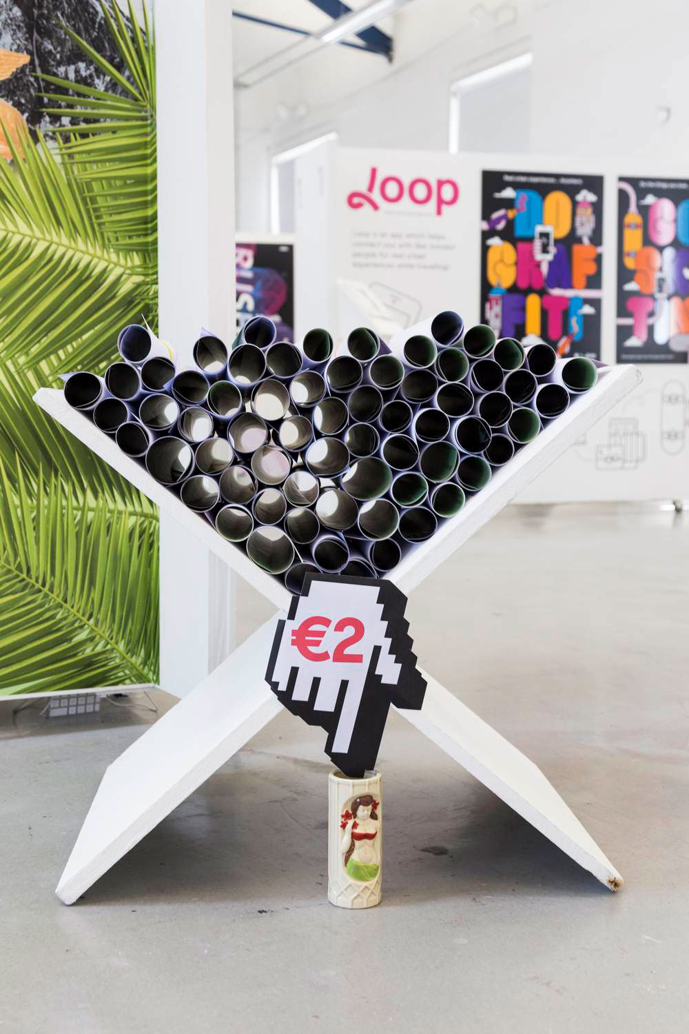
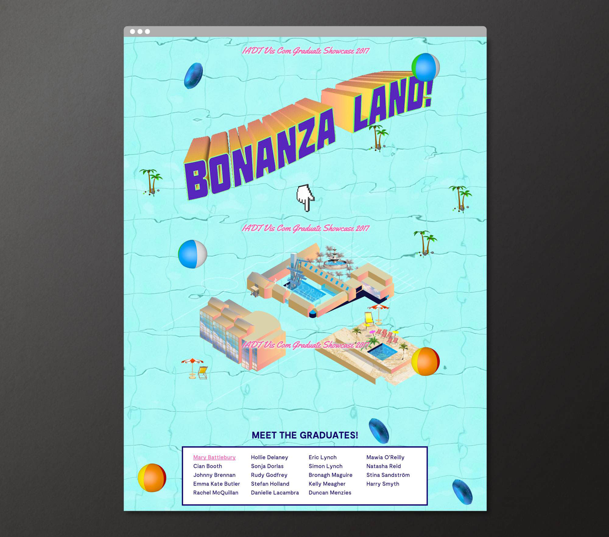
The project required a promotional poster, social media campaign, promotional motion piece, website, and exhibition graphics & signage.
The project required a promotional poster, social media campaign, promotional motion piece, website, and exhibition graphics & signage.
We borrowed cues and marketing tools from the world of tourism and created a hyperreal holiday resort called BONANZA LAND! The very definition of bonanza is a large amount of something desirable, so for this reason the identity was ideal for the 2017 Visual Communications Graduate Showcase—a veritable Visual Communications bonanza!
Bonanza Land! is included in 2017 100 Archive Selection and also won the IDI Graduate Award for best use of illustration in design 2017.
