2021
Saltwater Grocery
Brand Identity
Client:
Karl Whelan & Niall Sabongi
Winner
New Branding Schemes
Visual Communication
![]()
Brand Identity
Client:
Karl Whelan & Niall Sabongi
Winner
New Branding Schemes
Visual Communication
Client Brief:
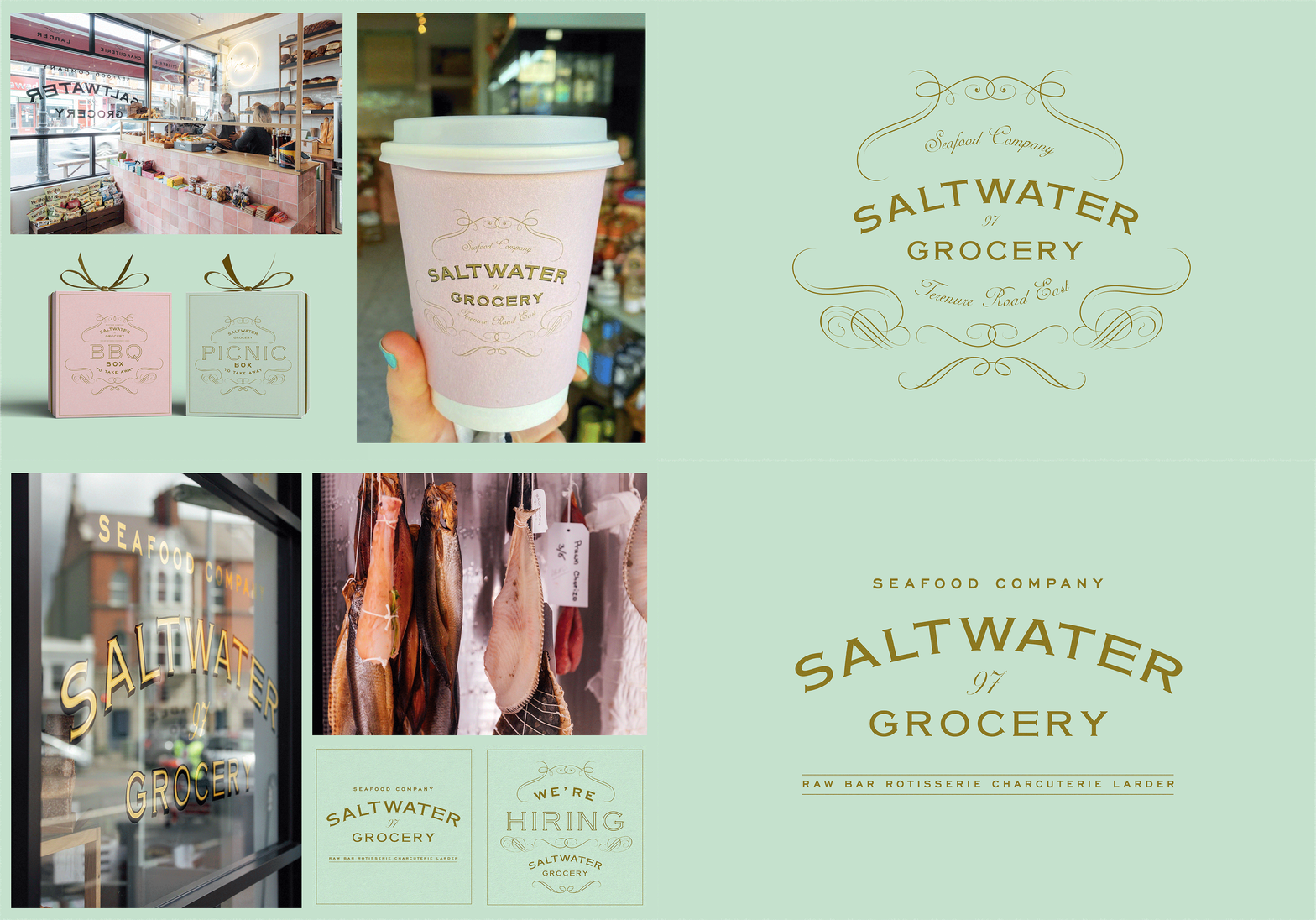
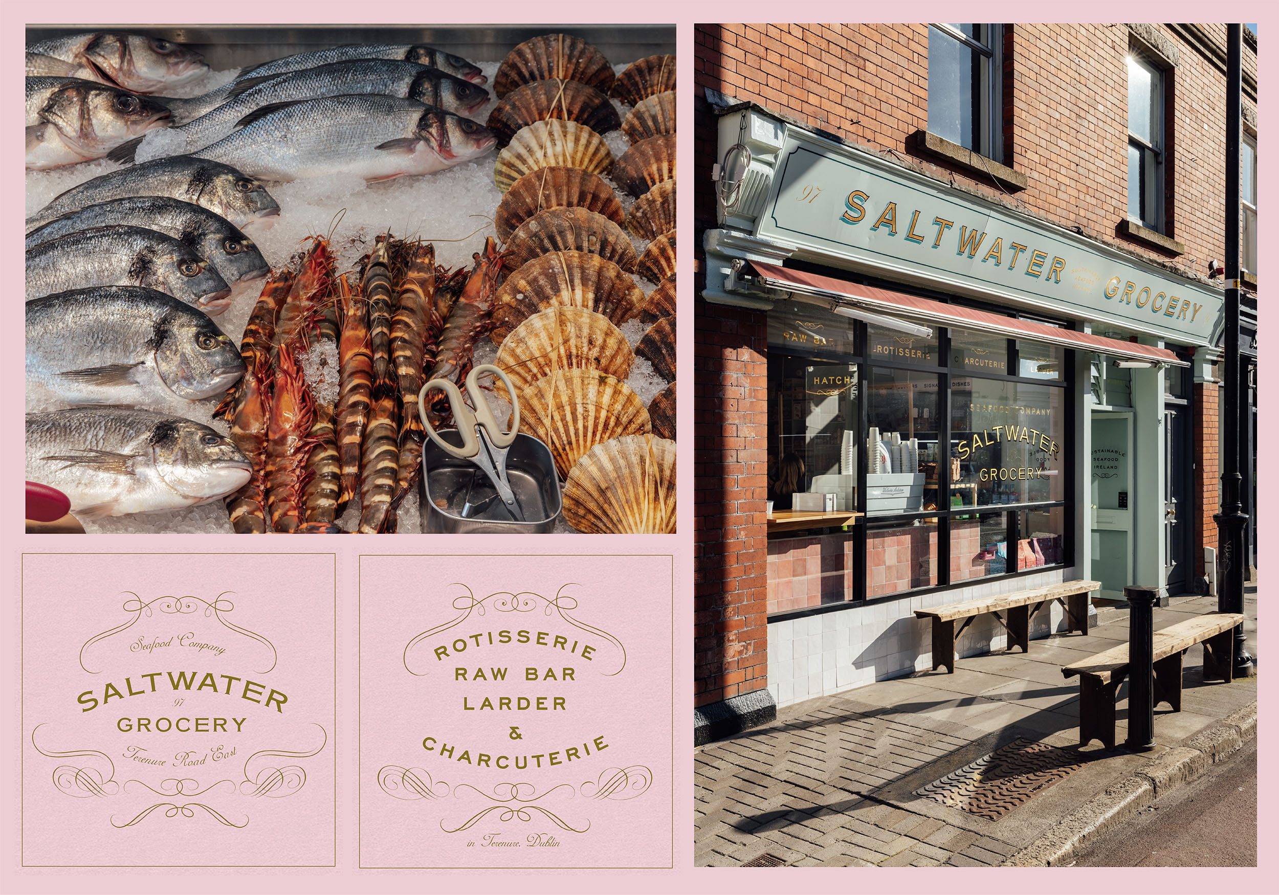
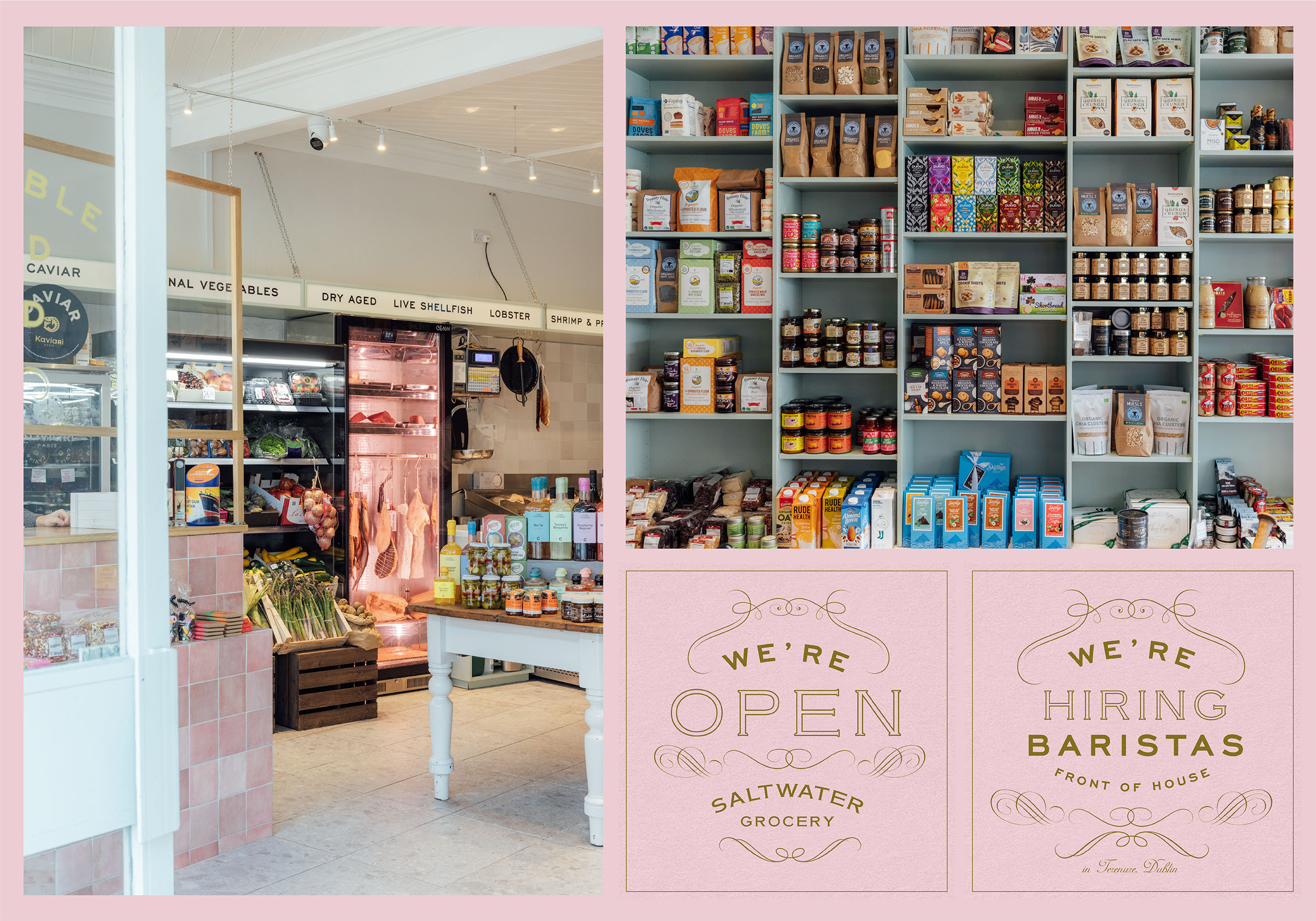
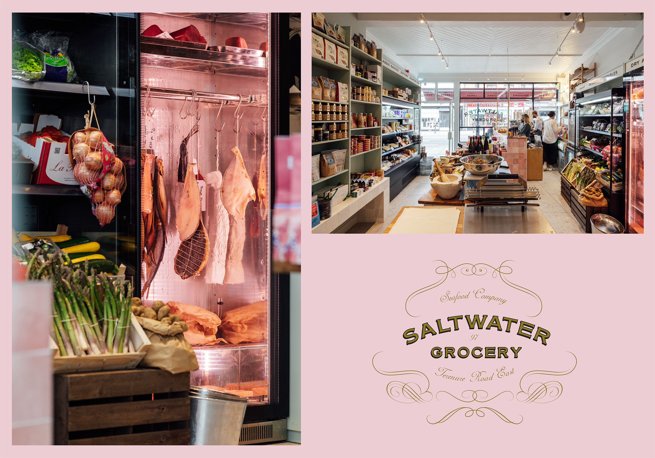
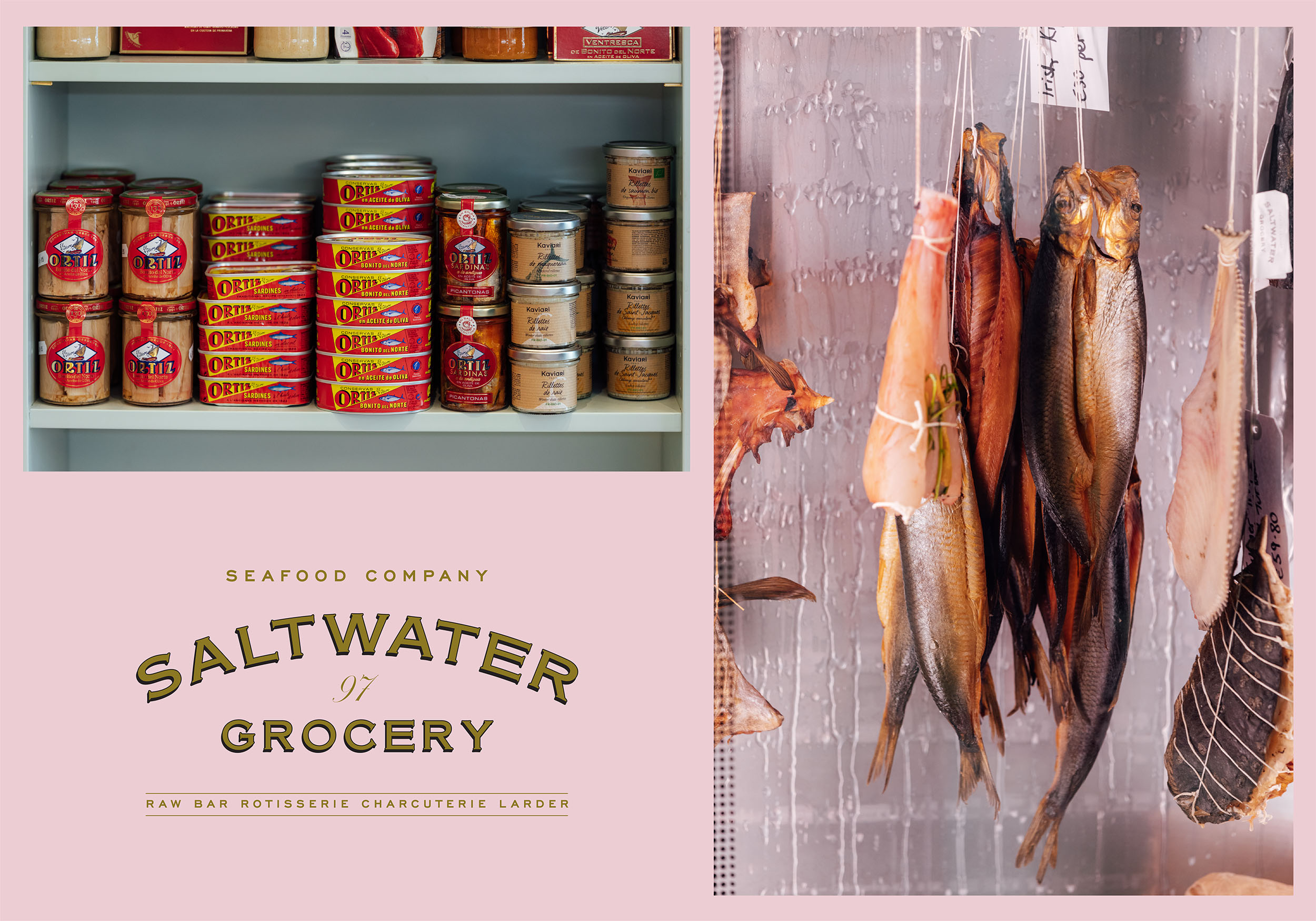
Saltwater Grocery, a gourmet food store that specialises in seafood, founded by chefs Karl Whelan and Niall Sabongi is situated on Terenure Road East. Originally a butchers, the shop was in need of a revamp and the new venture in need of a new brand identity.
Karl and Niall pride themselves on sourcing fresh, sustainable seafood and hand selected artisan products and they needed a brand to reflect this. They came to us with examples of what they wanted and asked us to recreate a vintage style grocery that looked ‘like it has always been there’.
Our Response:
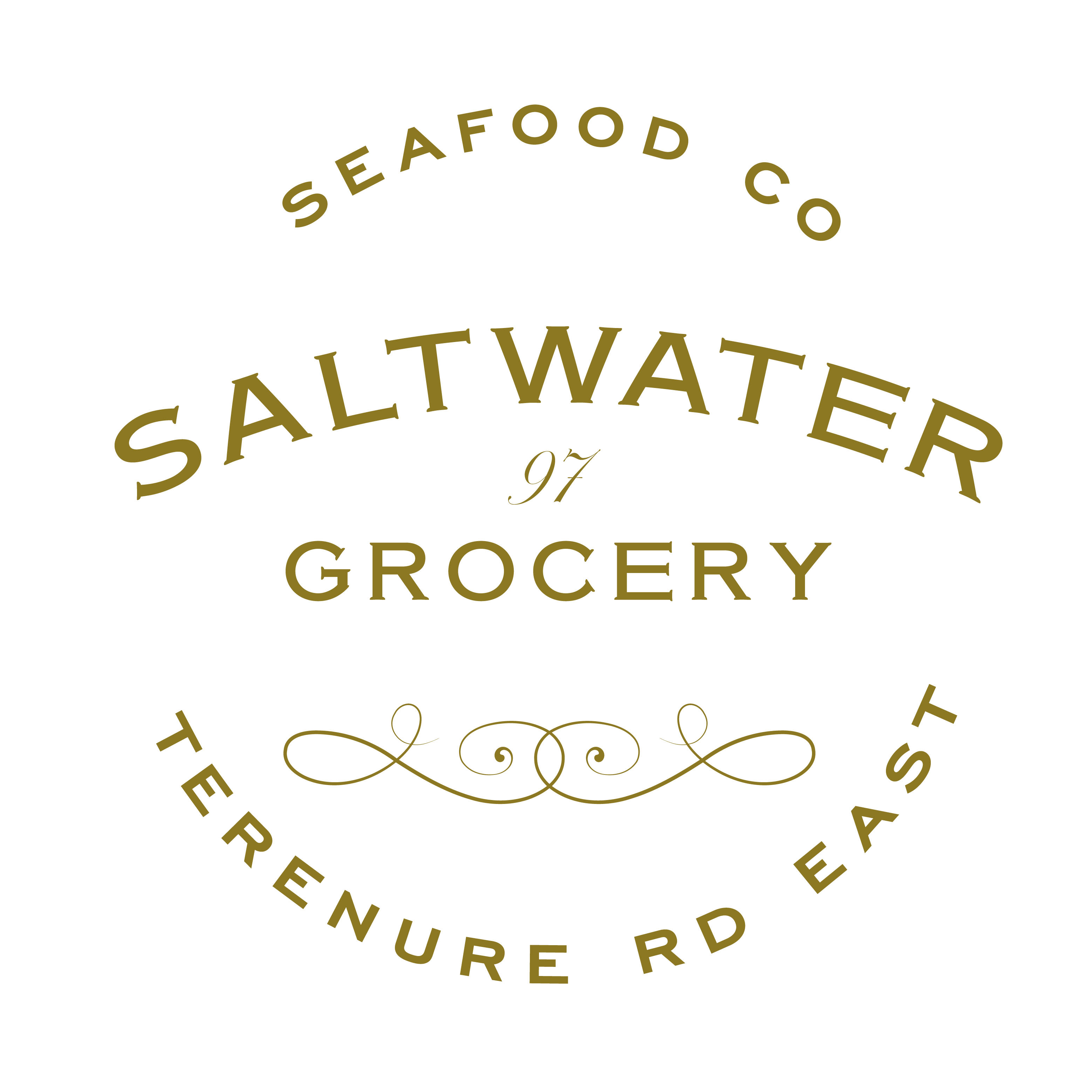
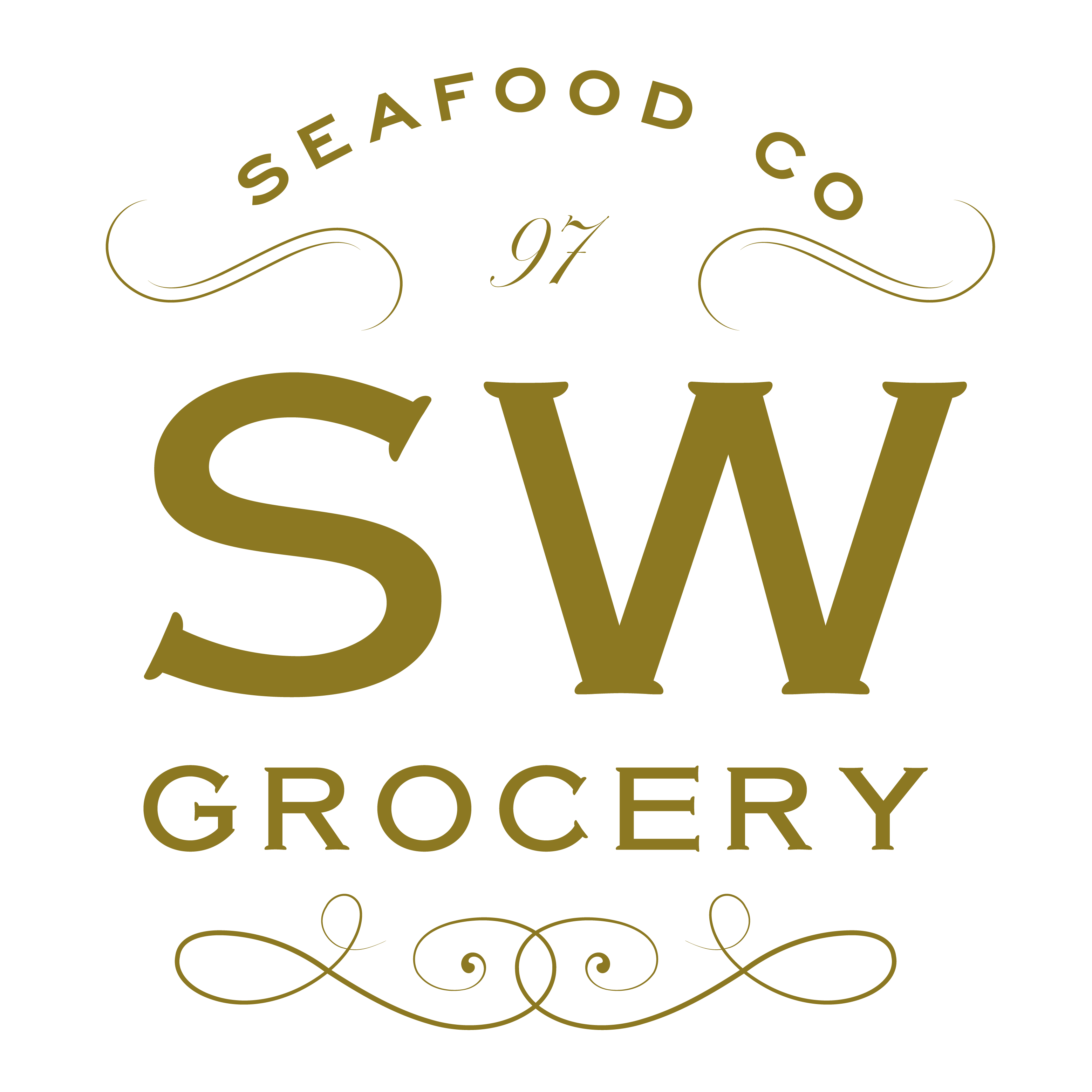
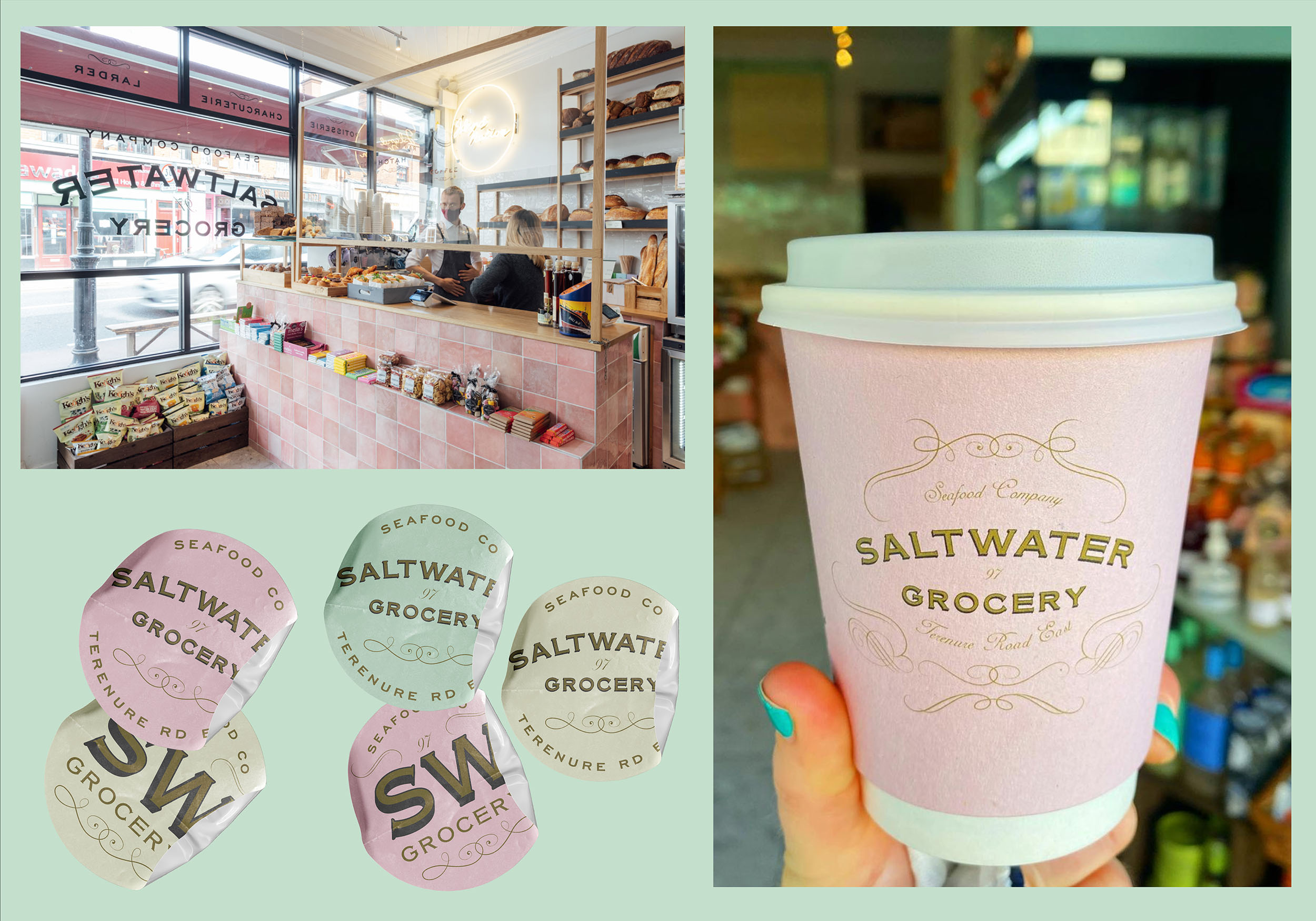
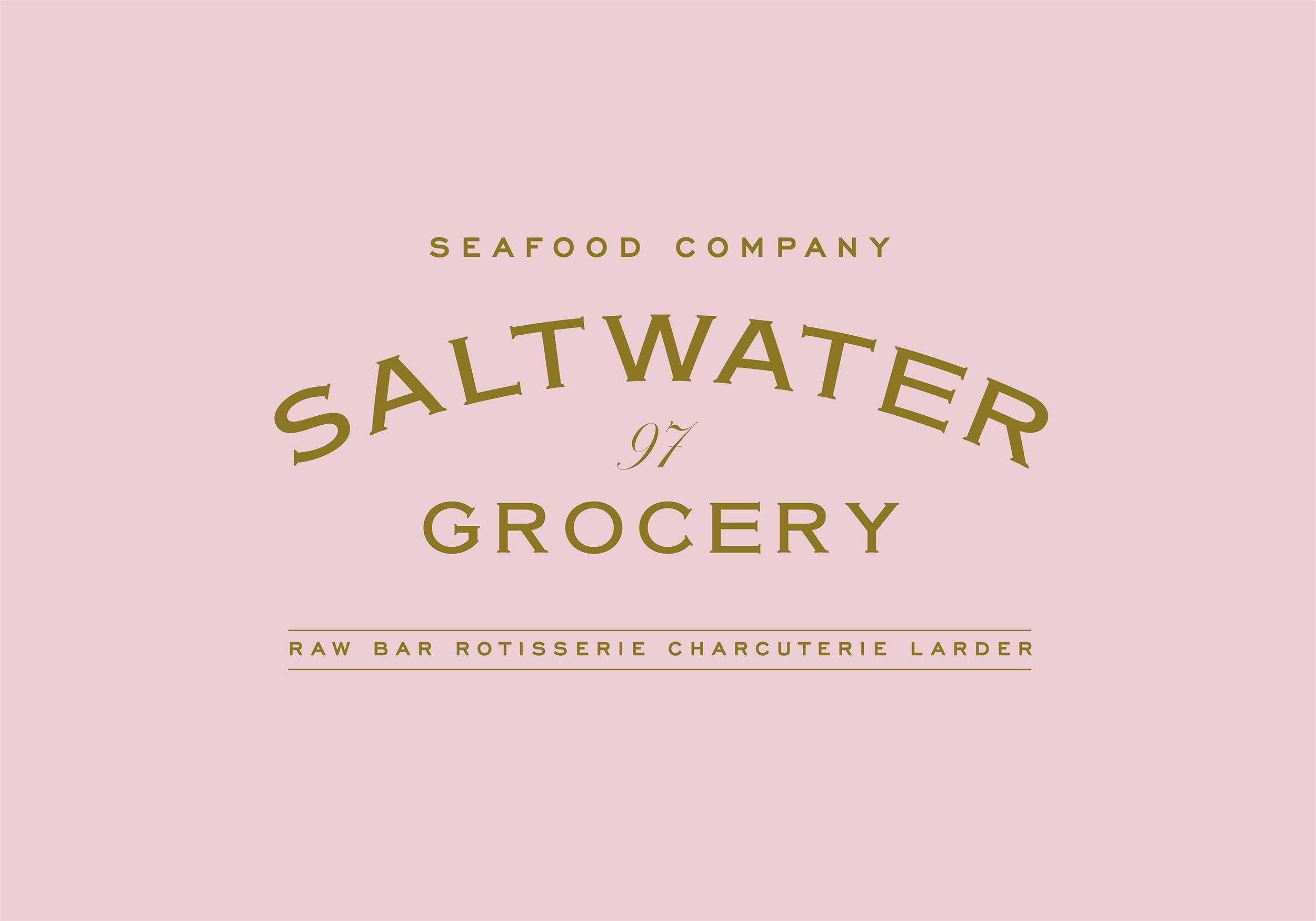
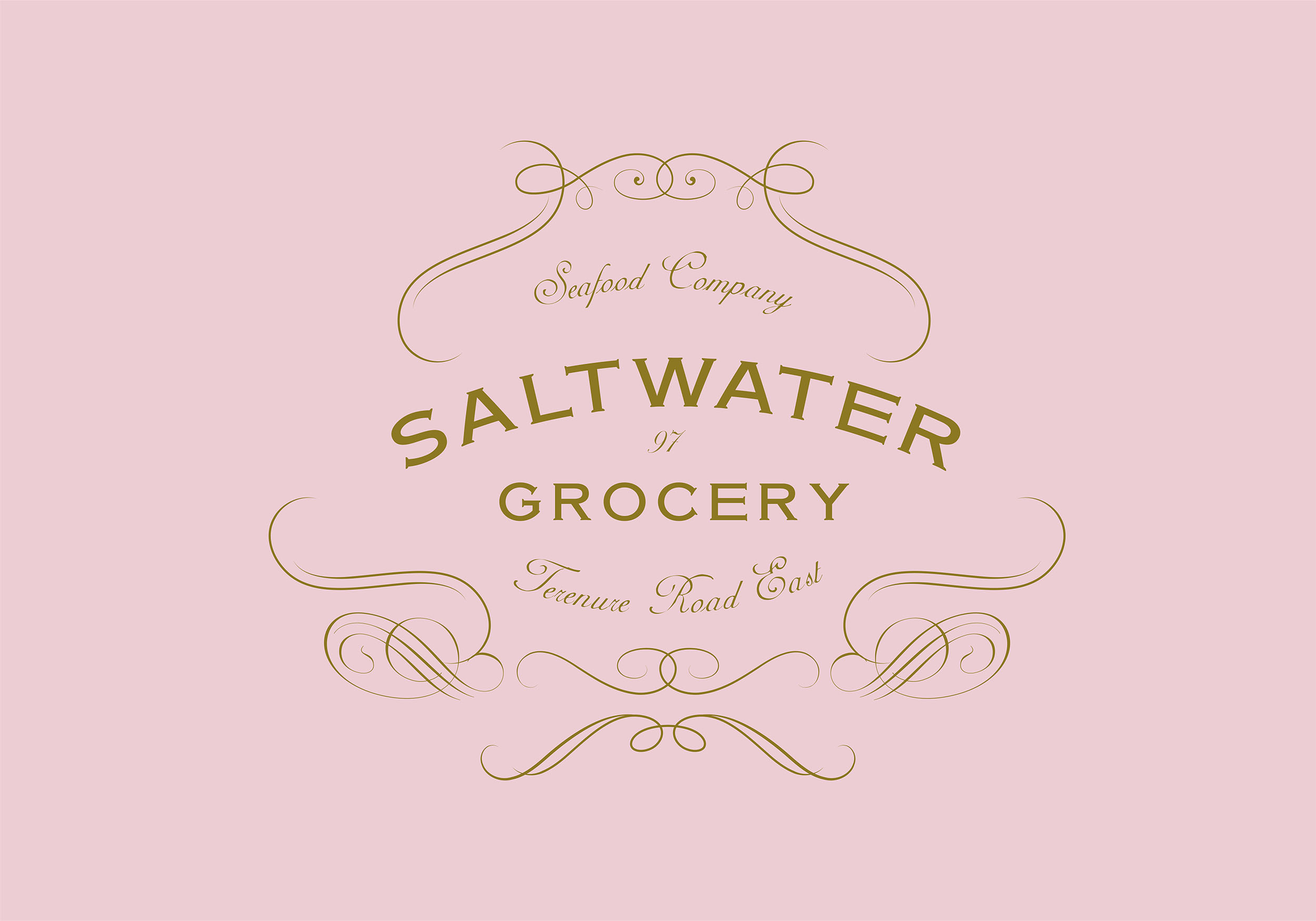
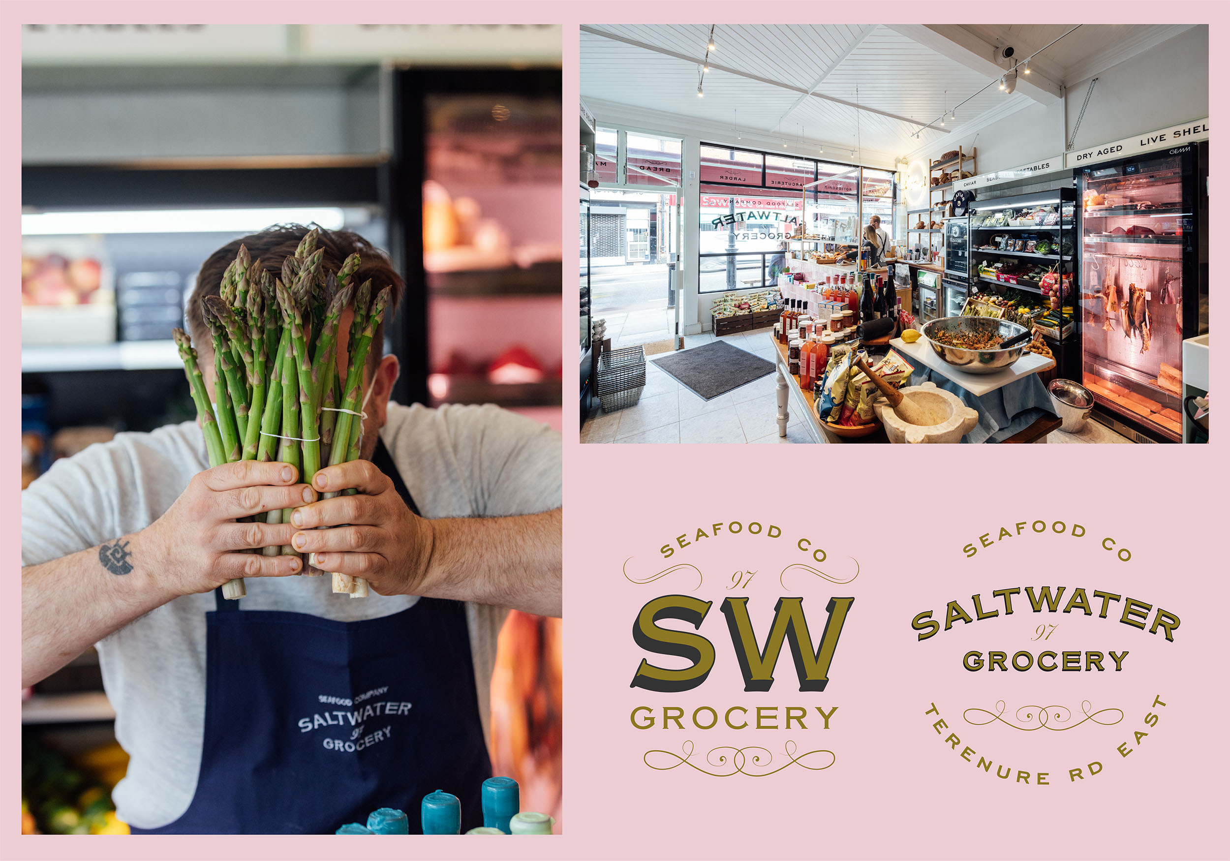
Together with interior specialists, AB Projects, we created an extensive brand and scheme for the store. The starting point was a suite of classic logos and a colour palette inspired by French Boulangeries. The suite included various marks for multiple applications; including a fancy, ornamented logo resembling an opened clam, and a purely typographic logo.
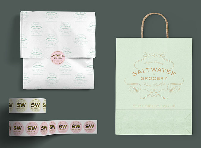
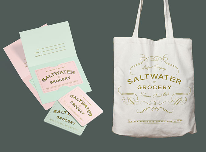
The flexible identity was designed and customised to fit the many elements from the shop interior and exterior shop signs (painted and gilded to the highest standard by Mac Signs) as well as extensive packaging, printed and digital materials, paying close attention to ensure we were sourcing the most environmentally friendly materials and working with printers that could provide such materials.
Design Assistance:
Rebecca Wright
Interior Design & Architecture:
Ahmad Fakhry & Andrew Burdock / AB Projects
Sign Painting:
Cormac Dillon & Louise Gardiner / Mack Signs
Photography:
Shantanu Starick
Rebecca Wright
Interior Design & Architecture:
Ahmad Fakhry & Andrew Burdock / AB Projects
Sign Painting:
Cormac Dillon & Louise Gardiner / Mack Signs
Photography:
Shantanu Starick


Client Brief:
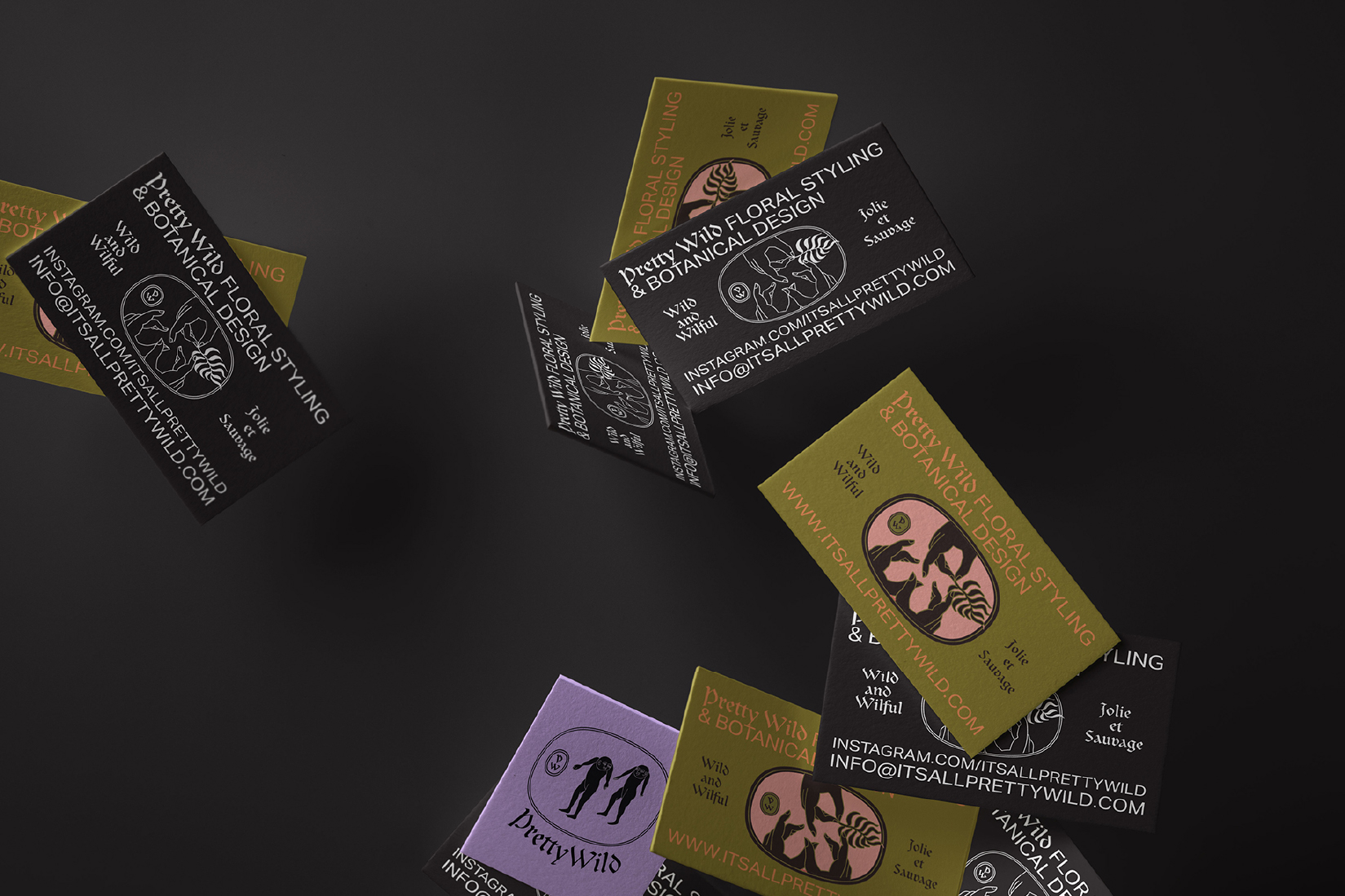
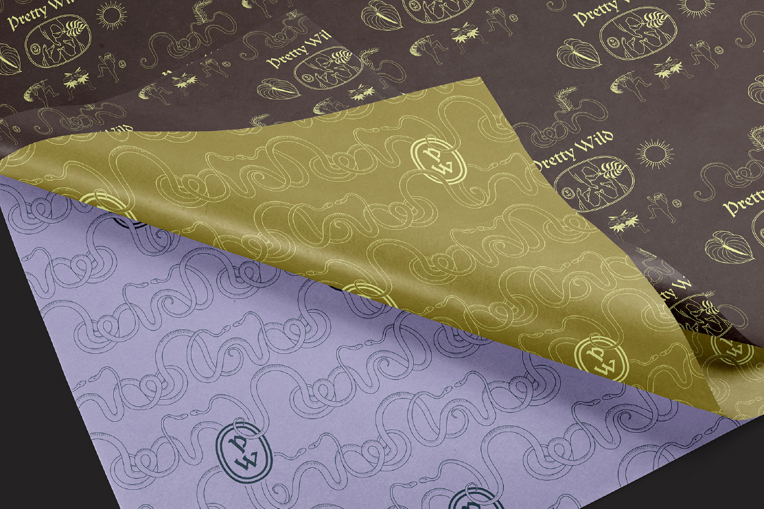
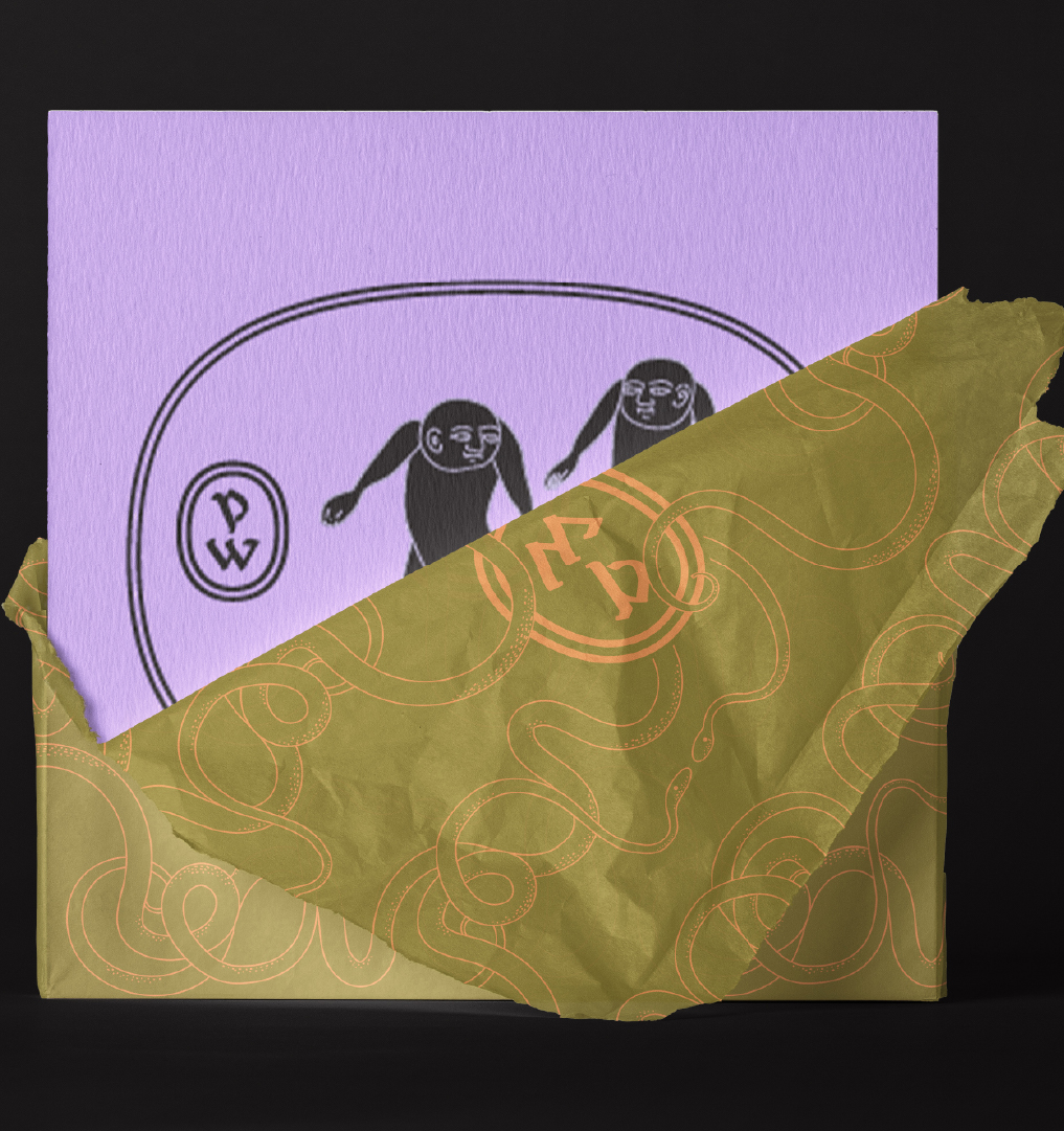
Pretty Wild is a Floristry Studio and Shop based in Bristol. Ellen needed a lot of bits designed for the rapidly expanding business such as business cards, care cards, branded wrapping tissue, stickers, tape etc. We needed to keep the existing legacy logotype but expand the brand identity with a colour way and a suite of illustartions and marks.
Pretty Wild is a Floristry Studio and Shop based in Bristol. Ellen needed a lot of bits designed for the rapidly expanding business such as business cards, care cards, branded wrapping tissue, stickers, tape etc. We needed to keep the existing legacy logotype but expand the brand identity with a colour way and a suite of illustartions and marks.
Our Response:
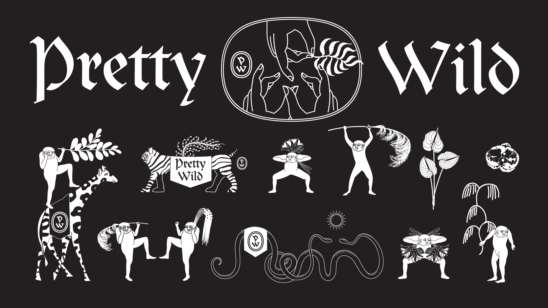
Inspired by gangster business cards, we created a three handed gang sign spelling out ‘PW’ as the central motif. Instead of simply repeating this same logo design across the whole suite of materials we created a whole gang of misfit characters that could inhabit the Pretty Wild world.
Inspired by gangster business cards, we created a three handed gang sign spelling out ‘PW’ as the central motif. Instead of simply repeating this same logo design across the whole suite of materials we created a whole gang of misfit characters that could inhabit the Pretty Wild world.
Client Testimonial:
Rachel and Stina, took a ball of tangled thoughts, ramblings and screenshots and distilled them in to a body of work that gives me such genuine and innocent pleasure.
‘I want flowers, but not flower flowers. I want romance but I don't want to be seen as romantic. I want androgyny. I want old and new. I want cool but not too cool. I want something that I'm happy to live through because, as a self-employed, creative person, I am my work.'
Ellen Kenny, Director, Pretty Wild
