

2021
![]()
The Douglas Hyde
Brand Identity & Website Design
thedouglashyde.ie
Client: The Douglas Hyde
Developer: Alex Bradley
Winner
IDI Universal Design
Special Awards
![]()
Brand Identity & Website Design
thedouglashyde.ie
Client: The Douglas Hyde
Developer: Alex Bradley
Winner
IDI Universal Design
Special Awards

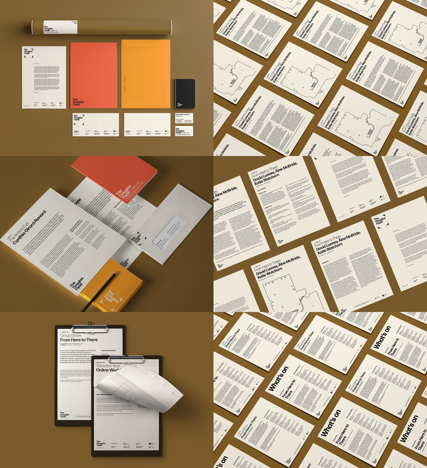
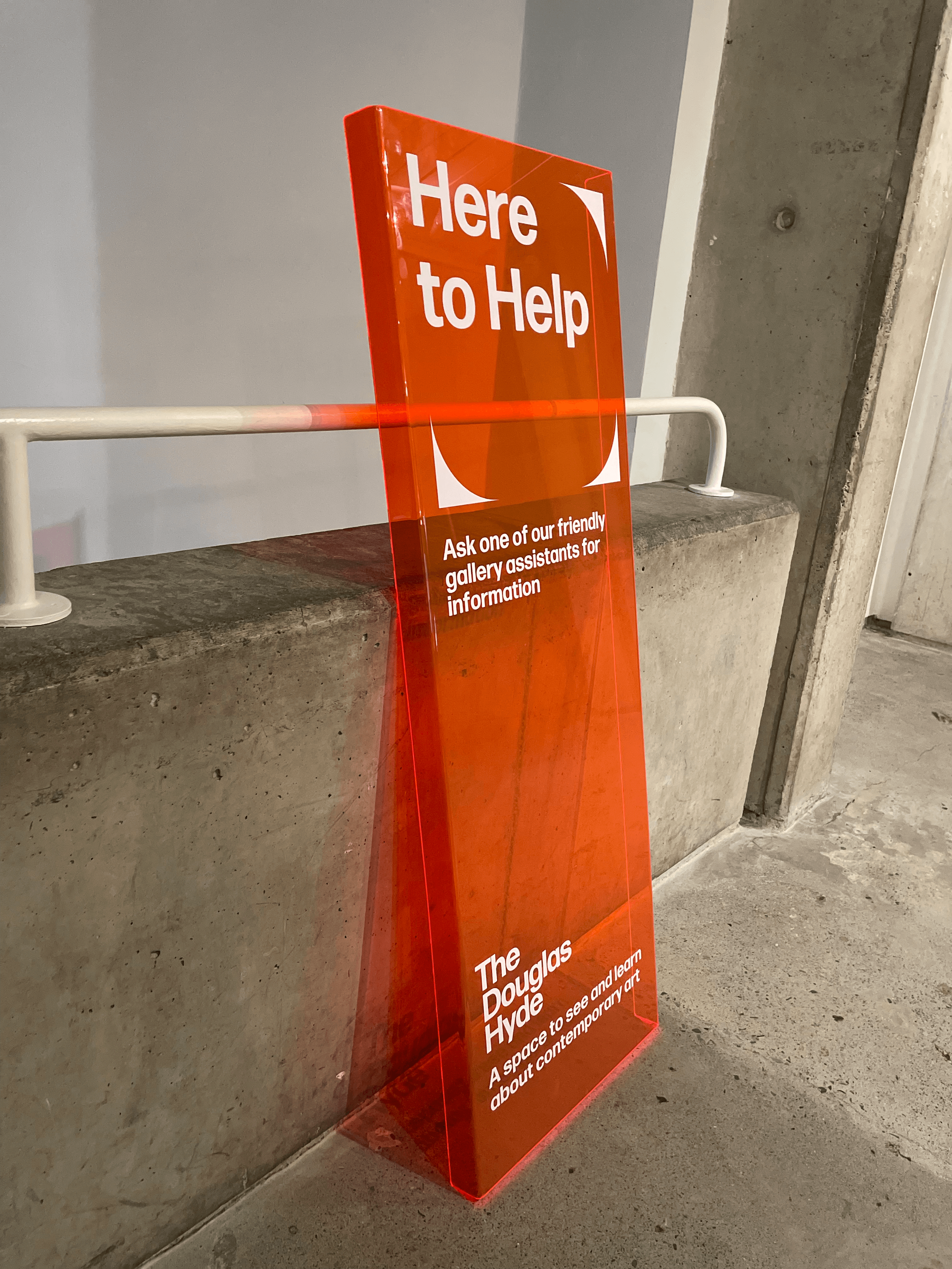
Client Brief:
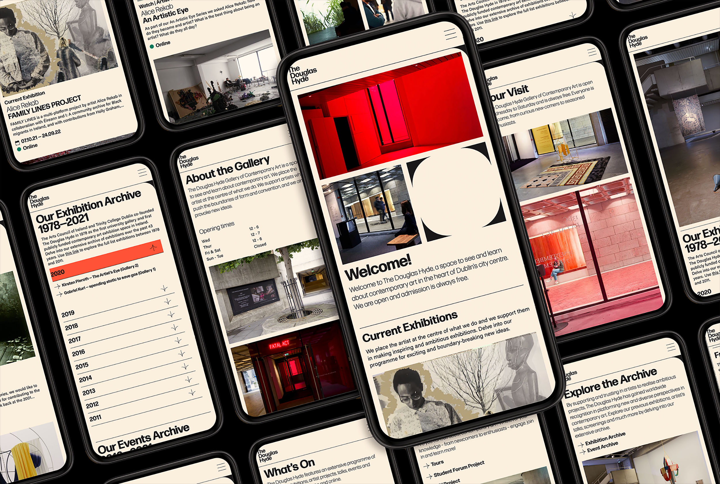
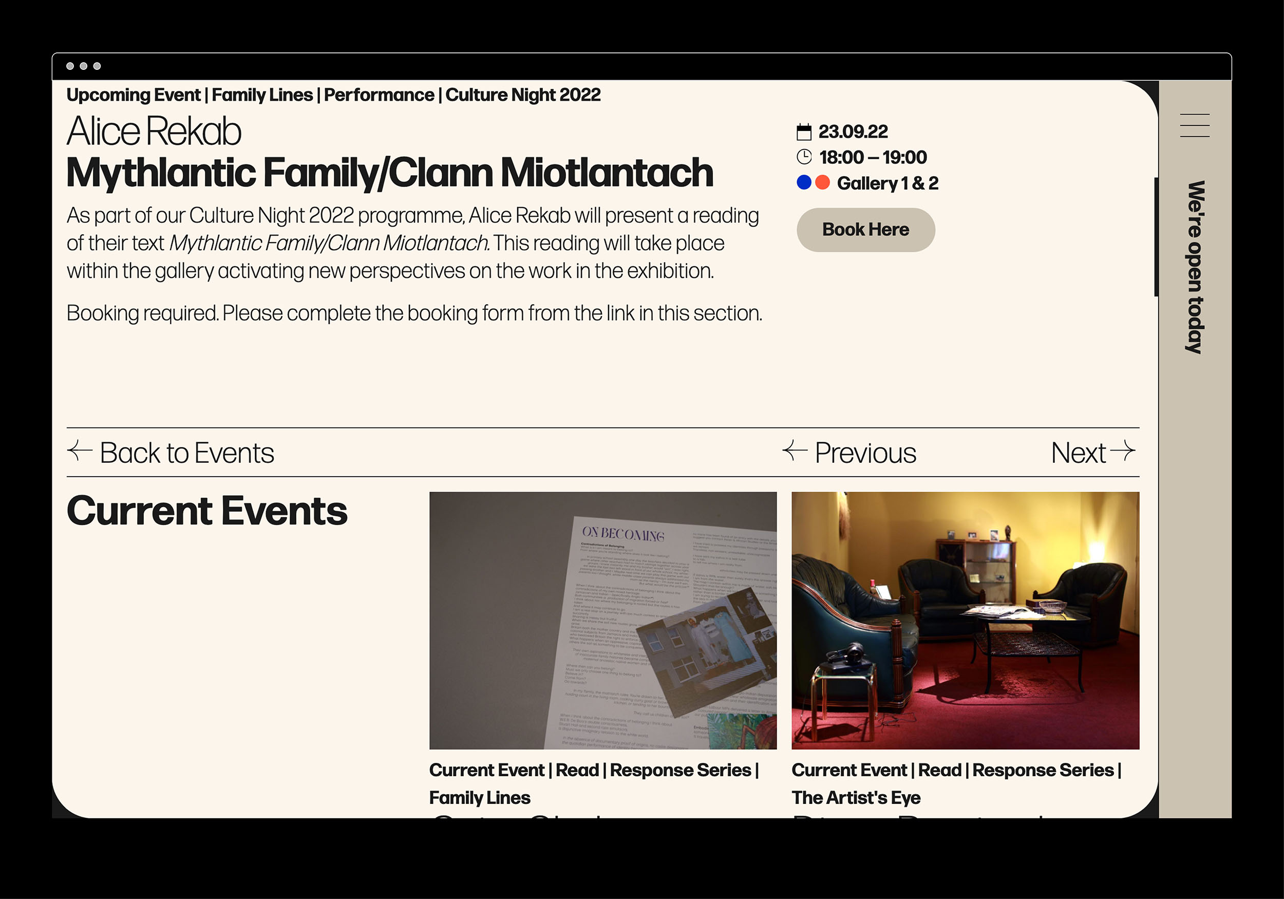
Challenges that most contemporary art galleries struggle with have to do with accessibility and how to bring conversations about art to larger and non-traditional audiences. With this rebrand and website project we needed to create an accessible and friendly design that welcomes new engagement and does away with any perceived intimidation whilst still maintaining the intellectual reputation of the gallery.
Challenges that most contemporary art galleries struggle with have to do with accessibility and how to bring conversations about art to larger and non-traditional audiences. With this rebrand and website project we needed to create an accessible and friendly design that welcomes new engagement and does away with any perceived intimidation whilst still maintaining the intellectual reputation of the gallery.
Our Response:
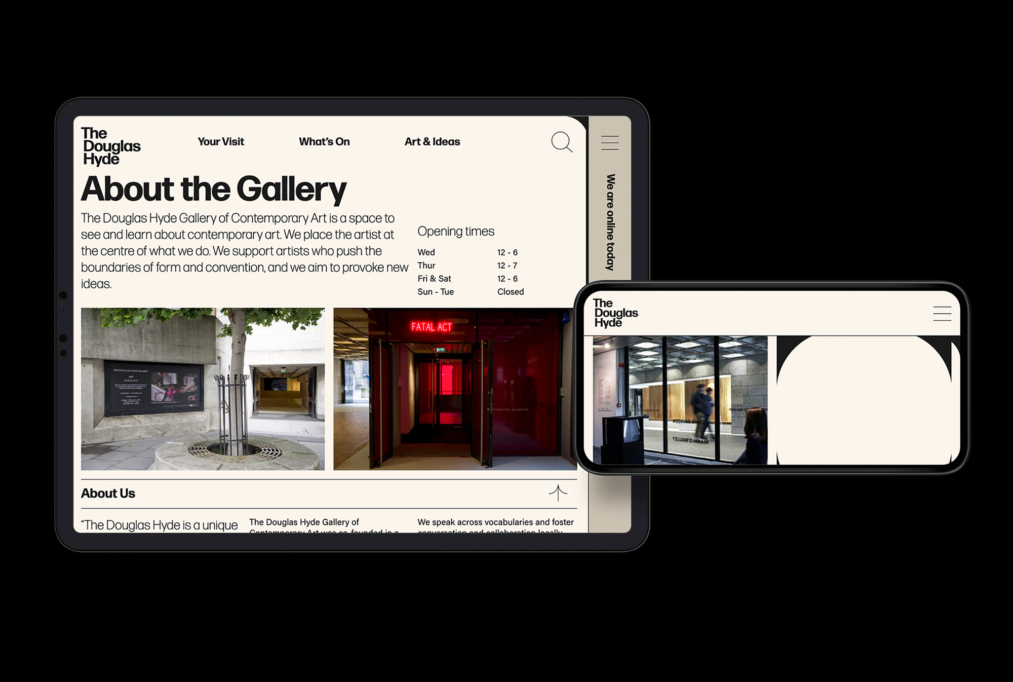
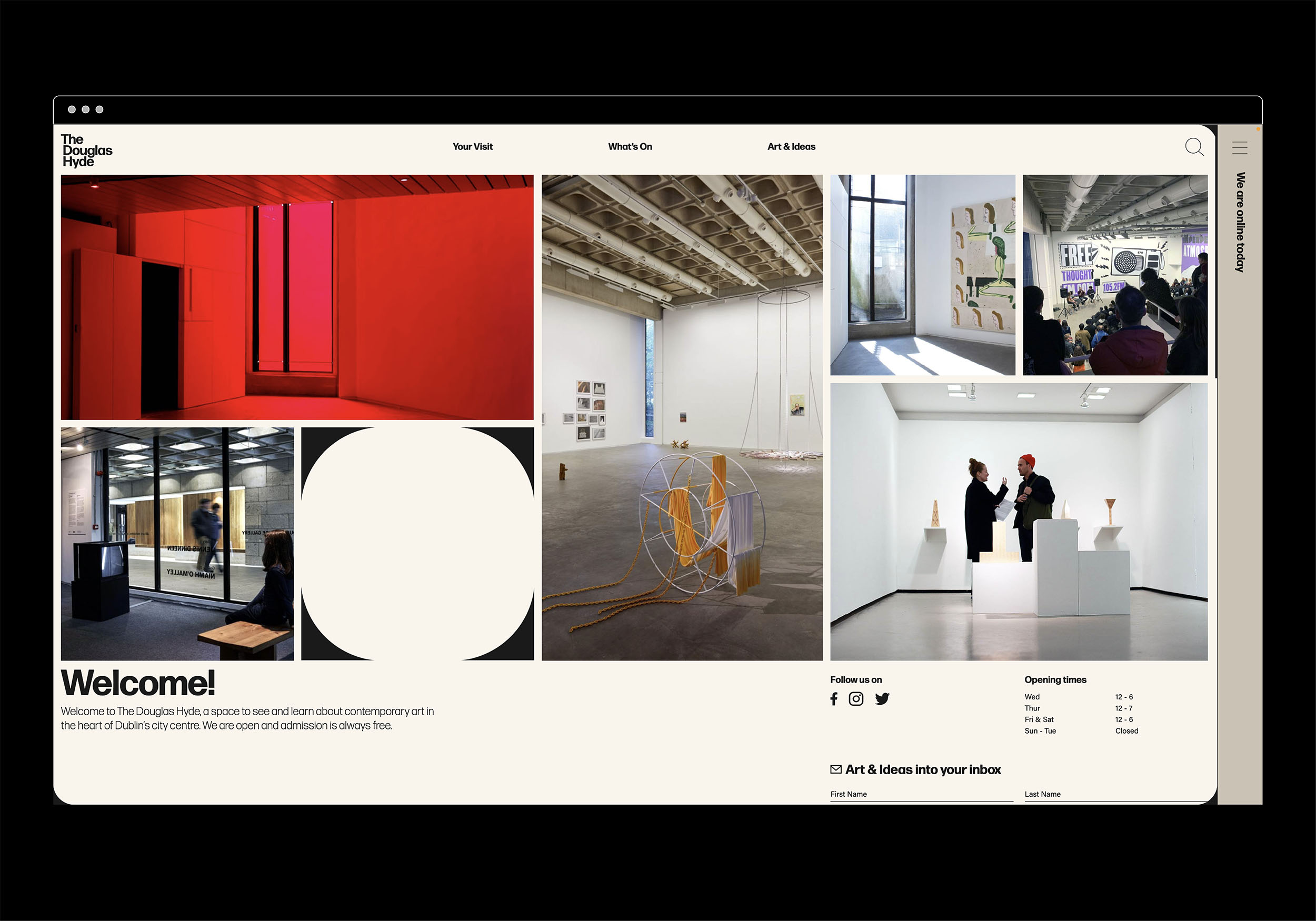
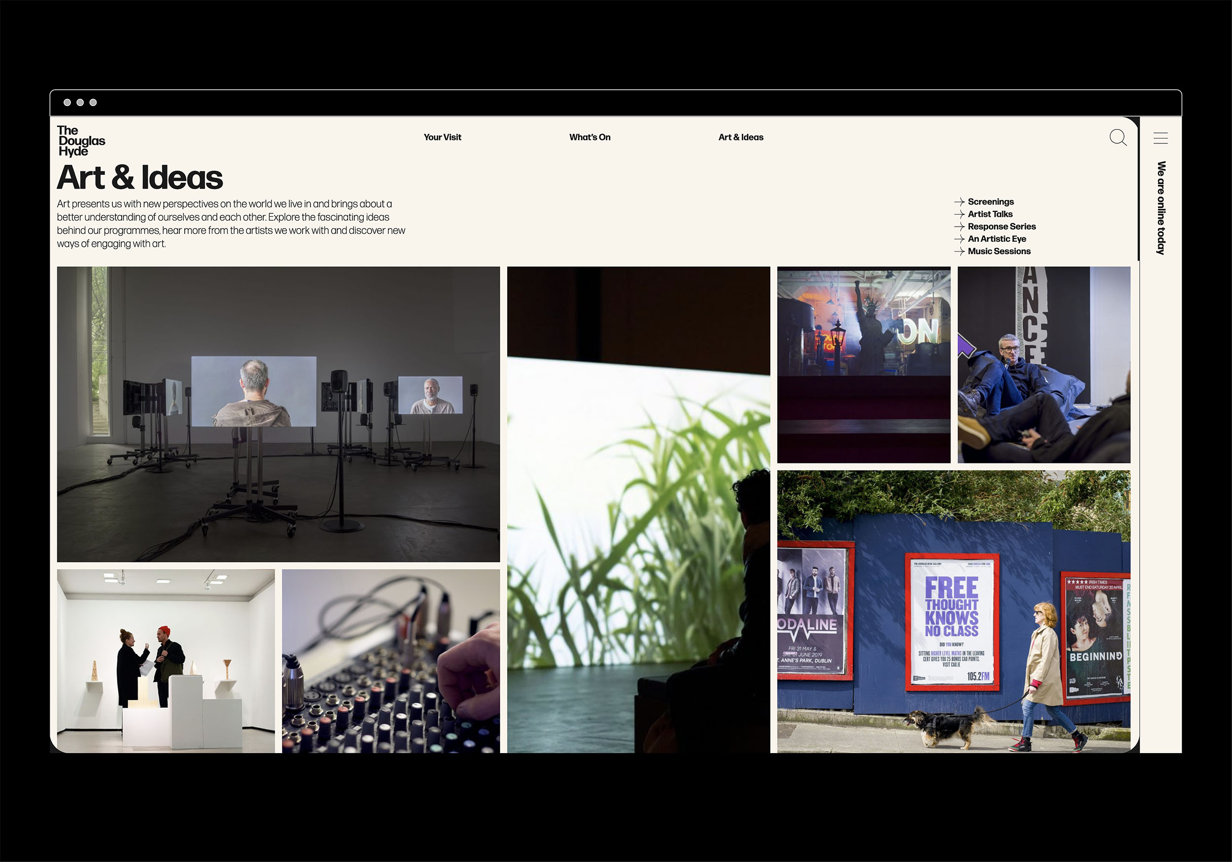
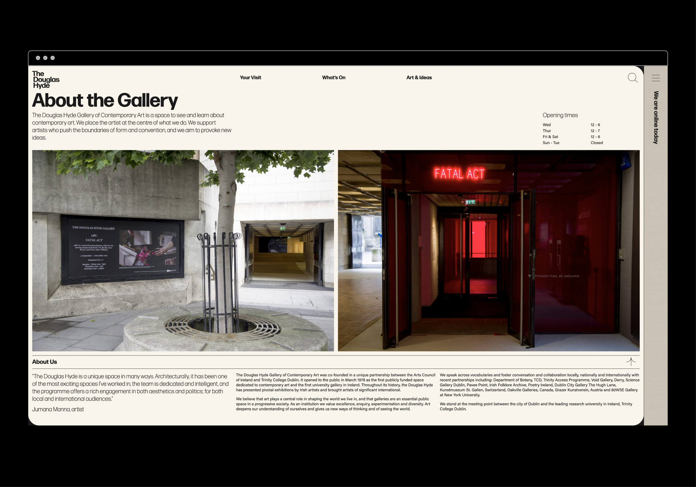
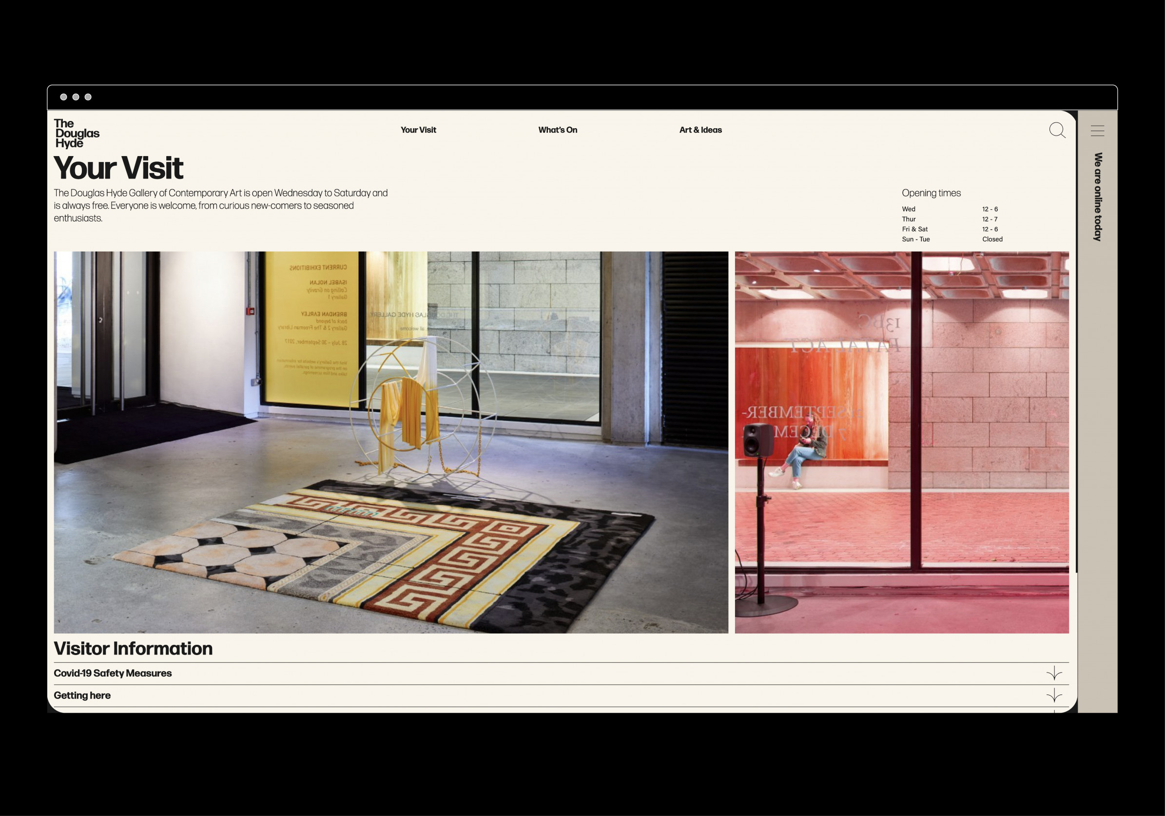
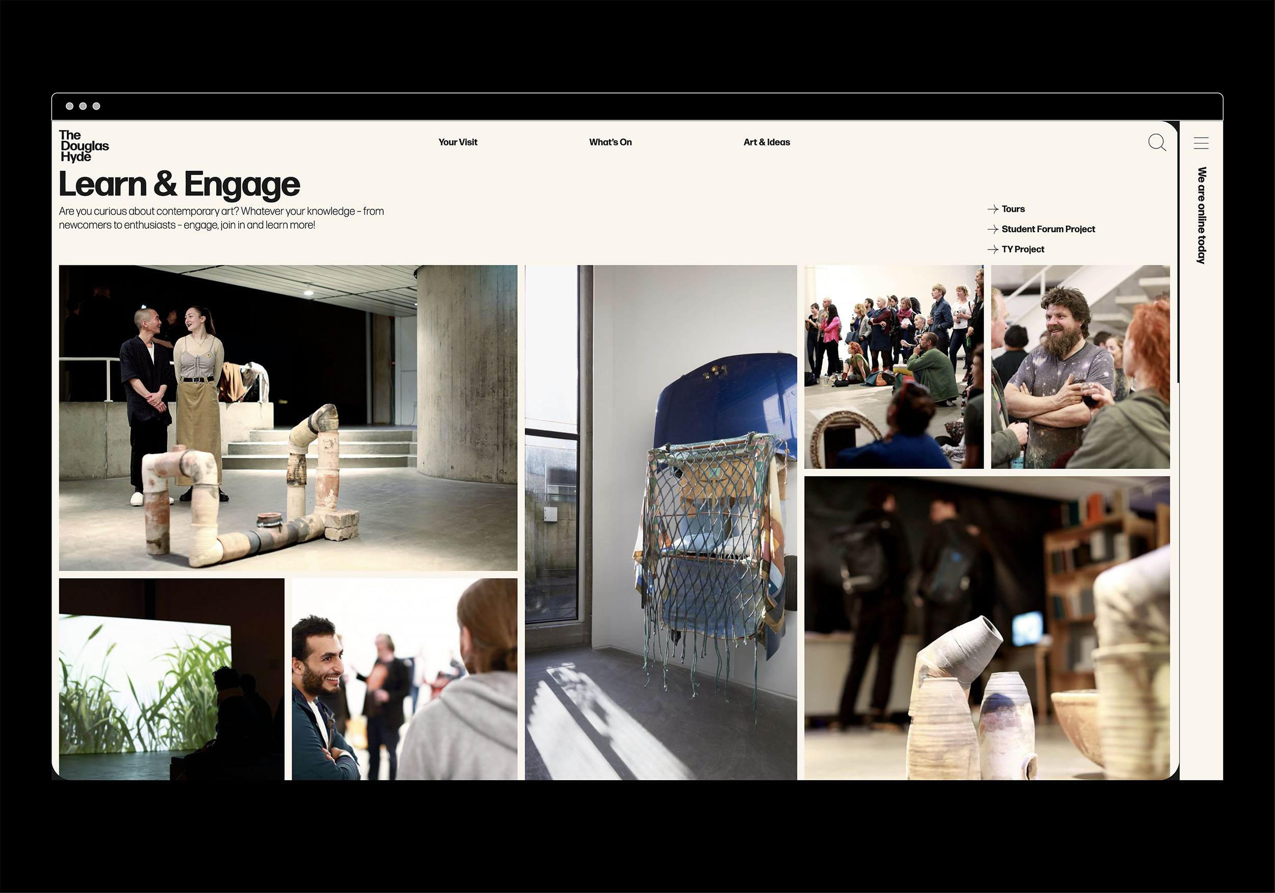
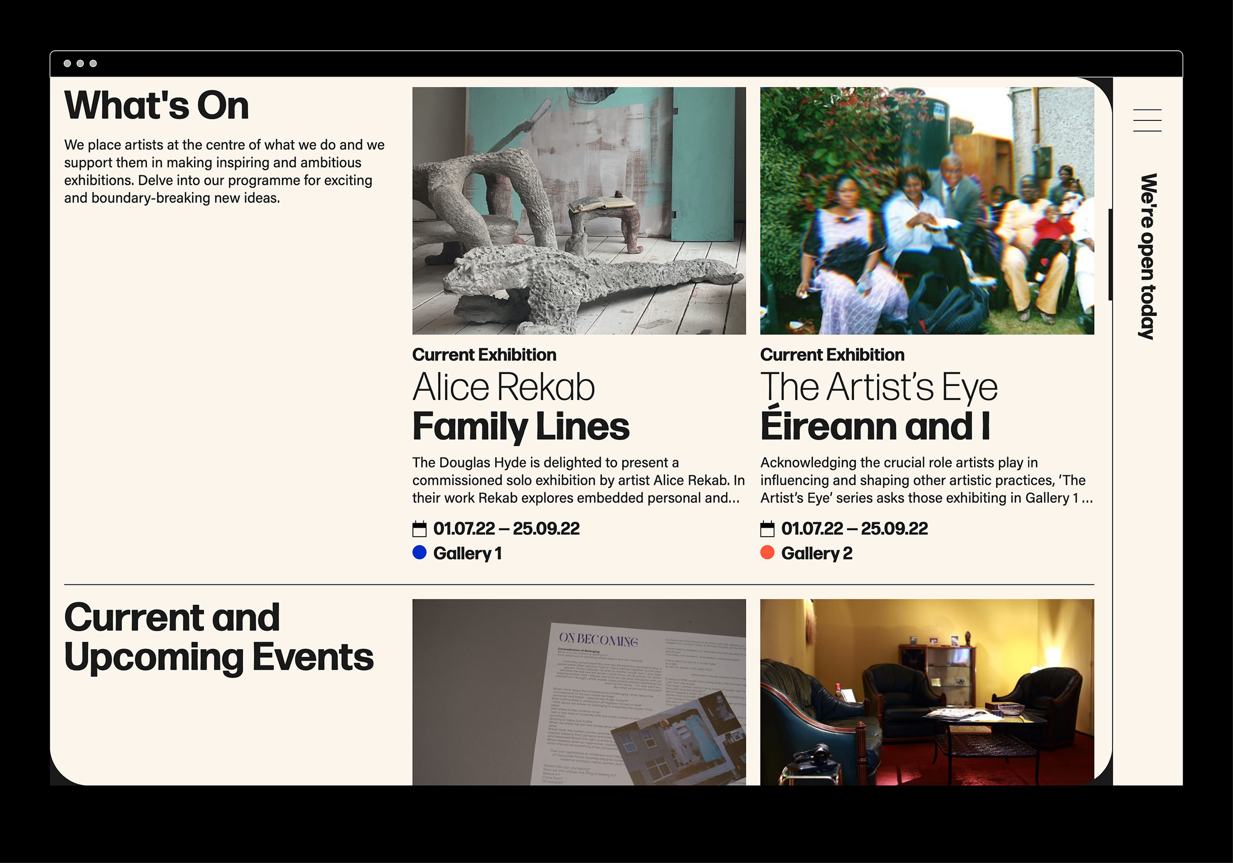
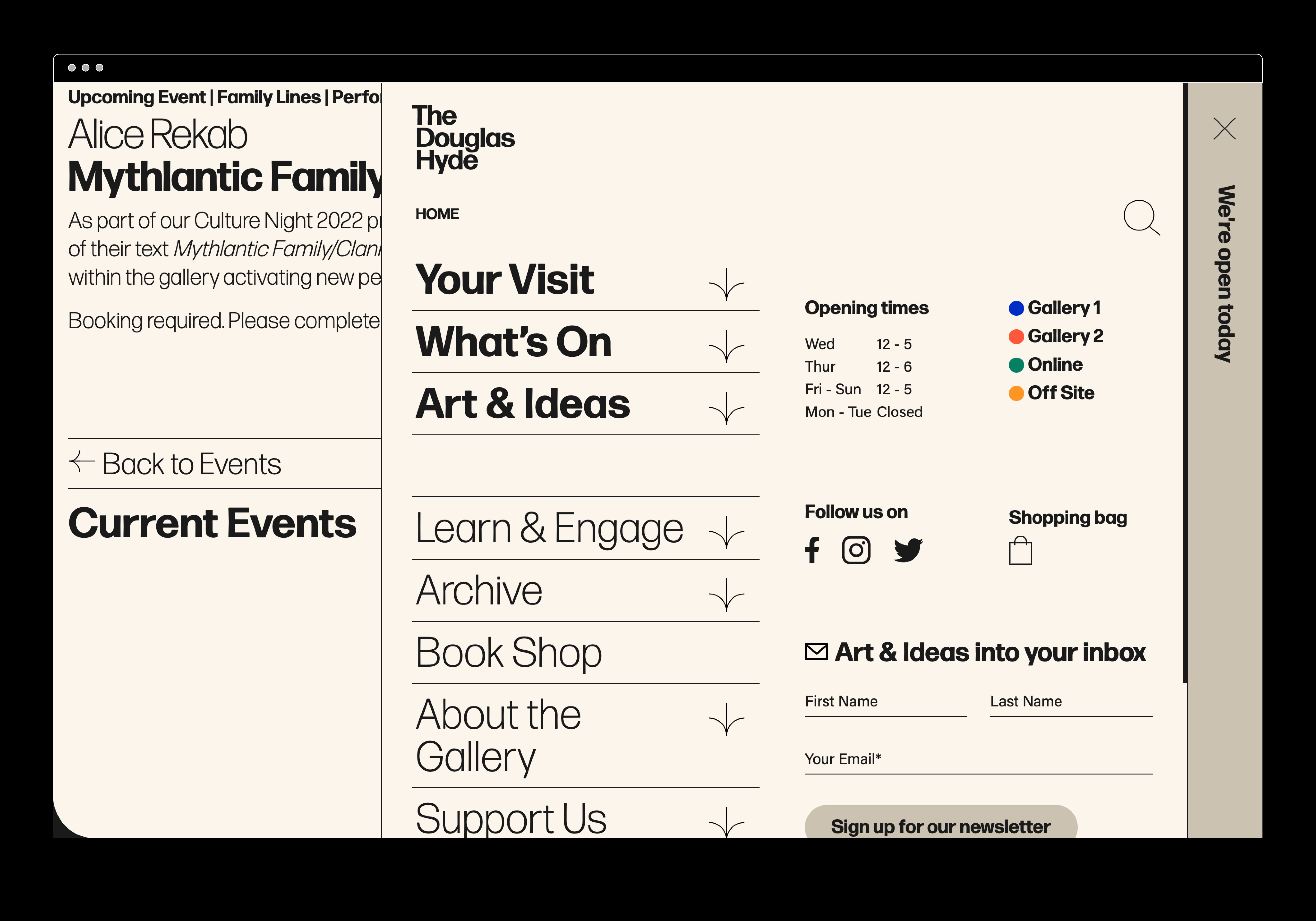
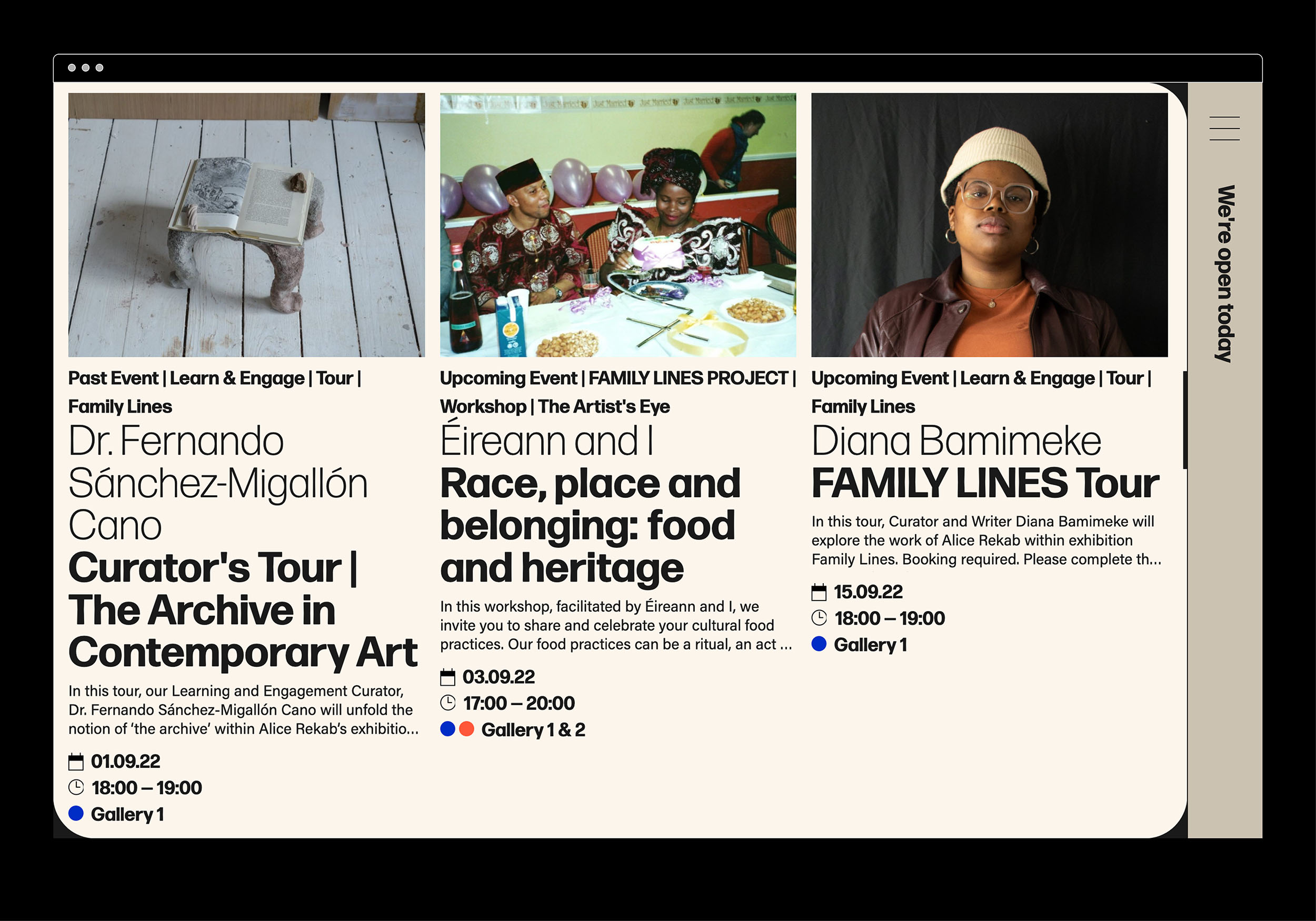
The website and all other communications platforms needed a clear editorial structure that allows for tiered levels of engagement with an information system using headings, sub-heads, introductory paragraph-styles, ‘read more’ tags etc. going from engaging and welcoming to descriptive and informative to academic and critical.
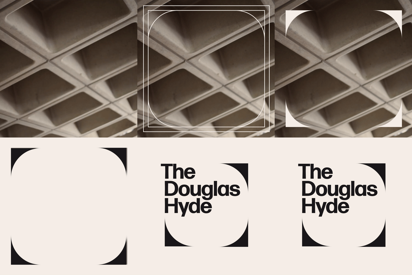
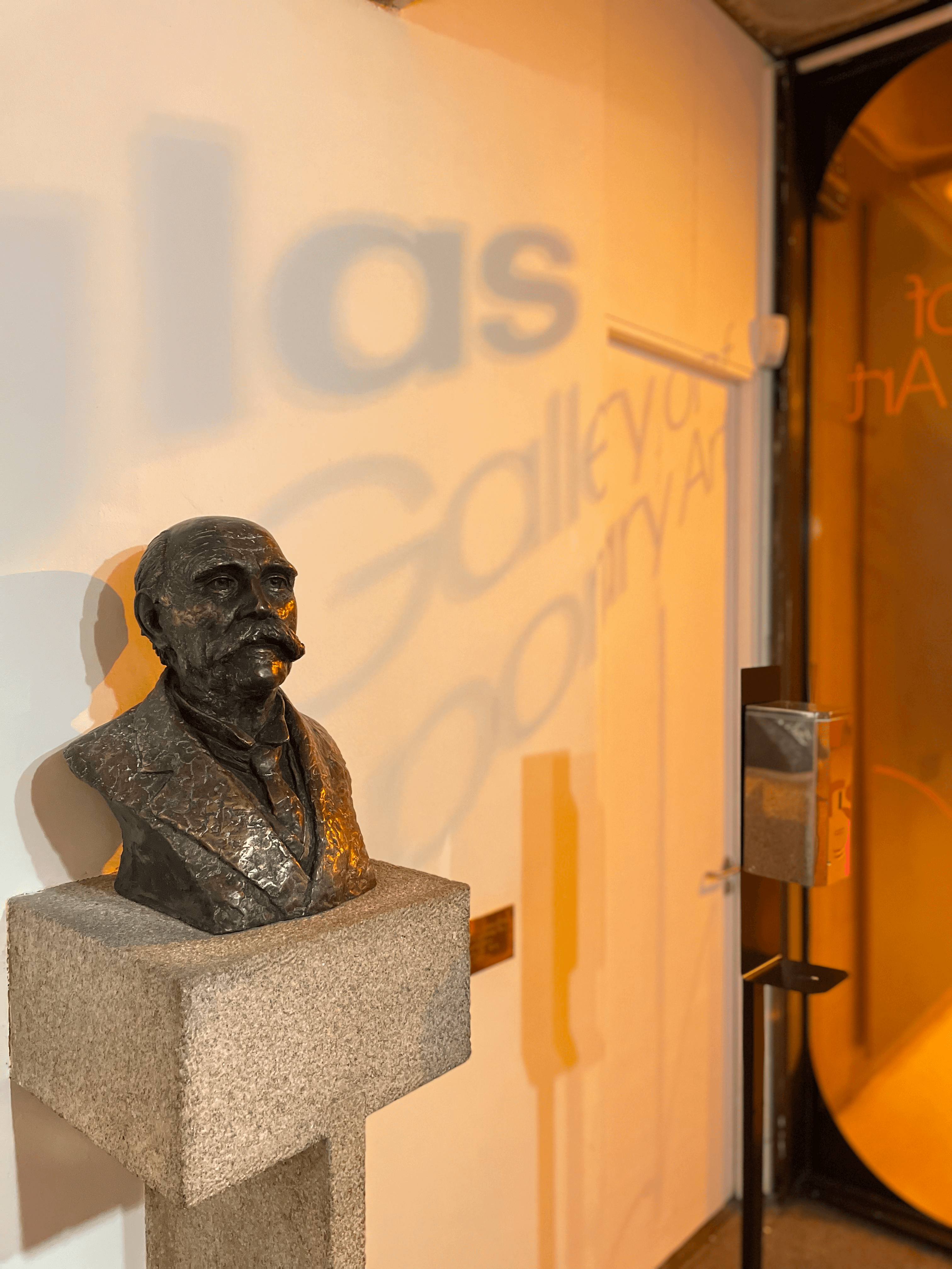
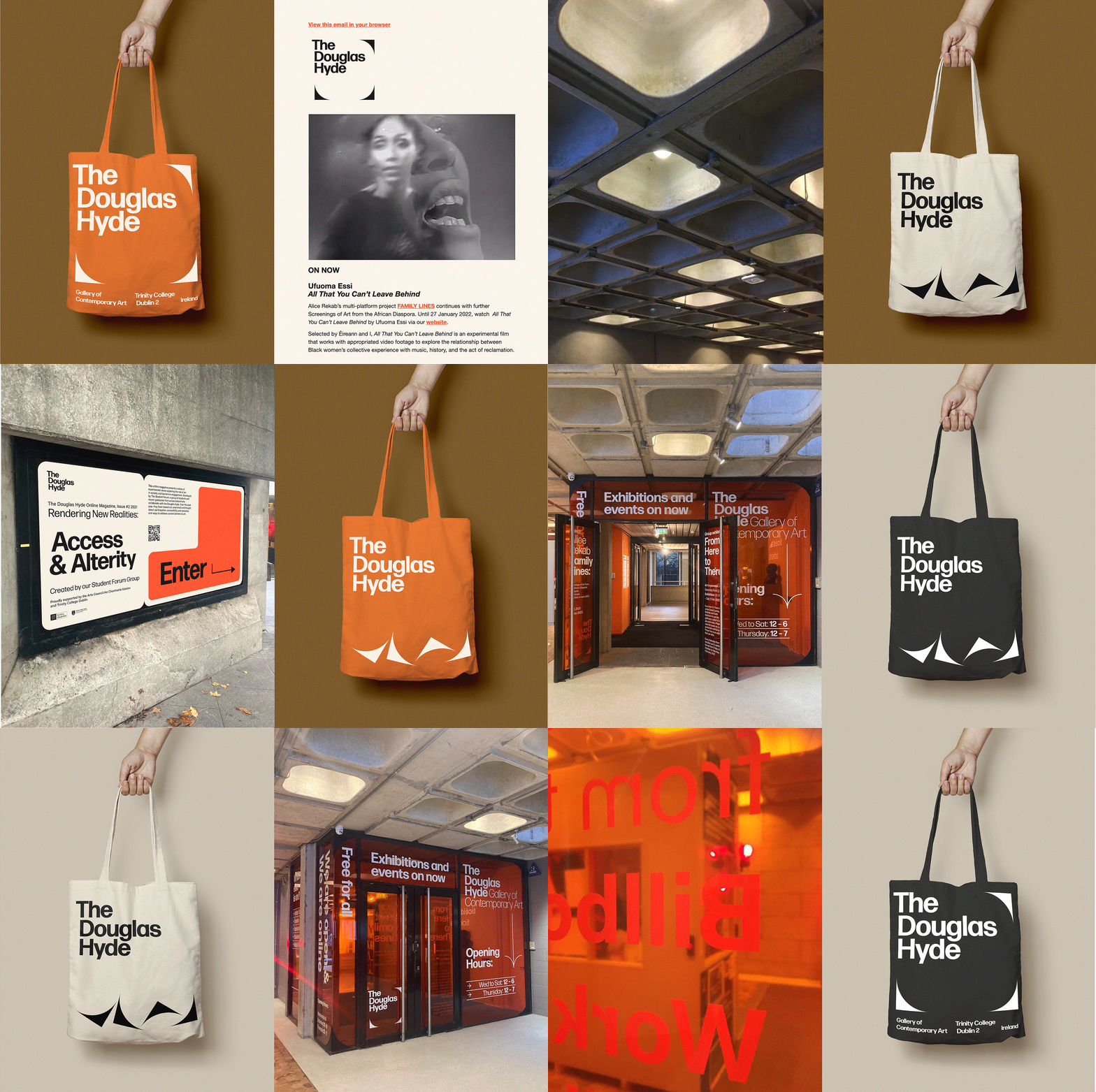
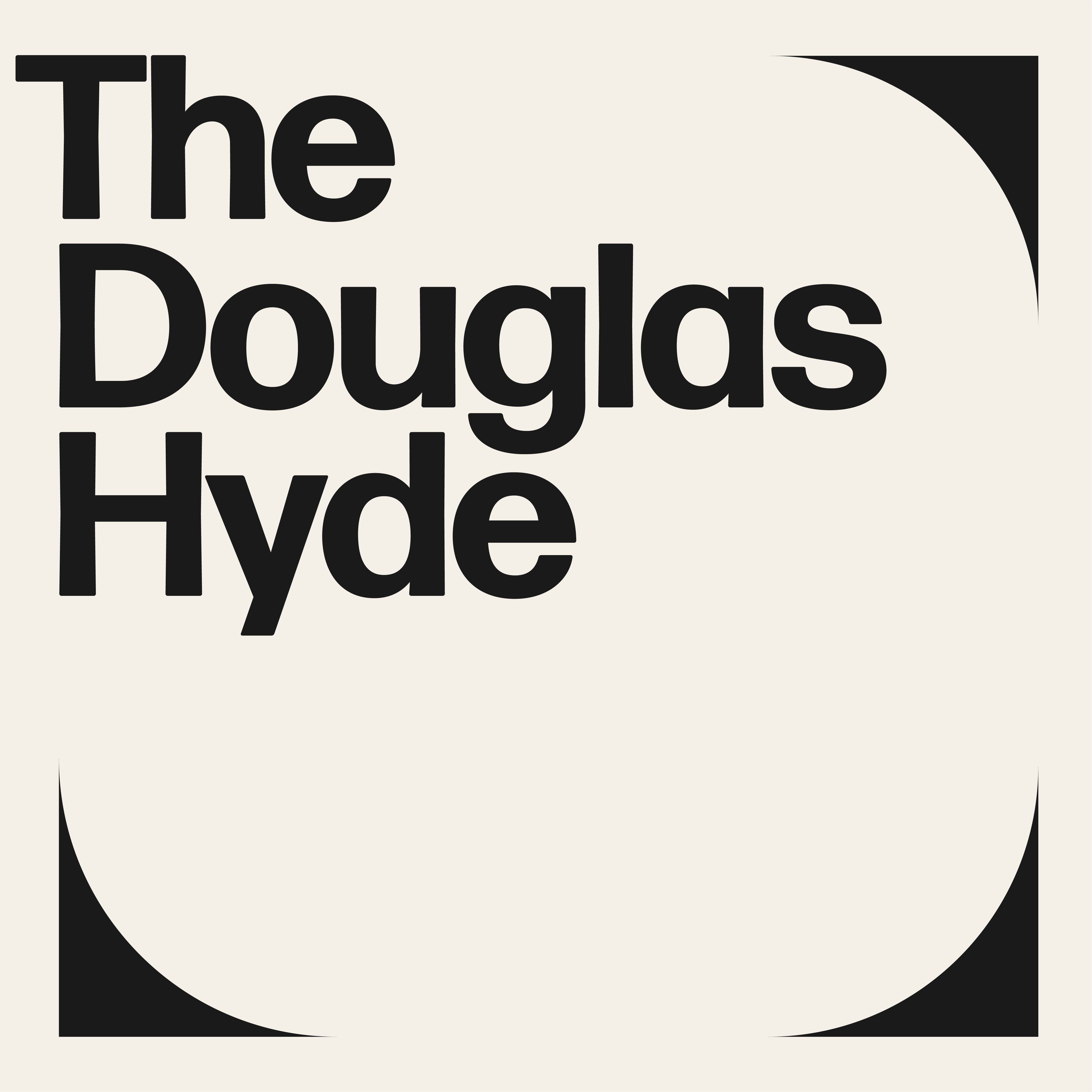
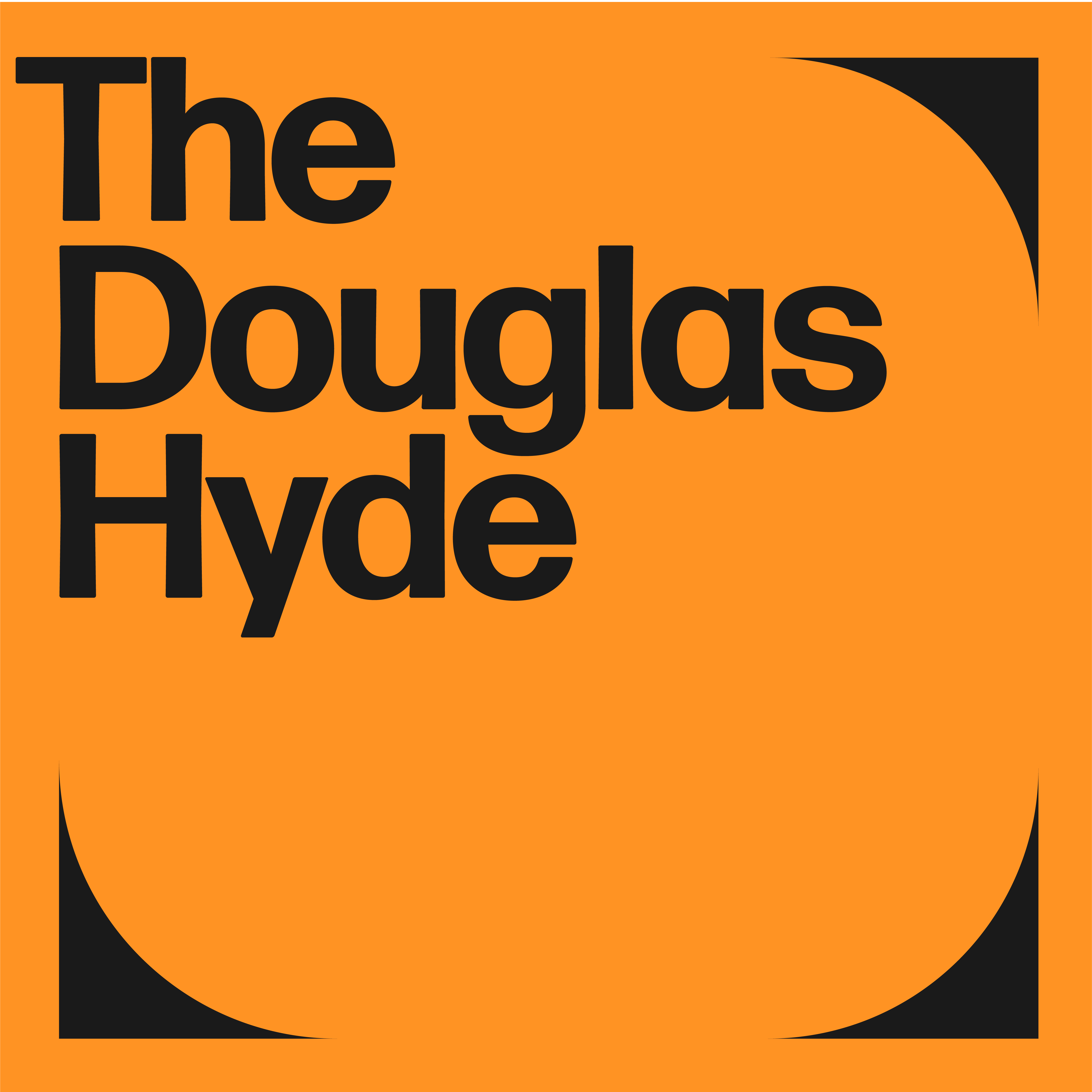
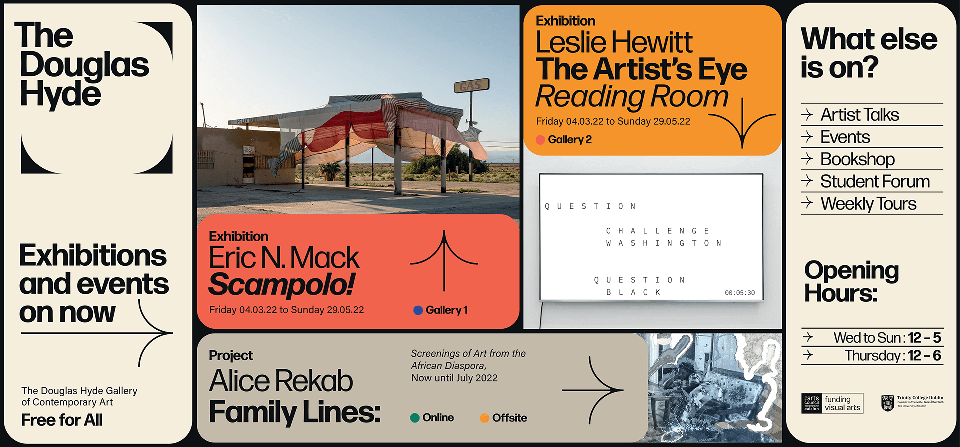
A gallery in essence is an architectural space, thus the design was inspired by aspects of its architectural features. The concrete ceiling of the gallery and the Trinity Arts Block became the catalyst for the logo and subsequently the brand identity and look and feel of the website. The rounded shape of the ceiling cells create a tension between sharpness and smoothness and of the negative and positive space.
We worked closely with Learning & Engagement Curator of The Douglas Hyde, Fernando Sánchez-Migallón Cano and developer, Alex Bradley, to achieve a universal design. This included working with Knowbility to ensure the finished design was accessible to a wide range of people regardless of their age, size, ability or disability.
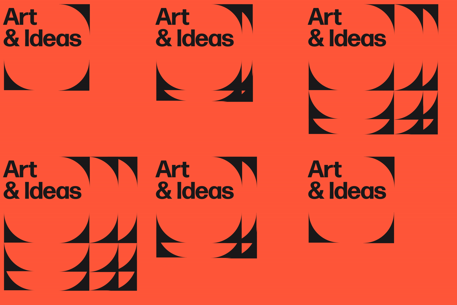
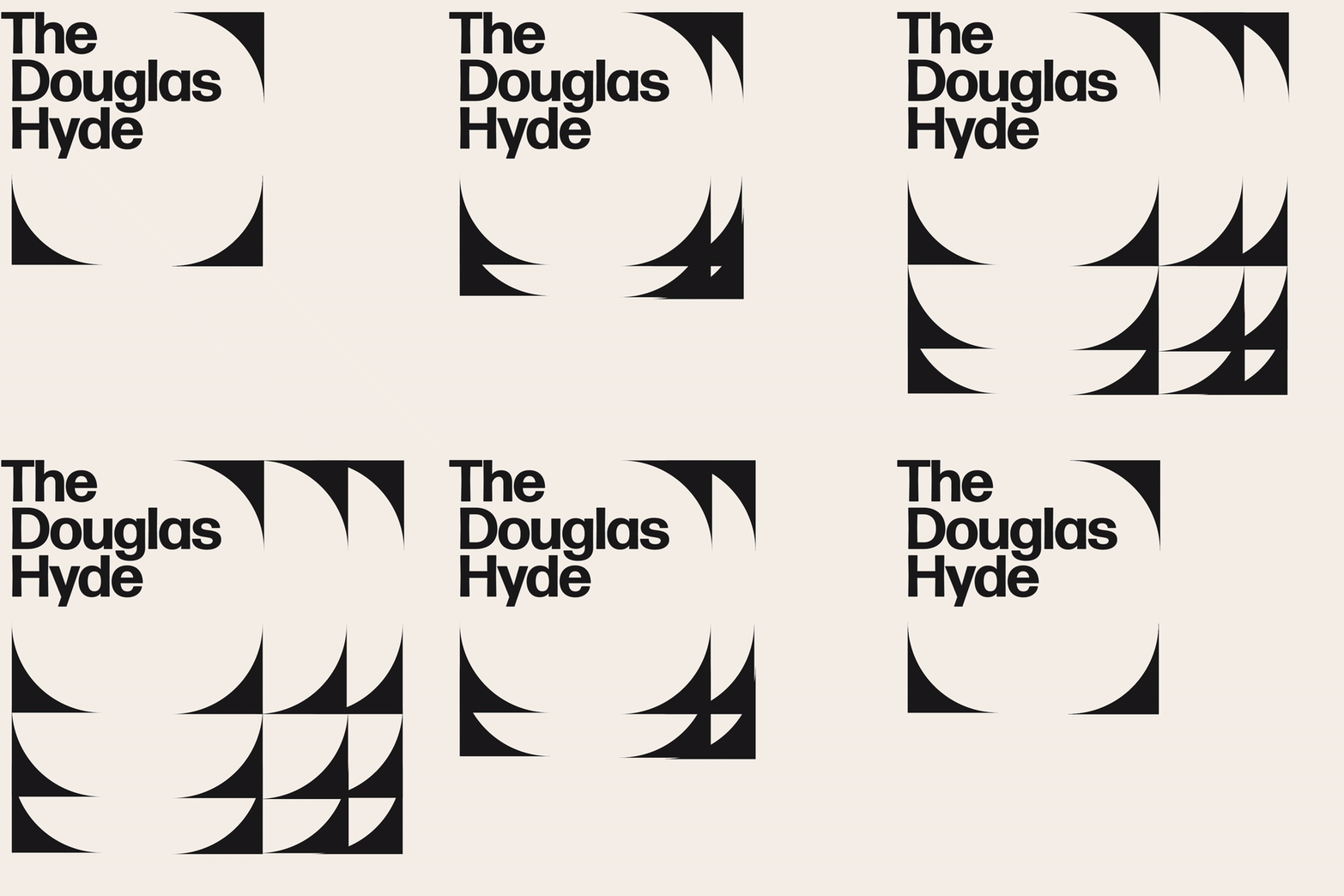
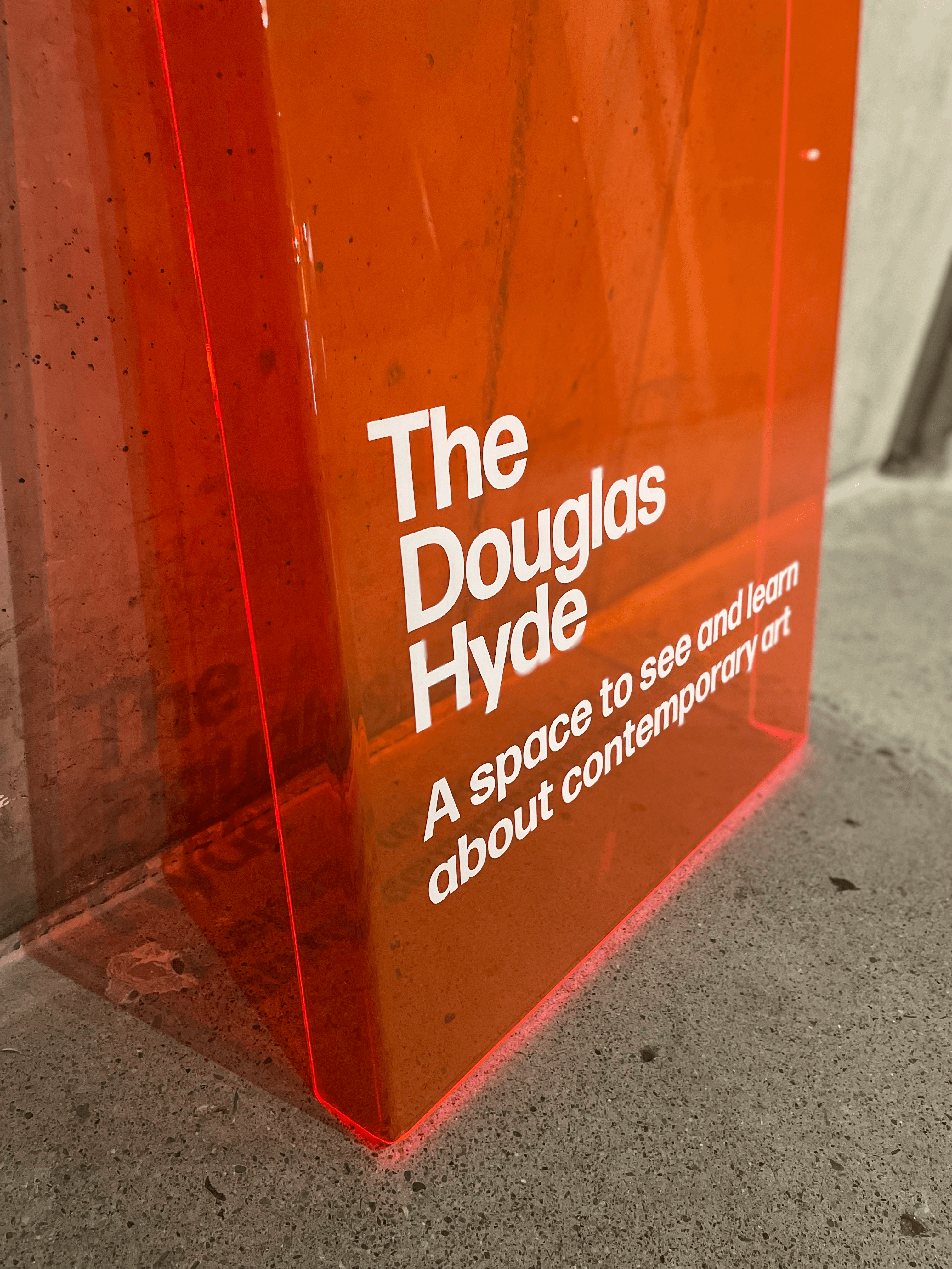
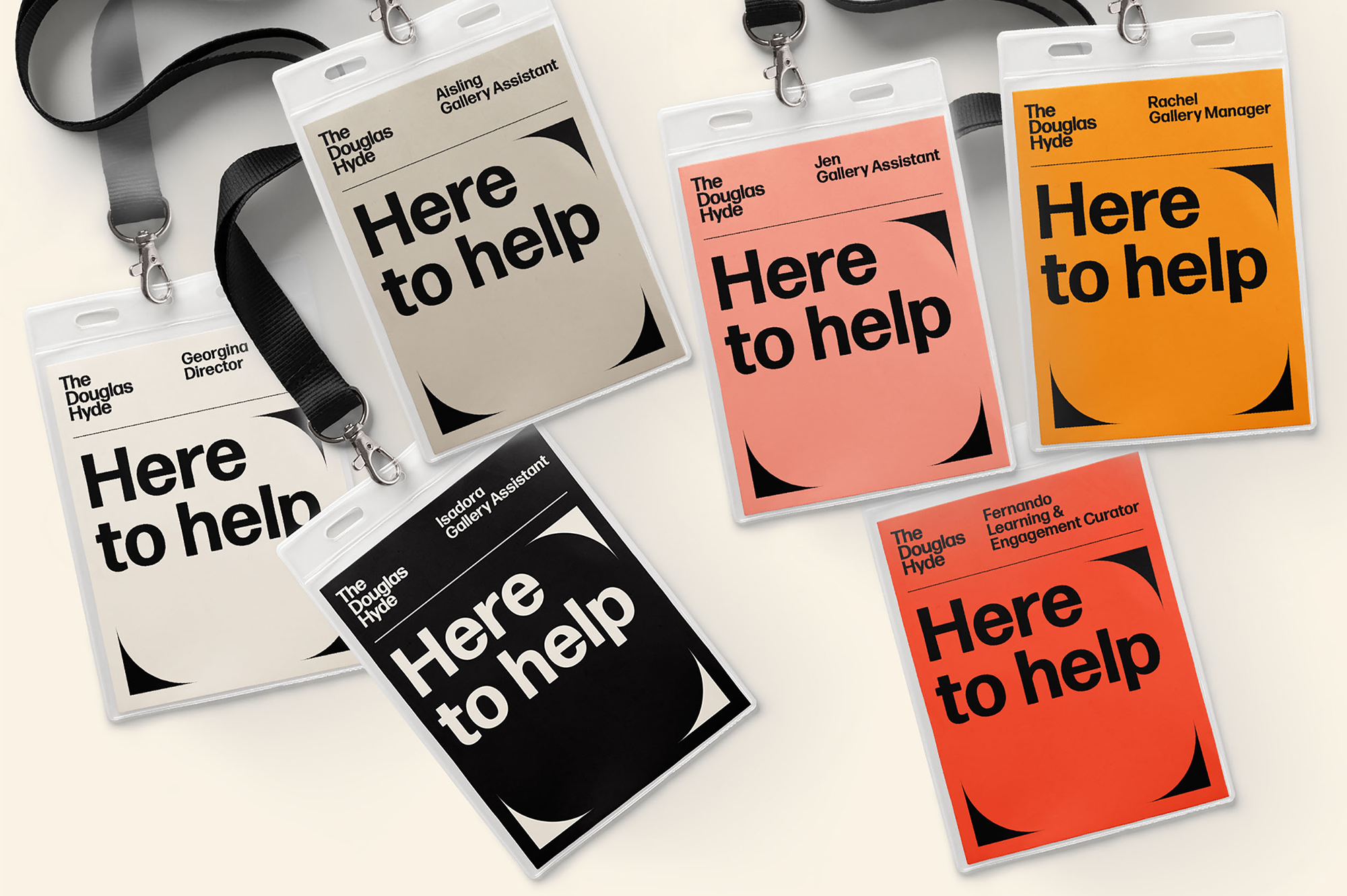
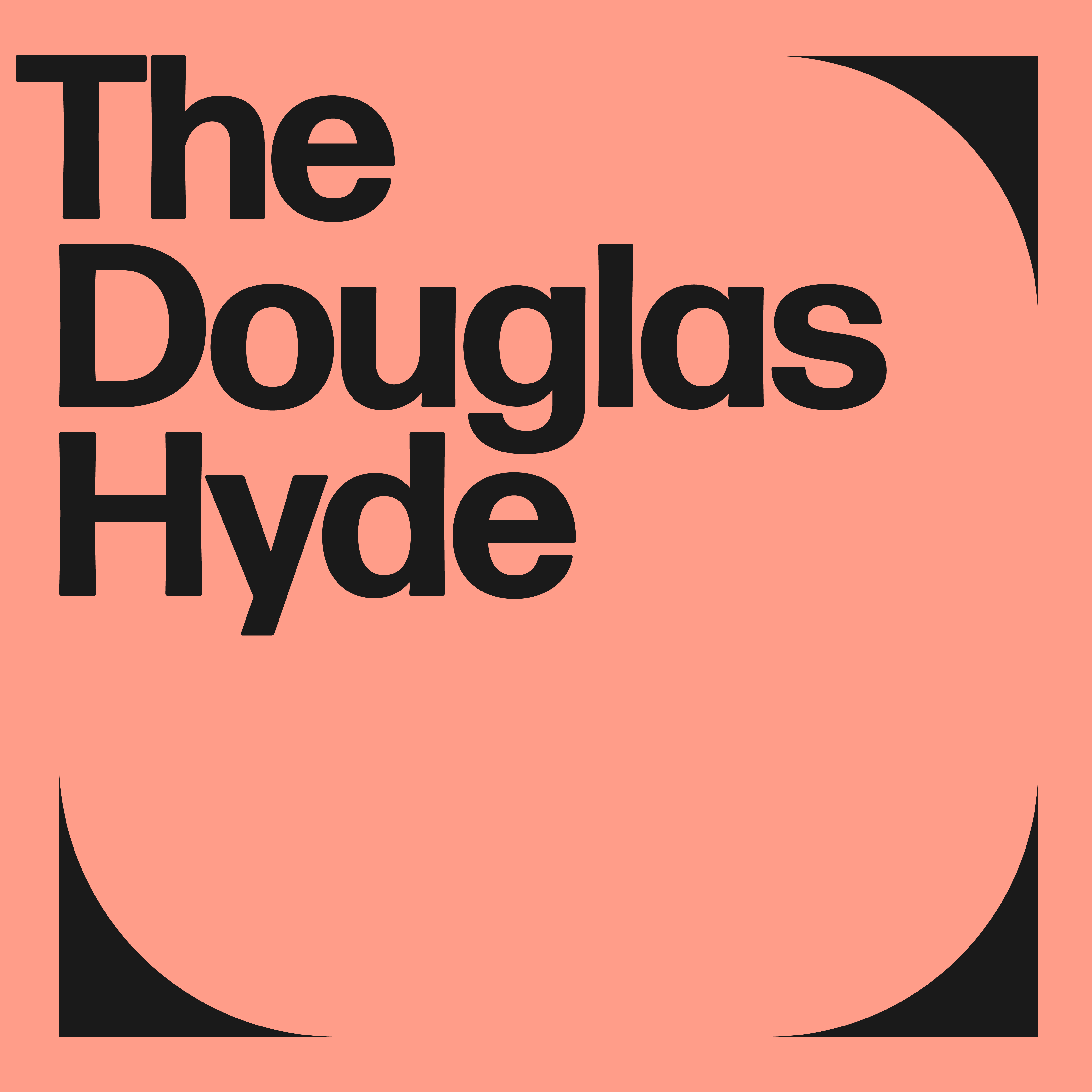
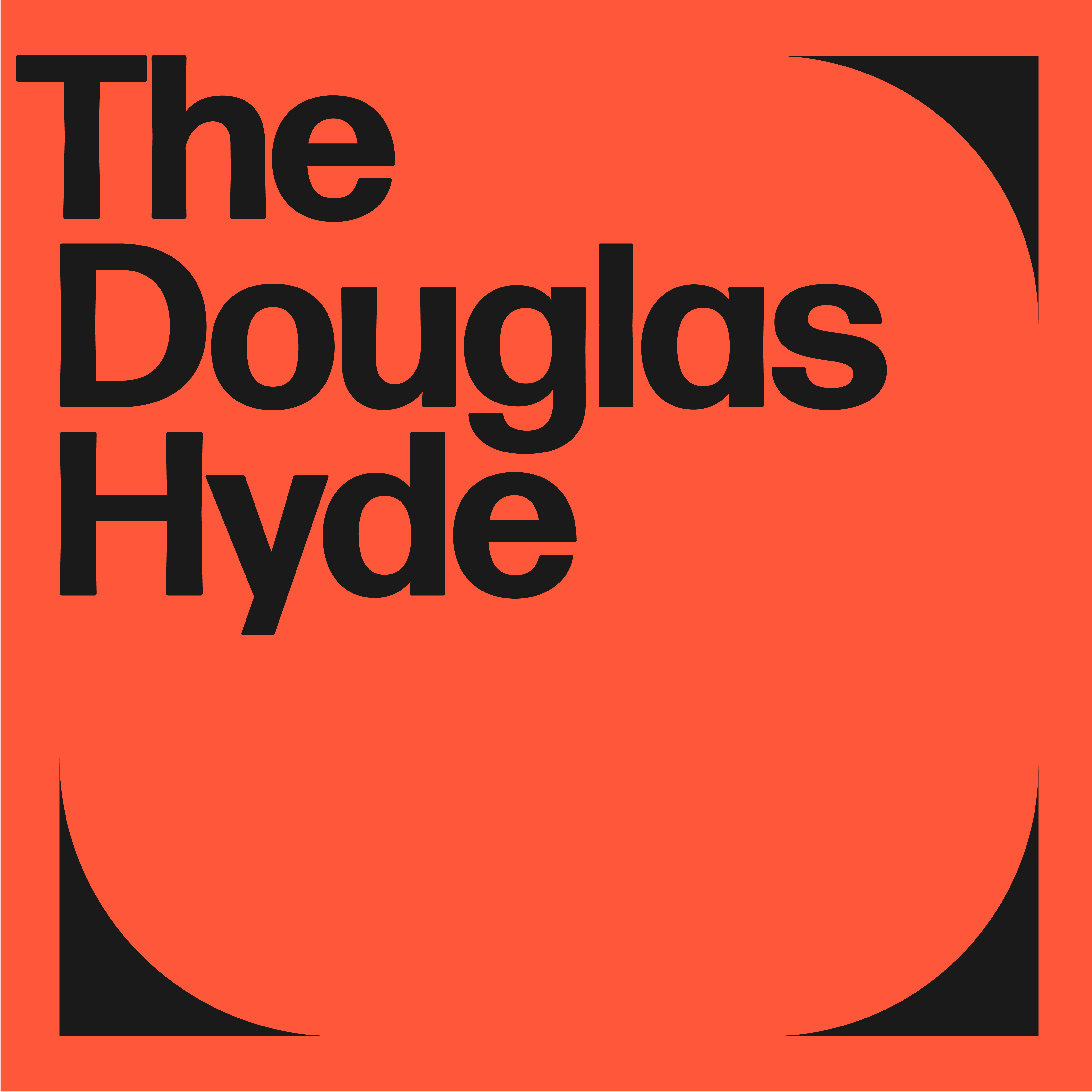
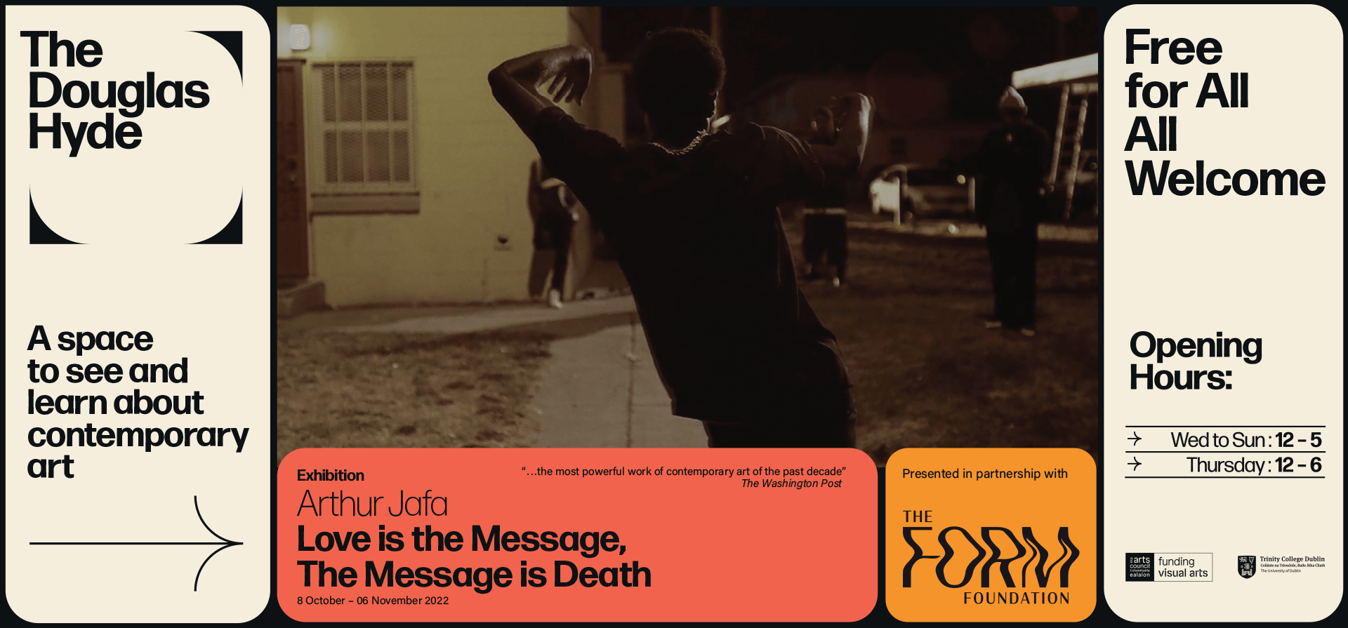
Through deconstructing and multiplying the mark and re-assembling the fragments of the original form, we developed a dynamic and modular system of symbols, icons and framing devices. The display type face (Forma) echoes that same tension between sharpness and smoothness whilst being high in contrast, legibility and character. Wanting to avoid the white cube aesthetic the colour scheme is led by a ‘muted’ charcoal black and warm off white that can be combined with the warm colours that compliments the grey concrete.




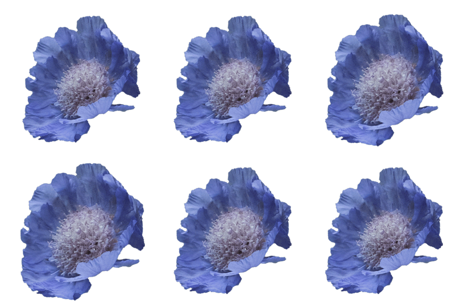
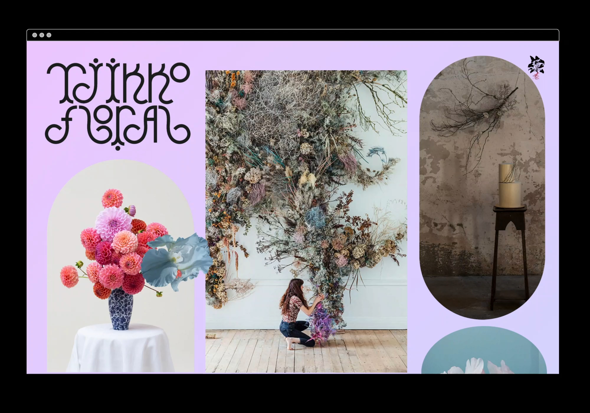
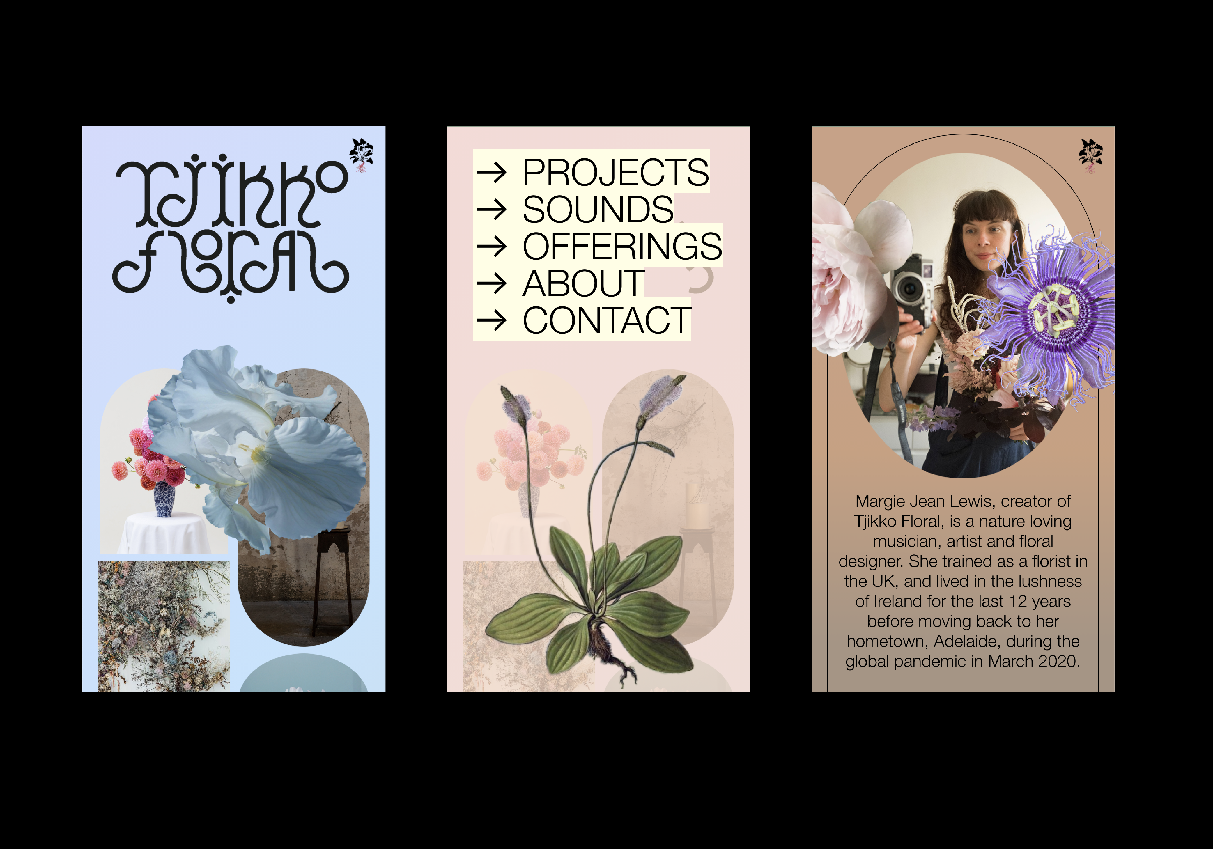
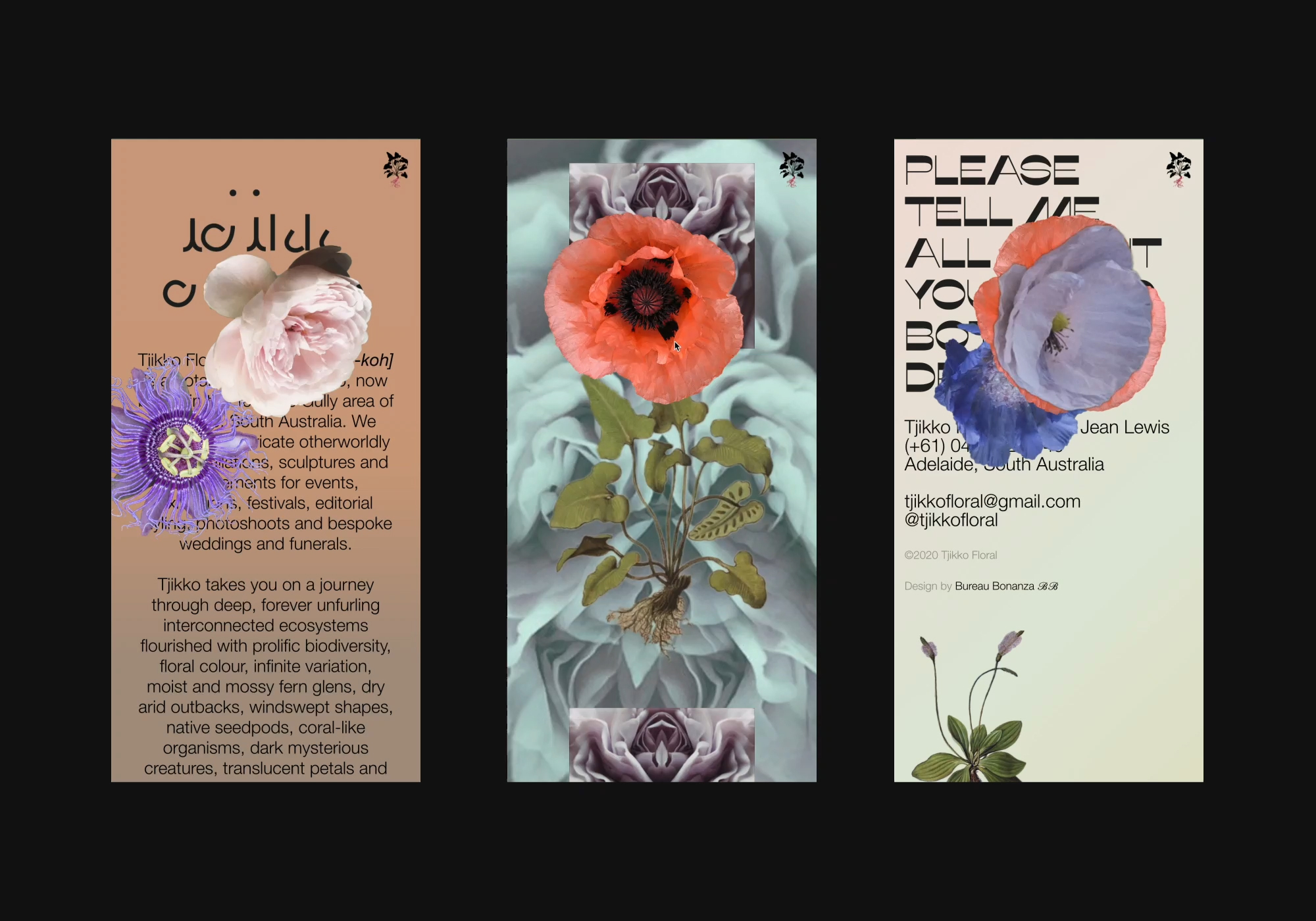
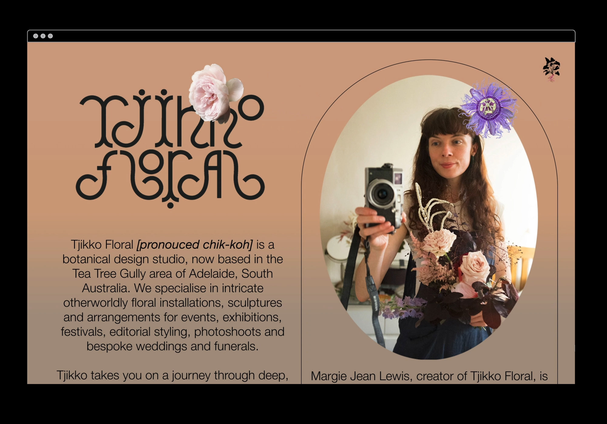
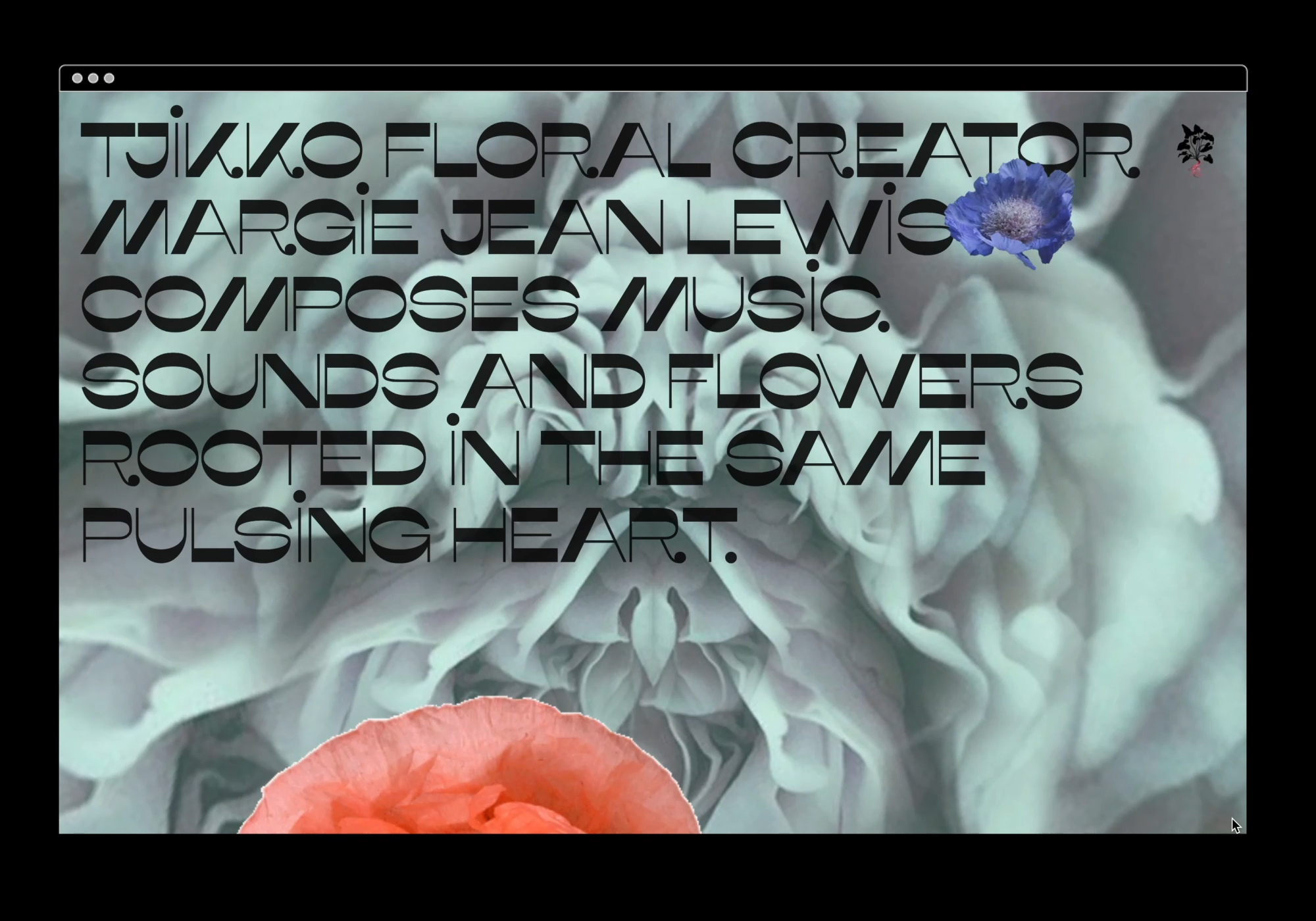
We designed and built an immersive portfolio website for eco-conscious botanical stylist, Tjikko Floral.
Based in Adelaide, Australia, floral artist and musician, Margie Lewis, wanted to slowly merge her two professions into one fully immersive sonic and floral experience. Tjikkofloral.com showcases her intricate otherworldly floral design as well as hosting her music in a mesmerising parallax petal portal, encouraging you to have a listen and get lost in this wholly escapist experience. By combining Tjikko’s images and sounds with a diverse range of animated elements, framing devices and the applied branding, we created a functional site that is “an art piece in and of itself.”
Based in Adelaide, Australia, floral artist and musician, Margie Lewis, wanted to slowly merge her two professions into one fully immersive sonic and floral experience. Tjikkofloral.com showcases her intricate otherworldly floral design as well as hosting her music in a mesmerising parallax petal portal, encouraging you to have a listen and get lost in this wholly escapist experience. By combining Tjikko’s images and sounds with a diverse range of animated elements, framing devices and the applied branding, we created a functional site that is “an art piece in and of itself.”
Photography & Music: Margie Jean Lewis
![]()
Client Brief:
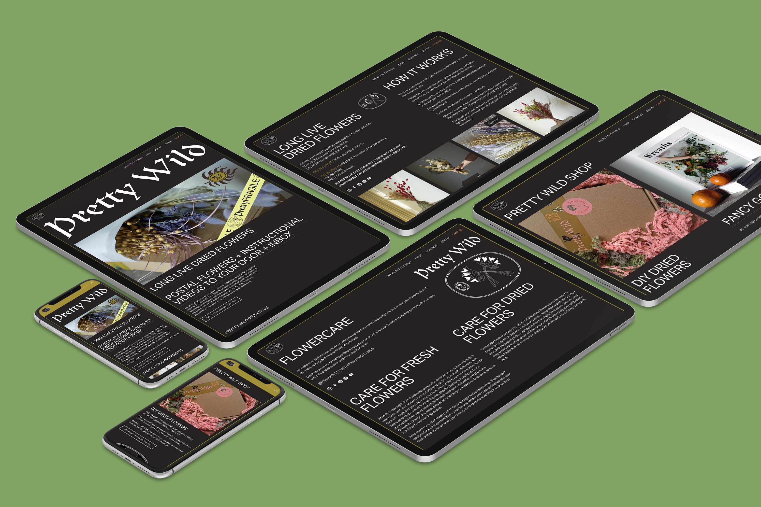
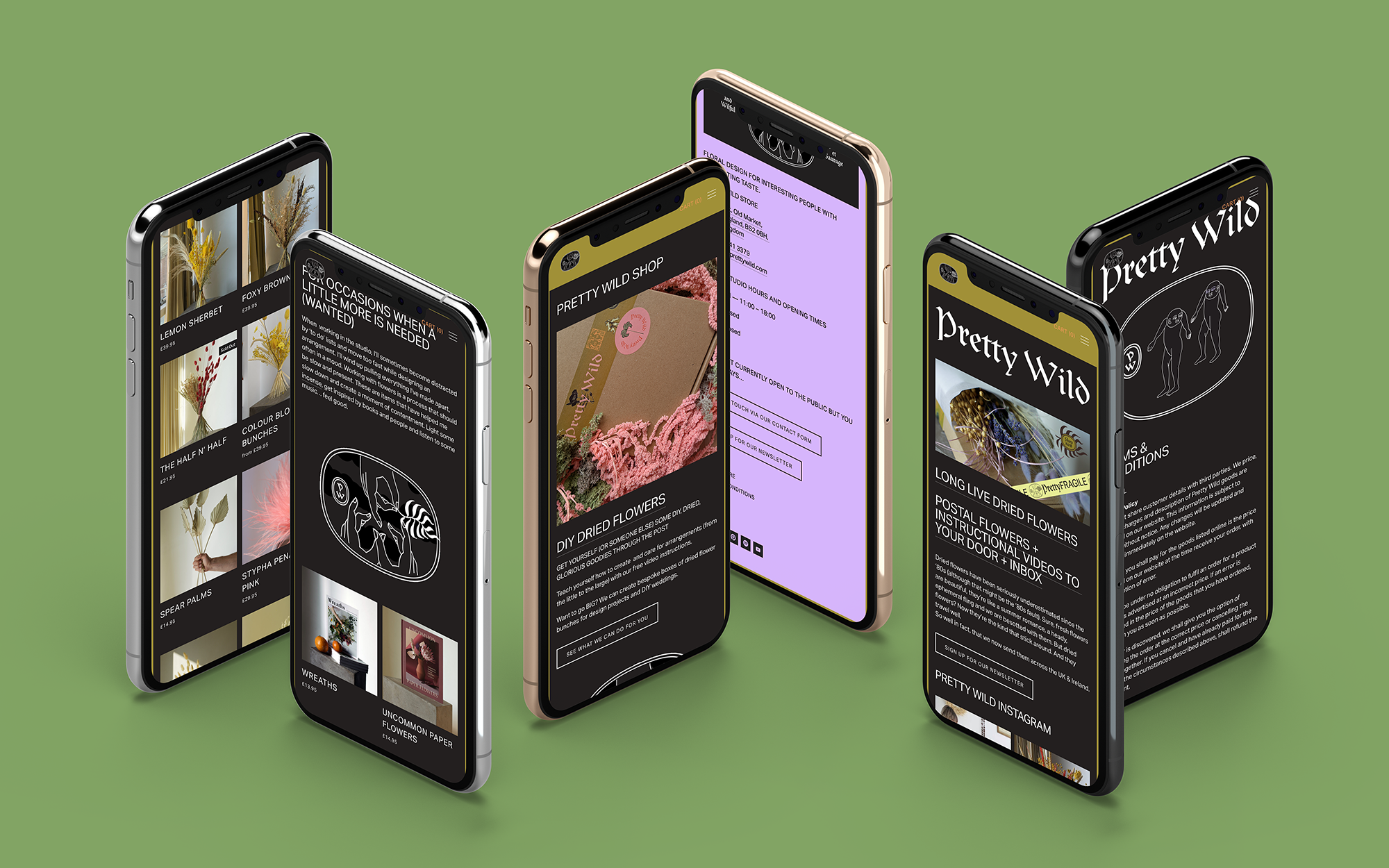
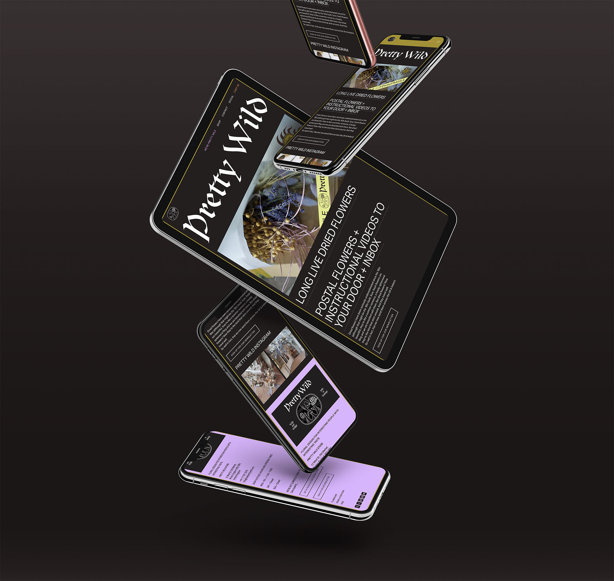
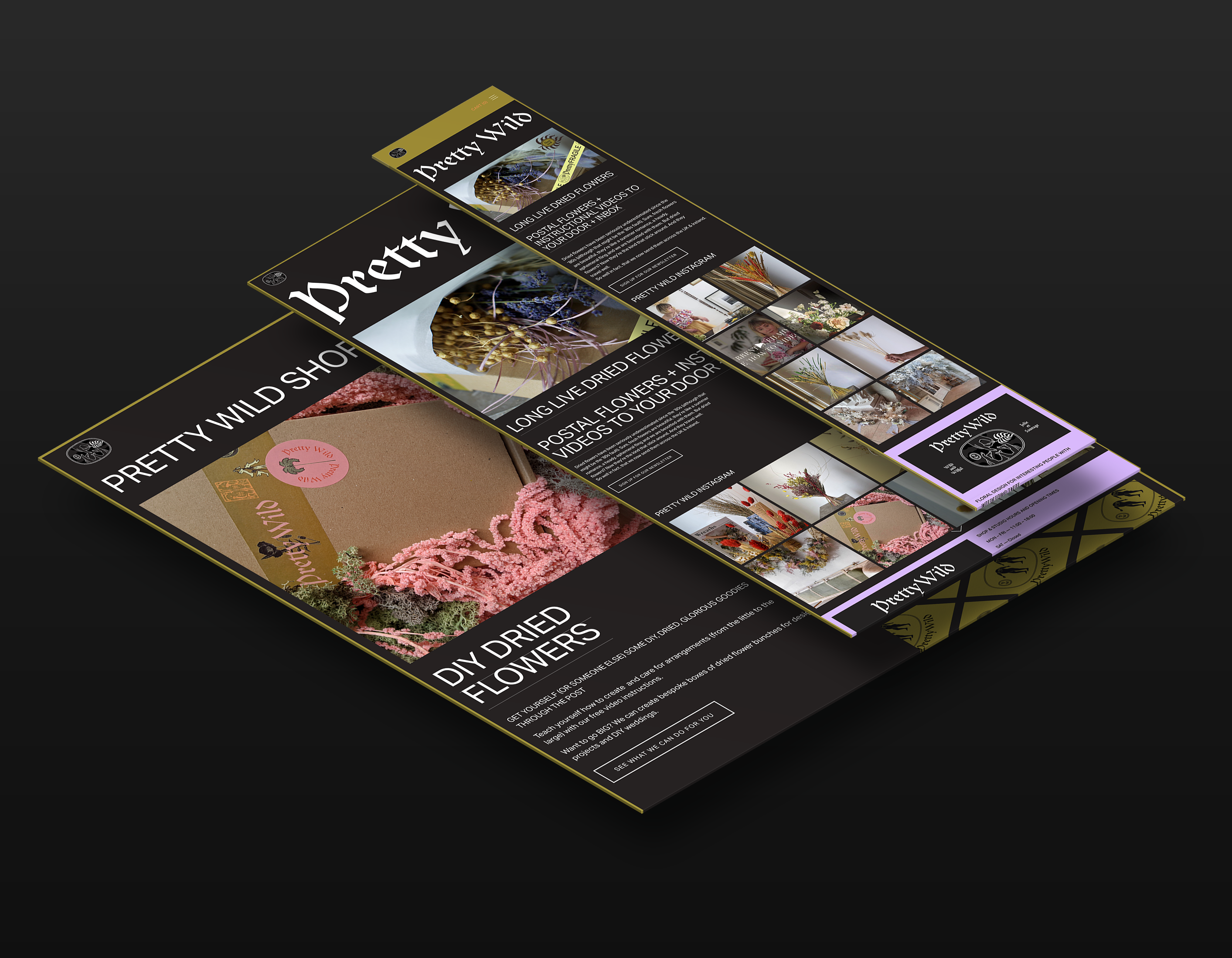
Bristol based Pretty Wild Floristry Studio and Shop needed to quickly adjust to the new restrictions her business was facing. With doors closed to the public, all shops and services had to adapt to a digital landscape and we were tasked with moving her business online.
Bristol based Pretty Wild Floristry Studio and Shop needed to quickly adjust to the new restrictions her business was facing. With doors closed to the public, all shops and services had to adapt to a digital landscape and we were tasked with moving her business online.
Our Response:
Ellen came to us with her idea—DIY DRIED FLOWERS AND INSTRUCTIONAL VIDEOS TO YOUR DOOR AND TO YOUR INBOX—and within a week, we made it a reality. We created an online shop and website that Ellen can easily update herself. Expanding and adapting to move with these changing times.
Ellen came to us with her idea—DIY DRIED FLOWERS AND INSTRUCTIONAL VIDEOS TO YOUR DOOR AND TO YOUR INBOX—and within a week, we made it a reality. We created an online shop and website that Ellen can easily update herself. Expanding and adapting to move with these changing times.
Client Brief:
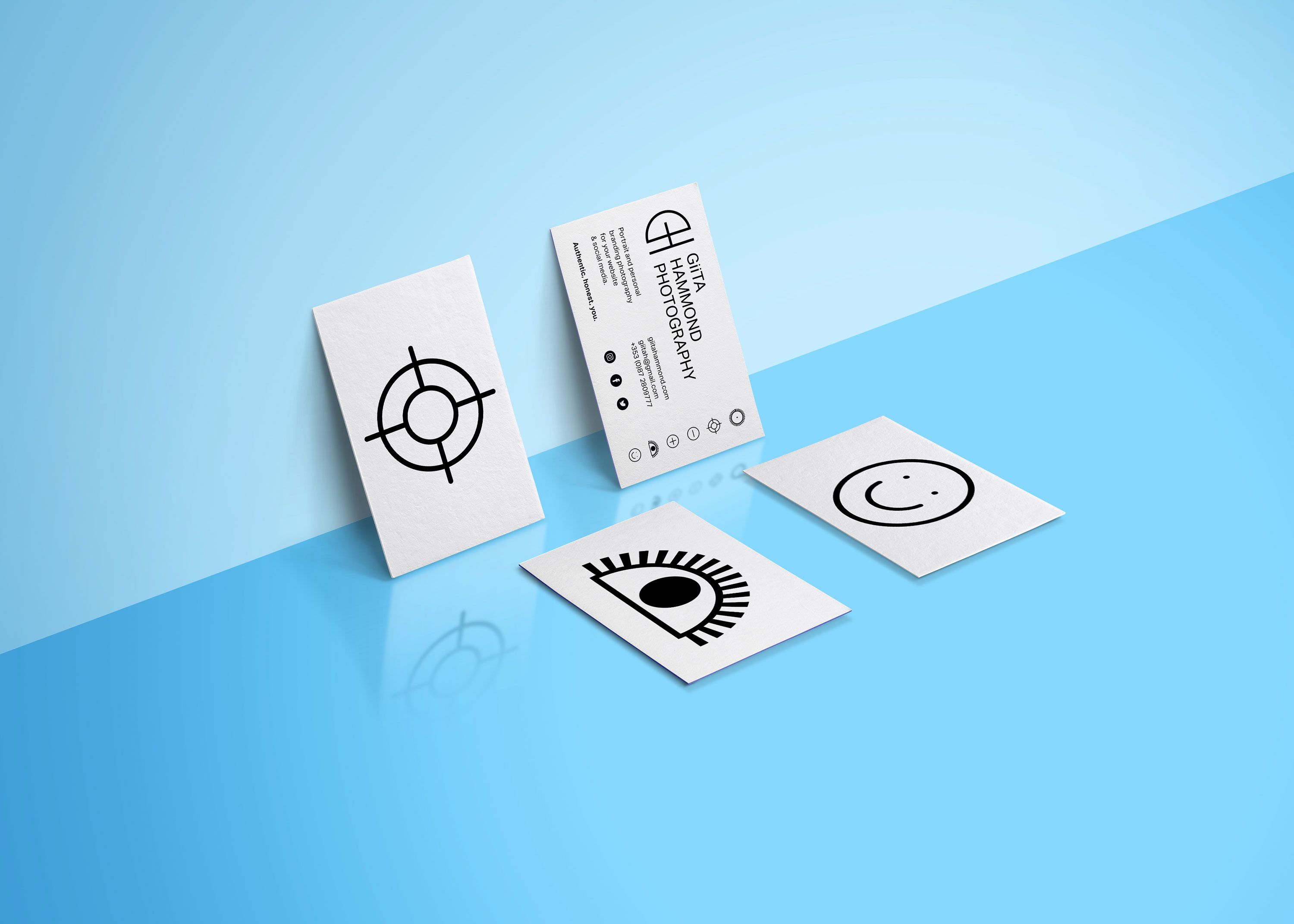
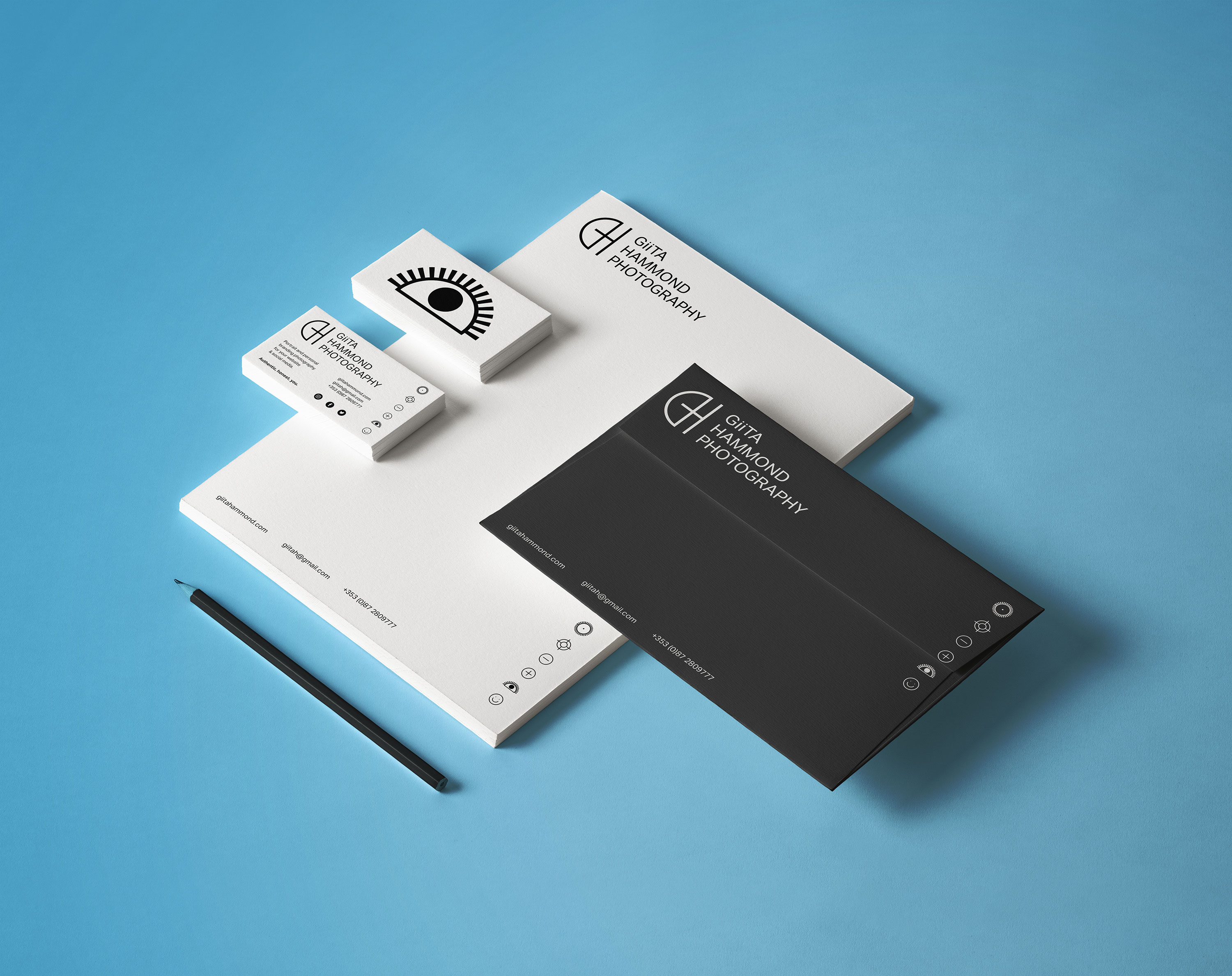
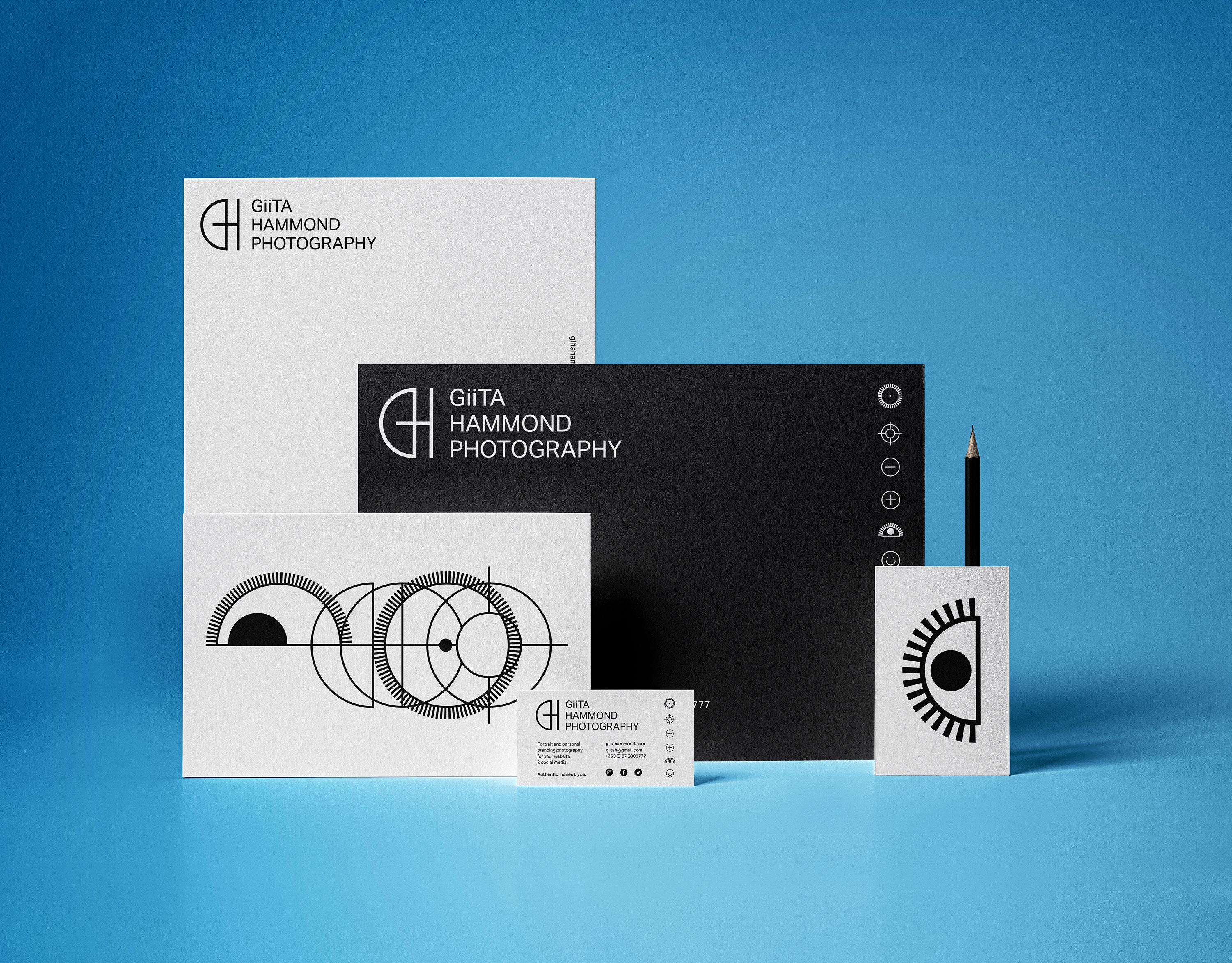
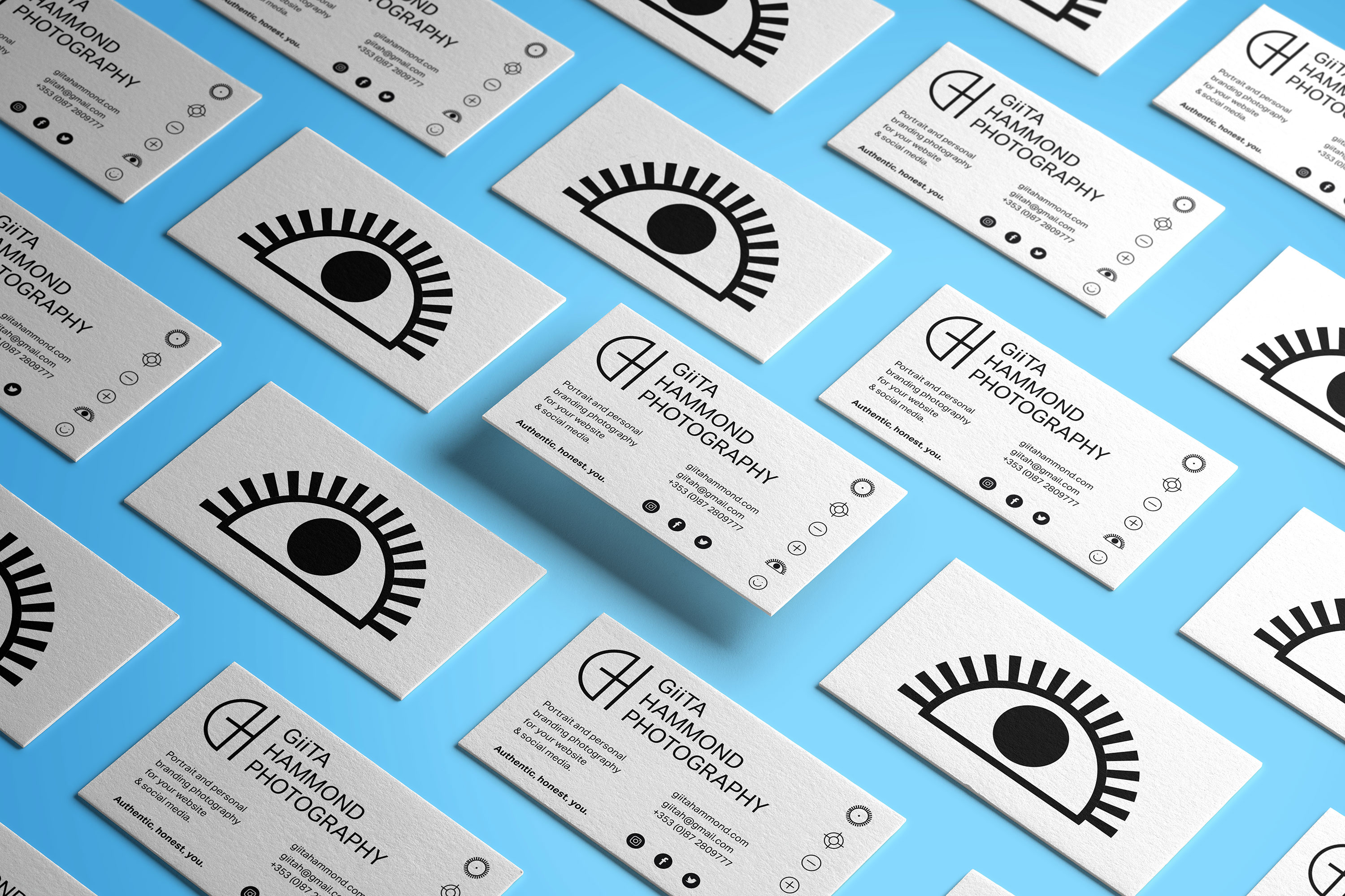
Giita needed an identity and website refresh for her new photography business specialising in creative portraiture and personal branding photography. The main thing she wanted us to portray in the identity was friendliness and openness and her ability to put those she photographs at ease to be themselves and get the best shot.
Giita needed an identity and website refresh for her new photography business specialising in creative portraiture and personal branding photography. The main thing she wanted us to portray in the identity was friendliness and openness and her ability to put those she photographs at ease to be themselves and get the best shot.
Our Response:
We came up with a monogram and series of icons related to photography that when animated communicated what Giita is all about.
We came up with a monogram and series of icons related to photography that when animated communicated what Giita is all about.
Client Testimonial:
I approached BB to get help to spruce up my website and get a logo for my photography business. They took on board everything I said and created a beautiful contemporary website and an amazing logo. I have gotten so many compliments about the logo they created. Stina and Rachel were very easy to work with and understood exactly what I wanted. The end result far exceeded my expectations. I have recommended them to many friends and colleagues and would love to work with them again in the future.
I approached BB to get help to spruce up my website and get a logo for my photography business. They took on board everything I said and created a beautiful contemporary website and an amazing logo. I have gotten so many compliments about the logo they created. Stina and Rachel were very easy to work with and understood exactly what I wanted. The end result far exceeded my expectations. I have recommended them to many friends and colleagues and would love to work with them again in the future.
